Tutorial of the previous day: Directly create a separate conda environment for CellPhoneDB , and: Output the expression matrix and cell phenotype information in Seurat object to CellPhoneDB for cell communication , show you how to do cell communication for pbmc3k single cell data set, and in: Understanding of single cell communication results of CellPhoneDB Demonstrate the meaning of multiple txt files of cell communication results.
And a simple visualization is made, as shown in: Bubble chart for visualization of single cell communication results of CellPhoneDB , it almost makes you understand that the so-called cell communication is one of the two pairs of receptor ligand genes that are highly expressed in two different single-cell subsets. Like CD74_MIF and C5AR1_ The pairing of RPS19 is obvious in the direction from mono to cd4, so CD74 and C5AR1 are highly expressed in mono, while MIF and RPS19 are highly expressed in cd4 t cells.
Then what you are most interested in is the number of receptor ligand gene pairs between multiple single cell subsets in each single cell dataset, which is actually a heat map and the corresponding data. It is worth noting that the statistical file of the number of receptor ligand gene pairs between the two of the single cell subsets, In fact, you need to use some statistical drawing functions provided by CellPhoneDB:
conda activate cellphonedb
# You must ensure that there is the out folder output in the previous steps under the current path
cellphonedb plot dot_plot
cellphonedb plot heatmap_plot cellphonedb_meta.txt
# After that, in order to distinguish from the previous ones, I changed the out folder to the out by symbol folder
Mainly to get count_network.txt file, which is the statistical results of the number of receptor ligand gene pairs between each pair of single cell subsets. But many fans left messages saying that he had his own cellphonedb plot dot_ The plot code will fail because of the R locale problem in the server.
Actually, this count_network.txt file, you can write your own code. As follows:
rm(list = ls())
getwd()
mypvals <- read.table("./out-by-symbol/pvalues.txt",
                      header = T,sep = "\t",stringsAsFactors = F)
mymeans <- read.table("./out-by-symbol/means.txt",
                      header = T,sep = "\t",stringsAsFactors = F)

colnames(mypvals)[12:ncol(mypvals)]
sm = as.data.frame(
  do.call(rbind,
          lapply( 12:ncol(mypvals) , function(i){
            return(c( strsplit(colnames(mypvals)[i],'\\.')[[1]],
                      sum(mypvals[,i] <0.05)))
          }))
)
head(sm)
colnames(sm)=c('SOURCE' ,'TARGET' ,'count')
sm$count = as.numeric( sm$count )
sm
write.table(sm,file = 'count_network.txt',
            sep = '\t',
            quote = F,row.names = F)
Get count at this time_ network. Txt file, following the previous cellphonedb plot dot_ The plot code is actually one thing.
And this count_network.txt file is easy to visualize. The code is as follows:
library(reshape2)
sm_df =dcast(as.data.frame(sm),SOURCE~TARGET )
sm_df[is.na(sm_df)]=0
sm_df
rownames(sm_df) = sm_df[,1]
sm_df = sm_df[,-1]
p1=pheatmap::pheatmap(sm_df,display_numbers = T)
p2=pheatmap::pheatmap(log(sm_df+1),display_numbers = T)
library(patchwork)
library(cowplot)
library(ggplotify)
as.ggplot(p1) + as.ggplot(p2)

ggplot2::ggsave('heatmap.pdf',width = 10,height = 5)
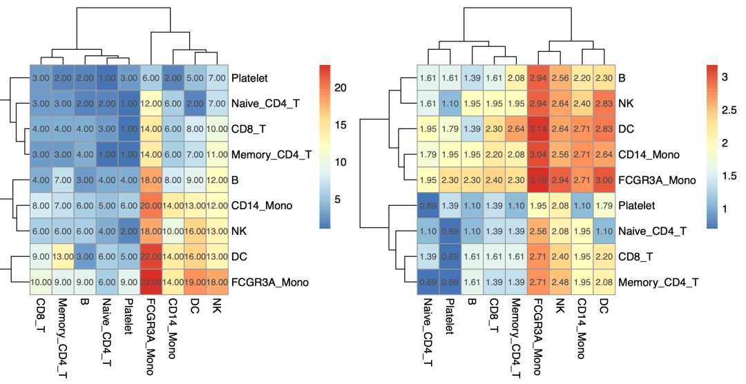
It is easy to see the number of receptor ligand gene pairs between each pair of single cell subsets, such as FCGR3A in this pbmc3k dataset_ Mono has a lot more communication with other single cell subsets:

Number of receptor ligand gene pairs between each pair of single cell subsets
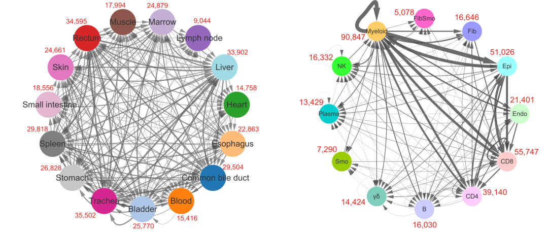
However, if you look at the literature, you will find that most of the display of cell communication results are similar to the following eggshell diagram:

From the literature: "single cell transcription profiling of an adult human cell Atlas of 15 major organizations", published at the end of 2020, in the Journal of genome biology, the link is: https://genomebiology.biomedcentral.com/articles/10.1186/s13059-020-02210-0
The right side of the above eggshell diagram is actually the number of connections between each single-cell subgroup and other single-cell subgroups, and the above value is the sum of the number of connections between it and all other single-cell subgroups, which is not as intuitive as the previous heat map.
If you really need to convert the quantity heat map of receptor ligand gene pairs between each pair of single cell subsets into eggshell map, there is also a mature code, as shown below:
rm(list = ls())
library(psych)
library(qgraph)
library(igraph)
library(purrr) # map function

netf<- read.table("count_network.txt", header = T)
mynet <- netf
head(mynet)


net<- graph_from_data_frame(mynet)
plot(net)

allcolour=c('#a6cee3','#1f78b4','#b2df8a','#33a02c' )

karate_groups <- cluster_optimal(net)
coords <- layout_in_circle(net, order =
                             order(membership(karate_groups)))  # Set network layout

E(net)$width  <- E(net)$count/40  # Edge point weight (thickness)
plot(net, edge.arrow.size=.1,
     edge.curved=0,
     vertex.color=allcolour,
     vertex.frame.color="#555555",
     vertex.label.color="black",
     layout = coords,
     vertex.label.cex=.7)

net2 <- net  # Make a copy for standby

for (i in 1: length(unique(mynet$SOURCE)) ){
  E(net)[map(unique(mynet$SOURCE),function(x) {
    get.edge.ids(net,vp = c(unique(mynet$SOURCE)[i],x))
  })%>% unlist()]$color <- allcolour[i]
}  # Who has a better solution for this wave of operation?

plot(net, edge.arrow.size=.1,
     edge.curved=0,
     vertex.color=allcolour,
     vertex.frame.color="#555555",
     vertex.label.color="black",
     layout = coords,
     vertex.size = 30,
     vertex.label.cex=.7)


dev.off()
length(unique(mynet$SOURCE))
  # See how many drawings need to be drawn to facilitate layout
  # Manual naked eye is required. Adjust mfrow=c(2,2) by yourself
par(mfrow=c(2,2), mar=c(.3,.3,.3,.3))

for (i in 1: length(unique(mynet$SOURCE)) ){
  net1<-net2
  E(net1)[map(unique(mynet$SOURCE),function(x) {
    get.edge.ids(net,vp = c(unique(mynet$SOURCE)[i],x))
  })%>% unlist()]$color <- allcolour[i]

  plot(net1, edge.arrow.size=.1,
       edge.curved=0.4,
       vertex.color=allcolour,
       vertex.frame.color="#555555",
       vertex.label.color="black",
       layout = coords,
       vertex.label.cex=1,
       vertex.size = 30)

}
For routine single cell analysis, please refer to the previous example: Single cell clustering and clustering annotation that everyone can learn , we demonstrate the first level of clustering. If you don't have a basic understanding of single-cell data analysis, you can see basic 10:
- 01. Upstream analysis process
- 02. How many samples of the subject and how much sequencing data
- 03. Filter unqualified cells and genes (data quality control is very important)
- 04. Filter mitochondrial ribosomal genes
- 05. Remove cellular and genetic effects
- 06. Dimensionality reduction clustering of single cell transcriptome data
- 07. Cell subpopulation annotation for single cell transcriptome data processing
- 08. Group the obtained subgroups more carefully
- 09. Comparison of cell subsets in single cell transcriptome data processing