The following is the sharing of last year's interns
author: "ylchen"
1, Foreword
PCA(Principal Components Analysis), namely principal component analysis, also known as principal component analysis or principal component regression analysis, is an unsupervised data dimensionality reduction method. Firstly, the data is transformed into a new coordinate system by linear transformation; Then, using the idea of dimension reduction, the first variance of any data projection is on the first coordinate (called the first principal component) and the second variance is on the second coordinate (the second principal component). In fact, the key is to reduce the dimension of the data set, while maintaining the characteristics that contribute the most to the data set, and finally make the data appear intuitively in the two-dimensional coordinate system.
(= = = figure = = =)
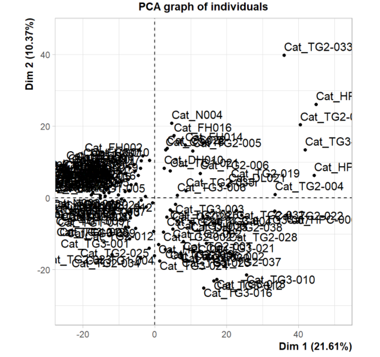
PCA chart is generally used to explore the relationship between different samples in the early stage of analysis. Here, the author projects the sample into a two-dimensional coordinate system according to the 1000 most variable protein coding genes. It was found that tumor and non tumor samples were significantly separated, while those liver tissues from fibrosis and cirrhosis were close to normal samples.
Source of the article: "predictive immune landscape predisposes adverse outcomes in hepatocellular cancer patients with liver transplantation" (2021, npj precision Oncology). All data and codes are disclosed in https://github.com/sangho1130/KOR_HCC .
Now let's show the drawing of PCA diagram and how to highlight a certain part.
2, Data loading
reference material: http://www.sthda.com/english/articles/31-principal-component-methods-in-r-practical-guide/112-pca-principal-component-analysis-essentials/
rm(list = ls())
library(FactoMineR)
library(ggplot2)
library(factoextra)
table <- '../data/Figure 1B input.txt'
data <- read.delim(table, header = TRUE,
sep = '\t', check.names = FALSE, row.names = 1)
# The gene has been selected and the transposed expression matrix is suitable for PCA analysis
data[1:4,1:4]
# Extract the data$Grade information as a matrix
dataGrade <- data.frame(row.names = rownames(data), grade = data$Grade)
head(dataGrade)
# Delete the information of Grade and leave the amount of gene expression
data$Grade <- NULL
unique(dataGrade$grade)
# Put it in order
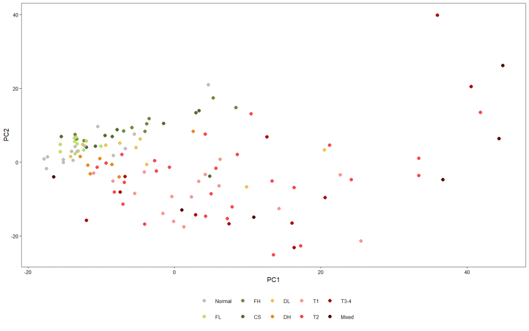
dataGrade$grade = factor(dataGrade$grade, c("Normal", 'FL', 'FH', 'CS', 'DL', 'DH', 'T1', 'T2', 'T3-4', 'Mixed'))
3, PCA analysis
data[1:4,1:4]
# At this time, the pca diagram is very primitive and ugly
pca <- PCA(data)
print(pca) # It mainly outputs these 15 results
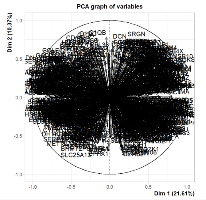
# The contribution of each variable to each principal component is saved in pca$var$contrib
contribution <- as.data.frame(pca$var$contrib)
colnames(contribution) <- c('PC1', 'PC2', 'PC3', 'PC4', 'PC5')
contribution <- cbind(gene = rownames(contribution), contribution)
head(contribution)
# write.table(contribution, '../results/Figure 1B PCA contribution.txt',
# row.names = F, col.names = T, quote = F, sep = '\t')
4, Visualization
# Extract the coordinate information and draw it with ggplot2
pcaScores <- as.data.frame(pca$ind$coord)
colnames(pcaScores) <- c('PC1', 'PC2', 'PC3', 'PC4', 'PC5')
pcaScores$Grade <- dataGrade$grade
head(pcaScores)
# Generally, PC1 and PC2 can be used to draw data features
# mapping
plt <- ggplot(pcaScores, aes(x = PC1, y = PC2, colour = Grade)) +
  geom_point(size = 1.5) +
  scale_colour_manual(name='',
                      values = c("Normal" = "#bebdbd",
                                 "FL" = "#bbe165", 'FH' = '#6e8a3c', 'CS' = '#546a2e',
                                 "DL" = "#f1c055", 'DH' = '#eb8919',
                                 "T1" = '#f69693', 'T2' = '#f7474e', 'T3-4' = '#aa0c0b', 'Mixed' = '#570a08')) +
  theme_bw(base_size = 7) + #font size
  theme(axis.text = element_text(colour = 'black'), # Axis scale value
        axis.ticks = element_line(colour = 'black'),# Axis scale mark
        plot.title = element_text(hjust = 0.5), # The title hjust is between 0 and 1. Adjust the horizontal position of the title
        panel.grid = element_blank(), #Blank background
        legend.position = 'bottom' ) #Annotation location
plt
# # It is originally a very small point and legend, but units = 'cm', width = 8 and height = 6 can be adjusted to be suitable for browsing
# ggsave('../results/Figure 1B.pdf', plt, units = 'cm', width = 8, height = 6)
5, Highlight display
How to highlight the content in the figure? AI or PS should be used here to make puzzles directly.
Let me show the second scheme below: with the help of the facet in the ggforce package_ Zoom() function. However, there are some differences in the original text. I still like R language + AI beautification. This is the king!
# install.packages("ggforce")
library(ggforce)
# Setting the focus area by xy
plt+facet_zoom(y=pcaScores$PC2<20 & pcaScores$PC2> -15, split = F)
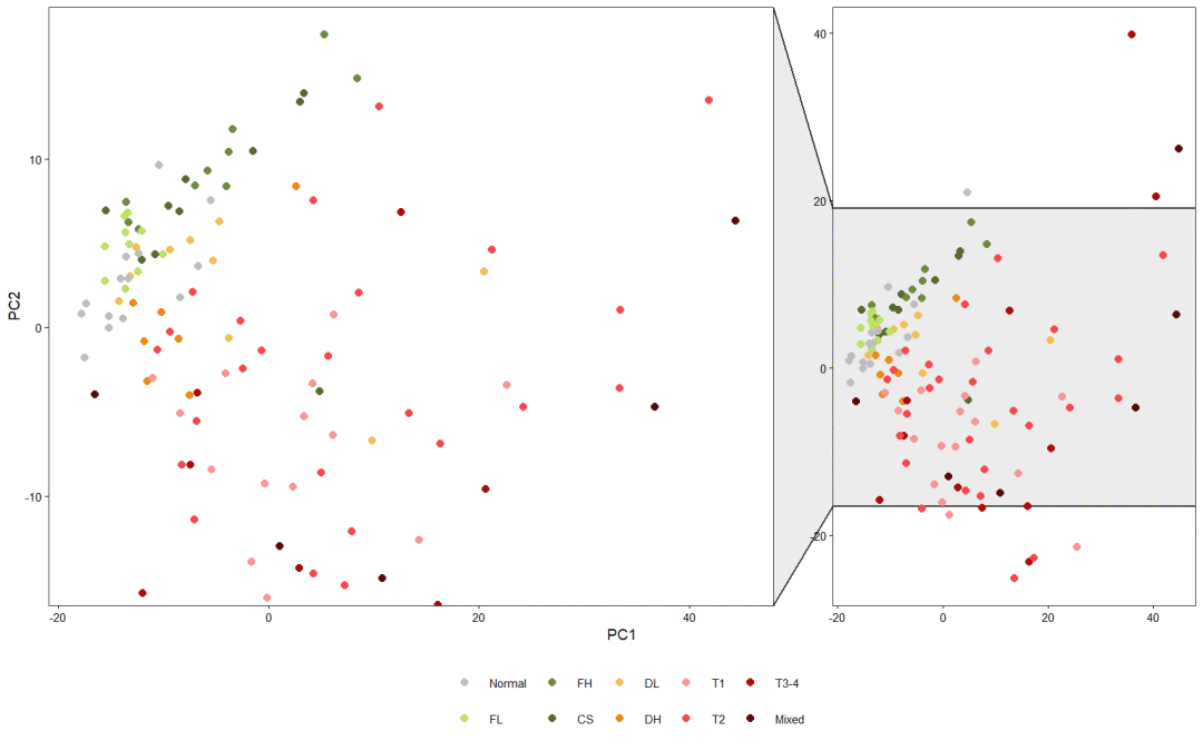
Ggforce package is a ggplot2 extension package developed by Thomas Pedersen. It is good at drawing contours based on data and enlarging areas. If you are interested, you can learn the following: https://rviews.rstudio.com/2019/09/19/intro-to-ggforce/ . Very practical. Let's introduce this bag later!
It can be seen that this PCA diagram, which is essentially a scatter diagram, is still not beautiful enough. In fact, it is only because of the resolution problem. You can adjust the output pdf size and pixels