1. General
Caterpillar effect:
In one experiment, many caterpillars were placed on the edge of a flowerpot to make them connect head to tail and form a circle. Then sprinkled some caterpillar food near the flowerpot.
At this time, caterpillars do not climb in the direction of food, but circle one by one at the edge of the flowerpot until they die one after another due to hunger and exhaustion seven days later.
This is a characteristic of caterpillars. They like to follow the route of the former, which is also a manifestation of solidified thinking.
Therefore, it is very important to emancipate the mind and have the spirit of innovation.
To get back to business, today we continue to talk about the use of labels to achieve animation and transition effects.
2. Use labels to achieve the effect of animation and transition
2.1 recommend two good animation related websites
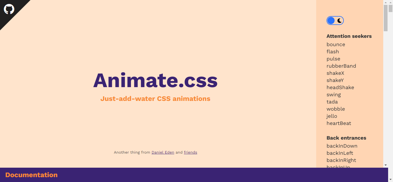
2.1.1 Animate.css
Website address: https://animate.style/
There are many good and encapsulated css styles for use, which saves programmers a lot of development workload

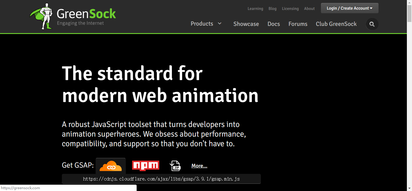
2.1.2 greensock
Website address: https://greensock.com
GSAP, the main product of this website, is a set of script animation tools, which encapsulates JavaScript and solves the compatibility problems of countless browsers, 20 times faster than jQuery.

2.2 custom style name
Previously, we defined the name of the style by adding the name attribute on the transition tag. This method is not flexible enough. Let's write it more flexibly. The name of the style can be completely customized
<style>
        @keyframes leftRight {
            /* Abscissa position of the element when the progress is X% */
            0% {
                transform: translateX(0px);
            }
            33% {
                transform: translateX(-100px);
            }
            66% {
                transform: translateX(100px);
            }
            100% {
                transform: translateX(0px);
            }
        }

        /* Center */
        .center {
            text-align: center;
        }

        /* Entry start style */
        .my-en-from {
            opacity: 0;  /* transparency */
        }
        /* Entrance transition effect */
        .my-en-active {
            transition: 4s opacity ease-out;
            animation : leftRight 4s;
        }
        /* Entry end style */
        .my-en-to {
            opacity: 1;
        }

        /* Exit start style */
        .my-leave-from {
            opacity: 1;  /* transparency */
        }
        /* Exit transition effect */
        .my-leave-active {
            transition: 4s opacity ease-out;
            animation : leftRight 4s;
        }
        /* Exit end style */
        .my-leave-to {
            opacity: 0;
        }
<body>
    <div id="myDiv"></div>
</body>
<script>
    const app = Vue.createApp({
        data(){
            return {
                show : false
            }
        },
        methods : {
            myClick() {
                this.show = !this.show;
            }

        },
        template:`
            <div class="center">
                <transition
                    enter-from-class="my-en-from"
                    enter-active-class="my-en-active"
                    enter-to-class="my-en-to"
                    leave-from-class="my-leave-from"
                    leave-active-class="my-leave-active"
                    leave-to-class="my-leave-to"
                >
                    <div v-show="show">hello world</div>
                </transition>
                <button @click="myClick">switch</button>
            </div>
        `
    });

    const vm = app.mount("#myDiv");
Specify the style in the transition tab
Enter from class: entry starting style
Enter active class: entry transition effect
Enter to class: entry end style
Leave from class: exit starting style
Leave active class: exit transition effect
Leave to class: exit end style
2.3 Animate.css example
<link
        rel="stylesheet"
        href="https://cdnjs.cloudflare.com/ajax/libs/animate.css/4.1.1/animate.min.css"
    />
<script src="../vue.global.js"></script>
<body>
    <div id="myDiv"></div>
</body>
<script>
    const app = Vue.createApp({
        data(){
            return {
                show : false
            }
        },
        methods : {
            myClick() {
                this.show = !this.show;
            }

        },
        template:`
            <div class="center">
                <transition
                    enter-active-class="animate__animated animate__backInDown"
                    leave-active-class="animate__animated animate__backOutUp"
                >
                    <div v-show="show"><h1>hello world</h1></div>
                </transition>
                <button @click="myClick">switch</button>
            </div>
        `
    });

    const vm = app.mount("#myDiv");
In this example, we directly specify the entry and exit styles as "animal" CSS style, you don't need to write it yourself
2.4 using # greenlock JavaScript framework to realize animation
<script src="https://cdnjs.cloudflare.com/ajax/libs/gsap/3.9.1/gsap.min.js"></script>
    <style>
        body {
            margin: 30px;
        }

        .box {
            width: 100px;
            height: 20px;
            background: blue;
            margin-top: 20px;
        }
    </style>
const app = Vue.createApp({
        data(){
            return {
                show : false
            }
        },
        methods : {
            myClick() {
                this.show = !this.show;
            },
            myBeforeEnter(element) {
                gsap.set(element, {
                    scaleX: 0.8,
                    scaleY: 1.2
                });
            },
            myEnter(element, done) {
                gsap.to(element, {
                    duration: 1,
                    scaleX: 1.5,
                    scaleY: 0.7,
                    opacity: 1,
                    x: 150,
                    ease: 'elastic.inOut(2.5, 1)',
                    onComplete: done
                });
            },
            myAfterEnter(element) {

            },
            myBeforeLeave(element) {

            },
            myLeave(element, done) {
                gsap.to(element, {
                    duration: 0.7,
                    scaleX: 1,
                    scaleY: 1,
                    x: 300,
                    ease: 'elastic.inOut(2.5, 1)'
                });
                gsap.to(element, {
                    duration: 0.2,
                    delay: 0.5,
                    opacity: 0,
                    onComplete: done
                });
            },
            myAfterLeave(element) {

            }

        },

        template:`
            <div>
                <button @click="myClick">switch</button>
                <transition
                    :css="false"
                    @before-enter="myBeforeEnter"
                    @enter="myEnter"
                    @after-enter="myAfterEnter"
                    @before-leave="myBeforeLeave"
                    @leave="myLeave"
                    @after-leave="myAfterLeave"
                >
                    <div v-if="show" class="box">hello world</div>
                </transition>

            </div>
        `
There are two knowledge points in this example.
When css="false" is used in the animation, it needs to use css="false" to realize a hook.
Another knowledge point is to use gsap framework in hook function to realize animation.
2.5 use the type attribute to solve the inconsistency between animation and transition time
In such a case, the animation time or transition time is relatively long. We hope that the time of the two is the same, so we can do so
         /* Entry start style */
        .v-enter-from {
            color:blue;
        }
        /* Entrance transition effect */
        .v-enter-active {
            transition: 10s all ease-in; /* all Indicates that any attribute change is a transition */
            animation : leftRight 4s;
        }
        /* Entry end style */
        .v-enter-to {
            color:red;
        }

        /* Exit start style */
        .v-leave-from {
            color:red;
        }
        /* Exit transition effect */
        .v-leave-active {
            transition: 10s all ease-out;
            animation : leftRight 4s;
        }
        /* Exit end style */
        .v-leave-to {
            color:blue;
        }
        template:`
            <div class="center">
                <transition type="animation">
                    <div v-show="show"><h3>hello world</h3></div>
                </transition>
                <button @click="myClick">switch</button>
            </div>
        `
In the transition tab, use type = "animation" to specify that the time of animation shall prevail. In this example, both animation and transition will be completed in 4 seconds
2.6 use the {duration attribute to solve the inconsistency between animation and transition time
        template:`
            <div class="center">
                <transition :duration="1000">
                    <div v-show="show"><h3>hello world</h3></div>
                </transition>
                <button @click="myClick">switch</button>
            </div>
        `
Use: duration to specify the running time in milliseconds, and: duration="1000" means that the animation and transition will end in 1 second
2.7 expression used for duration attribute
        template:`
            <div class="center">
                <transition :duration="{enter:2000, leave:5000}">
                    <div v-show="show"><h3>hello world</h3></div>
                </transition>
                <button @click="myClick">switch</button>
            </div>
        `
: duration="{enter:2000, leave:5000}" means that the entry animation and transition are 2 seconds and the exit is 5 seconds
3. Overview
Today, I talked about another part of the knowledge of using labels to realize the effect of animation and transition in VUE3. I hope it can be helpful to your work. In the next section, we will continue to talk about the relevant knowledge of animation in Vue. Please look forward to it
Welcome to help, like, comment, forward and pay attention:)
People who follow the trend talk about Java. There are full of dry goods here. They are all practical technical articles, which are easy to understand and easy to use.
4. official account
Fans talk about Java. Welcome to pay attention
