- Date : [[2022-01-06_Thu]]
- Tags: #r / index / 02 #R/R visualization #R/R data science # other / answer fan questions
preface
I feel that the legend / legend in ggplot drawing can be used as a separate content for a long time. I hereby summarize it.
1 - remove all / part of the legend
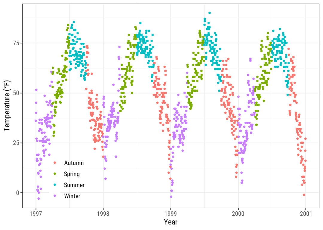
Use legend Position = "None" can facilitate us to remove the legend, but sometimes it may not need to be so ruthless. For example, to remove the legend specifying a certain type, usually geometric objects can set multiple classifications (color, fill, shape..), We can use the guide function:
ggplot(chic,
       aes(x = date, y = temp,
           color = season, shape = season)) +
  geom_point() +
  labs(x = "Year", y = "Temperature (°F)") +
  guides(color = "none")
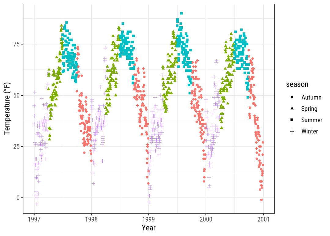
In addition, scale_ xx_ The discrete function can also specify the guide parameter, such as scale_shape_discrete(guide = "none").
2 - remove legend title
theme(legend.title = element_blank()), we can also directly create a blank name in labs according to the corresponding content defined by aes:
ggplot(chic, aes(x = date, y = temp, color = season)) +
  geom_point() +
  labs(x = "Year", y = "Temperature (°F)",
       color = "")
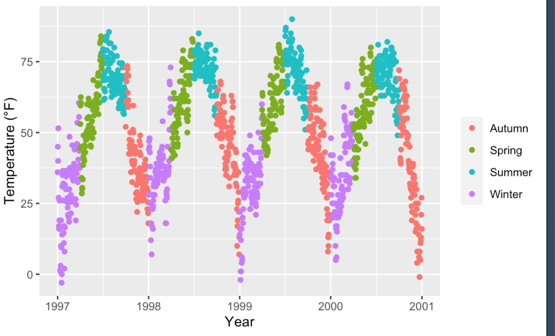
We can also use scale_xx_discrete definition, such as scale_color_discrete(name = "Seasons\nindicated\nby colors:").
3 - change legend title and sub label
There are many ways to change the legend title. For sub labels, you can use scale_xx_discrete defines labels:
ggplot(chic, aes(x = date, y = temp, color = season)) +
  geom_point() +
  labs(x = "Year", y = "Temperature (°F)") +
  scale_color_discrete(
    name = "Seasons:",
    labels = c("Mar—May", "Jun—Aug", "Sep—Nov", "Dec—Feb")
  ) +
  theme(legend.title = element_text(
    family = "Playfair", color = "chocolate", size = 14, face = 2
  ))
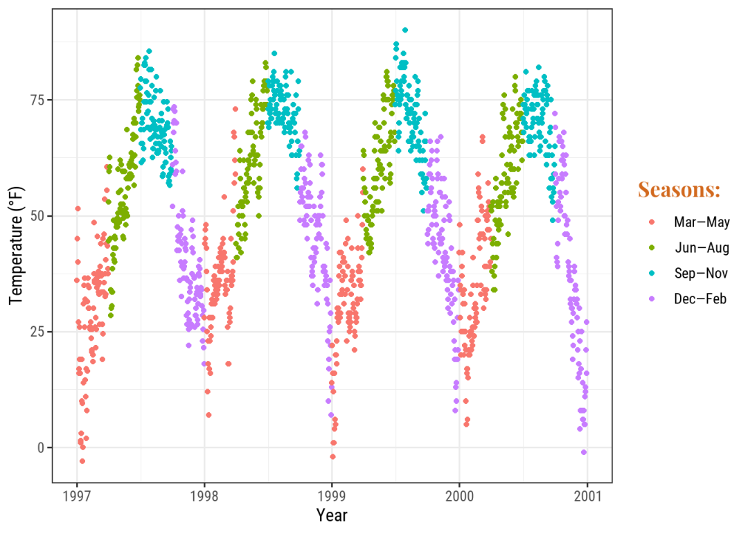
image.png
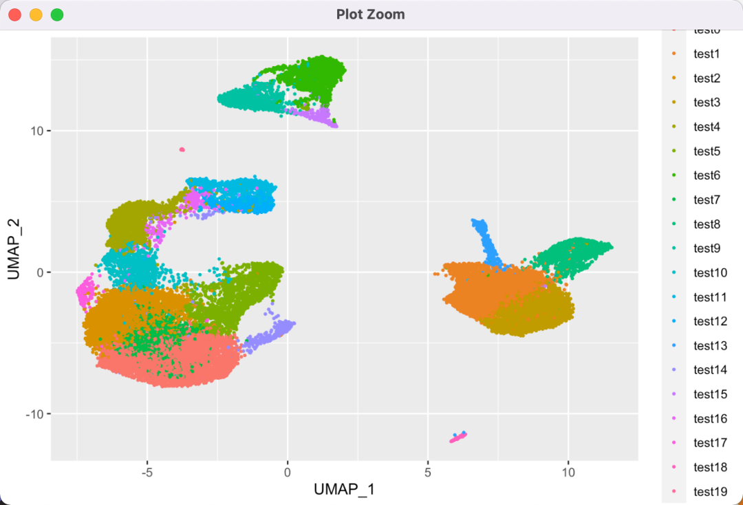
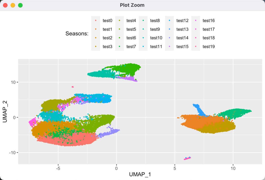
In addition, we can also use functions to operate the legend content more conveniently. In fact, I also mentioned this in [[86-R visualization 18 custom classification or continuous data coordinate axis text]]:
p <- ggplot(data = cell_reduction_df) +
  geom_point(aes(x = UMAP_1, y = UMAP_2, color = cell_anno),
             size = 0.5)
p + scale_color_discrete(
  name = "Seasons:",
  labels = function(x) {paste0("test", x)}
)
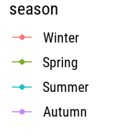
4 - move legend position
4.1 - peripheral turns
There are four types: "top", "right" (which is the default), "bottom", and "left":
ggplot(chic, aes(x = date, y = temp, color = season)) +
  geom_point() +
  labs(x = "Year", y = "Temperature (°F)") +
  theme(legend.position = "top")
4.2 - embedded legend
Before, let the legend wander around the periphery. Now let the legend enter the main figure.
By adjusting the legend position, legend Position is between 0-1, which can be embedded:
ggplot(chic,
       aes(x = date, y = temp,
           color = season, shape = season)) +
  geom_point() +
  labs(x = "Year", y = "Temperature (°F)") + theme_classic() +
  theme(legend.position = c(.15, .15),
        legend.background = element_rect(fill = "transparent"))
element_rect is used to set the drawing options for non data type content. You can specify that the legend background is transparent and looks better:
4.3 - adjust legend direction
By default, the legend is displayed vertically (from top to bottom). We can change it to horizontal:
ggplot(chic, aes(x = date, y = temp, color = season)) +
  geom_point() +
  labs(x = "Year", y = "Temperature (°F)") +
  theme(legend.position = c(.5, .97),
        legend.background = element_rect(fill = "transparent")) +
  guides(color = guide_legend(direction = "horizontal"))
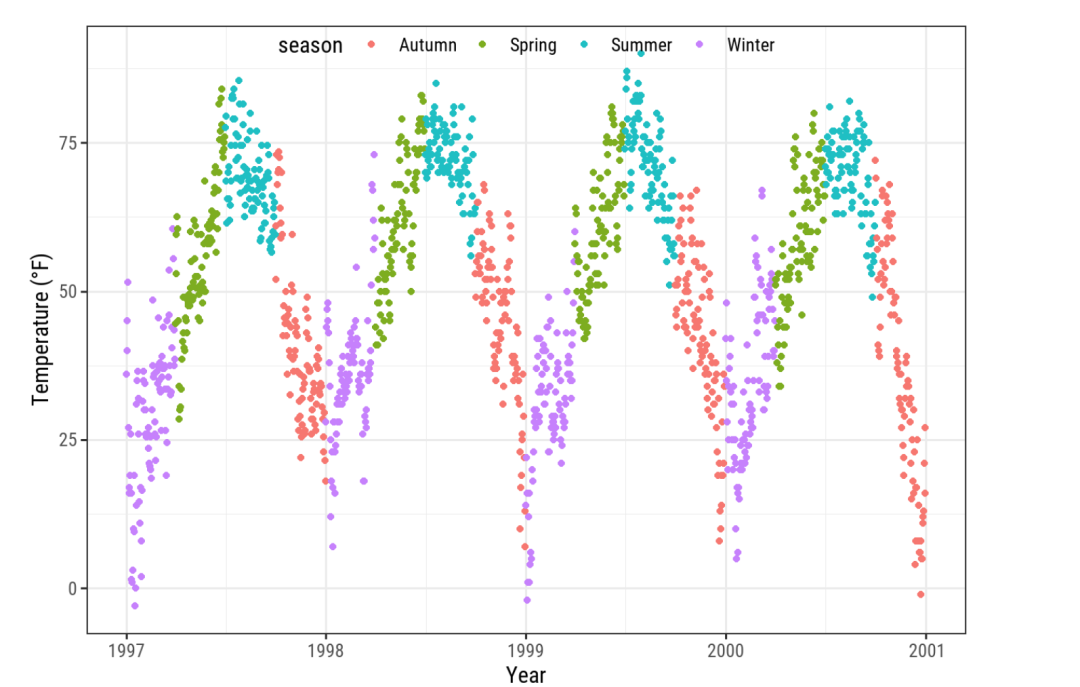
image.png
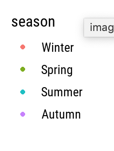
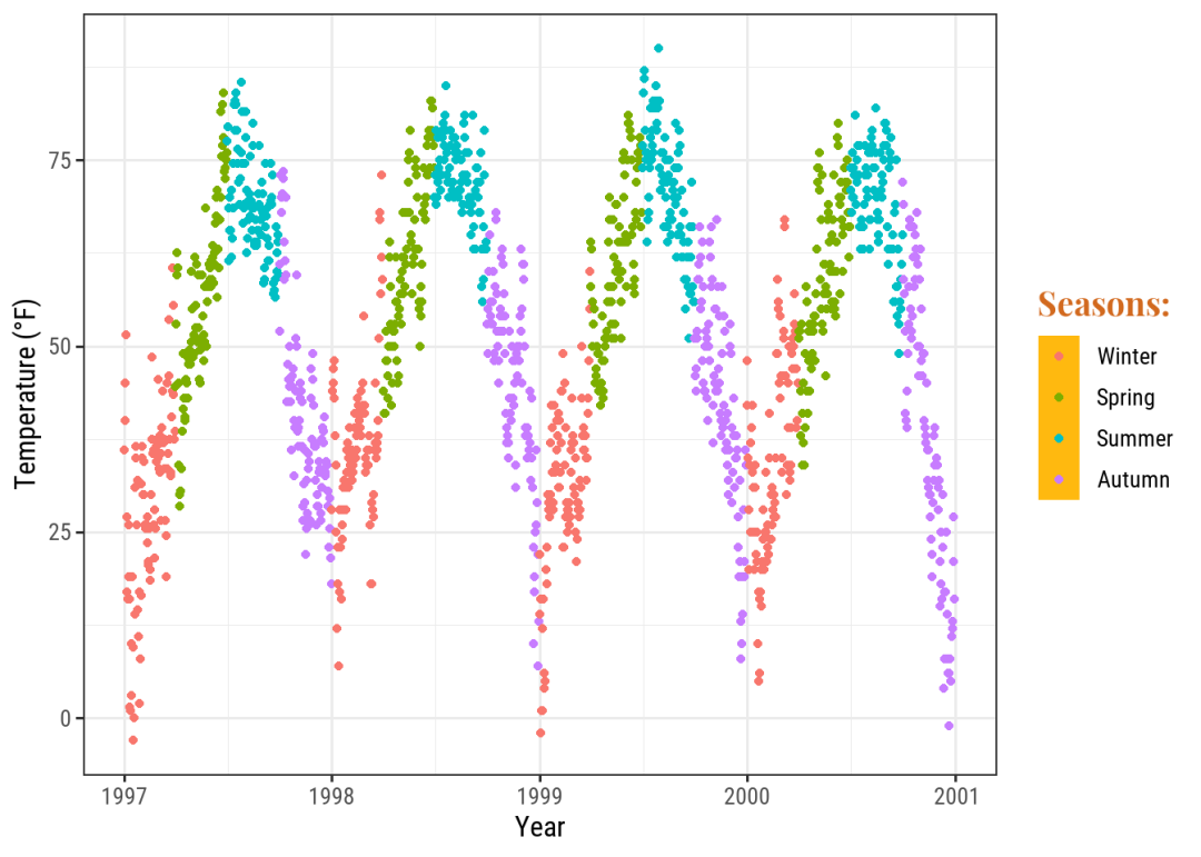
5 - change legend order
In fact, not only the legend, but also the attributes set in aes can be sorted. The rule is to convert the sorted column into factor type and adjust the levels attribute:
chic$season <-
  factor(chic$season,
         levels = c("Winter", "Spring", "Summer", "Autumn"))

ggplot(chic, aes(x = date, y = temp, color = season)) +
  geom_point() +
  labs(x = "Year", y = "Temperature (°F)")
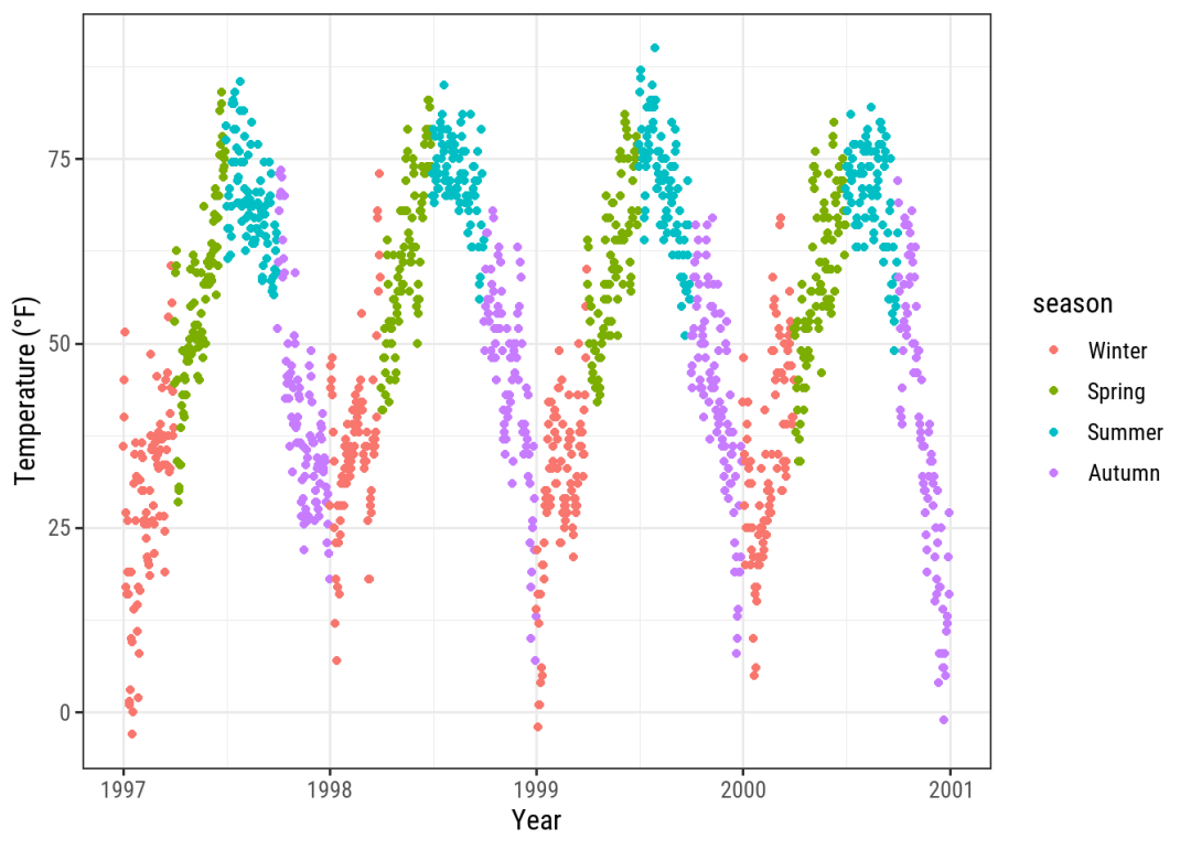
image.png
6 - define legend marks
The color attribute of the guides function specifically sets the legend color mark, such as the mark size:
ggplot(chic, aes(x = date, y = temp, color = season)) +
  geom_point() +
  labs(x = "Year", y = "Temperature (°F)") +
  theme(legend.key = element_rect(fill = NA),
        legend.title = element_text(color = "chocolate",
                                    size = 14, face = 2)) +
  scale_color_discrete("Seasons:") +
  guides(color = guide_legend(override.aes = list(size = 6)))
The classification variable is set in aes, and R will be set to guide by default_ legend() :
Continuous variables use guide_colorbar() :
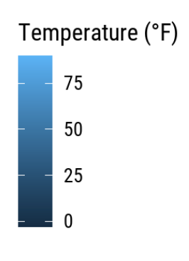
We can also modify continuous variables to look like classification:
ggplot(chic,
       aes(x = date, y = temp, color = temp)) +
  geom_point() +
  labs(x = "Year", y = "Temperature (°F)", color = "Temperature (°F)") +
  guides(color = guide_legend())
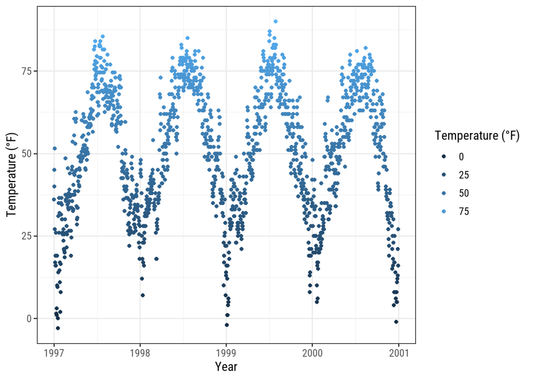
image.png
Other styles are:
- guide_bins()
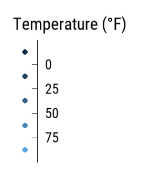
image.png
- guide_colorsteps()
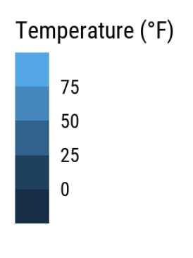
image.png
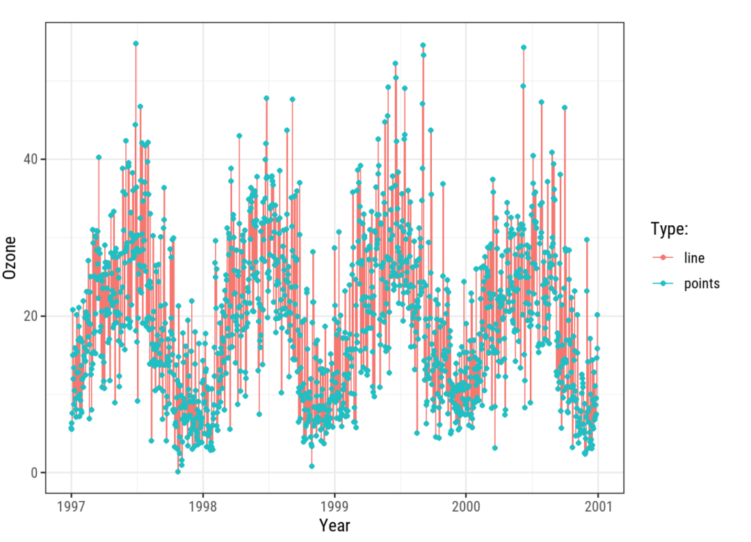
7 - Custom legend
Unless a variable is specified in aes, color does not create a legend, but we can use scale_color_discrete :
ggplot(chic, aes(x = date, y = o3)) +
  geom_line(aes(color = "line")) +
  geom_point(aes(color = "points")) +
  labs(x = "Year", y = "Ozone") +
  scale_color_discrete("Type:")
If you want to customize the color, you can not define the color attribute in aes:
ggplot(chic, aes(x = date, y = o3)) +
  geom_line(color = "darkorange2") +
  geom_point(color = "grey") +
  labs(x = "Year", y = "Ozone") + scale_color_discrete("Type:")
image.png
But it will sacrifice the display of the legend (I don't know what convenient method is here), or use the function scale_color_manual :
ggplot(chic, aes(x = date, y = o3)) +
  geom_line(aes(color = "line")) +
  geom_point(aes(color = "points")) +
  labs(x = "Year", y = "Ozone") +
  scale_color_manual(name = NULL,
                     guide = "legend",
                     values = c("points" = "darkorange2",
                                "line" = "gray"))
7.1 - other details
- Legend tag background
ggplot(chic, aes(x = date, y = temp, color = season)) +
  geom_point() +
  labs(x = "Year", y = "Temperature (°F)") +
  theme(legend.key = element_rect(fill = "darkgoldenrod1"),
        legend.title = element_text(family = "Playfair",
                                    color = "chocolate",
                                    size = 14, face = 2)) +
  scale_color_discrete("Seasons:")
We can also modify the tag background of the legend:
- Legend marker size
ggplot(chic, aes(x = date, y = temp, color = season)) +
  geom_point() +
  labs(x = "Year", y = "Temperature (°F)") +
  theme(legend.key = element_rect(fill = NA),
        legend.title = element_text(color = "chocolate",
                                    size = 14, face = 2)) +
  scale_color_discrete("Seasons:") +
  guides(color = guide_legend(override.aes = list(size = 6)))
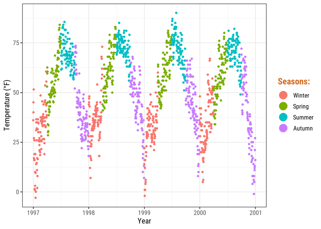
image.png
- Remove the legend mark of multi graph intersection
By default, if a group is specified for multiple graphs:
Legend marks will also be displayed very intelligently. We can use show in geometric objects instead of displaying legend = FALSE :
ggplot(chic, aes(x = date, y = temp, color = season)) +
  geom_point() +
  labs(x = "Year", y = "Temperature (°F)") +
  geom_rug(show.legend = FALSE)
image.png
- Personalized legend display content
For example, I set the color and fill elements of the legend at the same time, and the icon has the effect of background:
However, the legend is also framed:
How to remove this frame? Search around and find the parameter: key_glyph, such as key_glyph = draw_key_rect, only the background color of the legend will be drawn. Here comes the new question. So how to solve the internal line segment of tile graph?
Or is this picture OK?
Here comes the problem
As I mentioned in [[89-R visualization 21 - using aplot puzzle to realize the effect of annotation column similar to heat map]], the following figure:
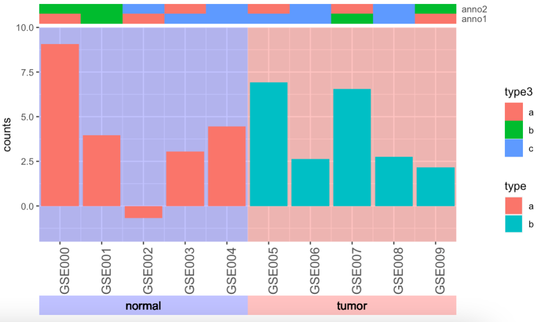
The advantage of this is that the annotation columns can be stacked together, which saves space; However, the legends of different types of color block columns will be "stitched" together to produce missundstanding.
But I didn't find a way to create this custom legend in ggplot. It seems that we still have to rely on grob bottom.