Due to the number of words, this blog is extracted from the author's last blog for explanation. If you want to understand the responsive layout, you can click this link to enter.
The layout feature of responsive layout is to ensure that a page can show satisfactory results on all terminals. In one sentence, it is a set of scheme that runs everywhere.
Without much nonsense, let's take a look at the effect of the page on the mobile terminal and pc terminal
pc end:

Mobile terminal:
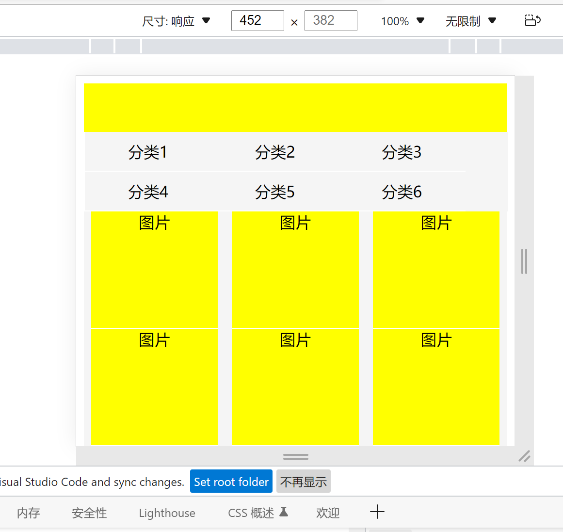 It can be seen that the top is the banner area, with navigation on the left, content display on the right and proper e-commerce platform web pages. The implementation method is to adjust the width height ratio, horizontal and vertical arrangement and detail optimization of the layout. See the code for the specific implementation:
The html part is very simple, with only div box and li tag.
    <div id="layout">
        <div id="top"></div>
        <div id="main">
            <div>
                <li>Category 1</li>
                <li>Category 2</li>
                <li>Classification 3</li>
                <li>Classification 4</li>
                <li>Classification 5</li>
                <li>Classification 6</li>
            </div>
            <div>
                <li>picture</li>
                <li>picture</li>
                <li>picture</li>
                <li>picture</li>
                <li>picture</li>
                <li>picture</li>
                <li>picture</li>
                <li>picture</li>
                <li></li>
            </div>
        </div>
    </div>
It should be noted that in addition, user scalable = 0 needs to be added to the meta tag. The function is to prohibit scaling and prevent problems.
The css part adopts the way of external introduction, and introduces two sets of css codes, one for pc terminal and one for mobile terminal screen with width of 400 ~ 600 pixels. The introduction method is as follows:
<link rel="stylesheet" href="css/big.css"
            media="(min-device-width: 1000px)">
<link rel="stylesheet" href="css/small.css"
            media="(min-device-width: 400px) and (max-device-width: 600px)">
big.css:
* {
    margin: 0;
    padding: 0;
    background-color: #f5f5f5;
}
/* Spindle setting longitudinal */
#layout {
    display: flex;
    flex-direction: column;
    width: 80%;
    margin: 0 auto;
}
#top {
    width: 100%;
    /* Longitudinal length */
    flex: 0 0 50px;
    margin: 0 auto;
    height: 30px;
    background-color: yellow;
}
#main {
    flex: 0 0 100%;
    display: flex;
    flex-direction: row;/*default*/
}
#main div:first-child {
    /* This is the horizontal length, because the parent defaults to horizontal */
    flex: 0 0 10%;
    background-color: #f5f5f5;
    list-style: none;
    display: flex;
    flex-wrap: wrap;/*Line feed*/
    border-left: 1px solid white;
    border-right: 1px solid white;

}
#main div:first-child li{
    flex: 0 0 100%;
    height: 40px;
    line-height: 40px;
    text-align: center;
    border-bottom: 1px solid white;
}
#main div:nth-child(2) {
    flex: 0 0 90%;
    background-color: #f5f5f5;
    list-style: none;
    display: flex;
    flex-wrap: wrap;
    justify-content: space-around;
}
#main div:nth-child(2) li {
    flex: 0 0 30%;
    height: 120px;
    text-align: center;
    border-bottom: 1px solid white;
    background-color: yellow;
    margin-top: 10px;
}
After the css code on the pc end is completed, switch to the mobile end, cv the code, and then only modify the size and layout. After all, the overall structure has been arranged and the modified content has been annotated. Please see the code:
* {
    margin: 0;
    padding: 0;
    background-color: #f5f5f5;
}
/* Spindle setting longitudinal */
#layout {
    display: flex;
    flex-direction: column;
    /* 1.Modify the width to 100% */
    width: 100%;
    margin: 0 auto;
}
#top {
    width: 100%;
    /* Longitudinal length */
    flex: 0 0 50px;
    margin: 0 auto;
    height: 30px;
    background-color: yellow;
}
#main {
    flex: 0 0 100%;
    display: flex;
    flex-direction: row;/*default*/
    /* 6.The picture is on the right side of the classification, and the layout is unreasonable, so the line feed is set */
    flex-wrap: wrap;
}
#main div:first-child {
    /* Because the horizontal length is the parent, the default is horizontal */
    /* 2.Change to 100% to complete the vertical in the form of line feed */
    flex: 0 0 100%;
    background-color: #f5f5f5;
    list-style: none;
    display: flex;
    flex-wrap: wrap;/*Line feed*/
    border-left: 1px solid white;
    border-right: 1px solid white;
    /* 5.Because the classification spacing is too large, but it is not the problem of row height, the alignment is modified */
    align-content: flex-start;

}
#main div:first-child li{
    /* 3.Sub object set to 30% */
    flex: 0 0 30%;
    height: 40px;
    line-height: 40px;
    text-align: center;
    border-bottom: 1px solid white;
}
#main div:nth-child(2) {
    /* 4.Same 100% */
    flex: 0 0 100%;
    background-color: #f5f5f5;
    list-style: none;
    display: flex;
    flex-wrap: wrap;
    justify-content: space-around;
}
#main div:nth-child(2) li {
    flex: 0 0 30%;
    height: 120px;
    text-align: center;
    border-bottom: 1px solid white;
    background-color: yellow;
}
Seeing this, you may think that the repetition rate of the two sets of css code is too high, which is indeed the case. Therefore, when writing code, we can divide css into three parts: public code, pc side modification details and mobile side modification details, which will greatly reduce the amount of code.
This sharing is over. I believe you have also understood that "a set of scheme runs everywhere" means that there is only one static page, which can be adapted selectively according to different css. This article may not be a complete page, but it will be an interesting experience and promotion for the author and the little partners who want to learn responsive layout. See you next time!