Previously introduced Detailed usage of matplotlib plot method , today we will introduce the drawing method in pandas. In essence, the drawing method encapsulated in pandas calls the drawing method of matplotlib.
- The basic plot method, the plot method of Series and DataFrame in pandas, is the plot method wrapped by matplotlib
# Series drawing
ts = pd.Series(
    np.random.randn(1000),
    index=pd.date_range('1/1/2000', periods=1000)
)
# Sum the sum of cum sum and keep the middle result of the sum
ts = ts.cumsum(axis=0)
ts.plot()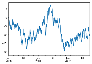
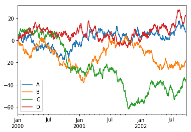
- Calling the plot function on DataFrame will set the name of each property to labels
df = pd.DataFrame(
    np.random.randn(1000, 4),
    index=ts.index,
    columns=["A", "B", "C", "D"]
)
df = df.cumsum(axis=0)
df.plot()
- When DataFrame calls the plot function, you can draw the relationship between the two properties by specifying the x and y parameters
df3 = pd.DataFrame(
    np.random.randn(100, 2),
    columns=["B", "C"]
)
df3["A"] = pd.Series(list(range(len(df3))))
"""
    Parameter explanation: see matplotlib plot function parameter explanation for details
    x: Horizontal axis data
    y: Vertical data
    Color drawing color
    linestyle: line style
    linewidth: line width
    figsize: drawing size
    Legend: Show legend or not
    Log: whether to log change the y-axis data and control the value range
"""
df3.plot(x="A", y="B", color="b", linestyle="-", linewidth=2, figsize=(10,10), legend=True, logy=True)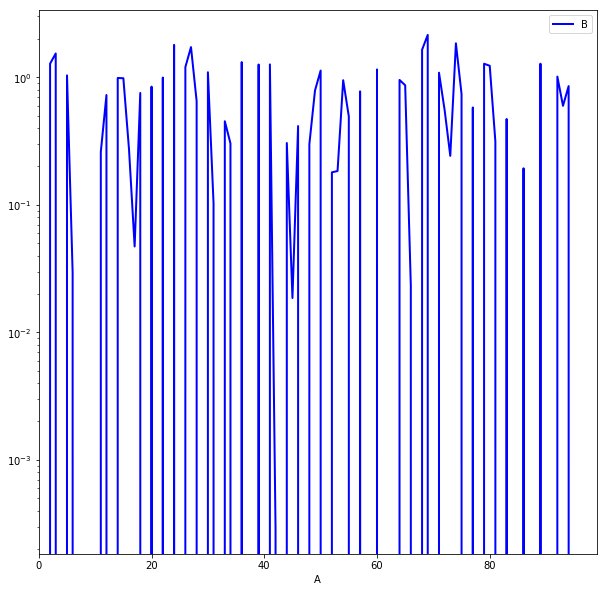
When drawing other images than linear graph, you can control the image style through the kind parameter of plot function:
- 'bar' or 'barh' for bar plots - > bar (vertical or horizontal)
- 'hist' for histogram - > histogram
- box for boxplot
- 'kde' or 'density' for density plots - > density plot
- 'area' for area plots - > area map
- Scatter for scatter plots
- 'hexbin' for hexagonal bin plots
- 'pie' for pie plots - > pie
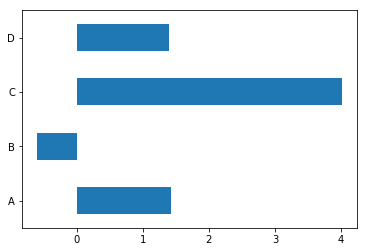
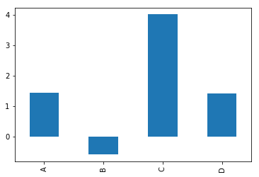
1) , kind="bar" bar (vertical)
df.iloc[5].plot(kind="bar")
print(df.iloc[5])

2) , kind="barh" bar chart (horizontal)
df.iloc[5].plot(kind="barh")
print(df.iloc[5])
3) In addition to using the kind parameter of plot to specify the drawing style, you can also directly use plot. To specify the drawing style
# Draw bar chart
df.iloc[5].plot.bar()
- Draw bar chart DataFrame.plot.bar()
df.iloc[5].plot.bar()
plt.axhline(0, color='b');

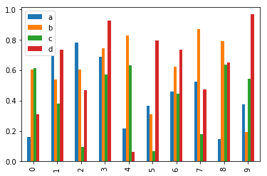
df2 = pd.DataFrame(np.random.rand(10, 4), columns=['a', 'b', 'c', 'd'])
df2.plot.bar()
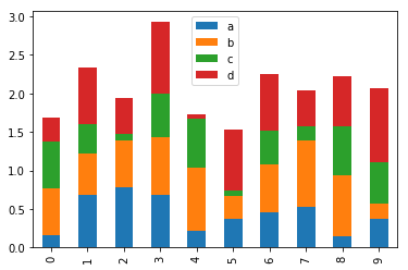
# Stack bars
df2.plot.bar(stacked=True)
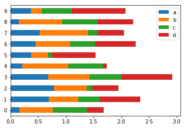
# Draw horizontal bar chart
df2.plot.barh(stacked=True)
- Draw histogram DataFrame.plot.hist()
df = pd.DataFrame(
    {
        "a": np.random.randn(1000) + 1,
        "b": np.random.randn(1000),
        "c": np.random.randn(1000) - 1
    },
    columns=["a", "b", "c"]
)
# alpha parameter controls the transparency of image
df.plot.hist(alpha=0.5)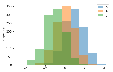
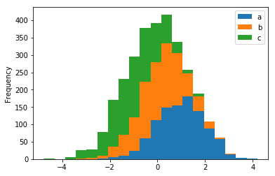
# Stack the histogram and specify the number of boxes of the histogram
#  bins parameter controls the size of statistical interval
df.plot.hist(stacked=True, bins=20)
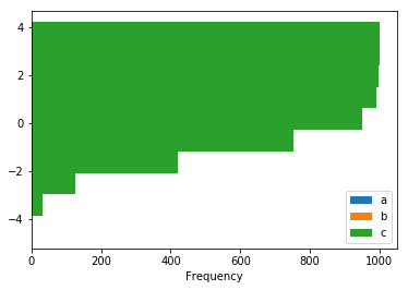
# You can also use the keyword parameters provided by the hist method of the matplotlib Library
df.plot.hist(orientation="horizontal", cumulative=True)
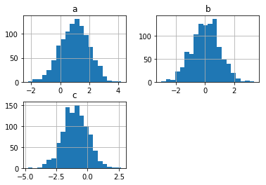
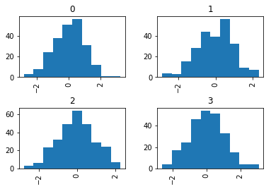
# Except through df.plot.hist Method, DataFrame also has hist method
# The hist method of DataFrame uses multiple subgraphs to draw column s of DataFrame respectively
df.hist(bins=20)
s = pd.Series([1,3,4,6,7,9])
# The diff function is used to determine the difference between each value of the attribute and the specified value. The default value is the value content of the previous line
s.diff().hist()
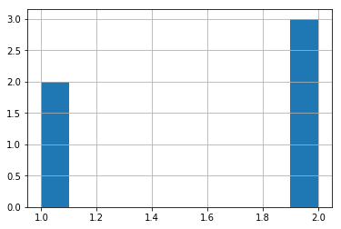
# The hist method of DataFrame can use the by parameter to define the grouping
data = pd.Series(np.random.randn(1000))
# np.random.randint(0, 4, 1000) randomly generate 1000 numbers between 0-3, then group these numbers, and draw a histogram with the corresponding data data
data.hist(by=np.random.randint(0, 4, 1000), figsize=(6, 4))
pd.Series(np.random.randint(0, 4, 1000)).value_counts()
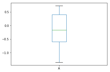
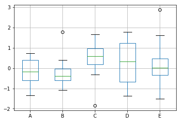
- Draw box diagram DataFrame.plot.box()
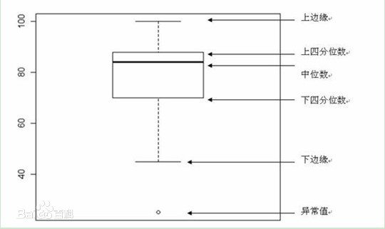
Brief introduction of box type drawing:
(1) Calculate upper quartile (Q3), median, lower quartile (Q1)
(2) Calculate the difference between the upper and lower quartiles, i.e. IQR (interquartile range) Q3-Q1
(3) Draw the upper and lower range of the box line diagram. The upper limit is the upper quartile and the lower limit is the lower quartile. Draw a horizontal line at the location of the median inside the box.
(4) Values greater than 1.5 times the difference of the upper quartile or less than 1.5 times the difference of the lower quartile are classified as outliers.
(5) In addition to the abnormal values, the two values closest to the upper edge and the lower edge shall be marked with horizontal lines as the tentacles of the box line diagram.
(6) Extreme outliers, that is, outliers that exceed 3 times the distance of the quartile difference, are represented by solid points; milder outliers, that is, outliers between 1.5 and 3 times the quartile difference, are represented by hollow points.
(7) Add name, number axis, etc. to the box diagram
df = pd.DataFrame(np.random.randn(10, 5), columns=["A", "B", "C", "D", "E"])
# Draw a box chart of all numerical properties
df.plot.box()
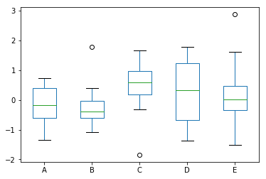
# Draw a box diagram of a single attribute
df["A"].plot.box()
df.boxplot()
# Set the color of the box line chart
color = {'boxes': 'DarkGreen', 'whiskers': 'DarkOrange', 'medians': 'DarkBlue', 'caps': 'Gray'}
# sym specifies the style of the exception value
df.plot.box(color=color, sym='r+')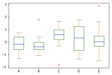
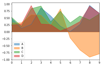
- Draw area map DataFrame.plot.area()
Significance of area map: stacked area map is a special area map, which can be used to compare multiple variables in a range. The difference between stacked area chart and area chart is that the starting point of each data series of stacked area chart is drawn based on the previous data series (stacked area chart requires a column of data to be either all positive or all negative), that is, each measurement row must fill the area between rows. If you have multiple data series and want to analyze the relationship between the part and the whole of each category, and show the contribution of part quantity to the total amount, using stacked area map is a very suitable choice.
df = pd.DataFrame(np.random.rand(10, 4), columns=["A", "B", "C", "D"])
df["B"] = df["B"] * -1.0
# The area map drawn is in the form of stacking by default. The stacking area map requires the values of the same feature to be either all positive or all negative
df.plot.area()
df.loc[0].sum() - df.loc[0, "B"], df.loc[0, "B"], df.loc[9].sum() - df.loc[9, "B"], df.loc[9, "B"]
(1.2377821011551786, -0.3169154766752843, 1.9799948518694093, -0.7935035073522937)
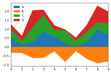
df.loc[0:5, "B"] = df.loc[0:5, "B"] * -1.0
df.plot.area(stacked=False)
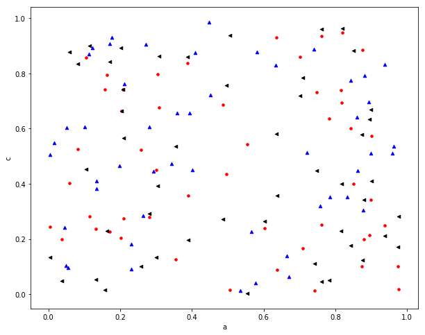
- Draw a scatter diagram DataFrame.plot.scatter()
The scatter chart requires that the attributes be numerical.
df = pd.DataFrame(np.random.rand(50, 4), columns=['a', 'b', 'c', 'd'])
df.plot.scatter(x="a", y="b")
# Drawing multiple scatter plots in an axe
# Get the handle of canvas, specify the painting color, mark the style
ax = df.plot.scatter(x="a", y="b", color="r", marker=".", figsize=(10, 8), s=50)
# Specify the canvas, color and marker style to distinguish different data
df.plot.scatter(x="c", y="d", ax=ax, color="b", marker="^")
df.plot.scatter(x="a", y="c", ax=ax, color="k", marker="<")
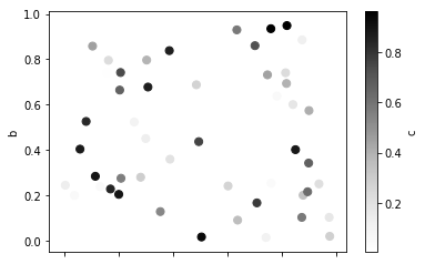
# The keyword c is used to set different colors for each data point, which is usually used to show the influence of the joint action of two variables (x,y) on the third variable c
df.plot.scatter(x='a', y='b', c='c', s=50)
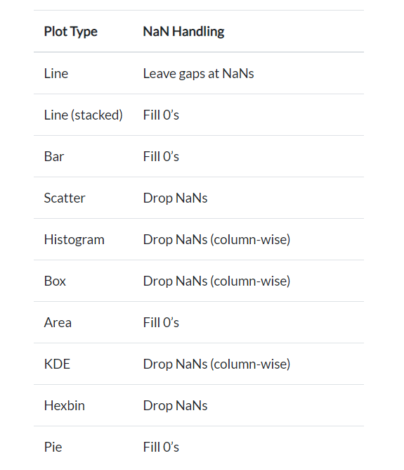
- Processing methods of missing values in different drawing methods
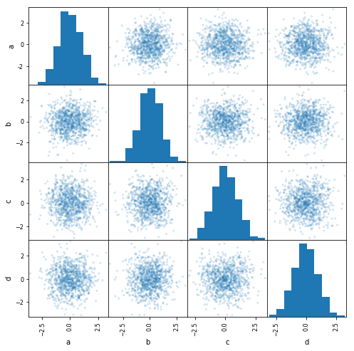
- Drawing scatter matrix pandas.plotting.scatter_matrix
from pandas.plotting import scatter_matrix

# Using scatter_matrix draws a scatter plot between all feature combinations and specifies the display style density kde or histogram hist on the diagonal
df = pd.DataFrame(np.random.randn(1000, 4), columns=['a', 'b', 'c', 'd'])
scatter_matrix(df, alpha=0.2, figsize=(8, 8), diagonal="hist")
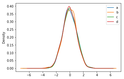
- Draw density map DataFrame.plot.kde()
df.plot.kde(legend=True)
reference resources: pandas official website pandas CookBook
Road block and long, come on, young!