From: http://blog.csdn.net/wenwen091100304/article/details/49667293, good summary
Introduction
The Chinese meaning selector is often used as the background of components in Android. The advantage of doing this is that it does not need to use code control to realize the transformation of different background colors or pictures of components in different states. It is very convenient to use.
Definition of selector
A selector is a state list. It can be divided into two types: a color selector and a drawable selector.
Color-Selector
Color selector is a list of color states. It can be used like color. The color will change with the state of the component. The location of the file is stored in
/res/color/filename.xml- 1
Used in Java is: R.color.filename
Used in XML: @ [package]color/filename
grammar
<?xml version="1.0" encoding="utf-8"?>
<selector xmlns:android="http://schemas.android.com/apk/res/android" >
    <item
        android:color="hex_color"               //Color value, #RGB,$ARGB,#RRGGBB,#AARRGGBB
        android:state_pressed=["true" | "false"]//Touch or not
        android:state_focused=["true" | "false"]//Get focus or not
        android:state_selected=["true" | "false"]//Is it in state
        android:state_checkable=["true" | "false"]//Optional or not
        android:state_checked=["true" | "false"]//Check or not
        android:state_enabled=["true" | "false"]//Available or not
        android:state_window_focused=["true" | "false"] />//Window focus or not
</selector>- 1
- 2
- 3
- 4
- 5
- 6
- 7
- 8
- 9
- 10
- 11
- 12
Example
Create a new test color selector.xml in the / res/color / folder
<?xml version="1.0" encoding="utf-8"?>
<selector xmlns:android="http://schemas.android.com/apk/res/android">
    <item android:state_pressed="true"
          android:color="#ffff0000"/> <!-- pressed -->
    <item android:state_focused="true"
          android:color="#ff0000ff"/> <!-- focused -->
    <item android:color="#ff000000"/> <!-- default -->
</selector>- 1
- 2
- 3
- 4
- 5
- 6
- 7
- 8
Call:
    <Button
        android:id="@+id/bt_about"
        style="@style/Button_style"
        android:layout_width="250dp"
        android:layout_height="50dp"
        android:layout_margin="5dp"
        android:textColor="@color/test_color_selector"
android:text="@string/about" />- 1
- 2
- 3
- 4
- 5
- 6
- 7
- 8
Effect: pay attention to the change of font color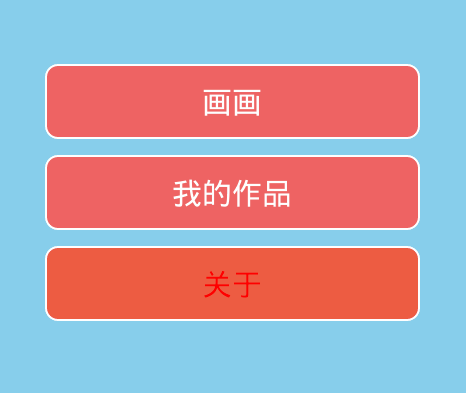
Drawable-Selector
Drawable selector is a list of background image states. It can be used as an image. The background changes according to the state of the component. File stored in
/res/drawable/filename.xml- 1
Call in Java: R.drawable.filename
Call in XML: @[package:]drawable/filename
grammar
<?xml version="1.0" encoding="utf-8"?>
<selector xmlns:android="http://schemas.android.com/apk/res/android"
    android:constantSize=["true" | "false"]//Whether the state changes in the size of drawable. true means change, false means no change. The default value is false
    android:dither=["true" | "false"]//When the pixel configuration of bitmap and screen is different (for example, a bitmap with ARGB of 8888 and a screen with RGB of 555), it will render its own color (dither). Color is not recursive when set to false. Default true
    android:variablePadding=["true" | "false"] >//Whether the inner margin changes? false by default
    <item
        android:drawable="@[package:]drawable/drawable_resource"//Picture resources
        android:state_pressed=["true" | "false"]//Touch or not
        android:state_focused=["true" | "false"]//Get focus or not
        android:state_hovered=["true" | "false"]//Whether the cursor passes
        android:state_selected=["true" | "false"]//Check or not
        android:state_checkable=["true" | "false"]//Can I check
        android:state_checked=["true" | "false"]//Check or not
        android:state_enabled=["true" | "false"]//Available or not
        android:state_activated=["true" | "false"]//Activate or not
        android:state_window_focused=["true" | "false"] />//Whether the window gets focus
</selector>- 1
- 2
- 3
- 4
- 5
- 6
- 7
- 8
- 9
- 10
- 11
- 12
- 13
- 14
- 15
- 16
- 17
Example
<?xml version="1.0" encoding="utf-8"?>
<selector xmlns:android="http://schemas.android.com/apk/res/android">
    <item android:state_selected="true" android:drawable="@drawable/button_bg_press" />
    <item android:state_focused="true" android:drawable="@drawable/button_bg_press" />
    <item android:state_pressed="true" android:drawable="@drawable/button_bg_press"  />
    <item android:drawable="@drawable/button_bg_normol"  />
</selector>- 1
- 2
- 3
- 4
- 5
- 6
- 7
Call:
 <Button
        android:id="@+id/bt_about"
        style="@style/Button_style"
        android:background="@drawable/button_selector"
        android:layout_width="250dp"
        android:layout_height="50dp"
        android:layout_margin="5dp"
        android:textColor="@color/test_color_selector"
android:text="@string/about" />- 1
- 2
- 3
- 4
- 5
- 6
- 7
- 8
- 9
Effect: Notice button background changes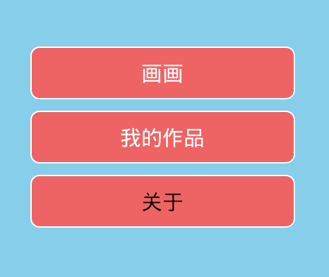
summary
selector is a good way to realize the background and color changes after the View state changes, which can save a lot of logic code. After mastering it, you can not only save a lot of Java code, but also write some beautiful UI.