This article will take you through the process of report automation and teach you how to use Python to implement a report automation practice in your work. It is long and recommended to collect it first. The specific contents of this article are as follows:
1. Basic composition of Excel 2. A report automation process 3. Report automation practice -Month on month comparison of various indicators on the same day -Order quantity created by provinces on the same day -Create order volume trend in recent period 4. Merge different results -Merge different results into the same Sheet -Merge different results into different sheets in the same workbook
Basic components of Excel
We usually start with excel when we first make reports. We use Excel to make reports, so let's first understand the basic composition of Excel.
The following figure shows the composition of various parts of Excel. We deal with many Excel files every day in our work. An excel file is actually a workbook. Each time you create an excel file, the file name will default to workbook x, where x is the number of files you create. There can be multiple sheets in a workbook, and different sheets are an independent table. Each Sheet is composed of several cells. Each cell has several elements or attributes. We generally set them for Excel files. In fact, most of them are set for cell elements.
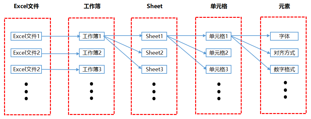
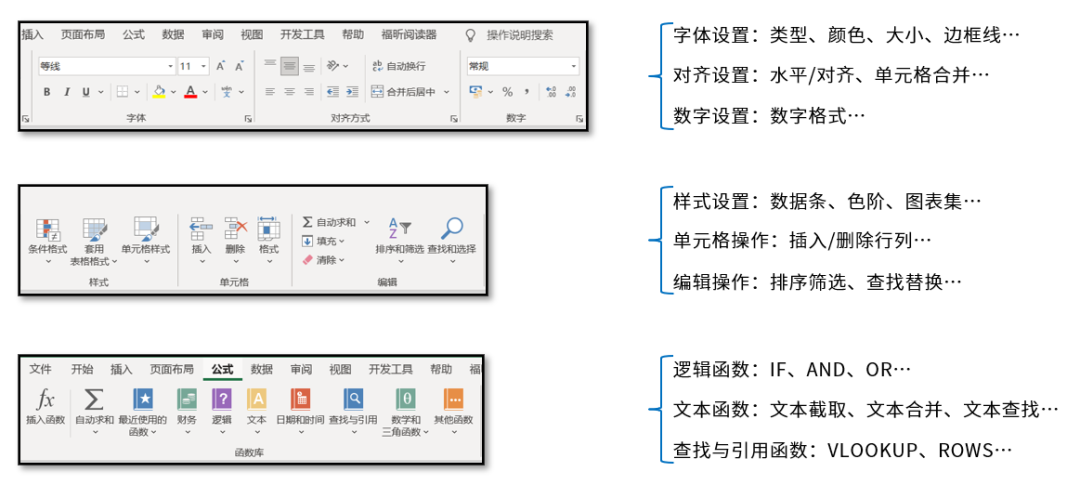
The main content of setting for cell elements is actually displayed in the menu bar as shown in the figure below, such as font, alignment, conditional format and so on. This book is also written according to each module in the Excel menu bar.
Process of an automated report
The following figure shows the process I need to go through to make an automated report, which is mainly divided into five steps:
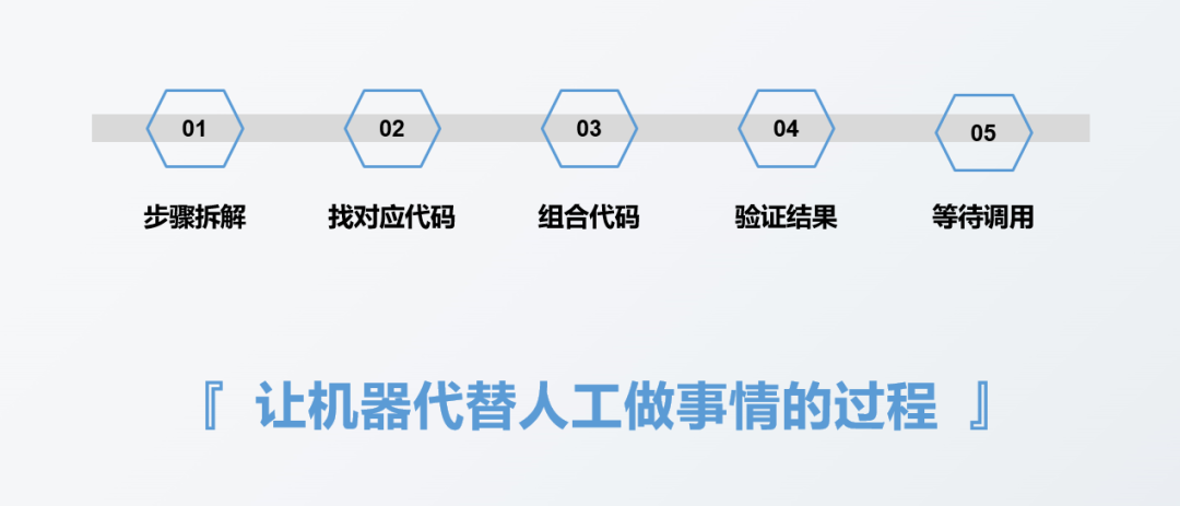
The first step is to disassemble the report to be made. This step has no direct relationship with whether to use tools or what tools to use. For example, the first step of making a report is generally to collect data. This data may be recorded in a paper notebook by offline personnel, stored in an Excel table, or stored in a database. Due to different data source types or storage methods, the corresponding data collection methods will be different, but the step of collecting data itself will not change. The purpose of this step is to collect data.
The second step is to think about the code implementation method corresponding to each specific step involved in the first step. Generally, it is to find the code corresponding to each step, such as what is the code for importing data, and what is the code for deleting duplicate values.
The third step is to combine the codes corresponding to each step in the second step to form a complete code.
The fourth step is to verify the report results obtained from the complete code in step 3 to see whether the results are correct.
The fifth step is to wait for the call to see when the report needs to be made, and then execute the written code once.
In fact, the essence of report automation is to let the machine do things instead of manual work. We only need to convert every step we need to do manually into a language that the machine can understand, that is, code, and then let the machine execute it automatically. In fact, automation is realized.
Report automation practice
This section demonstrates how to automatically generate reports by combining Pandas and openpyxl in practical work.
Suppose we now have the following data set:
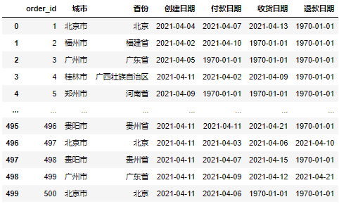
Now we need to make daily reports based on this data set, which mainly includes three aspects:
- The same month on month comparison of various indicators on that day;
- Order quantity created by each province on the same day;
- Create order volume trend in recent period
Next, we will implement these three parts respectively.
Month on month comparison of various indicators on that day:
We first calculate and process the data with Pandas to obtain the same month on month ratio of each index. The specific implementation code is as follows:
#Import file
import pandas as pd
df = pd.read_excel(r'D:\Data-Science\share\excel-python Report automation\sale_data.xlsx')

#Construct functions that obtain different indicators at the same time
def get_data(date):
    create_cnt = df[df['Creation date'] == date]['order_id'].count()
    pay_cnt = df[df['Payment date'] == date]['order_id'].count()
    receive_cnt = df[df['Date of receipt'] == date]['order_id'].count()
    return_cnt = df[df['Refund date'] == date]['order_id'].count()
    return create_cnt,pay_cnt,receive_cnt,return_cnt

#It is assumed that the day is April 11, 2021
#Obtain the index values in different time periods
df_view = pd.DataFrame([get_data('2021-04-11')
                     ,get_data('2021-04-10')
                     ,get_data('2021-04-04')]
                     ,columns = ['Create order quantity','Payment order quantity','Receipt order quantity','Refund order quantity']
                     ,index = ['same day','yesterday','Same period last week']).T

df_view['Ring ratio'] = df_view['same day'] / df_view['yesterday'] - 1
df_view['Year on year'] = df_view['same day'] / df_view['Same period last week'] - 1
df_view
Running the above code will get the following results:
The above only obtains the absolute value of the same month on month ratio of each index, but our general daily newspapers have to make some format adjustments before they are sent out, such as adjusting the font. The openpyxl library is required for format adjustment. We need to convert the data in DataFrame format in Pandas library into the data format applicable to openpyxl library. The specific implementation code is as follows:
from openpyxl import Workbook
from openpyxl.utils.dataframe import dataframe_to_rows

#Create an empty Workbook
wb = Workbook()
ws = wb.active

#Convert DataFrame format data to openpyxl format
for r in dataframe_to_rows(df_view,index = True,header = True):
    ws.append(r)

wb.save(r'D:\Data-Science\share\excel-python Report automation\Core indicators_original.xlsx')
Running the above code will get the following results. You can see that the original data file looks very chaotic:
Next, we will adjust the format of the above original data file. The specific adjustment code is as follows:
from openpyxl import Workbook
from openpyxl.utils.dataframe import dataframe_to_rows
from openpyxl.styles import colors
from openpyxl.styles import Font
from openpyxl.styles import PatternFill
from openpyxl.styles import Border, Side
from openpyxl.styles import Alignment

wb = Workbook()
ws = wb.active

for r in dataframe_to_rows(df_view,index = True,header = True):
    ws.append(r)

#The second line is empty. Delete the second line
ws.delete_rows(2)

#Assign a value to cell A1
ws['A1'] = 'index'

#Insert a row as the header row
ws.insert_rows(1)
ws['A1'] = 'E-commerce business direction 2021/4/11 daily'

#Merge the cells of the header row
ws.merge_cells('A1:F1') #merge cell

#Format the cells in rows 1 to 6
for row in ws[1:6]:
    for c in row:
        #Font settings
        c.font = Font(name = 'Microsoft YaHei ',size = 12)
        #Alignment settings
        c.alignment = Alignment(horizontal = "center")
        #Border line settings
        c.border = Border(left = Side(border_style = "thin",color = "FF000000"),
                   right = Side(border_style = "thin",color = "FF000000"),
                   top = Side(border_style = "thin",color = "FF000000"),
                   bottom = Side(border_style = "thin",color = "FF000000"))

#Special settings are made for the header row and header row
for row in ws[1:2]:
    for c in row:
        c.font = Font(name = 'Microsoft YaHei ',size = 12,bold = True,color = "FFFFFFFF")
        c.fill = PatternFill(fill_type = 'solid',start_color='FFFF6100')

#Format month on month and year on year as a percentage
for col in ws["E":"F"]:
    for r in col:
        r.number_format = '0.00%'

#Adjust column width
ws.column_dimensions['A'].width = 13
ws.column_dimensions['E'].width = 10

#Save adjusted file
wb.save(r'D:\Data-Science\share\excel-python Report automation\Core indicators.xlsx')
Running the above code will get the following results:
You can see that all items have been set successfully.
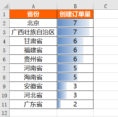
Order quantity created by provinces on the same day:
We also use the Pandas library to get the order quantity created by each province on that day. The specific implementation code is as follows:
df_province = pd.DataFrame(df[df['Creation date'] == '2021-04-11'].groupby('province')['order_id'].count())
df_province = df_province.reset_index()
df_province = df_province.sort_values(by = 'order_id',ascending = False)
df_province = df_province.rename(columns = {'order_id':'Create order quantity'})
df_province
Running the above code will get the following results:
After obtaining the absolute value of the order quantity created in each province on that day, the format is also set. The specific setting code is as follows:
from openpyxl import Workbook
from openpyxl.utils.dataframe import dataframe_to_rows
from openpyxl.styles import colors
from openpyxl.styles import Font
from openpyxl.styles import PatternFill
from openpyxl.styles import Border, Side
from openpyxl.styles import Alignment
from openpyxl.formatting.rule import DataBarRule

wb = Workbook()
ws = wb.active

for r in dataframe_to_rows(df_province,index = False,header = True):
    ws.append(r)

#Set the cells in rows 1 to 11
for row in ws[1:11]:
    for c in row:
        #Font settings
        c.font = Font(name = 'Microsoft YaHei ',size = 12)
        #Alignment settings
        c.alignment = Alignment(horizontal = "center")
        #Border line settings
        c.border = Border(left = Side(border_style = "thin",color = "FF000000"),
                   right = Side(border_style = "thin",color = "FF000000"),
                   top = Side(border_style = "thin",color = "FF000000"),
                   bottom = Side(border_style = "thin",color = "FF000000"))

#Format progress bar conditions
rule = DataBarRule(start_type = 'min',end_type = 'max',
                    color="FF638EC6", showValue=True, minLength=None, maxLength=None)
ws.conditional_formatting.add('B1:B11',rule)

#Set the title line of line 1
for c in ws[1]:
    c.font = Font(name = 'Microsoft YaHei ',size = 12,bold = True,color = "FFFFFFFF")
    c.fill = PatternFill(fill_type = 'solid',start_color='FFFF6100')

#Adjust column width
ws.column_dimensions['A'].width = 17
ws.column_dimensions['B'].width = 13

#Save adjusted file
wb.save(r'D:\Data-Science\share\excel-python Report automation\Sales by province.xlsx')
Running the above code will get the following results:
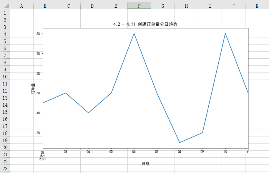
Create order volume trend in recent period:
Generally, the trend of an indicator is reflected in the form of a line chart. As we mentioned earlier, in practical work, we generally use matplotlib or other visual libraries to draw and save the chart, and then use openpyxl library to insert the chart into Excel.
First, use the matplotlib library to draw, and the specific implementation code is as follows:
%matplotlib inline
import matplotlib.pyplot as plt
plt.rcParams["font.sans-serif"]='SimHei'#Solve Chinese garbled code

#Set chart size
plt.figure(figsize = (10,6))
df.groupby('Creation date')['order_id'].count().plot()
plt.title('4.2 - 4.11 Create daily trend of order quantity')
plt.xlabel('date')
plt.ylabel('Order quantity')

#Save chart locally
plt.savefig(r'D:\Data-Science\share\excel-python Report automation\4.2 - 4.11 Create daily trend of order quantity.png')
Insert the chart saved locally into Excel. The specific implementation code is as follows:
from openpyxl import Workbook
from openpyxl.drawing.image import Image

wb = Workbook()
ws = wb.active

img = Image(r'D:\Data-Science\share\excel-python Report automation\4.2 - 4.11 Create daily trend of order quantity.png')

ws.add_image(img, 'A1')

wb.save(r'D:\Data-Science\share\excel-python Report automation\4.2 - 4.11 Create daily trend of order quantity.xlsx')
Running the above code will get the following results. You can see that the chart has been successfully inserted into Excel:
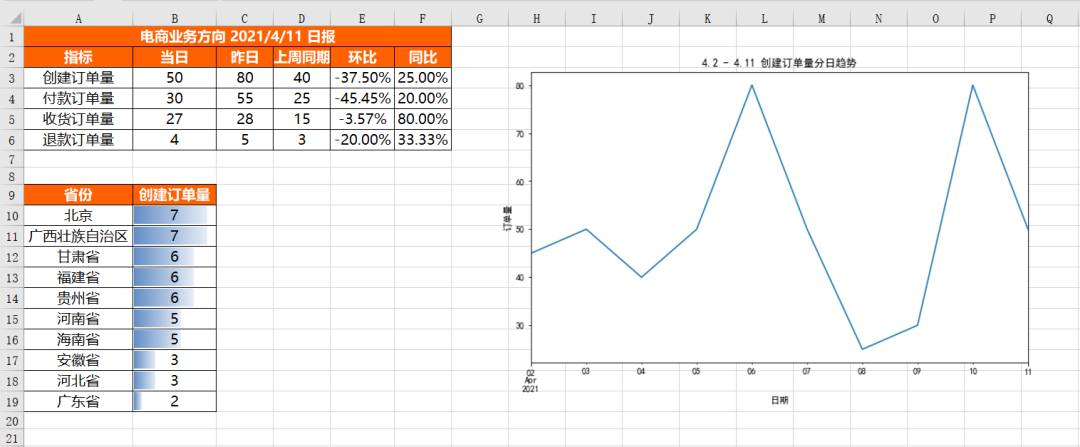
Merge different results
Above, we separate each part and store it in different Excel files. Of course, sometimes it is troublesome to put them in different files. We need to combine these results in the same Sheet or different sheets of the same excel.
Merge different results into the same Sheet:
The difficulty of merging different results into the same Sheet is that the results of different tables have different structures, and blank space needs to be left between different results.
First insert the core indicator table df_review, the insertion method is the same as that of individual insertion. The specific code is as follows:
for r in dataframe_to_rows(df_view,index = True,header = True):
    ws.append(r)
Next, we should insert the situation table DF of each province_ Province, because append is inserted from the first line by default, and we already have DF in the previous lines_ The data in the view table cannot be inserted by appen, but only by traversing each cell.
How do we know which cells to traverse? The core needs to know the row and column at the beginning of traversal and the row and column at the end of traversal.
Traversal start line = df_view Rows occupied by the table + Blank line(Generally, two rows are reserved between tables) + 1
 End of traversal row = Traversal start line + df_province Rows occupied by the table

Traversal start column = 1
 End of traversal column = df_province Columns occupied by the table
Moreover, because the method of obtaining column names in DataFrame is different from that of obtaining specific values, we need to insert column names respectively. The specific code is as follows:
for j in range(df_province.shape[1]):
    ws.cell(row = df_view.shape[0] + 5,column = 1 + j).value = df_province.columns[r]
df_province.shape[1] is to get DF_ How many columns are there in the province table, df_view.shape[0] is to get DF_ How many rows are there in the view table.
As mentioned earlier, the row at the beginning of traversal is the row occupied by the table plus the blank row plus 1. Generally, the blank row is 2, but why is DF_ view. What about shape [0] + 5? This is because df_view.shape[0] does not include column name rows. At the same time, one blank row will be added by default when inserting into Excel. Therefore, two more rows need to be added on the basis of leaving white rows, that is, 2 + 2 + 1 = 5.
Because the range() function starts from 0 by default, and the columns in Excel start from 1, the column needs to be added with 1.
The above code just puts DF_ The column name of the province table is inserted, and then the specific value is inserted in the same way as the column name, except that it needs to be inserted in the next row of the column name. The specific code is as follows:
#Then insert the specific value
for i in range(df_province.shape[0]):
    for j in range(df_province.shape[1]):
        ws.cell(row = df_view.shape[0] + 6 + i,column = 1 + j).value = df_province.iloc[i,j]
Next, it's time to insert the picture. The method of inserting the picture is the same as the previous separate insertion. The specific code is as follows:
#Insert picture
img = Image(r'D:\Data-Science\share\excel-python Report automation\4.2 - 4.11 Create daily trend of order quantity.png')
ws.add_image(img, 'G1')
After inserting all data, we should format these data. Because the structures of different tables are different, we can't directly format all cells in batch. We can only set them separately by range, and the formats of different ranges may be the same, so we preset some format variables first, In this way, you can directly call these variables later to reduce code redundancy. The specific codes are as follows:
#Format preset

#Header font settings
title_Font_style = Font(name = 'Microsoft YaHei ',size = 12,bold = True,color = "FFFFFFFF")
#Normal content font settings
plain_Font_style = Font(name = 'Microsoft YaHei ',size = 12)
Alignment_style = Alignment(horizontal = "center")
Border_style = Border(left = Side(border_style = "thin",color = "FF000000"),
                   right = Side(border_style = "thin",color = "FF000000"),
                   top = Side(border_style = "thin",color = "FF000000"),
                   bottom = Side(border_style = "thin",color = "FF000000"))
PatternFill_style = PatternFill(fill_type = 'solid',start_color='FFFF6100')
After the format is preset, you can set the format of each range separately. The specific code is as follows:
#Set the cells in the range A1 to F6
for row in ws['A1':'F6']:
    for c in row:
        c.font = plain_Font_style
        c.alignment = Alignment_style
        c.border = Border_style

#Set the cells in rows 1 and 2
for row in ws[1:2]:
    for c in row:
        c.font = title_Font_style
        c.fill = PatternFill_style

#Set the cells in columns E and F
for col in ws["E":"F"]:
    for r in col:
        r.number_format = '0.00%'

#Set the cells in the range A9 to B19
for row in ws['A9':'B19']:
    for c in row:
        c.font = plain_Font_style
        c.alignment = Alignment_style
        c.border = Border_style

#Set the cells in the range A9 to B9
for row in ws['A9':'B9']:
    for c in row:
        c.font = title_Font_style
        c.fill = PatternFill_style

#Set progress bar
rule = DataBarRule(start_type = 'min',end_type = 'max',
                    color="FF638EC6", showValue=True, minLength=None, maxLength=None)
ws.conditional_formatting.add('B10:B19',rule)

#Adjust column width
ws.column_dimensions['A'].width = 17
ws.column_dimensions['B'].width = 13
ws.column_dimensions['E'].width = 10
Finally, merging all the above code fragments together is the complete code of merging different result files into the same Sheet. The specific results are as follows. You can see that different result files are merged together and their formats are well set.
Merge different results into different sheets in the same Workbook:
It is easier to combine different results into different sheets in the same workbook. You only need to create several sheets, and then insert data for different sheets. The specific implementation code is as follows:
from openpyxl import Workbook
from openpyxl.utils.dataframe import dataframe_to_rows

wb = Workbook()
ws = wb.active

ws1 = wb.create_sheet()
ws2 = wb.create_sheet()

#Change the name of the sheet
ws.title = "Core indicators"
ws1.title = "Sales by province"
ws2.title = "Diurnal trend"

for r1 in dataframe_to_rows(df_view,index = True,header = True):
    ws.append(r1)

for r2 in dataframe_to_rows(df_province,index = False,header = True):
    ws1.append(r2)

img = Image(r'D:\Data-Science\share\excel-python Report automation\4.2 - 4.11 Create daily trend of order quantity.png')

ws2.add_image(img, 'A1')

wb.save(r'D:\Data-Science\share\excel-python Report automation\Multi result merging_many Sheet.xlsx')
Run the above code and you will get the following results. You can see that three sheets are created and different contents are saved in different sheets:

Here we have completed the code of an automated report. Every time we need to use this report in the future, execute the above code once, and the results will come out immediately. Of course, we can also set regular execution, and the results will be automatically sent to your email when the time comes.