Material You It is not only the development direction of the next generation of Material Design, but also a new design vision: it is convenient for you to create personalized style design, meet various needs and adapt to various screens; Jetpack Compose It is a new modern toolkit for building a native Android interface, which can help you build better applications faster.
You may be familiar with the existing Compose Material library, which is based on the Material Design 2 specification and includes functions such as Material theme, Material component and dark theme. new Composite material 3 jetpack Library The Alpha version has been released. It is based on the Material Design 3 specification and includes Material You personalized features such as updated themes, components and dynamic color matching. It is designed to complement the new Android 12 visual style and system interface. Next, we will use Jetchat To illustrate how to apply Material Design 3 and Material You.
If you prefer to learn about this through video, please Click here see.
Jetchat is an example chat application built with Jetpack Compose, which currently uses themes and components in Material Design 2. In jetchat, we will apply the update of Compose Material 3 library provided by our designers, including a wider range of hues and colors, the latest updates to components, and even dynamic color matching to make the application more personalized and more beautiful.
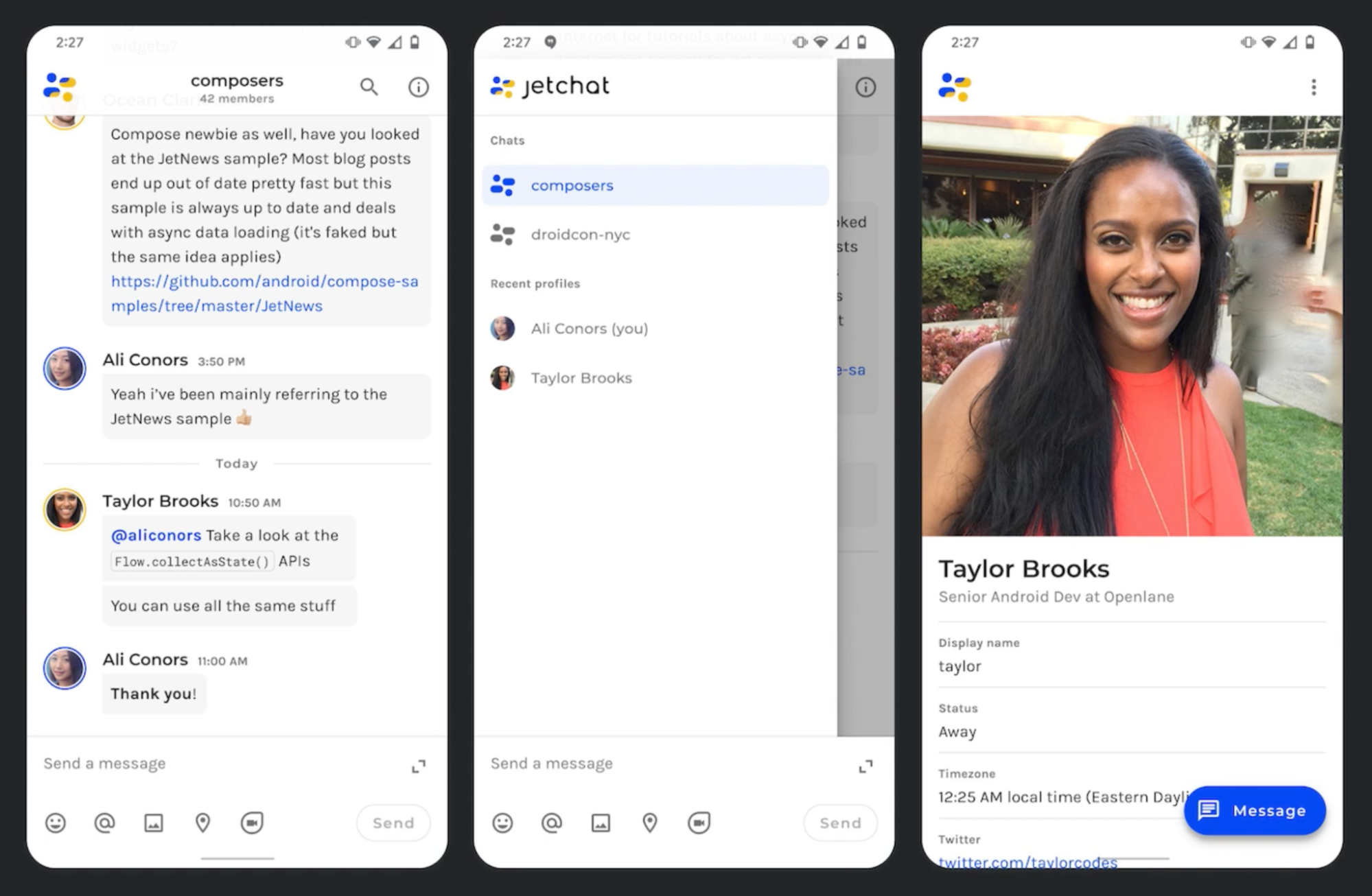
△ jettat application
Before we start, we first need to add the dependency of Material 3 to the build of the module In the gradle file:
implementation 'androidx.compose.material3:material3:1.0.0-alpha01'
MaterialTheme
Let's take a look at MaterialTheme first. The existing MaterialTheme composable item is the implementation of Material Design 2. It can set the theme of Material 2 components in the whole application by adjusting the color, layout and Shape system. We have introduced a new version of MaterialTheme for Material Design 3. You can set the theme of Material 3 components by adjusting the color scheme and typesetting system, and the function of updating Shape will be added soon.
import androidx.compose.material3.MaterialTheme

@Composable
fun MaterialTheme (
    colorScheme: ColorScheme,
    typography: Typography,
    // The ability to update Shape is coming
    content: @Composable () -> Unit
)
First, let's look at the color scheme. Material Design 3 subdivides colors into color slots with specific names. For example, the Primary, Background and Error used by Material 3 components form a color scheme together. Some color slots are from Material Design 2, and some new color slots are also introduced to expand the overall palette. These color slots contain beautiful new default base colors that can be applied to both light and dark themes.
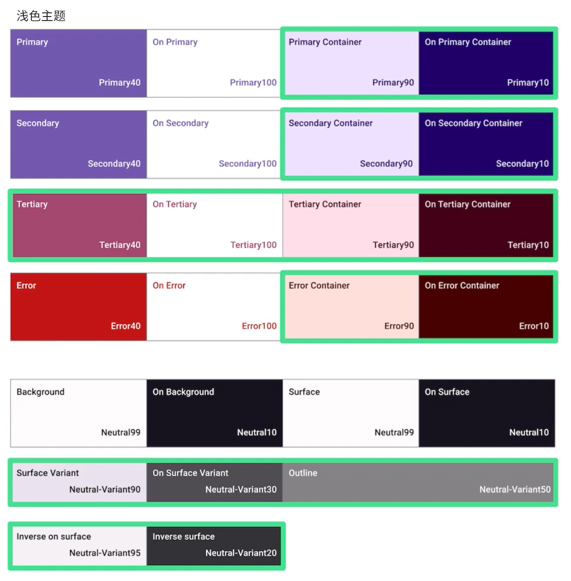
△ the green box is the newly added color slot in Material You
The above colors are taken from a set of hue palettes. For example, let's take a look at the Primary color slot. The color values used in the color slot come from different hues in the Primary hue palette, and the corresponding hues are selected according to light and dark themes to meet the requirements of barrier free function.
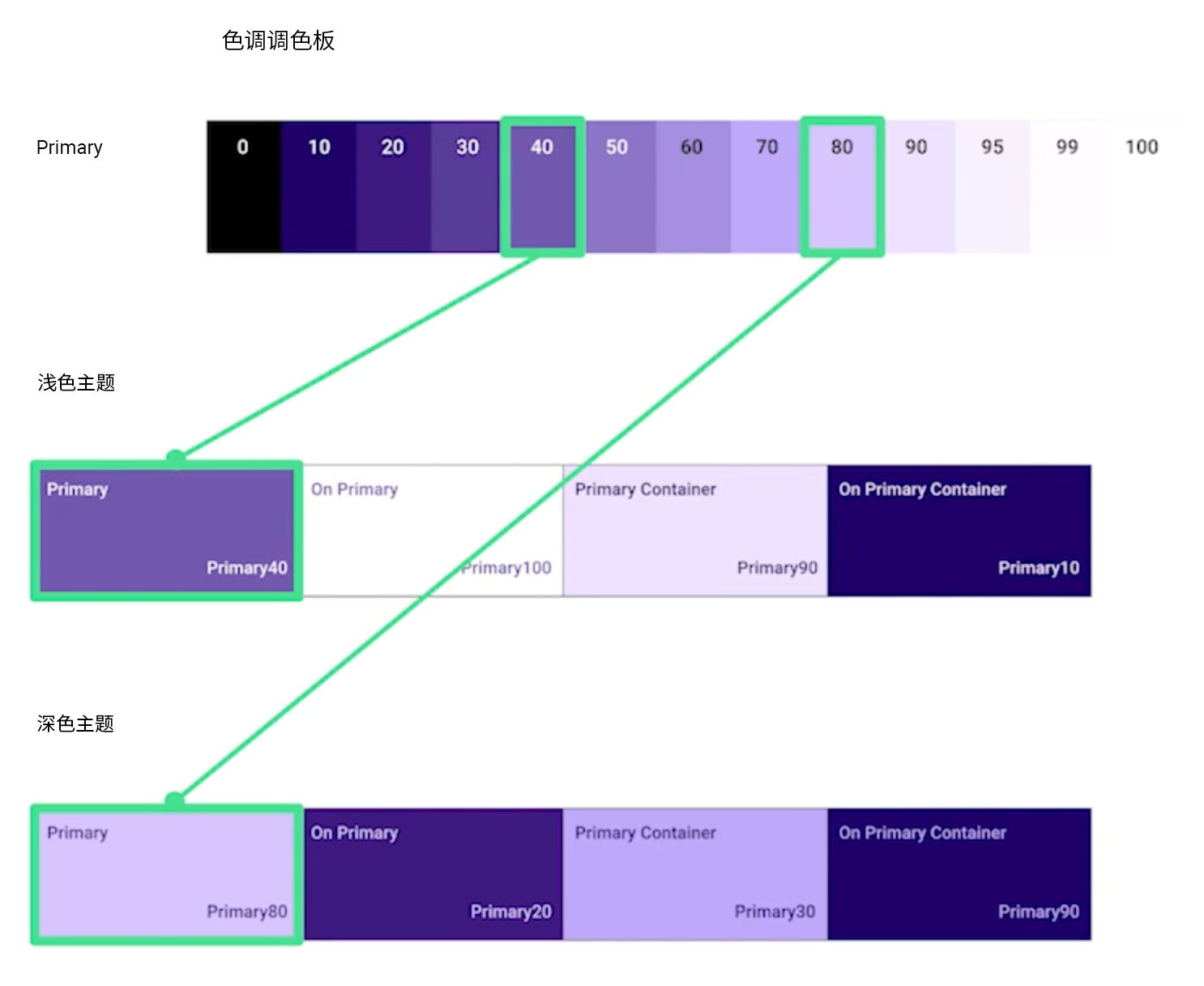
△ Primary color slot
Compose uses a new ColorScheme class to model this, and its parameters are named after the color slot in the Material Design 3 color scheme. You can use the lightColorScheme function to create an instance of ColorScheme with a light color base value; You can also use custom colors to override the default value, or use darkColorScheme to set the default benchmark value of dark color; You can also switch between light and dark color schemes based on system settings using the isSystemInDarkTheme tool function.
val AppLightColorScheme = lightColorScheme (
    primary = Color(...),
    // secondary, tertiary, etc
    // ColorScheme instance with light color base value
)

val AppDarkColorScheme = darkColorScheme(
    // primary, secondary, tertiary, etc
    // ColorScheme instance with dark base value
)

val dark = isSystemInDarkTheme()
val colorScheme = if (dark) AppDarkColorScheme else AppLightColorScheme

// Pass colorScheme as a parameter to MaterialTheme.
MaterialTheme (
    colorScheme = colorScheme,
    // Font
) {
    // Application content
}
Next, let's take a look at Jetchat's color scheme. The colors of our Primary and jettiary 3 themes are very suitable for the color scheme of jettiary and jettiary, and the colors of jettiary and jettiary are used as the colors of our Primary and jettiary 3 themes. The brand colors used by Jetchat are taken from a set of custom hue palettes generated by the MaterialTheme Builder tool. The following figure shows the Primary color, that is, the blue hue palette and the matching Primary color slot in the color scheme.
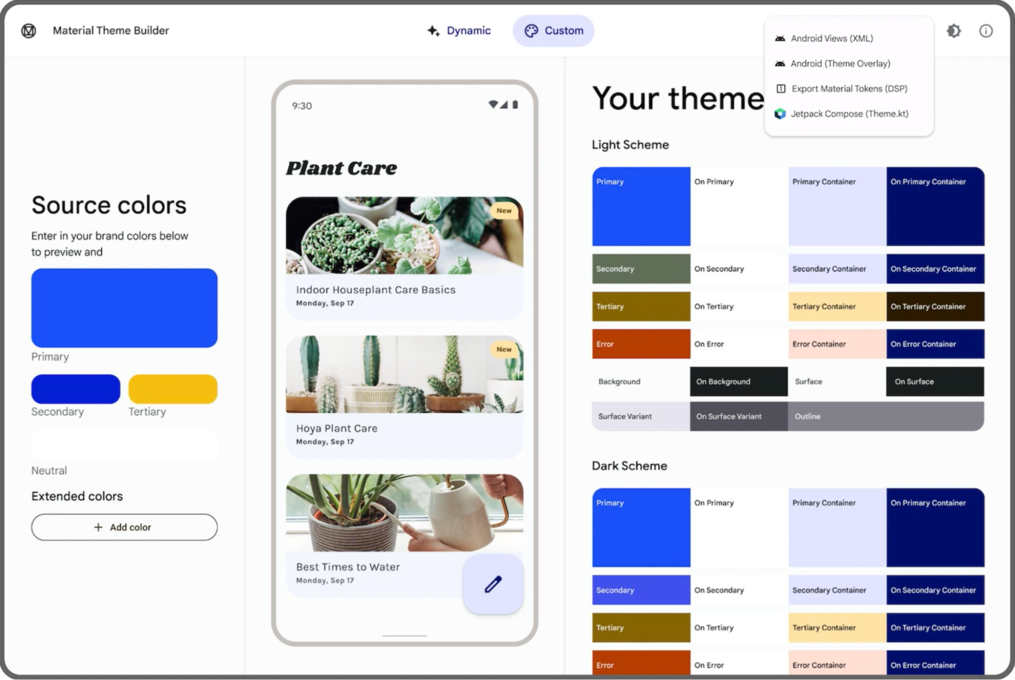
△ jettat color scheme generated in MaterialTheme Builder tool
To implement the jettat Color scheme, first declare these colors using the Color class. The MaterialTheme Builder tool can also export the generated code for you. Next, you can declare the jettat light and dark Color schemes with the corresponding Color values.
// The Primary color from the hue palette named 'Blue'
val Blue10 = Color (0xFF000965)
val Blue20 = Color (0xFF00159E)
val Blue30 = Color (0xFF0023DA)
val Blue40 = Color (0xFF1E40FF)
val Blue80 = Color (0xFFBBC3FF)
val Blue90 = Color (0xFFDDE0FF)

val JetchatLightColorScheme = lightColorScheme (
    primary = Blue40,
    onPrimary = Color.White,
    primaryContainer = Blue90,
    onPrimaryContainer = Blue10,
    // secondary, tertiary, surface, etc
)

val JetchatDarkColorScheme = darkColorScheme (
    primary = Blue80,
    onPrimary = Blue20,
    primaryContainer = Blue30,
    onPrimaryContainer = Blue90,
    // secondary, tertiary, surface, etc
)
We created a new composable function for the jettat theme, which receives a parameter for judging the dark theme and an application content parameter, so that we can switch between jettat's light and dark color schemes. Next, we pass the colorScheme value and content to the internal MaterialTheme composable item, which enables us to encapsulate the jettat content and provide themes for the application.
@Composable
fun JetchatTheme (
    dark: Boolean = isSystemInDarkTheme(),
    content: @Composable () -> Unit
) {
    val colorScheme = if (dark) JetchatDarkColorScheme else JetchatLightColorScheme
    MaterialTheme (
        colorScheme = colorScheme,
        content = content,
    )
}
Let's take a look at the jettat dialog interface. Different parts of the interface use different color slots in the color scheme. For example, according to different users, the border color of the message header image uses the Primary color or the Tertiary color. Here we use materialtheme Colorscheme access theme color values.
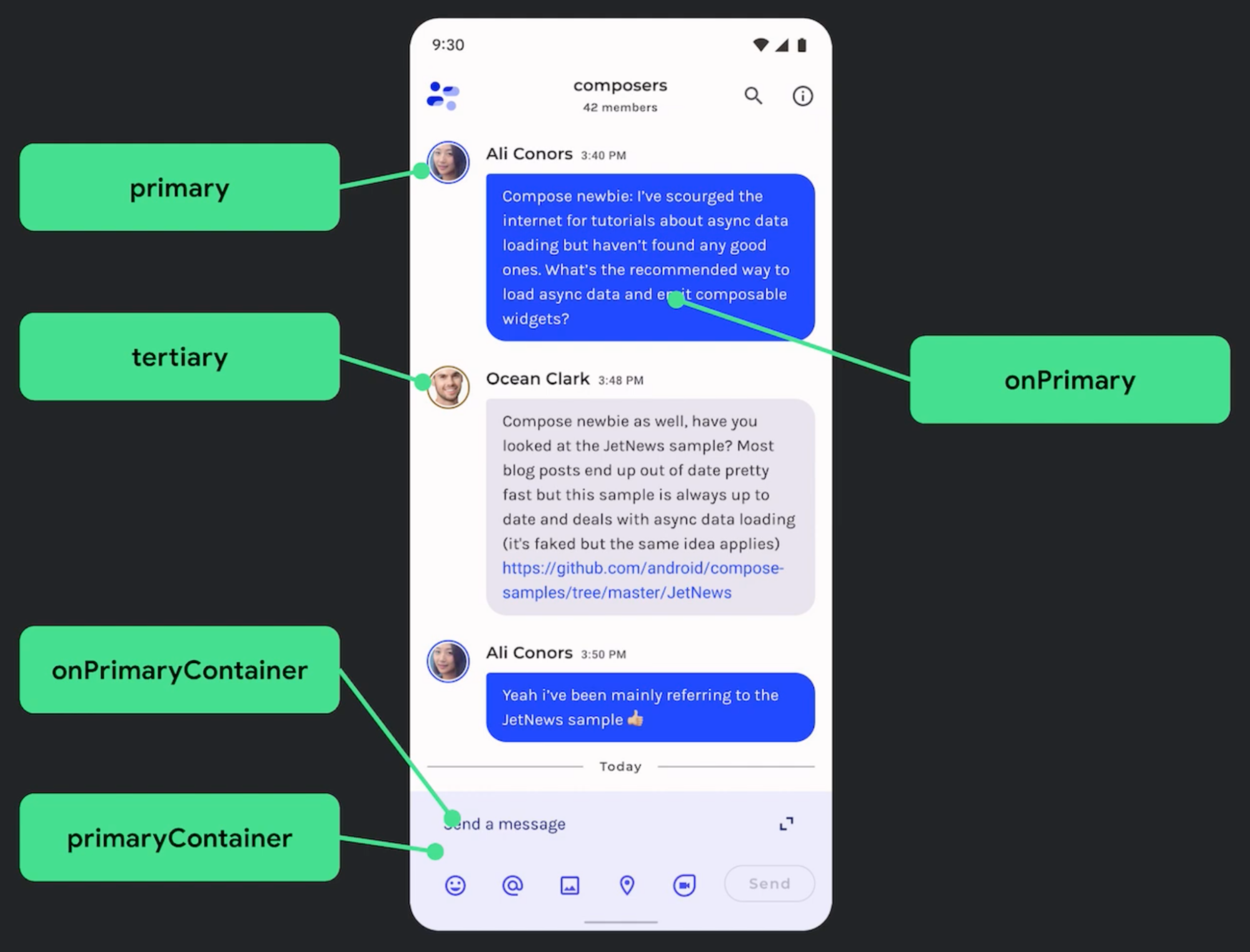
△ Jetchat dialogue interface
@Composable
fun Message(...) {
    val avatarBorderColor = if (isUserMe) {
        MaterialTheme.colorScheme.primary
    } else {
        MaterialTheme.colorScheme.tertiary
    }
    ...
}
Dynamic color matching
Next, let's understand what dynamic color matching is. Dynamic color matching is an important part of Material You, which uses algorithms to extract custom colors from users' wallpapers and apply them to application and system interfaces. You can use this as a starting point to generate complete light and dark color schemes.
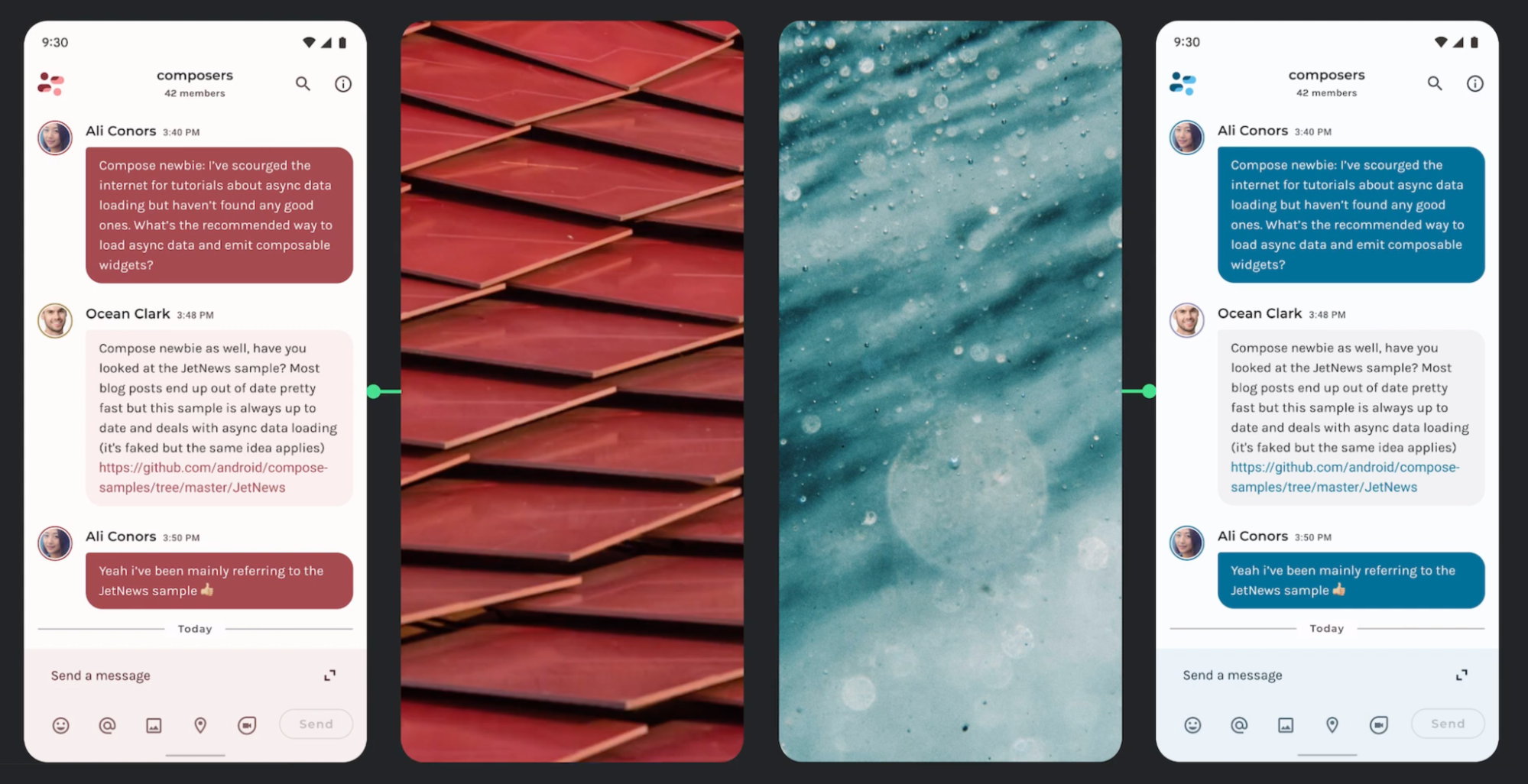
△ the color scheme of Jetchat changes with the wallpaper set by the user
Dynamic color matching can be used in Android 12 and later versions. To implement dynamic ColorScheme in Compose, you need to first check build VERSION. SDK. If dynamic color matching is available, we can set dynamic ColorScheme; If not available, you can go back to using lightColorScheme or darkColorScheme as before:
val dynamic = Build.VERSION.SOK_INT >= Build.VERSION_CODES.S
val colorScheme = if (dynamic) {
    val context = LocalContext.current
    // Use the dynamicLightColorScheme function to create an instance of ColorScheme with light color dynamic values
    // Or use dynamicDarkColorScheme to create instances with dark dynamic values
    // Pass in Context to obtain dynamic color matching resources from Android system
    if (dark) dynamiclightColorScheme(context) else dynamicDarkColorScheme(context)
} else {
    // Use lightColorScheme or darkColorScheme
}
At present, jettat has been using the brand's blue color scheme, but we hope to increase the support for wallpaper based dynamic color scheme to match the personalized adjustment of users. In this example, the hue palette is generated based on the colors in the wallpaper, and the dynamic color scheme is derived from these hue palettes, including colors for light and dark themes.
To achieve this in Jetchat, we first update JetchatTheme to add a new parameter to the dynamic color matching, and then use the dynamic color matching parameter to set the dynamic colorScheme, or go back to the brand's blue color scheme when it is not available. As before, pass the colorScheme value and content to the internal MaterialTheme composable item.
@Composable
fun JetchatTheme (
    dark: Boolean = isSystemInDarkTheme (),
    dynamic: Boolean = Build. VERSION.SDK_INT >= Build.VERSION_CODES.S,
    content: @Composable () -> Unit
) {
    // ColorScheme configuration and MaterialTheme
    val colorScheme = if (dynamic) {
        val context = LocalContext.current
        if (dark) dynamicDarkColorScheme(context) else dynamicLightColorScheme(context)
    } else {
        if (dark) JetchatDarkColor Scheme else Jetchat Light Color Scheme
    }

    MaterialTheme(
        colorScheme = colorScheme,
        content = content,
    )
}
Now, on Android 12 and later, the jettat interface can automatically adjust the color matching according to the user's wallpaper. Whether it is light or dark, it can provide a beautiful experience suitable for the brand.
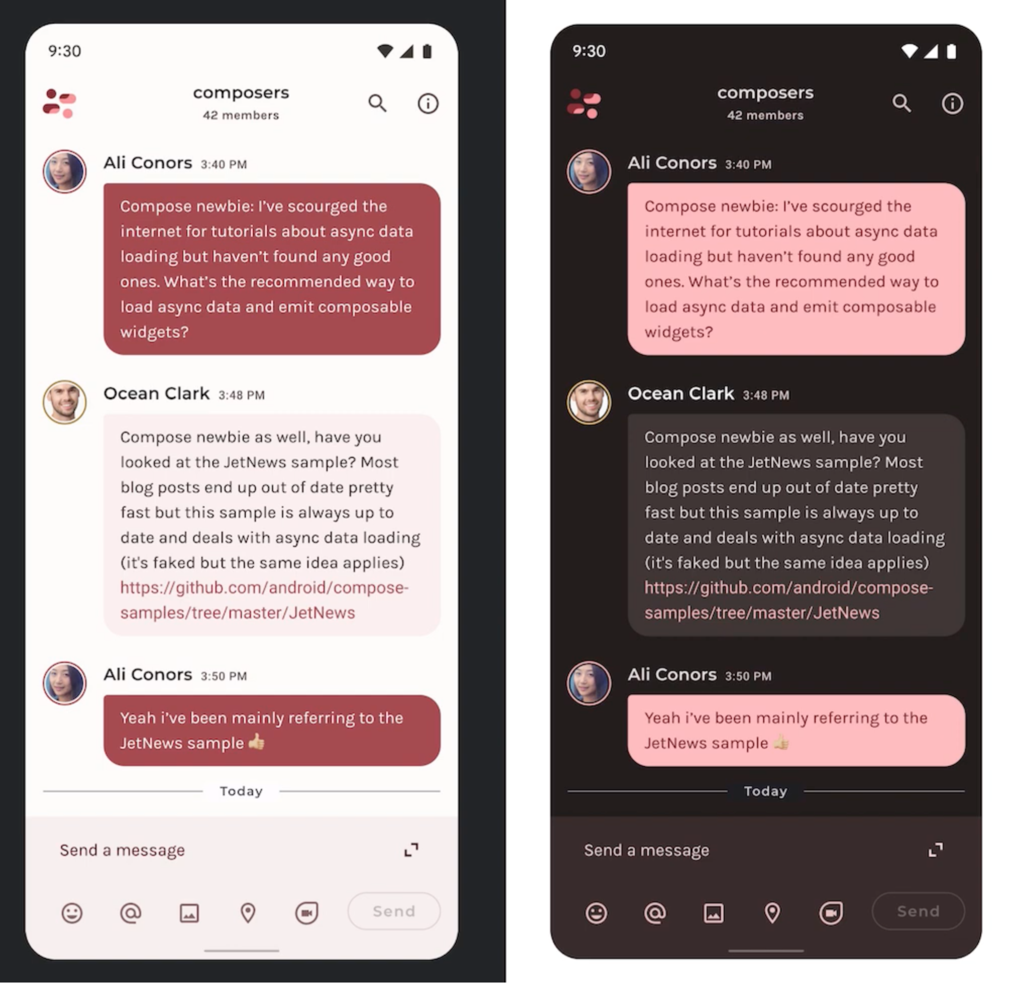
△ automatic dynamic color matching for dark and light color themes
Typesetting
Now that we know the color scheme, let's take a look at the typesetting. Material Design 3 has new font specifications, including text styles adapted from Material Design 2. The naming and grouping of styles are simplified to display, headline, title, body and label; Each group has large, medium, and small fonts.
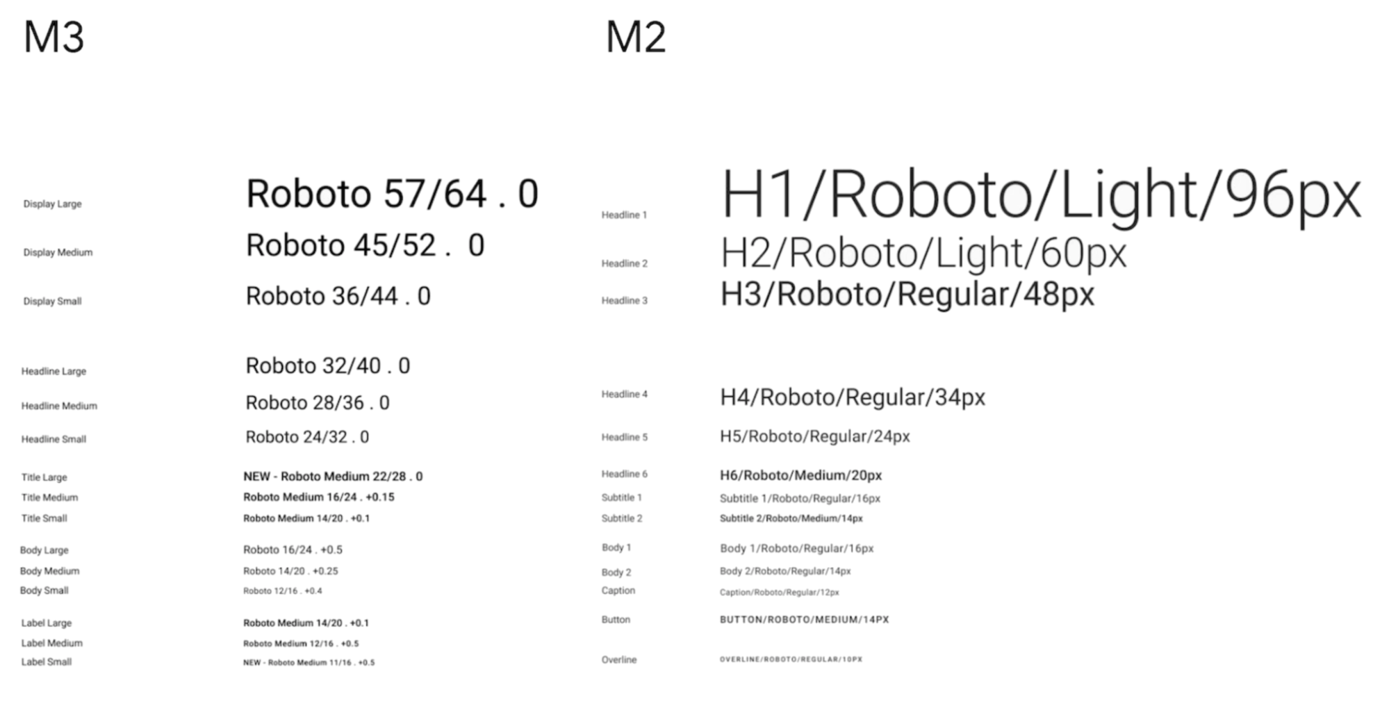
△ font style grouping of Material 3 and Material 2
Compose uses the new Typography class to model the font specification, and its parameters are named after the styles in the Material Design 3 font specification. We can use the robot benchmark value to create a Typography instance, override the default value with a custom text style, and finally pass the Typography as a parameter to MaterialTheme.
import androidx.compose.material3.Typography

class Typography (
    val displayLarge: TextStyle,
    val displayMedium: TextStyle,
    val displaySmall: TextStyle,
    // Headline large, titleMedium, bodySmall, etc
)

val AppTypography = Typography (
    bodyLarge = TextStyle(...),
    // displayLarge, titleMedium, labelSmall, etc
    // Use the default robot benchmark
)

MaterialTheme (
    typography = AppTypography,
    // colorScheme
) {
    //App content
}
Let's take a look at the layout of Jetchat. Designers provided us with new brand font specifications, using custom fonts Montserrat and Karla:
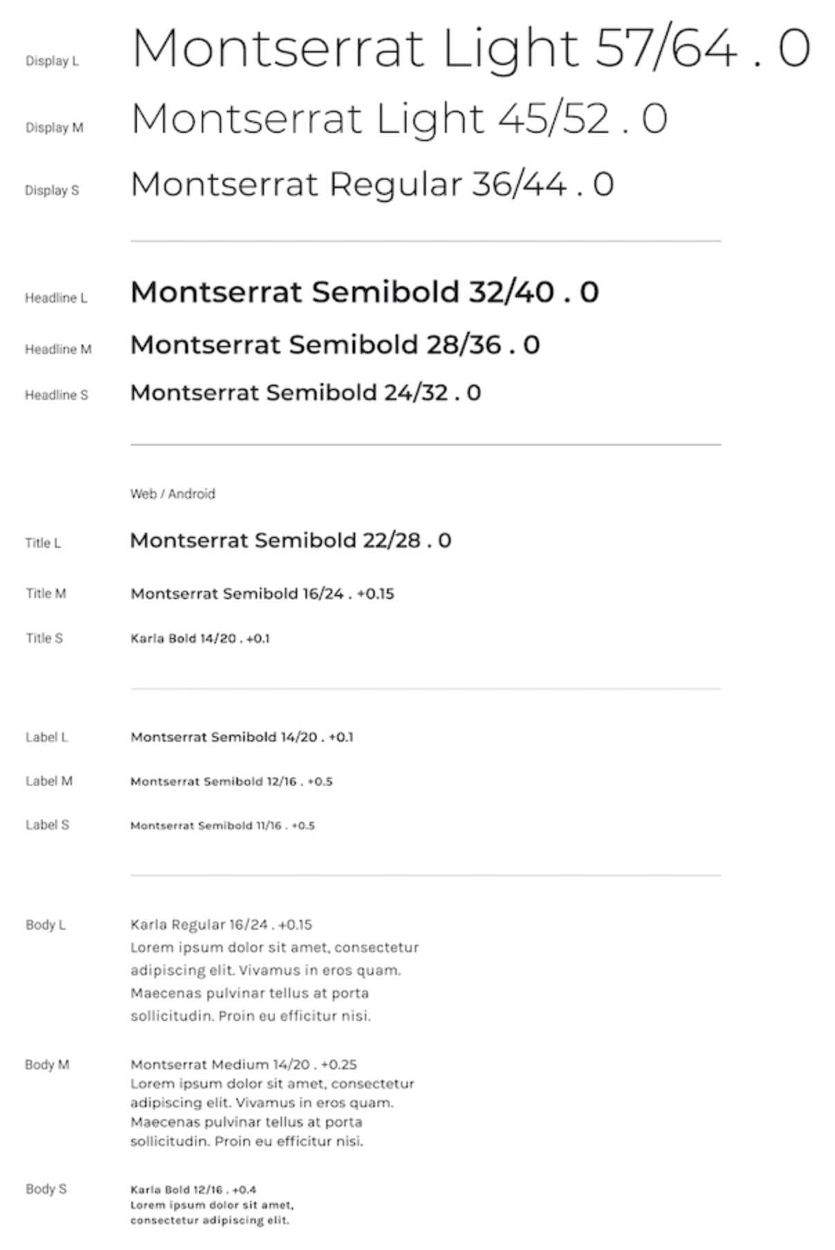
△ font size used by jettat
We first declare these fonts using the FontFamily class, which will hold instances of the Font class. We can use the Font resource ID and Font weight to construct the Font class, then use the Typography class to declare the jettat Font style, and use the TextStyle class to override each text style, including our Font, Font size, Font weight and other typesetting values. Finally, similarly, pass Typography as a parameter to MaterialTheme:
val MontserratFontFamily = FontFamily (
    Font(R.font.montserrat_regular),
    Font(R.font montserrat_light, FontWeight Light),
    Font(R.font.montserrat_semibold, FontWeight. SemiBold)
)

val KarlaFontFamily = FontFamily (
    Font(R.font.karla_regular),
    Font(R.font.karla_bold, FontWeight. Bold)
)

val JetchatTypography = Typography(
    bodyLarge = TextStyle(
        fontFamily = KarlaFontFamily,
        fontWeight = FontWeight. Normal,
        fontSize = 16.sp,
        lineHeight = 24.sp,
        letterSpacing = 0.15.sp
    ),

    // titleMedium, labelSmall, etc
)

MaterialTheme (
    typography = JetchatTypography,
    // colorScheme,content
)
Let's take a look at the jettat dialog interface. Each part of the interface uses different text styles in the jettat font specification. For example, the contact and timestamp in the message use the styles of titleMedium and labelSmall respectively. They pass through materialtheme Typography indicates access to the theme font value.
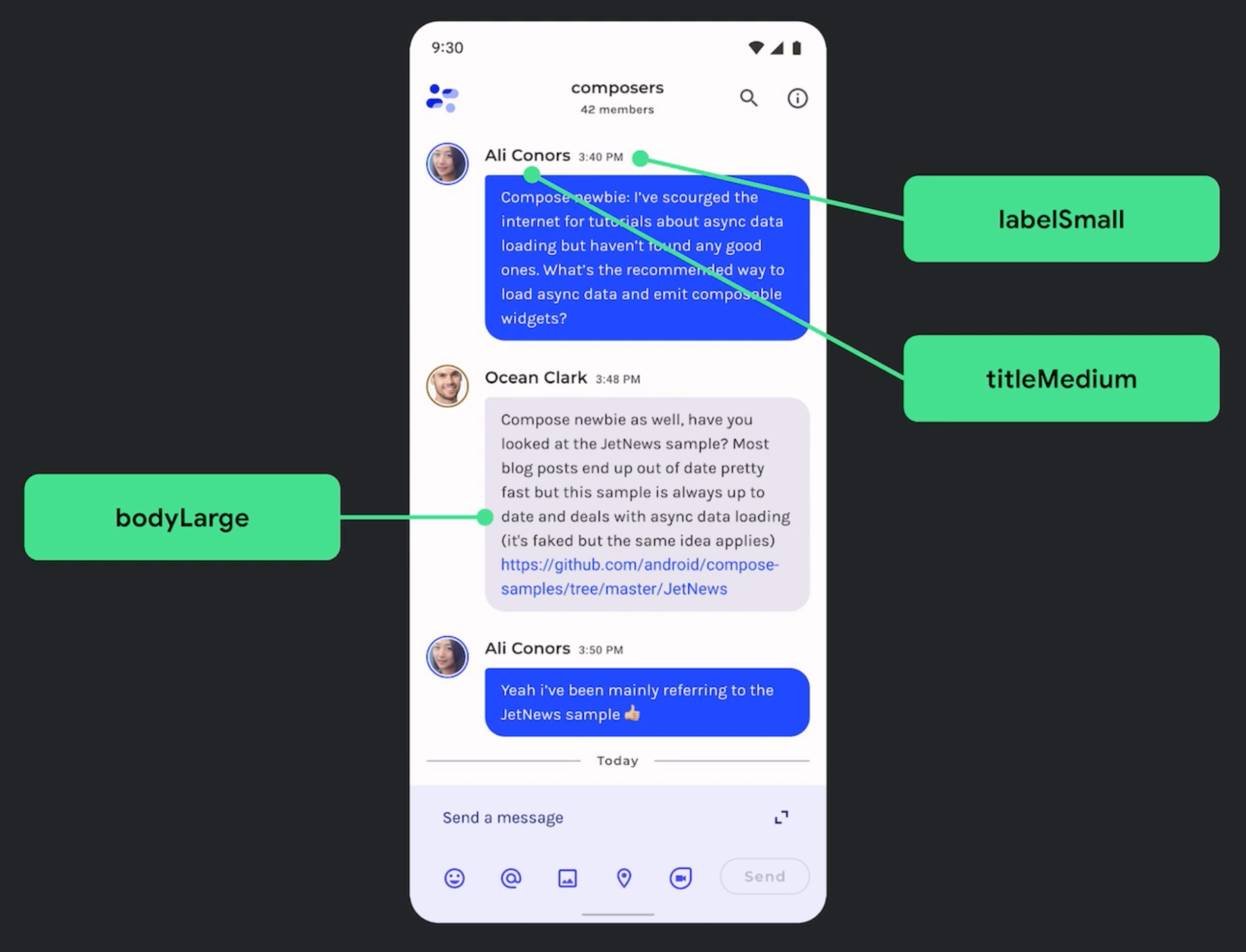
△ font setting of dialog interface
@Composable
fun Message(...) {
    ...
    Text (style = MaterialTheme.typography.titleMedium, ...)
    ...
    Text (style = MaterialTheme.typography.labelSmall, ...)
}
height
After understanding the updates related to the Material 3 theme, let's take a look at another key update of Material Design - height. In general, Material 2 uses shadow to represent height, while Material 3 uses hue color overlay to represent height instead. This is a new way to distinguish between containers and surfaces. Increasing the hue height will make the hue more prominent.
In Material 2, the height overlay is part of the dark theme and has also been changed to the hue color overlay in Material 3.
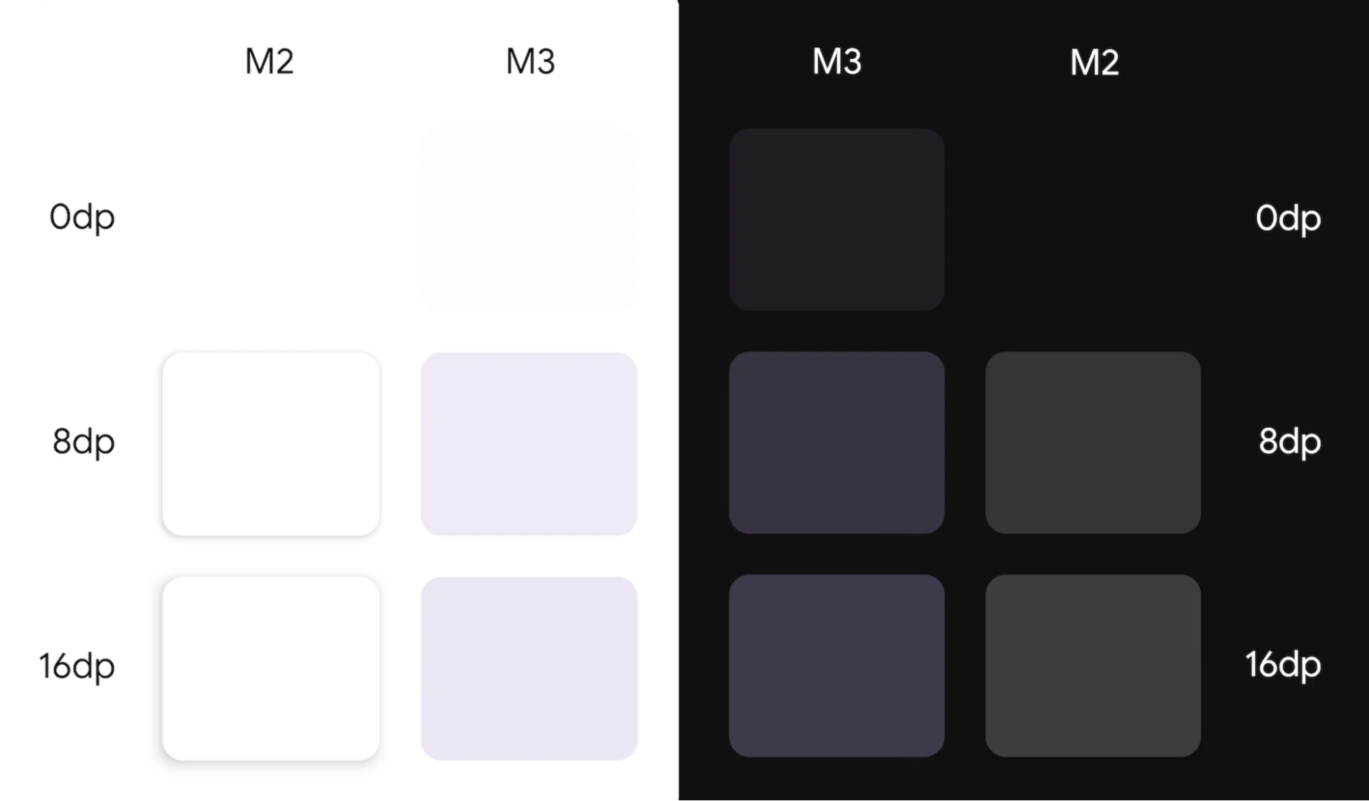
△ comparison between M2 and M3 medium height systems
Let's take surface component as an example. Surface is a composable item used to support most Material components. The existing surface composable item implements the height system of Material Design 2. In Material Design 2, surface receives an elevation parameter and handles shadow and overlay rendering in dark themes. We have introduced a new version of surface for Material Design 3, which accepts a tonalElevation parameter and handles hue color overlay rendering in light and dark themes. Let's see what's different:
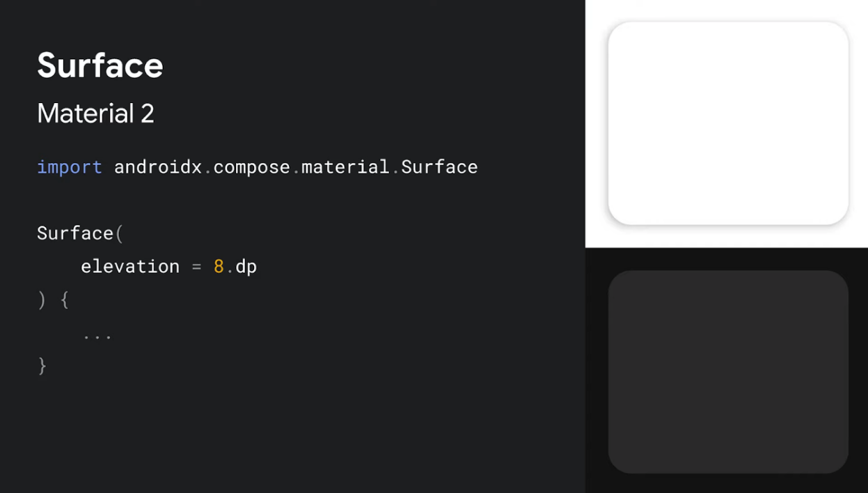
△ Surface in Material 2
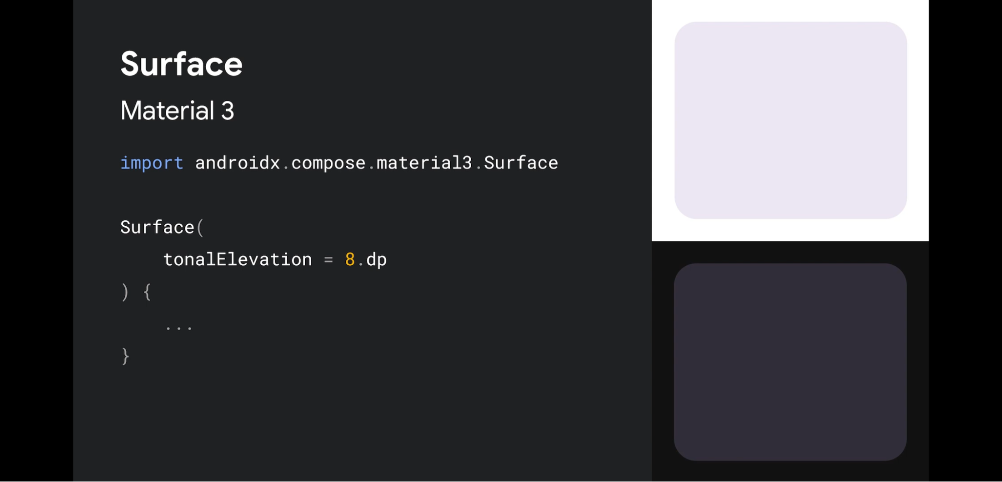
△ Surface in Material 3
Component update
Material 3 has updated many components, such as buttons, application bar, dialog box, FAB and navigation components. These updates take advantage of the new material 3 theme settings and include the latest updates to each component specification.
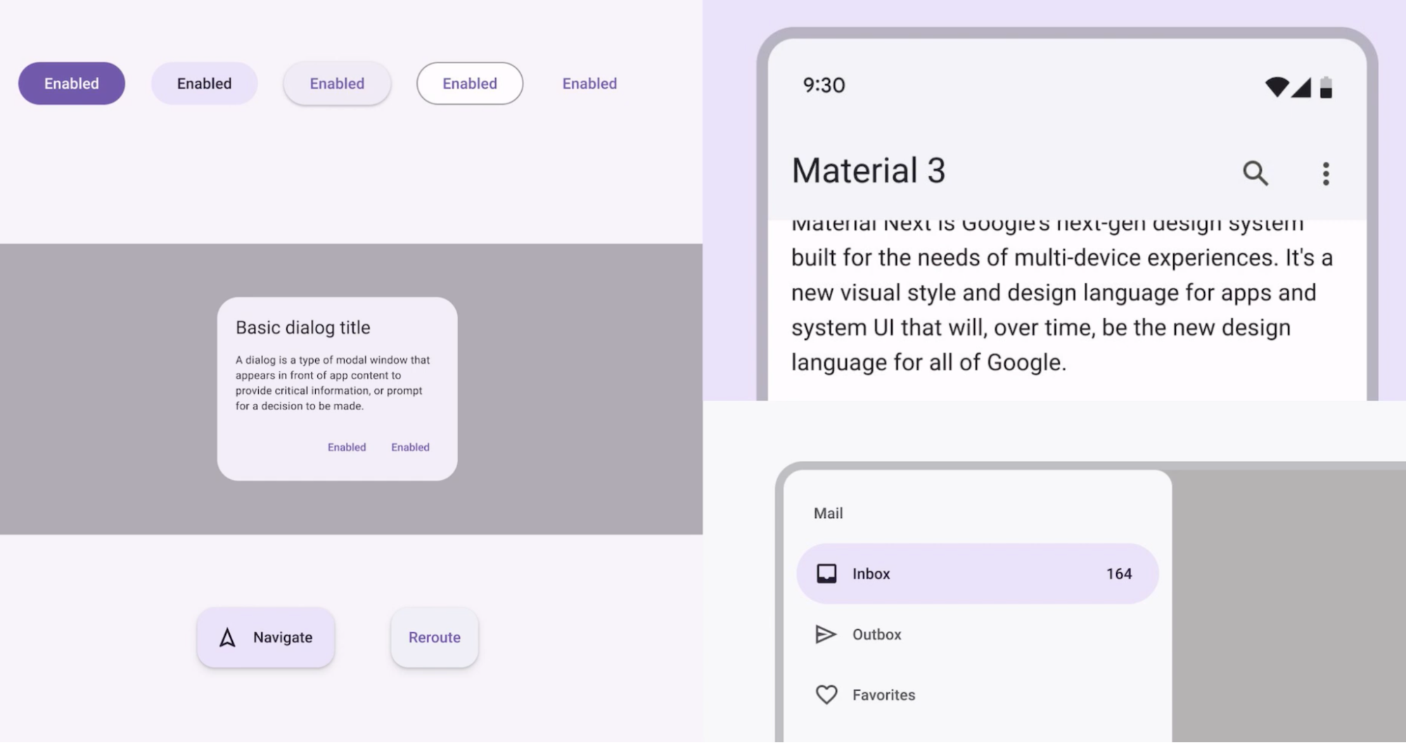
△ updated components in Material 3
For example, BottomNavigation in Material 2. It complies with the Material Design 2 specification and accepts parameters such as backgroundColor and elevation. In Material 3, the composable item is renamed NavigationBar, which complies with the Material Design 3 specification, in which the parameters are changed to containerColor and tonalElevation to more accurately reflect their respective purposes.
// NavigationBar in Materail 2
import androidx.compose.material.BottomNavigation

@Composable
fun BottomNavigation (
    // M2 default
    backgroundColor: Color,
    elevation: Dp,
    ...
)


// Navigation 3 in mation3
import androidx.compose.material3.NavigationBar

@Composable
fun NavigationBar (
    // M3 default
    containerColor: Color,
    tonalElevation: Dp,
    ...
)

△ style changes before and after update
Many updates have been made to the components in composite Material 3. In order to let you fully understand all components and their implementation methods, we have updated the composite material catalog application and added Material 3. Please check on AOSP source code And in Download the app from Google Play.
Let's take a look at an example in jettat. There is an extended FAB for writing messages on the profile interface, which has been updated from Material 2 to Material 3. This is a simple implementation of Material 2 version. It uses ExtendedFloatingActionButton composable items, and internally uses Icon and Text, composable items and customized Primary background colors.

import androidx.compose.material.ExtendedFloatingActionButton
import androidx.compose.material.Icon
import androidx.compose.material.Text

ExtendedFloatingActionButton(
    icon = { Icon(...) },
    text = { Text(...) },
    backgroundColor = MaterialTheme.colors.primary,
    ...
)
The update of this component by Material 3 is shown here. The dependent import of composable items has been changed to Material 3. We use the renamed containerColor parameter and the Tertiary color in the Material 3 color scheme.
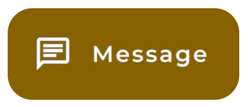
import androidx.compose.material3.ExtendedFloatingActionButton
import androidx.compose.material3.Icon
import androidx.compose.material3.Text

ExtendedFloatingActionButton(
    icon = { Icon(...) },
    text = { Text(...) },
    containerColor = MaterialTheme.colorScheme.tertiary,
    ...
)
visual effect
Some aspects of Material You come from the new Android 12 visual style and system interface. Two important changes are ripple and scroll effects. Now, the ripple effect illuminates the surface with a subtle flash when pressed, and the rolling effect uses a stretch effect on the edge of the rolling container. No extra work is required to implement these changes. In Compose Foundation 1.1 and later versions of rolling container composable items, stretch rolling is turned on by default; The flash ripple provided on Android 12 applies to all Material components.
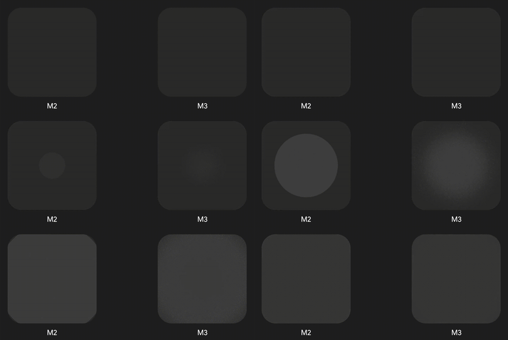
△ ripple effect in M2 and M3
// Stretch roll
// Applicable to LazyColumn, Lazy Row, LazyVerticalGrid and other components
// ComposeFoundation 1.1.0 + available

// Flash ripple
// Applicable to all Material 2 and Material 3 components
// Android 12 + available
Interoperability improvements with Android View
Interoperability with Android views is an important part of developing applications using Compose, and we have made some updates in Material 3 to support this. MDC androidcompose theme adapter Library It is a Material component that supports reusing Android XML themes, so that we can set themes in Jetpack Compose.
The existing MdcTheme composable item is compatible with the Material 2 XML theme. We also introduced a new Mdc3Theme composable item, which is compatible with the Material 3 XML theme.

△ MDC androidcompose theme adapter is the bridge between XML theme and MaterialTheme
Epilogue
Now is a good time to try composite material 3 in your Android application. We have prepared a series of resources to help you successfully complete your journey. We provide new information about API documentation for composite material 3 , and provides a new Empty Compose Activity template in Android Studio, which contains updates about Material 3. In addition, we have updated Theme settings in Compose Guide, as well as the jettat example and Compose Material Catalog Application, and MDC-Android ComposeTheme Adapter Interoperability library.