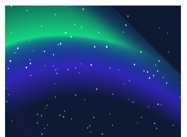
I finished this article last time-- Skillfully using gradient to realize high-level full background light animation After that, the comments below the article have students' comments. Can you use CSS to realize Aurora?
Like this:
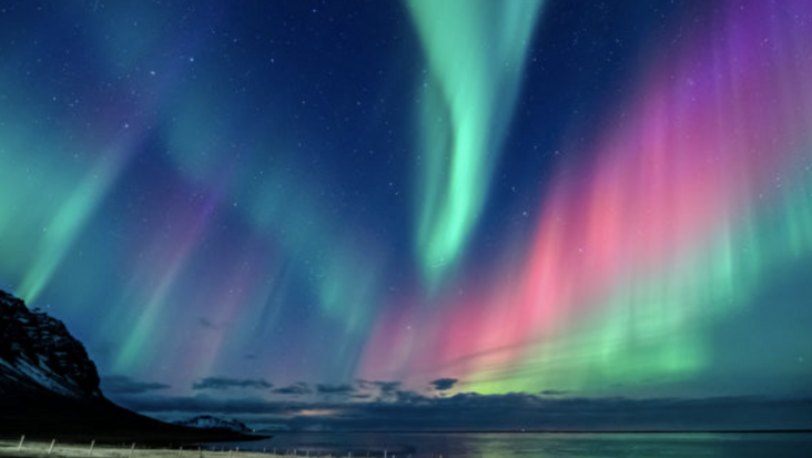
emmm, it's a little difficult. However, I have also tried recently. Although it is impossible to simulate such a real effect, some similar special effects can be made using CSS. Let's try it together today.
After observing some Aurora pictures, I found some important elements in Aurora Animation:
- Bright gradient color based on dark background
- Animation effect similar to water wave flow
Bright gradient colors we can try to use gradient simulation. The animation effect of water wave flow is specially done by feturbulence in SVG filter. The use of this filter has been repeatedly mentioned in many articles in the past.
In addition to gradient and SVG's < contour > filter, we may also use mix blend mode and CSS filter to improve the effect.
OK, with a general idea, the rest is to keep trying.
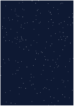
Step 1. Draw a dark background
First, we may need a dark background to represent our night sky. At the same time, some stars can be dotted. The stars can be simulated by box shadow. In this way, we can complete a pair of night sky background in 1 div:
<div class="g-wrap">
</div>
@function randomNum($max, $min: 0, $u: 1) {
    @return ($min + random($max)) * $u;
}

@function shadowSet($n, $size) {
    $shadow : 0 0 0 0 #fff;

    @for $i from 0 through $n {
        $x: randomNum(350);
        $y: randomNum(500);
        $scale: randomNum($size) / 10;

        $shadow: $shadow, #{$x}px #{$y}px 0 #{$scale}px rgba(255, 255, 255, .8);
    }

    @return $shadow;
}

.g-wrap {
    position: relative;
    width: 350px;
    height: 500px;
    background: #0b1a3a;
    overflow: hidden;

    &::before {
        content: "";
        position: absolute;
        width: 1px;
        height: 1px;
        border-radius: 50%;
        box-shadow: shadowSet(100, 6);
}
This step is relatively simple. With the help of SASS, we can get such a background picture of the night sky:
Step 2. Use gradients to outline the aurora
Next, use the gradient to draw a contour effect of the aurora.
It's actually a radial gradient:
<div class="g-wrap">
  <div class="g-aurora"></div>
</div>
.g-aurora {
    width: 400px;
    height: 300px;
    background: radial-gradient(
        circle at 100% 100%,
        transparent 45%,
        #bd63c1 55%,
        #53e5a6 65%,
        transparent 85%
    );
}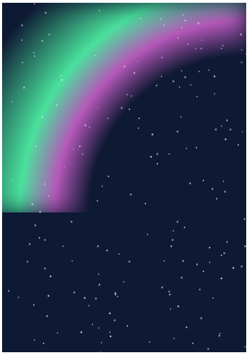
Step 3. Rotational stretching
At present, there is a little outline. Next, we transform the gradient effect by rotating and stretching.
.g-aurora {
    ...
    transform: rotate(45deg) scaleX(1.4);
}
We can probably get such an effect:
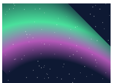
Step 4. Magical mixed mode transformation!
Here, in fact, the prototype has come out. But the color looks different. In order to blend with the dark background, we use the mix blend mode here.
.g-aurora {
    ...
    transform: rotate(45deg) scaleX(1.4);
    mix-blend-mode: color-dodge;
}
Something magical happened. See the effect:
The overall color looks more like the color of the aurora.
Step 5. Superimposed SVG feturbulence filter
Next, in order to produce the effect of water ripple, we need to use the < feturbulence > filter of SVG. If you don't know much about this filter, you can see my articles:
- significant! Powerful SVG filter
- Shock! Can you make expression packs with SVG filters?
- Realize a moving Hongmeng LOGO
Get back to the point. We add an SVG < feturbulence > filter and use CSS filter for reference
<div class="g-wrap">
  <div class="g-aurora"></div>
</div>

<svg id='blob' version='1.1' xmlns='http://www.w3.org/2000/svg'>
    <defs>
        <filter id='wave'>
            <feturbulence basefrequency='0.003 0.003 id='turbulence' numoctaves='3' result='noise' seed='10' />
            <fedisplacementmap id='displacement' in2='noise' in='SourceGraphic' scale='96' />
        </filter>
    </defs>
</svg>
.g-aurora {
...
transform: rotate(45deg) scaleX(1.4);
mix-blend-mode: color-dodge;
filter: url(#wave);
}We can get such an effect:
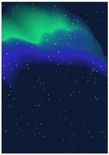
Wow, do you already feel that way. Through the characteristics of feturbulence, we almost simulated the effect of Aurora!
Step 6. Let the aurora move
Finally, we need to move our aurora. Because SVG animation itself does not support features like animation fill mode: alternate. We still need to write some JavaScript code to control the overall loop of the animation.
The approximate code is as follows:
var filter = document.querySelector("#turbulence");
var frames = 0;
var rad = Math.PI / 180;
function freqAnimation() {
bfx = 0.005;
bfy = 0.005;
frames += .5
bfx += 0.0025 * Math.cos(frames * rad);
bfy += 0.0025 * Math.sin(frames * rad);
bf = bfx.toString() + ' ' + bfy.toString();
filter.setAttributeNS(null, 'baseFrequency', bf);
window.requestAnimationFrame(freqAnimation);
}
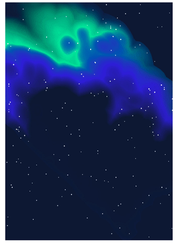
window.requestAnimationFrame(freqAnimation);So far, we have got a complete and moving Aurora Animation:
Some skills and other matters
- There will be obvious boundary burr effect around the gradient element. You can use black inner shadow box shadow: inset remove;
- The actual parameters of each attribute in the actual writing process seem simple, but they are actually obtained after continuous debugging;
- Mixed mode and SVG's feturbulence filter are difficult to master and need continuous practice and debugging; In this paper, the color selection of Aurora has not undergone too many repeated debugging. If you are willing to spend time, you can debug better colors.
The final effect is not perfect, but it is also a good CSS + SVG work. You can see the complete code here:
last
Well, this article ends here. I hope this article will help you:)
If you want Get to get the most interesting CSS information, don't miss my official account -- iCSS front end interesting news. 😄
More wonderful CSS technical articles are summarized in my Github -- iCSS , continuously updated. Welcome to a star subscription collection.
If you have any questions or suggestions, you can communicate more. The original articles have limited writing style and shallow talents. If there is anything wrong in the article, please let me know.