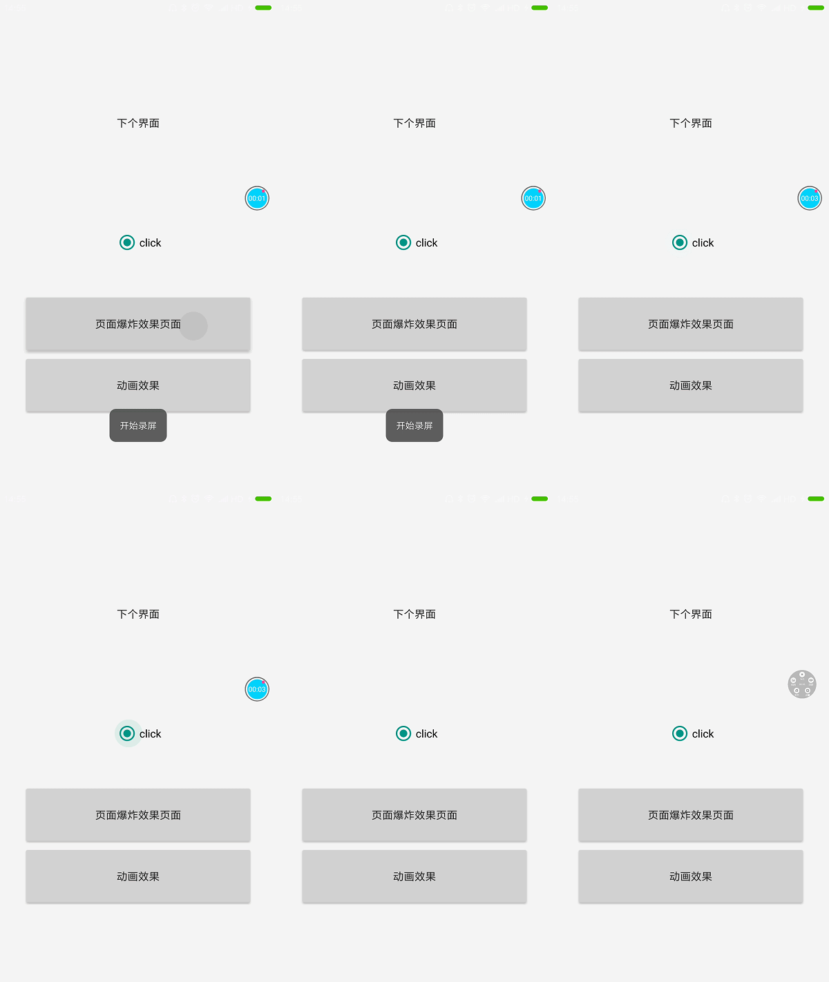
In Android 5.0, touch feedback, or water ripple, was added.
Use
1. When creating a new project, the default button usually has water ripple effect. If you want to delete it, you can specify a color for the view.
Code:
Android: background="? Android: attr / selectable ItemBackground" ripple with boundary
Android: background="? Android: attr / selectable ItemBackgroundBorderless" ripple beyond the boundary
Setting the water ripple color, I found that I can only use theme settings, not directly write to xml to modify the theme:
<!-- Base application theme. -->
<style name="AppTheme" parent="Theme.AppCompat.Light.DarkActionBar">
<!-- Customize your theme here. -->
<item name="colorPrimary">@color/colorPrimary</item>
<item name="colorAccent">@color/colorAccent</item>
</style>
Setting water ripple color
<item name="colorControlHighlight">@color/colorAccent</item>Select controls such as color settings, controls, CheckBox,RadioButton
<item name="colorControlHighlight">@color/colorAccent</item>Button click water ripple effect 
Activity Options Animation Explanation
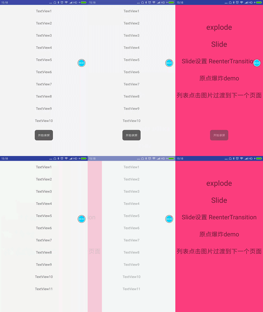
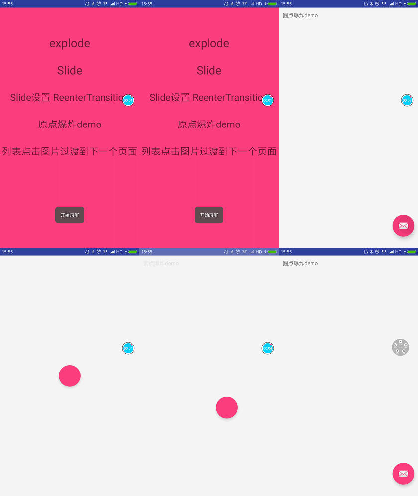
Activity Options is a new animation in 5.0. Let's see the effect first.
Origin explosion 
Click on the list image to move to the next page animation 
explode and slide animation effects 
explode: Page expansion effect
slide: sideslip
  // Gravity.TOP scrolls from top to bottom
  // Gravity.BOTTOM from bottom to top
  // Gravity.LEFT scrolls from left
Origin Explosion Animation Learning
The implementation of origin explosion animation mainly uses sharing elements between pages. This element usually refers to view, which transfers elements of interface A to interface B. When interface A exits and interface B comes in, sharing elements will begin to transition. This transition is animation effect, and this element sharing is only the first step of origin explosion:
Look at the xml layout of interface A:
 <RelativeLayout
        android:layout_width="match_parent"
        android:layout_height="match_parent">

        <TextView
            android:layout_marginTop="10dp"
            android:layout_marginLeft="10dp"
            android:text="Dot explosion demo"
            android:layout_width="wrap_content"
            android:layout_height="wrap_content" />
        <android.support.design.widget.FloatingActionButton
            android:id="@+id/fb"
            android:layout_width="wrap_content"
            android:layout_height="wrap_content"
            android:layout_alignParentBottom="true"
            android:layout_alignParentRight="true"
            android:layout_marginBottom="30dp"
            android:layout_marginRight="10dp"
            android:transitionName="@string/fb_sharedelementname"
            android:src="@android:drawable/ic_dialog_email"/>
    </RelativeLayout>
Floating Action Button in the lower right corner of the interface, careful students will see an additional unknown label:
android:transitionName="@string/fb_sharedelementname"This tag is used to mark the shared elements. The elements of interface A and interface B are independent view s. They are connected with android:transitionName to form element sharing. You will see the xml of interface B later.
Floating Action Button clicks on the event and jumps to the next level of the interface:
     activity = CircularRevealMainActivity.this;
     final FloatingActionButton fb = (FloatingActionButton) findViewById(R.id.fb);
     fb.setOnClickListener(new View.OnClickListener() {
            @Override
            public void onClick(View v) {
          ActivityOptions activityOptions=ActivityOptions.
          makeSceneTransitionAnimation
          (activity,fb,fb.getTransitionName());

            Intent  intent=new Intent(activity,CircularRevealPaoZaActivity.class);
              activity.startActivity(intent,activityOptions.toBundle());

            }
        });
The first parameter context, the second parameter sharing view, and the third parameter sharing element name
ActivityOptions. makeSceneTransitionAnimation (activity,fb,fb.getTransitionName());Activity Options is a class that can only be compatible with 5.0. Low versions will run out. If you are compatible with low versions, you need version control:
      if (Build.VERSION.SDK_INT >= Build.VERSION_CODES.LOLLIPOP) {
         //Execution above 5.0
        } else {
          //Low version execution
        }
Every time you need to do version control, it's very annoying. There happens to be a compatible class Activity Options Compat, which can be compatible with 4.x, animation can appear, so this class can be used. I've noticed that the current mainstream APP, qq, today's headlines are basically compatible with about 4.0, that is to say, the low version does not need to adapt to animation, and the animation effect of Activity Options is Activity Options. YOptions Compat, just a little change when you jump
Example: Shared element jump method, as long as it is replaced with this, the rest will not change.
ActivityOptionsCompat options5 = ActivityOptionsCompat.makeSceneTransitionAnimation(MainActivity.this, iv, "options5");
ActivityCompat.startActivity(context, new Intent(context, Activity_A.class), options5.toBundle());
Next, Floating Action Button triggers click events to jump to the next interface
Interface B xml:
<?xml version="1.0" encoding="utf-8"?>
<RelativeLayout xmlns:android="http://schemas.android.com/apk/res/android"
    xmlns:tools="http://schemas.android.com/tools"
    xmlns:app="http://schemas.android.com/apk/res-auto"
    android:id="@+id/main_rl"
    android:background="@android:color/transparent"
    android:layout_width="match_parent"
    android:layout_height="match_parent">

    <android.support.design.widget.FloatingActionButton
        android:id="@+id/shared_fb"
        android:layout_width="wrap_content"
        android:layout_height="wrap_content"
        android:layout_centerInParent="true"
        app:elevation="0dp"
        app:fabSize="normal"
        android:background="@color/colorAccent"
        app:pressedTranslationZ="8dp"
        android:transitionName="@string/fb_sharedelementname" />

    <RelativeLayout
        android:id="@+id/context_rl"
        android:layout_width="match_parent"
        android:layout_height="match_parent"
        android:visibility="invisible"
        android:background="@color/colorAccent"
        tools:visibility="visible">

        <TextView
            android:layout_width="match_parent"
            android:layout_height="match_parent"
            android:layout_centerInParent="true"
            android:gravity="center"
            android:text="Content center"
            android:textSize="30dp" />
    </RelativeLayout>
</RelativeLayout>
Let's start with Floating Action Button, why do you write this in layout?
 <android.support.design.widget.FloatingActionButton
        android:id="@+id/shared_fb"
        android:layout_width="wrap_content"
        android:layout_height="wrap_content"
        android:layout_centerInParent="true"
        app:elevation="0dp"
        app:fabSize="normal"
        android:background="@color/colorAccent"
        app:pressedTranslationZ="8dp"
android:transitionName="@string/fb_sharedelementname" />- android:transitionName="@string/fb_sharedelementname" sets the shared tag for view, which is to be set
- app:elevation = "0dp" Why did Floating Action Button write this? Floating Action Button won't be overwritten by the next view because it will always be at the top of the rootview.
- Floating Action Button is positioned in the middle of the layout
After doing this, we can see the animation effect as follows:

As we saw in the previous effect picture, he has a slightly curved effect. I don't know if you noticed it.
 //This is an animation transition for shared elements.
        Transition  transition= TransitionInflater.from(this).inflateTransition(R.transition.arc_motion);
        getWindow().setSharedElementEnterTransition(transition);
        transition.addListener(new Transition.TransitionListener() {
            @Override
            public void onTransitionStart(Transition transition) {

            }

            @Override
            public void onTransitionEnd(Transition transition) {
                transition.removeListener(this);
                //After the transition animation of shared elements is finished, the explosive animation effect is started.
               showCircularReveal();
            }

            @Override
            public void onTransitionCancel(Transition transition) {

            }

            @Override
            public void onTransitionPause(Transition transition) {

            }

            @Override
            public void onTransitionResume(Transition transition) {

            }
        });
The purpose of this code is to add a slightly bent animation to the shared element.
 Transition  transition= TransitionInflater.from(this).
 inflateTransition(R.transition.arc_motion);
        getWindow().setSharedElementEnterTransition(transition);
arc_motion layout
<?xml version="1.0" encoding="utf-8"?>
<transitionSet
    xmlns:android="http://schemas.android.com/apk/res/android"
    android:duration="500"
    android:interpolator="@android:interpolator/linear_out_slow_in">

    <changeBounds>
        <!--suppress AndroidElementNotAllowed -->
        <arcMotion
            android:maximumAngle="90"
            android:minimumHorizontalAngle="90"
            android:minimumVerticalAngle="0"/>
    </changeBounds>
</transitionSet>
Show Circular Reveal (); animation used to display explosive circles
  private void showCircularReveal() {
        int cx = (main_rl.getLeft() + main_rl.getRight()) / 2;
        int cy = (main_rl.getTop() + main_rl.getBottom()) / 2;

        float finalRadius = (float) Math.hypot(main_rl.getWidth(), main_rl.getHeight());

        // Setting up circular display animation
        //The first parameter is the view of animation execution; the second, the third parameter is the distance of x and y axis of execution mobilization; the fourth parameter is the starting big // small radius of animation; the fifth parameter is the maximum execution radius of animation.
        Animator anim = ViewAnimationUtils.createCircularReveal(main_rl, cx, cy, shared_fb.getWidth()/2, finalRadius);
        anim.setDuration(300);
        anim.setInterpolator(new AccelerateDecelerateInterpolator());
        anim.addListener(new AnimatorListenerAdapter() {
            @Override
            public void onAnimationEnd(Animator animation) {
                super.onAnimationEnd(animation);
                main_rl.setVisibility(View.VISIBLE);
                setInitAnimation();
            }

            @Override
            public void onAnimationStart(Animator animation) {
                super.onAnimationStart(animation);
                main_rl.setBackgroundColor(ContextCompat.getColor(activity, R.color.colorAccent));
            }
        });
        anim.start();
    }
- New features of ViewAnimationUtils.createCircularReveal() 5.0
- The outermost view in the xml layout, which is used to get the central point of the interface
     int cx = (main_rl.getLeft() + main_rl.getRight()) / 2;
int cy = (main_rl.getTop() + main_rl.getBottom()) / 2;- Obtain the diagonal line of the interface
float finalRadius = (float) Math.hypot(main_rl.getWidth(), main_rl.getHeight());After the explosion animation is executed, execute the following method, let context_rl show that there is a space in the layout, and override the layout.
FloatingActionButton.
    public  void   setInitAnimation()
    {
        Animation animation = AnimationUtils.loadAnimation(this, android.R.anim.fade_in);
        animation.setDuration(300);
        context_rl.startAnimation(animation);
        context_rl.setVisibility(View.VISIBLE);
    }
You can't set Visibility () control hiding while controlling Floating Action Button.
The best way is to cover the layout.
Because there is no Return Transition for B Activity, the animation will be automatically flipped when B Activity exits.
Setting up Return Transition, clicking the back button will execute the animation
 Fade fade = new Fade();
 getWindow().setReturnTransition(fade);
 fade.setDuration(300);
explode and slide animation learning
Explode, getWindow().setExitTransition(explode); Set exit activity transition animation
A activity
Expand animation
   /**
     * Set the window to leave the animation
     * <p>
     * Tests show that this method works well before this Activity jump.
     */
    public void setWindsExitAnimations() {
        Explode explode = new Explode();
        explode.setDuration(500);
        getWindow().setExitTransition(explode);
    }
Jump
ActivityOptions options = ActivityOptions.makeSceneTransitionAnimation
 (ActivityOptionsAnimationSetActivity.this);
                activity.startActivity(new Intent(ActivityOptionsAnimationSetActivity.this, ExplodeActivity.class), options.toBundle());
B activity
Tweened animation
   private void setWindsEnterAnimations() {
        Fade   slide=new Fade();
        slide.setDuration(300);
        getWindow().setEnterTransition(slide);
    }
slide
Slide side slide
A activity
    private void setWindsSlideExitAnimations() {

        //Gravity.TOP scrolls from top to bottom
        //Gravity.BOTTOM from bottom to top
        //Gravity.LEFT scrolls from left
        Slide slide = new Slide(Gravity.LEFT);
        slide.setDuration(500);
        slide.setInterpolator(new AccelerateDecelerateInterpolator());
        getWindow().setExitTransition(slide);
    }
Jump
ActivityOptions options1 = ActivityOptions.makeSceneTransitionAnimation
(ActivityOptionsAnimationSetActivity.this);
                activity.startActivity(new Intent(ActivityOptionsAnimationSetActivity.this, SlideActivity.class), options1.toBundle());
B activity
Fade slide=new Fade();
slide.setDuration(300);
getWindow().setEnterTransition(slide);
Fade, slide, explode can also be built with xml
<?xml version="1.0" encoding="utf-8"?>
<slide xmlns:android="http://schemas.android.com/apk/res/"
    android:duration="1000"/>
Slide slide = TransitionInflater.from(this).inflateTransition(R.transition.activity_slide);
getWindow().setExitTransition(slide);When writing Slide and explode demo, interface A enters interface B. When interface B presses the return key and returns to interface A too quickly, there will be blank or lack of view.
I still can't handle it like this, or there will be a blank space, which is a pit, but I know a solution.
    @Override
    public boolean onKeyDown(int keyCode, KeyEvent event) {
        if(keyCode == KeyEvent.KEYCODE_BACK) {
            finishAfterTransition();//Exit animation must be written like this, or there will be bug s
            return false;
        }
            return super.onKeyDown(keyCode, event);
    }
Solution:
This will not happen. I don't know if it's right.
    @Override
    public void onBackPressed() {
        super.onBackPressed();
        finish();
}- Exit Transition: A transitional animation in which activity enters the background
- Enter Transition: A transitional animation for creating an activity and displaying it
- Return Transition: A transitional animation for destroying activity
- Reenter Transition: It can be understood as the transition animation of activity from the background to the front stage.
View Height and Shadow
View height = elevation + translation Z
- elevation represents the height of view. The higher the height, the larger the shadow. You can use attributes directly in xml or view.setEvelvation() in code.
android:elevation="10dp"- The transtionZ attribute represents the distance from which view moves in the Z direction. It is commonly used in attribute animation.
android:translationZ="10dp"- Height affects the drawing order of View. In the past, it was drawn in the order of adding View. First, it was drawn in the order of adding View. Now, when the height is small, it is drawn in the order of adding because the height is small and the level is low. Below, the height is the same, it is drawn in the order of adding View.
Be careful:
If the background of the View is transparent, the shadow effect will not be displayed.
Shadows can only be displayed if the child View is smaller than the parent View.
git address: https://github.com/Followk/demoanimation
Reference to God:
Transition Animation Reference
http://blog.csdn.net/caroline_wendy/article/details/50756717
http://blog.csdn.net/ss1168805219/article/details/53445063
https://damonzh.github.io/2016/04/04/transition-framework/
http://blog.csdn.net/qq_23547831/article/details/51821159
http://blog.csdn.net/tm1989tm/article/details/51025309
5.0 New Features Reference:
http://blog.csdn.net/tianzhu2725/article/details/52775285
http://blog.csdn.net/yangxi_pekin/article/details/50610818
http://blog.csdn.net/a396901990/article/details/40187203