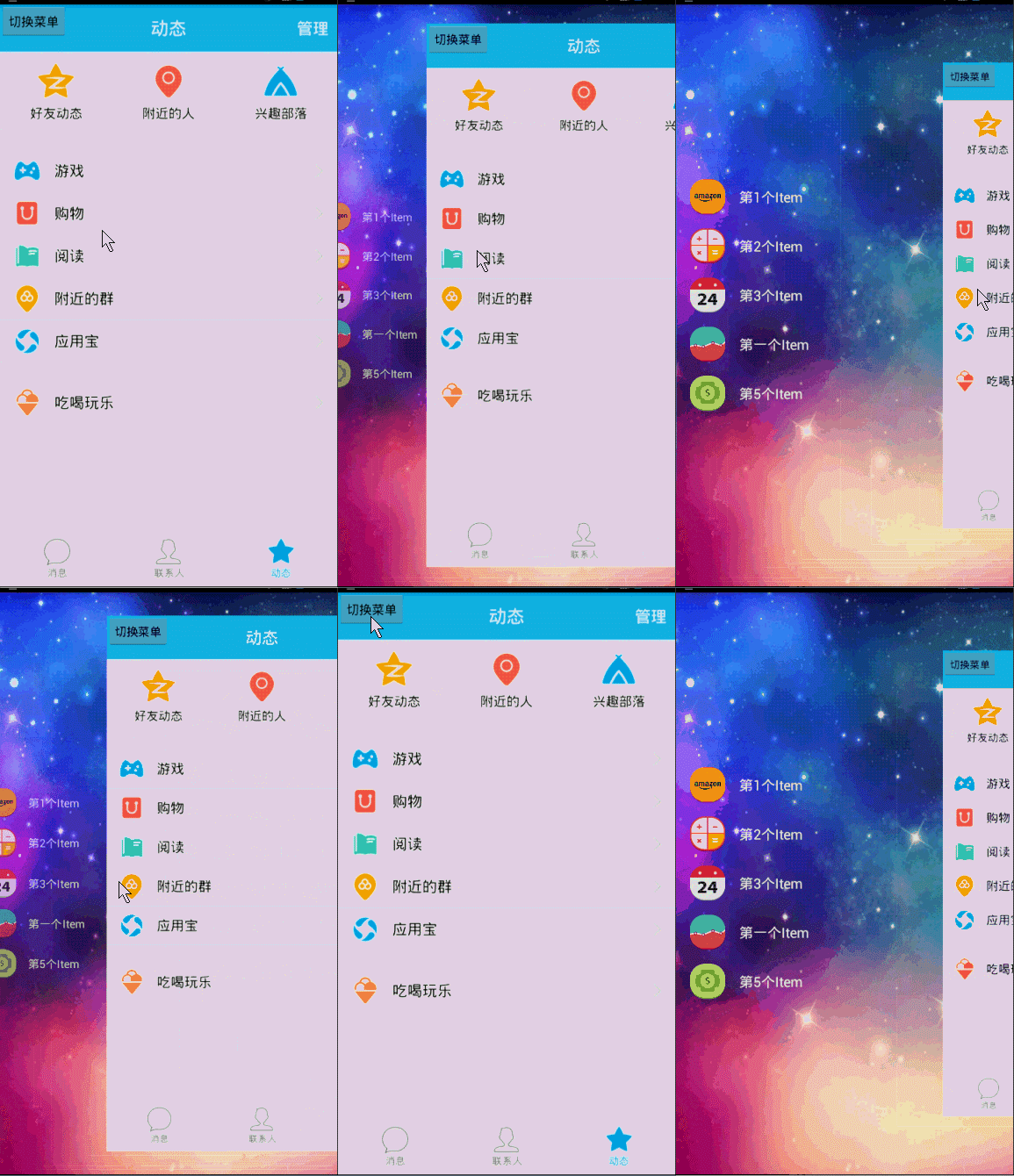
In the last blog, we realized that: Android Custom Controls Create the Simplest Side-Slide Menu in History Some brothers said after reading it, your sliding menu is out of date. ~QQ5.0's effect is not bad. ~Well, indeed, the last one also promised to slightly modify the code of the previous one to realize the QQ5.0 sliding menu. ~ Well, here we begin to show you how easy it is to write a sliding menu like QQ.
1. Principle analysis
Firstly, how far is the implementation of QQ from the next one?


The gap is still considerable.
Distinguish 1. The content area of QQ will be reduced with the appearance of menus.
The difference between QQ and QQ is that the sideslip menu gives the impression that it is hidden behind the content, not dragged out.
Distinguish 3. QQ's sideslip menu has a zoom and transparency effect~
So how can we do that?
For the difference 1: This is easy to do, we can constantly change the size of the content area while sliding; how to change it? During the whole process of menu appearing, it is a process from 0 to 1 to record the ratio of the width displayed by the menu to its total width, and then transform 0 to 1 to 0.7 (assuming that the content area is reduced to 0.7), and constantly reduce the content area.
For the difference 3: It's easier to do, the above can already get the value of 0 to 1, then zoom and transparency of the animation is not the case;
For Distinction 2: We use Horizontal ScrollView and then place menus and content horizontally. How can we hide menus behind content? In fact, it is also relatively simple. In the process of menu appearing, the offset of x direction of menu is set constantly; when 0 is completely hidden, when 0.3 is hidden, the offset of x direction is 0.7 width, and so on.~~~
Well, after the analysis, what is the best way to achieve these animations?
Don't even think about it. Attribute animation. If you don't know about attribute animation, you can refer to: Android Property Animation Complete Resolution (Part I) and Android Property Animation Complete Resolution (Part 2)
2. Realization
1. Preliminary code
The layout files are exactly the same as the last one. There will be no repetition of the code posting here. If you don't understand it, read the last one first.
Let's first look at the complete code we implemented in the previous article:
Horizontal ScrollView is used to monitor the ACTION_UP event. When the user raises his finger, he judges whether the menu is retracted or fully unfolded according to the width value displayed in the current menu; provides a right Padding attribute for the user to set the distance between the menu and the right screen; and provides several methods to open, close and switch out; and gives a detailed explanation of the next blog;
2. Ideas for Realization
Now we begin to solve those three differences. We have chosen to use attribute animation. Now we decide where the animation effect should be added.
Needless to say, I use my thighs to think that it should be in ACTION_MOVE. Yes, ACTION_MOVE can get the current getScrollX/mMenuWidth, constantly change the transparency of menus, zoom, X-direction offset, and constantly change the width and height of content area.
Say, I did it in MOVE at first, but there are two problems:
1. The animation effect is not very smooth, especially the menu, which has the effect of shaking.
2. After the user lifts it, it is necessary to continue the unfinished animation in UP. That is to say, your transparency and zooming Magic Horse need to change automatically after the user lifts it.
So, I started to change direction. Since it's SrollView, there must be a ScrollChanged method. It's really a good way to do it.
This method will trigger as long as scrollChanged, l is the scrollX we need. That's great.~~~
3. Calculation of Animation Proportion
In onScrollChanged, we get l, which is getScrollX, the width value that the menu has displayed.
By dividing with the width of the menu and hiding it in the menu to show the whole process, we can get a range of 1.0 to 0.0.
With this interval, you can set the animation according to this interval.
1. First, the scaling ratio of the content area is calculated.
We're going to let the content area change from 1.0 to 0.8 as the menu appears.~~
So how to convert 1.0-0.0 into 1.0-0.8 is very simple.
float rightScale = 0.8f + scale * 0.2f; (scale from 1 to 0), is that oh yeah?
Then there are three animations:
2. Calculating the Scaling Proportion of Menu
Looking closely at the next QQ, the menu scaling change is about 0.7-1.0.
float leftScale = 1 - 0.3f * scale;
3. The transparency ratio of menus:
We set it to 0.6 - 1.0; that is, 0.6f + 0.4f* (1 - scale)
4. The x-direction offset of the menu:
Look at QQ, not completely covered by the content area, or a little dragged out, so we set the offset as follows:
tranlateX = mMenuWidth * scale * 0.6f; let it hide a little at first~~~
4. Complete Implementation
Having said so much, it only takes a few lines of code to move from the simplest Sideslip in history to the effect of QQ5.0.~~
That's just a few lines. Nineold and ROIDS are used for attribute animation to maintain downward compatibility; the main thing is to set up various animations, which are described in detail above.~~~
Then, remember to declare the layout of our menu and content separately as our mMenu, mContent ~is gone, and change a few lines.~
3. Effect Map
A mule is a horse, pull it out and run away

The drag of ListView on the menu bar is not conflicting, as we have seen in the previous section. test ;
About the scope of animation attributes: the above description is particularly clear, such as content we are the smallest display 0.8, if you like 0.6, to modify it yourself; including offset, transparency and other areas;
Because the last article has written how to extract attributes into custom attributes; so there is no extraction here, otherwise it always feels like repetition.~
Well, recently there has been a sideslip for writing APP. It's like this: the menu bar is completely hidden under the content area, if you need to:

In fact, I like the effect.
Implemented by annotating a few lines of code:
Okay, although the final implementation looks very simple, it looks like, uh ~, but the process from scratch is not easy ~ ~various attempts, I can say that I even squat pit in QQ menu observation ~ha, laughed; blog also wrote out the failed attempts in the process, hoping to better let you learn some useful things in it ~ ~YEAH!! Let's leave a message. No more. I'll get a source code. Please leave your mailbox. Hey, hey, kidding.~