Bottom navigation bar
The bottom navigation bar is commonly used. At present, almost all commonly used apps use the bottom navigation bar to classify the content. The implementation of the bottom navigation bar is also relatively simple, which can be implemented in a user-defined way. Usually, each item is composed of an icon and title, and then control whether to click or not. Of course, you can also use the BottomNavigationView officially provided in the support package. For simple requirements, it is more convenient to use BottomNavigationView.
How to use BottomNavigationView
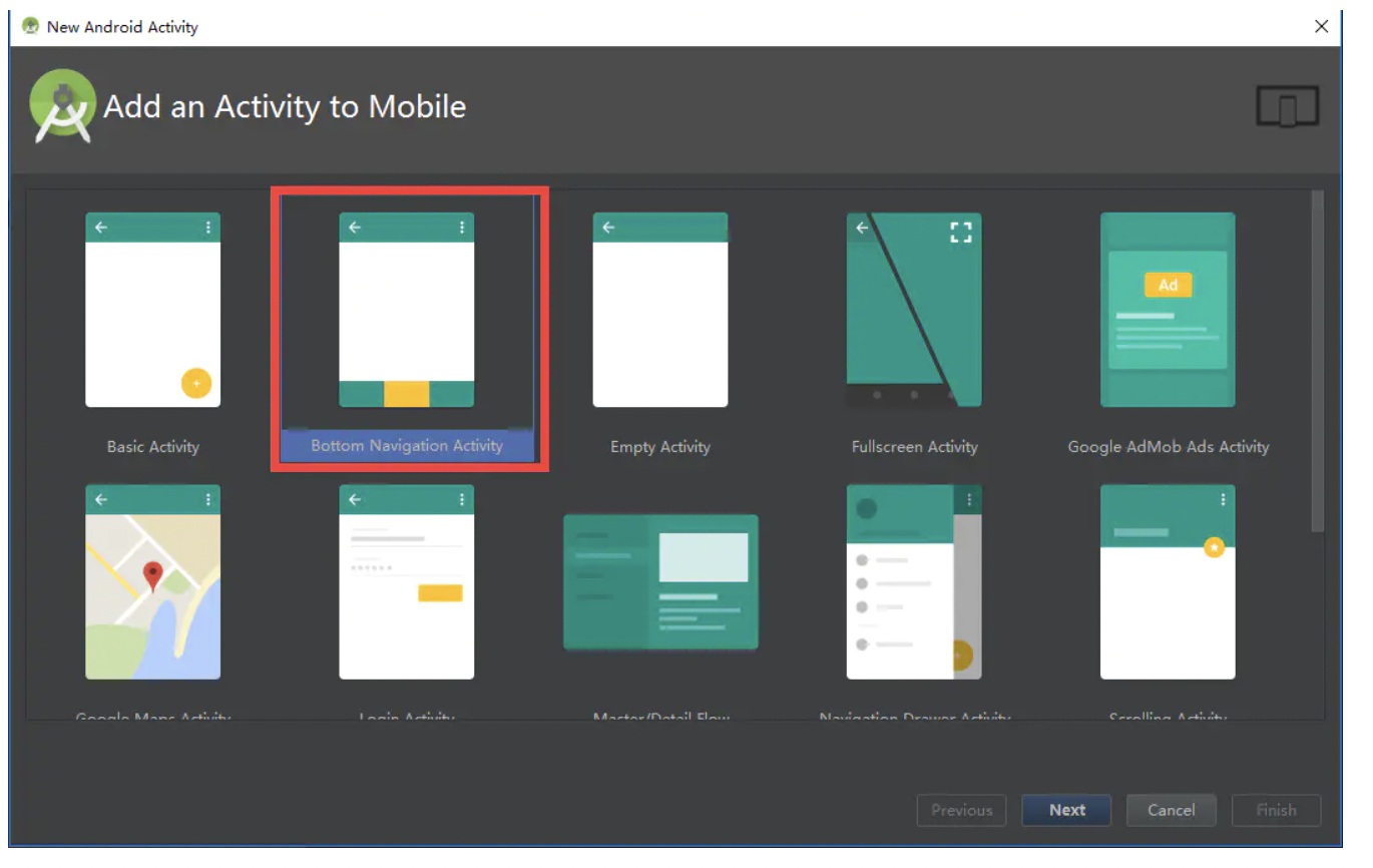
The access of BottomNavigationView is very simple. When creating an Activity, you can select the bottom navigation Activity and continue to next. AS will automatically help you create it.
At this time, AS will help you in the build. Of module Import the package of design in gradle: compile 'com android. support:design:26.+'
Three main files (some pictures and text resources) will be created:
    java/packagename/BottomNaviActivity.kt
    res/layout/activity_bottom_navi.xml
    res/menu/navigation.xml
navigation.xml is no different from ordinary menu resources. If you need to replace the icons and titles displayed on the navigation bar, just replace the icons and titles in the menu items.
    <menu xmlns:android="http://schemas.android.com/apk/res/android">

        <item
            android:id="@+id/navigation_home"
            android:icon="@drawable/ic_home_black_24dp"
            android:title="@string/title_home" />

        <item
            android:id="@+id/navigation_dashboard"
            android:icon="@drawable/ic_dashboard_black_24dp"
            android:title="@string/title_dashboard" />

        <item
            android:id="@+id/navigation_notifications"
            android:icon="@drawable/ic_notifications_black_24dp"
            android:title="@string/title_notifications" />

    </menu>
activity_bottom_navi.xml is the layout file of Activity. FrameLayout is generally used to place fragments
    <LinearLayout xmlns:android="http://schemas.android.com/apk/res/android"
        xmlns:app="http://schemas.android.com/apk/res-auto"
        xmlns:tools="http://schemas.android.com/tools"
        android:id="@+id/container"
        android:layout_width="match_parent"
        android:layout_height="match_parent"
        android:orientation="vertical"
        tools:context="com.fwl.base.BottomNaviActivity">

        <FrameLayout
            android:id="@+id/content"
            android:layout_width="match_parent"
            android:layout_height="0dp"
            android:layout_weight="1">

            <TextView
                android:id="@+id/message"
                android:layout_width="match_parent"
                android:layout_height="wrap_content"
                android:layout_marginBottom="@dimen/activity_vertical_margin"
                android:layout_marginLeft="@dimen/activity_horizontal_margin"
                android:layout_marginRight="@dimen/activity_horizontal_margin"
                android:layout_marginTop="@dimen/activity_vertical_margin"
                android:text="@string/title_home" />

        </FrameLayout>

        <android.support.design.widget.BottomNavigationView
            android:id="@+id/navigation"
            android:layout_width="match_parent"
            android:layout_height="wrap_content"
            android:layout_gravity="bottom"
            android:background="?android:attr/windowBackground"
            app:menu="@menu/navigation" />

    </LinearLayout>
The content in the Activity is also very simple. It mainly sets an OnNavigationItemSelectedListener for the object of BottomNavigationView to respond to the switching action.
    class BottomNaviActivity : AppCompatActivity() {

        private var mTextMessage: TextView? = null

        private val mOnNavigationItemSelectedListener = BottomNavigationView.OnNavigationItemSelectedListener { item ->
            when (item.itemId) {
                R.id.navigation_home -> {
                    mTextMessage!!.setText(R.string.title_home)
                    return@OnNavigationItemSelectedListener true
                }
                R.id.navigation_dashboard -> {
                    mTextMessage!!.setText(R.string.title_dashboard)
                    return@OnNavigationItemSelectedListener true
                }
                R.id.navigation_notifications -> {
                    mTextMessage!!.setText(R.string.title_notifications)
                    return@OnNavigationItemSelectedListener true
                }
            }
            false
        }

        override fun onCreate(savedInstanceState: Bundle?) {
            super.onCreate(savedInstanceState)
            setContentView(R.layout.activity_bottom_navi2)

            mTextMessage = findViewById(R.id.message) as TextView
            val navigation = findViewById(R.id.navigation) as BottomNavigationView
            navigation.setOnNavigationItemSelectedListener(mOnNavigationItemSelectedListener)
        }

    }
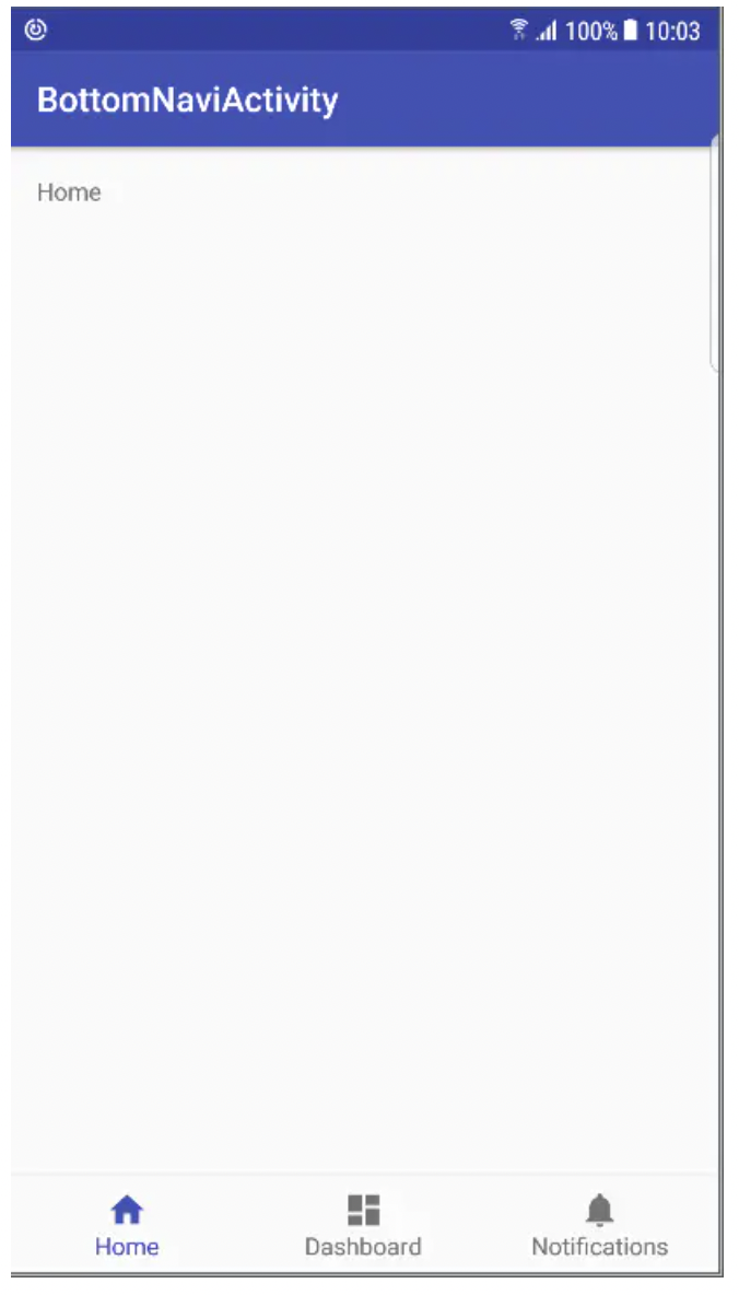
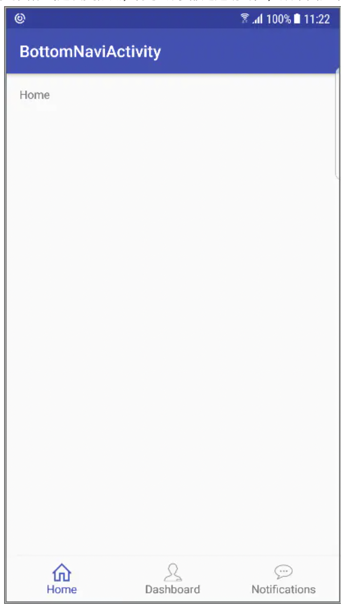
The above is all the code for the implementation of bottomnavigationview. You can switch pages in OnnavigationItemSelectedListener. The renderings are as follows:
If there are more than three menus, there is another effect:
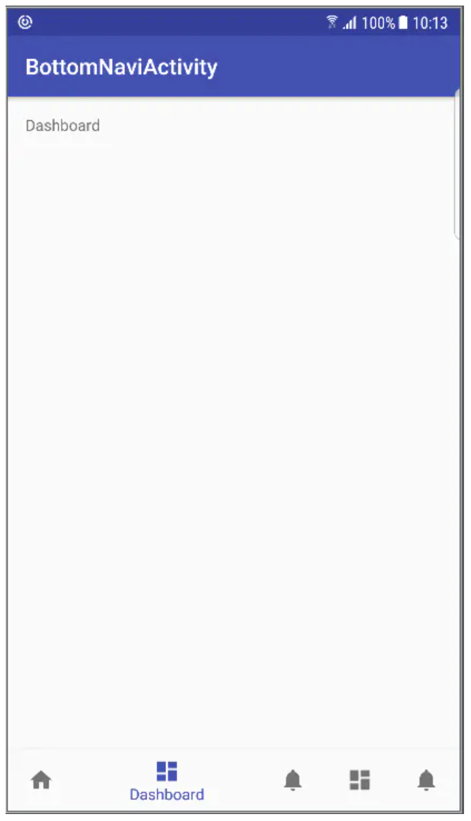
Five are already the limit. If there are more, it will collapse
individualization
Of course, our products can not be the same as the above effect. At least, the icon will not be like this. So how to change the style of icon and text?
Replace title
This has been mentioned when introducing the implementation of menu above. Just change the title in menu item.
change icon
The replacement icon was also mentioned when introducing the menu. AS can help you generate vertor icons. Theoretically, icons for various scenes are provided. But pay attention to the but here! AS automatically generates VectorDrawable for us. There is no problem in itself. Compared with png, it is small in size, but devices below 5.0 do not support, do not support
At present, the market below 5.0 can not be lost, so let's honestly replace it with png.
However, it is like this
Bottom Navigation icon error
Although I don't know why, I can be sure that my posture must be wrong, so I quickly turn to the source code. I don't know if I don't turn to it. I'm even more confused when I turn to it. The original implementation of this BottomNavigationView is so complex, but I still have to look at it. Let's sort out the steps of coloring icon.
First, when we do not set tintList for icon, BottomNavigationView will generate a default ColorStateList:
    private ColorStateList createDefaultColorStateList(int baseColorThemeAttr) {
            final TypedValue value = new TypedValue();
            if (!getContext().getTheme().resolveAttribute(baseColorThemeAttr, value, true)) {
                return null;
            }
            ColorStateList baseColor = AppCompatResources.getColorStateList(
                    getContext(), value.resourceId);
            if (!getContext().getTheme().resolveAttribute(
                    android.support.v7.appcompat.R.attr.colorPrimary, value, true)) {
                return null;
            }
            int colorPrimary = value.data;
            int defaultColor = baseColor.getDefaultColor();
            return new ColorStateList(new int[][]{
                    DISABLED_STATE_SET,
                    CHECKED_STATE_SET,
                    EMPTY_STATE_SET
            }, new int[]{
                    baseColor.getColorForState(DISABLED_STATE_SET, defaultColor),
                    colorPrimary,
                    defaultColor
            });
        }
You can see that the selected state is the colorPrimary used, while the unselected state is the default color used. This default color can be displayed through the property Android R.attr. Textcolorsecondary go to the source code to view. The results are consistent with the actual results
So the problem is, how can the picture become a small color block? Then look down, the icon color setting code, and enter the bottomnavigationmenuview Seticontintlist, bottomnavigationitemview Seticontintlist, and then called drawablecompat Settintlist finally calls drawable Settintlist, and the specific implementation is in bitmapdrawable setColorFilter.
Here is an article about setColorFilter You can refer to the introduction of. It's not difficult to explain why a small color block, what we make complaints about UED is actually not transparent, but white, white.
**So, focus** The periphery of the icon should be transparent! The periphery of the icon should be transparent!! The periphery of the icon should be transparent!!!
Non transparent areas will be colored. The coloring is divided into [android.R.attr.state_checked] and unchecked [- android.R.attr.state_checked]. Yes, I'm right, that's -- minus sign and minus sign
Now change to the transparent icon around (this time more thoroughly, except that the lines are transparent). The effect diagram is as follows:
Modify icon color
Now we basically know the precautions for changing the icon and the coloring process, so it's easy to change the color of the icon. Bottomnavigationview provides a custom property r.styleable BottomNavigationView_ Itemincontint, so add the attribute of itemincontint to the layout file
        <android.support.design.widget.BottomNavigationView
            android:id="@+id/navigation"
            android:layout_width="match_parent"
            android:layout_height="wrap_content"
            android:layout_gravity="bottom"
            android:background="?android:attr/windowBackground"
            app:itemIconTint="@color/color_state_menu_navi"
            app:itemTextColor="@color/color_state_menu_navi"
            app:menu="@menu/navigation" />
color_state_menu_navi.xml
    <selector xmlns:android="http://schemas.android.com/apk/res/android">
        <item android:color="#FF0000" android:state_checked="true"/>
        <item android:color="#00FF00" android:state_checked="false"/>
    </selector>
The effect picture is as follows (the color is somewhat exaggerated, please ignore):
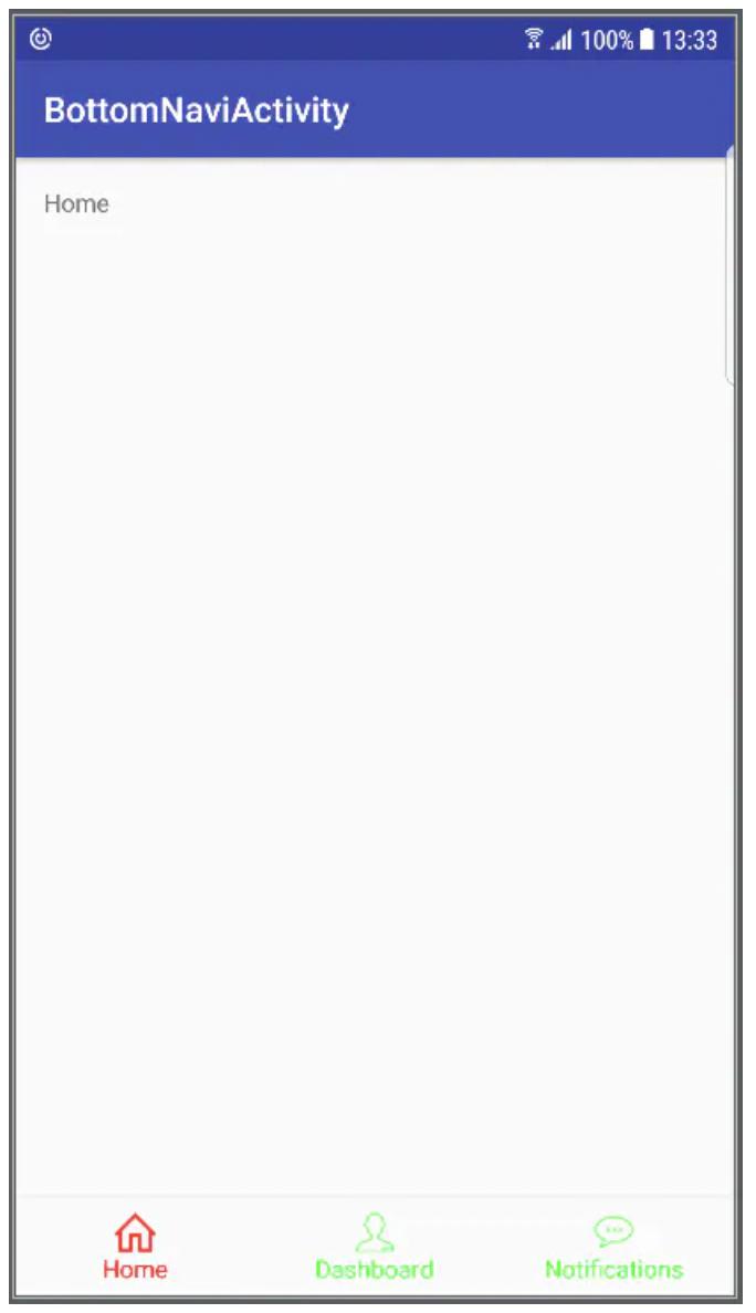
Set Bottom Navigation color
If it is implemented in code, this is the case
    private fun initNavigationColor() {
            val states = Array(2) { IntArray(1) }
            states[0][0] = -android.R.attr.state_checked
            states[1][0] = android.R.attr.state_checked
            val colors = IntArray(2)
            colors[0] = ContextCompat.getColor(this@BottomNaviActivity, android.R.color.red)
            colors[1] = ContextCompat.getColor(this@BottomNaviActivity, R.color.green)
            val csl = ColorStateList(states, colors)
            navigation.itemTextColor = csl
            navigation.itemIconTintList = csl
        }
Yes, you are right. The unchecked state is the selected state, preceded by a minus sign
Click effect
If you look carefully, you will find that when you click, the font and icon will shift a little: the font will become larger, and the icon will move up accordingly. In most cases, we do not need such an effect, so how to modify it?
After turning to the source code, I didn't provide an interface. Is there no way? Neither! Let's look at the layout file of item:
    <merge xmlns:android="http://schemas.android.com/apk/res/android">
        <ImageView
            android:id="@+id/icon"
            android:layout_width="24dp"
            android:layout_height="24dp"
            android:layout_gravity="center_horizontal"
            android:layout_marginTop="@dimen/design_bottom_navigation_margin"
            android:layout_marginBottom="@dimen/design_bottom_navigation_margin"
            android:duplicateParentState="true" />
        <android.support.design.internal.BaselineLayout
            android:layout_width="wrap_content"
            android:layout_height="wrap_content"
            android:layout_gravity="bottom|center_horizontal"
            android:clipToPadding="false"
            android:paddingBottom="10dp"
            android:duplicateParentState="true">
            <TextView
                android:id="@+id/smallLabel"
                android:layout_width="wrap_content"
                android:layout_height="wrap_content"
                android:textSize="@dimen/design_bottom_navigation_text_size"
                android:singleLine="true"
                android:duplicateParentState="true" />
            <TextView
                android:id="@+id/largeLabel"
                android:layout_width="wrap_content"
                android:layout_height="wrap_content"
                android:visibility="invisible"
                android:textSize="@dimen/design_bottom_navigation_active_text_size"
                android:singleLine="true"
                android:duplicateParentState="true" />
        </android.support.design.internal.BaselineLayout>
    </merge>
There are actually two textviews. Look at the implementation of the click response part in the BottomNavigationItemView
     if (checked) {
                    LayoutParams iconParams = (LayoutParams) mIcon.getLayoutParams();
                    iconParams.gravity = Gravity.CENTER_HORIZONTAL | Gravity.TOP;
                    iconParams.topMargin = mDefaultMargin + mShiftAmount;
                    mIcon.setLayoutParams(iconParams);
                    mLargeLabel.setVisibility(VISIBLE);
                    mSmallLabel.setVisibility(INVISIBLE);

                    mLargeLabel.setScaleX(1f);
                    mLargeLabel.setScaleY(1f);
                    mSmallLabel.setScaleX(mScaleUpFactor);
                    mSmallLabel.setScaleY(mScaleUpFactor);
                } else {
                    LayoutParams iconParams = (LayoutParams) mIcon.getLayoutParams();
                    iconParams.gravity = Gravity.CENTER_HORIZONTAL | Gravity.TOP;
                    iconParams.topMargin = mDefaultMargin;
                    mIcon.setLayoutParams(iconParams);
                    mLargeLabel.setVisibility(INVISIBLE);
                    mSmallLabel.setVisibility(VISIBLE);

                    mLargeLabel.setScaleX(mScaleDownFactor);
                    mLargeLabel.setScaleY(mScaleDownFactor);
                    mSmallLabel.setScaleX(1f);
                    mSmallLabel.setScaleY(1f);
                }
In other words, in the selected and unselected States, different textviews are displayed, and the distance between the icon and the upper margin is also different. First, let's look at the difference between the change of the upper margin of the icon in mShiftAmount, which is assigned in the constructor:
      int inactiveLabelSize =
                    res.getDimensionPixelSize(R.dimen.design_bottom_navigation_text_size);
            int activeLabelSize = res.getDimensionPixelSize(
                    R.dimen.design_bottom_navigation_active_text_size);
            mDefaultMargin = res.getDimensionPixelSize(R.dimen.design_bottom_navigation_margin);
            mShiftAmount = inactiveLabelSize - activeLabelSize;
It's clear that the value of mShiftAmount is the difference between the font sizes of the two textviews. It's simple. If the font sizes of the two textviews are the same, all the problems can be solved.
Although there is no interface to set font size, we can redefine R. dimension design_ bottom_ navigation_ text_ Size and r.dimension design_ bottom_ navigation_ The size of the two textviews is set by the value of margin.
So, just in values Add two new attributes to XML:
        <dimen name="design_bottom_navigation_active_text_size">14dp</dimen>
        <dimen name="design_bottom_navigation_text_size">14dp</dimen>
If you want to set the distance between icon and upper edge, you can also redefine r.dimension design_ bottom_ navigation_ Margin.