Examination platform: learning pass
Examination question type: single choice, judgment, multiple choice, filling in the blank, short answer and improving the procedure
Basic knowledge of wechat applet
Characteristics of applet
(1) No download required
(2) No upgrade required
(3) Short development cycle
(4) Low development cost
(5) Small volume
(6) Cross platform
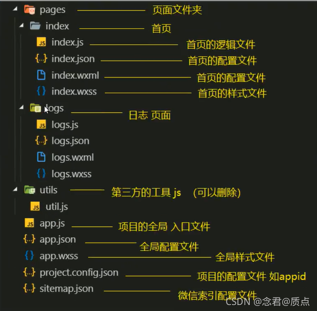
Basic structure of wechat applet
Global app Common settings of json and page json and the priority of global configuration and page configuration
An applet application contains two basic configuration files. One is the global app JSON and the page's own XXX json
Note: comments cannot appear in the configuration file
overall situation:
https://developers.weixin.qq.com/miniprogram/dev/reference/configuration/app.html
Page:
https://developers.weixin.qq.com/miniprogram/dev/reference/configuration/page.html
Master in app Set the usage of tabBar page in JSON
"tabBar": {
    "list": [{
      "pagePath": "", // Page Jump path
      "text": "",  // title
      "iconPath": "", // Picture with no icon selected
      "selectedIconPath": ""  //Picture of the selected icon
    }],
    "color": "#0094ff ", / / configure unselected text color
    "selectedColor": "#ff9400 "/ / the color of the selected text
  }
For more page configurations of tabBar, refer to the document:
https://developers.weixin.qq.com/miniprogram/dev/reference/configuration/app.html#tabBar
Execution timing of common life cycle functions
Application lifecycle:
(1) onLaunch listening applet initialization
(2) onShow monitoring applet starts or switches the foreground
(3) onHide monitoring applet switching background
Page lifecycle
(1) Triggered when the onload page loads
(2) Triggered when the onready page finishes rendering for the first time
(3) Triggered when Onshow page is displayed
(4) Triggered when onhide page is hidden
(5) Triggered when the onunload page is unloaded
Master the writing method and object of common events
For example: bindtap, bindsubmit, etc
The event object appears in the form of formal parameters of the event handling function, which is often represented by E. in particular, when adding events to a form or form element, the event object e is often used in the logic to be processed. For example, when adding a submit event to a form, it is displayed in e.detail Value stores the submitted data. Note that the form type attribute of the submit button should be set to submit
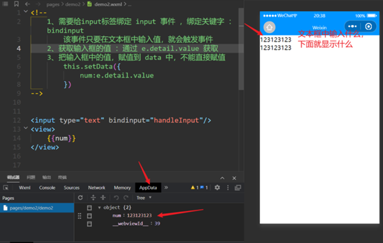
bindinput
wxml file
<input type="text" bindinput="handleInput"/>
<view>
    {{num}}
</view>
js file
Page({
   /**
   * Initial data of the page
   */
  data: {
    num:123
  },
  // Execution logic of input event of input box
  handleInput(e){
    // console.log(e.detail.value)
    this.setData({
      num:e.detail.value
    })
  }
})
bindtap
Take calculator as an example:
wxml file
<!--
    Bind click event: bindtap
    Parameters cannot be passed directly in events in applets, such as: handletap(1)
    Parameters are passed through custom attributes, such as: data-operation="{{-1}}"
    Event source
-->

<button bindtap="handletap" data-operation="{{1}}">+</button>
<button bindtap="handletap" data-operation="{{-1}}">-</button>
<view>
    {{num}}
</view>
js file
Page({

  /**
   * Initial data of the page
   */
  data: {
    num:0
  },
  handletap(e){
    //Get custom attribute operation
    //const declares a read-only constant. Once declared, the value of the constant cannot be changed.
    const operation = e.currentTarget.dataset.operation;
    this.setData({
      num:this.data.num+operation
    })
  }
})

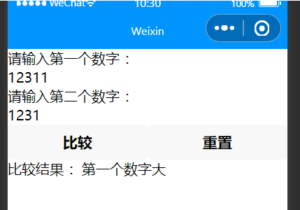
bindsubmit
Number to size case
wxml file
<!-- Compare size: through form -->
<form bindsubmit="compare">
  Please enter the first number:
  <input type="text" name="num1"/>
  Please enter the second number:
  <input type="text" name="num2"/>
  <view style="display:flex">
    <button form-type="submit">compare</button>
    <button form-type="reset">Reset</button>
  </view>
  <view>Comparison results:{{result}}</view>
</form>
js file
Page({
  /**
   * Initial data of the page
   */
  data: {
    result : ""
  },

  compare(e){
    // console.log(e)
    var str = ""
    var num1 = Number(e.detail.value.num1)
    var num2 = Number(e.detail.value.num2)
    if(num1>num2){
      str = "The first number is big"
    }else if (num1<num2){
      str = "The second number is big"
    }else{
      str = "The two numbers are the same"
    }
    this.setData({result:str})
  }
})
Master common components and component properties
Basic components
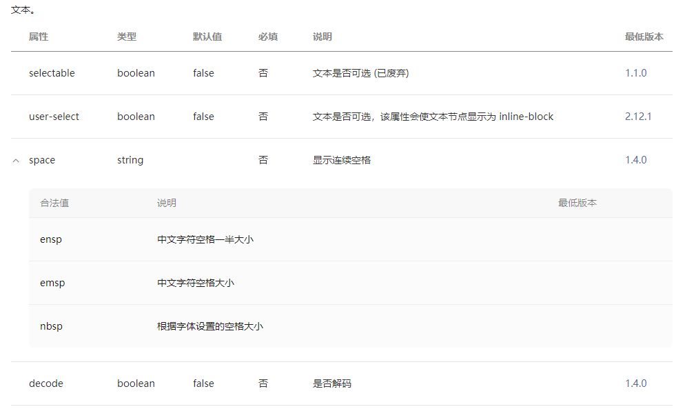
text
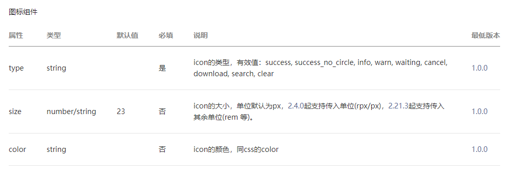
icon
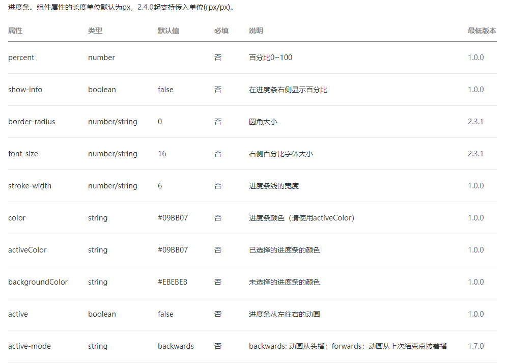
progress

Navigation components:
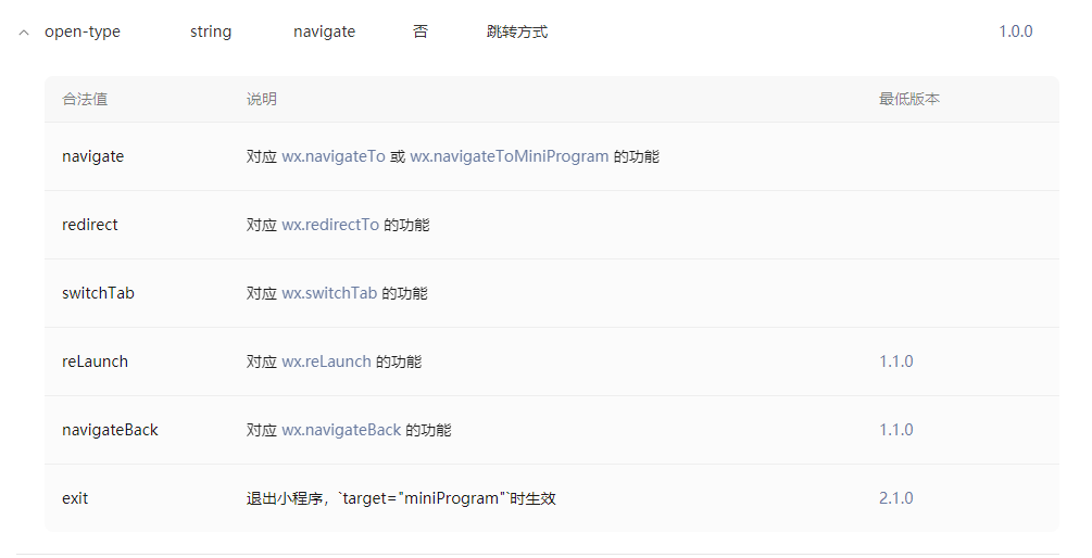
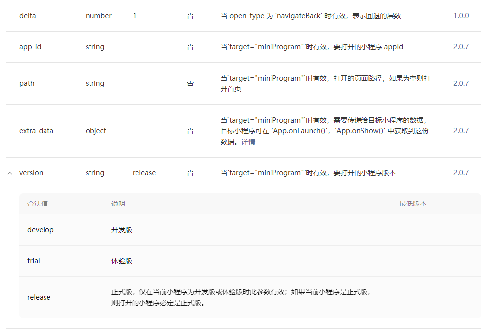
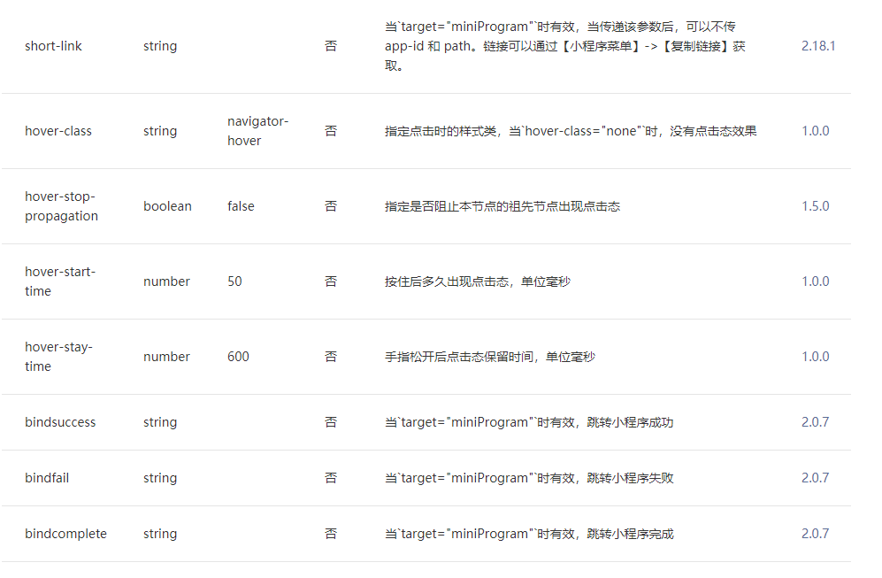
navigator

Media components:
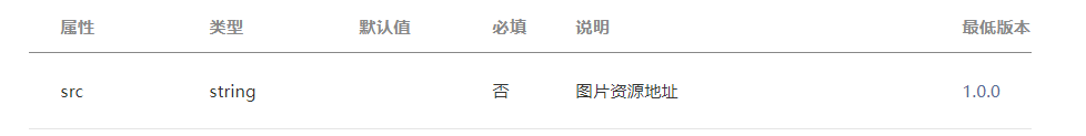
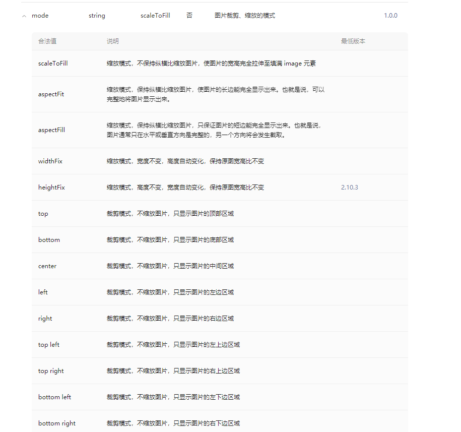
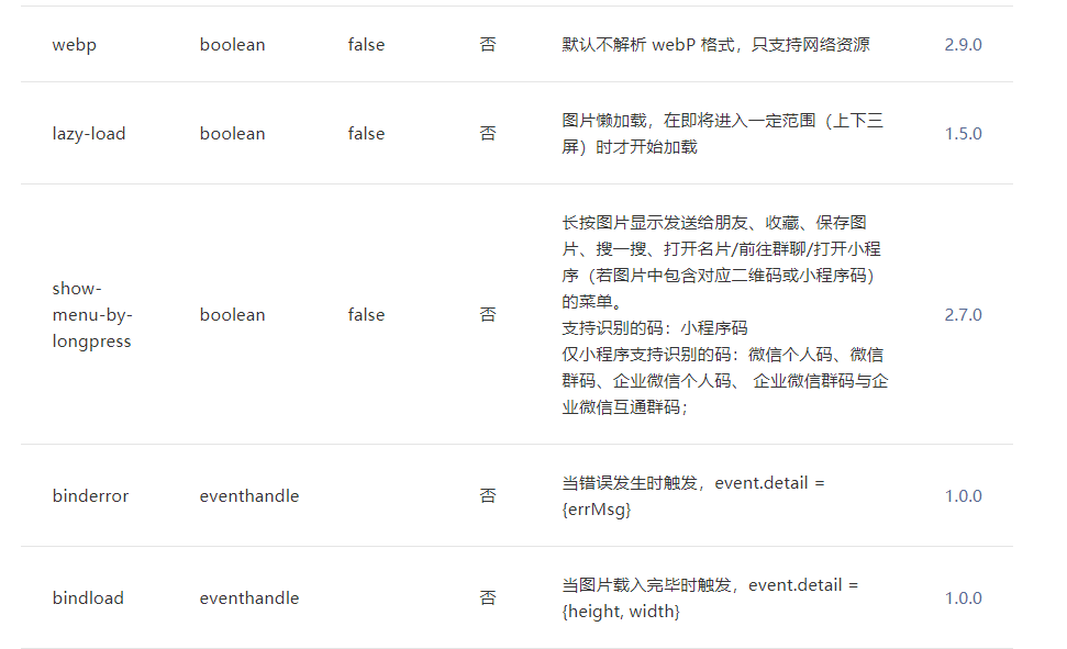
image
audio
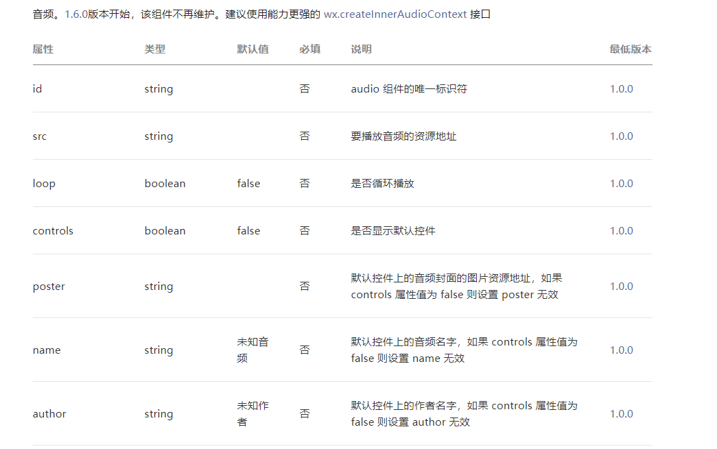
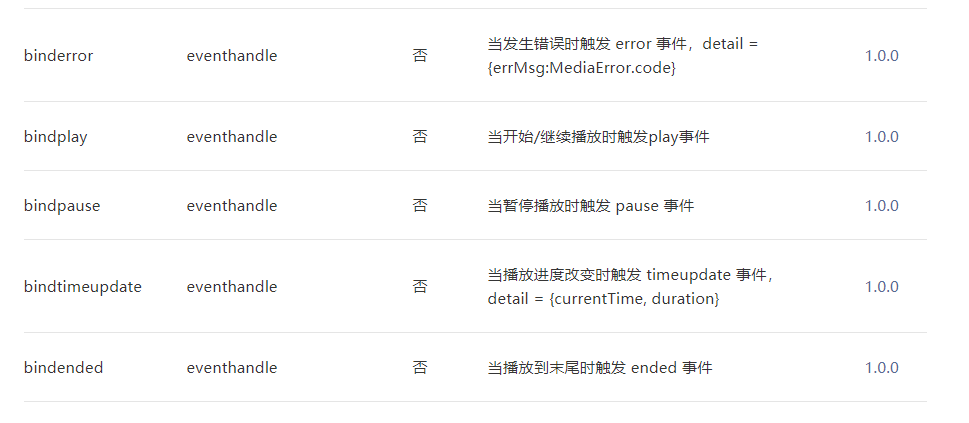
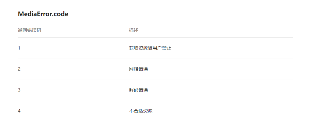
video
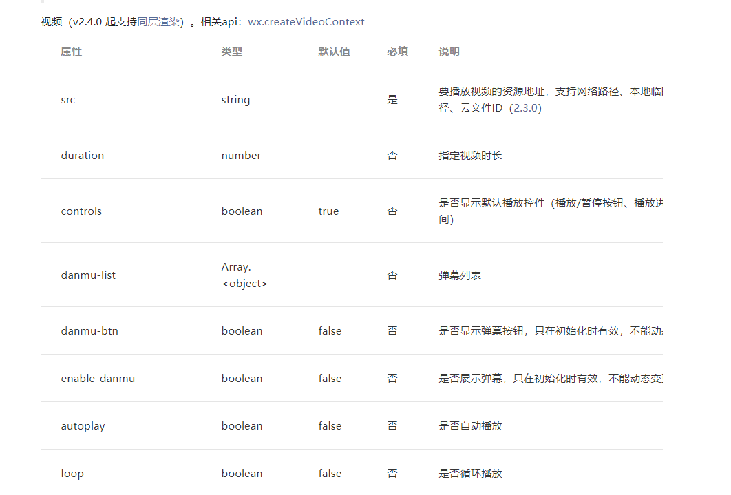
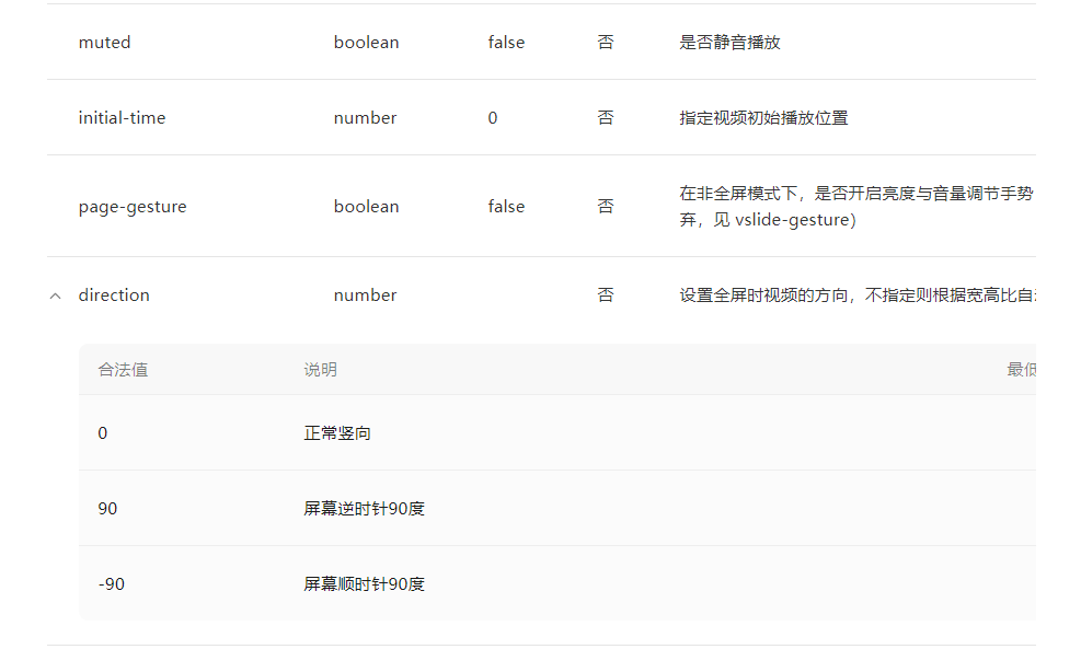
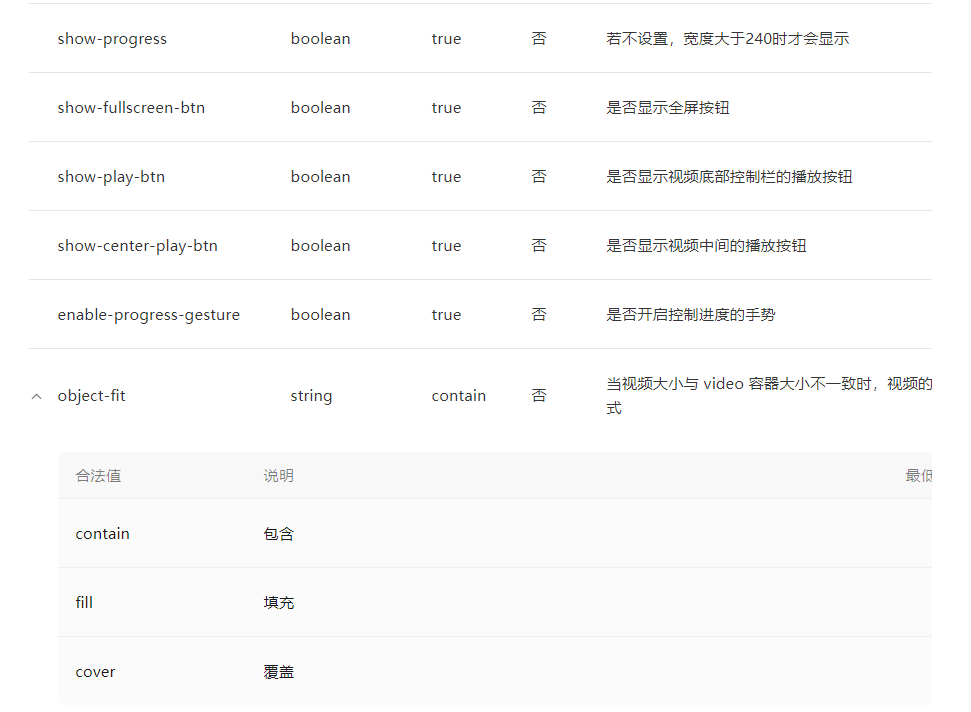
For other attributes, see:
https://developers.weixin.qq.com/miniprogram/dev/component/video.html
Map components:
map
https://developers.weixin.qq.com/miniprogram/dev/component/map.html
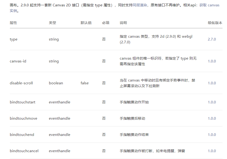
Canvas components:
canvas

Carousel component:
swiper
https://developers.weixin.qq.com/miniprogram/dev/component/swiper.html
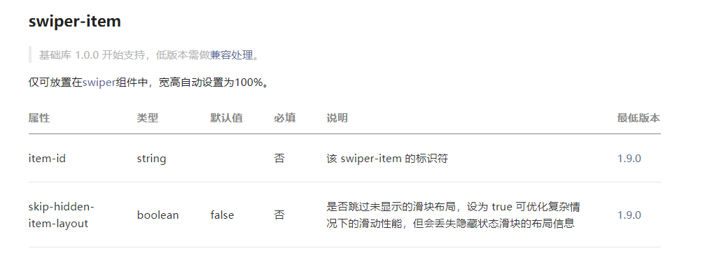
swiper-item
Form related components (special attention):
For example, form, input, radio, checkbox, picker, slider, textarea, button, label, etc
Document address:
https://developers.weixin.qq.com/miniprogram/dev/component/form.html
Data binding: {}
The binding is the attribute or variable defined in the data in the page js file
Basic binding
xxx.wxml file
<!--
1, text Equivalent to before web Medium span Tags, inline elements do not wrap
2, view Equivalent to before web Medium div Label, block elements wrap
-->
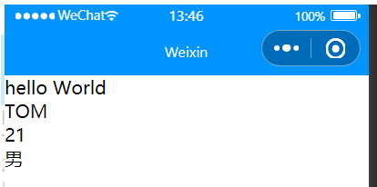
<view>{{msg}}</view>
<view>{{person.name}}</view>
<view>{{person.age}}</view>
<view>{{person.sex}}</view>
xxx.js file
Page({
  /**
   * Initial data of the page
   */
  data: {
    msg : "hello World",
    person:{
      name:"TOM",
      age:21,
      sex:"male"
    }
  }
})
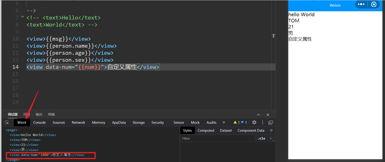
Property binding
xxx.wxml file
<view data-num="{{num}}">Custom properties</view>
xxx.js file
Page({
  /**
   * Initial data of the page
   */
  data: {
    num : 1000
  }
})
effect:
You can't see it on the page, but you can see it on the console
Conditional rendering: wx:if, wx:elif, wx:else
xxx.wxml
<!--
  conditional rendering
  1,wx:if="{{false/true}}"  by true Display label when false Do not display labels when
  2,wx:if="{{false/true}}"
    wx:elif="{{false/true}}"
    wx:else="{{false/true}}"
  3,hidden
    1,Add this attribute directly to the label hidden,This label is hidden
    2,hidden="{{false/true}}"
  Application scenario
    1,When the label is not displayed frequently, it is preferred to use it wx:if
      Remove tags directly from the page structure
    2,When the label is frequently switched and displayed, it is preferred to use it hidden
      By adding styles( display = none)To switch the display
 -->
<view>
  <view>conditional rendering </view>
  <view wx:if="{{true}}">display</view>
  <view wx:if="{{false}}">hide</view>

  <view hidden>hidden</view>
</view>
Note: using wx:if and setting the hidden attribute of the component can control the hiding and display of elements. What is the difference between them?
1. When the labels are not displayed frequently, wx:if is preferred to remove the labels from the page structure
2. When labels are frequently switched, hidden is preferred to switch the display by adding a style (display = none)

List rendering: wx:for, wx:key
Traverse the array data defined in data and render it to the component in the wxml file of the page
xxx.wxml
<!--
  List loop
  1,wx:for="{{Array or object}}"  wx:for-item="The name of the loop item" wx:for-index="Index of circular items"
  2,wx:key="Unique value" Used to improve the performance of list rendering
    1,wx:key When binding an ordinary string, the name of the string must be the only attribute of the object in the circular array.If you don't write, there will be a warning
    2,wx:key="*this" Indicates that the array is an ordinary array  *this Represents a circular item  [1,2,3,4,5]
    wx:key Set to*this"Is suitable for simple types of data
  3,When an array nesting loop occurs, pay particular attention to the binding name. Do not duplicate the name
    wx:for-item="The name of the loop item" wx:for-index="Index of circular items"
  4,By default, we don't write wx:for-item="item" wx:for-index="index"
    The applet will set the name of the circular item and the value of the index of the circular item to item and index
    When there is only one layer of circulation, wx:for-item="item" wx:for-index="index"Can be omitted
 -->

<view wx:for="{{list}}" wx:for-item="item" wx:for-index="index">
  {{index}}
  --
  {{item.name}}
</view>
xxx.js
Page({
  /**
   * Initial data of the page
   */
  data: {
    list:[{
      id:0,
      name : "Zhang San"
    },{
      id:1,
      name : "Li Si"
    },{
      id:2,
      name : "Wang Wu"
    }]
  }
})

Master the realization of the linkage effect between the customized tab and the rotation chart
(case of "music" applet in reference book)
be careful:
(1) Each view in the tab sets a custom attribute starting with data - to distinguish which tab item is clicked;
(2) current attribute of the wiper
Test example:
The effect of the index page of the applet project after running is shown in the figure below, and the complete index Wxml and index JS to complete the following functions:
(1) Click the text on the label at the top of the page, the text color will change to yellow, the line will change to red, and the corresponding color block will be displayed at the bottom;
(2) When sliding on the page color block, the corresponding text on the label turns yellow and the line turns red
wxml file
<view class="tab">
  <view class="tab-item {{item==0?'active':''}}" bindtap="changeItem" id="0">Pink</view>
  <view class="tab-item {{item==1?'active':''}}" bindtap="changeItem" id="1">green</view>
  <view class="tab-item {{item==2?'active':''}}" bindtap="changeItem" id="2">blue</view>
</view>
<swiper current="{{item}}"  bindchange="changeTab" circular="true">
  <swiper-item>
    <view style="background:pink;"></view>
  </swiper-item>
  <swiper-item>
    <view style="background:green;"></view>
  </swiper-item>
  <swiper-item>
    <view style="background:blue;"></view>
  </swiper-item>
</swiper>
wxss file
.tab {
  display: flex;
  background-color: #000;
  color: #fff;
}

.tab-item {
  flex: 1;
  font-size: 10pt;
  text-align: center;
  line-height: 72rpx;
  border-bottom: 6rpx solid #eee;
}

.active {
  color: yellow;
  border-bottom-color: red;
}

swiper {
  height: 400rpx;
}

swiper view {
  height: 100%;
}
js file
Page({
  data:{
      item:0
  },
  changeItem(e){
    this.setData({
     item:e.currentTarget.id
    })
  },
  changeTab(e){
    this.setData({
      item:e.detail.current
    })
  }
})