1, Foreword
- In the framework of UIKit, we often use UINavigationViewController to manage page push and pop, which is the basic operation of page management. When it comes to SwiftUI, the operation is completed by NavigationView and NavigationLink.
- This article starts with the basic application of NavigationView, and then adds how to flexibly use NavigationView to complete many more detailed requirements.
2, Basic concepts
- As shown below, a demo shows the basic applications of NavigationView and NavigationLink:
// NavigationView Basics
import SwiftUI

@main
struct iOS_testApp: App {
    var body: some Scene {
        WindowGroup {
            NavigationView {
                NavigationLink(
                    destination: Text("Destination"),
                    label: {
                        Text("Navigate")
                    })
            }
        }
    }
}
- In this example, a top-level View is provided, that is, NavigationView. In SwiftUI, NavigationView is equivalent to the UINavigationViewController of UIKit. It provides the top-level container of the whole page navigation environment. Under NavigationView is NavigationLink, which defines the View of this page and the View to be push ed (by clicking).
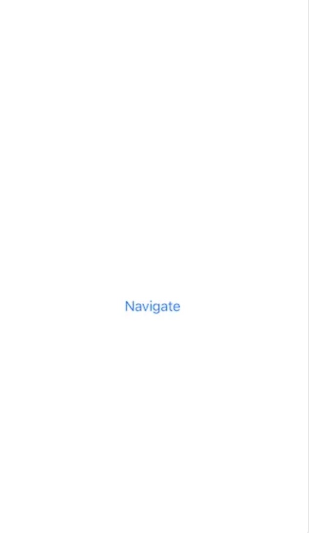
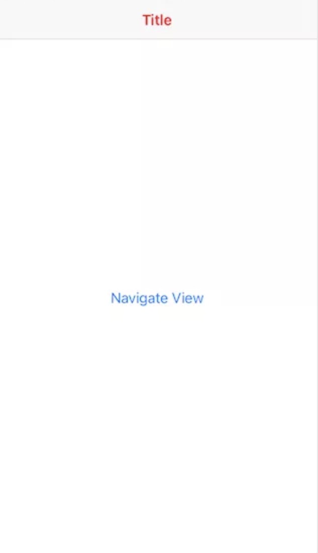
- For example, in the example, Text("Navigate") is the view of this page, and Text("Destination") is the view after clicking to jump. The main interface is as follows. Click Navigate to push:
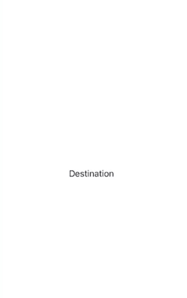
- Click Navigate to push the new interface Destination:
3, Set title block
- In the default display setting of NavigationView, the root level interface does not have a title bar, while the interface to be push ed returns with a title bar by default, but the title is empty. Pass The navigationBarTitle modifier property can set the title:
// NavigationView root interface with title bar
import SwiftUI

@main
struct iOS_testApp: App {
    var body: some Scene {
        WindowGroup {
            NavigationView {
                NavigationLink(
                    destination: Text("Destination"),
                    label: {
                        Text("Navigate")
                    })
                    .navigationBarTitle("Main", displayMode: .large)
            }
        }
    }
}
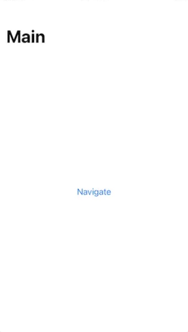
- The navigation interface with large title bar is as follows:
- displayMode is an enumeration type parameter, which supports inline, large and automatic, respectively indicating sub title bar, large title bar and automatic selection. If you select automatic, the general system will select large.
4, Hide title block
- In some cases, if you do not want to use the title bar, or do not like the title bar style provided by NavigationView, you are not satisfied with the customization flexibility it provides, but want to completely take over and implement the title bar by yourself. In this case, you can choose to hide the title bar and hide the title bar through navigationBarHidden(true) to complete:
// Hide destination title bar
import SwiftUI

@main
struct iOS_testApp: App {
    var body: some Scene {
        WindowGroup {
            NavigationView {
                NavigationLink(
                    destination: Text("Destination")
                                    // Hide the title bar of the secondary interface
                                    .navigationBarHidden(true),
                    label: {
                        Text("Navigate")
                    })
                    .navigationBarTitle("Main", displayMode: .automatic)
            }
        }
    }
}
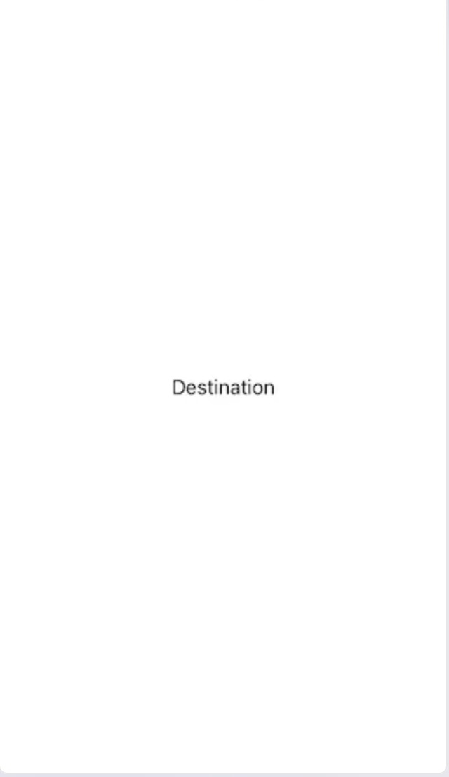
- The Destination interface of the title bar is hidden, as shown below:
5, Programming page return logic
- When the title bar of the secondary interface is hidden, don't we hide the return button of the title bar? What should we do to realize our own return button? At this time, we need to use the unique mechanism of SwiftUI: view Environment @ Environment, which provides the attribute binding service of view sharing. Through these attributes, we can complete the basic operation of the view. One attribute is presentationMode, which binds the context relationship between navigation pages, and can return to the page manually through its disass method:
// Realize the page return logic through programming
import SwiftUI

struct DestinationView: View {
    // Declaration property presentationMode
    @Environment(\.presentationMode) var presentationMode: Binding<PresentationMode>
    var body: some View {
        Text("Destination View")
            .navigationBarHidden(true) // After appending, the title bar of destination no longer appears
            .onTapGesture {
                // Click "Destination View" and return to
                self.presentationMode.wrappedValue.dismiss()
            }
    }
}

struct ContentView: View {
    var body: some View {
        NavigationView {
            NavigationLink(
                destination: DestinationView(),
                label: {
                    Text("Navigate View")
                })
        }
    }
}

@main
struct iOS_testApp: App {
    var body: some Scene {
        WindowGroup {
            ContentView()
        }
    }
}
- Note: this method will be replaced by the attribute disass after iOS 15.0, but considering that the mainstream system at the time of writing this article is iOS 14.5, for compatibility needs, we still use presentationMode to complete the code.
- In the above example, the secondary interface Text("Destination") is extracted into the DestinationView separately, and the ContentView is also proposed separately. By declaring @ Environment(.presentationMode), let DestinationView get the binding data of presentationMode attribute.
- Next, provide a click operation for Text("Destination View"): ontapgeture, and call self in the click implementation code presentationMode. wrappedValue. dismiss() .
- Run the program. Now you can go back and forth freely by clicking Navigate View and Destination View.
6, Title block style settings
- Now we know that NavigationView provides the basic elements of navigation and the default title bar of the system. We can hide the title bar to design the interface by ourselves. So when we want to use the default title bar, but want to change some styles, such as title color, what should we do?
- In fact, changing the style of the title bar is a global configuration in SwiftUI, that is, after one configuration, it will also take effect for all the title bars next to the runtime. This global configuration is through uinavigationbar Appearance().
- Modify the ContentView as follows:
// Set the title block title to red
struct ContentView: View {
    var body: some View {
        NavigationView {
            NavigationLink(
                destination: DestinationView(),
                label: {
                    Text("Navigate View")
                })
                .navigationBarTitle("Title", displayMode: .inline)
                .onAppear() {
                    // Set title color
                    UINavigationBar.appearance().titleTextAttributes = [.foregroundColor: UIColor.red]
                }
        }
    }
}
- As shown below, the title of the Navigation view title bar is red and the style is inline:
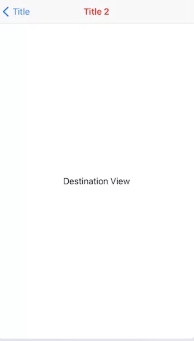
- When you run the application, you can find that the title is red. At the same time, this setting is also valid for DestinationView:
// Display the DestinationView title and find that it is red
struct DestinationView: View {
    @Environment(\.presentationMode) var presentationMode: Binding<PresentationMode>
    var body: some View {
        Text("Destination View")
            .navigationBarHidden(false) // Title block not hidden
            .navigationTitle("Title 2") // Append title
            .onTapGesture {
                self.presentationMode.wrappedValue.dismiss()
            }
    }
}
- Set the Destination View title bar to red:
7, Advanced: remove the interactive effects of clicking
- When running the sample program, it is easy to find that clicking on the Navigation view will produce an obvious gradient effect. On the other hand, it is also easy to find that the font color of the Navigation view is the classic iOS 7 blue, which is the default button effect. Some people think this effect is very good, but for applications developed by developers, due to different interface styles, The effect is not always appropriate. If you want to remove this effect, what should you do?
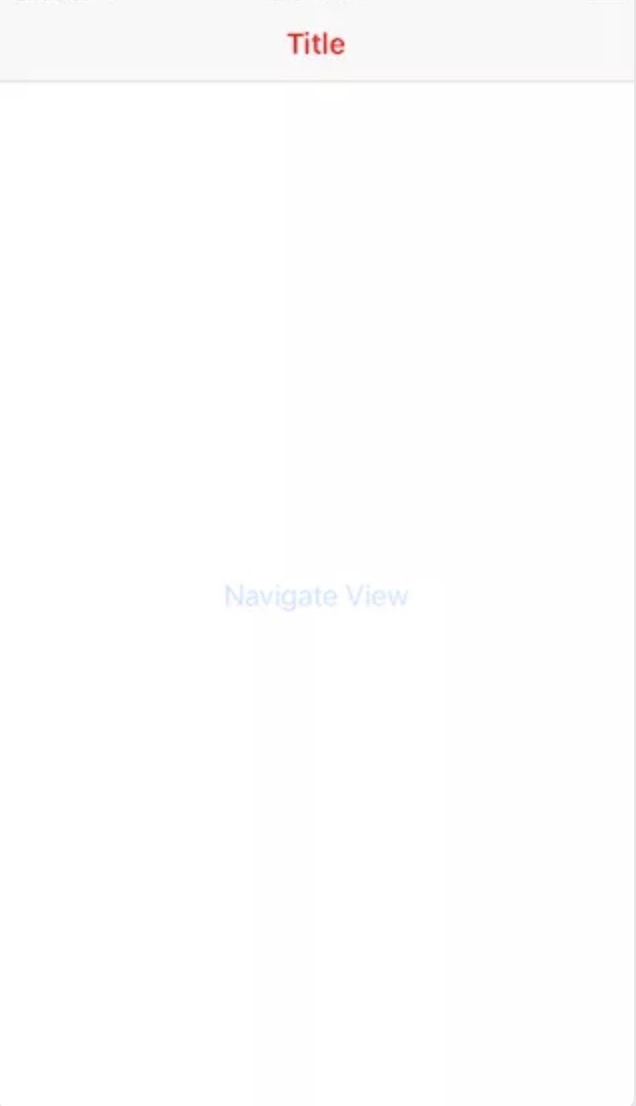
- The default display effect when Navigation view is pressed is as follows:
- At this time, the buttonStyle modifier is used. In SwiftUI, its complete declaration is as follows:
// Declaration of buttonStyle (not written by me)
extension View {
    public func buttonStyle<S>(_ style: S) -> some View where S : ButtonStyle
}
- This modifier is used to modify the Button style, and the passed in parameter ButtonStyle is defined by itself. That is to say, before that, you need to define a ButtonStyle Struct with the following code:
// Define a ButtonStyle and name it DefaultButtonStyle
struct DefaultButtonStyle: ButtonStyle {
    func makeBody(configuration: Self.Configuration) -> some View {
      configuration.label
        .background(configuration.isPressed ? Color.clear : Color.clear)
    }
}
- In this case, the background color is all changed to clear, developers can modify according to their own needs. The isPressed state attribute of configuration is also very useful. You can change the button vision according to the state. Next, set buttonStyle in ContentView:
// Set buttonStyle
struct ContentView: View {
    var body: some View {
        NavigationView {
            NavigationLink(
                destination: DestinationView(),
                label: {
                    Text("Navigate View")
                })
                .navigationBarTitle("Title", displayMode: .inline)
                // Set button style
                .buttonStyle(DefaultButtonStyle())
                .onAppear() {
                    UINavigationBar.appearance().titleTextAttributes = [.foregroundColor: UIColor.red]
                }
        }
    }
}
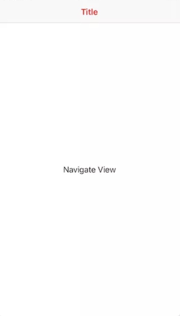
- When you run the application, you will find that the button style no longer has the original style effects. The "Navigation view" after eliminating the default effects is as follows:
8, Advanced: support more interaction than the default click
- So far, NavigationView and NavigationLink can meet most of our daily development needs. However, in some cases, we have richer requirements for product interaction. For example, in this example, NavigationLink supports click operation by default, but what if we want more operation responses, such as long press response?
- Start to try. First simplify the ContentView, remove some additional codes, and then add onlongpressgeture:
// Try joining onlongpressgeture
struct ContentView: View {
    var body: some View {
        NavigationView {
            NavigationLink(
                destination: DestinationView(),
                label: {
                    Text("Navigate View")
                        .onLongPressGesture {
                            print("long press")
                        }
                })
        }
    }
}
- Running the code, you can find that when you press and hold the Navigation view, it does print out "long press", but at the same time, the click response of NavigationLink also fails, which obviously does not meet our needs. The reason is that onLongPressGesture is supported, the button attribute of NavigationLink is also replaced by gesture with higher priority, and the button click function is no longer valid.
- How to support both long press and click? One solution provided here is to join the onTap operation:
// Click response is supported through onTapGesture
struct ContentView: View {
    var body: some View {
        NavigationView {
            NavigationLink(
                destination: DestinationView(),
                label: {
                    Text("Navigate View")
                        .onTapGesture {
                            print("tap")
                        }
                        .onLongPressGesture {
                            print("long press")
                        }
                })
        }
    }
}
- Run the code again. At this time, you can find that "tap" and "long press" can print correctly.