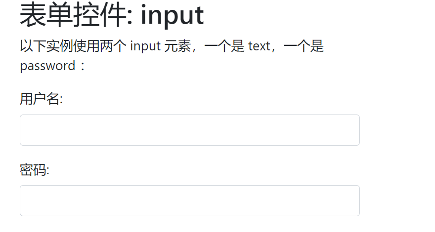
1: Input
Bootstrap supports all HTML5 input types: text, password, datetime, datetime-local,
date, month, time, week, number, email, url, search, tel, and color.
Note: If the type attribute of input is not properly declared, the style of the input box will not be displayed.
<!DOCTYPE html>
<html>
<head>
  <title>Bootstrap Example</title>
  <meta charset="utf-8">
  <meta name="viewport" content="width=device-width, initial-scale=1">
  <link rel="stylesheet" href="https://cdn.staticfile.org/twitter-bootstrap/4.1.0/css/bootstrap.min.css">
  <script src="https://cdn.staticfile.org/jquery/3.2.1/jquery.min.js"></script>
  <script src="https://cdn.staticfile.org/popper.js/1.12.5/umd/popper.min.js"></script>
  <script src="https://cdn.staticfile.org/twitter-bootstrap/4.1.0/js/bootstrap.min.js"></script>
</head>
<body>

<div class="container">
  <h2>form control: input</h2>
  <p>The following examples use two input Element, one is text,One is password : </p>
  <form>
    <div class="form-group">
      <label for="usr">User name:</label>
      <input type="text" class="form-control" id="usr">
    </div>
    <div class="form-group">
      <label for="pwd">Password:</label>
      <input type="password" class="form-control" id="pwd">
    </div>
  </form>
</div>

</body>
</html>
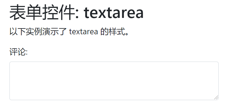
2: textarea
<div class="container">
  <h2>form control: textarea</h2>
  <p>The following example demonstrates this textarea Style.</p>
  <form>
    <div class="form-group">
      <label for="comment">comment:</label>
      <textarea class="form-control" rows="5" id="comment"></textarea>
    </div>
  </form>
</div>
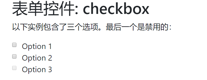
3: Check box
Checkboxes are used to allow users to choose from a set of preset options, one or more of which can be selected.
<div class="container">
  <h2>form control: checkbox</h2>
  <p>The following example contains three options. The last one is banned:</p>
  <form>
    <div class="form-check">
      <label class="form-check-label">
        <input type="checkbox" class="form-check-input" value="">Option 1
      </label>
    </div>
    <div class="form-check">
      <label class="form-check-label">
        <input type="checkbox" class="form-check-input" value="">Option 2
      </label>
    </div>
    <div class="form-check disabled">
      <label class="form-check-label">
        <input type="checkbox" class="form-check-input" value="" disabled>Option 3
      </label>
    </div>
  </form>
</div>
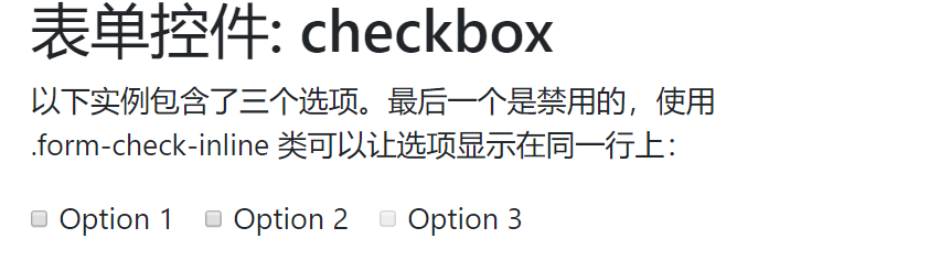
Use the. form-check-line class to display options on the same line:
<div class="container">
  <h2>form control: checkbox</h2>
  <p>The following example contains three options. The last one is disabled. Use .form-check-inline Class allows options to be displayed on the same line:</p>
  <form>
    <div class="form-check form-check-inline">
      <label class="form-check-label">
        <input type="checkbox" class="form-check-input" value="">Option 1
      </label>
    </div>
    <div class="form-check form-check-inline">
      <label class="form-check-label">
        <input type="checkbox" class="form-check-input" value="">Option 2
      </label>
    </div>
    <div class="form-check form-check-inline disabled">
      <label class="form-check-label">
        <input type="checkbox" class="form-check-input" value="" disabled>Option 3
      </label>
    </div>
  </form>
</div>
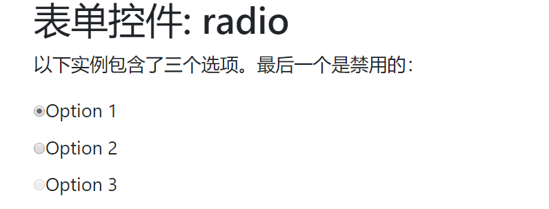
4: Radio
<div class="container">
  <h2>form control: radio</h2>
  <p>The following example contains three options. The last one is banned:</p>
  <form>
    <div class="radio">
      <label><input type="radio" name="optradio">Option 1</label>
    </div>
    <div class="radio">
      <label><input type="radio" name="optradio">Option 2</label>
    </div>
    <div class="radio disabled">
      <label><input type="radio" name="optradio" disabled>Option 3</label>
    </div>
  </form>
</div>
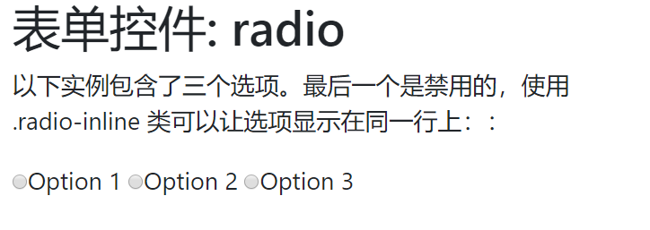
Using the. radio-inline class, you can display options on the same line:
<div class="container">
  <h2>form control: radio</h2>
  <p>The following example contains three options. The last one is disabled. Use .radio-inline Class allows options to be displayed on the same line::</p>
  <form>
    <label class="radio-inline"><input type="radio" name="optradio">Option 1</label>
    <label class="radio-inline"><input type="radio" name="optradio">Option 2</label>
    <label class="radio-inline"><input type="radio" name="optradio">Option 3</label>
  </form>
</div>
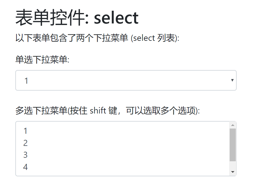
5: select drop-down menu
<div class="container">
  <h2>form control: select</h2>
  <p>The following form contains two drop-down menus (select list):</p>
  <form>
    <div class="form-group">
      <label for="sel1">Radio drop-down menu:</label>
      <select class="form-control" id="sel1">
        <option>1</option>
        <option>2</option>
        <option>3</option>
        <option>4</option>
      </select>
      <br>
      <label for="sel2">Multiple-choice drop-down menu(Hold down shift Key to select multiple options):</label>
      <select multiple class="form-control" id="sel2">
        <option>1</option>
        <option>2</option>
        <option>3</option>
        <option>4</option>
        <option>5</option>
      </select>
    </div>
  </form>
</div>