1, Introduction
Social media websites are popular. People often use comments to express their views. The comment function has become a part of the website.
2, Knowledge points
2.1 media objects
Official explanation: This is an abstract style used to build different types of components with images aligned to the left or right of the text content (such as blog comments or Twitter messages).
2.1.1 basic media objects
A basic media object consists of four parts:
- Media container: wrapped in the outermost layer with the style of media.
- Media object: it is often the user's Avatar or nickname, and the style is media object.
- Media body: the text content part of the wrapped media, with the style of media body.
- Media title: the title of media text content, with the style of media heading.
<!--Code part-->
<div class="media">
    <div class="media-left">
        <a href="#">
            <img src="img/header-animal-1.jpg" class="media-object">
        </a>
    </div>
    <div class="media-body">
        <h4 class="media-heading">I'm the title</h4>
        <p>I am a series of repeated contents; I am a series of repeated contents; I am a series of repeated contents; I am a series of repeated contents; I'm a lot of repetition.</p>
    </div>
</div>
        </div>
    </div>
</div>
design sketch:

The styles media left and media right are used to control the left and right placement of objects (avatars). To place objects (avatars) on the right, you need to put media right under media body.
<!--Code part-->
<div class="media">
    <div class="media-body">
        <h4 class="media-heading">I'm the title</h4>
        <p>I am a series of repeated contents; I am a series of repeated contents; I am a series of repeated contents; I am a series of repeated contents; I'm a lot of repetition.</p>
    </div>
    <div class="media-right">
        <a href="#">
            <img src="img/header-animal-1.jpg" class="media-object">
        </a>
    </div>
</div>
design sketch:

Of course, if you don't want to put it below, there is a feasible way. Use pull left and pull right instead of media left and media right.
<!--Code part-->
<div class="media">
    <div class="pull-left">
        <a href="#">
            <img src="img/header-animal-1.jpg" class="media-object">
        </a>
    </div>
    <div class="media-body">
        <h4 class="media-heading">I'm the title - left</h4>
        <p>I am a series of repeated contents; I am a series of repeated contents; I am a series of repeated contents; I am a series of repeated contents; I'm a lot of repetition.</p>
    </div>
</div>
<div class="media">
    <div class="pull-right">
        <a href="#">
            <img src="img/header-animal-1.jpg" class="media-object">
        </a>
    </div>
    <div class="media-body">
        <h4 class="media-heading">I'm the title - right</h4>
        <p>I am a series of repeated contents; I am a series of repeated contents; I am a series of repeated contents; I am a series of repeated contents; I'm a lot of repetition.</p>
    </div>
</div>
design sketch:
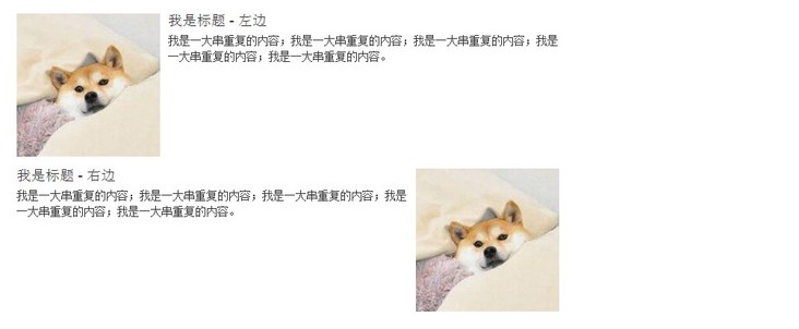
Note: official from v3 Version 3.0 is no longer recommended Pull left and Pull right.
2.1.2 multi tier media objects
When using social networking sites such as microblog, you often have to reply to other people's comments under other people's comments, which requires the nesting of media objects.
The way to use it is to nest the entire media container in the internal container media body of the superior.
<!--Code part-->
<div class="media">
    <div class="media-left">
        <a href="#">
            <img src="img/header-animal-1.jpg" class="media-object">
        </a>
    </div>
    <div class="media-body">
        <h4 class="media-heading">I'm the title - class a</h4>
        <p>I am a series of repeated contents; I am a series of repeated contents; I am a series of repeated contents; I am a series of repeated contents; I'm a lot of repetition.</p>
        <div class="media">
            <div class="media-left">
                <a href="#">
                    <img src="img/header-girl-3.jpg" class="media-object">
                </a>
            </div>
            <div class="media-body">
                <h4 class="media-heading">I'm the title - second level</h4>
                <p>I am a series of repeated contents; I am a series of repeated contents; I am a series of repeated contents; I am a series of repeated contents; I'm a lot of repetition.</p>
                <div class="media">
                    <div class="media-left">
                        <a href="#">
                            <img src="img/header-girl-2.jpg" class="media-object">
                        </a>
                    </div>
                    <div class="media-body">
                        <h4 class="media-heading">I'm the title - Tertiary</h4>
                        <p>I am a series of repeated contents; I am a series of repeated contents; I am a series of repeated contents; I am a series of repeated contents; I'm a lot of repetition.</p>
                    </div>
                </div>
            </div>
        </div>
    </div>
</div>
design sketch:

Although Bootstrap has no limit on the number of nesting layers, it can even be nested infinitely.
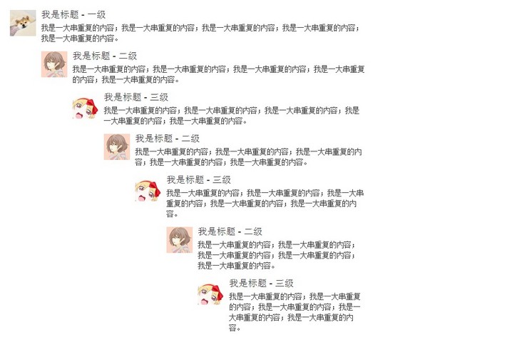
But generally speaking, two layers are enough in terms of aesthetics and organization.
2.1.3 alignment of media objects
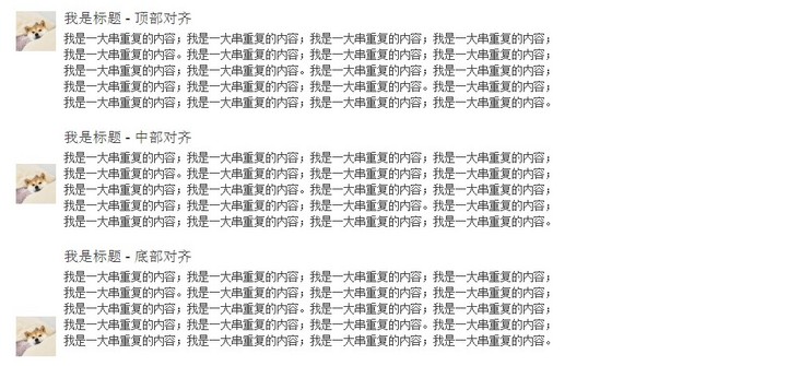
The default alignment of media objects (avatars) is top alignment. We can change the alignment by modifying the style. Usage: add media middle or media bottom to align the middle or bottom.
<!--Code part-->
<div class="media">
    <div class="media-left">
        <a href="#">
            <img src="img/header-animal-1.jpg" class="media-object">
        </a>
    </div>
    <div class="media-body">
        <h4 class="media-heading">I'm the title - Align Top </h4>
        <p>I am a series of repeated contents; I am a series of repeated contents; I am a series of repeated contents; I am a series of repeated contents; I'm a lot of repetition. I am a series of repeated contents; I am a series of repeated contents; I am a series of repeated contents; I am a series of repeated contents; I'm a lot of repetition. I am a series of repeated contents; I am a series of repeated contents; I am a series of repeated contents; I am a series of repeated contents; I'm a lot of repetition. I am a series of repeated contents; I am a series of repeated contents; I am a series of repeated contents; I am a series of repeated contents; I'm a lot of repetition.</p>
    </div>
</div>
<div class="media">
    <div class="media-left media-middle">
        <a href="#">
            <img src="img/header-animal-1.jpg" class="media-object">
        </a>
    </div>
    <div class="media-body">
        <h4 class="media-heading">I'm the title - Middle alignment</h4>
        <p>I am a series of repeated contents; I am a series of repeated contents; I am a series of repeated contents; I am a series of repeated contents; I'm a lot of repetition. I am a series of repeated contents; I am a series of repeated contents; I am a series of repeated contents; I am a series of repeated contents; I'm a lot of repetition. I am a series of repeated contents; I am a series of repeated contents; I am a series of repeated contents; I am a series of repeated contents; I'm a lot of repetition. I am a series of repeated contents; I am a series of repeated contents; I am a series of repeated contents; I am a series of repeated contents; I'm a lot of repetition.</p>
    </div>
</div>
<div class="media">
    <div class="media-left media-bottom">
        <a href="#">
            <img src="img/header-animal-1.jpg" class="media-object">
        </a>
    </div>
    <div class="media-body">
        <h4 class="media-heading">I'm the title - Align Bottom </h4>
        <p>I am a series of repeated contents; I am a series of repeated contents; I am a series of repeated contents; I am a series of repeated contents; I'm a lot of repetition. I am a series of repeated contents; I am a series of repeated contents; I am a series of repeated contents; I am a series of repeated contents; I'm a lot of repetition. I am a series of repeated contents; I am a series of repeated contents; I am a series of repeated contents; I am a series of repeated contents; I'm a lot of repetition. I am a series of repeated contents; I am a series of repeated contents; I am a series of repeated contents; I am a series of repeated contents; I'm a lot of repetition.</p>
    </div>
</div>
design sketch:
2.1.4 media object list
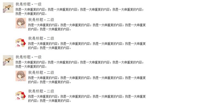
Comments are often a row of comments, that is, a list of comments. At this time, the familiar combination of < UL > + < li > will be used. Usage: wrap the outermost layer with element < UL > plus style media list, and use element < li > plus style media for each internal comment.
List with only one layer:
<!--Code part-->
<ul class="media-list">
<li class="media">
<div class="media-left">
<a href="#">
<img src="img/header-animal-1.jpg" class="media-object">
</a>
</div>
<div class="media-body">
<h4 class="media-heading">I'm the title</h4>
<p>I am a series of repeated contents; I am a series of repeated contents; I am a series of repeated contents; I am a series of repeated contents; I'm a lot of repetition.</p>
</div>
</li>
</ul>design sketch:

Two nested lists:
<!--Code part-->
<ul class="media-list">
    <li class="media">
        <div class="media-left">
            <a href="#">
                <img src="img/header-animal-1.jpg" class="media-object">
            </a>
        </div>
        <div class="media-body">
            <h4 class="media-heading">I'm the title - class a</h4>
            <p>I am a series of repeated contents; I am a series of repeated contents; I am a series of repeated contents; I am a series of repeated contents; I'm a lot of repetition.</p>
            <ul class="media-list">
                <li class="media">
                    <div class="media-left">
                        <a href="#">
                            <img src="img/header-girl-3.jpg" class="media-object">
                        </a>
                    </div>
                    <div class="media-body">
                        <h4 class="media-heading">I'm the title - second level</h4>
                        <p>I am a series of repeated contents; I am a series of repeated contents; I am a series of repeated contents; I am a series of repeated contents; I'm a lot of repetition.</p>
                    </div>
                </li>
                <li class="media">
                    <div class="media-left">
                        <a href="#">
                            <img src="img/header-girl-2.jpg" class="media-object">
                        </a>
                    </div>
                    <div class="media-body">
                        <h4 class="media-heading">I'm the title - second level</h4>
                        <p>I am a series of repeated contents; I am a series of repeated contents; I am a series of repeated contents; I am a series of repeated contents; I'm a lot of repetition.</p>
                    </div>
                </li>
            </ul>
        </div>
    </li>
    <li class="media">
        <div class="media-left">
            <a href="#">
                <img src="img/header-animal-1.jpg" class="media-object">
            </a>
        </div>
        <div class="media-body">
            <h4 class="media-heading">I'm the title - class a</h4>
            <p>I am a series of repeated contents; I am a series of repeated contents; I am a series of repeated contents; I am a series of repeated contents; I'm a lot of repetition.</p>
            <ul class="media-list">
                <li class="media">
                    <div class="media-left">
                        <a href="#">
                            <img src="img/header-girl-3.jpg" class="media-object">
                        </a>
                    </div>
                    <div class="media-body">
                        <h4 class="media-heading">I'm the title - second level</h4>
                        <p>I am a series of repeated contents; I am a series of repeated contents; I am a series of repeated contents; I am a series of repeated contents; I'm a lot of repetition.</p>
                    </div>
                </li>
                <li class="media">
                    <div class="media-left">
                        <a href="#">
                            <img src="img/header-girl-2.jpg" class="media-object">
                        </a>
                    </div>
                    <div class="media-body">
                        <h4 class="media-heading">I'm the title - second level</h4>
                        <p>I am a series of repeated contents; I am a series of repeated contents; I am a series of repeated contents; I am a series of repeated contents; I'm a lot of repetition.</p>
                    </div>
                </li>
            </ul>
        </div>
    </li>
</ul>
design sketch:
3, Actual combat
Make a comment list of Douban diary with Bootstrap media object knowledge.

Demo address: https://mazey.cn/bootstrap-blueprints/lesson-fourth-comment/index.html , source code address: https://github.com/mazeyqian/bootstrap-blueprints/tree/master/lesson-fourth-comment.
Copyright notice
All original articles of this blog are copyrighted by the author. Reprint must include this statement, keep this article complete, and indicate the author in the form of hyperlink Post Division And the original address of this article: https://blog.mazey.net/2613.html
(end)