1, Introduction
Single page has simple structure and clear layout. It is often used as the download introduction page of mobile App or a product. Now, the whole display web page tends to single page website design, so that the core information can be displayed at one time, which is more intuitive and simple for users and can quickly understand a product.
2, Knowledge points
2.1 rolling monitoring
Scroll monitoring uses the JavaScript plug-in of Bootstrap to automatically update the selected navigation bar according to the position of the scroll bar.
Scrolling monitoring is generally used in conjunction with the navigation bar. Here we first refer to the navigation bar with secondary navigation. And add the style navbar fixed top to the navigation bar so that it is fixed at the top and does not move with the scroll bar, but it will cover part of the content on the body, so add the style padding top to the body at the same time: 60px.
<!--Code part-->
<nav class="navbar navbar-default navbar-fixed-top" role="navigation" id="nav-menu">
    <div class="container">
        <div class="navbar-header">
            <!--The following is a fixed writing method, which can be copied and pasted when used-->
            <button class="navbar-toggle" type="button" data-toggle="collapse" data-target="#navigation-collapse">
                <span class="sr-only">Toggle Navigation</span>
                <span class="icon-bar"></span>
                <span class="icon-bar"></span>
                <span class="icon-bar"></span>
            </button>
            <a href="#" class="navbar-brand">LOGO</a>
        </div>
        <div class="collapse navbar-collapse" id="navigation-collapse">
            <ul class="nav navbar-nav">
                <li><a href="#first">Navigation First</a></li>
                <li><a href="#second">Navigation Second</a></li>
                <li><a href="#third">Navigation Third</a></li>
                <li><a href="#fourth">Navigation Fourth</a></li>
                <li class="dropdown">
                    <a href="#" class="dropdown-toggle" data-toggle="dropdown" role="button" aria-haspopup="true" aria-expanded="false">
                        Navigation Fifth <span class="caret"></span>
                        <ul class="dropdown-menu">
                            <li><a href="#sub-first">Sub-Navigation First</a></li>
                            <li><a href="#sub-second">Sub-Navigation Second</a></li>
                            <li><a href="#sub-third">Sub-Navigation Third</a></li>
                        </ul>
                    </a>
                </li>
            </ul>
        </div>
    </div>
</nav>
Because there are five navigation, the following five content carriers should be given accordingly. The only thing to note here is that the id attribute of each carrier should be navigated in the href = "#?" Corresponding, otherwise you won't see the effect.
<!--Code part-->
<div class="container-fluid scrollspy">
    <div id="first" class="bg-primary">
        <p>first</p>
    </div>
    <div id="second" class="bg-success">
        <p>second</p>
    </div>
    <div id="third" class="bg-info">
        <p>third</p>
    </div>
    <div id="fourth" class="bg-warning">
        <p>fourth</p>
    </div>
    <div id="fifth" class="bg-danger">
        <p id="sub-first" class="bg-success">Sub-Navigation First</p>
        <p id="sub-second" class="bg-info">Sub-Navigation Second</p>
        <p id="sub-third" class="bg-warning">Sub-Navigation Third</p>
    </div>
</div>
Trigger monitoring depends on the attribute id = "nav menu" of < NAV > element. The effect of scrolling monitoring is that when the scroll bar of its container changes, the navigation bar corresponding to its ID will respond accordingly with the visual change of the content of the carrier. The scroll bar here corresponds to the body element, so add the attributes data spy = "scroll" and data target = "#nav menu" (the value here corresponds to the ID value of navigation) to the body element, and add the relative positioning style position: relative. At this time, the first navigation part cannot be reasonably located when moving to the top, because the body element is given an inner margin of 60px. Here, an attribute data offset = "60" is added to the body element to make the scroll monitor have an offset relative to the top when calculating the scroll position. Example: < body data spy = "scroll" data target = "#nav menu" data offset = "60" >.
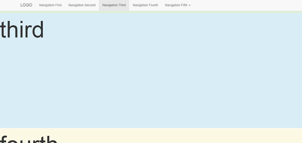
First level navigation rendering:
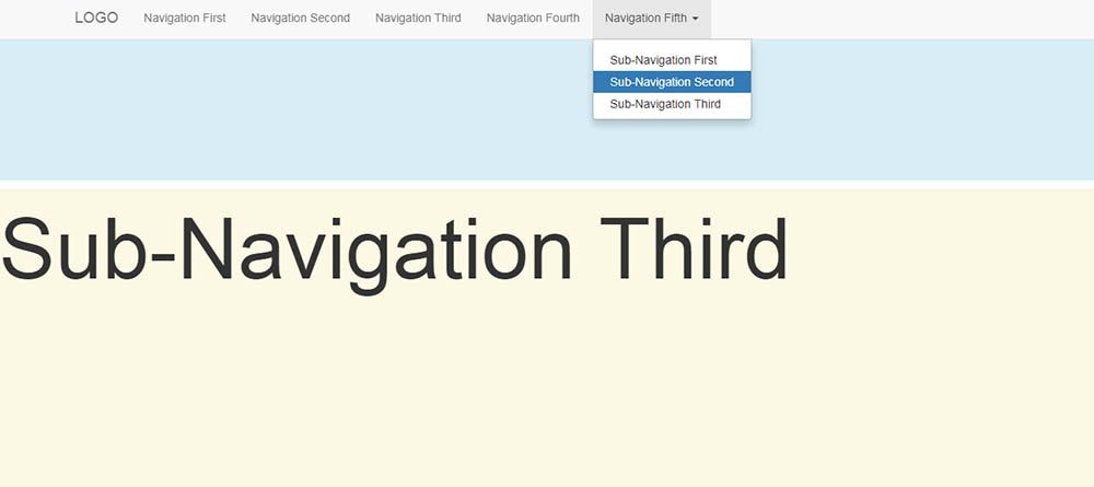
Secondary navigation rendering:
2.2 customization
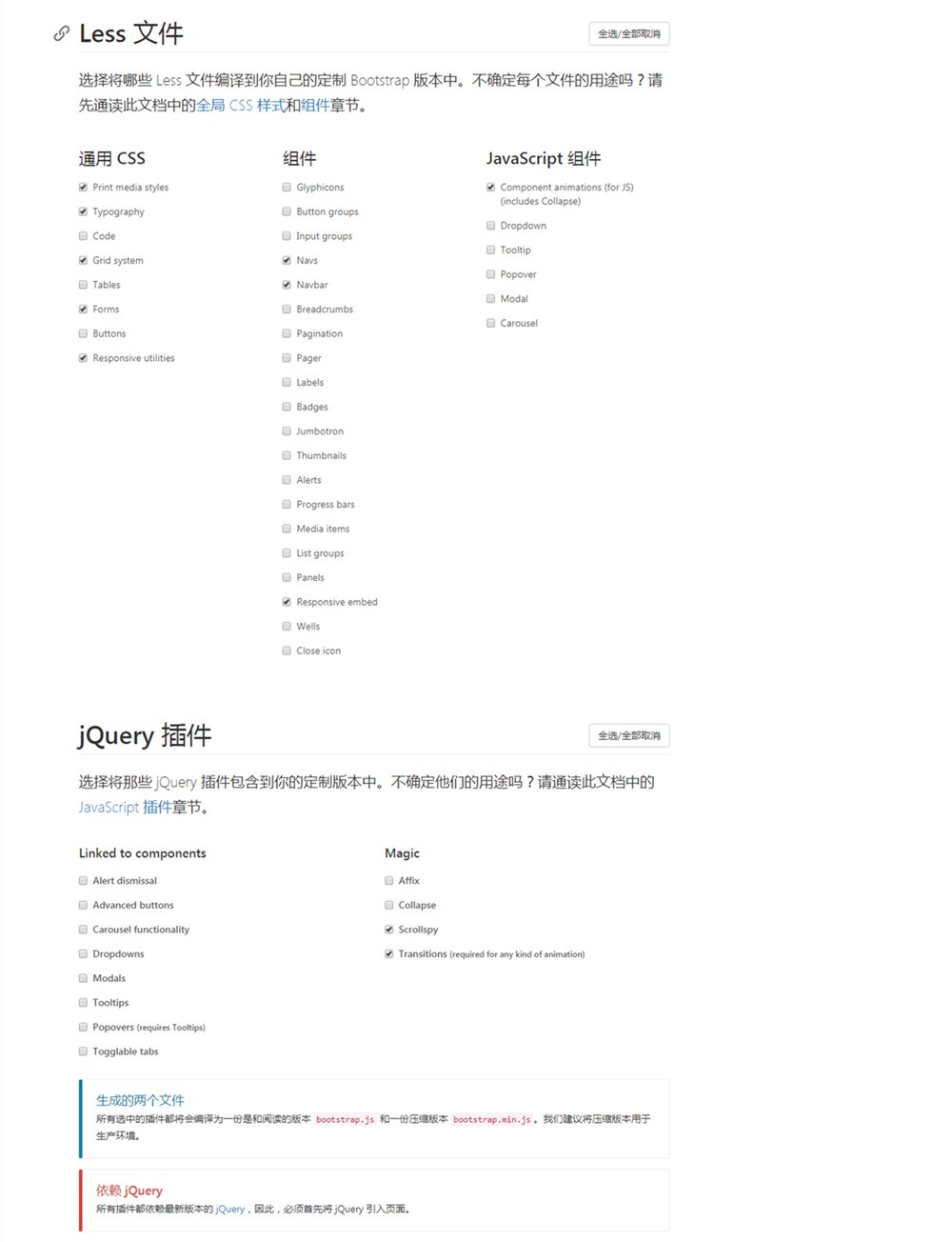
Although the downloaded Bootstrap source code has been compressed, it is still hundreds of k in size. Can you remove unnecessary CSS styles and JavaScript functions? Bootstrap Chinese network This function has been provided.
You can set your own needs on the customized page of the official website:
- General CSS
- assembly
- JavaScript component
- jQuery plug-in
For example, scrolling monitoring only requires navigation bar components, basic CSS styles and Scrollspy JavaScript plug-ins. You can only select what you need here and leave others blank.
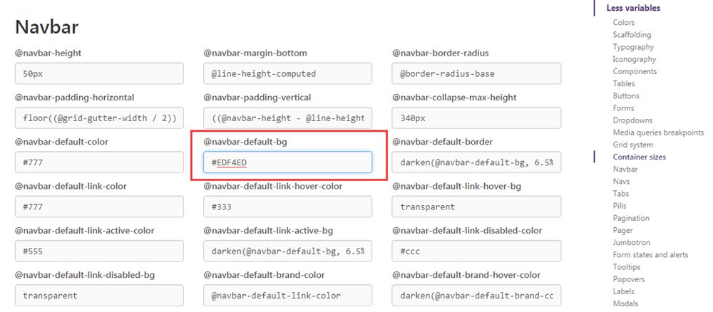
Before, if you want to change the default properties of Bootstrap CSS, you can either find it in the source code and modify it, or write styles in your own CSS to overwrite it, for example: navbar-default { background-color: #EDF4ED; }. In the customized page, CSS styles can not only be filtered, but also the default properties can be changed. For example, change the background color of the navigation bar and modify it directly under the property @navbar-default-bg.
After the modification is completed according to your own ideas, click [compile and download] at the bottom of the page to complete it. At this time, the size of CSS + JS has become about 50k, and then it can be referenced according to the conventional method.
3, Actual combat
Use the Bootstrap scrolling monitoring and customization functions to make a single page introducing Douban App.

Demo address: https://mazey.cn/bootstrap-blueprints/lesson-fifth-singlepage/index.html , source code address: https://github.com/mazeyqian/bootstrap-blueprints/tree/master/lesson-fifth-singlepage.
Copyright notice
All original articles of this blog are copyrighted by the author. Reprint must include this statement, keep this article complete, and indicate the author in the form of hyperlink Post Division And the original address of this article: https://blog.mazey.net/2671.html
(end)