Introduction to BootStrap
Bootstrap It is the most popular front-end open source tool library in the world. It supports Sass hybrid, responsive matrix system and its own library component and component JavaScript. Bootstrap provides powerful functions that enable you to quickly design and customize your website.
Use Bootstrap CDN and one of the simplest fast Bootstrap. Bostrap is the world's most popular front-end framework for manufacturing responsive templates and mobile device priority WEB sites.
BootStrap Chinese official website
Chapter 1 BootStrap4 Basics
Download Bootstrap to get the compiled CSS and JavaScript files, as well as the source code. Or use the package manager you are good at (npm, RubyGems, etc.) to load Bootstrap.
Compiled CSS and JS files
Download bootstrap 5.0, so you can easily add it directly to your precompiled version 4, including:
The compiled and compressed (minified) CSS file (see CSS file comparison) the compiled and compressed (minified JavaScript plug-in) does not contain the JavaScript dependencies of the document, source file or plug-in (jQuery and Popper.js).
1.1 BootStrap layout
Containers
Container is the most basic layout element in bootstrap. Container is required when using the default grid system of bootstrap. Containers are used to hold, fill, and center content. Containers can be nested, but most layouts do not require nested containers.
Bootstrap comes with three different containers:
.container: it max-width Set one at each response breakpoint
.container-fluid: This is width: 100%All breakpoints
.container-{breakpoint}: width: 100%Until the specified breakpoint
Fixed containers:
As with strap3, the default is The everyone class is a responsive, fixed rich container, which means that its max - width changes at the breakpoint.
<div class="container">
  <!-- content -->
</div>
container-fluid:
use. Container fluid the full width of the container, spanning the entire width of the viewport.
<div class="container-fluid">
  ...
</div>
response
The response container is bootstrap v4 4. They allow you to specify 100% wide classes until the specified breakpoints (nodes with different screen proportions) are reached, after which we apply max width to each higher breakpoint. For example: Container sm starts 100% wide until sm reaches the breakpoint, where it will expand to md, lg and xl.
<div class="container-sm">100% Until the specified sm Until breakpoint</div>
<div class="container-md">100% Until the specified md Until breakpoint</div>
<div class="container-lg">100% Until the specified lg Until breakpoint</div>
<div class="container-xl">100% Until the specified xl Until breakpoint</div>
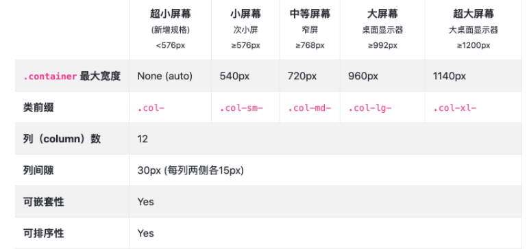
Response breakpoint
Since Bootstrap was first developed as a mobile device, it uses a few media queries to create reasonable breakpoints for layout and interface. These breakpoints are mainly based on the minimum viewport width and allow us to scale up the elements as the viewport changes.
Bootstrap mainly uses the following media query range (or breakpoint) as layout, grid system and components in the source Sass file.
//Ultra small devices (mobile phones, 576px up)
@media (min-width: 576px) { ... }

//Small device (tablet, 768px up)
@media (min-width: 768px) { ... }

//Medium equipment (desktop, 992px and up)
@media (min-width: 992px) { ... }

//Large equipment (large desktop computer, from 1200px)
@media (min-width: 1200px) { ... }
1.2 introduction to grid system
Bootstrap provides a responsive and mobile device first streaming grid system. With the increase of screen or viewport size, the system will be automatically divided into up to 12 columns.
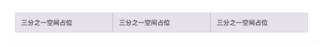
<div class="container">
  <div class="row">
    <div class="col-sm">
      One third space occupancy
    </div>
    <div class="col-sm">
      One third space occupancy
    </div>
    <div class="col-sm">
      One third space occupancy
    </div>
  </div>
</div>
The above example uses the BootStrap predefined grid system to demonstrate in Three equal width columns are established in the container container and are compatible with four device types: small (very narrow width web pages), medium (medium width web pages), large (wide web pages) and extra large (ultra wide web pages) - that is, these three columns are always presented regardless of the web page width.
Let's slowly uncover how it works:
- The grid system provides a method to center the content and fill the web content horizontally Container (strictly speaking, also includes. Container fluid, which is the same as the following, no comment - translator) responds to the web page width, or uses Container fluid enables web pages to be rendered 100% wide on all browser windows or device sizes.
- Row (. row) is the horizontal combination and parent container of column (. col - *) (they are effectively organized under. row). Each column has a horizontal padding value to control the spacing between them and offset on the negative margin row, so as to realize the experience that all contents in the column are visually aligned to the left.
- The rendering content of web developers must be placed in the column (. col - *), and only the column can be the direct child element of the row, otherwise it is illegal (rendering content cannot be added above. col - *).
- All this is thanks to the flexbox streaming layout, so that we can realize the automatic equal width arrangement of web pages without specifying the width of the column (the old bootrap 3 uses a strict width definition). For example, we Put four initialized in the container Col SM can achieve 25% width and left alignment to form a row arrangement. For more examples, see the auto layout columns section of this document.
- You may have noticed col - * is followed by different numbers, such as col-sm-4 or col-xl-12. The numbers after these css classes are used to indicate the number of columns you want to occupy in defining div space. Each row has a maximum of 12 columns. If you want to use three columns of equal width, take one third of 12, that is col-sm-4 is correct (described in detail later).
- The width attribute (i.e. column width) of. col - * is expressed and defined in percentage, so they are always streaming, and their size is affected by the definition of the parent element (this is the characteristic of flexbox layout, and the width ratio and arrangement of child elements are defined by the parent element).
- Columns have a horizontal padding definition that creates gaps between columns.
- . row with margin left: - 15px; margin-right: -15px; Properties, you can Row is defined above No gutters attribute, so as to eliminate this attribute, so that the page will not be extra wide by 30px, that is < div class = "row no gutters"
- There are five grid levels in total, and each responsive dividing point is separated by one level: extra small Col, small Col SM -, medium Col MD -, large Col lg-, extra large (large, extra large can also be called wide, ultra wide) col-xl-.
- The media query of grid breakpoints is based on the minimum value of width, which means that they are applied to a certain level and all above this level (for example, the definition of. col-sm-4 can be rendered on small, medium, wide and ultra wide devices, but not on ultra small. Col SX).
- Users do not need to define the grid by themselves. They can directly use the grid class predefined by the system (such as. col-4) or use Sass mixins to make more semantic tags to meet the development needs.
Difference between BootStrap3 grid system and BootStrap4 grid system
Bootstrap 4 its source code is written in Sass language
Layout using flex
All use rem as the unit (except that some margin and padding use px)
Bootstrap 4 has five grid classes, which are very small (col -), small (col SM -), medium (col MD -), large (col LG -), and super large (col XL -)
The offset column is set through the offset class, for example: offset-md-4 is the col-md-4 moved four columns to the right.
Bootstrap 3 uses the layout of float
Bootstrap 3 has four grid classes, which are very small (Col XS -), small (Col SM -), medium (Col MD -), and large (Col LG -)
Bootstrap 3 uses push and pull to move left and right
Grid options
Bootstrap uses ems or rems to define the specification size of most attributes, px for global level grid breakpoints and container width (because the width of browsers and devices is in pixels px and does not change with font size).
View the detailed conventions of Bootstrap's grid system on various screens and devices through a simple table:
1.3 common attributes of grid system
Using the grid breakpoint feature for typesetting can simplify the size of columns without batch explicit column width, such as forced writing as: col-sm-6.
Auto layout columns
Equal width layout
The following columns show the layout of one row, two columns and one row, three columns. From xs (as shown in the table above, xs does not actually exist, which is named in. col, the same below, and no more notes) to xl (i.e.. col xl - *), all devices have the same width and occupy a full row, as long as they are simply applied col can be completed.
<div class="container">
  <div class="row">
    <div class="col">
      1 of 2
    </div>
    <div class="col">
      2 of 2
    </div>
  </div>
  <div class="row">
    <div class="col">
      1 of 3
    </div>
    <div class="col">
      2 of 3
    </div>
    <div class="col">
      3 of 3
    </div>
  </div>
</div>
Equal width columns can be divided into multiple rows. The following is the processing method of two rows of equal width columns. Reference w-100 to cut branches:
<div class="container">
  <div class="row">
    <div class="col">Column</div>
    <div class="col">Column</div>
    <div class="w-100"></div>
    <div class="col">Column</div>
    <div class="col">Column</div>
  </div>
</div>
Set a column width
In the layout of Flexbox, it has many modern features, such as automatic layout and column width processing. You can specify a column and define the width when there are multiple columns in a row. At the same time, other columns are automatically resized. You can use predefined grid classes (as shown below) to optimize the grid width or row width. Note that in this case, the other columns will be resized regardless of the width of the center definition column.
<div class="container">
  <div class="row">
    <div class="col">
      1 of 3
    </div>
    <div class="col-6">
      2 of 3 (Wider-12 There are 6 cells in the grid, and the other 6 cells are divided equally by the other two columns)
    </div>
    <div class="col">
      3 of 3
    </div>
  </div>
  <div class="row">
    <div class="col">
      1 of 3
    </div>
    <div class="col-5">
      2 of 3 (Wider-12 5 spaces in the grid,The other seven cells are divided equally between the other two columns-Parity can be achieved)
    </div>
    <div class="col">
      3 of 3
    </div>
  </div>
</div>
Variable width elastic space
Using col-{breakpoint}-auto breakpoint method, you can resize the column according to the natural width of its content.
<div class="container">
  <div class="row justify-content-md-center">
    <div class="col col-lg-2">
      1 of 3
    </div>
    <div class="col-md-auto">
      Variable width content
    </div>
    <div class="col col-lg-2">
      3 of 3
    </div>
  </div>
  <div class="row">
    <div class="col">
      1 of 3
    </div>
    <div class="col-md-auto">
      Variable width content
    </div>
    <div class="col col-lg-2">
      3 of 3
    </div>
  </div>
</div>
Cover all devices
If you want to define the same grid system layout representation from the smallest device to the largest device at one time, use col and col - * class. The latter is used to specify a specific size (such as. col-6), otherwise use col will do.
<div class="row">
  <div class="col">col</div>
  <div class="col">col</div>
  <div class="col">col</div>
  <div class="col">col</div>
</div>
<div class="row">
  <div class="col-8">col-8</div>
  <div class="col-4">col-4</div>
</div>
Horizontal stacking
Use a single col SM - * class method can create a basic grid system. At this time, if the breakpoint width of other media query is not specified, the grid system is established, and will become an ultra small screen as the screen narrows col - automatically becomes one row for each column and stacked horizontally. Change the screen width of the web page. You can see the effect in the following columns:
<div class="row">
  <div class="col-sm-8">col-sm-8</div>
  <div class="col-sm-4">col-sm-4</div>
</div>
<div class="row">
  <div class="col-sm">col-sm</div>
  <div class="col-sm">col-sm</div>
  <div class="col-sm">col-sm</div>
</div>
Hybrid layout
Of course, designers will not simply make the grid under each screen the same, which will be monotonous, so you can define different devices for each column as needed. The following example shows the principle:
<!-- Define the full width of 1 column and half width of 1 column under the ultra small screen, while other scenes are displayed in 8:4 Proportional parallel arrangement -->
<div class="row">
  <div class="col-12 col-md-8">.col-12 .col-md-8</div>
  <div class="col-6 col-md-4">.col-6 .col-md-4</div>
</div>

<!-- Columns start at 50% wide on mobile and bump up to 33.3% wide on desktop -->
<div class="row">
  <div class="col-6 col-md-4">.col-6 .col-md-4</div>
  <div class="col-6 col-md-4">.col-6 .col-md-4</div>
  <div class="col-6 col-md-4">.col-6 .col-md-4</div>
</div>

<!-- Columns are always 50% wide, on mobile and desktop -->
<div class="row">
  <div class="col-6">.col-6</div>
  <div class="col-6">.col-6</div>
</div>
1.4 typesetting of bootstrap content
Initialization and CSS Reset
Bootstrap is committed to providing a concise and elegant foundation as a foothold. We use Reboot to put a series of CSS modifications of element features in a file. Refer to the official website documentation for this knowledge
CSS selectors also support h1 -- .h6 mode reference, which can make the font style show the Title Effect, the difference is reference h1 -- . The text segment of H6 will not be regarded as the title element of HTML (it is often sensitive to SEO, screen reader and machine recognition) - the effect is as follows:
<h1>h1. Bootstrap heading</h1>
<h2>h2. Bootstrap heading</h2>
<h3>h3. Bootstrap heading</h3>
<h4>h4. Bootstrap heading</h4>
<h5>h5. Bootstrap heading</h5>
<h6>h6. Bootstrap heading</h6>
Custom title notes
Recreate the small auxiliary title text from Bootstrap using the attached utility class, as follows:
<h3>
  Fancy display heading
  <small class="text-muted">With faded secondary text</small>
</h3>
Explicit title
bootstrap can make the traditional title elements more beautiful to cater to your web content. If you want a title to stand out, consider using the display title - a larger, distinctive Title style, you can use the following method:
<h1 class="display-1">Display 1</h1>
<h1 class="display-2">Display 2</h1>
<h1 class="display-3">Display 3</h1>
<h1 class="display-4">Display 4</h1>
Text inline element
The common inline representation of HTML5 text elements is also applicable to bootstrap 4.
<p>You can use the mark tag to <mark>highlight</mark> text.</p>
<p><del>This line of text is meant to be treated as deleted text.</del></p>
<p><s>This line of text is meant to be treated as no longer accurate.</s></p>
<p><ins>This line of text is meant to be treated as an addition to the document.</ins></p>
<p><u>This line of text will render as underlined</u></p>
<p><small>This line of text is meant to be treated as fine print.</small></p>
<p><strong>This line rendered as bold text.</strong></p>
<p><em>This line rendered as italicized text.</em></p>
Blockquote source comments and references
Reference the content block from another source in the document. Please wrap < blockquote class = "blockquote" > outside a paragraph of HTML as a reference. In order to display direct references, we recommend using p as a child package container, which also has several workarounds in the HTML specification, which will be explained one by one below.
<blockquote class="blockquote">
  <p class="mb-0">Lorem ipsum dolor sit amet, consectetur adipiscing elit. Integer posuere erat a ante.</p>
</blockquote>
Bottom note source
< footer class = "blockquote footer" > is used to identify the source. It is generally used in the footer (so there is a * - footer), and then used in conjunction with < cite >.
<blockquote class="blockquote">
  <p class="mb-0">If you love a place, you should carry your bag to travel and go further.</p>
  <footer class="blockquote-footer">From the Commercial Press <cite title="Source Title"><Xinhua Dictionary</cite></footer>
</blockquote>
Alignment processing
If you need to center or right align, use text-center,. The text right method can be used together, as shown in the following two examples:
<blockquote class="blockquote text-center">
  <p class="mb-0">If you love a place, you should carry your bag and travel farther.</p>
  <footer class="blockquote-footer">From the Commercial Press <cite title="Source Title"><Xinhua Dictionary</cite></footer>
</blockquote>
<blockquote class="blockquote text-right">
  <p class="mb-0">If you love a place, you should carry your bag and travel farther.</p>
  <footer class="blockquote-footer">From the Commercial Press <cite title="Source Title"><Xinhua Dictionary</cite></footer>
</blockquote>
list
Used on UL (or ol) List Unstyled can delete the default list style and left outer margin on the list item (only for direct child elements), which only takes effect on the direct child list item and does not affect your nested child list.
<ul class="list-unstyled">
  <li>Lorem ipsum dolor sit amet</li>
  <li>Consectetur adipiscing elit</li>
  <li>Integer molestie lorem at massa</li>
  <li>Facilisis in pretium nisl aliquet</li>
  <li>Nulla volutpat aliquam velit
    <ul>
      <li>Phasellus iaculis neque</li>
      <li>Purus sodales ultricies</li>
      <li>Vestibulum laoreet porttitor sem</li>
      <li>Ac tristique libero volutpat at</li>
    </ul>
  </li>
  <li>Faucibus porta lacus fringilla vel</li>
  <li>Aenean sit amet erat nunc</li>
  <li>Eget porttitor lorem</li>
</ul>
Multiple columns side by side in branches or single lines
use. list-inline , . Combined with list inline item, the list can be displayed line by line (it is also displayed line by line without reference by default and without the influence of parent elements), or single line and multiple columns side by side (follow the principle of left to right, and clear the margin method).
<ul class="list-inline">
  <li class="list-inline">List one</li>
  <li class="list-inline">List II</li>
  <li class="list-inline">List 3</li>
</ul>
<ul class="list-inline">
  <li class="list-inline-item">List one</li>
  <li class="list-inline-item">List II</li>
  <li class="list-inline-item">List 3</li>
</ul>
1.5 code and picture of bootstrap content
code
Documents and examples of inline code and multi line code segments embedded in lines are displayed based on Bootstrap.
Inline code
Wrap inline code snippets with < code > and don't forget to escape HTML angle brackets.
Example: <code><section></code> The code is embedded in the text segment.
Code block
The < pre > tag can be used to wrap code blocks. Similarly, the cusp number of HTML needs to be defined, and you can also use it The pre scrollable CSS style realizes the effect of vertical scrolling. By default, it provides 350px height limit and Y-axis vertical scrolling effect
<pre><code><p>Sample text here...</p> <p>And another line of sample text here...</p> </code></pre>
Var variable
It is recommended to use < var > label to label variables.
<var>y</var> = <var>m</var><var>x</var> + <var>b</var>
User input (keyboard action prompt)
Use the < KBD > tag to indicate that this is a keyboard input operation.
To switch directories, type <kbd>cd</kbd> followed by the name of the directory.<br>
To edit settings, press <kbd><kbd>ctrl</kbd> + <kbd>,</kbd></kbd>
Example annotation
The < samp > tag represents an example.
<samp>This is a code example.</samp>
picture
Examples and documents of BootStrap image processing. Because we add lightweight non-interference style and responsive behavior to images, it is more convenient to reference images in BootStrap design and will not easily break other elements.
Responsive picture
In Bootstrap, add to the picture IMG fluid style, or define max width: 100%, height:auto; Style, you can assign a responsive feature, and the picture size will scale synchronously with the size of the parent element.
<img src="..." class="img-fluid" alt="Responsive image">
Thumbnail processing
You can use The IMG thumbnail attribute enables the picture to be automatically added with an outline thumbnail style with rounded corners and 1px boundary (you can also use the edge gap spacing method provided by the system, such as. p-1 and border color definition). The effect is as follows:
<img src="..." alt="..." class="img-thumbnail">
Image alignment processing
For For block images with block attribute, we can also use floating definition specification or text alignment specification to realize image alignment and floating control The picture of block attribute can be obtained automatically Position alignment attribute of MX auto
<img src="..." class="rounded float-left" alt="...">
<img src="..." class="rounded float-right" alt="...">
<img src="..." class="rounded mx-auto d-block" alt="...">
1.6 table and frame of bootstrap content
Use the most basic table tags. The following is in bootstrap Table table style (basic style). Bootstrap 4 inherits all table styles, which means that any nested table will be styled in the same way as the parent type.
<table class="table">
  <thead>
    <tr>
      <th scope="col">#</th>
      <th scope="col">First Name</th>
      <th scope="col">Last Name</th>
      <th scope="col">Username</th>
    </tr>
  </thead>
  <tbody>
    <tr>
      <th scope="row">1</th>
      <td>Mark</td>
      <td>Otto</td>
      <td>@mdo</td>
    </tr>
    <tr>
      <th scope="row">2</th>
      <td>Jacob</td>
      <td>Thornton</td>
      <td>@fat</td>
    </tr>
    <tr>
      <th scope="row">3</th>
      <td>Larry</td>
      <td>the Bird</td>
      <td>@twitter</td>
    </tr>
  </tbody>
</table>
You can use it Table dark class selector to produce color reversal contrast effects, that is, dark background and light text
<table class="table table-dark">
  <thead>
    <tr>
      <th scope="col">#</th>
      <th scope="col">First Name</th>
      <th scope="col">Last Name</th>
      <th scope="col">Username</th>
    </tr>
  </thead>
  <tbody>
    <tr>
      <th scope="row">1</th>
      <td>Mark</td>
      <td>Otto</td>
      <td>@mdo</td>
    </tr>
    <tr>
      <th scope="row">2</th>
      <td>Jacob</td>
      <td>Thornton</td>
      <td>@fat</td>
    </tr>
    <tr>
      <th scope="row">3</th>
      <td>Larry</td>
      <td>the Bird</td>
      <td>@twitter</td>
    </tr>
  </tbody>
</table>
Head er processing
Similar to the preset inversion style, use Thead light or A style in thead dark can make the < thead > area display light black or dark gray.
<table class="table">
  <thead class="thead-dark">
    <tr>
      <th scope="col">#</th>
      <th scope="col">First Name</th>
      <th scope="col">Last Name</th>
      <th scope="col">Username</th>
    </tr>
  </thead>
  <tbody>
    <tr>
      <th scope="row">1</th>
      <td>Mark</td>
      <td>Otto</td>
      <td>@mdo</td>
    </tr>
    <tr>
      <th scope="row">2</th>
      <td>Jacob</td>
      <td>Thornton</td>
      <td>@fat</td>
    </tr>
    <tr>
      <th scope="row">3</th>
      <td>Larry</td>
      <td>the Bird</td>
      <td>@twitter</td>
    </tr>
  </tbody>
</table>

<table class="table">
  <thead class="thead-light">
    <tr>
      <th scope="col">#</th>
      <th scope="col">First Name</th>
      <th scope="col">Last Name</th>
      <th scope="col">Username</th>
    </tr>
  </thead>
  <tbody>
    <tr>
      <th scope="row">1</th>
      <td>Mark</td>
      <td>Otto</td>
      <td>@mdo</td>
    </tr>
    <tr>
      <th scope="row">2</th>
      <td>Jacob</td>
      <td>Thornton</td>
      <td>@fat</td>
    </tr>
    <tr>
      <th scope="row">3</th>
      <td>Larry</td>
      <td>the Bird</td>
      <td>@twitter</td>
    </tr>
  </tbody>
</table>
Striped table
use. Table striped style definition < tbody >, which can produce table styles with strong color contrast row by row (and add inversion).
<table class="table table-striped">
  <thead>
    <tr>
      <th scope="col">#</th>
      <th scope="col">First Name</th>
      <th scope="col">Last Name</th>
      <th scope="col">Username</th>
    </tr>
  </thead>
  <tbody>
    <tr>
      <th scope="row">1</th>
      <td>Mark</td>
      <td>Otto</td>
      <td>@mdo</td>
    </tr>
    <tr>
      <th scope="row">2</th>
      <td>Jacob</td>
      <td>Thornton</td>
      <td>@fat</td>
    </tr>
    <tr>
      <th scope="row">3</th>
      <td>Larry</td>
      <td>the Bird</td>
      <td>@twitter</td>
    </tr>
  </tbody>
</table>
Table border processing
add to. The table bordered class can generate table borders and gap systems
<table class="table table-bordered">
  <thead>
    <tr>
      <th scope="col">#</th>
      <th scope="col">First</th>
      <th scope="col">Last</th>
      <th scope="col">Handle</th>
    </tr>
  </thead>
  <tbody>
    <tr>
      <th scope="row">1</th>
      <td>Mark</td>
      <td>Otto</td>
      <td>@mdo</td>
    </tr>
    <tr>
      <th scope="row">2</th>
      <td>Jacob</td>
      <td>Thornton</td>
      <td>@fat</td>
    </tr>
    <tr>
      <th scope="row">3</th>
      <td colspan="2">Larry the Bird</td>
      <td>@twitter</td>
    </tr>
  </tbody>
</table>
Row hover effect
Will Table hover is defined on < tbody >, which can produce a line hover effect (a status prompt will appear when the mouse moves over the line).
<table class="table table-hover">
  <thead>
    <tr>
      <th scope="col">#</th>
      <th scope="col">First Name</th>
      <th scope="col">Last Name</th>
      <th scope="col">Username</th>
    </tr>
  </thead>
  <tbody>
    <tr>
      <th scope="row">1</th>
      <td>Mark</td>
      <td>Otto</td>
      <td>@mdo</td>
    </tr>
    <tr>
      <th scope="row">2</th>
      <td>Jacob</td>
      <td>Thornton</td>
      <td>@fat</td>
    </tr>
    <tr>
      <th scope="row">3</th>
      <td colspan="2">Larry the Bird</td>
      <td>@twitter</td>
    </tr>
  </tbody>
</table>
Compact table
add to. Table SM can reduce the padding value of the table by half, making the table more compact.
<table class="table table-sm">
  <thead>
    <tr>
      <th scope="col">#</th>
      <th scope="col">First Name</th>
      <th scope="col">Last Name</th>
      <th scope="col">Username</th>
    </tr>
  </thead>
  <tbody>
    <tr>
      <th scope="row">1</th>
      <td>Mark</td>
      <td>Otto</td>
      <td>@mdo</td>
    </tr>
    <tr>
      <th scope="row">2</th>
      <td>Jacob</td>
      <td>Thornton</td>
      <td>@fat</td>
    </tr>
    <tr>
      <th scope="row">3</th>
      <td colspan="2">Larry the Bird</td>
      <td>@twitter</td>
    </tr>
  </tbody>
</table>
Frame
Example
<figure class="figure">
  <img src="..." class="figure-img img-fluid rounded" alt="...">
  <figcaption class="figure-caption">A caption for the above image.</figcaption>
</figure>
Combined with our text utility, you can easily align the description text of the frame (such as right alignment and left alignment, just reference the. Text - * method - Translator's note).
<figure class="figure">
  <img src="..." class="figure-img img-fluid rounded" alt="...">
  <figcaption class="figure-caption text-right">A caption for the above image.</figcaption>
</figure>