Glyphicons
Format:
<span class="glyphicon glyphicon-search"></span>
Dropdowns
- Dropdown specifies the drop-down menu, which is wrapped in. dropdown
- dropdown-menu
- dropdown-menu-right drop-down menu right aligned
- Add a title to the drop down-header drop-down menu
- dropup specifies a drop-down menu that pops up
- disabled in the drop-down menu
- . divider The divider in the drop-down menu
Basic format
<div class="container"><div class="dropdown"><button class="btn btn-default dropdown-toggle" type="button" id="menu1" data-toggle="dropdown">menu<span class="caret"></span></button><ul class="dropdown-menu" role="menu" aria-labelledby="menu1"><li role="presentation"><a role="menuitem" tabindex="-1" href="#">A</a></li><li role="presentation" class="divider"></li><li role="presentation"><a role="menuitem" tabindex="-1" href="#">B</a></li></ul></div></div>
Button group
- Class Description
- Btn-group This class is used to form basic button groups. Place a series of buttons with class. BTN in. btn-group.
- Btn-toolbar. This class helps to combine several groups of <div class="btn-group"> into a <div class="btn-toolbar"> to obtain more complex components.
- Btn-group-lg,.Btn-group-sm,.Btn-group-xs are class es that can be applied to adjust the size of the entire button group without the need to adjust the size of each button.
- btn-group-vertical This class allows a group of buttons to be displayed vertically rather than horizontally.
Basic button
<div class="btn-group"><button type="button" class="btn btn-default">Button 1</button><button type="button" class="btn btn-default">Button 2</button></div>
Button drop-down menu
<div class="btn-group"><button type="button" class="btn btn-default dropdown-toggle" data-toggle="dropdown">drop-down<span class="caret"></span></button><ul class="dropdown-menu"><li><a href="#">Dropdown Link 1</a></li><li><a href="#">Dropdown Link 2</a></li></ul></div>
Button pull-up menu
<div class="btn-group dropup">
Basic input box group
<div style="padding: 100px 100px 10px;"><form class="bs-example bs-example-form" role="form"><div class="input-group"> #Prefix and Suffix Element Addition<span class="input-group-addon">$</span> #Prefix element<input type="text" class="form-control"><span class="input-group-addon">.00</span> #Suffix element</div></form></div>

Input box group size
.input-group-lg.input-group-sm
Checkboxes and check boxes (using check boxes and radio plug-ins as prefix or suffix elements)
<!--Check plug-ins--><span class="input-group-addon"><input type="checkbox"></span><!--Radio plug-in--><span class="input-group-addon"><input type="radio"></span>
Button plug-in (using buttons as prefix or suffix elements)
<span class="input-group-btn"><button class="btn btn-default" type="button">Go!</button></span>
Navigation elements
The base class is. nav
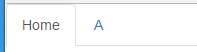
Table navigation (label)
<ul class="nav nav-tabs"><li class="active"><a href="#">Home</a></li><li><a href="#">A</a></li>
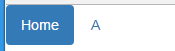
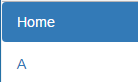
Capsule navigation menu
<ul class="nav nav-pills"><li class="active"><a href="#">Home</a></li><li><a href="#">A</a></li>
<ul class="nav nav-pills nav-stacked"><li class="active"><a href="#">Home</a></li><li><a href="#">A</a></li>
Aligned navigation at both ends
nav-justified makes the label or capsule navigation menu as wide as the parent element.
Disable connections
Disad class creates a gray link and disables the hover status of the link
Navigation bar
- 1. Add class. navbar,. navbar-default to the < NAV > tag.
- 2. Adding role="navigation" to the above elements helps increase accessibility.
- 3. Add a title class. navbar-header to the < div > element, which contains the < a > element with class navbar-brand. This will make the text look bigger.
- 4. To add links to the navigation bar, simply add an unordered list with class. NAV and. navbar-nav.
Basic navigation bar
<nav class="navbar navbar-default" role="navigation"><div class="navbar-header"><a class="navbar-brand" href="#">HOME</a></div><div><ul class="nav navbar-nav"><li class="active"><a href="#">A</a></li></div>
Responsive navigation bar
Folding navigation
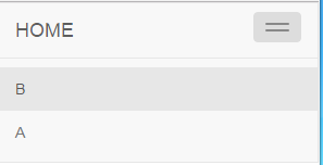
<nav class="navbar navbar-default" role="navigation"><div class="navbar-header"><button type="button" class="navbar-toggle" data-toggle="collapse"data-target="#example-navbar-collapse"><span class="sr-only">Navigation button</span><span class="icon-bar"></span> # Navigation button line<span class="icon-bar"></span></button><a class="navbar-brand" href="#">HOME</a></div><div class="collapse navbar-collapse" id="example-navbar-collapse"><ul class="nav navbar-nav"><li class="active"><a href="#">A</a></li><li><a href="#">B</a></li></ul><div>
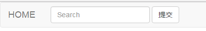
Navigation Bar Form
<nav class="navbar navbar-default" role="navigation"><div class="navbar-header"><a class="navbar-brand" href="#">HOME</a></div><div><form class="navbar-form navbar-left" role="search"><div class="form-group"><input type="text" class="form-control" placeholder="Search"></div><button type="submit" class="btn btn-default">Submission</button></form></div>
Text in Navigation Bar
.navbar-text
Component alignment method
Navbar-left.navbar-right is aligned left to right.
Fixed to the top or bottom
.navbar-fixed-top .navbar-fixed-bottom
Static at the top
.navbar-static-top
Anti-color Navigation Bar
.navbar-inverse
breadcrumbs
<ol class="breadcrumb"><li><a href="#">Home</a></li><li><a href="#">A</a></li><li class="active">November</li></ol>
Pagination
- pagination adds the class to display pages on the page.
- The. disabled,. active custom links define non-clickable links by using. disabled, and indicate the current page by using. active.
- Pagination-lg,. pagination-sm use these class es to obtain items of different sizes.
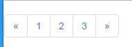
Default Paging
<ul class="pagination"><li><a href="#">«</a></li><li><a href="#">1</a></li><li><a href="#">2</a></li><li><a href="#">3</a></li><li><a href="#">»</a></li></ul>
Pager
- Page R. Add the class to get the flip link.
- Previous,. next uses class. previous to align links to the left and. next to align links to the right.
- Disad. Add the class to get a lighter look.
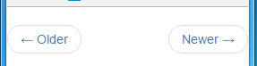
Default page turning
<ul class="pager"><li class="previous"><a href="#">← Older</a></li><li class="next"><a href="#">Newer →</a></li></ul>
Label
- Class description
- label label-default default gray label
- label label-primary "primary" type of blue label
- label label-success "success" type green label
- label label-info "info" type light blue label
- Yellow label of. label-warning "warning" type
- label label-danger "danger" type red label
Badges (similar labels)
<span class="badge">..</span>
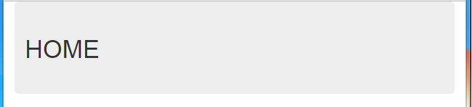
Jumbotron
.jumbotron
<div class="container"><div class="jumbotron"><h1>HOME</h1></p></div></div>
thumbnail
<a href="#" class="thumbnail"><img src="picture.jpg"alt="General placeholder thumbnails"></a>
Alerts
- <div class= "alert alert-success">success! The submission was well completed. </div>
- <div class= "alert alert-info">information! Please pay attention to this information. </div>
- <div class= "alert alert-warning">warning! Please do not submit. </div>
- <div class= "alert alert-danger"> error! Please make some changes. </div>
Progress bar
<div class="progress"><div class="progress-bar" role="progressbar" aria-valuenow="60"aria-valuemin="0" aria-valuemax="100" style="width: 40%;"> #style progress bar location<span class="sr-only">40% complete</span></div></div>
Stripe progress bar
<div class="progress progress-striped">
Progress bar of animation
<div class="progress progress-striped active">
Multimedia Object
- Media: This class allows multimedia (images, videos, audio) in the media object to float to the left or right of the content block.
- media-list: If you need a list that is part of an unordered list, you can use the class. Can be used for comment lists and article lists.
<div class="media"><a class="pull-left" href="#"><img class="media-object" src="pictrue.jpg" alt="Media Objects"></a><div class="media-body"><h4 class="media-heading">Media headlines</h4>file file</div></div>
List group
- Add class. list-group to the element <ul>.
- Add class. list-group-item to <li>.
Panels
<div class="panel panel-default"><div class="panel-heading"><h3 class="panel-title">Title</h3></div><div class="panel-body">content</div><div class="panel-footer">footnote</div></div>
Panels with Contextual Colors
- Use the context state class panel-primary, panel-success, panel-info, panel-warning, panel-danger to set up the panel with context color.
Well
Well is a container that causes content indentation or illustration effects
.well
size
.well-lg
.well-sm
Learning: http://www.runoob.com/bootstrap