1. Pull down menu and scroll monitor
1.1 pull down menu
1.1.1 attribute declarative method
<!DOCTYPE HTML>
<html>
<head>
<meta http-equiv="Content-Type" content="text/html; charset=utf-8">
<title>drop-down menu --Attribute declarative method (I)</title>
<link rel="stylesheet" href="https://maxcdn.bootstrapcdn.com/bootstrap/3.2.0/css/bootstrap.min.css">
<link rel="stylesheet" href="style.css">
</head>
<body>
<h3>Example 1</h3>
<div class="navbar navbar-default" id="navmenu">
    <a href="##" class="navbar-brand">W3cplus</a>
    <ul class="nav navbar-nav">
		<li class="dropdown">
			<a href="##"Data toggle =" dropdown "class =" dropdown toggle "role =" button "id =" tutorial "> tutorial < B class =" caret "></b></a>
			<ul class="dropdown-menu" role="menu" aria-labelledby="tutorial">
				<li role="presentation"><a href="##">CSS3</a></li>
				<li role="presentation"><a href="##">HTML5</a></li>
				<li role="presentation"><a href="##">Sass</a></li>
			</ul>
		</li>
		<li><a href="##"> front end Forum</a></li>
		<li><a href="##"> about us</a></li>
	</ul>
</div>

<h3>Example 2</h3>
<ul class="nav nav-pills">
    <li class="dropdown">
		<a href="##"Data toggle =" dropdown "class =" dropdown toggle "role =" button "id =" tutorial "> tutorial < B class =" caret "></b></a>
		<ul class="dropdown-menu" role="menu" aria-labelledby="tutorial">
			<li role="presentation"><a href="##">CSS3</a></li>
			<li role="presentation"><a href="##">HTML5</a></li>
			<li role="presentation"><a href="##">Sass</a></li>
		</ul>
	</li>
	<li class="active"><a href="##"> front end Forum</a></li>
	<li><a href="##"> about us</a></li>
</ul>
<script src="https://libs.baidu.com/jquery/1.9.0/jquery.js"></script>
<script src="https://maxcdn.bootstrapcdn.com/bootstrap/3.2.0/js/bootstrap.min.js"></script>
</body>
</html>
1.1.2 JavaScript trigger method
<ul class="nav nav-pills">
    <li class="dropdown">
        <a href="##"Class =" dropdown toggle "role =" button "id =" tutorial "> tutorial < B class =" caret "></b></a>
        <ul class="dropdown-menu" role="menu" aria-labelledby="tutorial">
            <li role="presentation"><a href="##">CSS3</a></li>
            <li role="presentation"><a href="##">HTML5</a></li>
            <li role="presentation"><a href="##">Sass</a></li>
        </ul>
    </li>
    <li class="active"><a href="##"> front end Forum</a></li>
    <li><a href="##"> about us</a></li>
</ul>
After calling the dropdown() method with JavaScript, click the activate button to pop up the drop-down menu. When you click again, the drop-down menu will be retracted
$(function(){
    $(".dropdown-toggle").dropdown();
})
You can also use the parameter "toggle". When the drop-down menu is hidden, call the dropdown("toggle") method to display the drop-down menu. On the contrary, if the drop-down menu is displayed, call the dropdown("toggle") method to hide the drop-down menu
$(function(){
    $(".dropdown-toggle").dropdown("toggle");
})
However, with this parameter, you need to toggle twice every time you click, and it will always be in a constant state. Therefore, generally, the method without parameters in the example is used. Even if you need to use the parameter "toggle", it is recommended to use the one method of jQuery
$(".dropdown-toggle").one("click",function(){
    $(this).dropdown("toggle");
})
1.2 rolling monitor
Manifestation:
- When the user scrolls with the mouse, the position of the scroll bar will automatically update the corresponding navigation items in the navigation bar
- The user drags the scroll bar. When scrolling to @ mdo, the above @ mdo navigation item will be highlighted
1.2.1 design of rolling monitor
-
Step 1: to use the scroll monitor, the first condition is to load the corresponding plug-in in the page
<script src="https://ajax.googleapis.com/ajax/libs/jquery/1.11.1/jquery.min.js"></script>
<script src="https://maxcdn.bootstrapcdn.com/bootstrap/3.2.0/js/bootstrap.min.js"></script>
-
Step 2: design a navigation bar with a drop-down menu. Define an anchor link for the navigation bar and drop-down menu items respectively. The anchor points are "#blog", "html", "css", "sass", "js", "php" and "#about". At the same time, define an id value "navbar menu" for the navigation bar (the id name can be freely defined) to facilitate rolling monitoring
-
Step 3: design the monitoring object. Here, the contents of the monitoring object are placed in a div container named scrollspy (this class name can be freely defined), in which multiple sub content boxes are placed. Each sub content box has a title, and the ID value of each title corresponds to the anchor link name in the navigation menu item, and pay attention to adding the "data target =" #navbar menu "attribute (this attribute value should be consistent with the ID name of the previous nav tag)
<div class="scrollspy" data-target="#navbar-menu"> <h4 id="blog">Blog</h4> <p>...</p> <h4 id="html">Html</h4> <p>...</p> <h4 id="css">CSS</h4> <p>...</p> <h4 id="sass">Sass</h4> <p>...</p> <h4 id="js">JavaScript</h4> <p>...</p> <p>...</p> <h4 id="php">PHP</h4> <p>...</p> <p>...</p> <h4 id="about">About</h4> <p>...</p> <p>...</p> </div> -
Step 4: define the style for the monitoring object and set the size of the container scrollspy (the height is set to generate a vertical scroll bar)
.scrollspy{
    height:500px;
    font-size:20px;
    overflow:auto;
}
1.2.2 declare attributes to trigger rolling monitoring
Set the monitored data attribute for the monitored object: Data spy = "scroll", and specify the monitored navigation bar: data target = "#navbar menu". At the same time, define the scroll bar offset position data offset = "60" in the monitoring process, and the code is as follows:
<div class="scrollspy" data-spy="scroll" data-target="#navbar-menu" data-offset="60">
  ...
</div>
1.2.3 add monitoring in the body
You can directly monitor the scroll bar on the body. At this time, move the scroll monitor to the body, and the navigation nav must be inside the body. As follows:
<body data-spy="scroll" data-target="#navbar-menu">
    <div class="navbar navbar-default navbar-fixed-top" id="navbar-menu">
    </div>
    <h3 id="blog">Blog</h3>
    <p>...</p>
</body>
Note: the navigation bar must be set to navbar fixed top
1.2.4 JavaScript method triggers scroll monitor
<nav id="navbar-menu" class="navbar navbar-default navbar-static" role="navigation">
  ...
</nav>
<div class="scrollspy" id="scrollspy">
  ...
</div>

<!--JavaScript Trigger can be written as follows:-->
$(function(){
    $("#scrollspy").scrollspy({
        target: "#navbar-menu"
    });
})

<!--Bootstrap Rolling monitoring also provides a method scrollspy("refresh"). When the function of rolling monitoring DOM When adding or deleting page elements, you need to call the following refresh method:-->
$(function(){
    $("[data-spy='scroll']").each(function(){
        var $spy=$(this).scrollspy("refresh");
    })
})
<!-- Note: this refresh Method is only valid for declarative usage. In addition, rolling monitoring options Parameters“ target"In addition, a offset Parameter. The default value of this parameter is 10. By default, the scrolling content is 10 away from the scrolling container px Within, the corresponding menu item will be displayed in front of the higher one-->
2. Tabs, prompt boxes and pop-up boxes
2.1 tabs - Tabs
2.1.1 tab structure
It consists of two parts:
- Tab component (i.e. menu component), corresponding to NAV tabs of Bootstrap)
- The tab panel that can be switched at the bottom is usually represented by tab pane in Bootstrap
The key point is that the anchor point linked in the tab should match the ID of the corresponding panel content container
2.1.2 trigger switching effect
- Data toggle = "tab" to be set in the tab navigation link
- The content id = "target data" of the panel is the corresponding setting; If it is a link, you can also use the href = "corresponding content panel selector (generally ID)"; The main function is to find the panel content tab pane corresponding to the selector when the user clicks.
- The value of "href tab" or "Pan tab" in each content panel should match the value of "target tab" in the content panel
2.1.3 add fade style for selection card
Make the hide and display of the panel smoother in the switching process. You can add the class name fade to the panel to produce the effect of gradual entry. When adding fade style, you must remember to add the in class name to the content panel displayed by default at the beginning, otherwise its content cannot be seen by users.
<!-- Tab components (menu items) nav-tabs)-->
<ul id="myTab" class="nav nav-tabs" role="tablist">
    <li class="active"><a href="#Bulletin "role =" tab "data toggle =" tab "> announcement</a></li>
    <li><a href="#Rule "role =" tab "data toggle =" tab "> rule</a></li>
    <li><a href="#Forum "role =" tab "data toggle =" tab "> Forum</a></li>
	<li><a href="#Security "role =" tab "data toggle =" tab "> Security</a></li>
	<li><a href="#Welfare "role =" tab "data toggle =" tab "> public welfare</a></li>
</ul>
<!-- Tab panel -->
<div id="myTabContent" class="tab-content">
	<div class="tab-pane fade in active" id="bulletin">Announcement content panel</div>
	<div class="tab-pane fade" id="rule">Rule content panel</div>
	<div class="tab-pane fade" id="forum">Forum content panel</div>
	<div class="tab-pane fade" id="security">Security content panel</div>
	<div class="tab-pane fade" id="welfare">Public welfare content panel</div>
</div>
2.1.4 capsule tabs (NAV pills)
Just replace NAV tabs with NAV pills. Another key point is to replace data toggle = "tab" with data toggle = "pill".
2.1.5 JavaScript trigger method
The tab("show") method is invoked in the click events of each link to display the corresponding tab panel contents. For the above example, delete the custom attribute of data toggle = "tab" or data toggle = "pill" in HTML, and then call it through the following script:
<!-- Tab components (menu items) nav-tabs)-->
<ul id="myTab2" class="nav nav-pills" role="tablist">
    <li><a href="#A "role =" tab "data toggle =" pill "> Entertainment</a></li>
    <li><a href="#B "role =" tab "data toggle =" pill "> Real Estate</a></li>
    <li><a href="#C "role =" tab "data toggle =" pill "> domestic</a></li>
    <li><a href="#D "role =" tab "data toggle =" pill "> abroad</a></li>
</ul>
<!-- Tab panel -->
<div id="myTabContent2" class="tab-content">
	<div class="tab-pane fade in active" id="a">Entertainment content panel</div>
	<div class="tab-pane fade" id="b">Property content panel</div>
	<div class="tab-pane fade" id="c">Domestic content panel</div>
	<div class="tab-pane fade" id="d">Foreign content panel</div>
</div>
<script>
    $(function(){
    $("#myTab2 a").click(function(e){
        e.preventDefault();
        $(this).tab("show");
    });
})
</script>
2.2 prompt box - Tooltip
2.2.1 structure
Common features:
- The prompt information is defined by the value of the title attribute (you can also use the custom attribute data original title to set the prompt information). The priority of data original title is higher than that of title.
- The position of the prompt information box is controlled through the user-defined attribute of data placement. According to four different positions, data placement has four values: top, right, bottom and left, indicating that the prompt box appears at the top, right, bottom and left respectively.
- Another important parameter is indispensable, data toggle = "tooltip".
2.2.2 JS trigger prompt box method
It cannot be triggered directly through the custom attribute data -. You have to rely on JavaScript code to trigger
// The simplest trigger method is as follows:
$(function(){
    $('[data-toggle="tooltip"]').tooltip();
});
// In addition, you can also specify an element separately and call the prompt box on this element, which may be implemented through various parameters of JavaScript without defining some data attributes, such as:
$(function(){
    $('#myTooltip').tooltip({
       title:"I am a prompt box and I appear at the top",
       placement:'top'
    });
});
Case:
<button type="button"
          class="btn btn-default"
          data-toggle="tooltip"
          data-placement="left"
          data-original-title="The prompt box is on the left"
          title="">
    The prompt box is on the left
</button>
<a class="btn btn-primary"
     data-toggle="tooltip"
     data-placement="top"
     title="The prompt box is at the top">
     The prompt box is at the top
</a>
<a href="##"
     class="btn btn-primary"
     id="myTooltip">
     I'm the prompt box
</a>
<script>
  $(function(){
    $('[data-toggle="tooltip"]').tooltip();
    $('#myTooltip').tooltip({
      title:"I am a prompt box and I appear at the top",
      placement:'top'
    });
  });
</script>
2.2.3 other custom attributes
There are other custom attributes in the prompt box. Each custom attribute has its own meaning
2.2.4 JS parameter setting method
Any attribute in the table can be called when JavaScript is used to trigger the prompt box, such as:
<script>
  $(function(){
    $('#myTooltip1').tooltip({
      title:"I am a prompt box and I appear at the top",
      placement:"top"
    });
  });
</script>
2.3 pop ups - Popover
2.3.1 structure of pop-up box
The pop-up box Popover has one more content content than the prompt box tooltip, so data content is used here to define the content in the pop-up box. It can also be made with < button > or < a > tags
<button type="button"
        class="btnbtn-default"
        data-container="body"
        data-placement="bottom"
        data-toggle="popover"
        data-original-title="Bootstrap Pop up title"
        data-content="Bootstrap Contents of pop-up box" >
        Hit me
</button>
<a href="#" class="btnbtn-default"
        data-container="body"
        data-placement="right"
        data-toggle="popover"
        title="Bootstrap Pop up title"
        data-content="Bootstrap Contents of pop-up box">
        Hit me
</a>
$(function(){
    $('[data-toggle="popover"]').popover();
});
2.3.2 method of triggering pop-up box
Need to rely on JavaScript scripts
// html code
<button type="button"
          class="btn btn-default"
          id="myPopover">
          Hit me
</button>
// Setting parameters using js
$(function(){
    $('#myPopover').popover({
        title:"I'm the title of the pop-up box",
        content:"I am the content of the pop-up box",
        placement:"top"
    });
});
2.3.3 user defined structure attributes
2.3.4 similarities and differences between prompt box and pop-up box
- The default trigger events of tooltip prompt box are hover and focus, while pop-up box popover is click
- The tooltip of the prompt box has only one title, and the pop-up box can set not only the title but also the content
// Template of tooltip in prompt box:

<div class="tooltip" role="tooltip">
    <div class="tooltip-arrow"></div>
    <div class="tooltip-inner"></div>
</div>
// Template of pop-up box popover:
<div class="popover" role="tooltip">
    <div class="arrow"></div>
    <h3 class="popover-title"></h3>
    <div class="popover-content"></div>
</div>
3. Warning box and button
3.1 warning box - Alert
3.1.1 structure and style
The warning box plug-in adds a close button on the basis of the "warning box component", which is an X in appearance. Therefore, its structure only needs to add a button on the basis of the warning box component:
// Cannot be closed
<div class="alert " role="alert">
<button class="close" type="button" >×</button>
Congratulations on your successful operation!
</div>
3.1.2 use declarative trigger warning box
If the warning box is triggered through a custom HTML attribute (declarative), you need to set the custom attribute data disass = "alert" on the close button, as shown below
<div class="alert alert-success" role="alert">
<button class="close" data-dismiss="alert" type="button" >×</button>
<p>Congratulations on your successful operation!</p>
</div>
In fact, the closing button does not have to use an X number, but can also be an ordinary button element or link element. Just ensure that the closing element has a user-defined attribute data disassiss = "alert"
3.1.3 JavaScript trigger warning box
<!--html code:-->
<div class="alert alert-warning" role="alert" id="myAlert">
    <h4>Beware of being cheated</h4>
    <p>Please confirm that your transfer information is your relatives and friends. Don't trust people you don't know...</p>
    <button type="button"  class="btn btn-danger" id="close">close</button>
</div>
<!--Through the following JavaScript Code to trigger:-->
$(function(){
    $("#close").on("click",function(){
        $(this).alert("close");
    });
});
3.2 Button plug-in Button
3.2.1 button loading status
You can design the status prompt through the button. When you click the button, the loading status information will be displayed
<button class="btnbtn-primary" data-loading-text="Loading,One moment please..." type="button" id="loaddingBtn">load</button>
Define the loaded text information through the data loading text attribute, bind an event to the button through JavaScript, and add a button("loading") method to the button to activate the loading state behavior of the button. As follows:
$(function(){
    $("#loaddingBtn").click(function () {
        $(this).button("loading");
      });
});
Note that this effect cannot be triggered directly declaratively
3.2.2 analog single selection button
Use button groups to simulate radio button groups. You can customize the attribute data toggle = "buttons" for button groups
<div class="btn-group" data-toggle="buttons">
    <label class="btn btn-primary">
        <input type="radio" name="options" id="options1">male
    </label>
    <label class="btn btn-primary">
        <input type="radio" name="options" id="options2">female
    </label>
</div>
Note: when using this effect, there is no need to trigger it with the help of JavaScript code, because the default Bootstrap has been initialized for the user
3.2.3 analog check button
This is also achieved by customizing data toggle = "buttons" on the button group. The only difference is that input[type="radio"] is replaced by input[type="checkbox"]
<div class="btn-group" data-toggle="buttons">
    <label class="btn btn-primary">
        <input type="checkbox" name="options" id="options1">film
    </label>
    <label class="btn btn-primary">
        <input type="checkbox" name="options" id="options2">music
    </label>
</div>
3.2.4 button state switching
Using the data toggle attribute, you can also activate the behavior state of the button to switch between activated and inactive
<button type="button" data-toggle="button" class="btn btn-primary">confirm</button>
Note that the custom attribute here is data toggle = "button", not data toggle = "buttons".
3.2.5 JavaScript usage
The button plug-in can also achieve different effects by calling the button function and then passing specific parameters to the button function. Two of the parameters are fixed, namely toggle and reset
-
Switch button status (get focus): $("#mybutton") button("toggle")
-
Redo button: $("#mybutton") button("reset")
$(function() { $("#mybutton").click(function(){ $(this).button('loading').delay(1000).queue(function() { $(this).button('reset'); }); }); }); -
Any parameter: $("#mybutton") Button ("any character parameter name")
Function of the above code: replace the attribute value of data arbitrary character parameter name text as "text value displayed on the button". The following code:
<!--html:-->
<button type="button" data-toggle="button" class="btn btn-primary" id="mybutton" data-complete-text="Loading finished" >confirm</button>
<!--js code:-->
 $(function() {
      $("#mybutton").click(function(){
         $(this).button('loading').delay(1000).queue(function() {
            $(this).button('complete');
         });
      });
 });
4. Accordion, picture rotation and fixed positioning
4.1 accordion collapse
4.1.1 accordion structure
The key part of the accordion is that there is a content corresponding to each title. Combining the two parts in the Bootstrap framework is called a panel page board. If there are three panel panels, combining the three panels together is a panel group. The simple point is a trigger and a folding area
<button type="button" class="btn btn-danger" data-toggle="collapse" data-target="#Demo "> trigger < / button >
<div id="demo" class="collapse in">folding domain</div>
4.1.2 declarative trigger accordion
Trigger accordion can be triggered through the custom data toggle attribute. Where the data toggle value is set to collapse, and data target = "# collapse area identifier"
-
Design a panel combination with three folding areas
<div class="panel-group" id="myAccordion"> <div class="panel panel-accordion panel-default"></div> <div class="panel panel-accordion panel-default"></div> <div class="panel panel-accordion panel-default"></div> </div> -
Add content to the panel. Each panel consists of two parts. The first is panel heading, and the title Panel title is added here. The second part is the panel content, that is, the folding area, which uses the panel collapse style
<div class="panel panel-accordion panel-default"> <div class="panel-heading"> <h4 class="panel-title">Title I</h4> </div> <div class="panel-collapse"> <div class="panel-body">Folding area content...</div> </div> </div> ... -
The title area and panel area are connected by anchor link
<div class="panel panel-accordion panel-default"> <div class="panel-heading"> <h4 class="panel-title"><a href="#Panel1 "> title I < / a > < / H4 > </div> <div class="panel-collapse" id="panel1"> <div class="panel-body">Folding area content...</div> </div> </div> -
To control whether the content area of the panel is visible, you only need to add collapse on the panel collapse style
<div class="panel-collapse collapse in" id="panel1">...</div>
If you want the content of the first panel to be visible by default, add in style on the basis of collapse
-
To activate the accordion interaction, you need to customize two attributes in the title link. One is data toggle and the value is collapse; The other is data target, which is the identifier of each panel content area
-
Define the data parent attribute to close all folding areas and then open the clicked area when clicking one of the elements. The value of data parent matches the identifier of the accordion panel container
<div class="panel-group" id="accordion">
    <div class="panel panel-default panel-accordion">
        <div class="panel-heading">
            <h4 class="panel-title"><a href="#aa1" data-toggle="collapse" data-target="#aa1" data-parent="#Accordion "> title I < / a > < / H4 >
        </div>
        <div class="panel-collapse collapse in" id="aa1">
            <div class="panel-body">Corresponding content of title I</div>
        </div>
    </div>
    <div class="panel panel-default panel-accordion">
        <div class="panel-heading">
            <h4 class="panel-title"><a href="#aa2" data-toggle="collapse" data-target="#aa2" data-parent="#Accordion "> Title II < / a > < / H4 >
        </div>
        <div class="panel-collapse collapse" id="aa2">
            <div class="panel-body">Corresponding content of Title II</div>
        </div>
    </div>
</div>
4.2 picture rotation Carousel
4.2.1 design of rotating pictures
The rotation picture includes three parts: the rotation picture, the rotation picture counter and the rotation picture controller
-
Design a container for rotating pictures. In the Bootstrap framework, carousel style is adopted, and an ID value is defined for the container, which is convenient for the data attribute to declare the trigger later.
<div id="slidershow" class="carousel"></div>
-
Design the rotation picture counter. Add a rotation picture calculator inside the container div.carousel, which adopts carousel indicators style. Its main function is to display the playback order of the current picture (several Li are placed for several pictures), which is generally made by sequential list
-
Design the rotation picture playing area, which is controlled by the carousel inner style, and it is also placed in the carousel container, and each rotation picture is placed through the item container
-
Design the rotation picture controller, which is realized in carousel through carousel control style combined with left and right. Where left means to play forward and right means to play backward. It is also placed in the carousel container
<div id="slidershow" class="carousel">
      <!-- Set the order of picture rotation -->
    <ol class="carousel-indicators">
        <li class="active">1</li>
        <li>2</li>
    </ol>
    <!-- Set rotation picture -->
    <div class="carousel-inner">
        <div class="item active">
            <a href="##"><img src="http://images3.c-ctrip.com/rk/201407/ll580x145.jpg" alt=""></a>
            <div class="carousel-caption">
                <h3>Picture Title 1</h3>
                <p>Description 1...</p>
            </div>
        </div>
        <div class="item">
            <a href="##"><img src="http://images3.c-ctrip.com/dj/201408/zj/zj_580145.jpg" alt=""></a>
            <div class="carousel-caption">
                <h3>Picture Title 2</h3>
                <p>Description 2...</p>
            </div>
        </div>
    </div>
    <!-- Set up the rotation picture controller -->
    <a class="left carousel-control" href="" >
        <span class="glyphicon glyphicon-chevron-left"></span>
    </a>
    <a class="right carousel-control" href="">
        <span class="glyphicon glyphicon-chevron-right"></span>
    </a>
</div>
4.2.2 playback of declarative touch carousel
The declarative method is realized by defining the data attribute, which can easily control the position of the rotation
-
Data ride attribute: take carousel and define it on carousel.
-
Data target attribute: the value is the ID name or other style identifier defined by carousel. As shown in the previous example, the value is "#slidershow", and it is defined on each li of the rotation chart counter.
-
Data slide attribute: values include prev and next. Prev means to scroll backward and next means to scroll forward. The attribute value is also defined on the a link of the carousel controller, and the controller href value is set to the ID name of the container carousel or other style identifier.
-
Data slide to attribute: used to pass the subscript of a frame, such as data slide to = "2". You can jump directly to the specified frame (the subscript starts from 0), which is also defined on each li of the rotation chart counter.
Add a slide style to the #slidershow layer, and use the picture to switch between pictures, which has a smooth effect
<div id="slidershow" class="carousel slide" data-ride="carousel">
<!-- Set the order of picture rotation -->
    <ol class="carousel-indicators">
        <li class="active" data-target="#slidershow" data-slide-to="0"></li>
        <li data-target="#slidershow" data-slide-to="1"></li>
        <li data-target="#slidershow" data-slide-to="2"></li>
    </ol>
    <!-- Set rotation picture -->
    <div class="carousel-inner">
    ...
    </div>
    <!-- Set up the rotation picture controller -->
    <a class="left carousel-control" href="#slidershow" role="button" data-slide="prev">
        <span class="glyphicon glyphicon-chevron-left"></span>
    </a>
    <a class="right carousel-control" href="#slidershow" role="button" data-slide="next">
        <span class="glyphicon glyphicon-chevron-right"></span>
    </a>
</div>
Other custom attributes:
<!--Realize "rotation does not continue to cycle" and "rotation time interval is 1 second".-->
<div id="slidershow" class="carousel" data-ride="carousel" data-wrap="false" data-interval="1000">
   ......
</div>
4.2.3 JavaScript trigger method
If the data ride attribute is not defined, you can trigger the rotation picture switching through the JavaScript method
// The specific application methods are as follows:
$(".carousel").carousel();
// You can also specify by the ID of the container:
$("#slidershow").carousel();
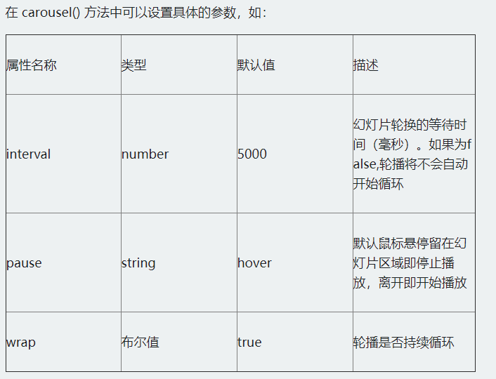
The carousel plug-in in the Bootstrap framework also provides users with several special calling methods:
- . carousel("cycle"): play circularly from left to right;
- . carousel("pause"): stop cyclic playback;
- . carousel("number"): loop to the specified frame, with subscript starting from 0, similar to array;
- . carousel("prev"): return to the previous frame;
- . carousel("next"): next frame
$(function(){
    $("#slidershow").carousel({
        interval:2000
    });
    $("#slidershow a.left").click(function(){
        $(".carousel").carousel("prev");
    });
    $("#slidershow a.right").click(function(){
        $(".carousel").carousel("next");
    });
});
4.3 fixed positioning Affix
4.3.1 declarative trigger fixed positioning
Triggered by the custom attribute data. It mainly includes two parameters:
- Data Spy: the value is affix, indicating that the element is fixed.
- Data offset: an integer value, such as 90, indicates that the values of the elements top and bottom are 90px, which includes two methods: data offset top and data offset bottom.
- Data offset top is used to set the distance of the element from the top. For example, 90 indicates that the element is 90px from the top. When the user drags the scroll bar down from the top, when the scrolling distance is greater than 90px, the affix element will no longer scroll and will be fixed at the top of the browser window.
- Data offset bottom is just the opposite of data offset top.
<body data-spy="scroll" data-target="myScrollspy">
<div class="container">
    <div class="jumbotron">
        <h1>Bootstrap Affix</h1>
    </div>
    <div class="row">
        <div class="col-xs-3" id="myScrollspy">
            <ul class="nav nav-tabs nav-stacked" data-spy="affix" data-offset-top="125">
                <li class="active"><a href="#Section-1 "> Part I</a></li>
                <li><a href="#Section-2 "> Part II</a></li>
                <li><a href="#Section-3 "> Part III</a></li>
                <li><a href="#Section-4 "> Part IV</a></li>
                <li><a href="#Section-5 "> Part V</a></li>
            </ul>
        </div>
        <div class="col-xs-9">...</div>
    </div>
</div>
</body>
Note that scroll monitoring should be declared in the body
If the element is no longer scrolling, it will be fixed at the top of the browser window.
- Data offset bottom is just the opposite of data offset top.
<body data-spy="scroll" data-target="myScrollspy">
<div class="container">
    <div class="jumbotron">
        <h1>Bootstrap Affix</h1>
    </div>
    <div class="row">
        <div class="col-xs-3" id="myScrollspy">
            <ul class="nav nav-tabs nav-stacked" data-spy="affix" data-offset-top="125">
                <li class="active"><a href="#Section-1 "> Part I</a></li>
                <li><a href="#Section-2 "> Part II</a></li>
                <li><a href="#Section-3 "> Part III</a></li>
                <li><a href="#Section-4 "> Part IV</a></li>
                <li><a href="#Section-5 "> Part V</a></li>
            </ul>
        </div>
        <div class="col-xs-9">...</div>
    </div>
</div>
</body>
Note that scroll monitoring should be declared in the body