Previous remarks
Modal pop-up box is called Modal in Bootstrap framework. This pop-up effect is visible in most Web site interactions. For example, if you click a button to pop up a box, the pop-up box may be a description of a document, or it may have button operation, or it may pop up a picture. In this paper, Bootstrap modal pop-up box is introduced in detail.
structural analysis
The modal pop-up box in Bootstrap framework uses modal, modal-dialog and modal-content styles respectively, while the real content of pop-up window is placed in modal-content, which mainly includes three parts:
The head of pop-up box is usually represented by modal-header, which mainly includes the title and closing button.
The main body of the pop-up box is usually represented by modal-body, which is the main content of the pop-up box.
The foot of pop-up frame is usually represented by modal-footer, and the operation button is mainly placed.
<div class="modal show"> <div class="modal-dialog"> <div class="modal-content"> <div class="modal-header"> <button type="button" class="close" data-dismiss="modal"><span aria-hidden="true">×</span><span class="sr-only">Close</span></button> <h4 class="modal-title">Modal pop-up window title</h4> </div> <div class="modal-body"> <p>Main Content of Modal Pop-up Window</p> </div> <div class="modal-footer"> <button type="button" class="btn btn-default" data-dismiss="modal">Close</button> <button type="button" class="btn btn-primary">Preservation</button> </div> </div><!-- /.modal-content --> </div><!-- /.modal-dialog --> </div><!-- /.modal -->
modal-content is the key to style for pop-up windows. Mainly set the frame, margin, background color and shadow of the bullet window.
.modal-content {
  position: relative;
  background-color: #fff;
  -webkit-background-clip: padding-box;
          background-clip: padding-box;
  border: 1px solid #999;
  border: 1px solid rgba(0, 0, 0, .2);
  border-radius: 6px;
  outline: 0;
  -webkit-box-shadow: 0 3px 9px rgba(0, 0, 0, .5);
          box-shadow: 0 3px 9px rgba(0, 0, 0, .5);
}
In addition, modal-header, modal-body and modal-footer in modal-content are set as follows
.modal-header {
  min-height: 16.42857143px;
  padding: 15px;
  border-bottom: 1px solid #e5e5e5;
}
.modal-header .close {
  margin-top: -2px;
}
.modal-title {
  margin: 0;
  line-height: 1.42857143;
}
.modal-body {
  position: relative;
  padding: 15px;
}
.modal-footer {
  padding: 15px;
  text-align: right;
  border-top: 1px solid #e5e5e5;
}
These three parts mainly control some spacing patterns. modal-footer is used to place buttons, so the bottom of the button contains a certain style processing.
.modal-footer .btn + .btn {
  margin-bottom: 0;
  margin-left: 5px;
}
.modal-footer .btn-group .btn + .btn {
  margin-left: -1px;
}
.modal-footer .btn-block + .btn-block {
  margin-left: 0;
}
Trigger mode
It is well known that the modal pop-up window is hidden in the page when the page is loaded, and only through certain actions (events) can it trigger the display of the modal pop-up window. There are two implementations in the Bootstrap framework
Before introducing the trigger mode, we first need to explain. show and. fade. Only when the modal pop-up window is hidden by default can its display be triggered.
.fade {
    opacity: 0;
    -webkit-transition: opacity .15s linear;
    -o-transition: opacity .15s linear;
    transition: opacity .15s linear;
}
.show {
    display: block!important;
}
[Method 1]
Modal pop-up window declarations require only two necessary attributes to be customized: data-toggle and data-target (declarative triggering methods in bootstrap generally depend on these customized data-xxx attributes. For example, data-toggle="" or data-dismiss=")
data-toggle must be set to modal.
data-target can be set to the selector of CSS or the ID value of the modal pop-up window. In general, it is set to the ID value of the modal pop-up window, because the ID value is the only value.
<!-- Elements of trigger mode pop-up window --> <button type="button" data-toggle="modal" data-target="#mymodal" class="btn btn-primary">click</button> <!-- Modal pop-up window --> <div class="modal fade" id="mymodal"> <div class="modal-dialog"> <div class="modal-content"> <div class="modal-header"> <button type="button" class="close" data-dismiss="modal"><span aria-hidden="true">×</span><span class="sr-only">Close</span></button> <h4 class="modal-title">Modal pop-up window title</h4> </div> <div class="modal-body"> <p>Main Content of Modal Pop-up Window</p> </div> <div class="modal-footer"> <button type="button" class="btn btn-default" data-dismiss="modal">Close</button> <button type="button" class="btn btn-primary">Preservation</button> </div> </div><!-- /.modal-content --> </div><!-- /.modal-dialog --> </div><!-- /.modal -->
[Method 2]
The trigger mode pop-up window can also be a link < a > element, so the data-target attribute can be replaced by the href attribute of the link element.
It is recommended, however, that data-target be used uniformly to trigger
<!-- Elements of trigger mode pop-up window --> <a data-toggle="modal" href="#mymodal" class=" btn btn-primary" >click</a> <!-- Modal pop-up window --> <div class="modal fade" id="mymodal"> <div class="modal-dialog"> <div class="modal-content"> <div class="modal-header"> <button type="button" class="close" data-dismiss="modal"><span aria-hidden="true">×</span><span class="sr-only">Close</span></button> <h4 class="modal-title">Modal pop-up window title</h4> </div> <div class="modal-body"> <p>Main Content of Modal Pop-up Window</p> </div> <div class="modal-footer"> <button type="button" class="btn btn-default" data-dismiss="modal">Close</button> <button type="button" class="btn btn-primary">Preservation</button> </div> </div><!-- /.modal-content --> </div><!-- /.modal-dialog --> </div><!-- /.modal -->
size
The Bootstrap framework provides different sizes for modal pop-up windows, one is modal-lg in large size and the other is modal-sm in small size. Its structure is slightly adjusted.
[Note]. bs-example-modal-lg and. bs-example-modal-sm are custom names, not mandatory
<!-- Large-size modal pop-up window -->
<div class="modal fade bs-example-modal-lg" tabindex="-1" role="dialog" aria-labelledby="myLargeModalLabel" aria-hidden="true">
    <div class="modal-dialog modal-lg">
       <div class="modal-content"> ... </div>
    </div>
</div>
<!-- Small-size modal pop-up window -->
<div class="modal fade bs-example-modal-sm" tabindex="-1" role="dialog" aria-labelledby="mySmallModalLabel" aria-hidden="true">
    <div class="modal-dialog modal-sm">
       <div class="modal-content"> ... </div>
    </div>
</div>
<button type="button" class="btn btn-primary" data-toggle="modal" data-target=".bs-example-modal-lg">Large size</button>
<button type="button" class="btn btn-primary" data-toggle="modal" data-target="#myModal">Default size</button>
<button type="button" class="btn btn-primary" data-toggle="modal" data-target=".bs-example-modal-sm">Small size</button>

<div class="modal fade" id="myModal">
    <div class="modal-dialog">
        <div class="modal-content">
            <div class="modal-body">
                <p>Blue Ideal of Small Match</p>
            </div>
        </div>
    </div>
</div>
<div class="modal fade bs-example-modal-lg">
    <div class="modal-dialog modal-lg">
        <div class="modal-content">
            <div class="modal-body">
                <p>Blue Ideal of Small Match</p>
            </div>
        </div>
    </div>
</div>
<div class="modal fade bs-example-modal-sm">
    <div class="modal-dialog modal-sm">
        <div class="modal-content">
            <div class="modal-body">
                <p>Blue Ideal of Small Match</p>
            </div>
        </div>
    </div>
</div>
CSS parsing
The modal pop-up box in bootstrap has the following characteristics:
1. The modal pop-up window is fixed in the browser.
2. Click on the right full-screen button. In the full-screen state, the width of the modal pop-up window is adaptive, and the modal-dialog level is in the middle.
3. When the browser window is larger than 768 px, the width of the modal pop-up window is 600 px.
4. The background of modal pop-up window often has a transparent mask effect.
5. When triggering the pop-up window, the pop-up window is from top to bottom and gradually appears in front of the page.
[Fixed in browser implementation]
.modal {
  position: fixed;
  top: 0;
  right: 0;
  bottom: 0;
  left: 0;
  z-index: 1050;
  display: none;
  overflow: hidden;
  -webkit-overflow-scrolling: touch;
  outline: 0;
}
[Horizontal Medium Realization]
.modal-dialog {
  position: relative;
  width: auto;
  margin: 10px;
}
[When the browser window is larger than 768px, the width of the modal pop-up window is 600px].
@media (min-width: 768px) {
  .modal-dialog {
    width: 600px;
    margin: 30px auto;
  }
  .modal-content {
    -webkit-box-shadow: 0 5px 15px rgba(0, 0, 0, .5);
            box-shadow: 0 5px 15px rgba(0, 0, 0, .5);
  }
  .modal-sm {
    width: 300px;
  }
}
[mask]
When the pop-up window pops up, add a. modal-open class to the <body> element to override the default scrolling behavior of the page, and automatically generate a. modal-backdrop element to provide a clickable area, which closes the modal box.
.modal-open {
    overflow: hidden;
}
.modal-backdrop {
  position: fixed;
  top: 0;
  right: 0;
  bottom: 0;
  left: 0;
  z-index: 1040;
  background-color: #000;
}
Adding a transition animation from fade to in, changing opacity from 0 to 0.5
.modal-backdrop.fade {
  filter: alpha(opacity=0);
  opacity: 0;
}
.modal-backdrop.in {
  filter: alpha(opacity=50);
  opacity: .5;
}
[Animation effects]
The animation content of the pop-up window is from - 25% top to top:0.
.modal.fade .modal-dialog {
  -webkit-transition: -webkit-transform .3s ease-out;
       -o-transition:      -o-transform .3s ease-out;
          transition:         transform .3s ease-out;
  -webkit-transform: translate3d(0, -25%, 0);
       -o-transform: translate3d(0, -25%, 0);
          transform: translate3d(0, -25%, 0);
}

.modal.in .modal-dialog {
  -webkit-transform: translate3d(0, 0, 0);
       -o-transform: translate3d(0, 0, 0);
          transform: translate3d(0, 0, 0);
}
If you don't need the animation effect when the modal box pops up (fade in and fade out), delete the fade class.
<!-- Elements of trigger mode pop-up window --> <button type="button" data-toggle="modal" data-target="#mymodal" class="btn btn-primary">click</button> <!-- Modal pop-up window --> <div class="modal" id="mymodal"> <div class="modal-dialog"> <div class="modal-content"> <div class="modal-header"> <button type="button" class="close" data-dismiss="modal"><span aria-hidden="true">×</span><span class="sr-only">Close</span></button> <h4 class="modal-title">Modal pop-up window title</h4> </div> <div class="modal-body"> <p>Main Content of Modal Pop-up Window</p> </div> <div class="modal-footer"> <button type="button" class="btn btn-default" data-dismiss="modal">Close</button> <button type="button" class="btn btn-primary">Preservation</button> </div> </div><!-- /.modal-content --> </div><!-- /.modal-dialog --> </div><!-- /.modal -->
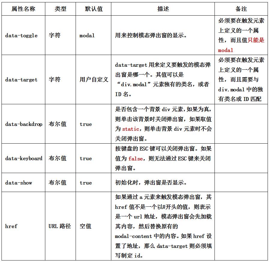
Description of parameters
In addition to data-toggle and data-target to control modal pop-up windows, the Bootstrap framework also provides other custom data-attributes for modal pop-up boxes to control modal pop-up windows. The instructions for Modal pop-up window custom properties are as follows
This parameter can be set on the button or on the pop-up window. For convenience, generally, set it on the button
[Note] Attribute values must be quoted, such as data-backdrop="false"
If you want to support the esc key to close the bullet window, you need to set tabindex="-1" on the bullet window.
<button type="button" data-toggle="modal" data-target="#mymodal1" class="btn btn-primary">Default Style</button> <button type="button" data-toggle="modal" data-target="#mymodal2" data-backdrop="false" class="btn btn-primary">Maskless Edition</button> <button type="button" data-toggle="modal" data-target="#mymodal3" data-keyboard="false" class="btn btn-primary">ESC Invalid</button> <button type="button" data-toggle="modal" data-target="#mymodal4" data-show="false" class="btn btn-primary">Bullet window is not displayed by default</button> <div class="modal fade" tabindex="-1" id="mymodal1"> <div class="modal-dialog"> <div class="modal-content"> <div class="modal-header"> <button type="button" class="close" data-dismiss="modal"><span aria-hidden="true">×</span><span class="sr-only">Close</span></button> <h4 class="modal-title">Blue Ideal of Small Match</h4> </div> <div class="modal-body"> <p>Good code is like porridge. It takes time to boil it.</p> </div> </div> </div> </div> <div class="modal fade" tabindex="-1" id="mymodal2"> <div class="modal-dialog"> <div class="modal-content"> <div class="modal-header"> <button type="button" class="close" data-dismiss="modal"><span aria-hidden="true">×</span><span class="sr-only">Close</span></button> <h4 class="modal-title">Blue Ideal of Small Match</h4> </div> <div class="modal-body"> <p>Good code is like porridge. It takes time to boil it.</p> </div> </div> </div> </div> <div class="modal fade" tabindex="-1" id="mymodal3"> <div class="modal-dialog"> <div class="modal-content"> <div class="modal-header"> <button type="button" class="close" data-dismiss="modal"><span aria-hidden="true">×</span><span class="sr-only">Close</span></button> <h4 class="modal-title">Blue Ideal of Small Match</h4> </div> <div class="modal-body"> <p>Good code is like porridge. It takes time to boil it.</p> </div> </div> </div> </div> <div class="modal fade" tabindex="-1" id="mymodal4"> <div class="modal-dialog"> <div class="modal-content"> <div class="modal-header"> <button type="button" class="close" data-dismiss="modal"><span aria-hidden="true">×</span><span class="sr-only">Close</span></button> <h4 class="modal-title">Blue Ideal of Small Match</h4> </div> <div class="modal-body"> <p>Good code is like porridge. It takes time to boil it.</p> </div> </div> </div> </div>
JS trigger
In addition to using the custom property data-triggering modal pop-up box, JavaScript can also be used to trigger modal pop-up window. For example, set a click event to a button and trigger a modal pop-up window.
With just one line of JavaScript code, you can call the modal box through the id myModal of the element
$('#myModal').modal()
<button type="button" class="btn btn-primary">click</button> <div class="modal fade" tabindex="-1" id="mymodal"> <div class="modal-dialog"> <div class="modal-content"> <div class="modal-header"> <button type="button" class="close" data-dismiss="modal"><span aria-hidden="true">×</span><span class="sr-only">Close</span></button> <h4 class="modal-title">Blue Ideal of Small Match</h4> </div> <div class="modal-body"> <p>Good code is like porridge. It takes time to boil it.</p> </div> </div> </div> </div> <script> $(function(){ $(".btn").click(function(){ $("#mymodal").modal(); }); }); </script>
When using JavaScript to trigger modal pop-up windows, the Bootstrap framework provides some settings, including attribute settings, parameter settings and event settings.
[Property Settings]
Custom properties supported by default in modal pop-up windows are mainly

If you don't want the user to press ESC to close the modal pop-up window, you can do this.
$(function(){
    $(".btn").click(function(){
        $("#mymodal").modal({
            keyboard:false
        });
    });
});
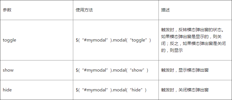
[Parameter Settings]
In the Bootstrap framework, three parameter settings are also provided for modal pop-up windows, which are specified as follows
<button type="button" class="btn btn-primary" id="btn" style="position:absolute;z-index:9999">open(Close)</button>
<div class="modal" tabindex="-1" id="mymodal" >
<div class="modal-dialog">
<div class="modal-content">
<div class="modal-header">
<button type="button" class="close" data-dismiss="modal"><span aria-hidden="true">×</span><span class="sr-only">Close</span></button>
<h4 class="modal-title">Blue Ideal of Small Match</h4>
</div>
<div class="modal-body">
<p>Good code is like porridge. It takes time to boil it.</p>
</div>
</div>
</div>
</div>
<script>
;$(function(){
$("#btn").click(function(){
$("#mymodal").modal("toggle");
});
});
</script>
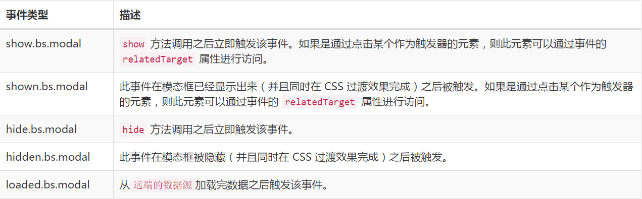
[Event Settings]
The modal pop-up window also supports five types of events: before pop-up, after pop-up, before close, after close and after remote data loading.
<button type="button" class="btn btn-primary" id="btn" style="position:absolute;z-index:9999">open</button> <div class="modal" tabindex="-1" id="mymodal" > <div class="modal-dialog"> <div class="modal-content"> <div class="modal-header"> <button type="button" class="close" data-dismiss="modal"><span aria-hidden="true">×</span><span class="sr-only">Close</span></button> <h4 class="modal-title">Blue Ideal of Small Match</h4> </div> <div class="modal-body"> <p>Good code is like porridge. It takes time to boil it.</p> </div> </div> </div> </div> <script> ;$(function(){ $("#btn").click(function(){ $("#mymodal").modal("toggle"); }); $('#mymodal').on('hide.bs.modal', function(){ $("#btn").html("open"); }); $('#mymodal').on('show.bs.modal', function(){ $("#btn").html("Close"); }); }); </script>
JS parsing
[1]IIFE
Use immediate call functions to prevent code leakage in plug-ins, thus forming a closed loop, and can only be extended from jQuery's fn
+function ($) {
    //Use es5 Strict model
    'use strict';
    //
}(window.jQuery);
[2] Initial settings
  var Modal = function (element, options) {

    this.options             = options//options Setting options
    this.$body               = $(document.body)//body element
    this.$element            = $(element)////element represents modal pop-up box containers and content elements
    this.$dialog             = this.$element.find('.modal-dialog')//Bullet window object
    this.$backdrop           = null //Mask object
    this.isShown             = null //PopupIdentification whether to display or not
    this.originalBodyPad     = null //padding-right identification of body
    this.scrollbarWidth      = 0 //The width of the scroll bar is 0.
    this.ignoreBackdropClick = false //Default mask clickable

    //If set remote,Just load remote Appoint url Content to modal-content Within the element of the style, and triggered loaded.bs.modal Event
    if (this.options.remote) {
      this.$element
        .find('.modal-content')
        .load(this.options.remote, $.proxy(function () {
          this.$element.trigger('loaded.bs.modal')
        }, this))
    }
  }
  //Component version number 3.3.7
  Modal.VERSION  = '3.3.7'

  //Animation duration 300 ms
  Modal.TRANSITION_DURATION = 300
  //Mask animation duration 150 ms
  Modal.BACKDROP_TRANSITION_DURATION = 150

  //default setting
  Modal.DEFAULTS = {
    backdrop: true, //Display mask
    keyboard: true, //Press ESC Keyboard Close Bullet Window
    show: true //Open the bullet window when you click on the trigger element
  }
[3] Plug-in Core Code
It mainly includes the definition of Modal core class functions, default parameters and nine prototype methods, which deal with the inversion, opening, closing, background setting and canceling of spring windows.
  // Flip-back window(turn on or off)
  Modal.prototype.toggle = function (_relatedTarget) {
    //If the pop-up window is in the display state, the call is made hide()Method, close it; otherwise, call show()Method, open the bullet window
    return this.isShown ? this.hide() : this.show(_relatedTarget)
  }

  // Open the bullet window
  Modal.prototype.show = function (_relatedTarget) {
    //Preservation this value
    var that = this
    //Define trigger events in front of the bullet window
    var e    = $.Event('show.bs.modal', { relatedTarget: _relatedTarget })
    //Trigger the event before opening the bullet window
    this.$element.trigger(e)
    // If it has been opened (or has been blocked), it exits execution and the subsequent code is not processed.
    if (this.isShown || e.isDefaultPrevented()) return
    //Set the bullet window display logo as true
    this.isShown = true
    this.checkScrollbar()
    this.setScrollbar()
    this.$body.addClass('modal-open')
    //Processing keyboard events, mainly by setting press esc Whether to close the bullet window when keying
    this.escape()
    this.resize()
    // If you click on the child element within the element (with[data-dismiss="modal"]Property), then close the bullet window
    this.$element.on('click.dismiss.bs.modal', '[data-dismiss="modal"]', $.proxy(this.hide, this))
    //When clicking on the pop-up window, if the mouse is aiming at the current pop-up window, set the non-clickable mark of the default mask as true,No more settings
    this.$dialog.on('mousedown.dismiss.bs.modal', function () {
      that.$element.one('mouseup.dismiss.bs.modal', function (e) {
        if ($(e.target).is(that.$element)) that.ignoreBackdropClick = true
      })
    })
    //After the mask is drawn, the following code is processed
    this.backdrop(function () {
      // Determine whether the browser supports animation, and whether the pop-up window has animation transition effect (whether or not) fade Style)
      var transition = $.support.transition && that.$element.hasClass('fade')
      // If modal Bullet window without parent container, attach it to body upper
      if (!that.$element.parent().length) {
        that.$element.appendTo(that.$body)
      }
      // display modal Popup
      that.$element
        .show()
        .scrollTop(0)
      that.adjustDialog()
      // If animation is supported, force refresh UI On-site, redrawing bullet windows
      if (transition) {
        that.$element[0].offsetWidth
      }
      // to modal Bullet window addition in Style, and modal Styles together
      that.$element.addClass('in')
      // Forced Bullet Window Focus Setting
      that.enforceFocus()
      // Trigger Event after Opening Bullet Window Display
      var e = $.Event('shown.bs.modal', { relatedTarget: _relatedTarget })
      transition ?
        that.$dialog //Find the Bullet Window Element
          .one('bsTransitionEnd', function () {
            // If animation is supported, the elements in the pop-up window are focused and triggered after the animation is finished. shown Event
            that.$element.trigger('focus').trigger(e)
          })
          .emulateTransitionEnd(Modal.TRANSITION_DURATION) :
        // Otherwise, set the focus directly and trigger it shown Event
        that.$element.trigger('focus').trigger(e)
    })
  }

  // Close the bullet window
  Modal.prototype.hide = function (e) {
    //Prevent bubbles
    if (e) e.preventDefault()
    //Define trigger events before closing the bullet window
    e = $.Event('hide.bs.modal')
    //Trigger event before closing bullet window
    this.$element.trigger(e)
    // If it has been closed (or has been blocked), it exits execution and the subsequent code is not processed.
    if (!this.isShown || e.isDefaultPrevented()) return
    //Set the display status to false
    this.isShown = false
    //Processing keyboard events, mainly by setting press Esc Whether to close the bullet window when keying
    this.escape()
    this.resize()
    //Cancel all focusin.bs.modal Event
    $(document).off('focusin.bs.modal')
    this.$element
      .removeClass('in') //delete in style
      .off('click.dismiss.bs.modal') //cancel dismiss Click events
      .off('mouseup.dismiss.bs.modal')//cancel dismiss Mouse Uplift Event
    //cancel dismiss Mouse down event
    this.$dialog.off('mousedown.dismiss.bs.modal')
    //If animation is supported, the animation will be closed after the end of the animation, otherwise it will be closed directly.
    $.support.transition && this.$element.hasClass('fade') ?
      this.$element
        .one('bsTransitionEnd', $.proxy(this.hideModal, this))
        .emulateTransitionEnd(Modal.TRANSITION_DURATION) :
      this.hideModal()
  }

  //Forced Bullet Window in Focus
  Modal.prototype.enforceFocus = function () {
    $(document)
      // Disable all focusin Events to prevent infinite loops
      .off('focusin.bs.modal')
      .on('focusin.bs.modal', $.proxy(function (e) {
        if (this.$element[0] !== e.target && !this.$element.has(e.target).length) {
          // If the element in focus is not the current element (or does not contain the current element), force the focus on the current element.
          this.$element.trigger('focus')
        }
      }, this))
  }

  //Press Esc Key Exit Processing
  Modal.prototype.escape = function () {
    if (this.isShown && this.options.keyboard) {
      //If the window is open, and keyboard Options are true,It is allowed to press ESC Key closes the bullet window
      this.$element.on('keydown.dismiss.bs.modal', $.proxy(function (e) {
        //Detect keyboard events if ESC(keycode=27),Close
        e.which == 27 && this.hide()
      }, this))
    } else if (!this.isShown) {
      // Otherwise, cancel keyboard event detection
      this.$element.off('keydown.dismiss.bs.modal')
    }
  }

  Modal.prototype.resize = function () {
    if (this.isShown) {
      $(window).on('resize.bs.modal', $.proxy(this.handleUpdate, this))
    } else {
      $(window).off('resize.bs.modal')
    }
  }

  //Close the bullet window
  Modal.prototype.hideModal = function () {
    var that = this
    //Close the bullet window
    this.$element.hide()
    this.backdrop(function () {
      //remove body Upper modal-open style
      that.$body.removeClass('modal-open')
      that.resetAdjustments()
      that.resetScrollbar()
      //After closing, trigger hidden Event
      that.$element.trigger('hidden.bs.modal')
    })
  }

  //Delete mask and trigger when closing window
  Modal.prototype.removeBackdrop = function () {
    // Delete mask
    this.$backdrop && this.$backdrop.remove()
    // Set the mask object to null
    this.$backdrop = null
  }

  //Add mask and trigger when pop-up window is opened
  Modal.prototype.backdrop = function (callback) {
    var that = this
    //Whether the animation transition effect is set, and if so, the animate Set to fade
    var animate = this.$element.hasClass('fade') ? 'fade' : ''
    //If it is open, and set backdrop parameter
    if (this.isShown && this.options.backdrop) {
      //Define animation identifiers
      var doAnimate = $.support.transition && animate
      // stay body Upper Definition Mask div Element, and add fade Identity to support animation
      this.$backdrop = $(document.createElement('div'))
        .addClass('modal-backdrop ' + animate)
        .appendTo(this.$body)
      //When the mask is clicked, judge: if backdrop The parameter is static,The bullet window is forced to be set as a selling point; otherwise, the bullet window is closed.
      this.$element.on('click.dismiss.bs.modal', $.proxy(function (e) {
        if (this.ignoreBackdropClick) {
          this.ignoreBackdropClick = false
          return
        }
        if (e.target !== e.currentTarget) return
        this.options.backdrop == 'static'
          ? this.$element[0].focus()
          : this.hide()
      }, this))
      // If animation is supported, force refresh UI On-site, redrawing bullet windows
      if (doAnimate) this.$backdrop[0].offsetWidth
      //Add to in style
      this.$backdrop.addClass('in')
      //If there is no callback, return directly
      if (!callback) return
      // If animation is supported, the callback function is executed at the end of the animation; otherwise, the callback function is executed directly.
      doAnimate ?
        this.$backdrop
          .one('bsTransitionEnd', callback)
          .emulateTransitionEnd(Modal.BACKDROP_TRANSITION_DURATION) :
        callback()
      //If it is closed, the mask object still exists
    } else if (!this.isShown && this.$backdrop) {
      //Remove in style
      this.$backdrop.removeClass('in')

      var callbackRemove = function () {
        that.removeBackdrop()
        callback && callback()
      }
      // If animation is supported, the callback function is executed at the end of the animation; otherwise, the callback function is executed directly.
      $.support.transition && this.$element.hasClass('fade') ?
        this.$backdrop
          .one('bsTransitionEnd', callbackRemove)
          .emulateTransitionEnd(Modal.BACKDROP_TRANSITION_DURATION) :
        callbackRemove()

    } else if (callback) {
      callback()
    }
  }
[4] Scroll Bar Processing
In the pop-up window plug-in, a lot of code is used to process the scrollbar.
  Modal.prototype.handleUpdate = function () {
    this.adjustDialog()
  }

  //Deal with the problem that the position of the bullet window is not fixed because of the scroll bar
  Modal.prototype.adjustDialog = function () {
    //If the height of the element is greater than the height of the page, that is, overflow the screen, modalIsOverflowing Set as true
    var modalIsOverflowing = this.$element[0].scrollHeight > document.documentElement.clientHeight
    //Will be elementary paddingLeft and paddingRight Set to scrollbarWidth
    this.$element.css({
      paddingLeft:  !this.bodyIsOverflowing && modalIsOverflowing ? this.scrollbarWidth : '',
      paddingRight: this.bodyIsOverflowing && !modalIsOverflowing ? this.scrollbarWidth : ''
    })
  }

  //Reset regulator
  Modal.prototype.resetAdjustments = function () {
    //Will be elementary paddingLeft and paddingRight Empty
    this.$element.css({
      paddingLeft: '',
      paddingRight: ''
    })
  }

  //Check the scroll bar
  Modal.prototype.checkScrollbar = function () {
    //fullWindowWidth Store page width
    var fullWindowWidth = window.innerWidth
    //IE8-Browser does not support innerWidth attribute
    if (!fullWindowWidth) {
      //Use getBoundingClientRect Method to get page width
      var documentElementRect = document.documentElement.getBoundingClientRect()
      fullWindowWidth = documentElementRect.right - Math.abs(documentElementRect.left)
    }
    //If there is a scroll bar, then bodyIsOverflowing Set as true
    this.bodyIsOverflowing = document.body.clientWidth < fullWindowWidth
    //take scrollbarWidth Set the actual scroll bar width
    this.scrollbarWidth = this.measureScrollbar()
  }

  //Used for body Element Settings padding-right Value, prevention body Element by scrollbar Stop
  Modal.prototype.setScrollbar = function () {
    var bodyPad = parseInt((this.$body.css('padding-right') || 0), 10)
    this.originalBodyPad = document.body.style.paddingRight || ''
    //If a scrollbar exists on the page, body Of padding-right Set to default padding-right Add the width of the scroll bar
    if (this.bodyIsOverflowing) this.$body.css('padding-right', bodyPad + this.scrollbarWidth)
  }

  //Reset scrollbar
  Modal.prototype.resetScrollbar = function () {
    //take body Of padding-right The value is set to null
    this.$body.css('padding-right', this.originalBodyPad)
  }

  //Measuring the width of the scroll bar
  Modal.prototype.measureScrollbar = function () {
    var scrollDiv = document.createElement('div')
    scrollDiv.className = 'modal-scrollbar-measure'
    this.$body.append(scrollDiv)
    //The width of the scroll bar is equal to offetWidth - clientWidth
    var scrollbarWidth = scrollDiv.offsetWidth - scrollDiv.clientWidth
    this.$body[0].removeChild(scrollDiv)
    return scrollbarWidth
  }
[5] jQuery plug-in definition
Defining plug-ins on jQuery is a little special code for collecting and merging options parameters. It mainly collects three parts: the default parameter DEFAULTS of plug-ins, data-attributes on modal elements, and the input option object when executing plug-ins. The priority of these three parts increases in turn.
  function Plugin(option, _relatedTarget) {
    //According to the selector, traverse all rule-compliant elements
    return this.each(function () {
      var $this   = $(this)
      //Get custom properties bs.modal Value
      var data    = $this.data('bs.modal')
      //Default parameters for plug-ins DEFAULTS,modal Elemental data-Property, which is passed in when the plug-in is executed option Object, these three values are combined as options parameter
      //The priority of the latter parameter is higher than that of the former.
      var options = $.extend({}, Modal.DEFAULTS, $this.data(), typeof option == 'object' && option)
      //If the value does not exist, the Modal The instance is set to bs.modal value
      if (!data) $this.data('bs.modal', (data = new Modal(this, options)))
      //If option It's passed on. string,Represents that a method is to be executed
      if (typeof option == 'string') data[option](_relatedTarget)
      else if (options.show) data.show(_relatedTarget)
    })
  }

  var old = $.fn.modal
  //Keeping other libraries $.fn.modal Code(If defined),In order to noConflict You can then continue to use the old code
  $.fn.modal             = Plugin
  //Reset the plug-in constructor to get the real class functions of the plug-in through this property
  $.fn.modal.Constructor = Modal
[6] Conflict prevention
  $.fn.modal.noConflict = function () {
    //Restore old code
    $.fn.modal = old
    //take $.fn.modal.noConflict()Set to Bootstrap Of Modal Plug-in unit
    return this
  }
[7] Binding trigger event
  //Monitor all custom attributes data-toggle="modal"Click events on elements of
  $(document).on('click.bs.modal.data-api', '[data-toggle="modal"]', function (e) {
    var $this   = $(this)
    //Obtain href Attribute value
    var href    = $this.attr('href')
    //Obtain data-target Property values, if not, are retrieved href Value, which is the pop-up element id
    var $target = $($this.attr('data-target') || (href && href.replace(/.*(?=#[^\s]+$)/, '')))
    //If an instance of a pop-up window is already on the pop-up window element(That's one pop-up.),Settings option Value is a string toggle,Otherwise it will remote value(If so),Custom attribute value sets on pop-up window elements and trigger elements are merged into option object
    var option  = $target.data('bs.modal') ? 'toggle' : $.extend({ remote: !/#/.test(href) && href }, $target.data(), $this.data())
    //If it is a Links prevent default behavior
    if ($this.is('a')) e.preventDefault()
    $target.one('show.bs.modal', function (showEvent) {
      if (showEvent.isDefaultPrevented()) return
      //Define once hidden Event to set the clicked element focus
      $target.one('hidden.bs.modal', function () {
        $this.is(':visible') && $this.trigger('focus')
      })
    })
    Plugin.call($target, option, this)
  })

}(jQuery);