1, Introduction
Registration and login is an essential part of social and business websites.
2, Knowledge points
2.1 tab
2.1.1 basic tab
The use of the tab is similar to that of the navigation bar. At the same time, it depends on the basic style nav. The difference is that the additional style becomes nav tabs and nav pills (capsule), and there is no need to add a layer of < div > elements with the style navbar navbar - *.
2.1.1.1 Tab tab
Usage: build a tab with < UL > + < li > + < a >, add the style NAV NAV tabs on the outer layer < UL >, and add active on the element < li > that needs to be active.
<!--Code part-->
<ul class="nav nav-tabs">
    <li class="active" role="presentation"><a href="#">Tab First</a></li>
    <li role="presentation"><a href="#">Tab Second</a></li>
    <li role="presentation"><a href="#">Tab Third</a></li>
    <li role="presentation"><a href="#">Tab Fourth</a></li>
    <li role="presentation"><a href="#">Tab Fifth</a></li>
</ul>
design sketch:

2.1.1.2 capsule tab
Usage: the implementation method is similar to that of Tab tabs. Replace the style NAV tabs with NAV pills.
<!--Code part-->
<ul class="nav nav-pills">
    <li class="active" role="presentation"><a href="#">Tab First</a></li>
    <li role="presentation"><a href="#">Tab Second</a></li>
    <li role="presentation"><a href="#">Tab Third</a></li>
    <li role="presentation"><a href="#">Tab Fourth</a></li>
    <li role="presentation"><a href="#">Tab Fifth</a></li>
</ul>
design sketch:

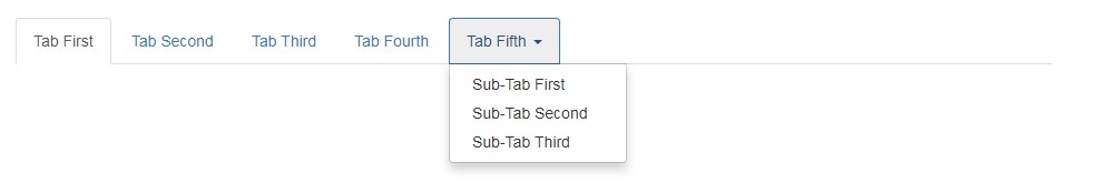
2.1.2 tab with drop-down box
Like the navigation bar, the tab can have a drop-down box, and the use method is the same. Embed a < UL > + < li > + < a > in the < li > where the pull-down box is to be put down, and add the style dropdown toggle and attribute data toggle = "dropdown" to the < a > element of the primary tab, and add the style dropdown menu to the < UL > element of the secondary navigation.
<!--Code part-->
<ul class="nav nav-tabs">
    <li class="active" role="presentation"><a href="#">Tab First</a></li>
    <li role="presentation"><a href="#">Tab Second</a></li>
    <li role="presentation"><a href="#">Tab Third</a></li>
    <li role="presentation"><a href="#">Tab Fourth</a></li>
    <li role="presentation">
        <a class="dropdown-toggle" data-toggle="dropdown" href="#">Tab Fifth <span class="caret"></span></a>
        <ul class="dropdown-menu">
            <li><a href="#">Sub-Tab First</a></li>
            <li><a href="#">Sub-Tab Second</a></li>
            <li><a href="#">Sub-Tab Third</a></li>
        </ul>
    </li>
</ul>
design sketch:
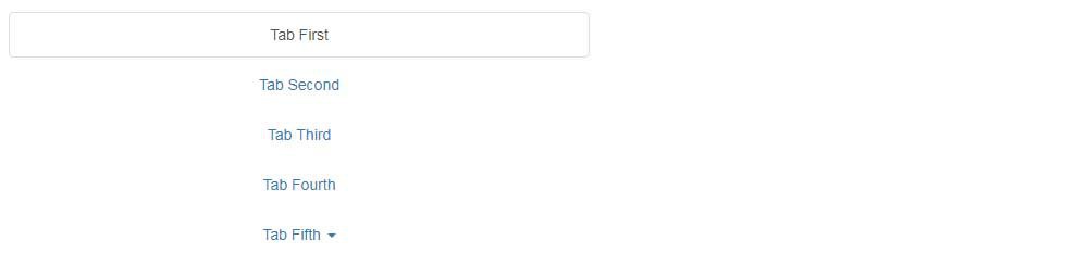
2.1.3 responsive tabs
Like the navigation bar, tabs have their own responsive style. Usage: add a style NAV justified in the < UL > element of the primary tab.
<!--Code part-->
<ul class="nav nav-tabs nav-justified">
    <li class="active" role="presentation"><a href="#">Tab First</a></li>
    <li role="presentation"><a href="#">Tab Second</a></li>
    <li role="presentation"><a href="#">Tab Third</a></li>
    <li role="presentation"><a href="#">Tab Fourth</a></li>
    <li role="presentation">
        <a class="dropdown-toggle" data-toggle="dropdown" href="#">Tab Fifth <span class="caret"></span></a>
        <ul class="dropdown-menu">
            <li><a href="#">Sub-Tab First</a></li>
            <li><a href="#">Sub-Tab Second</a></li>
            <li><a href="#">Sub-Tab Third</a></li>
        </ul>
    </li>
</ul>
Large screen rendering:

Small screen rendering:
2.1.4 contents of Label Page
Switching tabs to display content is common in web pages. How to use it: add a container with two layers of < div > elements inside and outside under the < UL > elements of the tab, add the style tab content to the outer < div > elements, add the style tab pane fade to multiple < div > elements in the inner layer, and add the style in active to the content displayed by default, The fade in here is to have a gradual effect during switching. In addition, add different ID attributes to the inner < div > element, corresponding to the href attribute corresponding to the < UL > element above. For example, if href="#first", the id="first" in the < div > element below.
<!--Code part-->
<ul class="nav nav-tabs nav-justified">
    <li class="active" role="presentation"><a href="#first" data-toggle="tab">Tab First</a></li>
    <li role="presentation"><a href="#second" data-toggle="tab">Tab Second</a></li>
    <li role="presentation"><a href="#third" data-toggle="tab">Tab Third</a></li>
    <li role="presentation"><a href="#fourth" data-toggle="tab">Tab Fourth</a></li>
    <li role="presentation"><a href="#fifth" data-toggle="tab">Tab Fifth</a></li>
</ul>
<!--Tab content section-->
<div class="tab-content">
    <div class="tab-pane fade in active" id="first" role="tabpanel">Hello, I'm Tab First, How are you?</div>
    <div class="tab-pane fade" id="second" role="tabpanel">Hello, I'm Tab Second, How are you?</div>
    <div class="tab-pane fade" id="third" role="tabpanel">Hello, I'm Tab Third, How are you?</div>
    <div class="tab-pane fade" id="fourth" role="tabpanel">Hello, I'm Tab Fourth, How are you?</div>
    <div class="tab-pane fade" id="fifth" role="tabpanel">Hello, I'm Tab Fifth, How are you?</div>
</div>
design sketch:

2.2 buttons
Buttons are an indispensable part of web page layout, and different styles of buttons should be used in different scenes.
2.2.1 basic button
Usage: add the style BTN - * (default, primary, success, info, warning, danger, link) to the < button > / < a > / < input > element.
<!--Code part-->
<!--White standard button-->
<button type="button" class="btn btn-default">default - default</button>
<!--navy blue-->
<button type="button" class="btn btn-primary">Preferences - primary</button>
<!--Forgiveness color-->
<button type="button" class="btn btn-success">success - success</button>
<!--wathet-->
<button type="button" class="btn btn-info">Tips - info</button>
<!--yellow-->
<button type="button" class="btn btn-warning">warning - warning</button>
<!--gules-->
<button type="button" class="btn btn-danger">DANGER - danger</button>
<!--Link style-->
<button type="button" class="btn btn-link">Preferences - link</button>
design sketch:

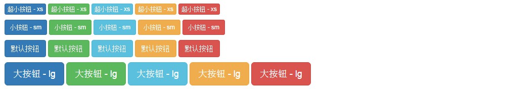
2.2.2 advanced buttons
2.2.2.1 change the size of the button
You can change the size of the button from small to large by adding styles BTN XS, BTN SM and BTN LG.
<!--Code part-->
<p>
    <button type="button" class="btn btn-primary btn-xs">Ultra small button - xs</button>
    <button type="button" class="btn btn-success btn-xs">Ultra small button - xs</button>
    <button type="button" class="btn btn-info btn-xs">Ultra small button - xs</button>
    <button type="button" class="btn btn-warning btn-xs">Ultra small button - xs</button>
    <button type="button" class="btn btn-danger btn-xs">Ultra small button - xs</button>
</p>
<p>
    <button type="button" class="btn btn-primary btn-sm">Small button - sm</button>
    <button type="button" class="btn btn-success btn-sm">Small button - sm</button>
    <button type="button" class="btn btn-info btn-sm">Small button - sm</button>
    <button type="button" class="btn btn-warning btn-sm">Small button - sm</button>
    <button type="button" class="btn btn-danger btn-sm">Small button - sm</button>
</p>
<p>
    <button type="button" class="btn btn-primary">Default button</button>
    <button type="button" class="btn btn-success">Default button</button>
    <button type="button" class="btn btn-info">Default button</button>
    <button type="button" class="btn btn-warning">Default button</button>
    <button type="button" class="btn btn-danger">Default button</button>
</p>
<p>
    <button type="button" class="btn btn-primary btn-lg">Big button - lg</button>
    <button type="button" class="btn btn-success btn-lg">Big button - lg</button>
    <button type="button" class="btn btn-info btn-lg">Big button - lg</button>
    <button type="button" class="btn btn-warning btn-lg">Big button - lg</button>
    <button type="button" class="btn btn-danger btn-lg">Big button - lg</button>
</p>
design sketch:
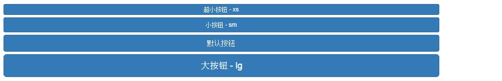
2.2.2.2 block button
Sometimes if you want to fill the entire parent container with a button, you can add a style BTN block to the button.
<!--Code part-->
<button type="button" class="btn btn-primary btn-xs btn-block">Ultra small button - xs</button>
<button type="button" class="btn btn-primary btn-sm btn-block">Small button - sm</button>
<button type="button" class="btn btn-primary btn-block">Default button</button>
<button type="button" class="btn btn-primary btn-lg btn-block">Big button - lg</button>
design sketch:
2.3 forms
2.3.1 basic form
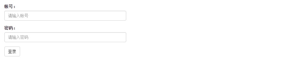
Bootstrap initializes the style of form elements such as < input > / < Select > / < label >. First, wrap the < label > and < input > elements with a style form group < div > element to obtain a good arrangement.
<!--Code part-->
<form>
    <div class="form-group">
        <label for="username">Account number:</label>
        <!--style form-control Will let input The element width is the parent container 100%-->
        <input type="text" class="form-control" id="username" placeholder="Please enter the account number" />
    </div>
    <div class="form-group">
        <label for="password">password:</label>
        <input type="password" class="form-control" id="password" placeholder="Please input a password" />
    </div>
    <button type="submit" class="btn btn-default">Sign in</button>
</form>
design sketch:
2.3.2 horizontal form
The above forms "account:" and "password:" are in the input box. Obviously, this effect is not what we want. At this time, we can add a style form horizontal to the form to make it a horizontal form, and coordinate with the grid system to make a reasonable layout. The form group here is equivalent to the style row in the grid system, Therefore, you can directly use col MD - * and other style layouts under form group.
<!--Code part-->
<form class="form-horizontal">
    <div class="form-group">
        <!--style control-label Make content right-->
        <label for="username" class="col-sm-3 control-label">Account number:</label>
        <div class="col-sm-9">
            <input type="text" class="form-control" id="username" placeholder="Please enter the account number" />
        </div>
    </div>
    <div class="form-group">
        <label for="password" class="col-sm-3 control-label">password:</label>
        <div class="col-sm-9">
            <input type="password" class="form-control" id="password" placeholder="Please input a password" />
        </div>
    </div>
    <div class="form-group">
        <div class="col-sm-9 col-sm-offset-3">
            <!--style checkbox by input[type='checkbox']Specify the appropriate style, and input[type='radio']Style of radio-->
            <div class="checkbox">
                <label>
                    <input type="checkbox" /> Remember password
                </label>
            </div>
        </div>
    </div>
    <div class="form-group">
        <div class="col-sm-9 col-sm-offset-3">
            <button type="submit" class="btn btn-primary btn-sm">Sign in</button>
            <a href="#"Class =" BTN BTN link BTN SM "> forgot your password</a>
        </div>
    </div>
</form>
design sketch:
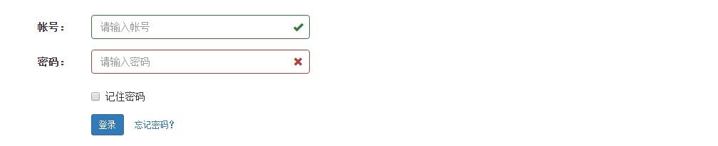
If you log in, you must verify the rationality. Bootstrap provides the prompt style of verification status. Add the style has - * (success, warning, error) to the < input > container that needs prompt. If you want to prompt √, × Or other symbols, add the style has feedback on the container, and add the glyphs Font Icon with the style form control feedback under the < input > element of the style form control.
<!--Code part-->
<form class="form-horizontal">
    <div class="form-group">
        <!--style control-label Make content right-->
        <label for="username" class="col-sm-3 control-label">Account number:</label>
        <div class="col-sm-9 has-feedback has-success">
            <input type="text" class="form-control" id="username" placeholder="Please enter the account number" />
            <span class="glyphicon glyphicon-ok form-control-feedback" aria-hidden="true"></span>
        </div>
    </div>
    <div class="form-group">
        <label for="password" class="col-sm-3 control-label">password:</label>
        <div class="col-sm-9 has-feedback has-error">
            <input type="password" class="form-control" id="password" placeholder="Please input a password" />
            <span class="glyphicon glyphicon-remove form-control-feedback" aria-hidden="true"></span>
        </div>
    </div>
    <div class="form-group">
        <div class="col-sm-9 col-sm-offset-3">
            <!--style checkbox by input[type='checkbox']Specify the appropriate style, and input[type='radio']Style of radio-->
            <div class="checkbox">
                <label>
                    <input type="checkbox" /> Remember password
                </label>
            </div>
        </div>
    </div>
    <div class="form-group">
        <div class="col-sm-9 col-sm-offset-3">
            <button type="submit" class="btn btn-primary btn-sm">Sign in</button>
            <a href="#"Class =" BTN BTN link BTN SM "> forgot your password</a>
        </div>
    </div>
</form>
design sketch:
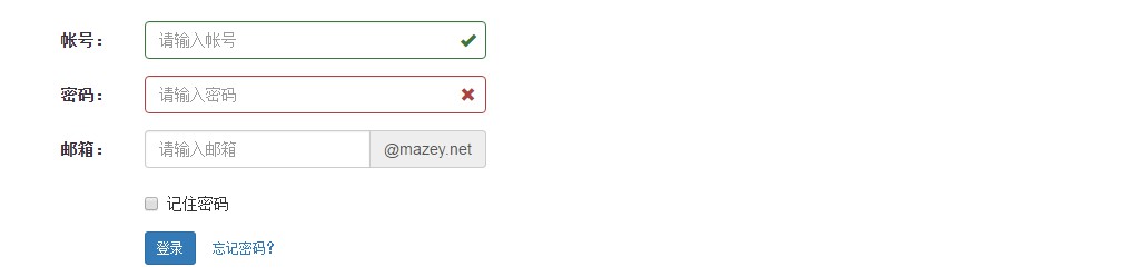
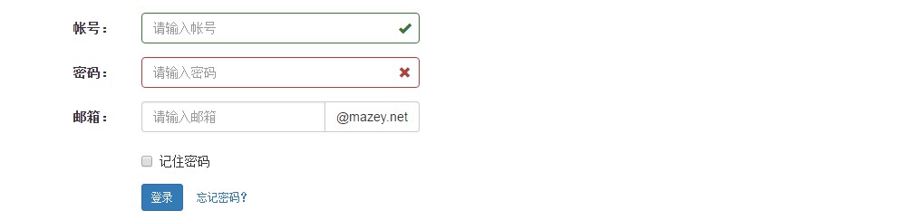
2.3.3 input box group
Sometimes elements are combined with < input > elements to meet requirements. The usage method is to wrap the < input > element in the < div > element of a style input group, and then put an element of style input group addon under the < input > element.
<!--Code part-->
<form class="form-horizontal">
    <div class="form-group">
        <!--style control-label Make content right-->
        <label for="username" class="col-sm-3 control-label">Account number:</label>
        <div class="col-sm-9 has-feedback has-success">
            <input type="text" class="form-control" id="username" placeholder="Please enter the account number" />
            <span class="glyphicon glyphicon-ok form-control-feedback" aria-hidden="true"></span>
        </div>
    </div>
    <div class="form-group">
        <label for="password" class="col-sm-3 control-label">password:</label>
        <div class="col-sm-9 has-feedback has-error">
            <input type="password" class="form-control" id="password" placeholder="Please input a password" />
            <span class="glyphicon glyphicon-remove form-control-feedback" aria-hidden="true"></span>
        </div>
    </div>
    <div class="form-group">
        <label for="email" class="col-sm-3 control-label">Email:</label>
        <div class="col-sm-9">
            <div class="input-group">
                <input type="email" class="form-control" id="email" placeholder="Please enter email address" />
                <span class="input-group-addon">@mazey.net</span>
            </div>
        </div>
    </div>
    <div class="form-group">
        <div class="col-sm-9 col-sm-offset-3">
            <!--style checkbox by input[type='checkbox']Specify the appropriate style, and input[type='radio']Style of radio-->
            <div class="checkbox">
                <label>
                    <input type="checkbox" /> Remember password
                </label>
            </div>
        </div>
    </div>
    <div class="form-group">
        <div class="col-sm-9 col-sm-offset-3">
            <button type="submit" class="btn btn-primary btn-sm">Sign in</button>
            <a href="#"Class =" BTN BTN link BTN SM "> forgot your password</a>
        </div>
    </div>
</form>
design sketch:
The elements here can also be replaced with buttons. Replace the style input group addon with input group BTN, and then wrap a < button > element in it.
<!--Code part-->
...
<div class="input-group">
    <input type="email" class="form-control" id="email" placeholder="Please enter email address" />
    <span class="input-group-btn">
        <button class="btn btn-default" type="button">@mazey.net</button>
    </span>
</div>
...
design sketch:
3, Actual combat
Use tab + form as a module that can switch login and registration.
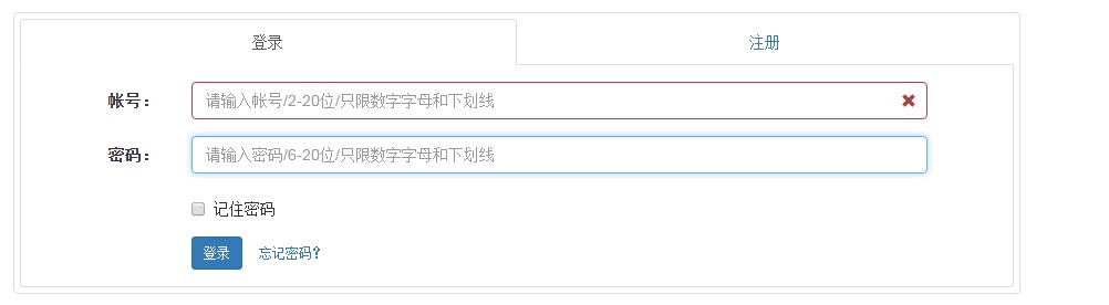
Demo address: https://mazey.cn/bootstrap-blueprints/lesson-third-login/index.html , source code address: https://github.com/mazeyqian/bootstrap-blueprints/tree/master/lesson-third-login.
Copyright notice
All original articles of this blog are copyrighted by the author. Reprint must include this statement, keep this article complete, and indicate the author in the form of hyperlink Post Division And the original address of this article: https://blog.mazey.net/2594.html
(end)