Three implementation methods of complex bullet frame
- Pages often have pop-up frame requirements. Some pop-up frame designs are complex and can only be realized with background drawings. Some pop-up frame heights need to be adapted according to the content. At this time, how to make the picture without stretching and deformation is a problem we should consider. This paper summarizes three implementation schemes for the above requirements:
The first scheme: cut the background picture into 3 copies, in which the head and bottom background pictures are applied to the outermost elements of the bullet frame, and the middle background picture is applied to the content elements of the bullet frame. If the following bullet frames need to be realized:
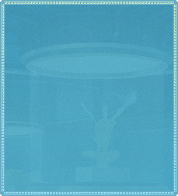
- As you can see, there is a border around the background image, and the background image has a pattern. First cut the background image into 3 copies:
- The implementation code is as follows:
<!-- DOM structure -->
<div class="dialog">
  <div class="mark">
    <div class="close"></div>
    <div class="dia-content">
      <div class="text">
        <p>1.The duration of the activity is from now to October 25, 2021.</p>
      </div>
    </div>
  </div>
</div>

<!-- style -->
<!-- Outer element -->
.mark {
      position: relative;
       width: 5.85rem;
      height: auto;
      padding: .45rem 0 .68rem;
      background-image: url(./images/bg-top.png),
                        url(./images/bg-bottom.png);
      background-position: center top, center bottom;
      background-repeat: no-repeat, no-repeat;
      background-size: 100% .45rem, 100% .68rem;
    }
<!-- Content element -->
    .dia-content {
      width: 5.85rem;
      height: 8rem;
      background: url(./images/bg-center.png) top center repeat;
      background-size: 100% auto;
    }
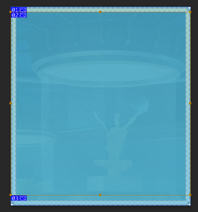
- Implementation principle: the head and bottom slices are used as the background image of the outer element mark (one element can have multiple background images), and the middle slice is used as the background image of the pop-up frame content element dia content. The effect of opening the page is as follows:
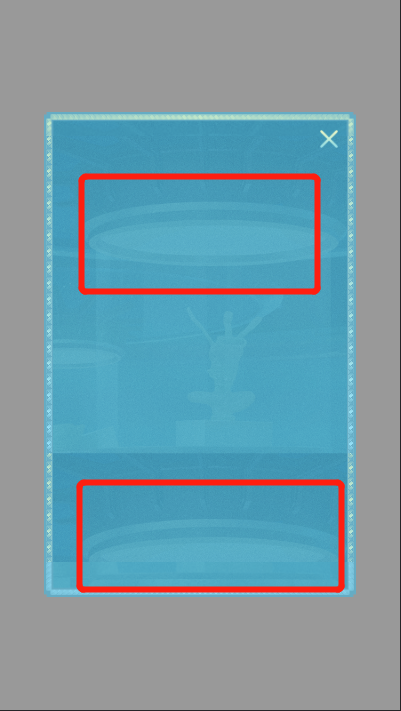
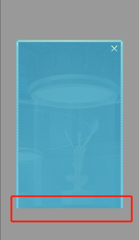
- Here, I deliberately set the height of content elements high. After the middle background image repeats, I see obvious repetition. If the background image no repeats, the size of the background image is set to: background size: 100% 100%. This stretching method spreads the elements. The effect is shown in the following figure:
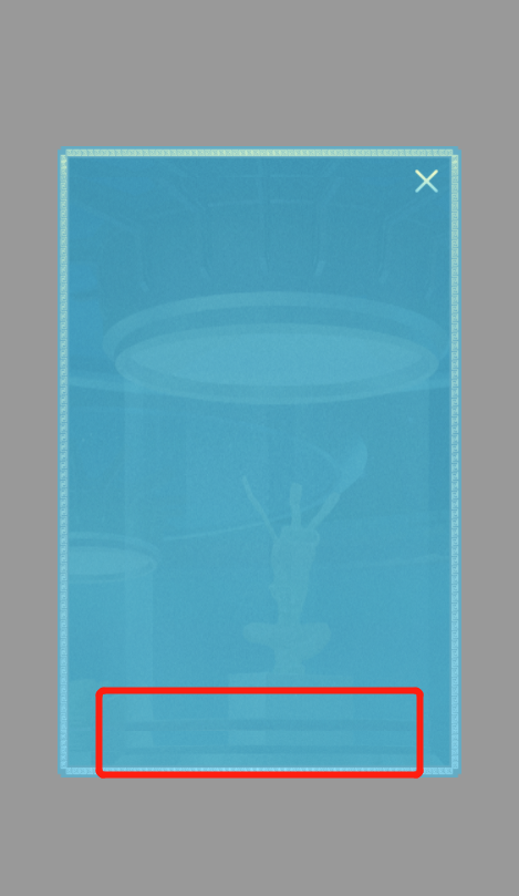
- The background image still has some flaws, but it is much better than repeat.
Summary: it can realize the effect that the background image of complex bullet frame is not stretched, but it has disadvantages: if the bullet frame size is adjusted, it needs to cut the picture again. If the style also needs not to be adjusted, the size of the picture cut at the top and bottom needs to be the same as before, which is a waste of time.
The second scheme: the upgraded version of the first scheme. The first scheme is to implement three background drawings on two elements. In fact, it can also be implemented with one element. The code is as follows:
<!-- Three background images are used for one element -->
<div class="dialog-more">
  <div class="mark-more">
    <div class="close"></div>
    <div class="dia-content-more">
      <div class="text">
        <p>1.The duration of the activity is from now to October 25, 2021.</p>
      </div>
    </div>
  </div>
</div>
<!-- style -->
    .mark-more {
      position: relative;
      padding: .45rem 0 .68rem;
      width: 5.85rem;
      height: auto;
      background-image:
        url(./images/bg-top.png),
        url(./images/bg-center.png),
        url(./images/bg-bottom.png);
      background-position: center top, center top, center bottom;
      background-repeat: no-repeat, no-repeat, no-repeat;
      background-size: 100% .45rem, 100% 100%, 100% .68rem;

    }
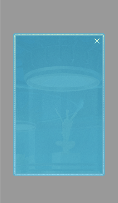
- The effect of opening the page is as follows:
- The display of the pop-up frame background image is abnormal, and the bottom image is covered. After debugging, the reason is obtained: the second image is covered with the remaining blank parts. To solve this problem, you need to control the display interval of the middle background image, which can be controlled with the background origin attribute. The starting position of the head and bottom background images is set as border box, and the starting position of the middle background image is set as content box. The following style code shall be added:
background-origin: border-box, content-box, border-box;
- The effect of opening the page is as follows:
Conclusion: the results are the same as the scheme one by one, but there are some differences in ideas. The disadvantage is still that when the content element is greater than the height of the design draft, the picture will display abnormalities, the size of the pop-up frame is adjusted, and it is necessary to cut the picture again, which is a waste of time.
The third scheme: it is implemented with border img. I've seen it recently css reference manual , we found a better way to implement the complex background image, that is, using the border img attribute. The document is described as follows:
- According to the document description, let's try to implement it. The code is as follows:
<!-- border-img -->
<div class="dialog-img">
  <div class="mark-img">
    <div class="close"></div>
    <div class="dia-content-img">
      <div class="text">
        <p>1.The duration of the activity is from now to October 25, 2021.</p>
      </div>
    </div>
  </div>
</div>

<!-- style -->
<style>
    /* Border background */
    .mark-img {
      position: relative;
      /* padding: .45rem 0 .68rem; */
      width: 5.85rem;
      height: auto;
      border-image-source: url(./images/border-img.png);
      border-image-slice: 30 30 30 30;
      border-image-width: .3rem;
      border-style: dashed;
    }

    .dia-content-img {
      width: 5.85rem;
      height: 8rem;
    }
</style>
- Open the page and the effect is as follows:
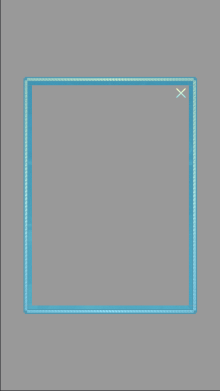
- The border effect appears, but the element content is still blank. The specific reasons are also explained in the document, as shown in the following figure:
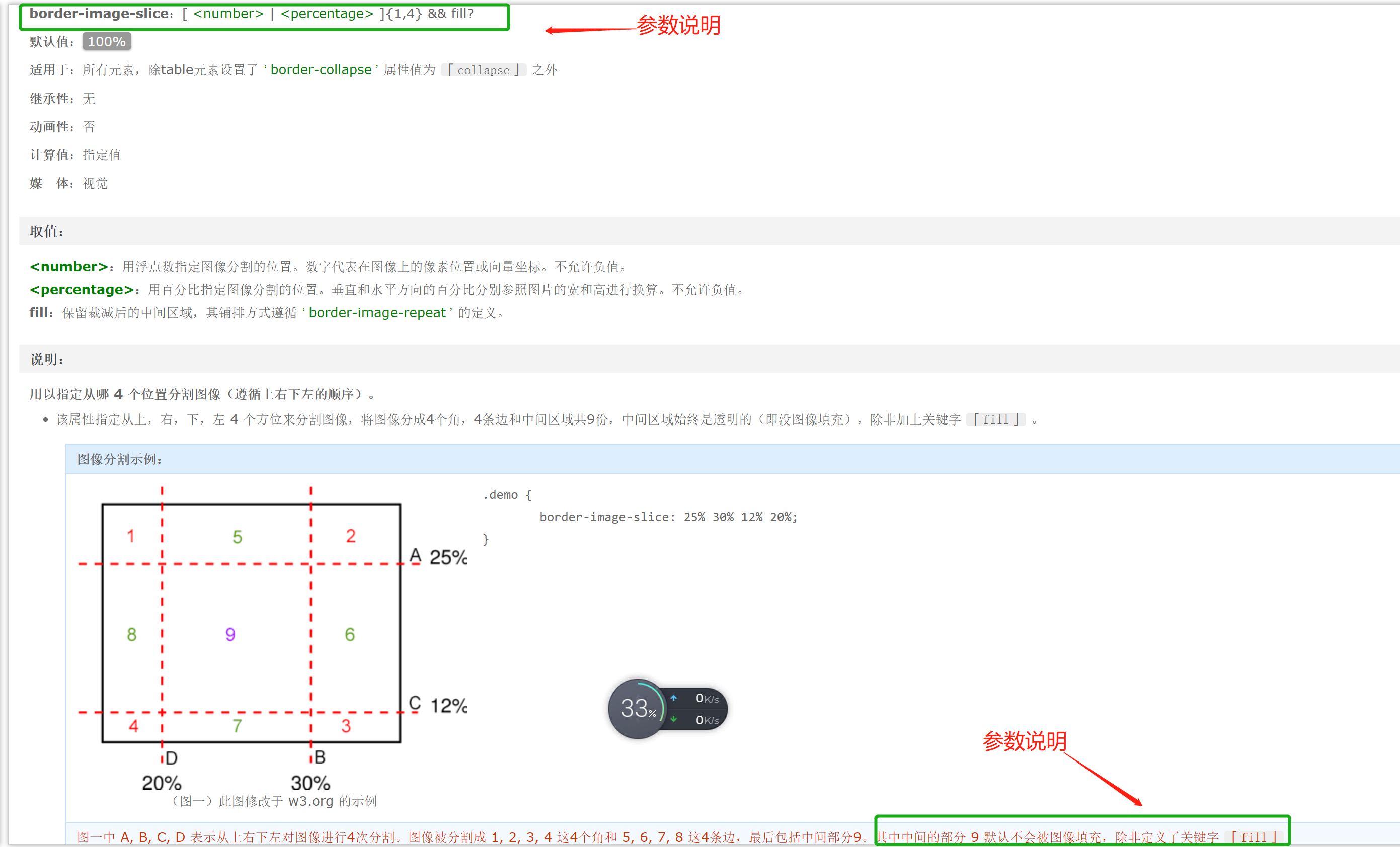
- The general meaning is: border image slice accepts the fifth parameter and can pass the fill attribute value. It is used to set, remove the pictures of the border part, and the remaining pictures are used to fill the content part. According to the document description, modify the style border image slice: 30; Border image slice: 30 fill; Take another look at the effect of the page:
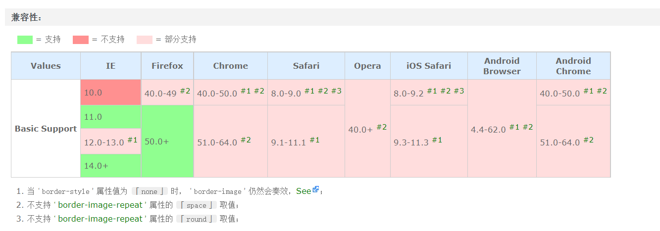
Summary: the background image does not seem to stretch obviously, and there is no need to cut the image. This scheme is much better than cutting the background image. But why we don't use it often is probably because of the compatibility problem. The compatible versions are as follows:
#Summary
-
- Scheme 1 and scheme 2 realize the effect that the background image is not stretched by cutting the background image. It takes time to cut the image. When the element content is higher than the maximum height of the design draft, the image will also stretch to a certain extent without compatibility;
-
- Scheme 3 is implemented through border image, which does not need to cut the picture. The code is simple and fast, but there is a compatibility problem;