
Build your own Vue code view library from 0 to 1 (Part 2)
0x00 Preface
The book continues from the above. This article will explain the core logic of Vue code view component from the aspect of source code function. You can understand the following contents:
- Use of dynamic components.
- Use of codeMirror plug-in.
- Single file component (SFC) parser.
0x01 CodeEditor component
The project uses codeMirror with rich functions to realize the online code display and editing function.
npm package installation:
npm install codemirror --save
Copy code
Sub component SRC \ SRC \ code editor.vue complete source code:
<template>
  <div class="code-editor">
    <textarea ref="codeContainer" />
  </div>
</template>

<script>
// Introduction core
import CodeMirror from "codemirror";
import "codemirror/lib/codemirror.css";

// theme style
import "codemirror/theme/base16-light.css";
import "codemirror/theme/base16-dark.css";
// Language mode
import "codemirror/mode/vue/vue";
// Bracket / label matching
import "codemirror/addon/edit/matchbrackets";
import "codemirror/addon/edit/matchtags";
// Brackets / labels automatically close
import "codemirror/addon/edit/closebrackets";
import "codemirror/addon/edit/closetag";
// Code folding
import "codemirror/addon/fold/foldgutter.css";
import "codemirror/addon/fold/brace-fold";
import "codemirror/addon/fold/foldcode";
import "codemirror/addon/fold/foldgutter";
import "codemirror/addon/fold/comment-fold";
// Indent file
import "codemirror/addon/fold/indent-fold";
// Highlight cursor line background
import "codemirror/addon/selection/active-line";

export default {
  name: "CodeEditor",
  props: {
    value: { type: String },
    readOnly: { type: Boolean },
    theme: { type: String },
    matchBrackets: { type: Boolean },
    lineNumbers: { type: Boolean },
    lineWrapping: { type: Boolean },
    tabSize: { type: Number },
    codeHandler: { type: Function },
  },
  data() {
    return {
      // Editor instance
      codeEditor: null,
      // Default configuration
      defaultOptions: {
        mode: "text/x-vue", //Syntax highlight MIME-TYPE
        gutters: [
          "CodeMirror-linenumbers",
          "CodeMirror-foldgutter",
        ],
        lineNumbers: this.lineNumbers, //set number
        lineWrapping: this.lineWrapping || "wrap", // In long lines, the text is wrapped / scrolled
        styleActiveLine: true, // Highlight the selected row
        tabSize: this.tabSize || 2, // Width of tab character
        theme: this.theme || "base16-dark", //set up themes
        autoCloseBrackets: true, // Parentheses close automatically
        autoCloseTags: true, // Label auto close
        matchTags: true, // Label matching
        matchBrackets: this.matchBrackets || true, // parenthesis matching
        foldGutter: true, // Code folding
        readOnly: this.readOnly ? "nocursor" : false, //  Except that the boolean|string "nocursor" setting is read-only, the editing area cannot get focus.
      },
    };
  },
  watch: {
    value(value) {
      const editorValue = this.codeEditor.getValue();
      if (value !== editorValue) {
        this.codeEditor.setValue(this.value);
      }
    },
    immediate: true,
    deep: true,
  },
  mounted() {
    // initialization
    this._initialize();
  },
  methods: {
    // initialization
    _initialize() {
      // Initialize the editor instance, and pass in the text field object to be instantiated and the default configuration
      this.codeEditor = CodeMirror.fromTextArea(
        this.$refs.codeContainer,
        this.defaultOptions
      );
      this.codeEditor.setValue(this.value);
      // Replace onChange event with prop function
      this.codeEditor.on("change", (item) => {
        this.codeHandler(item.getValue());
      });
    },
  },
};
</script>
Copy code
The plug-in enables the configuration options of the function. At the same time, relevant JS and CSS files need to be introduced.
parameter | explain | type |
|---|---|---|
mode | Support language syntax highlighting MIME-TYPE | string |
lineNumbers | Whether to display line numbers on the left side of the editor. | boolean |
lineWrapping | Whether the text wraps or scrolls in long lines, the default is scroll. | boolean |
styleActiveLine | Highlight the selected row | boolean |
tabSize | Width of tab character | number |
theme | set up themes | tring |
autoCloseBrackets | Parentheses close automatically | boolean |
autoCloseTags | Label auto close | boolean |
matchTags | Label matching | boolean |
matchBrackets | parenthesis matching | boolean |
foldGutter | Code folding | boolean |
readOnly | Read only. The editing area cannot get focus unless the "nocursor" setting is read-only. | boolean|string |
When the component is initialized, the editor example will be initialized automatically, the source code will be assigned to the editor, and the change event will be registered and monitored. When the value of the editor changes, the onchange event will be triggered, and the component prop property codeHandler will be called to pass the latest value to the parent component.
// Initialize the editor instance, and pass in the text field object to be instantiated and the default configuration
this.codeEditor = CodeMirror.fromTextArea( this.$refs.codeContainer, this.defaultOptions );
this.codeEditor.setValue(this.value);
// Register to listen for 'change' events
this.codeEditor.on("change", (item) => { this.codeHandler(item.getValue()); });
Copy code
0x02 SFC Parser
The function scenario of the component is used for simple example code running demonstration, and the source code is regarded as a simple instance of a single file component (SFC).
File src\utils\sfcParser\parser.js porting vue source code sfc/parser.js The parseComponent method of is used to realize the source code parsing and generate the component SFCDescriptor.
The dynamic introduction of components and styles is not supported at present. The function code here has been removed.
// SFCDescriptor interface declaration
export interface SFCDescriptor {
  template: SFCBlock | undefined; //
  script: SFCBlock | undefined;
  styles: SFCBlock[];
  customBlocks: SFCBlock[];
}

export interface SFCBlock {
  type: string;
  content: string;
  attrs: Record<string, string>;
  start?: number;
  end?: number;
  lang?: string;
  src?: string;
  scoped?: boolean;
  module?: string | boolean;
}
Copy code
SFCDescriptor consists of four parts: template, script, styles and customBlocks, which will be used for the dynamic construction of sample components. Where styles is an array, which can contain multiple code blocks and be parsed; If there are multiple code blocks in template and script, only the last one can be parsed. customBlocks are HTML codes that are not in the template, and the processing logic does not include this content at present.
0x03 component dynamic style
File SRC \ utils \ style loader \ addstylesclient.js porting Vue style loader source code addStylesClient Method to dynamically create a component style in the page DOM.
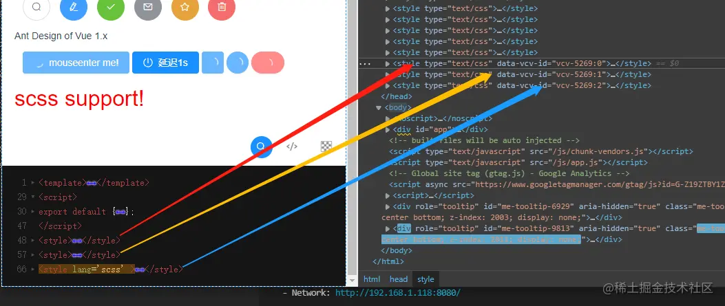
Add the corresponding style content in the DOM according to the styles and component numbers in the SFCDescriptor. If you add or delete < style >, the style content will be created or removed in the dom of the page. If the < style > content is updated, the DOM node only updates the content of the corresponding block to optimize the page performance.
0x04 CodeViewer component
Use JSX syntax to implement component core code.
<script>
export default {
  name: "CodeViewer",
  props: {
    theme: { type: String, default: "dark" }, //light
    source: { type: String },
  },
  data() {
    return {
      code: ``,
      dynamicComponent: {
        component: {
          template: "<div>Hello Vue.js!</div>",
        },
      },
    };
  },
  created() {
    this.viewId = `vcv-${generateId()}`;
    // Component style dynamic update
    this.stylesUpdateHandler = addStylesClient(this.viewId, {});
  },
  mounted() {
    this._initialize();
  },
  methods: {
    // initialization
    _initialize() {
      ...
    },
    // Build component
    genComponent() {
      ...
    },
    // Update code content
    handleCodeChange(val) {
      ...
    },
    // Dynamic component render
    renderPreview() {
      ...
    },
  },
  computed: {
    // The source code is parsed as sfcDescriptor
    sfcDescriptor: function () {
      return parseComponent(this.code);
    },
  },
  watch: {
    // Monitoring source code content
    code(newSource, oldSource) {
       this.genComponent();
    },
  },
  // JSX rendering function
  render() {
    ...
  },
};
</script>
Copy code
Component initialization generates component number, and the registered method stylesUpdateHandler is used for dynamic addition of styles.
Component initialization calls the handleCodeChange method to assign the incoming prop source value to code.
methods: {
    _initialize() {
      this.handleCodeChange(this.source);
    },
    handleCodeChange(val) {
      this.code = val;
    },
}
Copy code
Calculate the attribute sfcDescriptor and call the parseComponent method to parse the sfcDescriptor of the code content generation component.
computed: {
    // The source code is parsed as sfcDescriptor
    sfcDescriptor: function () {
      return parseComponent(this.code);
    },
  },
Copy code
The component listens to whether the code value changes and calls the genComponent method to update the component.
 methods: {
    // Build component
    genComponent() {
      ...
    },
  },
  watch: {
    // Monitoring source code content
    code(newSource, oldSource) {
       this.genComponent();
    },
  },
Copy code
The method genComponent dynamically generates the sfcDescriptor component of the code and updates it to dynamicComponent for example rendering. At the same time, call the stylesUpdateHandler method and use addStylesClient to add instance styles in the DOM for example style rendering.
  genComponent() {
      const { template, script, styles, customBlocks, errors } = this.sfcDescriptor;

      const templateCode = template ? template.content.trim() : ``;
      let scriptCode = script ? script.content.trim() : ``;
      const styleCodes = genStyleInjectionCode(styles, this.viewId);

      // Build components
      const demoComponent = {};

      // Component script
      if (!isEmpty(scriptCode)) {
        const componentScript = {};
        scriptCode = scriptCode.replace(
          /export\s+default/,
          "componentScript ="
        );
        eval(scriptCode);
        extend(demoComponent, componentScript);
      }

      // Component template
      demoComponent.template = `<section id="${this.viewId}" class="result-box" >
        ${templateCode}
      </section>`;

      // Component style
      this.stylesUpdateHandler(styleCodes);

      // Component content update
      extend(this.dynamicComponent, {
        name: this.viewId,
        component: demoComponent,
      });
    },
Copy code
JSX rendering functions display component content dynamically generated based on code content. Call the CodeEditor component to pass in the source code value and topic theme, and provide the codeHandler processing method handleCodeChange to obtain the latest code in the editor.
  methods: {
    renderPreview() {
      const renderComponent = this.dynamicComponent.component;

      return (
        <div class="code-view zoom-1">
          <renderComponent></renderComponent>
        </div>
      );
    },
  },
  // JSX rendering function
  render() {
    return (
      <div ref="codeViewer">
        <div class="code-view-wrapper">
          {this.renderPreview()}
          ...
          <CodeEditor
              codeHandler={this.handleCodeChange}
              theme={`base16-${this.theme}`}
              value={this.code}
            />
        </div>
      </div>
    );
  },
Copy code
After handleCodeChange is called, watch = > gencomponent = > render is triggered to refresh the page content, so as to achieve the function of code online editing and real-time preview.