Shopping cart case
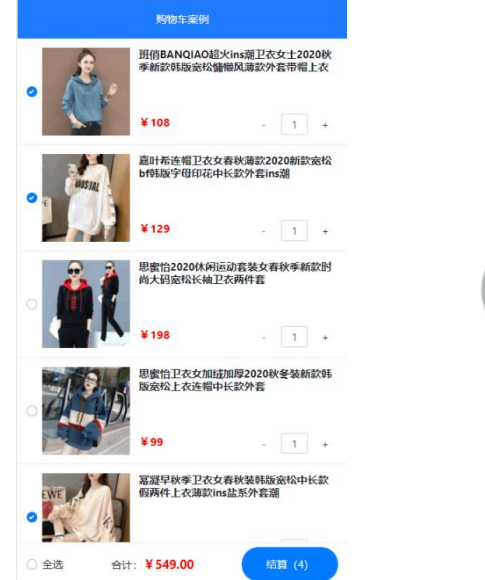
1. Case effect
2. Implementation steps
- ① Initialize project basic structure
- ② Encapsulating EsHeader components
- ③ Requesting product list data based on axios
- ④ Encapsulate EsFooter components
- ⑤ Encapsulate EsGoods components
- ⑥ Encapsulate the EsCounter component
1. Initialize project structure
Run the following command to initialize the vite project:
npm init vite-app code-cart
cd code-cart
npm install
2. Clean up the project structure:
- Put the bootstrap related files into the src/assets directory
- In main JS css
- Empty app Vue component
- Delete HelloWorld. In the components directory Vue component
3. Enable less syntax for component style
npm i less -D
4. Initialize index The CSS global style is as follows:
:root {
 font-size: 12px;
 }
2. Encapsulate the ES header component
2.1 create and register EsHeader component
1. In
src/components/es-header/
New under directory
EsHeader.vue
Components:
<template>
 <div>EsHeader assembly</div>
</template> <script>
export default {
 name: 'EsHeader', }
</script> <style lang="less" scoped></style>
2. In
App.vue
Import and register in component
EsHeader.vue
Components:
// Import header component
import EsHeader from './components/es-header/EsHeader.vue'
export default {
 name: 'MyApp',
 components: {
 // Register header component
 EsHeader,
 },
}
3. In
App.vue
of
template
Used in template structure
EsHeader
Components:\
<template>
 <div>
 <h1>App Root component</h1>
 <!-- use es-header assembly -->
 <es-header></es-header>
 </div>
</template>
2.2
encapsulation
es-header
assembly
0.
Packaging requirements:
- Allow users to customize the title content
- Allow users to customize color text color
- Allow users to customize bgcolor background color
- Allow users to customize fsize font size
- The ES header component must be fixed at the top of the page, with a height of 45px, the text centered, and the z-index of 999
1. In
es-header
The following are encapsulated in the component
props
Properties:
export default {
 name: 'EsHeader',
 props: {
 title: { // Title Content
 type: String,
 default: 'es-header',
 },
 bgcolor: { // background color
 type: String,
 default: '#007BFF',
 },
 color: { // Text color
 type: String,
 default: '#ffffff',
 },
 fsize: { // Text size
 type: Number,
 default: 12,
 },
 },
}
2. Render the title content and dynamically change it into DOM
Within the element binding line
style
Style object:
<template>
 <div :style="{ color: color, backgroundColor: bgcolor, fontSize:
fsize + 'px' }">{{ title }}</div>
</template>
3. DOM
Node addition
header-container
Class name, further beautification
es-header
Style of component:
<template>
 <div class="header-container" :style="{ color: color,
backgroundColor: bgcolor, fontSize: fsize + 'px' }">
 {{ title }}
 </div>
</template> <style lang="less" scoped>
.header-container {
 height: 45px;
 line-height: 45px;
 text-align: center;
 position: fixed;
 top: 0;
 left: 0;
 width: 100%;
 z-index: 999;
}
</style>
4.
stay
App
Used in the root component
es-header
Components, through
title
attribute
appoint
Title Content
<template>
 <div class="app-container">
 <h1>App Root component</h1>

 <!-- by es-header Component assignment title The value of the property -->
 <es-header title="Shopping cart case"></es-header>
 </div>
</template>
3. Request product list data based on axios
1. Run the following command to install axios
npm
i axios
-S
2. In
main.js
Import and global configuration from the portal file
axios
:
import { createApp } from 'vue'
import App from './App.vue'
import './assets/css/bootstrap.css'
import './index.css'
// Import axios
import axios from 'axios'
const app = createApp(App)
// Configure the root path of the request
axios.defaults.baseURL = 'https://www.escook.cn'
// Mount axios as a global $http custom attribute
app.config.globalProperties.$http = axios
app.mount('#app')
3.2
Request item list data
1. In
App.vue
The following is declared in the root component
data
Data:
data() {
 return {
 // Item list data
 goodslist: [],
 }
},
2. In
App.vue
Root component
created
In the life cycle function,
Pre call
Get product list data
methods method
/ The lifecycle function after the component instance is created
created() {
 // Call the getGoodsList method in methods to request the data of the commodity list
 this.getGoodsList()
},
3.
stay
Ap.vue
Root component
methods
Node, declare the pre called
getGoodsList
method:
methods: {
 // Request data for item list
 async getGoodsList() {
 // 1. Access the $http attribute of the global mount through the component instance this and initiate
Ajax Data request
 const { data: res } = await this.$http.get('/api/cart')
 // 2. Judge whether the request is successful
 if (res.status !== 200) return alert('Failed to request commodity list data!')
 // 3. Store the requested data in data for use during page rendering
 this.goodslist = res.list
 },
},
4. Package es footer components
Create and register esoter component 1.4
1. In
src/components/es-footer/
New under directory
EsFooter.vue
Components:
<template>
 <div>EsFooter assembly</div>
</template> <script>
export default {
 name: 'EsFooter', }
</script> <style lang="less" scoped></style>
2. In
App.vue
Import and register in component
EsFooter.vue
Components:
// Import header component
import EsHeader from './components/es-header/EsHeader.vue'
// Import footer component
import EsFooter from './components/es-footer/EsFooter.vue'
export default {
 name: 'MyApp',
 components: {
 // Register header component
 EsHeader,
 // Register footer component
 EsFooter,
 },
} 6
3.
stay
App.vue
of
template
Used in template structure
EsFooter
Components:
<template>
 <div>
 <h1>App Root component</h1>
 <!-- use es-header assembly -->
 <es-header></es-header>
 <!-- use es-footer assembly -->
 <es-footer></es-footer>
 </div>
</template>
4.2
encapsulation
es-footer
assembly
- The ES footer component must be fixed and positioned at the bottom of the page. The height is 50px. The two ends of the content are aligned with each other. Z-index: 999
- Allows users to customize the total amount price (in Yuan) and keep two decimal places during rendering
- Allows the user to customize the total quantity and render it to the settlement button. If the number of items to be settled is 0 , the settlement button is disabled
- Allows users to customize the selected state of the isfull select all button
- Allows the user to listen to the change of the selected state of the select all button in the form of user-defined events and obtain the latest selected state
<!-- Footer assembly -->
<my-footer :isfull="false" :total="1" :amount="98"
@fullChange="onFullStateChange"></my-footer>
4.2.1
Basic layout of rendering components
1. Will
EsFooter.vue
Components are fixed at the bottom of the page
<template>
 <div class="footer-container">EsFooter assembly</div>
</template> <script>
export default {
 name: 'EsFooter', }
</script> <style lang="less" scoped>
.footer-container {
 // Set width and height
 height: 50px;
 width: 100%;
 // Set the background color and top border color
 background-color: white;
 border-top: 1px solid #efefef;
 // Bottom fixed positioning
 position: fixed;
 bottom: 0;
 left: 0;
 // Alignment of internal elements
 display: flex;
 justify-content: space-between;
 align-items: center;
 // Set left and right padding
 padding: 0 10px; }
</style>
2. According to bootstrap
Provided
Checkboxes
https://v4.bootcss.com/docs/components/forms/#check
boxes
Render left
Select all
Button:
<template>
 <div class="footer-container">
 <!-- Select all button -->
 <div class="custom-control custom-checkbox">
 <input type="checkbox" class="custom-control-input"
id="fullCheck" />
 <label class="custom-control-label" for="fullCheck">Select all
</label>
 </div>
 </div>
</template>
And in the global style sheet
index.css
Medium coverage
Select all
Button fillet style:
.custom-checkbox .custom-control-label::before {
 border-radius: 10px; }
3.
Render
total
Corresponding price area:
<template>
 <div class="footer-container">
 <!-- Select all button -->
 <div class="custom-control custom-checkbox">
 <input type="checkbox" class="custom-control-input"
id="fullCheck" />
 <label class="custom-control-label" for="fullCheck">Select all
</label>
 </div>
 <!-- total -->
 <div>
 <span>total:</span>
 <span class="amount">¥0.00</span>
 </div>
 </div>
</template>
And in the current component
<style>
The style of beautifying the total price in the node
.amount {
 color: red;
 font-weight: bold; }
4. According to
Rendering provided by bootstrap
Settlement button
:
Buttons
https://v4.bootcss.com/docs/components/buttons/#examples
<template>
 <div class="footer-container">
 <!-- Select all button -->
 <div class="custom-control custom-checkbox">
 <input type="checkbox" class="custom-control-input"
id="fullCheck" />
 <label class="custom-control-label" for="fullCheck">Select all
</label>
 </div>
 <!-- total -->
 <div>
 <span>total:</span>
 <span class="amount">¥0.00</span>
 </div>
 <!-- Settlement button -->
 <button type="button" class="btn btn-primary">settlement(0)</button>
 </div>
</template>
And in the current component
<style>
The style of the settlement button in the node
.btn-primary {
 // Set fixed height
 height: 38px;
 // Set fillet effect
 border-radius: 19px;
 // Set minimum width
 min-width: 90px; }
4.2.2
Encapsulate custom attributes
amount
amount
Is the total price of the checked item
1. In
EsFooter.vue
Component
props
Node, declare the following custom attributes
export default {
 name: 'EsFooter',
 props: {
 // Total price of the checked item
 amount: {
 type: Number,
 default: 0,
 },
 },
}
2. In
EsFooter.vue
Component
DOM
Rendering in structure
amount
Value of:
<!-- total -->
<div>
 <span>total:</span>
 <!-- take amount Keep two decimal places for the value of -->
 <span class="amount">¥{{ amount.toFixed(2) }}</span>
</div>
4.2.3
Encapsulate custom attributes
total
total
Is the total quantity of the checked item
1.
stay
EsFooter.vue
Component
props
Node, declare the following custom attributes
export default {
 name: 'EsFooter',
 props: {
 // Total price of the checked item
 amount: {
 type: Number,
 default: 0,
 },
 // Total quantity of checked items
 total: {
 type: Number,
 default: 0,
 },
 },
}
2. In
EsFooter.vue
Component
DOM
Rendering in structure
total
Value of
<!-- Settlement button -->
<button type="button" class="btn btn-primary">settlement({{total}})
</button>
3. Dynamic control settlement button
Disabled status of:
<!-- disabled The value of is true,Indicates that the button is disabled -->
<button type="button" class="btn btn-primary" :disabled="total ===
0">settlement({{ total }})</button>
4.2.4
Encapsulate custom attributes
isfull
isfull
Is the selected state of the select all button,
true
Indicates selected,
false
Indicates that it is not selected
1.
stay
EsFooter.vue
Component
props
Node, declare the following custom attributes:
export default {
 name: 'EsFooter',
 props: {
 // Total price of the checked item
 amount: {
 type: Number,
 default: 0,
 },
 // Total quantity of checked items
 total: {
 type: Number,
 default: 0,
 },
 // The selected state of the select all button
 isfull: {
 type: Boolean,
 default: false,
 },
 },
}
2.
Dynamically bind check boxes
ckecked
Value of property:
<!-- Select all button -->
<div class="custom-control custom-checkbox">
 <input type="checkbox" class="custom-control-input"
id="fullCheck" :checked="isfull" />
 <label class="custom-control-label" for="fullCheck">Select all</label>
</div>
4.2.5
Encapsulate custom event fullChange
By customizing events
fullChange
, pass the latest selected status to the user of the component
1. Select the status change in the monitor check box
change
event:
<!-- Select all button -->
<div class="custom-control custom-checkbox">
 <input type="checkbox" class="custom-control-input"
id="fullCheck" :checked="isfull" @change="onCheckBoxChange" />
 <label class="custom-control-label" for="fullCheck">Select all</label>
</div>
2. In
methods
Statement in
onCheckBoxChange
And through the event object
e
Get the latest selected status:
methods: {
 // Listen for changes in the selected state of the check box
 onCheckBoxChange(e) {
 // e.target.checked is the latest selected state of the check box
 console.log(e.target.checked)
 },
},
3. In
emits
Custom events declared in:
// Declare custom events
emits: ['fullChange'],
stay
onCheckBoxChange
In the event handler function, through
$emit()
Trigger a custom event and select the latest one
The status is passed to the user of the current component:
methods: {
 onCheckBoxChange(e) {
 // Trigger custom event
 this.$emit('fullChange', e.target.checked)
 },
},
5.
stay
App.vue
Test in root component
EsFooter.vue
Components:
<!-- use footer assembly -->
<es-footer :total="0" :amount="0" @fullChange="onFullStateChange">
</es-footer>
And in
methods
Statement in
onFullStateChange
Processing function, obtained through formal parameters
Select all button
abreast of the times
Selected status:
methods: {
 // Monitor the change of the state of the select all button
 onFullStateChange(isFull) {
 // Print the latest selected status of the select all button
 console.log(isFull)
 },
},
5. Package es goods components
5.1 create and register EsGoods components
1.
stay
src/components/es-goods/
New under directory
EsGoods.vue
Components:
<template>
 <div>EsGoods assembly</div>
</template> <script>
export default {
 name: 'EsGoods', }
</script> <style lang="less" scoped></style>
2. In
App.vue
Import and register in component
EsGoods.vue
Components:
// Import header component
import EsHeader from './components/es-header/EsHeader.vue'
// Import footer component
import EsFooter from './components/es-footer/EsFooter.vue'
// Import goods component
import EsGoods from './components/es-goods/EsGoods.vue'
export default {
 name: 'MyApp',
 components: {
 // Register header component
 EsHeader,
 // Register footer component
 EsFooter,
 // Register the goods component
 EsGoods,
 },
}
3. In
App.vue
of
template
Used in template structure
EsGoods
assembly
<template>
 <div class="app-container">
 <!-- use header assembly -->
 <es-header title="Shopping cart case"></es-header>
 <!-- use goods assembly -->
 <es-goods></es-goods>
 <!-- use footer assembly -->
 <es-footer :total="0" :amount="0"
@fullChange="onFullStateChange"></es-footer>
 </div>
</template>
5.2
encapsulation
es-goods
assembly
5.2.0
Packaging requirements
- 1. Implement the basic layout of EsGoods components
- 2. Encapsulate the six custom attributes of the component (id, thumb, title, price, count, checked)
- 3. Encapsulate the custom event stateChange of the component, allowing the outside world to listen to the change of the selected state of the component
<!-- use goods assembly -->
<es-goods
 v-for="item in goodslist"
 :key="item.id"
 :id="item.id"
 :thumb="item.goods_img"
 :title="item.goods_name"
 :price="item.goods_price"
 :count="item.goods_count"
 :checked="item.goods_state"
 @stateChange="onGoodsStateChange"
></es-goods>
5.2.1
Basic layout of rendering components
1. Rendering
EsGoods
Foundation of components
DOM
Structure:
<template>
  <div class="goods-container">
    <!-- Left picture area -->
    <div class="left">
      <!-- Thumbnail of the item -->
      <img src="" alt="Product picture" class="thumb" />
    </div>
    <!-- Right information area -->
    <div class="right">
      <!-- Trade name -->
      <div class="top">xxxx</div>
      <div class="bottom">
        <!-- commodity price -->
        <div class="price">¥0.00</div>
        <!-- Quantity of goods -->
        <div class="count">quantity</div>
      </div>
    </div>
  </div>
</template>
2. Layout style of beautifying components
.goods-container {
  display: flex;
  padding: 50px,10px;
  // The style of the picture on the left
  .left {
    margin-right: 10px;
    // Product picture
    .thumb {
      display: block;
      width: 100px;
      height: 100px;
      background-color: #efefef;
    }
  }
  // Style of commodity name, unit price and quantity on the right
  .right {
    display: flex;
    flex-direction: column;
    justify-content: space-between;
    flex: 1;
    .top {
      font-weight: bold;
    }
    .bottom {
      display: flex;
      justify-content: space-between;
      align-items: center;
      .price {
        color: red;
        font-weight: bold;
      }
    }
  }
}
Package outside product thumbnail
check box
(
https://v4.bootcss.com/docs/components/forms/#checkboxes
)
<!-- Left picture and check box area -->
<div class="left">
 <!-- check box -->
 <div class="custom-control custom-checkbox">
 <input type="checkbox" class="custom-control-input"
id="customCheck1" />
 <!-- Wrap the product picture in label Click the picture to switch the selection of "check box"
Medium state -->
 <label class="custom-control-label" for="customCheck1">
 <img src="" alt="Product picture" class="thumb" />
 </label>
 </div>
 <!-- <img src="" alt="Product picture" class="thumb" /> -->
</div>
4.
cover
check box
Default style for:
.custom-control-label::before,
.custom-control-label::after {
 top: 3.4rem; }
5. In
App.vue
Loop rendering in component
EsGoods.vue
assembly
<!-- use goods assembly -->
<es-goods v-for="item in goodslist" :key="item.id"></es-goods> 12
6. For
EsGoods.vue
Add top border:
.goods-container {
 display: flex;
 padding: 10px;
 // The resulting selector is goods-container + .goods-container
 // In css, (+) is the "adjacent sibling selector", which means that after selecting another element immediately connected
 Element with the same parent element.
 + .goods-container {
 border-top: 1px solid #efefef;
 }
 // ... Omit other styles
}
5.2.2
Encapsulate custom attributes
id
id
Is a unique identifier for each item
1. In
EsGoods.vue
Component
props
Node, declare the following custom attributes:
export default {
 name: 'EsGoods',
 props: {
 // Unique key value
 id: {
 type: [String, Number], // The value of id can be "string" or "numeric"
 required: true,
 },
 },
}
2. Bind dynamically when rendering check boxes
input
of
id
And properties
label
of
for
Attribute value
<!-- check box -->
<div class="custom-control custom-checkbox">
 <input type="checkbox" class="custom-control-input" :id="id" />
 <label class="custom-control-label" :for="id">
 <img src="" alt="Product picture" class="thumb" />
 </label>
</div>
3.
stay
App.vue
Used in
EsGoods.vue
Component, dynamic binding
id
Value of property:
<!-- use goods assembly -->
<es-goods v-for="item in goodslist" :id="item.id"></es-goods> 12
5.2.3
Encapsulate other attributes
except
id
In addition to attributes,
EsGoods
Components also need to be encapsulated:
thumbnail
(
thumb
),
Trade name
(
title
),
Unit Price
(
price
),
quantity
(
count
),
Check status
(
checked
)This
5
Attributes
1.
stay
EsGoods.vue
Component
props
Node, declare the following custom attributes:
export default {
 name: 'EsGoods',
 props: {
 // Unique key value
 id: {
 type: [String, Number],
 required: true,
 },
 // 1. Thumbnail of goods
 thumb: {
 type: String,
 required: true,
 },
 // 2. Name of commodity
 title: {
 type: String,
 required: true,
 },
 // 3. Unit price
 price: {
type: Number,
 required: true,
 },
 // 4. Quantity
 count: {
 type: Number,
 required: true,
 },
 // 5. Check status of goods
 checked: {
 type: Boolean,
 required: true,
 },
 },
}
2.
stay
EsGoods.vue
Component
DOM
Information data of rendered goods in the structure:
<template>
 <div class="goods-container">
 <!-- Left picture and check box area -->
 <div class="left">
 <!-- check box -->
 <div class="custom-control custom-checkbox">
 <input type="checkbox" class="custom-control-input"
:id="id" :checked="checked" />
 <label class="custom-control-label" :for="id">
 <img :src="thumb" alt="Product picture" class="thumb" />
 </label>
 </div>
 </div>
 <!-- Right information area -->
 <div class="right">
 <!-- Trade name -->
 <div class="top">{{ title }}</div>
 <div class="bottom">
 <!-- commodity price -->
 <div class="price">¥{{ price.toFixed(2) }}</div>
 <!-- Quantity of goods -->
 <div class="count">number:{{ count }}</div>
 </div>
 </div>
 </div>
</template>
stay
App.vue
Used in components
EsGoods.vue
When the component is, the value of the corresponding property is dynamically bound:
<!-- use goods assembly -->
<es-goods
 v-for="item in goodslist"
 :key="item.id"
 :id="item.id"
 :thumb="item.goods_img"
 :title="item.goods_name"
 :price="item.goods_price"
 :count="item.goods_count"
 :checked="item.goods_state"
></es-goods> 123456789
10
11
5.2.4
Encapsulate custom events
stateChange
Click the check box
When, you can
Latest tick status
, pass
Custom event
To the user of the component
1. In
EsGoods.vue
Component, listening
checkbox
Select event with status change:
<!-- Of the listen check box change event -->
<input type="checkbox" class="custom-control-input" :id="id"
:checked="checked" @change="onCheckBoxChange" />
2. In
EsGoods.vue
Component
methods
Declare the corresponding event handler function in
methods: {
 // The listen check box selects events with status changes
 onCheckBoxChange(e) {
 // e.target.checked is the latest checked status
 console.log(e.target.checked)
 },
},
1234567
stay
EsGoods.vue
To declare a custom event in a component:
emits: ['stateChange'],
4. Perfection
onCheckBoxChange
Function processing logic, call
$emit()
Function triggers a custom event
methods: {
 // The listen check box selects events with status changes
 onCheckBoxChange(e) {
 // The data sent out is an object, which contains two attributes {id, value}
 this.$emit('stateChange', {
 id: this.id,
 value: e.target.checked,
 })
 },
},
5.
stay
App.vue
Used in the root component
EsGoods.vue
Component, listen for its
stateChange
event:
<!-- use goods assembly -->
<es-goods
 v-for="item in goodslist"
 :key="item.id"
 :id="item.id"
 :thumb="item.goods_img"
 :title="item.goods_name"
 :price="item.goods_price"
 :count="item.goods_count"
 :checked="item.goods_state"
 @stateChange="onGoodsStateChange"
></es-goods>
And in
App.vue
of
methods
The following event handling functions are declared in
methods: {
 // Listen for the event that the selected status of a commodity changes
 onGoodsStateChange(e) {
 // 1. Search by id (Note: e is an object, including id and value)
(two properties)
 const findResult = this.goodslist.find(x => x.id === e.id)
 // 2. If the corresponding commodity is found, its selection status will be updated
 if (findResult) {
 findResult.goods_state = e.value
 }
 },
}
Realize the functions of total, settlement quantity and select all
6.1 dynamic statistics of the total price of the checked goods
Demand analysis: the total price of goods depends on goodslist
The change of each item information in the array is suitable for this scenario
Computational genus
nature
.
1. In
App.vue
The following calculation properties are declared in:
computed: {
 // Total price of the checked item
 amount() {
 // 1. Define the total price of goods
 let a = 0
 // 2. Total commodity price of circular accumulation
 this.goodslist
 .filter(x => x.goods_state)
 .forEach(x => {
 a += x.goods_price * x.goods_count
 })
 // 3. Return the result of accumulation
 return a
 },
},
2. In
App.vue
Used in
EsFooter.vue
Component, dynamic binding
Total price of the checked item
:
<!-- use footer assembly -->
<es-footer :total="0" :amount="amount"
@fullChange="onFullStateChange"></es-footer> 1
6.2 dynamic statistics of the total quantity of checked commodities
Demand analysis:
Total quantity dependency of checked goods
goodslist
The change in the checked status of goods in this scenario is suitable for using calculation attributes.
1.
stay
App.vue
The following calculation properties are declared in:
computed: {
 // Total quantity of checked items
 total() {
 // 1. Define the total quantity of checked goods
 let t = 0
 // 2. Cyclic accumulation
 this.goodslist
 .filter(x => x.goods_state)
 .forEach(x => (t += x.goods_count))
 // 3. Return calculation results
 return t
 },
},
2.
stay
App.vue
Used in
EsFooter.vue
Component, dynamic binding
Total quantity of checked items
:
<!-- use footer assembly -->
<es-footer :total="total" :amount="amount"
@fullChange="onFullStateChange"></es-footer>
6.3 realize the function of selecting all
1. In
App.vue
In assembly monitoring
EsFooter.vue
When the selected state of the component changes, it is updated immediately
goodslist
Select the status of each item in the list:
<!-- use footer assembly -->
<es-footer :total="total" :amount="amount"
@fullChange="onFullStateChange"></es-footer>
2. In
onFullStateChange
Modify the selected status of each item in the event handling function of:
methods: {
 // Monitor the change of the state of the select all button
 onFullStateChange(isFull) {
 this.goodslist.forEach(x => x.goods_state = isFull)
 },
}
7. Package es counter components
7.1 create and register the EsCounter component
stay
src/components/es-counter/
New under directory
EsCounter.vue
assembly
<template>
 <div>EsCounter assembly</div>
</template> <script>
export default {
 name: 'EsCounter',
}
</script> <style lang="less" scoped></style>
2. In
EsGoods.vue
Import and register in component
EsCounter.vue
assembly
// Import counter component
import EsCounter from '../es-counter/EsCounter.vue'
export default {
 name: 'EsGoods',
 components: {
 // Register counter component
 EsCounter,
 }
}
3. In
EsGoods.vue
of
template
Used in template structure
EsCounter.vue
Components:
<div class="bottom">
 <!-- commodity price -->
 <div class="price">¥{{ price.toFixed(2) }}</div>
 <!-- Quantity of goods -->
 <div class="count">
 <!-- use es-counter assembly -->
 <es-counter></es-counter>
 </div>
</div>
7.2
encapsulation
es-counter
assembly
7.2.0
Packaging requirements
- 1. Basic layout of rendering components
- 2. Realize the addition and subtraction of quantity value
- 3. min. treatment time
- 4. Use the watch listener to process the results entered in the text box
- 5. Encapsulate numChange custom event
1 <es-counter :num="count" :min="1" @numChange="getNumber"></es-counter>
7.2.1
Basic layout of rendering components
1.
be based on
bootstrap
Provided
Buttons
https://v4.bootcss.com/docs/components/buttons/#exampl
es
and
form-control
Basic layout of rendering components:
<template>
 <div class="counter-container">
 <!-- quantity -1 Button -->
 <button type="button" class="btn btn-light btn-sm">-</button>
 <!-- Input box -->
 <input type="number" class="form-control form-control-sm ipt-num" />
 <!-- quantity +1 Button -->
 <button type="button" class="btn btn-light btn-sm">+</button>
 </div>
</template>
2.
Beautify the style of the current component:
counter-container {
 display: flex;
 // Button style
 .btn {
 width: 25px;
 }
 // Style of input box
 .ipt-num {
 width: 34px;
 text-align: center;
 margin: 0 4px;
 }
}
7.2.2
Realize the rendering and addition and subtraction of numerical values
Train of thought analysis:
- 1. Addition and subtraction operations need to rely on the data of the EsCounter component
- 2. The initial data depends on the props passed in by the parent component, and the props initial value passed in by the parent component is transferred to the data to form the internal state of the EsCounter component!
1. In
EsCounter.vue
The following is declared in the component
props
:
props: {
 // Quantity value
 num: {
 type: Number,
 default: 0,
 },
},
2. In
EsGoods.vue
In the component, data is transferred to the through attribute binding
EsCounter.vue
In components:
<!-- Quantity of goods -->
<div class="count">
 <es-counter :num="count"></es-counter>
</div> 1234
Note: do not directly
num
adopt
v-model
Directive bidirectional binding to
input
Input box because
vue regulation: props
The value of is read-only!
For example, the following is wrong:
<!-- Warning Warning: do not imitate the following operations -->
<input type="number" class="form-control form-control-sm ipt-num"
v-model.number="num" />
3.
The right thing to do: put
props
Initial value of
Redeposit
reach
data
Yes, because
data
The data in is readable and writable!
Example generation
The code is as follows:
export default {
 name: 'EsCounter',
 props: {
 // Initial quantity value [read only data]
 num: {
 type: Number,
 default: 0,
 },
 },
 data() {
 return {
 // Internal status value [readable and writable data]
 // The initial value in props can be accessed through this
 number: this.num,
 }
 },
}
And put
data
Medium
number
Bidirectional binding to
input
Input box:
<input type="number" class="form-control form-control-sm ipt-num"
v-model.number="number" />
4.
by
-1
and
+1
Click event handling function of button binding response:
<button type="button" class="btn btn-light btn-sm"
@click="onSubClick">-</button> <input type="number" class="form-control form-control-sm ipt-num"
v-model.number="number" />
<button type="button" class="btn btn-light btn-sm"
@click="onAddClick">+</button>
And in
methods
The corresponding event handling functions declared in are as follows
methods: {
 // -Event handling function of 1 button
 onSubClick() {
 this.number -= 1
 },
 // +Event handling function of 1 button
 onAddClick() {
 this.number += 1
 },
},
7.2.3
realization
min
Processing of minimum value
Demand analysis:
When purchasing goods, the minimum quantity purchased is
1
1. In
EsCounter.vue
The components are encapsulated as follows:
props
:
export default {
 name: 'EsCounter',
 props: {
 // Quantity value
 num: {
 type: Number,
 default: 0,
 },
 // minimum value
 min: {
 type: Number,
 // The default value of min attribute is NaN, which means that the minimum value is not limited
 default: NaN,
 },
 },
}
stay
-1
In the event handler function of the button
min
Judge and process the value of:
methods: {
 // -Event handling function of 1 button
 onSubClick() {
 // Judgment condition: the value of Min exists and is less than min after number - 1
 if (!isNaN(this.min) && this.number - 1 < this.min) return
 this.number -= 1
 },
}
3.
stay
EsGoods.vue
Used in components
EsCounter.vue
Specify when component
min
Minimum:
<!-- Quantity of goods -->
<div class="count">
 <!-- The minimum value of the specified quantity is 1 -->
 <es-counter :num="count" :min="1"></es-counter>
</div> 12345
7.2.4
Process the input results of the input box
Train of thought analysis:
- 1. Convert the entered new value to an integer
- 2. If the result of conversion is not a number or less than 1, the value of number is forced to be equal to 1
- 3. If the new value is decimal, assign the conversion result to number
1.
For input box
v-model
Instruction addition
.lazy
Modifier (when the input box is triggered)
change
Update on event
v
model
Data source bound to:
<input type="number" class="form-control form-control-sm ipt-num"
v-model.number.lazy="number" />
2.
adopt
watch
Listener listening
number
Numerical changes, and implement the code according to the analysis steps
export default {
 name: 'EsCounter',
 watch: {
 // Monitor the change of number value
 number(newVal) {
 // 1. Convert the entered new value to an integer
 const parseResult = parseInt(newVal)
 // 2. If the result of the conversion is not a number or less than 1, the value of number is forced to be equal to
if (isNaN(parseResult) || parseResult < 1) {
 this.number = 1
 return
 }
 // 3. If the new value is decimal, assign the conversion result to number
 if (String(newVal).indexOf('.') !== -1) {
 this.number = parseResult
 return
 }
 console.log(this.number)
 },
 },
}
7.2.5
Deliver the latest data to users
Demand analysis:
When
EsGoods
Component use
EsCounter
Component, expect to be able to listen
Quantity of goods
At this time, you need to use
Self determined
Semantic event
The way to put the latest data
Passed to the consumer of the component
.
stay
EsCounter.vue
The custom events declared in the component are as follows:
emits
: [
'numChange'
],
2. In
EsCounter.vue
Component
watch
Trigger custom event in listener:
watch: {
 number(newVal) {
 // 1. Convert the entered new value to an integer
 const parseResult = parseInt(newVal)
 // 2. If the result of conversion is not a number or less than 1, the value of number is forced to be equal to 1
 if (isNaN(parseResult) || parseResult < 1) {
 this.number = 1
 return
 }
 // 3. If the new value is decimal, assign the conversion result to number
 if (String(newVal).indexOf('.') !== -1) {
 this.number = parseResult
 return
 }
 // Trigger a custom event and pass the latest number value to the user of the component
 this.$emit('numChange', this.number)
 },
},
3.
stay
EsGoods.vue
Listen in component
EsCounter.vue
Custom events for components:
<!-- Quantity of goods -->
<div class="count">
 <es-counter :num="count" :min="1" @numChange="getNumber"></escounter>
</div> 1234
And declare the corresponding event handling function as follows:
methods: {
 // Listen for events with changing number
 getNumber(num) {
 console.log(num)
 },
}
7.2.6
Update the number of items in the shopping cart
Train of thought analysis:
- 1. Get the latest commodity quantity in EsGoods component
- 2. Declare custom events in EsGoods component
- 3. Trigger a custom event in EsGoods component and transfer the data object {id, value}
- 4. Listen to the custom events of EsGoods component in the App root component and update the quantity of corresponding products according to the id
1. In
EsGoods.vue
Declare custom events in components
countChange
:
emits
: [
'stateChange'
,
'countChange'
],
2. In
EsCounter.vue
Component
numChange
In the event handler function, trigger
step
1
Declared custom events
<es-counter :num="count" :min="1" @numChange="getNumber"></escounter>
methods: {
 // Listen for events with changing number
 getNumber(num) {
 // Trigger a custom event and transfer the data object {id, value}
 this.$emit('countChange', {
// id of the item
 id: this.id,
 // Latest quantity
 value: num,
 })
 },
}
stay
App.vue
Used in the root component
EsGoods.vue
Component, listen for its custom events
countChange
<!-- use goods assembly -->
<es-goods
 v-for="item in goodslist"
 :key="item.id"
 :id="item.id"
 :thumb="item.goods_img"
 :title="item.goods_name"
 :price="item.goods_price"
 :count="item.goods_count"
 :checked="item.goods_state"
 @stateChange="onGoodsStateChange"
 @countChange="onGoodsCountChange"
></es-goods>
And in
methods
Corresponding event handling function declared in:
 // Event to monitor the change of commodity quantity
 onGoodsCountChange(e) {
 // Search by id
 const findResult = this.goodslist.find(x => x.id === e.id)
 // If the corresponding item is found, its quantity will be updated
 if (findResult) {
 findResult.goods_count = e.value
 }
 }
}