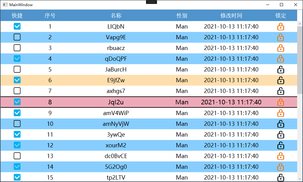
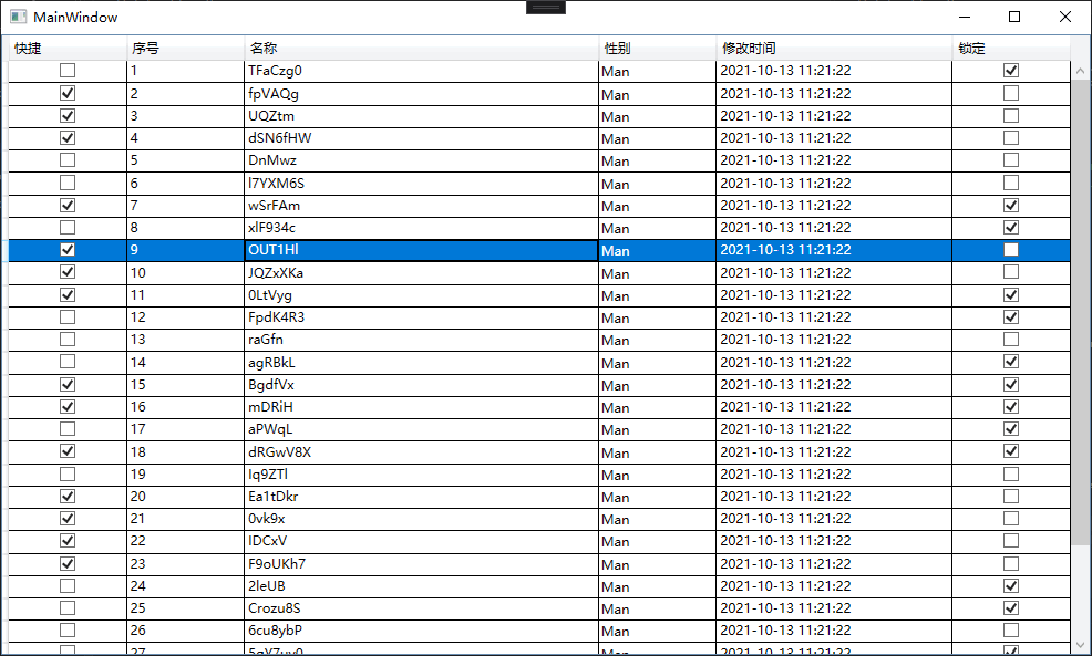
Let's first look at two pictures. One realizes its own effect and the other uses the default effect:
Not much to say, on the code...
1. Converter
Because there is a DateTime in it, it should be converted to the corresponding string through the converter.
using System;
using System.Globalization;
using System.Windows.Data;

[ValueConversion(typeof(DateTime), typeof(string))]
public class DateConverter : IValueConverter
{
    public string Format { get; set; } = "yyyy-MM-dd HH:mm:ss.fff";

    public object Convert(object value, Type targetType, object parameter, CultureInfo culture)
    {
        DateTime dt = (DateTime)value;
        return dt.ToString(Format);
    }

    public object ConvertBack(object value, Type targetType, object parameter, CultureInfo culture)
    {
        return DateTime.Parse(value.ToString());
    }
}
2. Resource dictionary
<ResourceDictionary xmlns="http://schemas.microsoft.com/winfx/2006/xaml/presentation"
                    xmlns:x="http://schemas.microsoft.com/winfx/2006/xaml"
                    xmlns:local="clr-namespace:WpfApp6">

    <FontFamily x:Key="iconFont">/WpfApp6;component/fonts/iconfont/#iconfont</FontFamily>
    <FontFamily x:Key="songti">Song typeface</FontFamily>
    <SolidColorBrush x:Key="mainBackground" Color="#B0E2FF" />

    <local:DateConverter x:Key="dataConverterFull" />
    <local:DateConverter x:Key="dataConverterShort" Format="yyyy-MM-dd HH:mm:ss" />

</ResourceDictionary>
In order to achieve the effect of two checkboxes, iconFont is used Icon Font  https://www.iconfont.cn/collections/index?spm=a313x.7781069.1998910419.5&type=1
<ResourceDictionary xmlns="http://schemas.microsoft.com/winfx/2006/xaml/presentation" xmlns:x="http://schemas.microsoft.com/winfx/2006/xaml">

    <ResourceDictionary.MergedDictionaries>
        <ResourceDictionary Source="/WpfApp6;component/DictionaryUse.xaml" />
    </ResourceDictionary.MergedDictionaries>

    <Style TargetType="CheckBox" x:Key="ckColumn">
        <Setter Property="HorizontalAlignment" Value="Stretch" />
        <Setter Property="VerticalAlignment" Value="Stretch" />
        <Setter Property="VerticalContentAlignment" Value="Center" />
        <Setter Property="HorizontalContentAlignment" Value="Center" />
        <Setter Property="FontFamily" Value="{StaticResource iconFont}" />
        <Setter Property="FontSize" Value="25" />
        <Setter Property="Template">
            <Setter.Value>
                <ControlTemplate TargetType="CheckBox">
                    <Border Background="Transparent">
                        <TextBlock x:Name="tb" HorizontalAlignment="Center" VerticalAlignment="Center" FontFamily="{TemplateBinding FontFamily}" FontSize="{TemplateBinding FontSize}" FontWeight="{TemplateBinding FontWeight}" Foreground="Black" Text="{TemplateBinding Content}" />
                    </Border>
                    <ControlTemplate.Triggers>
                        <Trigger Property="IsChecked" Value="True">
                            <Setter TargetName="tb" Property="Text" Value="{Binding Tag, RelativeSource={RelativeSource AncestorType=CheckBox}}" />
                            <Setter TargetName="tb" Property="Foreground" Value="{Binding Foreground, RelativeSource={RelativeSource AncestorType=CheckBox}}" />
                        </Trigger>
                    </ControlTemplate.Triggers>
                </ControlTemplate>
            </Setter.Value>
        </Setter>
    </Style>

    <Style TargetType="TextBlock" x:Key="tbColumn">
        <Setter Property="HorizontalAlignment" Value="Center" />
        <Setter Property="VerticalAlignment" Value="Center" />
        <Setter Property="TextWrapping" Value="WrapWithOverflow" />
    </Style>

    <Style TargetType="DataGridColumnHeader" x:Key="gridColHeaderStyle">
        <Setter Property="Background" Value="#4F94CD" />
        <Setter Property="FontFamily" Value="{StaticResource songti}" />
        <Setter Property="FontSize" Value="18" />
        <Setter Property="HorizontalContentAlignment" Value="Center" />
        <Setter Property="VerticalContentAlignment" Value="Center" />
        <Setter Property="Padding" Value="8" />
        <Setter Property="Foreground" Value="White" />
        <Setter Property="TextBlock.TextWrapping" Value="Wrap" />
        <Setter Property="Template">
            <Setter.Value>
                <ControlTemplate TargetType="DataGridColumnHeader">
                    <Border Padding="{TemplateBinding Padding}" Background="{TemplateBinding Background}">
                        <TextBlock HorizontalAlignment="{TemplateBinding HorizontalContentAlignment}" VerticalAlignment="{TemplateBinding VerticalContentAlignment}" Text="{TemplateBinding Content}" TextAlignment="Center" TextWrapping="Wrap" />
                    </Border>
                </ControlTemplate>
            </Setter.Value>
        </Setter>
    </Style>

    <Style TargetType="DataGridCell" x:Key="gridCellStyle">
        <Setter Property="VerticalAlignment" Value="Stretch" />
        <Setter Property="HorizontalAlignment" Value="Stretch" />
        <Style.Triggers>
            <Trigger Property="IsSelected" Value="True">
                <Setter Property="Background" Value="#FFDEAD" />
                <Setter Property="Foreground" Value="Black" />
                <Setter Property="BorderThickness" Value="0" />
            </Trigger>
        </Style.Triggers>
    </Style>

    <Style TargetType="DataGridRow" x:Key="gridRowStyle">
        <Setter Property="Background" Value="White" />
        <Setter Property="Height" Value="35" />
        <Setter Property="FontSize" Value="18" />
        <!--<Setter Property="BorderThickness" Value="2"/>
        <Setter Property="BorderBrush" Value="Red"/>-->
        <Style.Triggers>
            <Trigger Property="AlternationIndex" Value="1">
                <Setter Property="Background" Value="#87CEFF" />
            </Trigger>
            <Trigger Property="IsMouseOver" Value="True">
                <Setter Property="Background" Value="#EEA9B8" />
                <Setter Property="BorderThickness" Value="0,2,0,2" />
                <Setter Property="BorderBrush" Value="Black" />
                <Trigger.EnterActions>
                    <BeginStoryboard>
                        <Storyboard>
                            <DoubleAnimation Storyboard.TargetProperty="FontSize" To="20" Duration="0:0:0.3" />
                            <DoubleAnimation Storyboard.TargetProperty="Height" To="37" Duration="0:0:0.3" />
                        </Storyboard>
                    </BeginStoryboard>
                </Trigger.EnterActions>
                <Trigger.ExitActions>
                    <BeginStoryboard>
                        <Storyboard>
                            <DoubleAnimation Storyboard.TargetProperty="FontSize" Duration="0:0:0.2" />
                            <DoubleAnimation Storyboard.TargetProperty="Height" Duration="0:0:0.3" />
                        </Storyboard>
                    </BeginStoryboard>
                </Trigger.ExitActions>
            </Trigger>
        </Style.Triggers>
    </Style>

    <Style TargetType="DataGrid" x:Key="gridStyle">
        <!--<Setter Property="HorizontalContentAlignment" Value="Center" />
        <Setter Property="VerticalContentAlignment" Value="Center" />-->
        <Setter Property="AlternationCount" Value="2" />
        <Setter Property="AutoGenerateColumns" Value="False" />
        <Setter Property="Background" Value="Transparent" />
        <Setter Property="CanUserAddRows" Value="False" />
        <Setter Property="CanUserReorderColumns" Value="False" />
        <Setter Property="CanUserResizeColumns" Value="False" />
        <Setter Property="CanUserResizeRows" Value="False" />
        <Setter Property="CanUserSortColumns" Value="False" />
        <Setter Property="GridLinesVisibility" Value="None" />
        <!--<Setter Property="VirtualizingPanel.IsVirtualizing" Value="False" />-->
        <Setter Property="RowHeaderWidth" Value="0" />
        <Setter Property="ColumnHeaderStyle" Value="{StaticResource gridColHeaderStyle}" />
        <Setter Property="CellStyle" Value="{StaticResource gridCellStyle}" />
        <Setter Property="RowStyle" Value="{StaticResource gridRowStyle}" />
    </Style>

</ResourceDictionary>
3. View model
namespace WpfApp6
{
    using System;
    using System.Collections.Generic;
    using System.Linq;
    using System.Text;
    using System.Threading.Tasks;
    using System.Collections.ObjectModel;
    using System.ComponentModel;

    public class ProgramListViewModel
    {
        public ObservableCollection<ProgramStepModel> ProgramModels { get; set; } = new ObservableCollection<ProgramStepModel>();

        public bool CanEdit { get; set; } = true;

        public ProgramListViewModel()
        {
            Random random = new Random();
            for (int i = 0; i < 30; i++)
            {
                ProgramModels.Add(new ProgramStepModel { IsQuick = random.Next(2) == 0, Num = i + 1, Name = Tools.RandomName(5, 8), AlterTime = DateTime.Now, IsLock = random.Next(2) == 0 });
            }
        }
    }

    public class ProgramStepModel
    {
        public bool IsQuick { get; set; }

        public int Num { get; set; }

        public string Name { get; set; }

        public Sex Sex { get; set; }

        public DateTime AlterTime { get; set; }

        public bool IsLock { get; set; }

        public override string ToString()
        {
            return $"IsQuick:{IsQuick}  Num:{Num}  Name:{Name}  AlterTime:{AlterTime}  IsLock:{IsLock}";
        }

    }

    public enum Sex
    {
        Man,
        Woman,
    }

    public class Tools
    {
        static Random Random = new Random();
        public static string RandomName(int minLen, int maxLen, bool haveNum = true)
        {
            List<int> listAscii = new List<int>();
            if (haveNum)
            {
                listAscii.AddRange(Enumerable.Range(48, 10));
            }
            listAscii.AddRange(Enumerable.Range(65, 26));
            listAscii.AddRange(Enumerable.Range(97, 26));
            return Encoding.ASCII.GetString(listAscii.ConvertAll(t => (byte)t).OrderBy(l => Guid.NewGuid()).Take(Random.Next(minLen, maxLen)).ToArray());
        }
    }
}
4. Form XAML
<Window x:Class="WpfApp6.MainWindow" Title="MainWindow"
xmlns="http://schemas.microsoft.com/winfx/2006/xaml/presentation"
xmlns:x="http://schemas.microsoft.com/winfx/2006/xaml"
xmlns:d="http://schemas.microsoft.com/expression/blend/2008"
xmlns:mc="http://schemas.openxmlformats.org/markup-compatibility/2006" xmlns:local="clr-namespace:WpfApp6"
xmlns:core="clr-namespace:System;assembly=mscorlib"
Width="1000" Height="600" mc:Ignorable="d">
<Window.DataContext>
<local:ProgramListViewModel />
</Window.DataContext>
<Grid>
<Grid.Resources>
<ObjectDataProvider x:Key="myEnum" MethodName="GetValues" ObjectType="{x:Type core:Enum}">
<ObjectDataProvider.MethodParameters>
<x:Type Type="local:Sex" />
</ObjectDataProvider.MethodParameters>
</ObjectDataProvider>
</Grid.Resources>
<Grid.ColumnDefinitions>
<ColumnDefinition />
</Grid.ColumnDefinitions>
<Grid.RowDefinitions>
<RowDefinition />
</Grid.RowDefinitions>
<DataGrid x:Name="grid" AutoGenerateColumns="False" CanUserAddRows="True" ItemsSource="{Binding ProgramModels}" Style="{StaticResource gridStyle}">
<DataGrid.Columns>
<DataGridTemplateColumn Width="0.1*" Header="quick" IsReadOnly="True">
<DataGridTemplateColumn.CellTemplate>
<DataTemplate>
<CheckBox Content="" Foreground="#00B2EE" IsChecked="{Binding IsQuick, Mode=TwoWay, UpdateSourceTrigger=PropertyChanged}"
IsEnabled="{Binding DataContext.CanEdit, RelativeSource={RelativeSource AncestorType=Window}}" Style="{StaticResource ckColumn}" Tag="" />
</DataTemplate>
</DataGridTemplateColumn.CellTemplate>
</DataGridTemplateColumn>
<DataGridTextColumn Width="0.1*" Binding="{Binding Num}" ElementStyle="{StaticResource tbColumn}" Header="Serial number" IsReadOnly="True" />
<DataGridTextColumn Width="0.3*" Binding="{Binding Name}" ElementStyle="{StaticResource tbColumn}" Header="name" />
<DataGridComboBoxColumn Width="0.1*" Header="Gender" ItemsSource="{Binding Source={StaticResource myEnum}}" SelectedItemBinding="{Binding Sex}">
<DataGridComboBoxColumn.ElementStyle>
<Style TargetType="ComboBox">
<Setter Property="HorizontalAlignment" Value="Center" />
<Setter Property="VerticalAlignment" Value="Center" />
</Style>
</DataGridComboBoxColumn.ElementStyle>
</DataGridComboBoxColumn>
<DataGridTextColumn Width="0.2*" Binding="{Binding AlterTime, Converter={StaticResource dataConverterShort}}" ElementStyle="{StaticResource tbColumn}" Header="Modification time" IsReadOnly="True" />
<DataGridTemplateColumn Width="0.1*" Header="locking" IsReadOnly="True">
<DataGridTemplateColumn.CellTemplate>
<DataTemplate>
<CheckBox Content="" FontSize="28" FontWeight="Bold" Foreground="#EE7600" IsChecked="{Binding IsLock, Mode=TwoWay, UpdateSourceTrigger=PropertyChanged}"
IsEnabled="{Binding DataContext.CanEdit, RelativeSource={RelativeSource AncestorType=Window}}" Style="{StaticResource ckColumn}" Tag="" />
</DataTemplate>
</DataGridTemplateColumn.CellTemplate>
</DataGridTemplateColumn>
</DataGrid.Columns>
</DataGrid>
</Grid>
</Window>
5. Simple number of DataGrid properties
- AutoGenerateColumns Gets or sets a value indicating whether columns are automatically created. When set to True (the default is True), columns will be automatically created according to ItemsSource; If it is created manually at the same time, the automatically created columns are displayed first, and then the manually created columns are displayed.
- AlternationCount Gets or sets the number of alternate item containers in ItemsControl that gives alternate containers a unique look. For example, if it is set to 3, the AlternationIndex of each row is sorted according to 0, 1, 2, 0, 1, 2... So that we can set the style of the corresponding row through the trigger.
- GridLinesVisibility Indicates which grid lines are displayed, can not be displayed, or vertical and horizontal lines are displayed
- DataGrid currently supports columns of the following types:
DataGridTextColumn Text type, displayed in TextBlock element DataGridCheckBoxColumn check box DataGridHyperlinkColumn Clickable links DataGridComboxBox Dropdown ComboBox control DataGridTemplateColumn This column allows you to customize the data template -
Each column has elementstyle (the style displayed by cells not in edit mode) and editingelementstyle (the rendered column will display the style in edit mode).
-
Data modification is only effective in editing mode. Several other types of columns cannot modify data in non editing mode, but DataGridCheckBoxColumn can be modified in non editing mode. It only shows the effect and does not really change the data, so we should pay attention to this when designing.
-
You can control whether column information can be modified by setting IsReadOnly for each column, but it is invalid for DataGridTemplateColumn. You need to define variables to control whether it can be modified
6.