1. Implementation process of component library
1.1 component: Reusable Vue instances
1.2 Vue component library: a third-party UI Library Based on vue and independent of business, such as element and ant design
2. Implement your own component library
2.1 scaffold generation vue project
2.2 revised project catalogue
2.2.1 move the component directory under src directory to the root directory
2.2.2 move src to the root directory and rename it examples
2.2.3 configure the default entry file vue config. js
module.exports = {
  pages: {
    index:{
      entry:'examples/main.js',
      template:'public/index.html',
      filename:'index.html'
    }
  }
}
2.3 create Card component
2.3.1 create css and lib directories in the components directory
2.3.2 configuring scss
1, npm i sass-loader@5 -S
2, npm i node-sass -D
2.3.3 create card in css directory SCSS file
2.3.4 create card folder under lib folder, src folder in card folder and main vue
2.3.5 create index in card folder JS (used to register directly as a global component when Vue.use(card))
lib => card => src => main.js
<template>

  <div class="Card" :style="width ? { width:width + 'px' } : {}">
    <!-- Picture if wiath If it exists, the original of the component will be overwritten width-->
      <div class="Card-img" :style="imgHeight ? { height: imgHeight + 'px' } : {}">
        <img :src="imgSrc" alt="img">
      </div>
      <!-- summary If it does string Just show-->
      <div v-if="summary" class="Card-summary">
        {{ summary }}
      </div>
      <!-- In another case, the user uses the slot -->
      <div v-else class="Card-summary">
        <slot></slot>
      </div>
      <!-- footer slot slot  -->
      <slot name="footer"></slot>
  </div>
</template>

<script>
export default {
    nam:'w-Card',
    props:{
      /* Card width */
      width:{
        type:Number,
        default:0,
      },
      /* Card picture address */
      imgSrc:{
        type:String,
        default:'',
      },
      /* Picture height */
      imgHeight:{
        type:Number,
        default:0,
      },
      /* Picture overview */
      summary:{
        type:String,
        default:'',
      },
      /* footer slot  */
    }
}
</script>
card => index.js
import Card from './src/main.vue'

Card.install = function(Vue) {
    Vue.component(Card.name, Card)
}

export default Card
lib => index.js
import Demo from './demo'
import Card from './card'

const components = {
    Demo,
    Card,
}

const install = function (Vue) {
    if(install.installed) return;
    Object.keys(components).forEach(key => {
        Vue.component(components[key].name, components[key]);
    });
}

const API = {
    install,
};

export default API
css => card.scss
.Card {
    width: 270px;
    border-radius: 8px;
    background-color: #fff;
    overflow:hidden;
    box-shadow: 0 6px 10px 0 rgba(95, 101, 105, 0.15);
    &-img {
       height: 150px;
    }
    &-summary {
        padding: 8px;
        text-align:left;
        font-size: 14;
    }
    img {
        width: 100%;
        height: 100%;
    }
    .level {
        font-size: 14px;
        color: #cdcdcd;
        margin-left: 10px;
    }
    .price {
        padding:10px;
        color: red;
    }
}
css => index.scss
@import './card.scss';
3. Using components
Attributes
| parameter | explain | type | Is it necessary | Default value |
|---|---|---|---|---|
| width | Card width | Number | false | - |
| imgSrc | Picture resource address | String | true | - |
| imgHeight | Picture height | Number | false | - |
| summary | Card summary | String/slot | false | - |
| footer | Bottom of card | Slot | false | - |
4. webpack packaging configuration
Root directory = > webpack conponents. js
const {
    VueLoaderPlugin
} = require('vue-loader')
//Traversing a folder's Library
const glob = require('glob');
// Construct absolute path
const path = require('path');

const List = {};
/* Dynamic use of glob The sync method traverses the contents file directory */
async function makeList(dirPath, List) {
    const files = glob.sync(`${dirPath}/**/index.js`)
    console.log(files);
    for (let file of files) {
        const component = file.split(/[/.]/)[2];
        console.log(component);
        //Configure list object
        List[component] = `./${file}`;
    }
    console.log(List);
}
makeList('components/lib', List)

module.exports = {
    entry: List,
    mode: 'development',
    output: {
        filename: '[name].umd.js', //card.umd.js
        path: path.resolve(__dirname, 'dist'),
        library: 'mui',
        libraryTarget: 'umd',
    },
    //Configure Vue loader
    plugins: [
        new VueLoaderPlugin(),
    ],
    module: {
        rules: [{
            test: /\.vue$/,
            use: [{
                loader: 'vue-loader'
            }]
        }]
    }
};
Run webpack components. js
node webpack.components.js
Install Vue loader to development dependency
npm i vue-loader -D
To add a run file target and run it, you need to install webpack CLI and select yes
"build:js": "webpack --config ./webpack.components.js",
5. gulp packaging scss file
const gulp = require('gulp');
//gulp no longer contains scss
const sass = require('gulp-sass') ( require ( 'sass' ));//scss -> css
const minifyCSS = require('gulp-minify-css');//compress

gulp.task('sass', async () => {
    return gulp.src('components/css/**/*.scss')
    .pipe(sass().on("error", sass.logError))
    .pipe(minifyCSS())
    .pipe(gulp.dest('dist/css'));
});
Install gulp gulp sass gulp minify CSS
npm i gulp gulp-sass gulp-minify-css -D
Add packaging instruction
"build:css": "npx gulp sass",
Component Publishing
1. Configure package json
"name": "2-1.ui",
"version": "0.1.0",
"description": "Card assembly",
"main": "dist/index.umd.js",
"keywords": [
  "wubo-ui",
  "vue",
  "ui"
],
"author": "wubo",
"files": [
  "dist",
  "components"
],
2. Log in to npm
npm login
3. Upload components to npm
npm publish
Component documentation
1,vuepress
1.1 VuePress consists of two parts: the first part is an open new window, which contains the theme system and plug-in API driven by Vue, and the other part is the default theme optimized for writing technical documents. Its original intention is to support the document requirements of Vue and its subprojects.
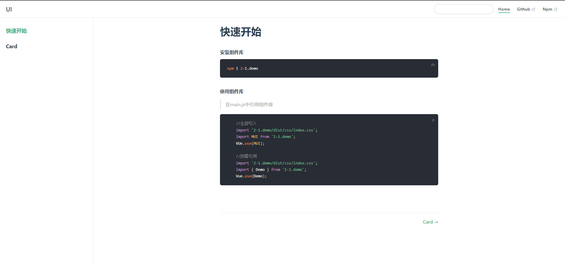
2. Building documentation web pages using Vuepress
npm install -D vuepress
To create a docs directory, you can use & & together with the third command, but an error will be reported for some reasons
mkdir docs
Create readme in the docs directory If MD is created automatically, there will be garbled code. You can create readme yourself MD file
echo '# Hello VuePress' > docs/README.md
package.json add run command
"scripts": {
  "docs:dev": "vuepress dev docs",
  "docs:build": "vuepress build docs"
}
function
npm run docs:dev
Create directory
1,docs => .vuepress => components(card.vue,card.scss),public(img)
2,docs => componentDocs =>card. MD (used to display card usage examples and interface usage methods at last)
3,docs => README. MD (quick start page)
Add navigation bar, sidebar, title, base address
// .vuepress/config.js
module.exports = {
title: 'UI',//title
base: '/UI',//Static resource base address
themeConfig: {
  // navigation bar
  nav: [{
      text: 'Home',
      link: '/'
    }, {
      text: 'Github',
      link: 'https://github.com/JCUT-WB'
    },
    {
      text: 'Npm',
      link:'https://www.npmjs.com/~wubo_007'
    }
  ],
  //sidebar
  sidebar: [
    '/',
    //homepage
    '/componentDocs/card'
  ]
}
}
Change sidebar name configuration quick start
Create github site
1. New site name
wubo-ui.github.io
2. Description
3,public
4,README.md
Find index MD is index MD, otherwise readme md
Configure the warehouse to wubo UI github. IO / below
1. Create a warehouse and push local code into github
//Initialize git
git init

//Bind local warehouse and remote warehouse
git remote add origin https://github.com/JCUT-WB/UI.git
//If an error is reported, use git remote rm origin to reset it

//Submit
git add .

git commit -m "feat:save"

//Push
git push -u origin master
2. Configure deploy sh
1,change
git push -f https://github.com/JCUT-WB/UI.git master:gh-pages

2,package.json add to scripts command
 "deploy": "bash deploy.sh"

3,release
npm run deploy
3. Delete dist file for repeated submission
git add .

git commit -m "feat:save"
4. The component picture address is / UI / img jpg
5. After publishing, style and hyperlink problems can be viewed Config. Under vuepress JS (base: '/ UI')
6. Release
npm run deploy