
Chapter 3. Scales, Axes and Lines
This chapter introduces the processing of various scales, coordinate axes and the use of broken lines. As mentioned at the beginning, a basic problem to consider when drawing visual charts is how to present the actual data values on the page in an appropriate proportion of pixel size and color. D3 has done a lot of optimization work in this regard. Let's have a look.
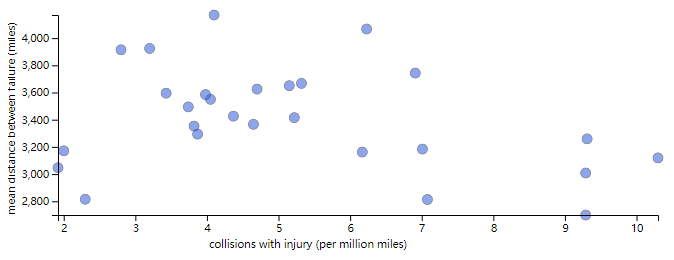
Example 1: scatter diagram of bus fault spacing with respect to collision injury rate
The background of this case is to explore whether there is a correlation between bus failure frequency, bus collision and passenger traffic accidents in New York City. After all, in a metropolis with complex traffic networks like New York, accidental failures or traffic accidents may trigger a series of chain reactions. If we can find out some related factors from a statistical point of view, we can take countermeasures in advance. The starting point of the problem selected here is to see whether the incidence of bus collision with casualties will have an impact on the spacing of bus accidents (it's really an unidentified brain circuit... Well, just learn the drawing of D3 scatter diagram, and spare the author for other problems).
get down to business. In order to solve the problem of mapping scale, D3 provides a tool function D3 Ext() returns an array containing the minimum and maximum values, eliminating the problem of manually calculating the value range.
Then, the range of the actual value is used as the domain and the range of the drawing area is used as the range to obtain two axial scales.
Then bind the data to the circle element of SVG drawing area, and draw each data point with the defined scale.
Finally, use the coordinate axis function of D3 to generate the x-axis and y-axis, as well as the corresponding coordinate axis name, and set the CSS style, that is, it is done.
The complete code is as follows:
<body>
    <h2>Ch3 - Example 1 | Bus Breakdown, Accident, and Injury</h2>
    <script src="/demos/js/d3.js"></script>
    <script>
        let json = null;
        function draw(data) {
            "use strict";

            // visualization code goes here
            json = data;

            var margin = 50,
                width = 700,
                height = 300;

            // plot circles
            var x_extent = d3.extent(data, function(d){ return d.collision_with_injury });
            var y_extent = d3.extent(data, function(d){ return d.dist_between_fail });

            var x_scale = d3.scale.linear()
                .domain(x_extent)
                .range([margin, width - margin]);
            var y_scale = d3.scale.linear()
                .domain(y_extent)
                .range([height - margin, margin]);

            d3.select('body')
                .append('svg')
                    .attr('width', width)
                    .attr('height', height)
                .selectAll('circle')
                .data(data)
                .enter()
                .append('circle')
                    .attr('r', 5)
                    .attr('cx', function(d){ return x_scale(d.collision_with_injury) })
                    .attr('cy', function(d){ return y_scale(d.dist_between_fail) });

            // Add axes
            // x
            var x_axis = d3.svg.axis().scale(x_scale);
            d3.select('svg')
                .append('g')
                    .attr('class', 'x axis')
                    .attr('transform', 'translate(0, ' + (height - margin) + ')')
                    .call(x_axis);
            // y
            var y_axis = d3.svg.axis().scale(y_scale).orient('left');
            d3.select('svg')
                .append('g')
                    .attr('class', 'y axis')
                    .attr('transform', 'translate(' + margin + ', 0)')
                    .call(y_axis);

            // Axis title
            d3.select('.x.axis')
                .append('text')
                    .text("collisions with injury (per million miles)")
                    .attr('x', (width / 2) - margin)
                    .attr('y', margin / 1.5);

            d3.select('.y.axis')
                .append('text')
                .text('mean distance between failure (miles)')
                .attr('transform', 'rotate(-90, -43, 0) translate(-280)');
        }

        d3.json("/demos/data/bus_perf.json", draw);
    </script>
    <style>
        .axis path{
            fill: none;
            stroke: black;
        }
        .axis {
            font-size: 8pt;
            font-family: sans-serif;
        }
        .tick {
            fill: none;
            stroke: black;
        }
        circle {
            stroke: black;
            stroke-width: 0.5px;
            fill: royalblue;
            opacity: 0.6;
        }
    </style>
</body>
The effect is as follows:
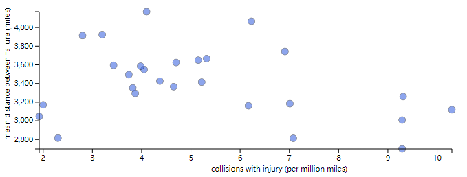
A small pit in this example appears in D3 JS version replacement, known changes include:
- The linear scale is created by D3 scale. Change linear () to D3 scaleLinear();
- How axes are created:
- Old version: D3 svg. axis(). scale(x_scale),d3.svg.axis().scale(y_scale).orient('left');
- New edition: D3 axisBottom(x_scale),d3.axisLeft(y_scale) (of course, there are d3.axisTop and d3.axisRight, which are closer to the declarative style)
However, the final effect after the first change is not ideal:
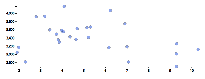
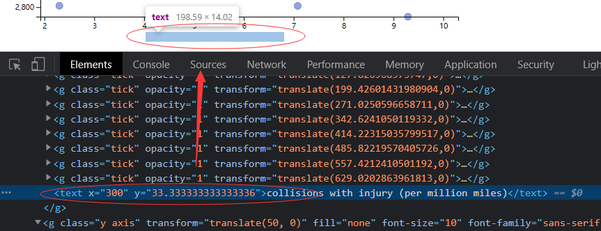
You can see that the numbers on the axis are bold, and the axis label is not displayed. The former can be disabled in CSS styles tich{ stroke: black; } For the latter, press F12 to check whether the text tag has been generated (indeed):
Then add fill color in JS or CSS:
- Fix in JavaScript:
d3.select('.x.axis')
  .append('text')
    .attr('fill', 'black')
// ...
d3.select('.x.axis')
  .append('text')
    .attr('fill', 'black')
// ...
- Fix in CSS:
text {
    fill: black;
}
The effect is as follows:
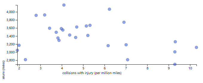
It is noted that the y-axis name is not fully displayed, so it is necessary to manually adjust the longitudinal translation of the y-label after rotation again. It is found that it is more appropriate to change it to translate(-100):
Attachment: complete code of the new version:
<!DOCTYPE html>
<html lang="en">

<head>
    <meta charset="utf-8">
    <link rel="shortcut icon" href="/favicon.ico" type="image/x-icon">
    <title>Ch3 - Example 1 | Getting Started with D3</title>
</head>

<body>
    <h2>Ch3 - Example 1 | Bus Breakdown, Accident, and Injury</h2>
    <script src="/demos/js/d3.v6.js"></script>
    <script>
        let json = null;
        const draw = data => {
            "use strict";

            // badass visualization code goes here
            json = data;

            const margin = 50,
                width = 700,
                height = 300;

            // plot circles
            const x_extent = d3.extent(data, d => d.collision_with_injury);
            const y_extent = d3.extent(data, d => d.dist_between_fail);

            const x_scale = d3.scaleLinear()  // v6.7.0
                .domain(x_extent)
                .range([margin, width - margin]);
            const y_scale = d3.scaleLinear()  // v6.7.0
                .domain(y_extent)
                .range([height - margin, margin]);

            d3.select('body')
                .append('svg')
                    .attr('width', width)
                    .attr('height', height)
                .selectAll('circle')
                .data(data)
                .join(enter => enter.append('circle')
                    .attr('r', 5)
                    .attr('cx', d => x_scale(d.collision_with_injury))
                    .attr('cy', d => y_scale(d.dist_between_fail))
                );

            // Add axes
            // x
            const x_axis = d3.axisBottom(x_scale);  // v6.7.0
            d3.select('svg')
                .append('g')
                    .attr('class', 'x axis')
                    .attr('transform', `translate(0, ${(height - margin)})`)
                    .call(x_axis);
            // y
            const y_axis = d3.axisLeft(y_scale);    // v6.7.0
            d3.select('svg')
                .append('g')
                    .attr('class', 'y axis')
                    .attr('transform', `translate(${margin}, 0)`)
                    .call(y_axis);

            // Axis title
            // x
            d3.select('.x.axis')
                .append('text')
                    .attr('fill', 'black')  // v6.7.0
                    .text("collisions with injury (per million miles)")
                    .attr('x', (width / 2) - margin)
                    .attr('y', margin / 1.5);
            // y
            d3.select('.y.axis')
                .append('text')
                    .attr('fill', 'black')  // v6.7.0
                    .text('mean distance between failure (miles)')
                    .attr('transform', 'rotate(-90, -43, 0) translate(-100)');
        }

        d3.json("/demos/data/bus_perf.json").then(draw)
            .catch(console.error);
    </script>
    <style>
        .axis path{
            fill: none;
            stroke: black;
        }
        .axis {
            font-size: 8pt;
            font-family: sans-serif;
        }
        .tick {
            fill: none;
            /* stroke: black; */
        }
        circle {
            stroke: black;
            stroke-width: 0.5px;
            fill: royalblue;
            opacity: 0.6;
        }
    </style>
</body>

</html>
Example 2: draw a comparison diagram of the average daily flow of turnstiles at two locations
(to be continued)