Simple chart drawing
1.1 draw line chart
Using the plot() function of pyplot, you can draw a line chart with multiple lines, which can be done in any of the following ways.
plot(x, y, fmt, scalex=True, scaley=True, data=None, label=None, *args, **kwargs)
x: Represents the data of the x-axis. The default value is range(len(y)).
y: Data representing the y-axis.
fmt: a format string that represents quick line styling.
Label: represents the label text applied to the legend.
The plot() function returns a list of Line2D class objects (representing lines).
First kind
plt.plot(x1, y1)
plt.plot(x2, y2)
Second
plt.plot(x1, y1, x2, y2)
Third
arr = np.array([[1, 2, 3],
                [4, 5, 6],
                [7, 8, 9],
                [10, 11, 12]])
plt.plot(arr[0], arr[1:])
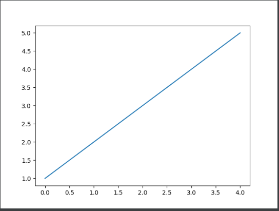
Draw a line chart
import matplotlib.pyplot as plt #Import pyplot under the matplotlib package and name it as the plot function
import numpy as np

#Use matplotlib to draw the first chart
data =np.array([1,2,3,4,5])     #Prepare data
fig=plt.figure()                #Create canvas
ax=fig.add_subplot(111)         #Add drawing area
ax.plot(data)                   #draw icon
plt.show()                      #Display icon
1.2 draw column chart or stacked column chart
The bar() function returns an object of the BarContainer class.
• the object of BarContainer class is a container containing columns or error bars. It can also be regarded as a tuple and can traverse to obtain each column or error bar.
• the object of BarContainer class can also access the patches or errorbar property to obtain all columns or error bars in the chart respectively.
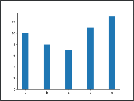
• a column chart with a set of columns is drawn
import matplotlib.pyplot as plt
import numpy as np

x = np.arange(5)
y1 = np.array([10, 8, 7, 11, 13])
# Width of column
bar_width = 0.3
# Draw a column chart
plt.bar(x, y1, tick_label=['a', 'b', 'c', 'd', 'e'], width=bar_width)
plt.show()
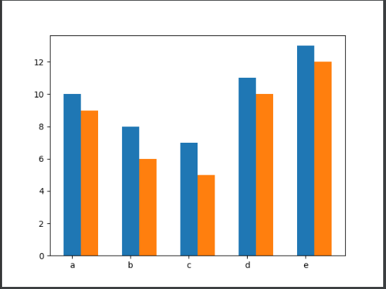
• draw a column chart with two sets of columns
import matplotlib.pyplot as plt
import numpy as np

x = np.arange(5)
y1 = np.array([10, 8, 7, 11, 13])
y2 = np.array([9, 6, 5, 10, 12])
# Width of column
bar_width = 0.3
# Draw a column chart based on multiple sets of data
plt.bar(x, y1, tick_label=['a', 'b', 'c', 'd', 'e'], width=bar_width)
plt.bar(x+bar_width, y2, width=bar_width)
plt.show()
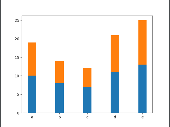
• plot stacked columns
When drawing a chart with the bar() function, you can control the y value of the column by passing a value to the bottom parameter of the function, so that the column drawn later is above the column drawn earlier.
import matplotlib.pyplot as plt
import numpy as np

x = np.arange(5)
y1 = np.array([10, 8, 7, 11, 13])
y2 = np.array([9, 6, 5, 10, 12])
# Width of column
bar_width = 0.3
# Plot stacked column
plt.bar(x, y1, tick_label=['a', 'b', 'c', 'd', 'e'], width=bar_width)
plt.bar(x, y2, bottom=y1,width=bar_width)
plt.show()
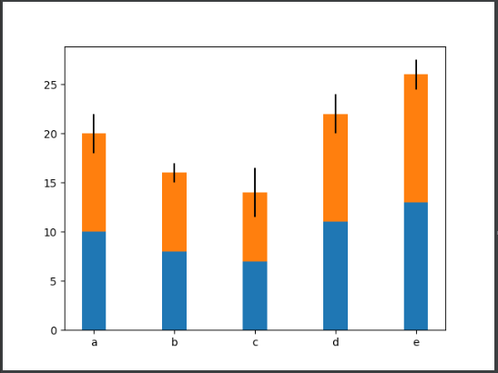
• draw a bar chart with error bars
When using the bar() function to draw a chart, you can also add error bars to the column by passing values to the xerr and yerr parameters.
import matplotlib.pyplot as plt
import numpy as np

x = np.arange(5)
y1 = np.array([10, 8, 7, 11, 13])
y2 = np.array([9, 6, 5, 10, 12])
# Width of column
bar_width = 0.3
# Deviation data
error = [2, 1, 2.5, 2, 1.5]
# Draw a bar chart with error bars
plt.bar(x, y1, tick_label=['a', 'b', 'c', 'd', 'e'], width=bar_width)
plt.bar(x, y1, bottom=y1, width=bar_width, yerr=error)
plt.show()
1.3 draw bar chart or stacked bar chart
Using the barh() function of pyplot, you can quickly draw bar graphs or stacked bar graphs.
barh(y, width, height=0.8, left=None, align='center', *, **kwargs)
y: Represents the y value of the bar.
Width: indicates the width of the bar.
Height: indicates the height of the bar. The default value is 0.8.
Left: the x coordinate value on the left side of the bar. The default value is 0.
align: indicates the alignment of the bar. The default value is "center", that is, the bar is aligned with the tick mark in the center.
tick_label: indicates the scale label corresponding to the bar.
xerr, yerr: if it is not set to None, you need to add horizontal / vertical error bars to the bar chart.
The barh() function returns an object of the BarContainer class.
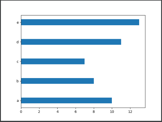
• bar chart with a set of bars
import matplotlib.pyplot as plt
import numpy as np

y = np.arange(5)
x1 = np.array([10, 8, 7, 11, 13])
# Height of bar
bar_height = 0.3
# Draw bar chart
plt.barh(y, x1, tick_label=['a', 'b', 'c', 'd', 'e'], height=bar_height)
plt.show()
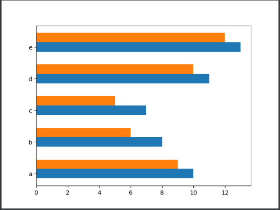
• bar chart with two sets of bars
import matplotlib.pyplot as plt
import numpy as np


y = np.arange(5)
x1 = np.array([10, 8, 7, 11, 13])
x2 = np.array([9, 6, 5, 10, 12])
bar_height = 0.3
plt.barh(y, x1, tick_label=['a', 'b', 'c', 'd', 'e'], height=bar_height)
plt.barh(y+bar_height, x2,height=bar_height)
plt.show()
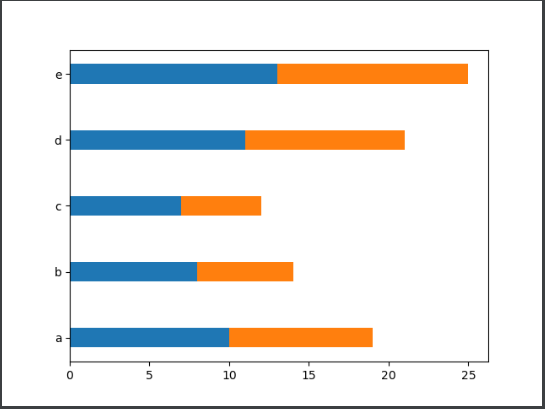
• plot stacked bar charts
When using the barh() function to draw a chart, you can control the x value of the bar by passing a value to the left parameter, so that the later drawn bar is to the right of the first drawn bar.
import matplotlib.pyplot as plt
import numpy as np

y = np.arange(5)
x1 = np.array([10, 8, 7, 11, 13])
x2 = np.array([9, 6, 5, 10, 12])
bar_height = 0.3
# Draw stacked bar chart
plt.barh(y, x1, tick_label=['a', 'b', 'c', 'd', 'e'], height=bar_height)
plt.barh(y, x2, left=x1, height=bar_height)
plt.show()
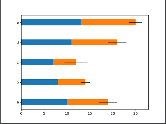
• draw a bar chart with error bars
When using the barh() function to draw a chart, you can add error bars to the bar by passing values to the xerr and yerr parameters.
import matplotlib.pyplot as plt
import numpy as np

y = np.arange(5)
x1 = np.array([10, 8, 7, 11, 13])
x2 = np.array([9, 6, 5, 10, 12])
bar_height = 0.3
# Deviation data
error = [2, 1, 2.5, 2, 1.5]
# Draw a bar chart with error bars
plt.barh(y, x1, tick_label=['a', 'b', 'c', 'd', 'e'], height=bar_height)
plt.barh(y, x2, left=x1, height=bar_height, xerr=error)
plt.show()
1.4 drawing of stacking area
Using pyplot's stackplot() function, you can quickly draw a stacked area map.
grammar
stackplot(x, y,labels=(), baseline='zero', data=None, *args, **kwargs)
x: The data representing the x-axis can be a one-dimensional array.
y: The data representing the y-axis can be a two-dimensional array or a one-dimensional array sequence.
labels: represents the label of each filled area.
Baseline: indicates the method of calculating the baseline, including zero, sym, wiggle and weighted_wiggle. Where zero represents a constant zero baseline, that is, a simple superposition diagram; SYM means symmetrical to the zero baseline; Wiggle represents the sum of the minimized square slopes; weighted_wiggle means to perform the same operation, but the weight is used to describe the size of each layer.
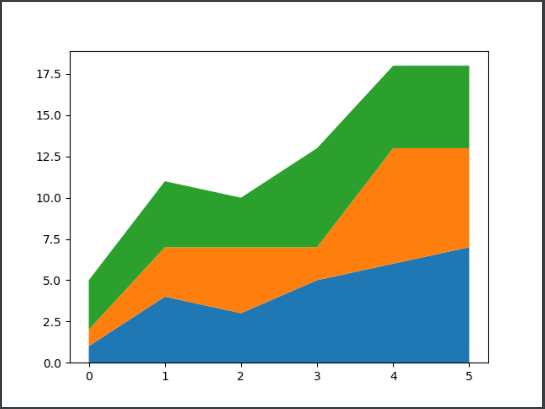
• plot the stacking area with three filled areas stacked
import matplotlib.pyplot as plt
import numpy as np

x = np.arange(6)
y1 = np.array([1,4,3,5,6,7])
y2 = np.array([1,3,4,2,7,6])
y3 = np.array([3,4,3,6,5,5])
# Plot stacked area
plt.stackplot(x, y1, y2, y3)
plt.show()
1.5 drawing histogram
Using pyplot's hist() function, you can quickly draw histograms.
grammar
hist(x, bins=None, range=None, density=None, weights=None,
       bottom=None,  **kwargs)
x: Represents the data of the x-axis.
bins: indicates the number of rectangular bars. The default value is 10.
Range: indicates the range of data. If the range is not set, the default data range is (x.min(), x.max()).
Cumulative: indicates whether to calculate cumulative frequency or frequency.
histtype: indicates the type of histogram. Four values are supported, 'bar', 'barstacked', 'step' and 'stepfilled', of which 'bar' is the default value and represents the traditional histogram Barstacked 'stands for stacking histogram;' Step 'represents the unfilled line histogram;' Stepfilled 'represents the filled line histogram.
align: indicates the alignment of the rectangular strip boundary. It can be set to 'left', 'mid' or 'right'. The default is' mid '.
orientation: indicates the placement of rectangular bars. The default is' vertical ', that is, the vertical direction.
Rwidth: indicates the percentage of the width of the rectangular bar. The default value is 0. If the value of histtype is' step 'or' stepfilled ', the value of rwidth parameter is ignored directly.
Stacked: indicates whether multiple rectangular bars are stacked.
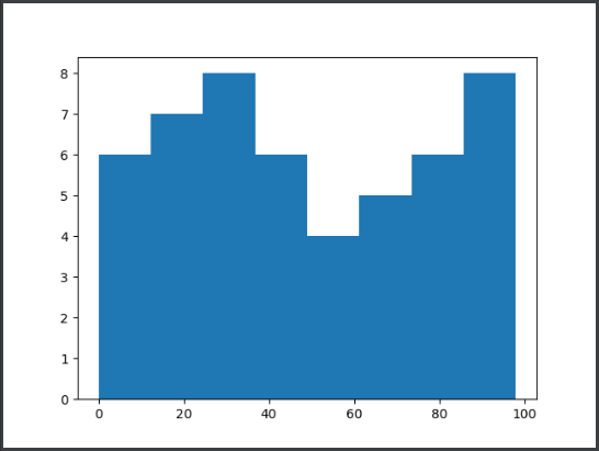
• draw a histogram of filled lines
import matplotlib.pyplot as plt
import numpy as np

# Prepare 50 random test data
scores = np.random.randint(0,100,50)
# Draw histogram
plt.hist(scores, bins=8, histtype='stepfilled')
plt.show()
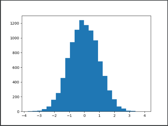
Gray histogram of face recognition
This example requires that a group of 10000 random numbers be used as the gray value of the face image, and the hist() function is used to draw the gray histogram shown in the figure below.
import matplotlib.pyplot as plt
import numpy as np


# 10000 random numbers
random_state = np.random.RandomState(19680801)
radom_x = random_state.randn(10000)
# Draw a histogram containing 25 rectangular bars
plt.hist(radom_x, bins=25)
plt.show()
1.6 draw pie chart or doughnut chart
Using pyplot's pie() function, you can quickly draw pie or doughnut charts.
pie(x, explode=None, labels=None, autopct=None, pctdistance=0.6,
      startangle=None, *, data=None)
x: Data representing a sector or wedge.
Expand: indicates the distance of the sector or wedge from the center of the circle.
labels: indicates the label text corresponding to the sector or wedge.
autopct: represents a string that controls the display of fan-shaped or wedge-shaped numerical values. The number of digits after the decimal point can be specified through the format string.
pctdistance: indicates the ratio of the numerical label corresponding to the sector or wedge to the center of the circle, which is 0.6 by default.
shadow: indicates whether shadows are displayed.
labeldistance: indicates the drawing position of the label text (scale relative to the radius). The default is 1.1.
startangle: indicates the starting drawing angle. It is drawn counterclockwise from the positive direction of the x axis by default.
Radius: refers to the circular radius surrounded by a fan or wedge.
Wedgeprops: represents a dictionary that controls fan or wedge attributes. For example, set the width of the wedge to 0.7 by wedgeprops = {'width': 0.7}.
textprops: represents a dictionary that controls text properties in a chart.
Center: indicates the center point of the chart. The default value is (0,0).
Frame: indicates whether the frame is displayed.
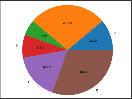
• draw pie chart
import matplotlib.pyplot as plt
import numpy as np

data = np.array([20, 50, 10, 15, 30, 55])
pie_labels = np.array(['A', 'B', 'C', 'D', 'E', 'F'])
# Draw pie chart: the radius is 0.5, and the value retains 1 decimal place
plt.pie(data, radius=1.5, labels=pie_labels, autopct='%3.1f%%')
plt.show()
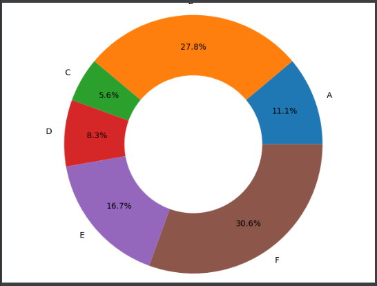
• draw a doughnut
data = np.array([20, 50, 10, 15, 30, 55])
pie_labels = np.array(['A', 'B', 'C', 'D', 'E', 'F'])
# Draw a doughnut
plt.pie(data, radius=1.5, wedgeprops={'width': 0.7},
           labels=pie_labels, autopct='%3.1f%%',
           pctdistance=0.75)
1.7 plot scatter or bubble chart
Using pyplot's scatter() function, you can quickly draw scatter or bubble charts.
Syntax:
scatter(x, y, s=None, c=None, marker=None, cmap=None, linewidths=None, edgecolors=None, *, **kwargs)
x. y: indicates the position of the data point.
s: Represents the size of the data point.
c: Represents the color of the data point.
marker: indicates the style of data points. The default is circle.
alpha: indicates transparency, which can be 0 ~ 1.
linewidths: indicates the stroke width of the data point.
edgecolors: indicates the stroke color of the data point.
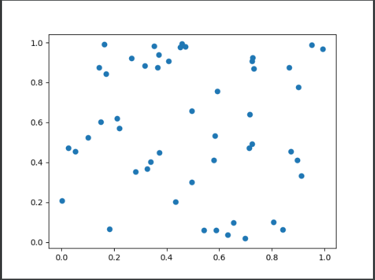
• scatter plot
import  matplotlib.pyplot as plt
import numpy as np

num = 50
x = np.random.rand(num)
y = np.random.rand(num)
plt.scatter (x, y)
plt.show()
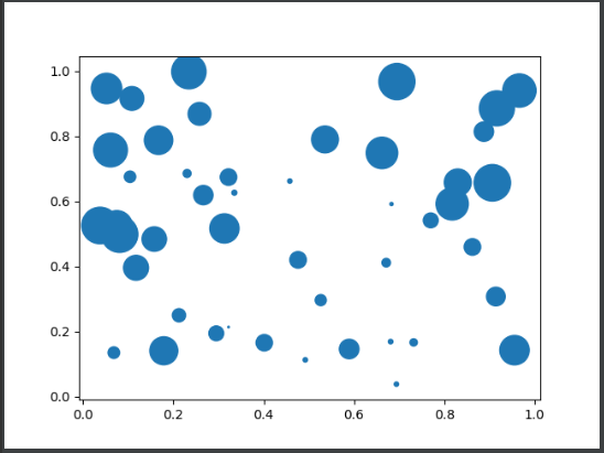
• bubble plot
import matplotlib.pyplot as plt
import numpy as np

num = 50
x = np.random.rand(num)
y = np.random.rand(num)
area = (30 * np.random.rand(num))**2
plt.scatter(x, y, s=area)
plt.show()
1.8 draw box diagram
The boxplot() function of pyplot can be used to draw box graphs quickly.
Syntax:
boxplot(x, notch=None, sym=None, vert=None, whis=None, positions=None, widths=None, *, data=None)
x: Draw the data of the box diagram.
sym: indicates the symbol corresponding to the abnormal value. It is a hollow circle by default.
vert: indicates whether to place the box diagram vertically. The default is vertical.
whis: indicates the distance between the upper and lower quartiles of the box chart. The default is 1.5 times the quartile difference.
positions: indicates the position of the box.
widths: indicates the width of the box, which is 0.5 by default.
patch_artist: indicates whether to fill the color of the box. It is not filled by default.
Mean line: whether to mark the median with a line across the box. It is not used by default.
showcaps: indicates whether to display the horizontal lines at the top and bottom of the box. It is displayed by default.
showbox: indicates whether to display the box of the box diagram. It is displayed by default.
showfliers: indicates whether to display outliers. It is displayed by default.
Labels: labels representing box drawings.
boxprops: a dictionary representing the properties of the control box.
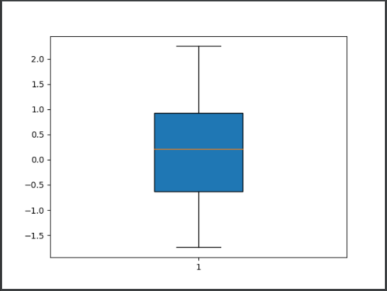
• draw a box diagram without outliers
import matplotlib.pyplot as plt
import numpy as np

data = np.random.randn(100)
plt.boxplot(data, eanline=True, widths=0.3, patch_artist=True,
showfliers=False)
plt.show()
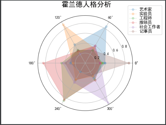
The polar() function of pyplot can be used to draw radar map quickly.
polar(theta, r, **kwargs)
theta: represents the angle between the ray and the polar diameter where each data point is located.
r: Represents the distance from each data point to the origin.
Holland radar map
import numpy as np
import matplotlib.pyplot as plt
import matplotlib

plt.rcParams['font.sans-serif'] = ['SimHei']
plt.rcParams['axes.unicode_minus'] = False

radar_labels = np.array(['Research type(I)', 'Artistry( A)', 'Sociality( S)', 'Enterprise type( E)', 'Routine( C', 'Realistic type( R)'])
data = np.array([[0.4, 0.32, 0.35, 0.30, 0.30, 0.88],
                 [0.85, 0.35, 0.30, 0.40, 0.40, 0.30],
                 [0.43, 0.89, 0.30, 0.28, 0.22, 0.30],
                 [0.30, 0.25, 0.48, 0.85, 0.45, 0.40],
                 [0.20, 0.38, 0.87, 0.85, 0.45, 0.40],
                 [0.34, 0.31, 0.38, 0.40, 0.92, 0.28]])
data_labels = ('artist', 'Experimenter', 'engineer', 'salesman', 'social worker', 'Recorder')
angles = np.linspace(0, 2 * np.pi, 6, endpoint=False)  # Sets the angle of the radar chart, which is used to cut a circle flat
'''
np.linspace(start.stop, num,endpoint=Ture)
Parameters:
    start:scalar(scalar) Starting point of the sequence
    stop:scalar(scalar) End point of sequence
    num:int The number of samples generated. The default is 50. It must be non negative
    endpoint: bool If true, it must include stop,If yes False,Certainly not stop
'''
data = np.concatenate((data, [data[0]]))
angles = np.concatenate((angles, [angles[0]]))
'''
np.concatenate((arr,arr),axis=1)
Parameters: (data source 1, data source 2), axis Yes direction: 1 is row, 0 is column
 be careful:
    1.Cascading parameters are lists, which must be enclosed in brackets or parentheses
    2.Dimensions must be the same
    3.Consistent traits: on the premise of consistent dimensions,
        If transverse( axis=1)For cascading, you must ensure that the number of array rows cascaded is consistent
        If longitudinal( axis=0)For cascading, the number of array columns to be cascaded must be consistent
    4.Can pass axis Parameter changes the direction of the cascade
'''
fig = plt.figure(facecolor='white')
'''
figure(num-None,figsize=None,dpi=None,facecolor=None,edgecolor=None,frameon=True)
    num:Image number or name, number is number and string is name
    figsize:appoint figure Width and height of, in inches
    dpi:Specifies the resolution of the drawing object, that is, how many pixels per inch. The default value is 80
    facecolor:Background color
    edgecolor:border color
    frameon: Show border
'''
plt.subplot(111, polar=True)
'''
subplot(nrows,ncols,plot_number)
This function is used to represent figure Divide nrows*ncols Subgraph representation of
nrows:Number of rows of subgraph
ncols:Column number of subgraph
plot_numbel:Index value, indicating that the picture is placed on the second page plot_number Location
plt.subplot(232),take figure Divided into 2*3=6 In the subgraph area, the third parameter 2 indicates that the picture to be generated is in the second position
'''
plt.plot(angles, data, 'o-', linewidth=1, alpha=0.2)
'''
plt.plot(x,y,format_string,**kwargs)
    x: x Axis data, list or array, optional
    y: y Axis data, list or array
    format_string: Format string of control curve, optional
    **kwargs:The second group or more can draw multiple curves
'''
plt.fill(angles, data, alpha=0.25)  # Area fill function
plt.thetagrids(angles * 180 / np.pi)  # Trigonometric function of mathematical function in numpy
plt.figtext(0.52, 0.95, 'Holland personality analysis', ha='center', size=20)
'''
0.52:Represents abscissa
0.95: Represents the ordinate
'Holland personality analysis': Represents the text content to add
ha:horizontal alignment
va:Vertical alignment
fontsize:Text font size
'''
legend = plt.legend(data_labels, loc=(0.95, 0.80), labelspacing=0.1)
plt.setp(legend.get_texts(), fontsize='large')
plt.grid(True)
plt.savefig('holland_radar.jpg')
plt.show()
2.0 drawing error bar chart
The error bar () function of pyplot can be used to draw the error bar graph quickly.
Syntax:
errorbar(x, y, yerr=None, xerr=None, fmt='', ecolor=None, *, data=None, **kwargs)
x. y: indicates the position of the data point.
xerr, yerr: indicates the error range of the data.
fmt: represents the marker style of data points and the style of connecting lines between data points.
elinewidth: indicates the line width of the error bar.
capsize: indicates the size of the error bar boundary bar.
capthick: indicates the thickness of the error bar boundary cross bar.
• draw error bar chart
import matplotlib.pyplot as plt
import numpy as np

x = np.arange(5)
y = (25, 32, 34, 20, 25)
y_offset = (3, 5, 2, 3, 3)
plt.errorbar(x, y, yerr=y_offset, capsize=3, capthick=2)
plt.show()
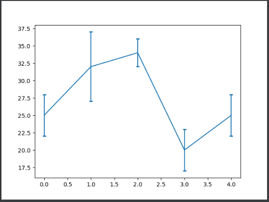
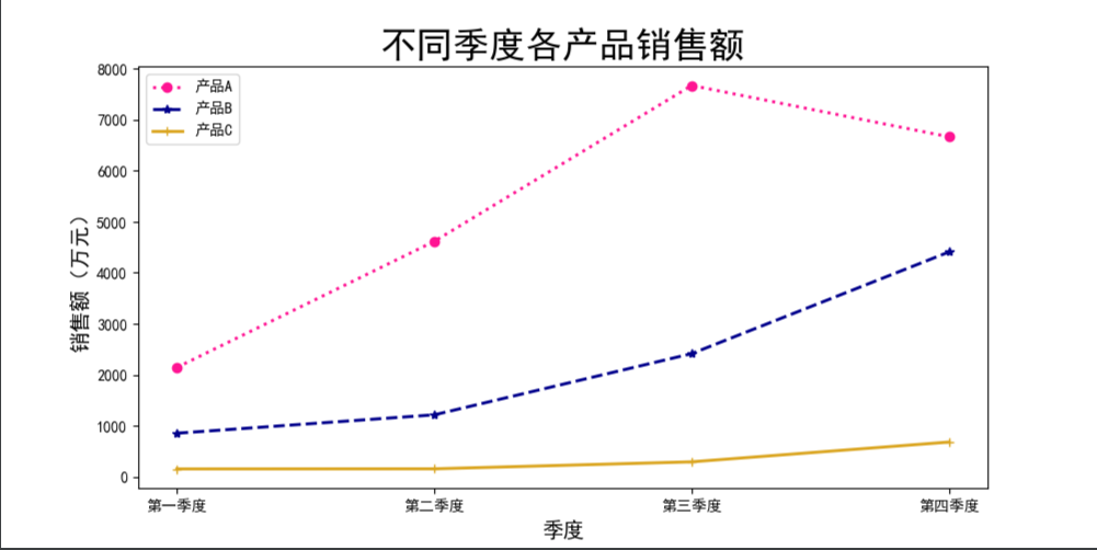
Chart style beautification
Table data source:
import matplotlib.pyplot as plt
import matplotlib as mpl
import pandas as pd

mpl.rcParams['font.sans-serif'] = ['SimHei']  # Set simple black font
mpl.rcParams['axes.unicode_minus'] = False  # Resolve '-' bug

datafile = 'path';
data = pd.read_excel(datafile)
# Set canvas size
plt.figure(figsize=(10, 5))

# Set the icon title and label the axis
plt.title("Sales of products in different quarters", fontsize=24)
plt.xlabel("quarter", fontsize=14)
plt.ylabel("Sales (10000 yuan)", fontsize=14)

plt.plot(data['quarter'], data['product A'], color="deeppink", linewidth=2, linestyle=':', label='product A', marker='o')
plt.plot(data['quarter'], data['product B'], color="darkblue", linewidth=2, linestyle='--', label='product B', marker='*')
plt.plot(data['quarter'], data['product C'], color="goldenrod", linewidth=2, linestyle='-', label='product C', marker='+')

# Sets the size of the tick mark
plt.legend(loc=2)
plt.show()