Author: Peter Editor: Peter
Hello, I'm Peter~
I have written many articles about Pandas. This paper carries out a simple comprehensive use, which is mainly divided into:
- How to simulate data by yourself
- Multiple data processing methods
- Data statistics and visualization
- User RFM model
- User repurchase cycle

<!--MORE-->
Build data
The data used in this case is self simulated by Xiaobian, which mainly includes two data: order data and fruit information data, and the two data will be combined
import pandas as pd
import numpy as np
import random
from datetime import *
import time

import plotly.express as px
import plotly.graph_objects as go
import plotly as py

# Draw subgraph
from plotly.subplots import make_subplots
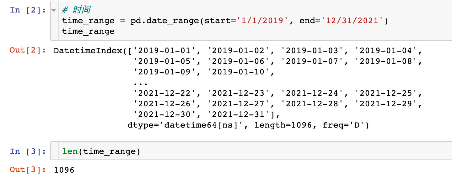
1. Time field
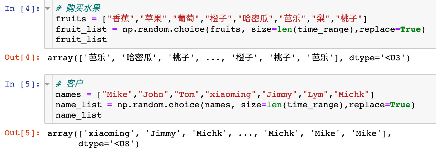
2. Fruits and users
3. Generate order data
order = pd.DataFrame({
    "time":time_range,  # Order time
    "fruit":fruit_list,  # Fruit name
    "name":name_list,  # Customer name
    # Purchase volume
    "kilogram":np.random.choice(list(range(50,100)), size=len(time_range),replace=True)
})

order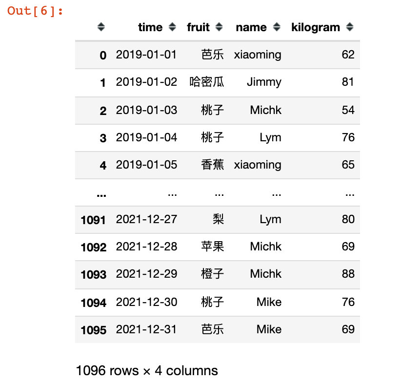
4. Generate fruit information data
infortmation = pd.DataFrame({
    "fruit":fruits,
    "price":[3.8, 8.9, 12.8, 6.8, 15.8, 4.9, 5.8, 7],
    "region":["south China","North China","northwest","Central China","northwest","south China","North China","Central China"]
})

infortmation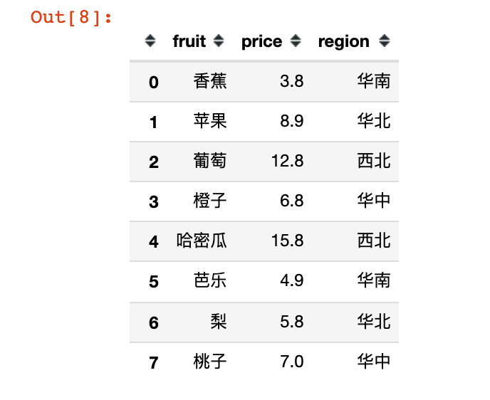
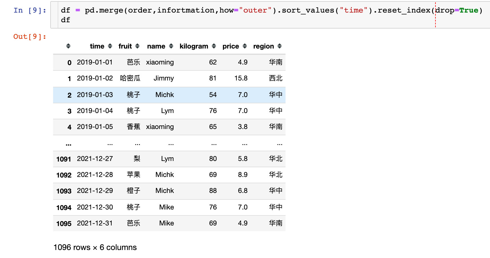
5. Data merging
The order information and fruit information are directly combined into a complete DataFrame, and this df is the data to be processed next
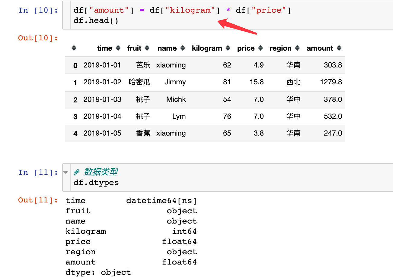
6. Generate new field: order amount
Here you can learn:
- How to generate time related data
- How to generate random data from a list (iteratable objects)
- The DataFrame of Pandas is created by itself, including generating new fields
- Pandas data merge
Analysis dimension 1: time
Monthly sales trend from 2019 to 2021
1. First extract the year and month:
df["year"] = df["time"].dt.year
df["month"] = df["time"].dt.month
# Extract year and month at the same time
df["year_month"] = df["time"].dt.strftime('%Y%m')

df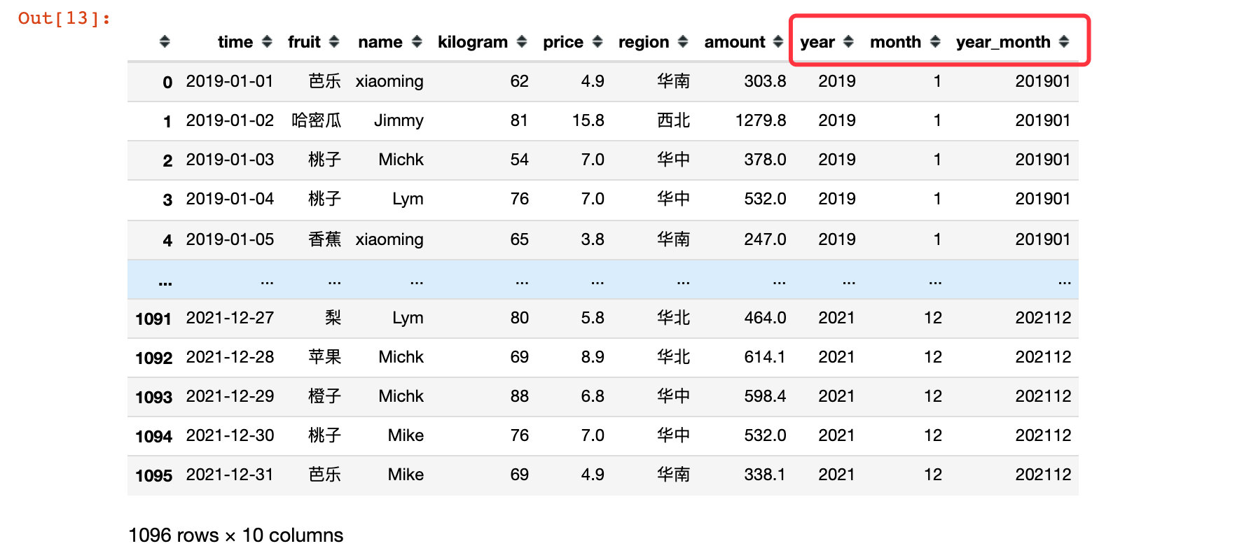
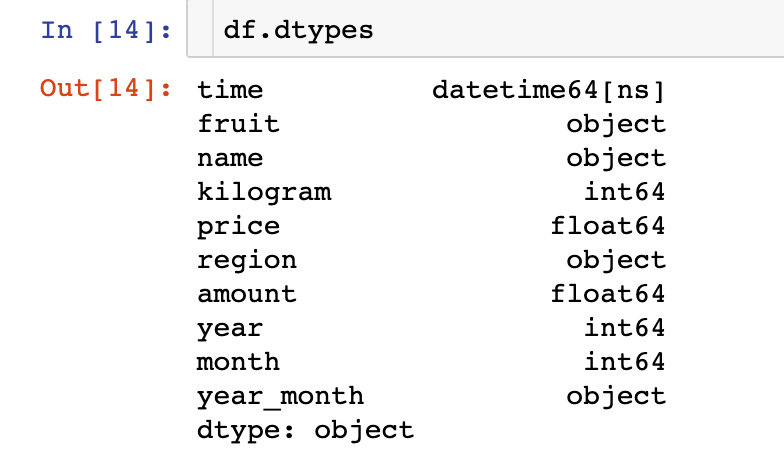
2. View field types:
3. Statistics and display by month and year:
# Statistics of sales volume by month and year
df1 = df.groupby(["year_month"])["kilogram"].sum().reset_index()

fig = px.bar(df1,x="year_month",y="kilogram",color="kilogram")
fig.update_layout(xaxis_tickangle=45)   # Tilt angle

fig.show()
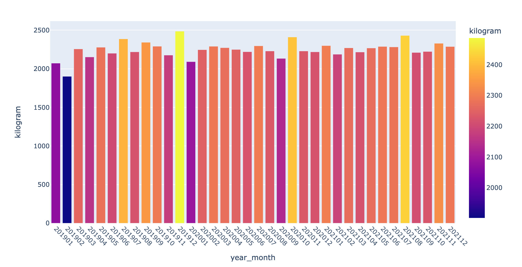
2019-2021 sales trend
df2 = df.groupby(["year_month"])["amount"].sum().reset_index()

df2["amount"] = df2["amount"].apply(lambda x:round(x,2))

fig = go.Figure()
fig.add_trace(go.Scatter(  #
    x=df2["year_month"],
    y=df2["amount"],
    mode='lines+markers', # Mode mode selection
    name='lines')) # name

fig.update_layout(xaxis_tickangle=45)   # Tilt angle

fig.show()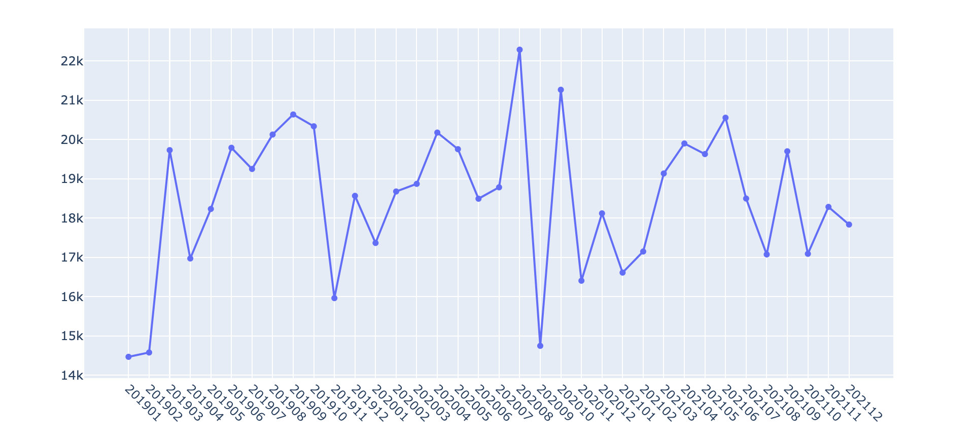
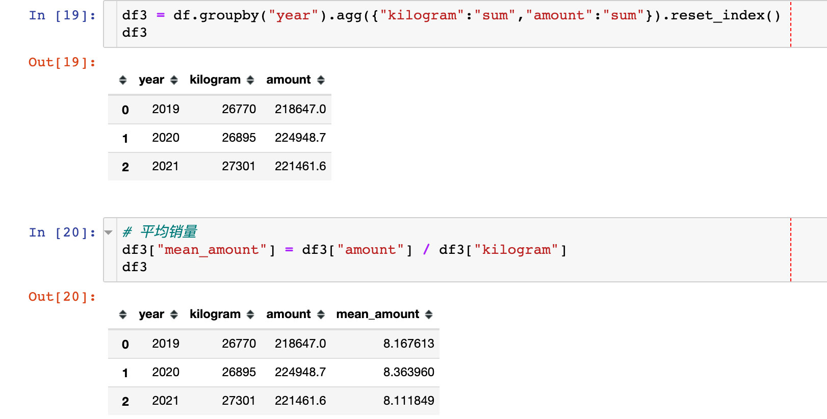
Annual sales, sales and average sales
Analysis dimension 2: goods
Proportion of annual fruit sales
df4 = df.groupby(["year","fruit"]).agg({"kilogram":"sum","amount":"sum"}).reset_index()
df4["year"] = df4["year"].astype(str)
df4["amount"] = df4["amount"].apply(lambda x: round(x,2))

from plotly.subplots import make_subplots
import plotly.graph_objects as go

fig = make_subplots(
    rows=1,
    cols=3,
    subplot_titles=["2019 year","2020 year","2021 year"],
    specs=[[{"type": "domain"},   # Specify the type by type
           {"type": "domain"},
           {"type": "domain"}]]
)

years = df4["year"].unique().tolist()

for i, year in enumerate(years):
    name = df4[df4["year"] == year].fruit
    value = df4[df4["year"] == year].kilogram

    fig.add_traces(go.Pie(labels=name,
                        values=value
                       ),
                 rows=1,cols=i+1
                )

fig.update_traces(
    textposition='inside',   # 'inside','outside','auto','none'
    textinfo='percent+label',
    insidetextorientation='radial',   # horizontal,radial,tangential
    hole=.3,
    hoverinfo="label+percent+name"
)

# fig.update_layout(title_text = "making multi row and multi column subgraphs")

fig.show()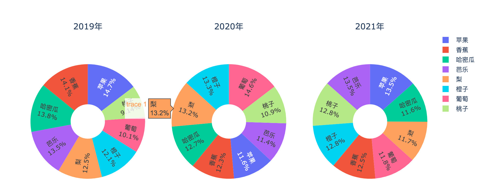
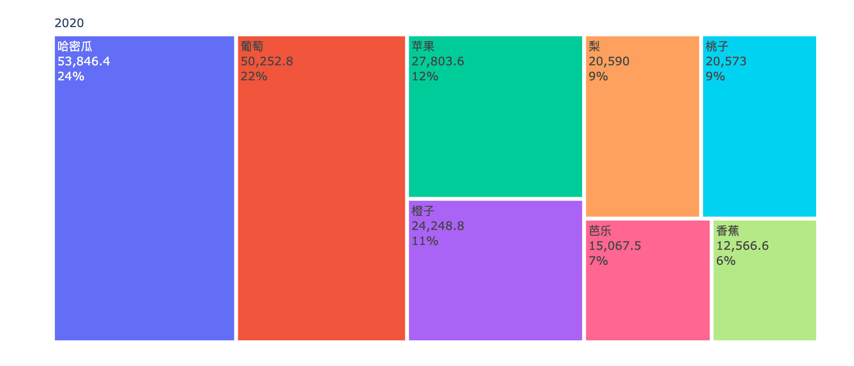
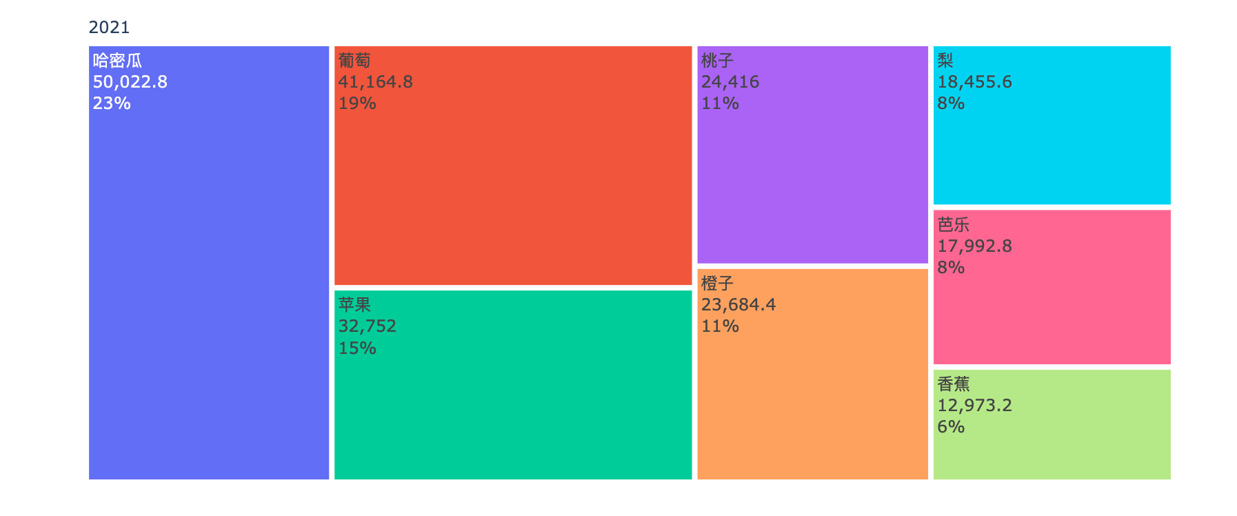
Comparison of annual sales amount of each fruit
years = df4["year"].unique().tolist()

for _, year in enumerate(years):

    df5 = df4[df4["year"]==year]
    fig = go.Figure(go.Treemap(
        labels = df5["fruit"].tolist(),
        parents = df5["year"].tolist(),
        values = df5["amount"].tolist(),
        textinfo = "label+value+percent root"
    ))

    fig.show()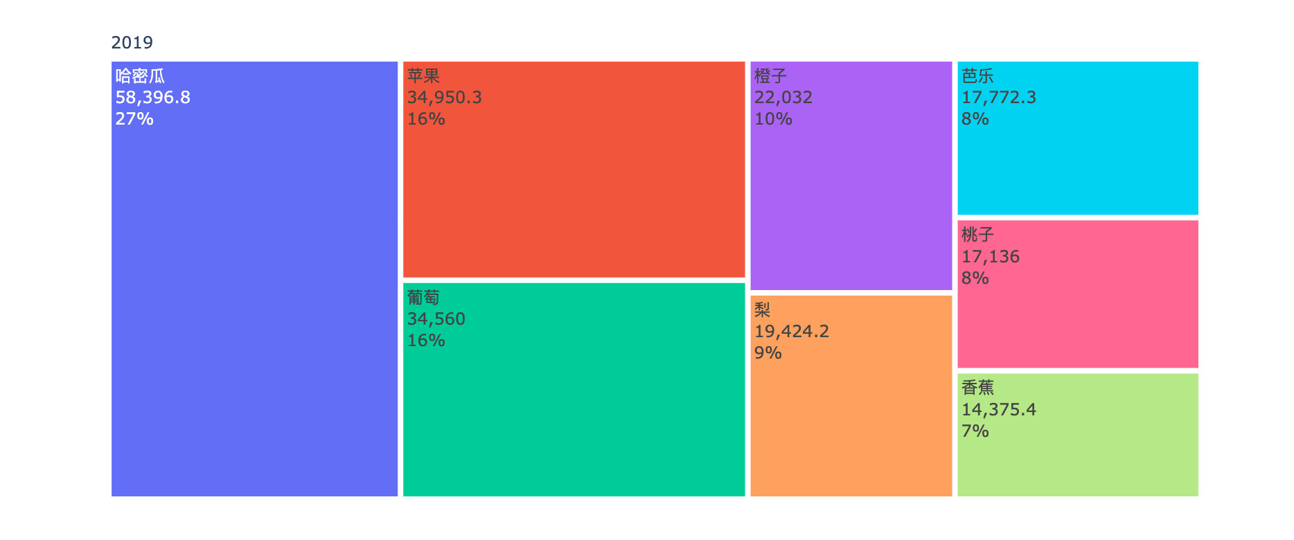
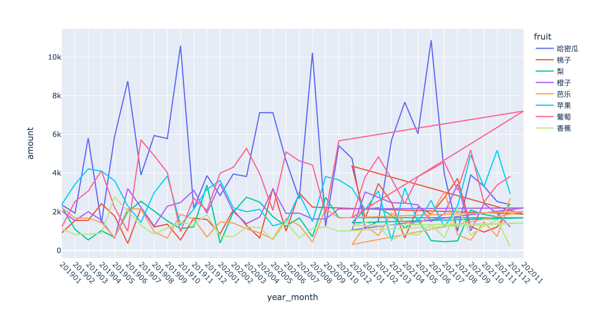
Monthly sales volume change of commodities
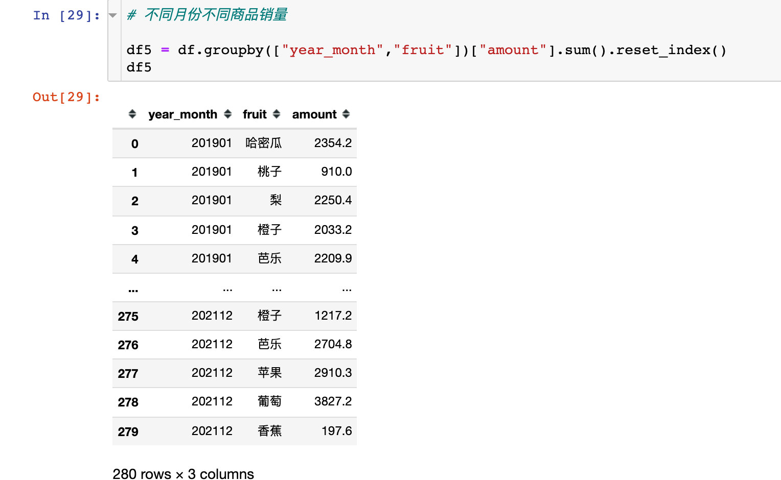
fig = px.bar(df5,x="year_month",y="amount",color="fruit")
fig.update_layout(xaxis_tickangle=45)   # Tilt angle
fig.show()

Changes in line chart display:
Analysis dimension 3: Region
Sales by Region
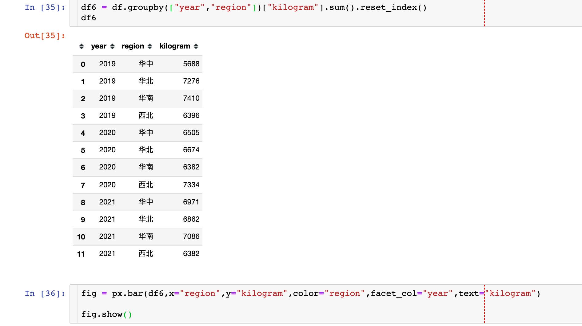
Average annual sales in different regions
df7 = df.groupby(["year","region"])["amount"].mean().reset_index()

Analysis dimension 4: user
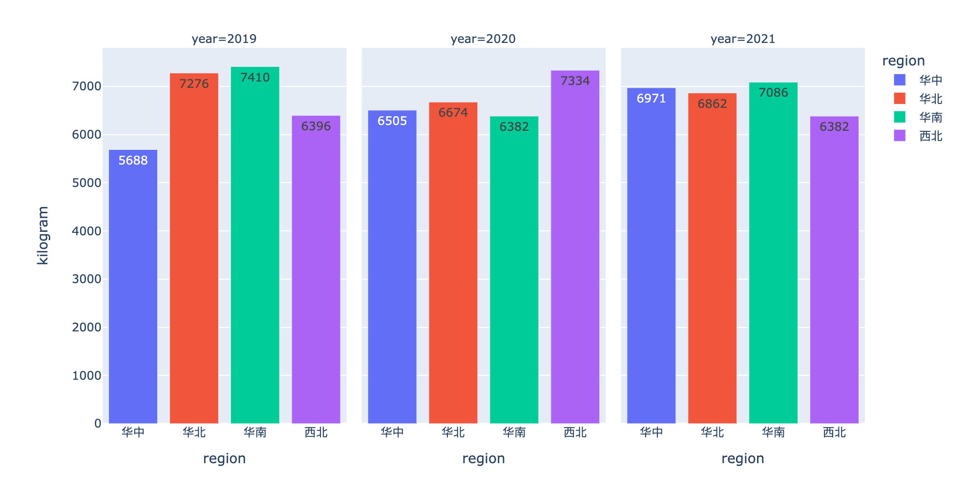
User order quantity and amount comparison
df8 = df.groupby(["name"]).agg({"time":"count","amount":"sum"}).reset_index().rename(columns={"time":"order_number"})

df8.style.background_gradient(cmap="Spectral_r")
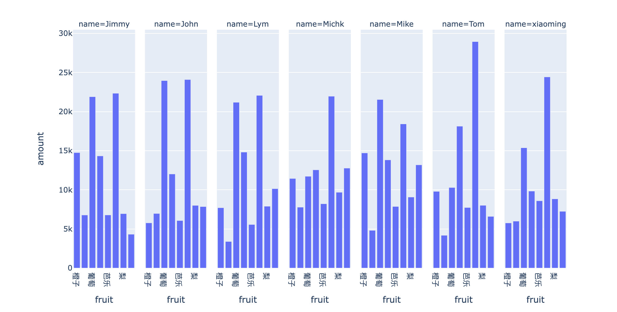
User fruit preferences
Analyze according to the order quantity and order amount of each fruit by each user:
df9 = df.groupby(["name","fruit"]).agg({"time":"count","amount":"sum"}).reset_index().rename(columns={"time":"number"})

df10 = df9.sort_values(["name","number","amount"],ascending=[True,False,False])

df10.style.bar(subset=["number","amount"],color="#a97fcf")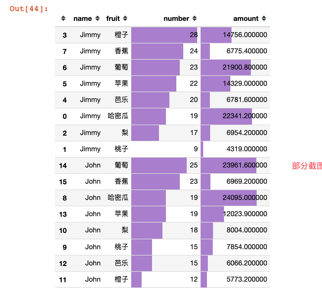
px.bar(df10,
       x="fruit",
       y="amount",
#            color="number",
       facet_col="name"
      )
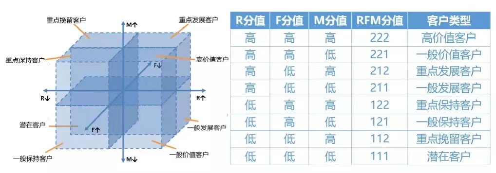
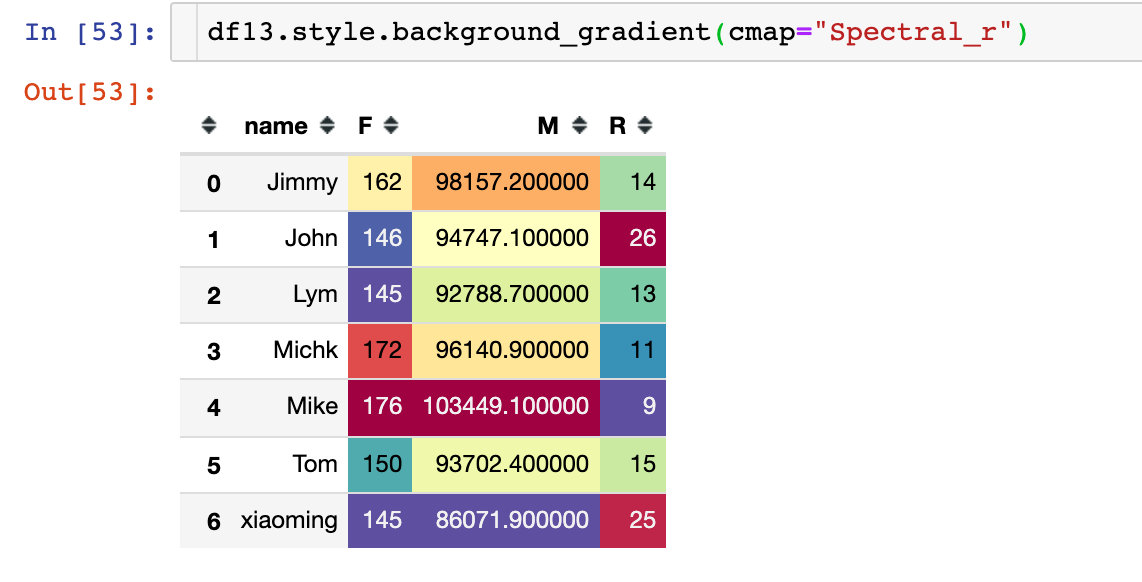
User hierarchy - RFM model
RFM model is an important tool and means to measure customer value and profitability.
This model can reflect three indicators of a user's delivery transaction behavior, overall transaction frequency and total transaction amount, and describe the customer's value status through three indicators; At the same time, customers are divided into 8 types of customer value according to these three indicators:
- Recency (R) is the number of days from the latest purchase date of the customer to the present. This indicator is related to the time point of analysis, so it changes. In theory, the more recent a customer purchases, the more likely it is to repurchase
- Frequency (F) refers to the number of times customers purchase -- consumers who buy most often have higher loyalty. Increasing the number of customers' purchases means that they can occupy more time share.
- Monetary value (M) is the total amount spent by the customer on the purchase.
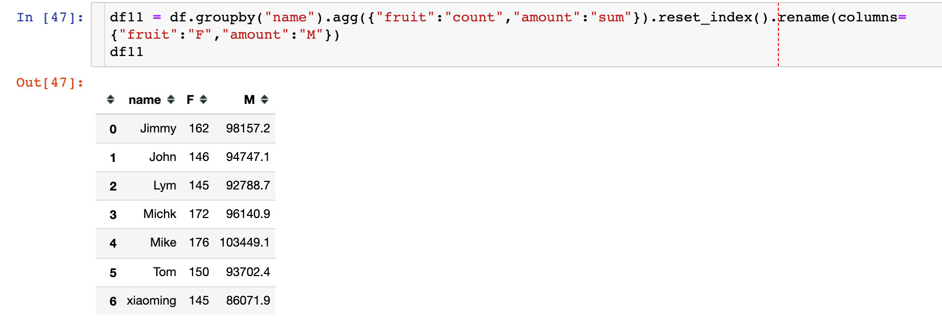
The following three indicators are solved by Pandas's multiple methods. The first is F and M: the number of orders and total amount of each customer
How to solve R index?
1. First solve the difference between each order and the current time
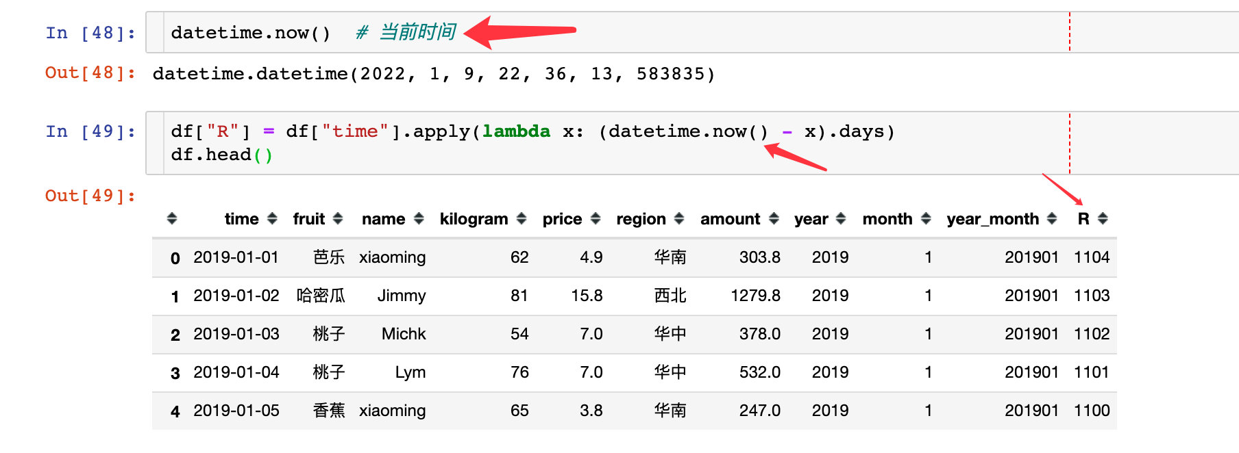
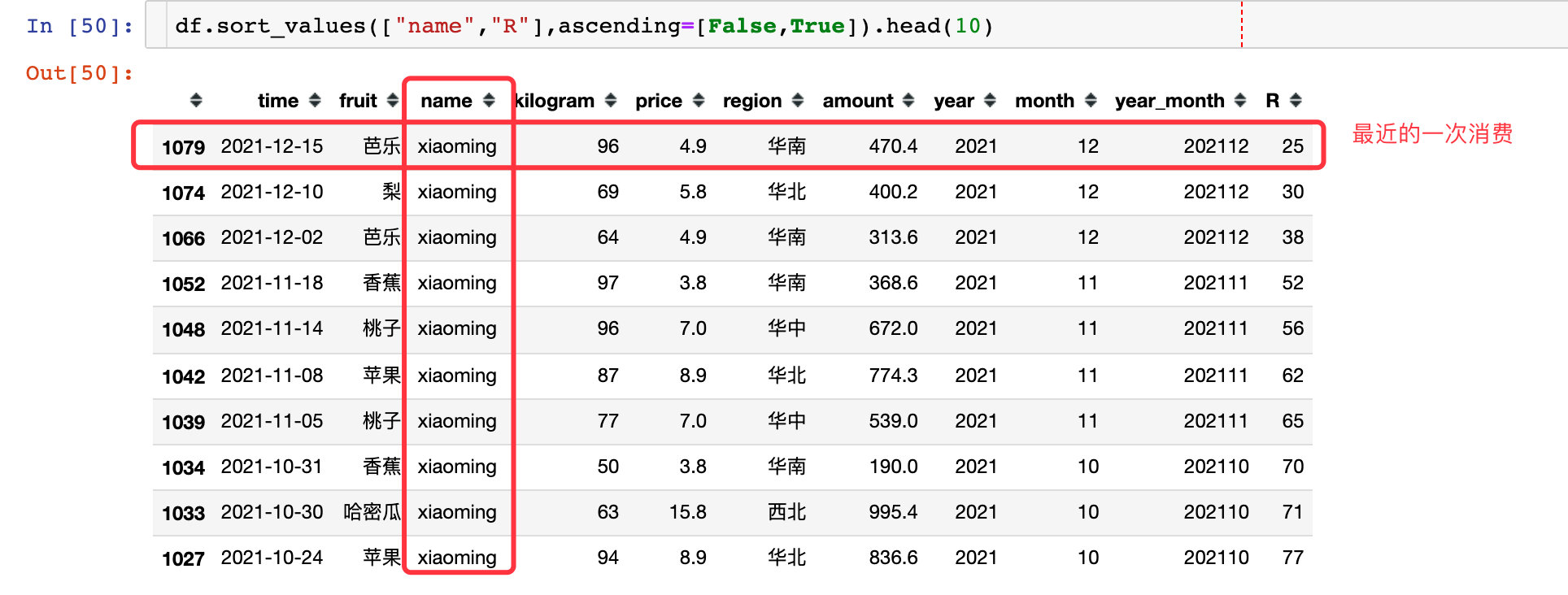
2. The data in the first place is his latest purchase record: Taking xiaoming user as an example, the last time is December 15, and the difference from the current time is 25 days
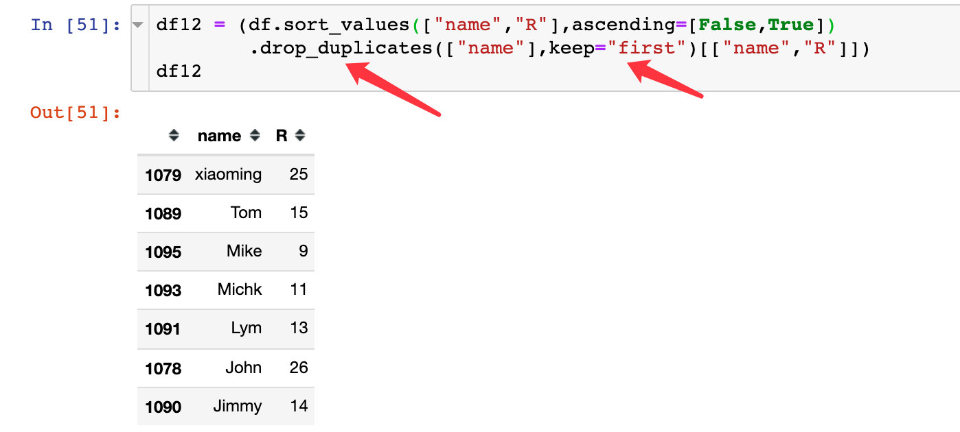
3. According to the user's de duplication, the first data is retained, so as to obtain the R index of each user:
4. Three indicators are obtained by data consolidation:
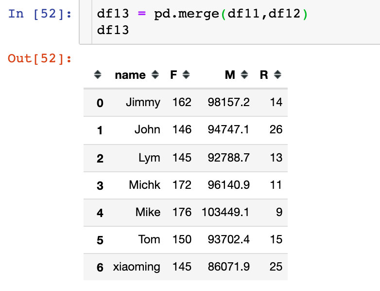
When the amount of data is large enough and there are enough users, users can be divided into 8 types only by RFM model
User repurchase analysis
The re purchase cycle is the time interval between two purchases: Taking xiaoming users as an example, the first two re purchase cycles are 4 days and 22 days respectively
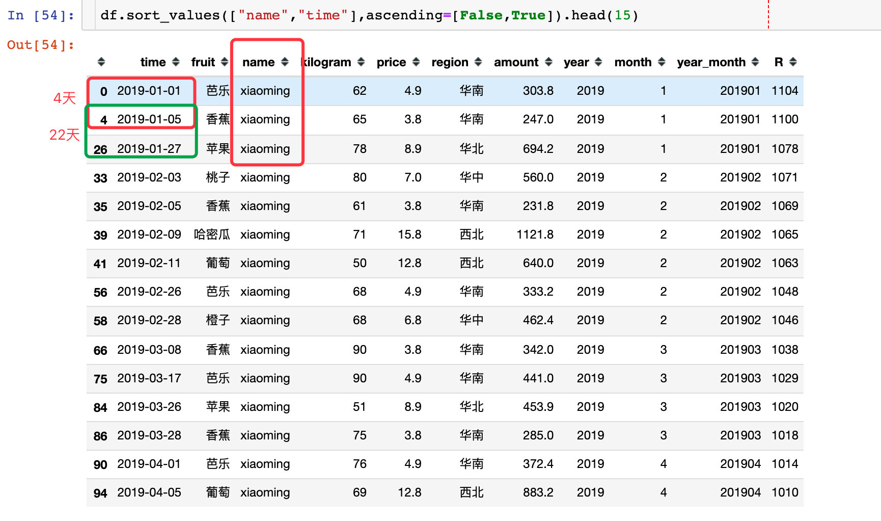
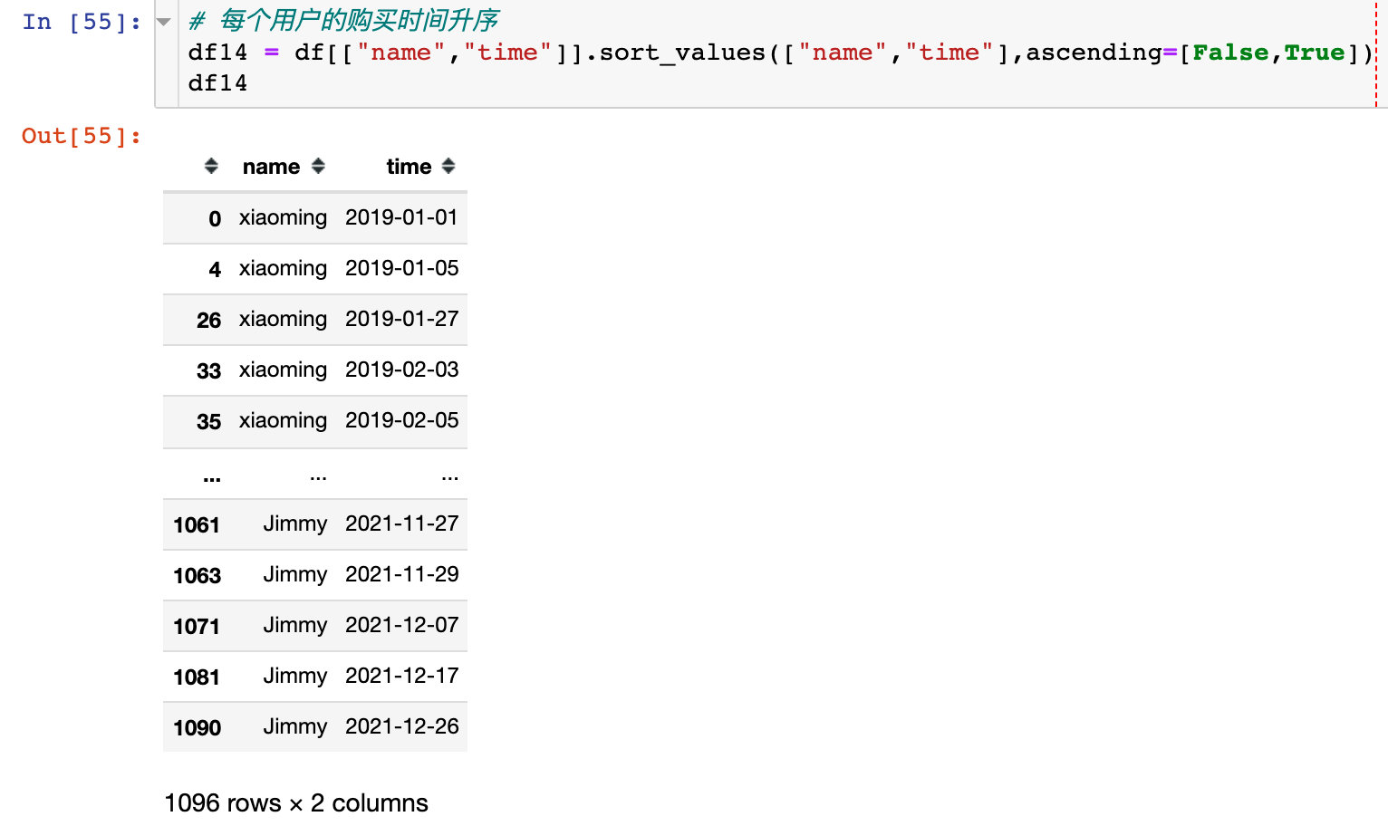
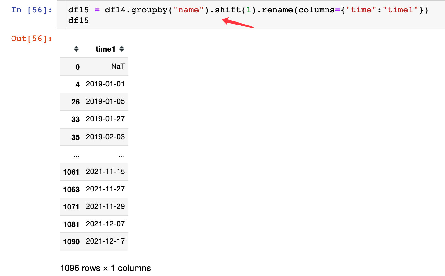
The following is the process of solving the repurchase cycle of each user:
1. The purchase time of each user is in ascending order
2. Move time one unit:
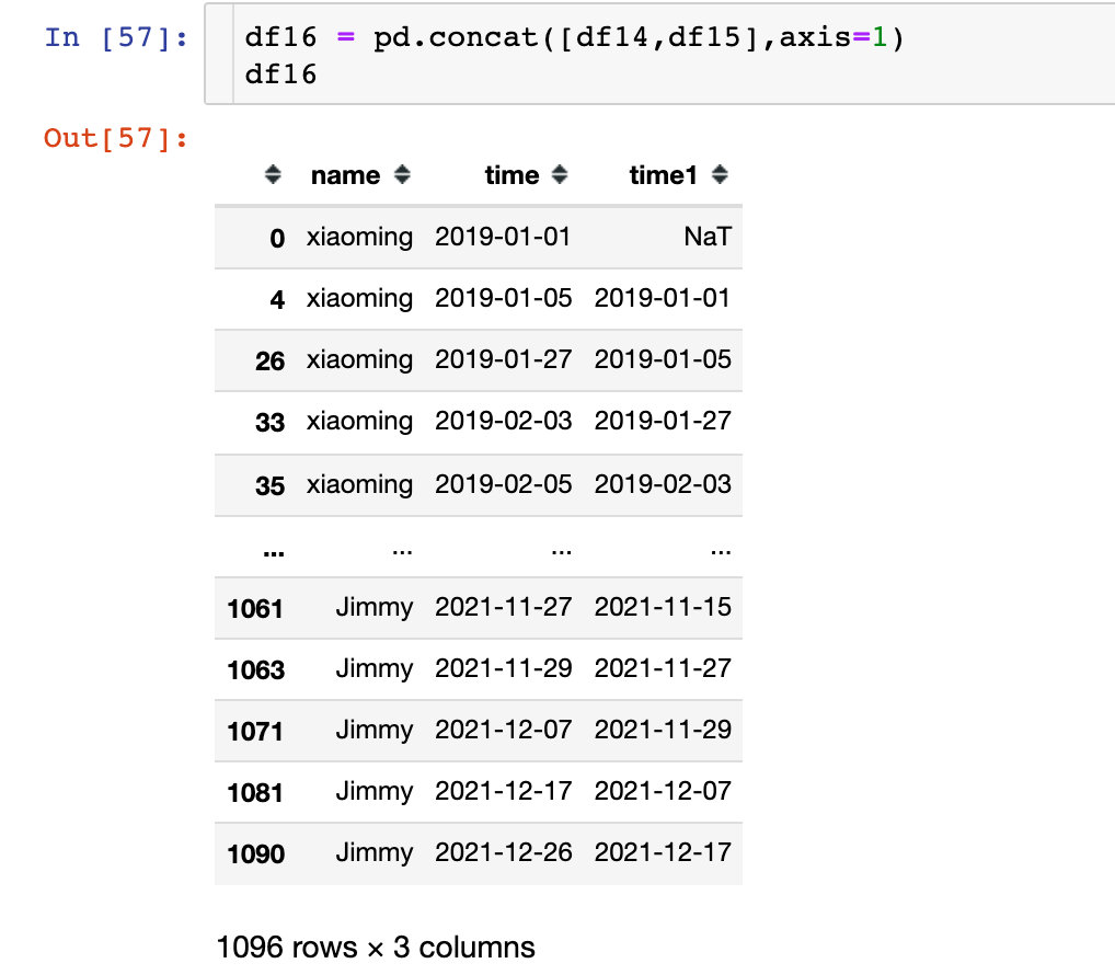
3. Combined difference:
The occurrence of null value is the first record of each user. There is no data before it, and the null value part is directly deleted later

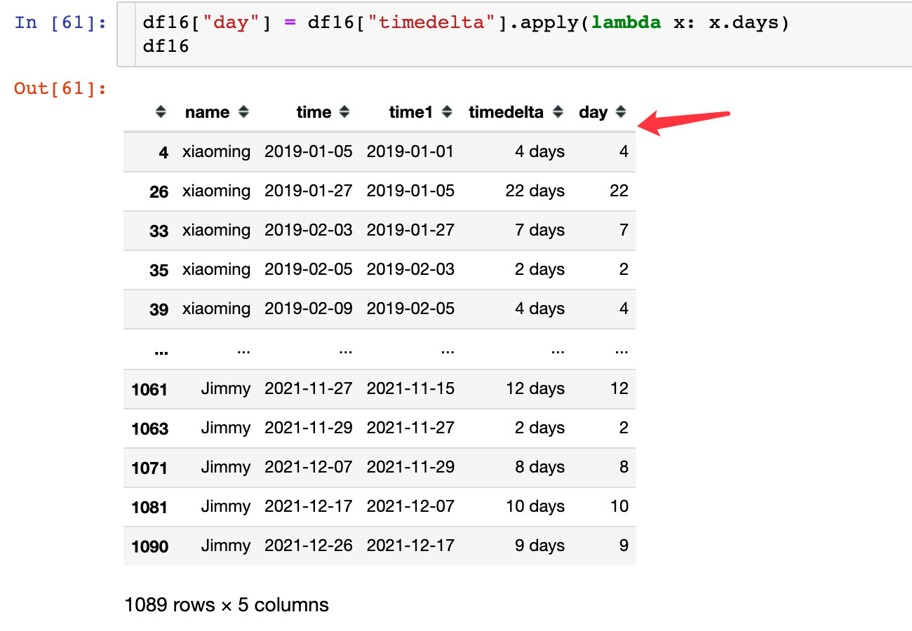
Directly extract the numerical part of the number of days:
5. Re purchase cycle comparison
px.bar(df16,
       x="day",
       y="name",
       orientation="h",
       color="day",
       color_continuous_scale="spectral"   # purples
      )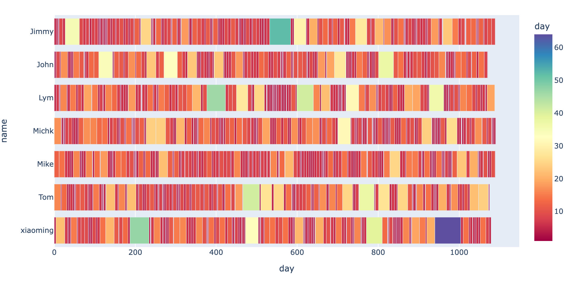
The narrower the rectangle in the figure above, the smaller the interval; The whole re purchase cycle of each user is determined by the length of the whole rectangle. View the sum of the overall re purchase cycle and the average re purchase cycle of each user:

A conclusion is drawn: the overall repurchase cycle of Michk and Mike users is relatively long, and they are loyal users in the long run; Moreover, the average repurchase cycle is relatively low, indicating that the repurchase is active in a short time.
It can also be observed from the following violin that the re purchase cycle distribution of Michk and Mike is the most concentrated.
