brief introduction
When we present the content to users on the mobile phone screen for viewing, the composition of the content is composed of layout and group price elements. Therefore, here we learn about the components and layouts commonly used in the development of harmony OS.
assembly
We call the elements displayed on mobile phones or other devices that can be viewed or operated by users as components. In harmonyOS, the corresponding object of components is Component, which is used to provide content display or operation. It is the base class of all components in the interface, Developers can set event processing callbacks (such as click events and gesture events) for components to create an interactive Component.
For more information, please refer to the official documentation: Common component development guidance
Some components that are not very different from Android, such as text image checkbox, RadioButton switch, Scrollview and other components, will not be introduced here, but some components that are quite different from Android.
ListContainer
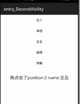
ListContainer is a component used to render continuous, multi row data, containing a series of list items of the same type. Some are similar to the ListView in Android. Here is the use process of data ListContainer. More listcontainers can consult the official documents for operation.
- Add ListContainer component to layout file
<?xml version="1.0" encoding="utf-8"?>
<DirectionalLayout
    xmlns:ohos="http://schemas.huawei.com/res/ohos"
    ohos:height="match_parent"
    ohos:width="match_parent"
    ohos:orientation="vertical">
    <ListContainer
        ohos:id="$+id:data_list"
        ohos:height="match_parent"
        ohos:width="match_parent"
        ohos:layout_alignment="horizontal_center"/>
</DirectionalLayout>
- Write data source
private ArrayList<SampleItemEntity> getData(){
        ArrayList<SampleItemEntity> initList = new ArrayList<>();
        initList.add(new SampleItemEntity("Zhang San","Outlaw maniac Zhang San"));
        initList.add(new SampleItemEntity("Li Si","Mohammed Lee Si"));
        initList.add(new SampleItemEntity("Wang Wu","Spicy chicken King Mead five"));
        initList.add(new SampleItemEntity("Zhao Si","Nicholas Zhao Si"));
        initList.add(new SampleItemEntity("Lennon ","Mohammed Liu Neng"));
        return initList;
    }
- Write a Provider and inherit it to BaseItemProvider
package com.example.demo1.provider;

import com.example.demo1.ResourceTable;
import com.example.demo1.entity.SampleItemEntity;
import ohos.aafwk.ability.AbilitySlice;
import ohos.agp.components.*;

import java.util.List;

public class SampleItemProvider extends BaseItemProvider {

    private List<SampleItemEntity> dataList;
    private AbilitySlice abilitySlice;

    public SampleItemProvider(List<SampleItemEntity> dataList, AbilitySlice abilitySlice) {
        this.dataList = dataList;
        this.abilitySlice = abilitySlice;
    }

    @Override
    public int getCount() {
        return dataList == null ? 0 : dataList.size();
    }

    @Override
    public Object getItem(int i) {
        if (dataList != null && i >= 0 && i< dataList.size())
            return dataList.get(i);
        return null;
    }

    @Override
    public long getItemId(int i) {
        return i;
    }

    @Override
    public Component getComponent(int i, Component component, ComponentContainer componentContainer) {
        final Component cpt;
        if (component == null){
            cpt = LayoutScatter.getInstance(abilitySlice).parse(ResourceTable.Layout_item_list,null,false);
        }else {
            cpt = component;
        }
        SampleItemEntity itemEntity = dataList.get(i);
        Text tvItem = (Text) cpt.findComponentById(ResourceTable.Id_item_tv);
        tvItem.setText(itemEntity.getItemName());
        return cpt;
    }
}
- Set Provider for ListContainer
ListContainer listContainer = (ListContainer) findComponentById(ResourceTable.Id_data_list);        listContainer.setOrientation(Component.VERTICAL);
List<SampleItemEntity> dataList = getData();
SampleItemProvider provider = new SampleItemProvider(dataList,this);
listContainer.setItemProvider(provider);
The effects are as follows:
PageSlider
PageSlider is a component for switching between pages. It completes the switching between pages by responding to sliding events. It is a bit similar to the ViewPager in Android. The usage is similar to ListContainer. The steps are as follows:
- xml add PageSlider component
<PageSlider
    ohos:id="$+id:page_slider"
    ohos:height="400vp"
    ohos:width="match_parent"/>
- Write Provider to inherit from PageSliderProvider
public class DataPagerSlideProvider extends PageSliderProvider {

    private List<PageSlideEntity> pageList;

    public DataPagerSlideProvider(List<PageSlideEntity> pageList) {
        this.pageList = pageList;
    }

    @Override
    public int getCount() {
        return pageList == null ?0 : pageList.size();
    }

    @Override
    public Object createPageInContainer(ComponentContainer componentContainer, int i) {
        PageSlideEntity itemPage = pageList.get(i);

        Text pageTv = new Text(null);
        pageTv.setTextAlignment(LayoutAlignment.CENTER);
        pageTv.setLayoutConfig(new StackLayout.LayoutConfig(ComponentContainer.LayoutConfig.MATCH_PARENT, ComponentContainer.LayoutConfig.MATCH_PARENT));
        pageTv.setText(itemPage.getPageName());
        pageTv.setTextSize(20);

        ShapeElement shapeElement = new ShapeElement();
        shapeElement.setRgbColor(RgbColor.fromArgbInt(Color.getIntColor("#AFEEEE")));
        pageTv.setBackground(shapeElement);
        componentContainer.addComponent(pageTv);
        return pageTv;
    }

    @Override
    public void destroyPageFromContainer(ComponentContainer componentContainer, int i, Object o) {
        componentContainer.removeComponent((Component) o);
    }

    @Override
    public boolean isPageMatchToObject(Component component, Object o) {
        return true;
    }
}
- Add test data
ArrayList<PageSlideEntity> pageList = new ArrayList<>();
pageList.add(new PageSlideEntity("Page one",1));
pageList.add(new PageSlideEntity("Page 2",2));
pageList.add(new PageSlideEntity("Page 3",3));
return pageList;
- Set the provider through the set method
PageSlider pageSlider = (PageSlider) findComponentById(ResourceTable.Id_page_slider);
pageSlider.setProvider(new DataPagerSlideProvider(getDataPageSlider()));
DatePicker
As the name suggests, the date selector.
The properties are as follows:
- date_order
Value:
0 indicates that the date is displayed in the format of day month year.
1 indicates that the date is displayed in the format of month day year.
2 indicates that the date is displayed in the format of year month day.
3 indicates that the date is displayed in year day month format.
4 indicates that the date is displayed in day month format.
5 indicates that the date is displayed in month day format.
6 indicates that the date is displayed in year month format.
7 indicates that the date is displayed in month year format.
8 indicates that only the year is displayed.
9 indicates that only the month is displayed.
10 indicates that only the date is displayed. - day_fixed set date fixed
- month_fixed set month fixed
- year_fixed set year fixed
- max_date sets the maximum date
- min_date sets the minimum date
- text_size sets the text size
More attribute lookup DatePicker official document
use:
1. Add DatePicker component to the layout
<DatePicker
    ohos:id="$+id:date_pick"
    ohos:height="match_content"
    ohos:width="300vp">
</DatePicker>
2. Get DatePicker instance with java code
DatePicker datePicker = (DatePicker) findComponentById(ResourceTable.Id_date_pick);
int day = datePicker.getDayOfMonth();
int month = datePicker.getMonth();
int year = datePicker.getYear();
3. Set current date
datePicker.updateDate(2021, 8, 8);
4. Set minimum and maximum dates
datePicker.setMinDate(1627747200);//Msec
datePicker.setMaxDate(1630339200);
5. Obtain the selected time through setValueChangedListener
datePicker.setValueChangedListener(
        new DatePicker.ValueChangedListener() {
            @Override
            public void onValueChanged(DatePicker datePicker, int year, int monthOfYear, int dayOfMonth) {
               //Hilog output year monthOfYear month dayOfMonth
            }
        }
);
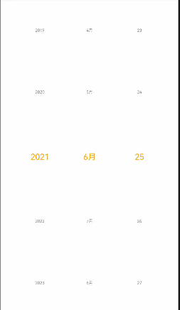
design sketch:
TimePicker
Time selector. We can get the date selection of year, month and day through the DatePicker above. To get the time selection of hour, minute and second, we need to get it through TimePicker.
Properties:
- am_pm_order in the morning and afternoon
Value space:
0 indicates that the am/pm column is displayed at the beginning of the time selector.
1 indicates that the am/pm column is displayed at the end of the time selector.
2 indicates that the am/pm column is displayed on the left side of the time selector.
3 indicates that the am/pm column is displayed on the right side of the time selector. - mode_ 24_ Whether hour displays Boolean type in 24-hour system
- Hour displays the hour int
- Minute displays the minute int
- Second displays second int
More attribute lookup TimePicker official document
use:
1. Add TimePicker component to the layout
<TimePicker
    ohos:id="$+id:time_picker"
    ohos:height="match_content"
    ohos:width="match_parent" />
2. Get TimePicker instance
TimePicker timePicker = (TimePicker) findComponentById(ResourceTable.Id_time_picker);
int hour = timePicker.getHour();
int minute = timePicker.getMinute();
int second = timePicker.getSecond();
3. Set the hours, minutes and seconds through the set method
timePicker.setHour(19);
timePicker.setMinute(18);
timePicker.setSecond(12);
4. Obtain the selected hours, minutes and seconds by listening to the setTimeChangedListener event
timePicker.setTimeChangedListener(new TimePicker.TimeChangedListener() {
    @Override
    public void onTimeChanged(TimePicker timePicker, int hour, int minute, int second) {
        //Hilog input hour hour minute second second
    }
});
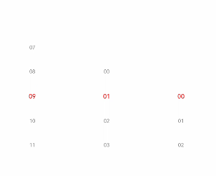
design sketch:
RoundProgressBar
RoundProgressBar inherits from ProgressBar. We all know the progress bar component, while RoundProgressBar is a circular progress bar component.
Properties:
- min Min int
- max int
- Progress current progress int
- background_ instruct_ Elementbackground color Element type
- progress_width progress bar width float
- progress_color progress bar color
- progress_ Elementprogress bar background Element type
The above attributes are some common attributes inherited from RoundProgressBar (many have not been listed); RoundProgressBar also has its own free attributes:
- start_angle the starting angle of the circular progress bar is the float type
- max_angle maximum angle of circular progress bar float type
use:
1.xml add RoundProgressBar component
<RoundProgressBar
    ohos:id="$+id:round_progress_bar"
    ohos:height="200vp"
    ohos:width="200vp"
    ohos:progress_width="10vp"
    ohos:progress="20"
    ohos:progress_color="#47CC47"/>
2. Set progress
round_progress_bar.setProgressValue(60);
3. Set the maximum and minimum values
round_progress_bar.setMaxValue(400);
round_progress_bar.setMinValue(0);
4. Set the progress color and the background color of the progress bar
<ProgressBar
    ohos:progress_element="#FF9900"
    ohos:background_instruct_element="#FFFFFF" />
5. Set prompt text and text color
<ProgressBar
    ohos:progress_hint_text="20%"
    ohos:progress_hint_text_color="#FFCC99" />
6. Set listening
AbilitySlice implements Slider.ValueChangedListener

@Override
public void onProgressUpdated(Slider slider, int position, boolean isUpdated) {
    switch (slider.getId()) {
		       case ResourceTable.Id_current_value_slider: {
		       progressBar.setProgressValue(position);
		       currentText.setText(String.valueOf(currentSlider.getProgress()));
		       break;
    	   }
    	   case ResourceTable.Id_max_value_slider: {
                maxText.setText(String.valueOf(maxSlider.getProgress()));
                progressBar.setMaxValue(position);
                break;
            }
            case ResourceTable.Id_speed_value_slider: {
                speedText.setText(String.valueOf(speedSlider.getProgress()));
                break;
            }
            default:
                break;
    }
}
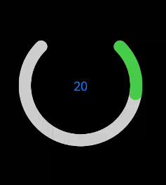
design sketch:

ToastDialog
In Android development, we often use Toast to prompt users for some information. In harmonios, we use Toast dialog to complete this work.
use:
1. To use toast dialog in java, you need to directly instantiate a toast dialog object
- setText set display content
- show display
new ToastDialog(getContext())
    .setText("Prompt value")
    .show();
2. Set the display position of Toast. The value range is LayoutAlignment
.setAlignment(LayoutAlignment.CENTER)
3. Customize the layout of Toast
- Through layoutscatter getInstance(this). Parse gets the custom xml layout
- Set custom layout through setContentCustomComponent
- show display
DirectionalLayout toastLayout = (DirectionalLayout) LayoutScatter.getInstance(this)
         .parse(ResourceTable.Layout_layout_toast, null, false);
new ToastDialog(getContext())
    .setContentCustomComponent(toastLayout)
    .setSize(DirectionalLayout.LayoutConfig.MATCH_CONTENT, DirectionalLayout.LayoutConfig.MATCH_CONTENT)
    .setAlignment(LayoutAlignment.CENTER)
    .show();
For more usage, see ToastDialog official document
layout
Each Component is a separate element, and we can combine the components according to a certain hierarchical structure. The Layout also has a corresponding object ComponentContainer in harmony OS; As a container, a Layout can contain either a Component or a Layout ComponentContainer object, and Layout the elements in the Layout. When a Component is not added to the Layout, it cannot be displayed and operated interactively. Therefore, a user interface contains at least one Layout. Some standard Layout function containers are provided in the Java UI of harmonyOS, which are inherited from ComponentContainer and generally end with Layout, such as DependentLayout dependent Layout and DirectionalLayout directional Layout.
For more layout contents, please refer to the official documents: Common layout development guidance
The above is an introduction to some commonly used components of HarmonyOS that are slightly different from Android. Some commonly used components that are not different from Android are not introduced here. You can refer to the relevant official documents for understanding.
Relationship between layout and components
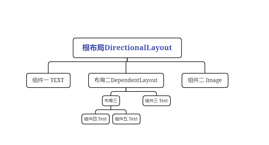
The layout can contain components and layouts, and their relationship can be seen from the figure. Components and layouts can be added to each layout:
Layout configurationlayoutconfig
When we put components on the layout, we do not specify the display position. If it is a directional layout, all components will be displayed along the horizontal or vertical direction. If it depends on the layout, they will be displayed in the upper left corner. At this time, we need to use the property LayoutConfig to set the display position of components and layout, The LayoutConfig corresponding to different layouts is also different. It is the same as the previous layout:
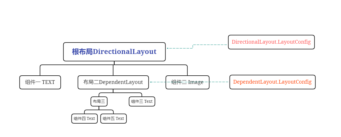
As can be seen from the figure, if DependentLayout is used as the layout package component, the corresponding layout configuration is:
DependentLayout.LayoutConfig leftConfig = new DependentLayout.LayoutConfig(80,80);
If DirectionalLayout is used as the layout package component, the corresponding layout configuration is:
DirectionalLayout.LayoutConfig layoutConfig = new DirectionalLayout.LayoutConfig(MATCH_PARENT,MATCH_PARENT);
The corresponding attribute capabilities of LayoutConfig under different layouts are also different.
DirectionalLayout properties and component properties within a layout
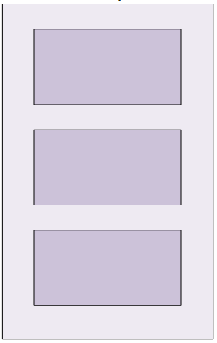
DirectionalLayout is displayed in a certain direction, as shown in the following figure:
The properties of DirectionalLayout are as follows:
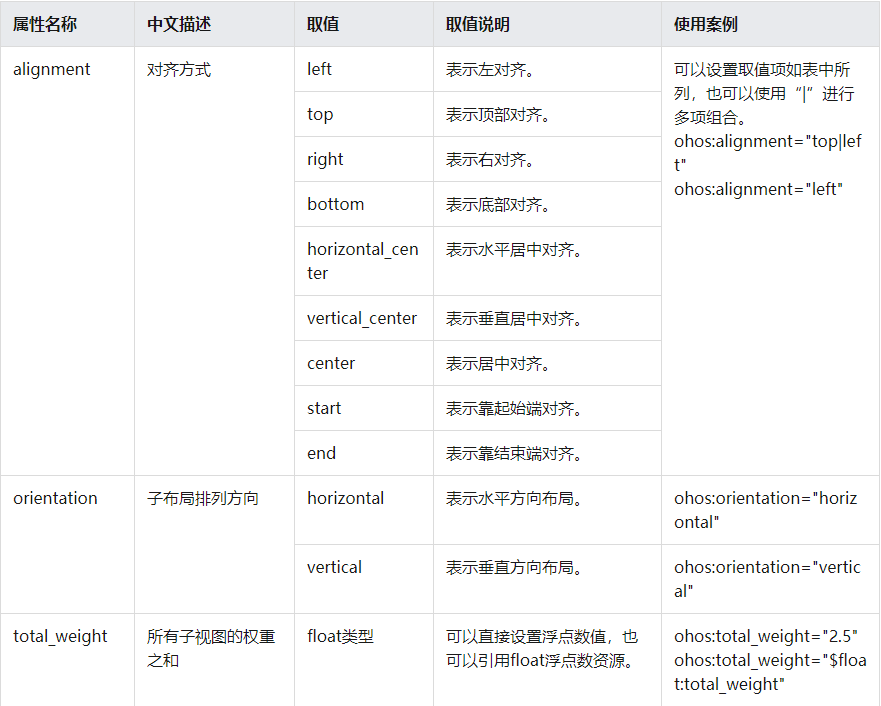
The properties supported by components in the DirectionalLayout layout are as follows:
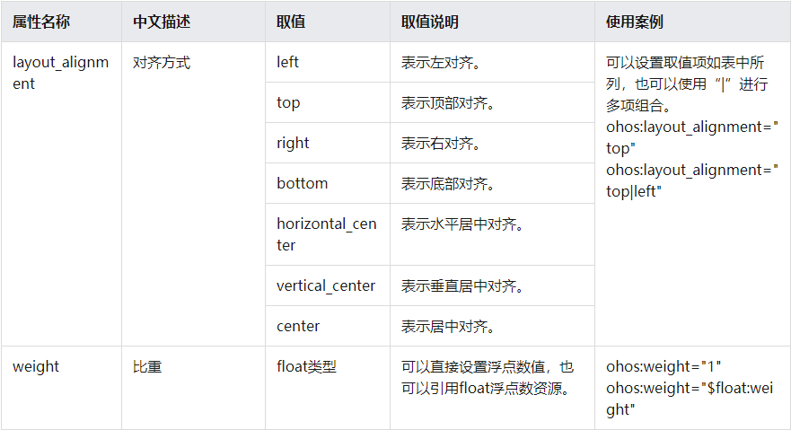
The above attributes are set through the set method when they are written in code in java files.
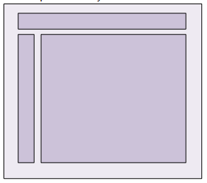
DependentLayout property and component property in layout
DependentLayout is displayed relative to a location or a component, as shown in the following figure:
DependentLayout own properties:
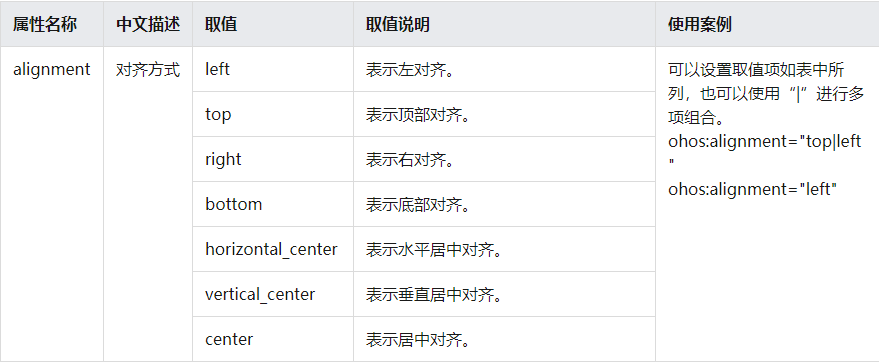
Properties supported by components contained in DependentLayout (these properties are familiar to Android developers):
- left_of aligns the right edge with the left edge of another subcomponent
- right_of aligns the left edge with the right edge of another subcomponent
- start_of aligns the end edge with the start edge of another subcomponent
- end_of aligns the start edge with the end edge of another subcomponent
- above aligns the lower edge with the upper edge of another subcomponent
- below aligns the upper edge with the lower edge of another subcomponent
- align_baseline aligns the baseline of a subcomponent with the baseline of another subcomponent
- align_left aligns the left edge with the left edge of another subcomponent
- align_top aligns the top edge with the top edge of another subcomponent
- align_right aligns the right edge with the right edge of another subcomponent
- align_bottom aligns the bottom edge with the bottom edge of another subcomponent
- align_start aligns the start edge with the start edge of another subcomponent
- align_end aligns the end edge with the end edge of another subcomponent
- align_parent_left aligns the left edge with the left edge of the parent component
- align_parent_top aligns the top edge with the top edge of the parent component
- align_parent_right align the right edge with the right edge of the parent component
- align_parent_bottom aligns the bottom edge with the bottom edge of the parent component
- align_parent_start aligns the start edge with the start edge of the parent component
- align_parent_end aligns the end edge with the end edge of the parent component
- center_in_parent keeps the child component at the center of the parent component
- horizontal_center keeps the child component at the center of the parent component's horizontal direction
- vertical_center keeps the child component at the center of the vertical direction of the parent component
The above properties are set in the java file through the set method.
summary
The above components and layout are relatively similar to Android. As an Android Developer, it is still relatively fast to get started; The official documents are also very detailed; Here is an introduction to the Java UI framework. If you want to develop with js, you can take a look at the JS UI framework.