This article is shared from Huawei cloud community< Common evaluation indicators for deep learning classification tasks >Original author: lutianfei.
This article mainly introduces the evaluation indicators of deep learning classification tasks, including basic application, practical skills, principles and mechanisms, hoping to help you.
Classification model
Confusion matrix
sklearn implementation:
sklearn.metrics.confusion_matrix(y_true, y_pred, labels=None)

Return value: a formatted string that gives the confusion matrix of the classification results.

Parameters: Reference classification_report .

The confusion matrix is as follows, where Cij Indicates that the real tag is i But the forecast is j Number of samples.

Confusion Matrix:

[[5 0]

[3 2]]
def calc_confusion_matrix(y_true: list, y_pred: list, show=True, save=False, figsize=(16, 16), verbose=False):
    """
    Calculate confusion matrix
    :param y_true:
    :param y_pred:
    :param show:
    :param save:
    :param figsize:
    :param verbose:
    :return:
    """
    confusion = confusion_matrix(y_true, y_pred)
    if verbose:
        print(confusion)

    if show:
        show_confusion_matrix(confusion, figsize=figsize, save=save)

    return confusion

def show_confusion_matrix(confusion, classes=MY_CLASSES, x_rot=-60, figsize=None, save=False):
    """
    Draw confusion matrix
    :param confusion:
    :param classes:
    :param x_rot:
    :param figsize:
    :param save:
    :return:
    """
    if figsize is not None:
        plt.rcParams['figure.figsize'] = figsize

    plt.imshow(confusion, cmap=plt.cm.YlOrRd)
    indices = range(len(confusion))
    plt.xticks(indices, classes, rotation=x_rot, fontsize=12)
    plt.yticks(indices, classes, fontsize=12)
    plt.colorbar()
    plt.xlabel('y_pred')
    plt.ylabel('y_true')

    # Display data
    for first_index in range(len(confusion)):
        for second_index in range(len(confusion[first_index])):
            plt.text(first_index, second_index, confusion[first_index][second_index])

    if save:
        plt.savefig("./confusion_matrix.png")
    plt.show()
Confusion matrix is a visual tool in supervised learning, which is mainly used to compare the classification results with the real information of examples. Each row in the matrix represents the prediction category of the instance, and each column represents the real category of the instance.
Understanding method:
P (positive): predicted as a positive sample
N (Negative): predicted as Negative sample
T (True): the prediction is correct
F (False): prediction error
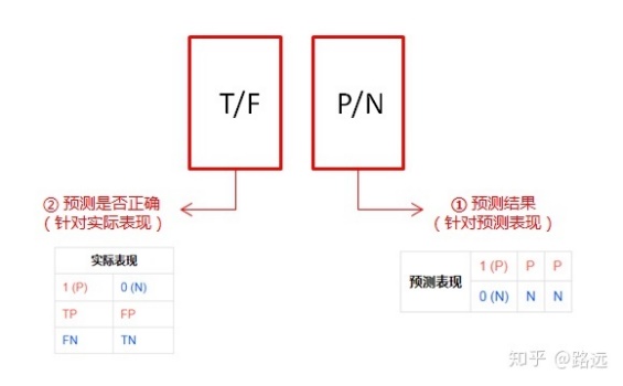
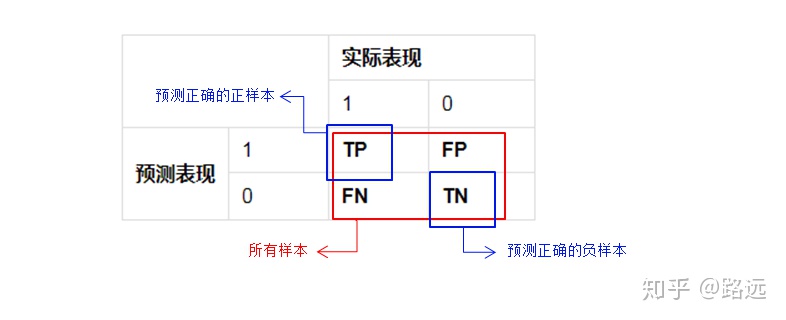
- True positive (TP): a positive sample predicted to be positive by the model. If the prediction is 1, the prediction is correct, that is, the actual 1
- False positive (FP): a negative sample predicted to be positive by the model. The prediction is 1, the prediction is wrong, that is, the actual 0
- False negative (FN): a positive sample predicted to be negative by the model. If the forecast is 0, the forecast is wrong, that is, the actual 1
- True negative (TN): negative samples predicted as negative by the model. If the prediction is 0, the prediction is correct, that is, the actual 0
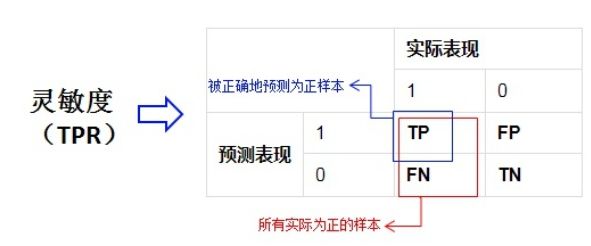
True positive rate (TPR) or sensitivity
TPR = TP / (TP + FN) - > predicted number of positive samples / actual number of positive samples
According to the above formula, TPR is equivalent to Recall
True negative rate (TNR) or specificity
TNR = TN / (TN + FP) - > predicted results of negative samples / actual number of negative samples
False positive rate (FPR)
FPR = FP / (FP + TN) - > number of negative sample results predicted to be positive / actual number of negative samples

False negative rate (FNR)
FNR = FN / (TP + FN) - > number of positive sample results predicted to be negative / actual number of positive samples
Accuracy (accuracy)
Also known as accuracy, it is the percentage of correct prediction results in the total sample. It is the most commonly used classification performance index.
Formula: Accuracy = (TP+TN)/(TP+FN+FP+FN)

Disadvantages: there are limitations when the samples are unbalanced,
For example, when the negative samples account for 99%, the classifier can also obtain 99% accuracy by predicting all samples as negative samples. Therefore, when the sample proportion of different categories is very uneven, the category with a large proportion often becomes the main factor affecting the accuracy.
sklearn implementation:
from sklearn.metrics import accuracy_score

accuracy_score(y_true, y_pred, normalize=True, sample_weight=None)

Return value: if normalize by True,Returns the accuracy; If normalize by False,Returns the quantity of the correct classification.

Parameters:

y_true: Real tag collection.

y_pred: Predicted tag set.

normalize: A Boolean value indicating whether a normalized result is required.

If yes True,The correct proportion (accuracy) of classification is returned.

If yes False,The number of samples with correct classification is returned.

sample_weight: Sample weight: the default weight of each sample is 1.

# Method encapsulation
def calc_accuracy_score(y_true: list, y_pred: list, verbose=False):
    res = accuracy_score(y_true, y_pred)
    if verbose:
        print("accuracy:%s" % res)

    return res
Error rate
That is, the number / total number of positive and negative cases of false prediction.
The correct rate and the error rate are the evaluation indicators from both positive and negative aspects, and the sum of the two values is just equal to 1.
ErrorRate = (FP+FN)/(TP+FN+FP+TN)
Accuracy (Precision)
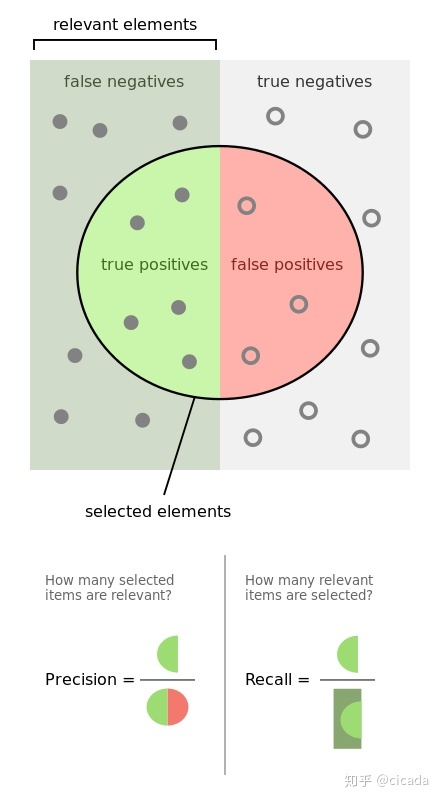
Precision, also known as precision, is aimed at the prediction results. It means the probability of actually positive samples among all the predicted positive samples, which means how sure we can predict the results correctly. Its formula is as follows:
Precision = TP/(TP+FP)
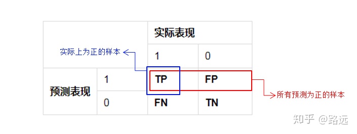
Disadvantages: the predicted result is only 1 positive case, and is correct, with an accuracy of 100%. In fact, there are many negative cases of prediction errors, that is, real positive cases.
Scenario: it is predicted that the stock will rise. The real rise has been 10 times. It is only predicted that it will rise twice. Both predictions are correct, so the accuracy we want is high. At this time, the recall rate is not important.
sklearn implementation:
from sklearn.metrics import precision_score

sklearn.metrics.precision_score(y_true, y_pred, labels=None, pos_label=1,
average='binary', sample_weight=None)

Return value: precision. That is, how many of those samples whose prediction results are positive are indeed positive.

Parameters:

y_true: Real tag collection.

y_pred: Predicted tag set.

labels: A list. When average no'binary' When used.

For multi classification problems, it means: which categories will be calculated. be not in labels Categories in, calculating macro precision
 Its composition is 0.

For the multi label problem, it represents the index of the label to be investigated.

except average=None outside, labels The order of the elements is also very important.

By default, y_true and y_pred All categories in will be used.

pos_label: A string or integer that specifies which tag value belongs to the positive class.

If it is a multi classification or multi label problem, this parameter is ignored.

If set label=[pos_label] as well as average!='binary' Only the of the category will be calculated precision .

average: A string or None,Used to specify two or more categories precision How to calculate.

'binary': Calculation of class II Classification precision.  At this time by pos_label
 The specified class is positive, report its precision .

It requires y_true,y_pred All elements are 0,1 .

'micro': Through the global positive and negative examples, the calculation precision .

'macro': Calculate for each category precision,Then return their mean.

'weighted': Calculate for each category precision,Then return its weighted mean, which is the number of samples in each category.

'samples': Calculate the for each sample precision,Then return to its mean. This method is only meaningful for multi label classification problems.

None: Calculate for each category precision,Each is then returned as an array precision .

sample_weight: Sample weight: the default weight of each sample is 1
# Method encapsulation
def calc_precision_score(y_true: list, y_pred: list, labels=MY_CLASSES, average=None, verbose=False):
    res = precision_score(y_true, y_pred, labels=labels, average=average)
    if verbose:
        print("precision:%s" % res)

    return res
Recall rate (recall)
Recall, also known as recall, refers to the original sample. It means the probability of being predicted as a positive sample in the actual positive sample. Its formula is as follows:
Recall = TP/(TP+FN)
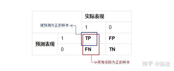
Disadvantages: all predicted positive cases will cover all real positive cases, and the recall rate is 100%.
Application scenario of recall rate: take the default rate of online loan as an example. Compared with good users, we are more concerned about bad users and can't miss any bad users. Because if we treat too many bad users as good users, the subsequent possible default amount will far exceed the loan interest repaid by good users, resulting in serious losses. The higher the recall rate, the higher the probability that the actual bad users will be predicted. Its meaning is similar: it's better to kill a thousand by mistake than to let one go.
sklearn implementation:
from sklearn.metrics import recall_score

sklearn.metrics.recall_score(y_true, y_pred, labels=None,
pos_label=1,average='binary', sample_weight=None)
Return value: recall. That is, how much of the real positive class is predicted to be positive.

Parameters: Reference precision_score.

# Method encapsulation
def calc_recall_score(y_true: list, y_pred: list, labels=MY_CLASSES, average=None, verbose=False):
    res = recall_score(y_true, y_pred, labels=labels, average=average)
    if verbose:
        print("recall: %s" % res)

    return res
The figure below illustrates the accuracy rate and recall rate further
PR curve
According to the formula of accuracy rate and recall rate, the numerator of accuracy rate and recall rate is the same, both of which are TP, but the denominator is different, one is (TP+FP) and the other is (TP+FN). The relationship between the two can be shown in a P-R diagram:
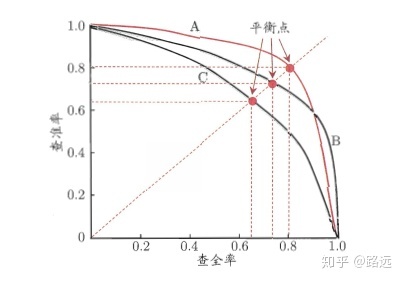
The final output of the classification model is often a probability value. We generally need to convert the probability value into a specific category. For the second classification, we set a threshold, and then if it is greater than this threshold, it will be judged as a positive category, and vice versa. The above evaluation indicators (Accuracy, Precision and Recall) are all for a specific threshold. How to comprehensively evaluate different models when different thresholds are taken for different models? Therefore, it is necessary to introduce PR curve, namely Precision Recall curve, for evaluation.
In order to find the most suitable threshold to meet our requirements, we must traverse all thresholds between 0 and 1, and each threshold corresponds to a pair of precision and recall, so we get this curve.
As shown in the figure below, the ordinate is the accuracy rate P and the abscissa is the recall rate R. For a model,
A point on its P-R curve represents that under a certain threshold, the model determines the result greater than the threshold as a positive sample and the result less than the threshold as a negative sample,
At this time, the returned result corresponds to the recall rate and accuracy rate of a pair of children as a coordinate in the PR coordinate system.
The whole P-R curve is generated by moving the threshold from high to low. The closer the P-R curve is to the upper right corner (1,1), the better the model. In the real scene, it is necessary to comprehensively judge the quality of different models according to different decision-making requirements.
Evaluation criteria:
First look at whether it is smooth or not (the smoother the better). Generally speaking, in the same test set, the upper one is better than the lower one (the green line is better than the red line). When the values of P and R are close, F1 is the largest. Draw a line connecting (0,0) and (1,1). The F1 value is the largest where the line coincides with the PR curve. At this time, F1 vs PR curve is the same as AUC vs ROC.
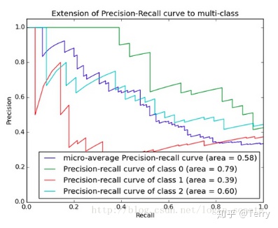
The area under the PR curve is called AP (Average)
Precision), which indicates the average precision value of the recall rate from 0-1. AP can be calculated by integral. AP area will not be greater than 1. The larger the area under the PR curve, the better the performance of the model.
The so-called model with excellent performance should keep the accuracy at a high level while increasing the recall rate.
sklearn implementation:
sklearn.metrics.precision_recall_curve(y_true, probas_pred, pos_label=None,
sample_weight=None)

Return value: a tuple. The elements in the tuple are:

P-R The precision rate sequence of the curve. The sequence is an increasing sequence, and the second sequence i The first element is when the decision threshold of positive class probability is
thresholds[i]The precision of the.

P-R Recall sequence of curves. The sequence is a decreasing sequence, the second sequence i The first element is when the decision threshold of positive class probability is
thresholds[i]Recall rate at.

P-R Threshold sequence of curves thresholds. The sequence is an increasing sequence, and the threshold of positive class probability when it is determined as a positive example is given.

Parameters:

y_true: Real tag collection.
probas_pred: The set of probabilities that each sample is predicted to be a positive class.
pos_label: The category tag of the positive class.
sample_weight: Sample weight: the default weight of each sample is 1.
def calc_precision_recall_curve(class_info, class_name=None, show=True, save=False, verbose=False):
    """
    calculation PR curve
    :param class_info:
    :param class_name:
    :param show:
    :param save:
    :param verbose:
    :return:
    """
    precision, recall, thresholds = precision_recall_curve(class_info['gt_lbl'], class_info['score'])
    if verbose:
        print("%s precision:%s " % (class_name, precision,))
        print("%s recall:%s " % (class_name, recall,))
        print("%s thresholds:%s " % (class_name, thresholds,))

    if show:
        show_PR_curve(recall, precision, class_name)

    return precision, recall, thresholds
PR curve drawing method:
def show_PR_curve(recall, precision, class_name=None, save=False):
    """
    draw PR curve
    :param recall:
    :param precision:
    :param class_name:
    :param save:
    :return:
    """
    plt.figure("%s P-R Curve" % class_name)
    plt.title('%s Precision/Recall Curve' % class_name)
    plt.xlabel('Recall')
    plt.ylabel('Precision')

    plt.plot(recall, precision)
    if save:
        plt.savefig("./%s_pr_curve.png")
    plt.show()
F1 score harmonic average
F1
Score, also known as F-Measure, is the harmonic value of accuracy rate and recall rate, which is closer to the smaller one. Therefore, when the accuracy rate and recall rate are close, F1 value is the largest. F1 is the evaluation index of many recommendation systems
Score.
Precision and Recall are two contradictory and unified indicators. In order to improve the precision value,
The classifier needs to try to predict the sample as a positive sample when it is "more confident",
But at this time, many "uncertain" positive samples are often missed because they are too conservative,
Causes the Recall value to decrease. So how to select models when Recall and Precision of different models have their own advantages? If we want to find a balance between the two, we need a new indicator: F1 score. F1 score considers both Precision and Recall, so that they reach the highest at the same time and take a balance. The formula for F1 score is
=2 * precision rate * recall rate / (precision rate)+
Recall). The equilibrium point we see in PR curve 1 is the result of F1 score.
Namely
In the real scene, if two models, one with high precision and one with low recall, and the other with high recall and low precision, the f1 score may be similar and may not pass through one f1
When socre makes the final judgment, it needs to select other appropriate indicators according to different scenarios.
sklearn implementation:
from sklearn.metrics import f1_score #Harmonic average F1

f1_score(y_true, y_pred, labels=None, pos_label=1, average='binary',
sample_weight=None)

Return value: value. That is, the harmonic mean of precision and recall.

Parameters: Reference precision_score.

#Method encapsulation
def calc_f1_score(y_true: list, y_pred: list, labels=MY_CLASSES, average=None, verbose=False):
    res = f1_score(y_true, y_pred, labels=labels, average=average)
    if verbose:
        print("f1_score: %s" % res)

    return res
ROC curve
ROC(Receiver Operating
Characteristic - receiver working characteristic curve (also known as receptivity curve), which uses graphics to describe the performance of the binary classification model, is an index for comprehensively evaluating the model.
The reason why ROC and AUC can ignore sample imbalance is sensitivity and (1-specificity), also known as true rate (TPR) and false positive rate (FPR). Since TPR and fpr are based on the actual performance 1 and 0 respectively, that is to say, they observe the relevant probability problems in the actual positive samples and negative samples respectively. Because of this, it will not be affected whether the sample is balanced or not.
For example, 90% of the total samples are positive samples and 10% are negative samples. We know that there is moisture in the accuracy, but TPR is different from FPR. Here, TPR only focuses on how many of the 90% positive samples are actually covered, which has nothing to do with the 10%. Similarly, FPR only focuses on how many of the 10% negative samples are incorrectly covered, which has nothing to do with the 90%. Therefore, it can be seen that if we start from the perspective of various results of actual performance, we can avoid the problem of sample imbalance, This is why TPR and FPR are selected as ROC/AUC indicators.
X axis: false positive rate (FPR), the proportion of false positive cases predicted by the model in real negative cases. The positive category of wrong judgment accounts for the proportion of all negative categories, which is equivalent to the misdiagnosis rate in medicine.
Y-axis: true rate (TPR), the proportion of real positive cases predicted by the model in real positive cases.
The closer the ROC curve is to the diagonal, the lower the accuracy of the model.
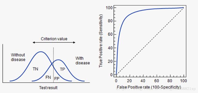
Curve description:
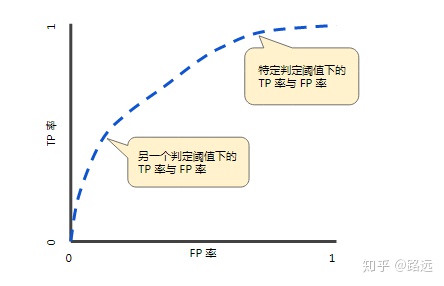
ROC curve is obtained by FPR and TPR coordinates under different thresholds. Specifically, by dynamically adjusting the model probability threshold (probability threshold means how much probability the model is judged to be positive),
Start from the highest value (e.g. 1, corresponding to the zero point of ROC curve), and gradually adjust to the lowest probability value,
Each probability value corresponds to an FPR and TPR, and the corresponding position of each probability value is drawn on the ROC diagram,
Then connect all points to get the final ROC curve.
Curve characteristics:
- By adjusting the threshold of judging classification (the default threshold of logistic regression is 0.5), TPR and FPR change accordingly, and then multiple points are formed on the ROC curve coordinates to reflect the classification effect of the model.
- The faster the TPR increases, the lower the FPR and the more convex the curve, the better the classification performance of the model, that is, the more positive examples predicted to be correct.
- ROC curve exceeds (0,0), (1,0) two points. reason:
The default threshold of logistic regression model is 0.5. When the result of sigmoid() is that the category probability p is ≥ 0.5 by default, the model predicts category 1 (positive example). Then, when the modified threshold is 0, the P ≥ 0 model is predicted as category 1 (positive example), indicating that the model will predict all data as category 1 (right or wrong). At this time, FN=TN=0, TPR=FPR=1
When the modified threshold is 1, p ≥ 1 is predicted as category 1 (positive example), and p cannot be greater than 100%, indicating that the model will predict all data as category 0 (right or wrong). At this time, FP=TP=0, TPR=FPR=0
sklearn implementation:
roc_curve Function to calculate the classification result ROC Curve. Its prototype is:

sklearn.metrics.roc_curve(y_true, y_score, pos_label=None, sample_weight=None,
drop_intermediate=True)

Return value: a tuple. The elements in the tuple are:

ROC Curvilinear FPR Sequence. The sequence is an increasing sequence, and the second sequence i The first element is when the decision threshold of positive class probability is
thresholds[i]False positive case rate.

ROC Curvilinear TPR Sequence. The sequence is an increasing sequence, and the second sequence i The first element is when the decision threshold of positive class probability is
thresholds[i]The real case rate.

ROC Threshold sequence of curves thresholds. The sequence is a decreasing sequence, and the threshold of positive class probability when it is determined as a positive example is given.

Parameters:

y_true: Real tag collection.

y_score: The set of probabilities that each sample is predicted to be a positive class.

pos_label: The category tag of the positive class.

sample_weight: Sample weight: the default weight of each sample is 1.

drop_intermediate: A Boolean value. If yes True,Then abandon some that cannot appear in ROC Threshold on the curve.

#Method encapsulation
def calc_roc_curve(class_info, class_name=None, show=True, save=False, verbose=False):
    """
    calculation roc curve
    :param class_info:
    :param class_name:
    :param show:
    :param save:
    :param verbose:
    :return:
    """
    fpr, tpr, thresholds = roc_curve(class_info['gt_lbl'], class_info['score'], drop_intermediate=True)
    if verbose:
        print("%s fpr:%s " % (class_name, fpr,))
        print("%s tpr:%s " % (class_name, tpr,))
        print("%s thresholds:%s " % (class_name, thresholds,))

    if show:
        auc_score = calc_auc_score(fpr, tpr)
        show_roc_curve(fpr, tpr, auc_score, class_name)

    return fpr, tpr, thresholds
ROC curve drawing method:
def show_roc_curve(fpr, tpr, auc_score, class_name=None, save=False):
    plt.figure("%s ROC Curve" % class_name)
    plt.title('%s ROC Curve' % class_name)
    plt.xlabel('False Positive Rate')  # The abscissa is fpr
    plt.ylabel('True Positive Rate')  # The ordinate is tpr

    plt.plot(fpr, tpr, 'b', label='AUC = %0.2f' % auc_score)
    plt.legend(loc='lower right')
    plt.plot([0, 1], [0, 1], 'r--')
    plt.xlim([-0.1, 1.1])
    plt.ylim([-0.1, 1.1])
    if save:
        plt.savefig("./%s_auc_curve.png")
    plt.show()
AUC (area of ROC curve)
AUC (Area Under Curve
It is defined as the area under the ROC curve. Obviously, the value of this area will not be greater than 1. Since the ROC curve is generally above the line y=x, the value range of AUC is generally between 0.5 and 1. AUC value is used as the evaluation standard because ROC curve can not clearly explain which classifier is better, but as a value, the classifier with larger AUC is better.
sklearn implementation:
roc_auc_score Function to calculate the classification result ROC Area of curve AUC. Its prototype is:

sklearn.metrics.roc_auc_score(y_true, y_score, average='macro',
sample_weight=None)

Return value: AUC Value.

Parameters: Reference roc_curve.

#It can also be calculated by the following method
def calc_auc_score(fpr, tpr, verbose=False):
    res = auc(fpr, tpr)
    if verbose:
        print("auc:%s" % res)

    return res
There are two ways to calculate AUC: trapezoidal method and ROC
The AUCH method uses the approximation method to obtain the approximate value. See wikipedia for details.
Criteria for judging classifier (prediction model) from AUC:
- AUC =
1. It is a perfect classifier. When using this prediction model, there is at least one threshold to obtain a perfect prediction. In most cases of prediction, there is no perfect classifier. - 0.5 < AUC <
1. Better than random guess. This classifier (model) can have predictive value if the threshold is properly set. - AUC = 0.5, which is the same as random guess (e.g. lost copper plate), and the model has no predictive value.
- AUC < 0.5, worse than random guess; But as long as it is always reverse prediction, it is better than random guess.
Examples of three AUC values:
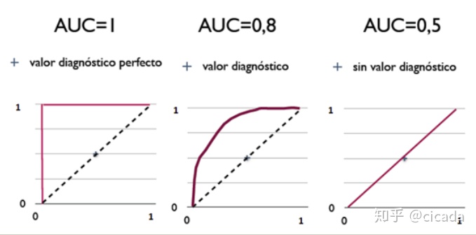
Simply put: the larger the AUC value, the higher the accuracy of the classifier.
Note: compared with the definitions of TPR, fpr, Precision and Recall, the denominator of TPR and Recall is the number of positive classes in the sample, and the denominator of FPR is the number of negative classes in the sample. Once the sample is determined, the denominator is the fixed value. Therefore, the changes of the three indicators increase monotonically with the increase of molecules. However, the denominator of Precision is the number of predicted positive classes, which will change with the change of threshold. Therefore, the change of Precision is not monotonous and unpredictable due to the comprehensive influence of TP and FP.
ROC-AUC curve drawing method under multi category
def show_roc_info(classdict, show=True, save=False, figsize=(30, 22), fontsize=12):
    """
    Calculate and display the of each category in the case of multiple categories roc-auc chart
    :param classdict:
    :param show:
    :param save:
    :param figsize:
    :param fontsize:
    :return:
    """
    def sub_curve(fpr, tpr, auc_score, class_name, sub_idx):
        plt.subplot(6, 5, sub_idx)
        plt.title('%s ROC Curve' % class_name)
        plt.xlabel('False Positive Rate')  # The abscissa is fpr
        plt.ylabel('True Positive Rate')  # The ordinate is tpr

        plt.plot(fpr, tpr, 'b', label='AUC = %0.2f' % auc_score)
        plt.legend(loc='lower right')
        plt.plot([0, 1], [0, 1], 'r--')
        plt.xlim([-0.1, 1.1])
        plt.ylim([-0.1, 1.1])

    if show:
        plt.figure("Maoyan video class AUC Curve", figsize=figsize)
        plt.subplots_adjust(bottom=0.02, right=0.98, top=0.98)
    for idx, cls in enumerate(MY_CLASSES):
        if cls in classdict:
            fpr, tpr, thresholds = calc_roc_curve(classdict[cls], class_name=cls, show=False)
            auc_score = calc_auc_score(fpr, tpr)
            print("%s auc:\t\t\t%.4f" % (cls, auc_score))
            if show:
                sub_curve(fpr, tpr, auc_score, cls, idx + 1)
        else:
            print("%s auc:\t\t\t0" % cls)
            sub_curve([0], [0], 0, cls, idx + 1)

    if save:
        plt.savefig("./maoyan_all_auc_curve.png")
    if show:
        plt.show()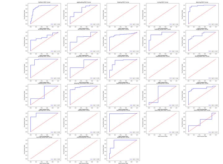
Practical skills
For ROC, generally speaking, if ROC is smooth, it can be judged that there is not too much overfitting (for example, 0.2 to 0.4 in the figure may be a problem, but there are too few samples). At this time, the adjustment model can only look at AUC. The larger the area is, the better the model is generally considered.
For PRC(precision recall)
curve) is the same as ROC. First look at whether it is smooth (the blue line is obviously better), and then look at who goes up and who goes down (on the same test set). Generally speaking, the one above is better than the one below (the green line is better than the red line). The closer P and R are to F1, the larger. Generally, F1 where the line connecting (0,0) and (1,1) coincides with PRC is the largest F1 of this line (in the case of smoothness). At this time, F1 is the same to PRC as AUC is to ROC. A number is more convenient to adjust the model than a line.
AP
Strictly AP is the area under the PR curve, and mAP is the arithmetic mean of all classes of AP.
However, the area is generally estimated by approximation method.
sklearn implementation:
sklearn.metrics.average_precision_score(y_true, y_score, average='macro',
sample_weight=None)

Note: this implementation is limited to binary classification tasks or multi label classification tasks.

Parameters:

y_true : array, shape = [n_samples] or [n_samples, n_classes]
Real label: take 0 and 1

y_score : array, shape = [n_samples] or [n_samples, n_classes]

Forecast tab:[0,1]Values between.
It can be the probability estimation and confidence value of the positive class, or it can also be the non threshold measurement of decision (such as returned by the "decision function" on some classifiers)

average : string, [None, 'micro', 'macro' (default), 'samples', 'weighted']
sample_weight : array-like of shape = [n_samples], optional sample weights.

#Method encapsulation
def calc_AP_score(class_info, class_name=None, average="macro", verbose=True):
    res = average_precision_score(class_info['gt_lbl'], class_info['score'], average=average)
    if verbose:
        print("%s ap:\t\t\t%.4f" % (class_name, res))

    return res
AP calculation method
Firstly, the confidence of all test samples is obtained by using the trained model
Score, assuming that there are 20 test samples in a class, each has its own id, confidence score and ground truth
The label is as follows:
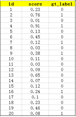
Then sort the confidence score to get:
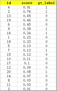
Calculate the recall and precision corresponding to TopN. Where, for a recall value r, the precision value takes all recalls
>=The maximum value in R (this ensures that the p-r curve is monotonically decreasing and avoids the swing of the curve) is called all points interpolation. This AP value is the area value under the PR curve.
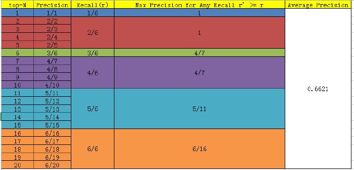
For example: recall = 2 / 6 and precision = 2 / 5 = 0.4 in top5. When recall > = 2 / 6, the maximum precision is 1.
Recall = 3 / 6 and precision = 3 / 6 of top6. When all recall > = 3 / 6, the maximum precision is 4 / 7.
here
AP=1*(1/6) + 1*(1/6)+ (4/7)*(1/6) + (4/7)*(1/6) + (5/11)*(1/6) + (6/16)*
(1/6) = 0.6621
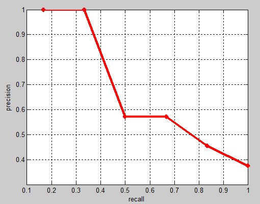
The corresponding precision recall curve (which is monotonically decreasing) is as follows:
mAP
mean Average Precision, that is, the average value of AP in each category
Use the above method to calculate the AP of each class, and then take the average to get the mAP. The advantage of mAP is that it can prevent AP
bias to a large number of categories.
sklearn implementation:
#mAP computing package
def calc_mAP_score(classdict, verbose=True):
    AP = []
    for cls in MY_CLASSES:
        if cls in classdict:
            AP.append(calc_AP_score(classdict[cls], cls))
        else:
            print("%s ap:\t 0" % cls)
            AP.append(0)
    mAP_score = np.mean(AP)
    if verbose:
        print("mAP:%s" % mAP_score)
    return mAP_score
In the case of multiple categories, calculate and display the pr diagram of each category and the corresponding AP value
def show_mAP_info(classdict, show=True, save=False, figsize=(30, 22), fontsize=12):
    """
    Calculate and display the of each category in the case of multiple categories pr Figure and corresponding AP value
    :param classdict:
    :param show:
    :param save:
    :param figsize:
    :param fontsize:
    :return:
    """

    def sub_curve(recall, precision, class_name, ap_score, sub_idx):
        plt.subplot(6, 5, sub_idx)
        plt.title('%s PR Curve, ap:%.4f' % (class_name, ap_score))
        plt.xlabel('Recall')
        plt.ylabel('Precision')
        plt.plot(recall, precision)

    AP = []
    if show:
        plt.figure("Maoyan video class P-R Curve", figsize=figsize)
        plt.subplots_adjust(bottom=0.02, right=0.98, top=0.98)
    for idx, cls in enumerate(MY_CLASSES):
        if cls in classdict:
            ap_score = calc_AP_score(classdict[cls], cls)
            precision, recall, thresholds = calc_precision_recall_curve(classdict[cls], class_name=cls, show=False)
            if show:
                sub_curve(recall, precision, cls, ap_score, idx + 1)
        else:
            ap_score = 0
            print("%s ap:\t\t\t0" % cls)
            sub_curve([0], [0], cls, ap_score, idx + 1)

        AP.append(ap_score)
    if save:
        plt.savefig("./maoyan_all_ap_curve.png")
    if show:
        plt.show()

    mAP_score = np.mean(AP)
    print("mAP:%s" % mAP_score)
    return mAP_score
Method for obtaining required label information in case of multiple categories
def get_simple_result(df: DataFrame):
    y_true = []
    y_pred = []
    pred_scores = []
    for idx, row in df.iterrows():
        video_path = row['video_path']
        gt_label = video_path.split("/")[-2]
        y_true.append(gt_label)

        pred_label = row['cls1']
        y_pred.append(pred_label)

        pred_score = row['score1']
        pred_scores.append(pred_score)

    return y_true, y_pred, pred_scores
def get_multiclass_result(df: DataFrame):
    classdict = {}
    for idx, row in df.iterrows():
        video_path = row['video_path']
        gt_label = video_path.split("/")[-2]
        pred_label = row['cls1']
        pred_score = row['score1']
        if pred_label in classdict:
            classdict[pred_label]['score'].append(pred_score)
            classdict[pred_label]['gt_lbl'].append(1 if gt_label == pred_label else 0)
        else:
            classdict[pred_label] = {'score': [pred_score], 'gt_lbl': [1 if gt_label == pred_label else 0]}
    return classdict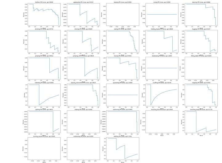
log_loss
from sklearn.metrics import log_loss
log_loss(y_true,y_pred)
classification_report
classification_ The report function is used to display the text report of the main classification indicators. Display the accuracy, recall rate, F1 value and other information of each class in the report.
sklearn implementation:
sklearn.metrics.classification_report(y_true, y_pred, labels=None,
target_names=None, sample_weight=None, digits=2)

Return value: a formatted string that gives the classification evaluation report.
Parameters:
y_true: Real tag collection.
y_pred: Predicted tag set.
labels: A list that specifies which categories appear in the report.
target_names: A list that specifies the displayed names corresponding to the categories in the report.
digits: Used to format floating-point numbers in the report, with several decimal places reserved.
sample_weight: Sample weight: the default weight of each sample is 1
 The contents of the classified evaluation report are as follows:
precision Column: the precision is given. It takes category 0 as a positive class and category 1 as a positive class...
recall Column: recall is given. It takes category 0 as a positive class and category 1 as a positive class...
F1 Column: given F1 Value.
support Column: gives the number of samples of this class.
avg / total that 's ok:
about precision,recall,f1 The arithmetic mean of this column of data is given.
about support Column, which gives the arithmetic sum of the column (in fact, it is equal to the total number of samples in the sample set).
Usage Summary
- For the classification model, AUC, ROC curve (the line formed by the points of FPR and TPR) and PR curve (the line formed by the points of accuracy and recall) are the indicators for comprehensively evaluating the discrimination ability and sorting ability of the model, while the accuracy, recall and F1 values are the indicators calculated after determining the threshold.
- For the first mock exam, PRC and ROC curves can explain certain problems, and the two have some correlation. If we want to evaluate the effect of the model, we can draw two curves to evaluate them comprehensively.
- For supervised binary classification problems, ROC curve and AUC can be directly used to evaluate the effect of the model when both positive and negative samples are sufficient; In the case of extremely unbalanced samples, the PR curve can better reflect the effect of the model.
- In the process of determining the threshold, the classification effect of the model can be evaluated according to Precision, Recall or F1. For multi classification problems, Precision, Recall and F1 can be calculated respectively for each class, which can be comprehensively used as the model evaluation index.
regression model
MAE mean absolute error
sklearn implementation:
mean_absolute_error The function is used to calculate the mean of the absolute value of regression prediction error(mean absolute
error:MAE),Its prototype is:

sklearn.metrics.mean_absolute_error(y_true, y_pred, sample_weight=None,
multioutput='uniform_average')

Return value: the mean value of the absolute value of prediction error.

Parameters:

y_true: Real tag collection.

y_pred: Predicted tag set.

multioutput: Specifies the error type for regression problems with multiple output variables. Can be:

'raw_values': For each output variable, calculate its error.

'uniform_average': Calculate the average of the errors of all its output variables.

sample_weight: Sample weight: the default weight of each sample is 1.

MSE mean square error
mean_ squared_ The error function is used to calculate the mean square of the regression prediction error
error:MSE), whose prototype is:
sklearn.metrics.mean_squared_error(y_true, y_pred, sample_weight=None,

multioutput='uniform_average')

Return value: the average value of the square of the prediction error.

Parameters: Reference mean_absolute_error .

RMSE root mean squared error

Normalized root mean square error

Coefficient of determination (R2)
R2 is the proportion of the sum of regression squares in the total sum of squares in multiple regression. It is a statistic to measure the degree of fitting in the multiple regression equation, reflecting the proportion explained by the estimated regression equation in the variation of dependent variable y.
The closer R2 is to 1, the greater the proportion of the sum of squares in the total sum of squares, the closer the regression line is to each observation point, the more the variation of y value is explained by the change of x, and the better the fitting degree of regression.
from sklearn.metrics import r2_score

r2_score(y_true, y_pred, sample_weight=None, multioutput='uniform_average')

Refer to the following articles to summarize the common evaluation indicators of in-depth learning:
Terry: https://zhuanlan.zhihu.com/p/86120987
cicada: https://zhuanlan.zhihu.com/p/267901426
https://www.pythonf.cn/read/128402
Distance: https://www.zhihu.com/question/30643044
Click focus to learn about Huawei cloud's new technologies for the first time~