The release of Compose Multiplatform marks a new step forward in developing unified UI support using Kotlin!
Based on Google released Jetpack Compose Android 1.0 stable Premise:
-
Compose for Desktop and Compose for Web have been upgraded to "Alpha" version. Their version control is now consistent under Compose Multiplatform, so that Android, Desktop and Web UI can be built with the same "artifacts".
-
IDE management application JetBrains Toolbox App Finished migrating to Compose for Desktop.
-
New plugins for IntelliJ IDEA and Android Studio The @ Preview annotation enables component Preview of Compose for Desktop.
-
Compose for Desktop Now the composable API Window is used by default, providing new support for adaptive window size and unified image resources, as well as new platform support for Linux on ARM64, allowing it to run on targets such as Raspberry Pi.
-
Compose for Web The DOM and CSS API s are further extended.
In addition In The Compose Story Outlined the path of Compose and shared more information about the declarative multi platform user interface!
Unified Desktop, Web and Android UI development
Jetpack Compose It is a responsive development UI framework for building a native user interface for Android. JetBrains expands the Compose framework to more new platforms based on Google's Jetpack Compose.
With Compose Multiplatform, developers can use the same API as Android Jetpack Compose to develop Desktop and Web build user interfaces.
Use Kotlin Multiplatform The provided mechanism can now be used for any combination of the following in the same project:
- Android (Jetpack Compose)
- Desktop
- Web
Previously, Compose for Desktop and Compose for Web used different} artifacts, but now they will be unified under one Gradle plug-in and component, which means that it will be easier to develop Android, Desktop and Web user interfaces based on Compose.
With the update of the Alpha version, the API provided by Compose Multiplatform is very close to its final form. We will fully invest in the development support of Compose and expect to reach version 1.0 within 2021. More details: Learn more about composite multi platform
Compose in Production: JetBrains Toolbox application
In JetBrains, some production applications have begun to adopt Compose. The first is JetBrains Toolbox App , it is the management application of the JetBrains IDE, with more than 800000 active users per month.
image.png
In their latest version , the team has completely converted the implementation of the application to Compose for Desktop. During the migration from Electron based UI, the team noticed many advantages of Compose:
- Memory consumption is significantly reduced, especially when the application is running in the background
- Installer size reduced by approximately 50%
- The overall rendering performance of the application is significantly improved
Victor Kropp, team leader of JetBrains Toolbox, also shared his views on Compose for Desktop in his post:
Compose for Desktop is still in its early stage, but it has been proved to be a great choice for Toolbox App. With the support of colleagues in the development framework, the whole UI can be rewritten almost in a short time. This enables us to unify the development experience, so from business logic to UI, from application to server, Toolbox is now 100% Kotlin.
New IntelliJ IDEA and Android Studio plug-ins for Compose Multiplatform
In this version, a new IDE plug-in has been released to support the development work: the Compose Multiplatform plug-in for IntelliJ IDEA and Android Studio, which is released together with the new version of the framework and provides additional functions to help the development of the user interface.
The first version included a long-awaited feature: the ability to preview Compose for Desktop and Android components directly in the IDE without even starting the application.
To display the function Preview of @ Composable without parameters, you can add the @ Preview comment to its definition. At this time, a small binding line icon will be added, which can be used to switch the Preview pane of the component:
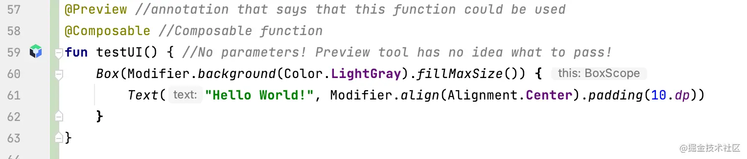
image.png
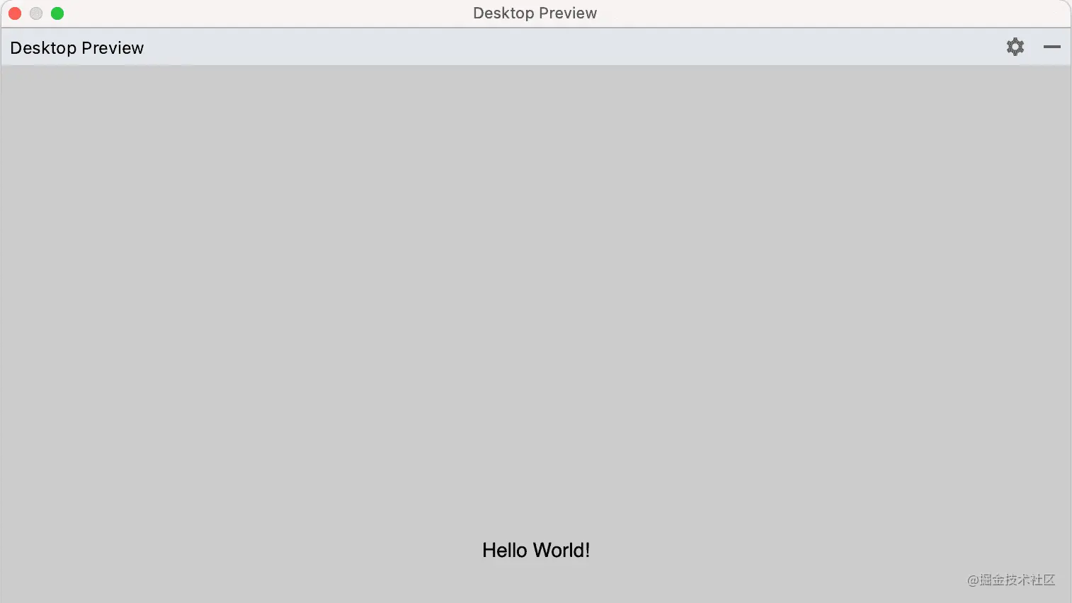
image.png
This new preview can help developers shorten the development cycle and more easily translate ideas into real design and layout based on Compose.
To find and install new plug-ins, search "Compose Multiplatform IDE Support" in the plug-in market, or click below to open the plug-in page directly: Install the composite multi platform plug-in
What's new in Compose for Desktop
In addition to a big step in upgrading Compose for Desktop to Alpha, its API has been improved and support for the new platform has been added in this release.
Composable window API by default
In milestone 4 Desktop Edition, we launched a Experimental group API : Window, MenuBar, and Tray. These new API s all use @ Composable's same state management, behavior, and conditional rendering concepts as other components in the application.
In this release, these composable versions are now the default way to manage windows, menu bars, and tray icons, replacing the old window API.
If you haven't tried these new API s yet, or just want to know more about the behavior and functionality they provide, you can refer to Updated Compose for Desktop tutorial, Understand window and tray management.
Adaptive window size
Sometimes we want to display some content as a whole, and without knowing what will be displayed in advance, this means that we don't know its optimal window size.
In order to develop these UI scenarios more easily, we have introduced the adaptive window size function by setting one or two dimensions of the window to WindowSize DP Unspecified, Compose for Desktop will automatically adjust the initial size of the window in this dimension to suit its content:
fun main() = application {
   val state = rememberWindowState(width = Dp.Unspecified, height = Dp.Unspecified) //automatic size
   Window(
       onCloseRequest = ::exitApplication,
       state = state,
       title = "Adaptive",
       resizable = false
   ) {
       Column(Modifier.background(Color(0xFFEEEEEE))) {
           Row {
               Text("label 1", Modifier.size(100.dp, 100.dp).padding(10.dp).background(Color.White))
               Text("label 2", Modifier.size(150.dp, 200.dp).padding(5.dp).background(Color.White))
               Text("label 3", Modifier.size(200.dp, 300.dp).padding(25.dp).background(Color.White))
           }
       }
   }
}
Copy code
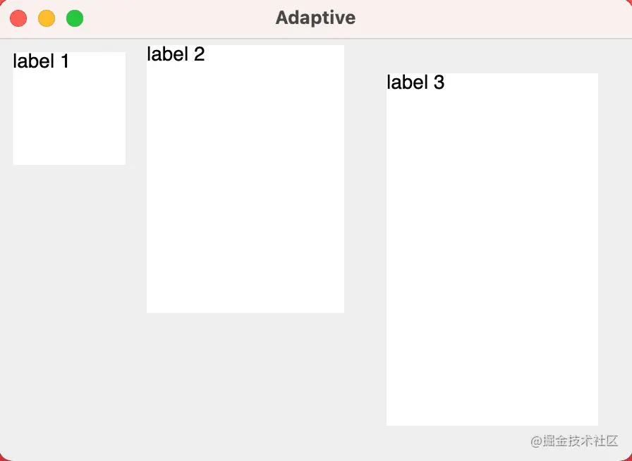
image.png
Together with the deletion of windows (defined by the application Window with undecorated = true), we believe that this new method of creating dynamically sized windows adds additional possibilities to user interfaces of various shapes and sizes.
Additional functions of composable window menu
Desktop applications usually have rich and complex window menus. Additional API s have been added in this release that allow you to create rich menus.
They can be structured, enriched by icons, shortcuts and mnemonics, and integrate the logic of widely used check boxes and radio lists (radio buttons):
@OptIn(ExperimentalComposeUiApi::class)
@Composable
private fun MenuBarScope.FileMenu() = Menu("Settings", mnemonic = 'S') {
   Item(
       "Reset",
       mnemonic = 'R',
       shortcut = KeyShortcut(Key.R, ctrl = true),
       onClick = { println("Reset") }
   )
   CheckboxItem(
       "Advanced settings",
       mnemonic = 'A',
       checked = isAdvancedSettings,
       onCheckedChange = { isAdvancedSettings = !isAdvancedSettings }
   )
   if (isAdvancedSettings) {
       Menu("Theme") {
           RadioButtonItem(
               "Light",
               mnemonic = 'L',
               icon = ColorCircle(Color.LightGray),
               selected = theme == Theme.Light,
               onClick = { theme = Theme.Light }
           )
           RadioButtonItem(
               "Dark",
               mnemonic = 'D',
               icon = ColorCircle(Color.DarkGray),
               selected = theme == Theme.Dark,
               onClick = { theme = Theme.Dark }
           )
       }
   }
}
Copy code
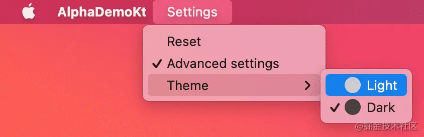
image.png
Support context menu
Compose for Desktop Alpha supports default and custom context menus, which can be triggered by right clicking.
For selectable text and text fields, the framework provides a set of default context menu items that users can copy, paste, cut and select.
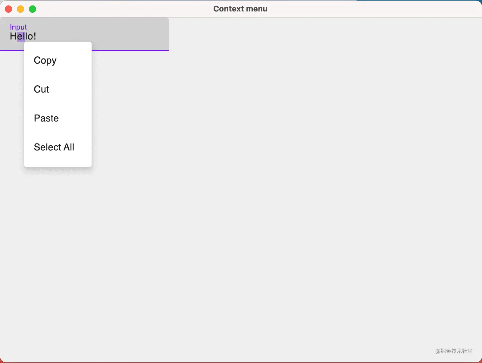
image.png
@OptIn(ExperimentalComposeUiApi::class, androidx.compose.foundation.ExperimentalFoundationApi::class)
fun main() = singleWindowApplication(title = "Context menu") {
   DesktopMaterialTheme { //it is mandatory for Context Menu
       val text = remember {mutableStateOf("Hello!")}
       ContextMenuDataProvider(
           items = {
               listOf(ContextMenuItem("Clear") { text.value = "" })
           }
       ) {
               TextField(
                   value = text.value,
                   onValueChange = { text.value = it },
                   label = { Text(text = "Input") }
               )
       }
   }
}
Copy code
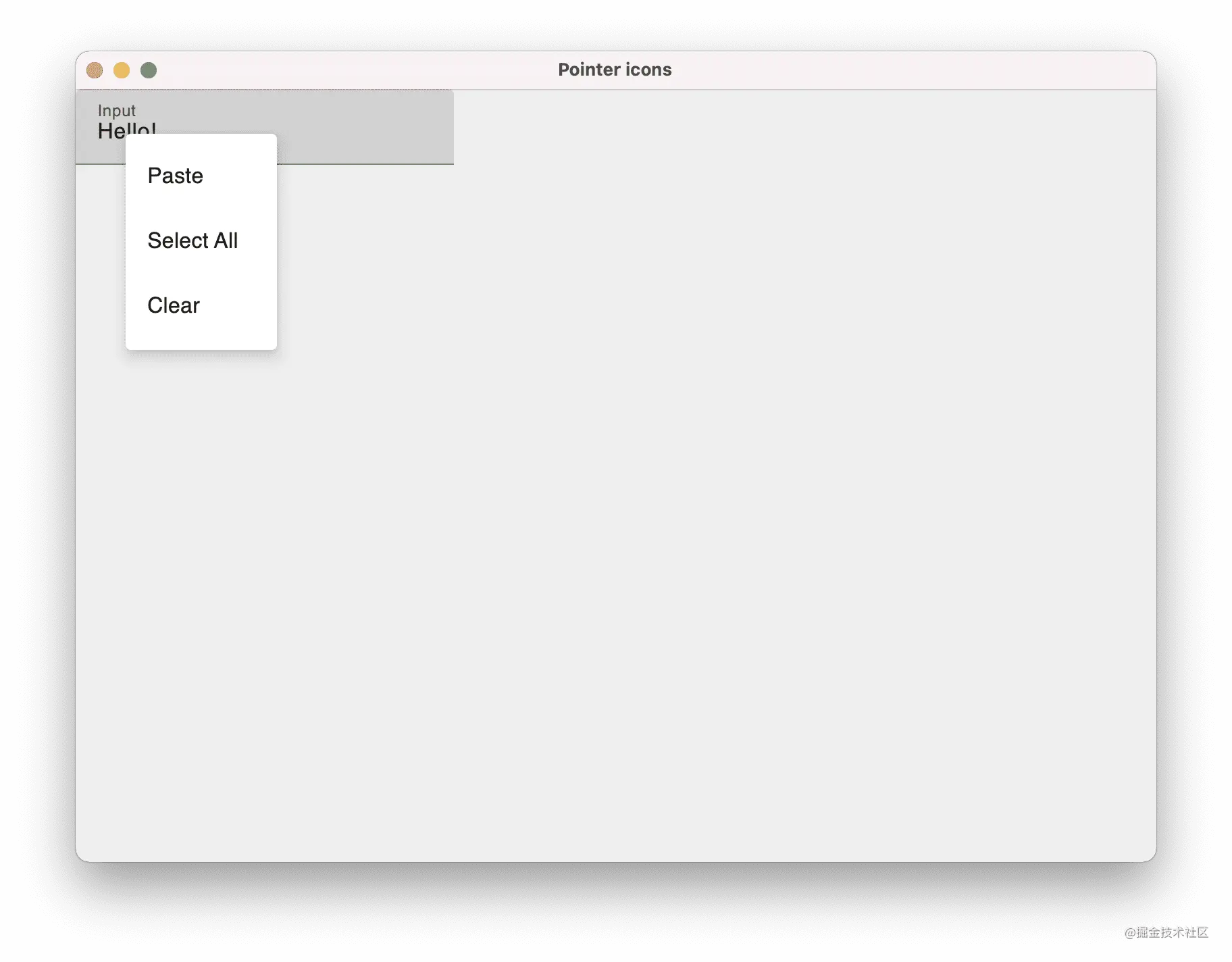
image.png
Cursor change behavior and pointer icon API
Starting with this version of Compose for Desktop, when the mouse hovers over a text field or optional text, the mouse pointer will now automatically become a text selection cursor, indicating that text selection can be made, making the application feel closer to the original.
For your own components, you can also use the newly added "pointerIcon" modifier to adjust the behavior of the mouse pointer. You can change the pointer when you hover over a specific component.
@OptIn(ExperimentalComposeUiApi::class)
@Composable
fun ApplicationScope.pointerIcons() {
   Window(onCloseRequest = ::exitApplication, title = "Pointer icons") {
           Text(
               modifier = Modifier.pointerIcon(PointerIcon.Hand),
               text = "Hand icon!"
           )
   }
}
Copy code
Mouse clickable modifier
To make it easier to handle mouse buttons and keyboard modifiers that are clicked or pressed when the mouse is clicked, a New API for mouseClickable modifier.
Adding this modifier to a component allows you to specify a callback to receive MouseClickScope, which provides complete information about the event:
@ExperimentalDesktopApi
@Composable
fun ApplicationScope.mouseClickable() {
   Window(onCloseRequest = ::exitApplication, title = "mouseClickable") {
       Box {
           var clickableText by remember { mutableStateOf("Click me!") }

           Text(
               modifier = Modifier.mouseClickable(
                   onClick = {
                       if (buttons.isPrimaryPressed && keyboardModifiers.isShiftPressed)  {
                           clickableText = "Shift + left-mouse click!"
                       } else {
                           clickableText = "Wrong combination, try again!"
                       }
                   }
               ),
               text = clickableText
           )

       }
   }
}
Copy code
Please note that this API is not the final version. It is still under development and may be changed in the future.
Unified image resources and Painter
In the process of further stabilizing the API of Compose for Desktop, you can now use a unified {painterResource instead of dividing graphics resources into} svgResource, imageResource and vectorXmlResource:
@Composable
fun ApplicationScope.painterResource() {
   Window(onCloseRequest = ::exitApplication, title = "Image resources") {
       Column {
           Image(
               painter = painterResource("sample.svg"), // Vector
               contentDescription = "Sample",
               modifier = Modifier.fillMaxSize()
           )
           Image(
               painter = painterResource("sample.xml"), // Vector
               contentDescription = "Sample",
               modifier = Modifier.fillMaxSize()
           )
           Image(
               painter = painterResource("sample.png"), // ImageBitmap
               contentDescription = "Sample",
               modifier = Modifier.fillMaxSize()
           )
       }
   }
}
Copy code
We also removed the window icon attribute from Java awt. Image , changed to Android X compose. ui. graphics. painter. Painter, so in addition to future raster graphics, vector based icons can also be used:
fun vectorWindowIcon() {
   application {
       var icon = painterResource("sample.svg") //vector icon
       Window(onCloseRequest = ::exitApplication, icon = icon) {
           Text("Hello world!")
       }
   }
}
Copy code
Supports Linux on ARM64
In this release, in addition to the existing x86-64 support, Compose for Desktop also adds support for Linux running on ARM64 processor based devices.
In general, you can now use Compose for Desktop to write UI for the following platforms:
- macOS on x64 and arm64
- Linux on x64 and arm64
- Windows on x64
What's new in Compose for Web
In addition to Compose for Desktop, Compose for Web has also been upgraded to the Alpha version. Both have adjusted the version control scheme and release cycle, and expanded the available functions through their DSL for style and event management.
Extended CSS API
We will continue to improve and perfect the API to specify style rules through CSS. This latest version adds better support for arithmetic operation, setting properties and animation in type safe DSL.
Arithmetic operation of CSS unit
You can now perform arbitrary operations on CSS values. If you use operations on two values in the same unit, you will get a new value in the same unit, as shown in the following example:
val a = 5.px
val b = 20.px
borderBottom(a + b) // 25px
 Copy code
CSS API for setting properties
It extends type safe access to all the most commonly used CSS properties and covers all CSS properties supported by most modern browsers.
This means that in most cases, support can be obtained directly from type safe API s. For more exotic properties or properties that are not yet supported, assignment can also be made through the function that directly obtains keys and values through property:
borderWidth(topLeft = 4.px, bottomRight = 10%) // type-safe access!

property("some-exotic-property", "hello-friend") // raw property assignment
 Copy code
Animation API
In order to make the Compose based user interface more dynamic, there is now an option to create CSS animation from type safe DSL:
object AppStyleSheet : StyleSheet() {
   val bounce by keyframes {
       from {
           property("transform", "translateX(50%)")
       }

       to {
           property("transform", "translateX(-50%)")
       }
   }

   val myClass by style {
       animation(bounce) {
           duration(2.s)
           timingFunction(AnimationTimingFunction.EaseIn)
           direction(AnimationDirection.Alternate)
       }
   }
}
Copy code
If you want to explore these API s more yourself, be sure to check out our newly added examples, which show some more advanced CSS animation and DOM operation functions.
Event hierarchy, event listeners, and new input types
Handling events, especially those emitted by input components, is one of the key parts of responding to changes in Compose applications.
In this release, access to event properties is simplified, making it easier to define event listeners, and different input types are provided.
Event type hierarchy
Previously, most event based API s required the direct use of nativeEvent or eventTarget to access the value of the event of interest.
Starting with this version of Compose for Web, you can now access a#SyntheticEvent, whose subtypes make it easier to access the related properties of the emitted event.
- SyntheticMouseEvent: public coordinates;
- SyntheticInputEvent exposes text values;
- SyntheticKeyEvent exposes the click key
For example:
Div(attrs = {
   onClick { event -> // SyntheticMouseEvent
       val x = event.x
       val y = event.y
   }
})
Copy code
These new event types are designed to provide direct access to Available in Native events Access to the same properties without accessing the {nativeEvent} or the target of a direct event.
input
In regular HTML, different input types, from text fields to check boxes, share the same tag - input.
In order to make it easier to use these different input types in Kotlin DSL and provide more tips, many additional functions for creating different types of input are introduced:
TextInput(value = "text", attrs = {
   onInput { } // all these components have attrs same as HTMLInputElement
})
CheckboxInput(checked = false)
RadioInput(checked = false)
NumberInput(value = 0, min = 0, max = 10)
DateInput(value = 2021-10-10")
TelInput(value = "0123456")
EmailInput()
// and other input types
 Copy code
Event listener
It further unifies the functions used to listen to events of different input types.
The input type specific function onCheckBoxInput of the input listener has been deleted. Now you can use onCheckBoxInput or onChange directly, which means that you no longer need to search for correctly named callbacks:
Input(type = InputType.Text, attrs = {
   onInput { event ->
       val inputValue: String = event.value
   }
})

Input(type = InputType.Checkbox, attrs = {
   onInput { event ->
       val isChecked: Boolean = event.value
   }
})
Copy code
Try Compose Multiplatform Alpha!
Whether it's Web, desktop, Android or these three, we hope you can try Compose Multiplatform!
We expect Compose Multiplatform 1.0 (our first stable version) to be released later this year, so now is an ideal time to try to evaluate Compose Multiplatform for your production applications.
There are many resources available:
-
For desktop applications, you can In the Compose for Desktop tutorial Find the latest information on how to get started.
-
For browser applications, Compose for Web tutorial Will help start and run.
-
Sample application presentation Includes other examples to study, including Web, desktop, and multi platform applications.
Pre release notes
Compose Multiplatform is currently in the "Alpha" stage. Although most APIs are now very similar to their stable shape, remember that some APIs may still be changed to ensure that the final version provides the best possible development experience.
As we approach the stable version, we will continue to rely on user feedback to help achieve this goal!