preface
We have finished the basic drawing of android. Now, the following two content points are the issue of event distribution, which is related to screen adaptation. In this article, we mainly come to various screen adaptation problems in android
1. Screen adaptation concept
With the increase of devices supporting Android system (mobile phone, tablet, TV and watch), the degree of device fragmentation, brand fragmentation, system fragmentation, sensor fragmentation and screen fragmentation is also deepening. What we want to discuss today is the fragmentation of the screen, which has a great impact on our development.
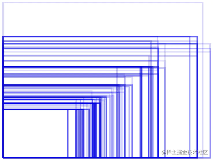
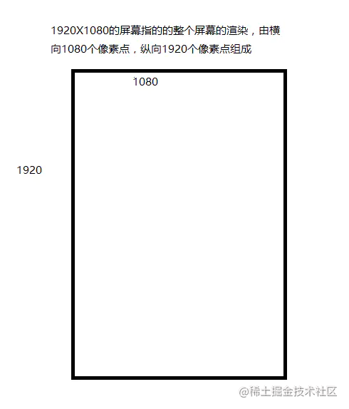
The following figure is a schematic diagram of Android screen size. In this figure, the size of the blue rectangle represents different sizes, and the color depth represents the size of the percentage.
The following is the of IOS
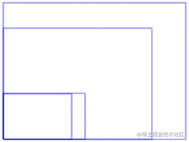
By comparison, we can clearly know how many kinds of screens there are on adnroid, while Apple has only five, including the latest bangs. So if you want to have some experience on the relevant processing schemes of screen adaptation, first of all, we need to understand some basic information about android screen
2. Screen adaptation basis
Well, the following is a basic thought map for screen adaptation, which is basically an outline of the basic chapter. I won't go to you in great detail here, but it is all reflected in the brain map
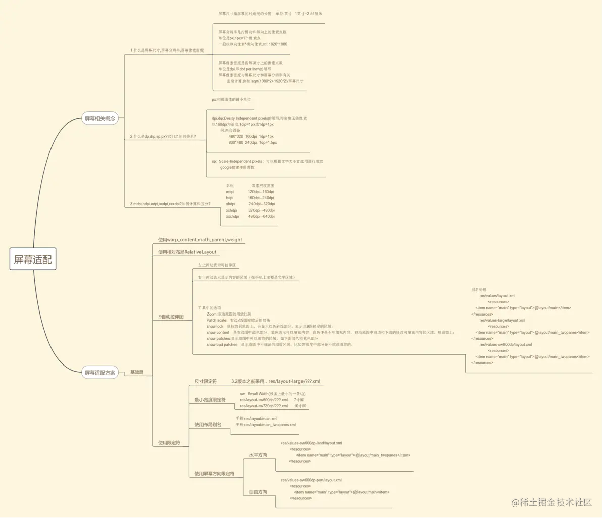
In terms of screen adaptation related concepts, we need to master the most basic three points. The relatively basic content is for students with lower grades, and students with higher grades can choose to skip
2.1 what are screen size, screen resolution, and screen pixel density
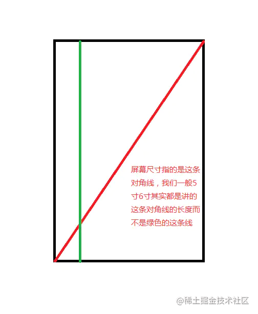
Screen size refers to:
resolving power:
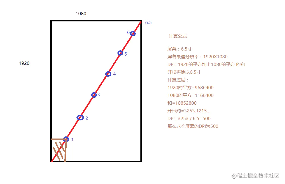
Screen pixel density (DPI) refers to each pixel inch In the length, the number of output pixels can be displayed. The number of DPI is affected by the screen size and resolution. DPI can be calculated
The above content lies in literacy... After all, there are still unclear students, and DPI is closely combined with the following content, so I'm wordy
2.2 what is dp,dip,sp,px? The relationship between them?
- px: the smallest unit that constitutes an image
- Dip: abbreviation for desirability independent pixels, i.e. density independent pixels
When recognizing image pixels, android takes 160dpi as the benchmark, 1dip=1px or 1dp=1px. Example: operate with DP on the following two devices
- 480 * 320 160dpi, then the 1DP on this machine will be translated into 1px
- 800 * 480 240dpi, and the 1DP on this machine will be translated into 1.5px
That is to say, at present, the DP of our device is translated in proportion by the basic standards given by android, which is why we can solve some adaptation problems with DP
2.3 mdpi,hdpi,xdpi,xxdpi,xxxdpi? How to calculate and distinguish?
  name	             Pixel density range	        Picture size
  mdpi	               120dp~160dp	       48×48px
  hdpi	               160dp~240dp	       72×72px
  xhdpi	               240dp~320dp	       96×96px
  xxhdpi	           320dp~480dp	       144×144px
  xxxhdpi	           480dp~640dp	       192×192px
In the official development document of Google, it is explained that the size scale of mdpi: hdpi: xhdpi: xxhdpi: xxxhdpi=2:3:4:6:8 is scaled. For example, the size of an icon is 48 × 48dp, which means on mdpi, the actual size is 48 × 48px, in the pixel density of hdpi, the actual size is 1.5 times that of mdpi, that is, 72 × 72px, and so on, can continue to increase in the future, but it is generally enough to adapt to the graphics problems between mobile phones and tablets
3. Fundamentals of screen adaptation scheme (for common sense, see mind map, here only the lower limit qualifier)
Use "u.parent" and "u.parent # 3"
3.2 relative layout control screen
3.3 application of drawing
The above three are the most basic use of android. We only need to pay attention to them in ordinary applications. We won't talk about them in detail here
3.4 qualifier
When we do screen adaptation, dp can make the display effect similar on devices with different resolutions when the screen size is not different. However, in the case of large screen size difference (flat panel), dp loses this effect. Therefore, the following qualifiers are required to constrain, and multiple sets of layout and numerical values are used to adapt.
In fact, the so-called qualifier is that when android loads resources, it will identify the names corresponding to the folders according to the relevant information on the screen, and these special names are our qualifiers
Qualifier classification:
    Screen size
        small	Small screen
     	normal	Reference screen
     	large	Large screen
     	xlarge	Large screen
    Screen density
      	ldpi	<=120dpi
     	mdpi	<= 160dpi
     	hdpi	<= 240dpi
     	xhdpi	<= 320dpi
     	xxhdpi	<= 480dpi
     	xxhdpi	<= 640dpi(For storage only icon)
     	nodpi	Resources independent of screen density.The system will not compress or stretch the resources according to the screen density
     	tvdpi	be situated between mdpi And hdpi between,Specific to 213 dpi,Specially prepared for TV,Mobile application development does not need to care about this density value.
    Screen orientation
        land	transverse
     	port	portrait
    Aspect ratio
        long	A screen that is significantly higher or wider than a standard screen
     	notlong	Same screen aspect ratio as standard screen configuration
2.4.1 using size qualifiers:
When we want to display different layouts on the large screen, we need to use the large qualifier. For example, if the list is displayed on the left side of the wide screen and the detailed information of the list item is displayed on the right side, and only the list is displayed on the screen of general width without the detailed information of the list item, we can use the large qualifier.
res/layout/main.xml single panel:
<LinearLayout xmlns:android="http://schemas.android.com/apk/res/android"
android:orientation="vertical"
android:layout_width="match_parent"
android:layout_height="match_parent">
<!-- list -->
<fragment android:id="@+id/headlines"
          android:layout_height="fill_parent"
          android:name="com.example.android.newsreader.HeadlinesFragment"
          android:layout_width="match_parent" />
</LinearLayout>
res/layout-large/main. Double sided board:
<LinearLayout xmlns:android="http://schemas.android.com/apk/res/android"
android:layout_width="fill_parent"
android:layout_height="fill_parent"
android:orientation="horizontal">
<!-- list -->
<fragment android:id="@+id/headlines"
          android:layout_height="fill_parent"
          android:name="com.example.android.newsreader.HeadlinesFragment"
          android:layout_width="400dp"
          android:layout_marginRight="10dp"/>
<!-- List item details -->
<fragment android:id="@+id/article"
          android:layout_height="fill_parent"
          android:name="com.example.android.newsreader.ArticleFragment"
          android:layout_width="fill_parent" />
</LinearLayout>
If the program runs on a device with a screen size greater than 7inch, the system will load RES / layout large / main XML instead of RES / layout / main XML, RES / layout / main will be loaded on devices less than 7 inches xml.
It should be noted that this method of identifying the screen size through the large qualifier is applicable to Android 3 Before 2. In Android 3 2 later, in order to more accurately distinguish the screen size, Google introduced the minimum width qualifier.
2.4.2 using the minimum width qualifier
The use of the minimum width qualifier is basically the same as that of large, except that specific width qualifiers are used.
res/layout/main.xml, single panel (default) layout:
<LinearLayout xmlns:android="http://schemas.android.com/apk/res/android"
android:orientation="vertical"
android:layout_width="match_parent"
android:layout_height="match_parent">

<fragment android:id="@+id/headlines"
          android:layout_height="fill_parent"
          android:name="com.example.android.newsreader.HeadlinesFragment"
          android:layout_width="match_parent" />
</LinearLayout>
res/layout-sw600dp/main.xml, double panel layout: Small Width, minimum width
<LinearLayout xmlns:android="http://schemas.android.com/apk/res/android"
android:layout_width="fill_parent"
android:layout_height="fill_parent"
android:orientation="horizontal">
<fragment android:id="@+id/headlines"
          android:layout_height="fill_parent"
          android:name="com.example.android.newsreader.HeadlinesFragment"
          android:layout_width="400dp"
          android:layout_marginRight="10dp"/>
<fragment android:id="@+id/article"
          android:layout_height="fill_parent"
          android:name="com.example.android.newsreader.ArticleFragment"
          android:layout_width="fill_parent" />
</LinearLayout>
This method does not distinguish the screen direction. This minimum width qualifier applies to android 3 After 2, if you want to adapt all versions of android, you need to use the large qualifier and sw600dp file to exist in the res directory of the project at the same time.
This requires us to maintain two files with the same function. In order to avoid cumbersome operations, we need to use layout aliases.
2.4.3 using layout aliases
- res/layout/main.xml: single panel layout
- res/layout-large/main.xml: multi panel layout
- res/layout-sw600dp/main.xml: multi panel layout
Since the latter two stationery files are the same, we can replace the above three layout files with the following two files:
- res/layout/main.xml single panel layout
- res/layout/main_twopanes.xml double sided board layout
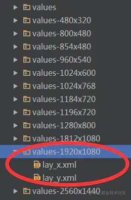
Then create RES / values / layout under res xml,res/values-large/layout.xml,res/values-sw600dp/layout.xml three files.
**Default layout: * * RES / values / layout xml:
<resources>
    <item name="main" type="layout">@layout/main</item>
</resources>
**Android3.2 previous flat panel layout: * * RES / values large / layout xml:
<resources>
    <item name="main" type="layout">@layout/main_twopanes</item>
</resources>
**Android3. Flat panel layout after 2: * * RES / values-sw600dp / layout xml:
<resources>
    <item name="main" type="layout">@layout/main_twopanes</item>
</resources>
In this way, there is a layout with main as the alias.
Set contentview (r.layout. Main) in activity; In this way, when the program is running, it will detect the screen size of the mobile phone. If it is a tablet device, it will load res/layout/main_twopanes.xml. If it is a mobile device, RES / layout / main will be loaded xml . We solved the problem of using only one layout file to adapt to Android 3 2 all tablet devices before and after.
2.4.4 using the screen orientation qualifier
If we require different layouts for horizontal and vertical screens. You can use the screen direction qualifier. For example, to realize the layout of horizontal and vertical screen display on the flat panel, it can be realized in the following ways.
res/values-sw600dp-land/layouts.xml: horizontal screen
<resources>
    <item name="main" type="layout">@layout/main_twopanes</item>
</resources>
res/values-sw600dp-port/layouts.xml: vertical screen
<resources>
    <item name="main" type="layout">@layout/main</item>
</resources>
So the above is the most basic solution for screen adaptation
Here is a translation of the official adaptation scheme made by the god man for your reference: https://blog.csdn.net/wzy_1988/article/details/52932875
4. Screen adaptation solution:
At the end of the basic chapter, I have summarized two solutions most commonly used in our market
4.1 It is completed by customizing the layout components
The core principle is to layout according to a reference resolution, then extract the current machine resolution on each machine, convert the coefficient, and then re measure to achieve the effect of adaptation. This set of scheme can be basically applicable to models above 95. At that time, it will be OK to add the adaptation of Liu Haiping.
  /**
   * Created by barry on 2018/6/7.
   */
public class ScreenAdaptationRelaLayout extends RelativeLayout {
public ScreenAdaptationRelaLayout(Context context) {
    super(context);
}

public ScreenAdaptationRelaLayout(Context context, AttributeSet attrs) {
    super(context, attrs);
}

public ScreenAdaptationRelaLayout(Context context, AttributeSet attrs, int defStyleAttr) {
    super(context, attrs, defStyleAttr);
}

static boolean isFlag = true;

@Override
protected void onMeasure(int widthMeasureSpec, int heightMeasureSpec) {


    if(isFlag){
        int count = this.getChildCount();
        float scaleX =  UIUtils.getInstance(this.getContext()).getHorizontalScaleValue();
        float scaleY =  UIUtils.getInstance(this.getContext()).getVerticalScaleValue();

        Log.i("testbarry","x coefficient:"+scaleX);
        Log.i("testbarry","y coefficient:"+scaleY);
        for (int i = 0;i < count;i++){
            View child = this.getChildAt(i);
            //Represents the list of all attributes of the current space
            LayoutParams layoutParams = (LayoutParams) child.getLayoutParams();
            layoutParams.width = (int) (layoutParams.width * scaleX);
            layoutParams.height = (int) (layoutParams.height * scaleY);
            layoutParams.rightMargin = (int) (layoutParams.rightMargin * scaleX);
            layoutParams.leftMargin = (int) (layoutParams.leftMargin * scaleX);
            layoutParams.topMargin = (int) (layoutParams.topMargin * scaleY);
            layoutParams.bottomMargin = (int) (layoutParams.bottomMargin * scaleY);
        }
        isFlag = false;
    }


    super.onMeasure(widthMeasureSpec, heightMeasureSpec);
}

@Override
protected void onDraw(Canvas canvas) {
    super.onDraw(canvas);
}
}


public class UIUtils {

private Context context;

private static UIUtils utils ;

public static UIUtils getInstance(Context context){
    if(utils == null){
        utils = new UIUtils(context);
    }
    return utils;
}


//Reference width and height
public final float STANDARD_WIDTH = 720;
public final float STANDARD_HEIGHT = 1232;

//Actual width and height of current equipment
public float displayMetricsWidth ;
public float displayMetricsHeight ;

private  final String DIMEN_CLASS = "com.android.internal.R$dimen";


private UIUtils(Context context){
    this.context = context;
    //
    WindowManager windowManager = (WindowManager) context.getSystemService(Context.WINDOW_SERVICE);

    //Load current interface information
    DisplayMetrics displayMetrics = new DisplayMetrics();
    windowManager.getDefaultDisplay().getMetrics(displayMetrics);

    if(displayMetricsWidth == 0.0f || displayMetricsHeight == 0.0f){
        //Get status box information
        int systemBarHeight = getValue(context,"system_bar_height",48);

        if(displayMetrics.widthPixels > displayMetrics.heightPixels){
            this.displayMetricsWidth = displayMetrics.heightPixels;
            this.displayMetricsHeight = displayMetrics.widthPixels - systemBarHeight;
        }else{
            this.displayMetricsWidth = displayMetrics.widthPixels;
            this.displayMetricsHeight = displayMetrics.heightPixels - systemBarHeight;
        }

    }
}

//External supply coefficient
public float getHorizontalScaleValue(){
    return displayMetricsWidth / STANDARD_WIDTH;
}

public float getVerticalScaleValue(){

    Log.i("testbarry","displayMetricsHeight:"+displayMetricsHeight);
    return displayMetricsHeight / STANDARD_HEIGHT;
}


public int getValue(Context context,String systemid,int defValue) {

    try {
        Class<?> clazz = Class.forName(DIMEN_CLASS);
        Object r = clazz.newInstance();
        Field field = clazz.getField(systemid);
        int x = (int) field.get(r);
        return context.getResources().getDimensionPixelOffset(x);

    } catch (Exception e) {
       return defValue;
    }
}
}
4.2 individually adapt each resolution, set the corresponding px in res and dimens ions, and then call it uniformly for screening by the system.
This method has been used for a long time, but it is still used in many projects. The principle is to write a set of dimensions according to the resolution of the device screen XML file, and then divide the width into 720 parts according to a reference resolution (e.g. 720x1080), with the value of 1px-720px, and divide the height into 1080 parts, with the value of 1px-1080px. Generate respective dimensions The value corresponding to the XML file.
But today, I made a change based on this scheme according to this method. I used the concept of DP seen before and combined with the qualifier mentioned before to upgrade this scheme with DP. The principle of DP adaptation is the same as that of px adaptation. The difference is that px adaptation is scaled according to the screen resolution, that is, the px value, DP adaptation is just scaling with DP value.
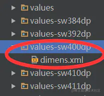
Since the principles are the same, multiple sets of dimensions are required XML file, why is DP adaptation better than px adaptation? Because px adaptation is based on the screen resolution, Android devices have a lot of resolutions, and we also need to consider the virtual keyboard. DP adaptation, no matter how many pixels and density ratio of the mobile phone screen, the minimum width DP value (widthPixels / density) of 80% of mobile phones is 360dp, which greatly reduces the number of dimensions XML file
PS: (at present, the dpi of the mobile phone is basically more than 350 +, so according to the lowest calculation, 350 / 160 = 2.1, then 360 * 2.1 = 720 + basically, the resolution of the mobile phone will be within 360dp. In the case of 19201080, 500 / 160 = 3.125, then 3603.125 = 1125 is also within 360),
Traditional practices:
Improved practice:
Obtain the minimum width as follows:
    DisplayMetrics dm = new DisplayMetrics();

    getWindowManager().getDefaultDisplay().getMetrics(dm);

    int widthPixels = dm.widthPixels;

    float density = dm.density;

    float widthDP = widthPixels / density;
Therefore, through the combination of these two forms, we can achieve the purpose of adapting any model as a whole