CSS
brief introduction
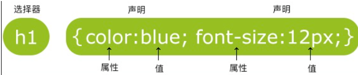
p
{
    color:red;
    text-align:center;
}
Do not leave spaces between attribute values and units
CSS comments start with / * and end with /
id selector
#para1
{
    text-align:center;
    color:red;
}
id and class should not start with numbers
class selector
.center {text-align:center;}
Specifies that a specific HTML element uses class.
p.center {text-align:center;}
CSS creation
There are three ways to insert a style sheet:
- External style sheet
- Internal style sheet
- Inline style
External style sheet
<head>
<link rel="stylesheet" type="text/css" href="mystyle.css">
</head>
Internal style sheet
Internal style sheets should be used when a single document requires special styles.
<head>
<style>
hr {color:sienna;}
p {margin-left:20px;}
body {background-image:url("images/back40.gif");}
</style>
</head>
inline style
Use the style attribute within the associated label.
<p style="color:sienna;margin-left:20px">This is a paragraph.</p>
Multiple style priority
(inline style) inline style > (internal style) internal style sheet > (external style) external style sheet > browser default style
If the external style is placed after the internal style, the external style overrides the internal style.
background
background color
body {background-color:#b0c4de;}
background image
body {background-image:url('paper.gif');}
Set multiple different properties for different pictures
#example1 {
    background: url(img_flwr.gif) right bottom no-repeat, url(paper.gif) left top repeat;
}
Tiling and positioning
body
{
background-image:url('img_tree.png');
background-repeat:no-repeat;
background-position:right top;
}
Background size
div
{
    background:url(img_flwr.gif);
    background-size:80px 60px;
    background-repeat:no-repeat;
}

div
{
    background:url(img_flwr.gif);
    background-size:100% 100%;
    background-repeat:no-repeat;
}
Specifies the positioning area of the background image.
div
{
    background:url(img_flwr.gif);
    background-repeat:no-repeat;
    background-size:100% 100%;
    background-origin:content-box;
}
The background clipping attribute is drawn from the specified position.
#example1 {
    border: 10px dotted black;
    padding: 35px;
    background: yellow;
    background-clip: content-box;
}
Linear gradient
#grad {
  height: 200px;
  background-image: linear-gradient(to right, red , yellow);
}

#grad {
  height: 200px;
  background-image: linear-gradient(to bottom right, red, yellow);
}

#grad {
  /* Multicolor */
  background-image: linear-gradient(to right, red,orange,yellow,green,blue,indigo,violet);
}

/*A linear gradient with a specified angle*/
#grad {
  background-image: linear-gradient(-90deg, red, yellow);
}

/*Use transparency*/
#grad {
  background-image: linear-gradient(to right, rgba(255,0,0,0), rgba(255,0,0,1));
}

#grad {
  /* Repeated linear gradient */
  background-image: repeating-linear-gradient(red, yellow 10%, green 20%);
}
Radial Gradient
#grad {
  background-image: radial-gradient(red, yellow, green);
}
/*Uneven gradient*/
#grad {
  background-image: radial-gradient(red 5%, yellow 15%, green 60%);
}
/*Specific shape*/
#grad {
  background-image: radial-gradient(circle, red, yellow, green);
}
/*Different keyword sizes*/
#grad1 {
  background-image: radial-gradient(closest-side at 60% 55%, red, yellow, black);
}
Merge properties
body {background:#ffffff url('img_tree.png') no-repeat right top;}
When using abbreviated attributes, the order of attribute values is:
- background-color
- background-image
- background-repeat
- background-attachment
- background-position
text
text color
body {color:red;}
h1 {color:#00ff00;}
h2 {color:rgb(255,0,0);}
Alignment
h1 {text-align:center;}
p.date {text-align:right;}
p.main {text-align:justify;}
modification
h1 {text-decoration:overline;}
h2 {text-decoration:line-through;}
h3 {text-decoration:underline;}

a {text-decoration:none;}
Text conversion
p.uppercase {text-transform:uppercase;}
p.lowercase {text-transform:lowercase;}
p.capitalize {text-transform:capitalize;}
Text indent
p {text-indent:50px;}
typeface
font family
p{font-family:"Times New Roman", Times, serif;}
If the browser does not support the first font, it will try the next font.
Font style
p.normal {font-style:normal;}
p.italic {font-style:italic;}
p.oblique {font-style:oblique;}  /*tilt*/
font size
h1 {font-size:40px;}
In order to avoid the problem that text cannot be adjusted in Internet Explorer, many developers use em units instead of pixels.
1 {font-size:2.5em;} /* 40px/16=2.5em */
The default size of 1em is 16px.
percentage
body {font-size:100%;}
link
Different link state styles
a:link {color:#000000;}      /*  Link not visited*/
a:visited {color:#00FF00;}  /*  Link visited*/
a:hover {color:#FF00FF;}  /*  Move the mouse over the link*/
a:active {color:#0000FF;}  /*  When the mouse clicks*/
- a:hover must follow a:link and a:visited
- a:active must follow a:hover
list
ul.a {list-style-type: circle;}
ul.b {list-style-type: square;}

ol.c {list-style-type: upper-roman;}
ol.d {list-style-type: lower-alpha;}
The list style type: none attribute can be used to remove small tags.
Specifies the image of the list item tag
ul
{
    list-style-image: url('sqpurple.gif');
}
Abbreviated attribute
ul
{
    list-style: square url("sqpurple.gif");
}
- list-style-type
- list-style-position
- list-style-image
form
frame
table
{
    border-collapse:collapse;
}
table,th, td
{
    border: 1px solid black;
}
Width and height
table
{
    width:100%;
}
th
{
    height:50px;
}
Text alignment
td
{
    text-align:right;
}

td
{
    height:50px;
    vertical-align:bottom;
}
Table filling
Controls the spacing between borders and table contents
td
{
    padding:15px;
}
Table color
table, td, th
{
    border:1px solid green;
}
th
{
    background-color:green;
    color:white;
}
Element display mode
Element display mode, that is, how elements (labels) are displayed, which accounts for one line or multiple lines.
Block element
For example, < H1 > ~ < H6 >, < p >, < UL >, < ol >, < li >, < div >, etc.
characteristic:
- Exclusive row
- Height, width and inner and outer margins can be controlled
- The width defaults to 100% of the container
- It is a container or box in which internal or block level elements can be released (block level elements cannot be placed in text labels).
Inline element
For example, < a > < strong > < del > < span >, etc
characteristic:
- Multiple in one line
- Invalid height and width settings
- The default width is the content width
- Only text or other inline elements can be accommodated (block level elements can be placed in the link, but it is best to convert)
Inline block element
For example, < img / > < input / > < td >
characteristic:
- There are more than one in a row, but there are gaps between them
- The default width is the content width
- Height, width and inner and outer margins can be controlled
Conversion of display mode
display:block;   /*Convert to block element*/
display:inline;  /*Convert to inline element*/
display:inline;  /*Convert to inline block element*/
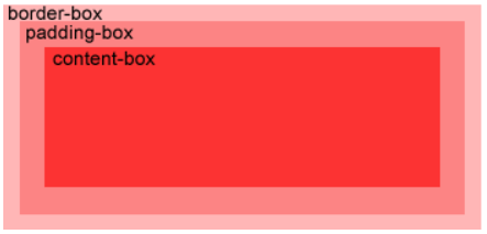
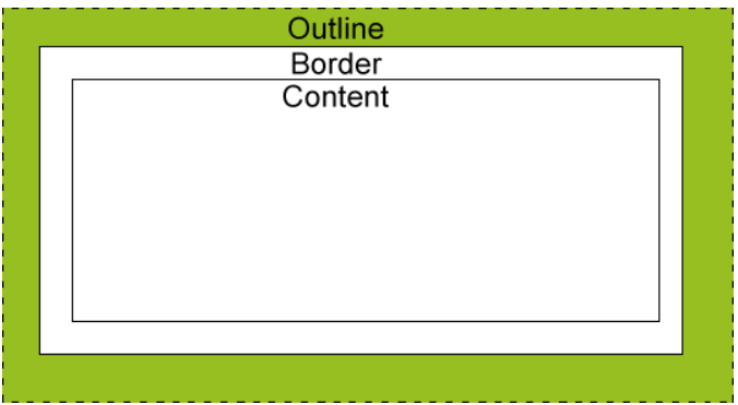
Box model
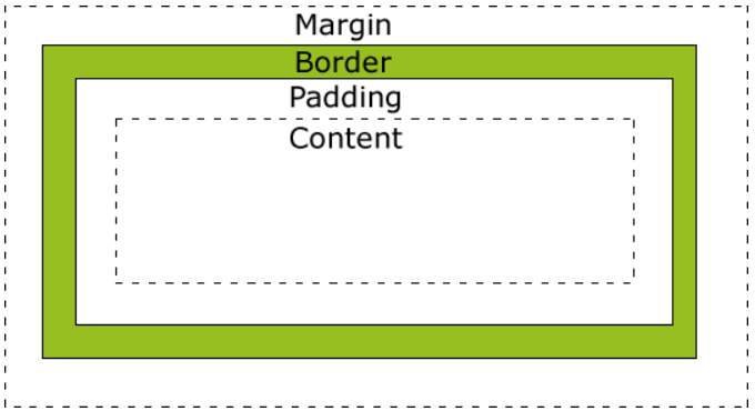
- Margin - clears the area outside the border, which is transparent.
- Border - a border around the inside margin and outside the content.
- Padding - clears the area around the content. The padding is transparent.
- Content - the content of the box, displaying text and images.
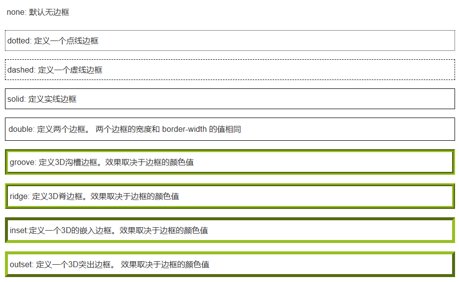
frame
border-style
Border width
You can specify a length value or use one of three keywords: thick, medium (default), and thin.
Set each side separately
p
{
    border-top-style:dotted;
    border-right-style:solid;
    border-bottom-style:dotted;
    border-left-style:solid;
}
Abbreviated attribute
border:5px solid red;
- border-width
- border-style (required)
- border-color
CSS3
Rounded border:
div
{
border:2px solid;
border-radius:25px;
}
Box shadow
div
{
box-shadow: 10px 10px 5px #888888;
}
Boundary picture
div
{
border-image:url(border.png) 30 30 round;
-webkit-border-image:url(border.png) 30 30 round; /* Safari 5 and older */
-o-border-image:url(border.png) 30 30 round; /* Opera */
}
outline
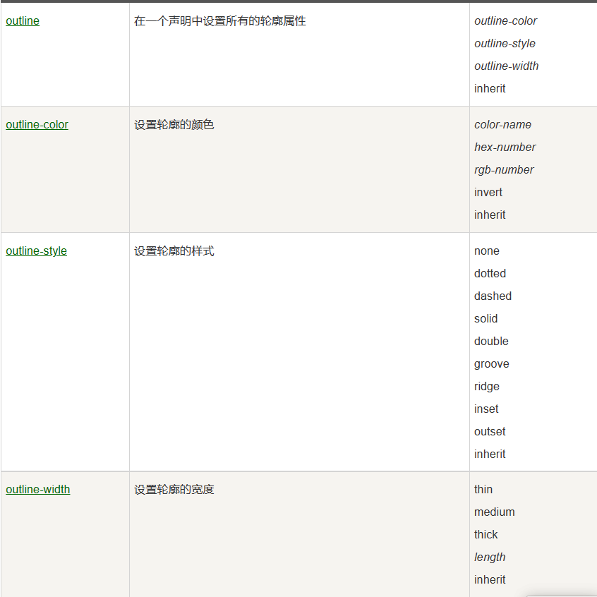
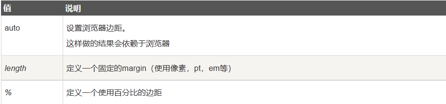
Margin
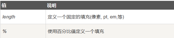
fill
Grouping and nesting
Each selector is separated by a comma.
h1,h2,p
{
    color:green;
}
nesting
p
{
    color:blue;
    text-align:center;
}
.marked
{
    background-color:red;
}
.marked p
{
    color:white;
}
p.marked{
    text-decoration:underline;
}
display
You can hide an element by setting the display attribute to "none" or the visibility attribute to "hidden".
visibility:hidden can hide an element, but takes up the same space as before.
display:none can hide an element, and the hidden element will not occupy any space.
float
Multiple block level boxes are arranged seamlessly in a row, which is often used for horizontal arrangement.
If the image is floating right, the following text stream will surround it to the left:
img
{
    float:right;
}
characteristic:
- Off standard flow (off standard), floating above
- Not in the original position
- It is displayed in one line with other floating boxes and aligned at the top. If the parent width is not enough, another line will be started
- Features of inline block elements
General strategy: arrange the upper and lower positions with the parent elements of the standard flow, and float the inner child elements to the left and right positions.
Theoretically, if a box floats, the brother box should also float.
Floating affects the standard flow behind, while the front does not.
Clear float:
After floating is cleared, the parent will have height and will not affect the standard flow below.
1. Additional labeling method:
Add a block level element and use:
div
{
    clear:both;
}
2. Add the overflow attribute to the parent and set it to hidden, auto or scroll
location
Let the box move freely or fixed to a position in the screen, and can press other boxes.
Positioning = positioning mode + edge offset
static positioning
That is, there is no location and follows the normal document flow object.
Statically positioned elements are not affected by top, bottom, left and right (that is, there is no edge offset).
relative positioning
Relative to its normal position.
Keep the original position without losing the standard.
h2.pos_left
{
    position:relative;
    left:-20px;
}
h2.pos_right
{
    position:relative;
    left:20px;
}
absolute positioning
The position of the absolutely positioned element is relative to the nearest positioned parent element
If the element has no positioned parent element, its position is relative to:
absolute positioning makes the position of the element independent of the document flow, so it does not occupy space.
The box with absolute positioning cannot be centered horizontally through margin:0 auto
center on page
left: 50%
margin-left: -100       Shift left half its width
Son Jue father phase: if the child is absolutely positioned, the parent should use relative positioning.
- The child is absolutely positioned and does not occupy a position. It can be placed anywhere in the parent box.
- The parent box needs positioning to limit the child box, and needs to occupy the position, so it is relative positioning.
fixed positioning
The position of the element is fixed relative to the browser window, independent of the parent element.
Even if the window is scrolling, it will not move
Fixed positioning makes the position of the element independent of the document flow, so it does not occupy space.
It can be regarded as a special absolute positioning.
sticky positioning
Switch between position:relative and position:fixed positioning.
Take the visual window of the browser as the reference (fixed positioning) and occupy the original position (relative positioning).
Before crossing a specific threshold, it is relative positioning, and then it is fixed positioning.
Specify one of the four thresholds of top, right, bottom or left to make the sticky positioning effective. Otherwise, its behavior is the same as relative positioning.
div.sticky {
    position: -webkit-sticky; /* Safari */
    position: sticky;
    top: 0;
    background-color: green;
    border: 2px solid #4CAF50;
}
Stacking of elements
img
{
    position:absolute;
    left:0px;
    top:0px;
    z-index:-1;        /*z The axis controls the front and rear order of the box*/
}
Elements with a higher stacking order always come first.
After adding absolute positioning to the elements in the line, you can set the height and width
After absolute positioning is added to block level elements, the default is content size
Absolute positioning will suppress all the contents of the following standard stream, but floating will not suppress the text and pictures in the box.
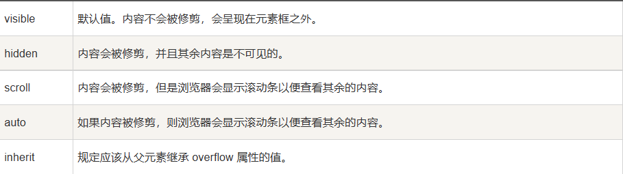
Overflow
Controls how content is displayed when it overflows the element box.
alignment
Align element center
.center {
    margin: auto;
    width: 50%;
    border: 3px solid green;
    padding: 10px;
}
Evenly distribute the empty outer margins on both sides.
If the width property is not set (or 100%), the center alignment will not work.
Center text
.center {
    text-align: center;
    border: 3px solid green;
}
Picture center alignment
Use margin: auto; And put it in the block element
Align left and right: position
body {
    margin: 0;
    padding: 0;
}

.container {
    position: relative;
    width: 100%;
}

.right {
    position: absolute;
    right: 0px;
    width: 300px;
    background-color: #b0e0e6;
}
When using position to align elements, the element usually sets margin and padding. This can avoid visible differences in different browsers.
When using position attribute, please always set it! DOCTYPE declaration
Align left and right: float
.right {
    float: right;
    width: 300px;
    border: 3px solid #73AD21;
    padding: 10px;
}
If the height of the child element is higher than the parent element and the child element is set to float, the child element will overflow. At this time, you can use "Clearfix" to solve the problem.
You can add overflow: auto; To solve the problem of child element overflow:
.clearfix {
    overflow: auto;
}
When using the float attribute, always set it! DOCTYPE declaration
Vertical center: padding
.center {
    padding: 70px 0;
    border: 3px solid green;
}
Vertical center: line height
.center {
    line-height: 200px;
    height: 200px;
    border: 3px solid green;
    text-align: center;
}

/* If the text has more than one line, add the following code: */
.center p {
    line-height: 1.5;
    display: inline-block;
    vertical-align: middle;
}
Vertical center: position and transform
.center {
    height: 200px;
    position: relative;
    border: 3px solid green;
}

.center p {
    margin: 0;
    position: absolute;
    top: 50%;
    left: 50%;
    transform: translate(-50%, -50%);
}
Combination selector
Descendant selector: select the descendant element of an element.
div p
{
  background-color:yellow;
}
Child element selector: only elements that are direct / first level child elements of an element can be selected.
div>p
{
  background-color:yellow;
}
Adjacent sibling selector: select the element immediately after another element, and they have the same parent element.
div+p
{
  background-color:yellow;
}
Sibling selector: Selects all the siblings of the adjacent elements.
div~p
{
  background-color:yellow;
}
Pseudo class
Syntax of pseudo class:
selector:pseudo-class {property:value;}
CSS classes can also use pseudo classes:
selector.class:pseudo-class {property:value;}
a.red:visited {color:#FF0000;}

<a class="red" href="css-syntax.html">CSS grammar</a>
Pseudo element
Syntax of pseudo element:
selector:pseudo-element {property:value;}
CSS classes can also use pseudo elements:
selector.class:pseudo-element {property:value;}
The "first line" pseudo element is used to set a special style to the first line of text.
p:first-line
{
    color:#ff0000;
    font-variant:small-caps;
}
The "first letter" pseudo element is used to set a special style to the first letter of the text:
p:first-letter
{
    color:#ff0000;
    font-size:xx-large;
}
The ": before" pseudo element can insert new content before the content of the element.
h1:before
{
    content:url(smiley.gif);
}
The ": after" pseudo element can insert new content after the content of the element.
h1:after
{
    content:url(smiley.gif);
}
navigation bar
<ul>
  <li><a href="#Home "> Home Page</a></li>
  <li><a href="#News "> News</a></li>
  <li><a href="#Contact "> contact</a></li>
  <li><a href="#About "> about</a></li>
</ul>
ul {
    list-style-type: none;
    margin: 0;
    padding: 0;
}

/*Remove the browser's default settings and set margins and padding to 0*/
Vertical navigation bar
a
{
    display:block;
    width:60px;
}
ul {
    list-style-type: none;
    margin: 0;
    padding: 0;
    width: 200px;
    background-color: #f1f1f1;
}

li a {
    display: block;
    color: #000;
    padding: 8px 16px;
    text-decoration: none;
}

/* Move the mouse over the option to modify the background color */
li a:hover {
    background-color: #555;
    color: white;
}
Fixed navigation bar with full screen height
ul {
    list-style-type: none;
    margin: 0;
    padding: 0;
    width: 25%;
    background-color: #f1f1f1;
    height: 100%; /* Full screen height */
    position: fixed;
    overflow: auto; /* If the navigation bar has many options, scrolling is allowed */
}
Horizontal navigation bar
Inline list item
li
{
    display:inline;
}
Floating list item
li
{
    float:left;
}
a
{
    display:block;
    width:60px;
}
example
ul {
    list-style-type: none;
    margin: 0;
    padding: 0;
    overflow: hidden;
    background-color: #333;
}

li {
    float: left;
}

li a {
    display: block;
    color: white;
    text-align: center;
    padding: 14px 16px;
    text-decoration: none;
}

/*Move the mouse over the option to modify the background color */
li a:hover {
    background-color: #111;
}
Fixed navigation bar
ul {
    position: fixed;
    top: 0;
    width: 100%;
}
drop-down menu
<div class="dropdown">
  <span>Move the mouse to me!</span>
  <div class="dropdown-content">
    <p>Rookie tutorial</p>
    <p>www.runoob.com</p>
  </div>
</div>
<style>
.dropdown {
  position: relative;
  display: inline-block;
}
.dropdown-content {
  display: none;
  position: absolute;
  background-color: #f9f9f9;
  min-width: 160px;
  box-shadow: 0px 8px 16px 0px rgba(0,0,0,0.2);
  padding: 12px 16px;
}
.dropdown:hover .dropdown-content {
  display: block;
}
</style>
prompt box
<div class="tooltip">Move the mouse here
  <span class="tooltiptext">Prompt text</span>
</div>
/* Tooltip container */
.tooltip {
    position: relative;
    display: inline-block;
    border-bottom: 1px dotted black; /* Show dotted lines on hovering elements */
}

/* Tooltip text */
.tooltip .tooltiptext {
    visibility: hidden;
    width: 120px;
    background-color: black;
    color: #fff;
    text-align: center;
    padding: 5px 0;
    border-radius: 6px;

    /* location */
    position: absolute;
    z-index: 1;
}

/* When the mouse moves up, a prompt box is displayed */
.tooltip:hover .tooltiptext {
    visibility: visible;
}
picture
transparency
img
{
  opacity:0.4;
  filter:alpha(opacity=40); /* IE8 And earlier versions */
}
attribute selectors
[title]
{
    color:blue;
}
Property and value selectors
[title=runoob]
{
    border:5px solid green;
}
Selector for properties and values - multivalued
[title~=hello] { color:blue; }

[lang|=en] { color:blue; }
form
input[type=text], select {
  width: 100%;
  padding: 12px 20px;
  margin: 8px 0;
  display: inline-block;
  border: 1px solid #ccc;
  border-radius: 4px;
  box-sizing: border-box;
}

input[type=submit] {
  width: 100%;
  background-color: #4CAF50;
  color: white;
  padding: 14px 20px;
  margin: 8px 0;
  border: none;
  border-radius: 4px;
  cursor: pointer;
}

input[type=submit]:hover {
  background-color: #45a049;
}

div {
  border-radius: 5px;
  background-color: #f2f2f2;
  padding: 20px;
}
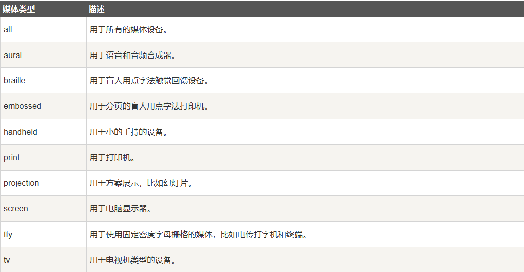
media type
@Media rule: allows you to set different styles for different media in the same style sheet.
A 14 pixel Verdana font style is displayed on the browser screen. However, if the page is printed, it will be a 10 pixel Times font.
@media screen
{
    p.test {font-family:verdana,sans-serif;font-size:14px;}
}
@media print
{
    p.test {font-family:times,serif;font-size:10px;}
}
@media screen,print
{
    p.test {font-weight:bold;}
}
Web page layout
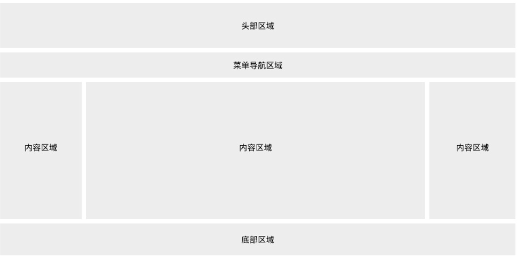
Responsive web layout
* {
  box-sizing: border-box;
}

body {
  font-family: Arial;
  padding: 10px;
  background: #f1f1f1;
}

/* Header title */
.header {
  padding: 30px;
  text-align: center;
  background: white;
}

.header h1 {
  font-size: 50px;
}

/* Navigation bar */
.topnav {
  overflow: hidden;
  background-color: #333;
}

/* Navigation bar link */
.topnav a {
  float: left;
  display: block;
  color: #f2f2f2;
  text-align: center;
  padding: 14px 16px;
  text-decoration: none;
}

/* Link color modification */
.topnav a:hover {
  background-color: #ddd;
  color: black;
}

/* Create two columns */
/* Left column */
.leftcolumn {
  float: left;
  width: 75%;
}

/* Right column */
.rightcolumn {
  float: left;
  width: 25%;
  background-color: #f1f1f1;
  padding-left: 20px;
}

/* Image part */
.fakeimg {
  background-color: #aaa;
  width: 100%;
  padding: 20px;
}

/* Article card effect */
.card {
  background-color: white;
  padding: 20px;
  margin-top: 20px;
}

/* Clear float after column */
.row:after {
  content: "";
  display: table;
  clear: both;
}

/* bottom */
.footer {
  padding: 20px;
  text-align: center;
  background: #ddd;
  margin-top: 20px;
}

/* Responsive layout - when the screen size is less than 800px, the two column layout is changed to up and down layout */
@media screen and (max-width: 800px) {
  .leftcolumn, .rightcolumn {
    width: 100%;
    padding: 0;
  }
}

/* Responsive layout - when the screen size is less than 400px, the layout such as navigation is changed to up-down layout */
@media screen and (max-width: 400px) {
  .topnav a {
    float: none;
    width: 100%;
  }
}