The classic time series prediction methods all assume that if a time series has significant autocorrelation, then the historical value will be very helpful to predict the current value. However, the order of historical value should be obtained by analyzing the correlation function diagram and partial correlation function diagram. This paper introduces how to define correlation function graph and partial correlation function graph, and also introduces lag graph.
What are autocorrelation and partial autocorrelation functions?
- First, we explain the lower lag order n. if the current value is related to the value of the first two periods, then n=2, then we can train an autoregressive model with the time series and its second-order lag series to predict the future value.
- The autocorrelation function (ACF) expresses the correlation between time series and n-order lag series (considering the influence of the value of the intermediate time, such as the influence of t-3 on T, the influence of t-2 and t-1 on t is also considered).
- The partial autocorrelation function (PACF) expresses the pure correlation between the time series and the n-th order lag series (without considering the influence of the intermediate time value, such as the influence of t-3 on T, the influence of t-2 and t-1 on T will not be considered). If the autoregressive equation is used to predict the value of time t, the coefficient of each lag order is the partial autocorrelation value under each lag order. For example, α 1, α 2, α 3 of the following equation are the partial autocorrelation values under the first lag, the second lag and the third lag respectively.

ACF and PACF visualization
from statsmodels.tsa.stattools import acf, pacf
from statsmodels.graphics.tsaplots import plot_acf, plot_pacf

df = pd.read_csv('https://raw.githubusercontent.com/selva86/datasets/master/a10.csv')
# Calculate ACF and PACF upto 50 lags# acf_50 = acf(df.value, nlags=50)# pacf_50 = pacf(df.value, nlags=50)
# Draw Plot
fig, axes = plt.subplots(1,2,figsize=(16,3), dpi= 100)
plot_acf(df.value.tolist(), lags=50, ax=axes[0])
plot_pacf(df.value.tolist(), lags=50, ax=axes[1])
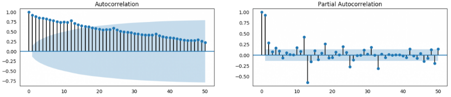
- If the ACF shows a long tail (as shown in the left figure above), it shows a trend and needs to be differential.
- If the first-order lag of ACF is truncated, it may be excessive difference (the difference will reduce the correlation).
- If ACF is tailed a little and then truncated, the selected order of difference is more appropriate. At this time, the value of the first n historical moments can be used to predict the current value after self returning. For the value of N, you can refer to the truncation of PACF. Suppose that the upper right figure is the differential PACF figure. After the second lag order (starting from the 0, the 0 lag is the original sequence compared with the original sequence, and the correlation is 1), it suddenly falls into the correlation confidence interval, It means that 95% probability is uncorrelated, so the sequence can do second-order lag autoregression.
What is the correlation confidence interval?
For the white noise sequence, there is no autocorrelation. We expect the autocorrelation to be 0, but due to the existence of random disturbance, the autocorrelation will not be 0. Generally, if the random disturbance conforms to the standard normal distribution (the mean value is 0, the standard deviation is 1), then the 95% confidence interval of the random disturbance (generally 95%, Of course, the probability can also be adjusted) can be calculated by the following formula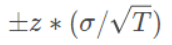
The z-fraction of the standard normal distribution indicates that there are several standard deviations in the mean distance, and σ divided by the root sign T indicates the standard deviation of biased samples,
Here, under 95% confidence, z fraction = 1.96, standard deviation σ = 1, T is the length of the sequence, then the confidence interval is calculated as follows:
For white noise sequence, 95% of autocorrelation falls in this confidence interval.
And this confidence interval is the correlation interval in the above acf and pacf graphs, that is to say, if the correlation between the lag order and the original sequence falls within this interval, it means no correlation.
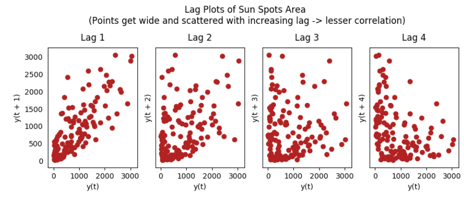
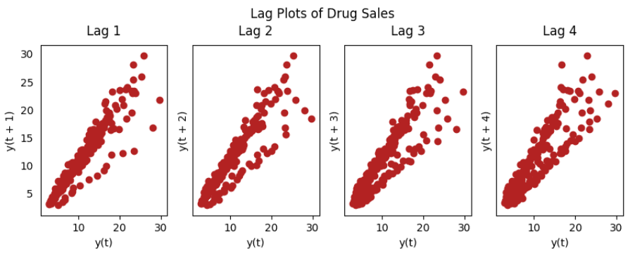
Lag graph
Lag chart is a scatter chart made of time series and corresponding lag order series. It can be used to observe autocorrelation.
from pandas.plotting import lag_plot
plt.rcParams.update({'ytick.left' : False, 'axes.titlepad':10})

# Import
ss = pd.read_csv('https://raw.githubusercontent.com/selva86/datasets/master/sunspotarea.csv')
a10 = pd.read_csv('https://raw.githubusercontent.com/selva86/datasets/master/a10.csv')

# Plot
fig, axes = plt.subplots(1, 4, figsize=(10,3), sharex=True, sharey=True, dpi=100)for i, ax in enumerate(axes.flatten()[:4]):
    lag_plot(ss, lag=i+1, ax=ax, c='firebrick')
    ax.set_title('Lag ' + str(i+1))

fig.suptitle('Lag Plots of Sun Spots Area \n(Points get wide and scattered with increasing lag -> lesser correlation)\n', y=1.15)

fig, axes = plt.subplots(1, 4, figsize=(10,3), sharex=True, sharey=True, dpi=100)for i, ax in enumerate(axes.flatten()[:4]):
    lag_plot(a10, lag=i+1, ax=ax, c='firebrick')
    ax.set_title('Lag ' + str(i+1))

fig.suptitle('Lag Plots of Drug Sales', y=1.05)
plt.show()
ok, so much for this article ~, thank you for reading O(∩)_ ∩)O.