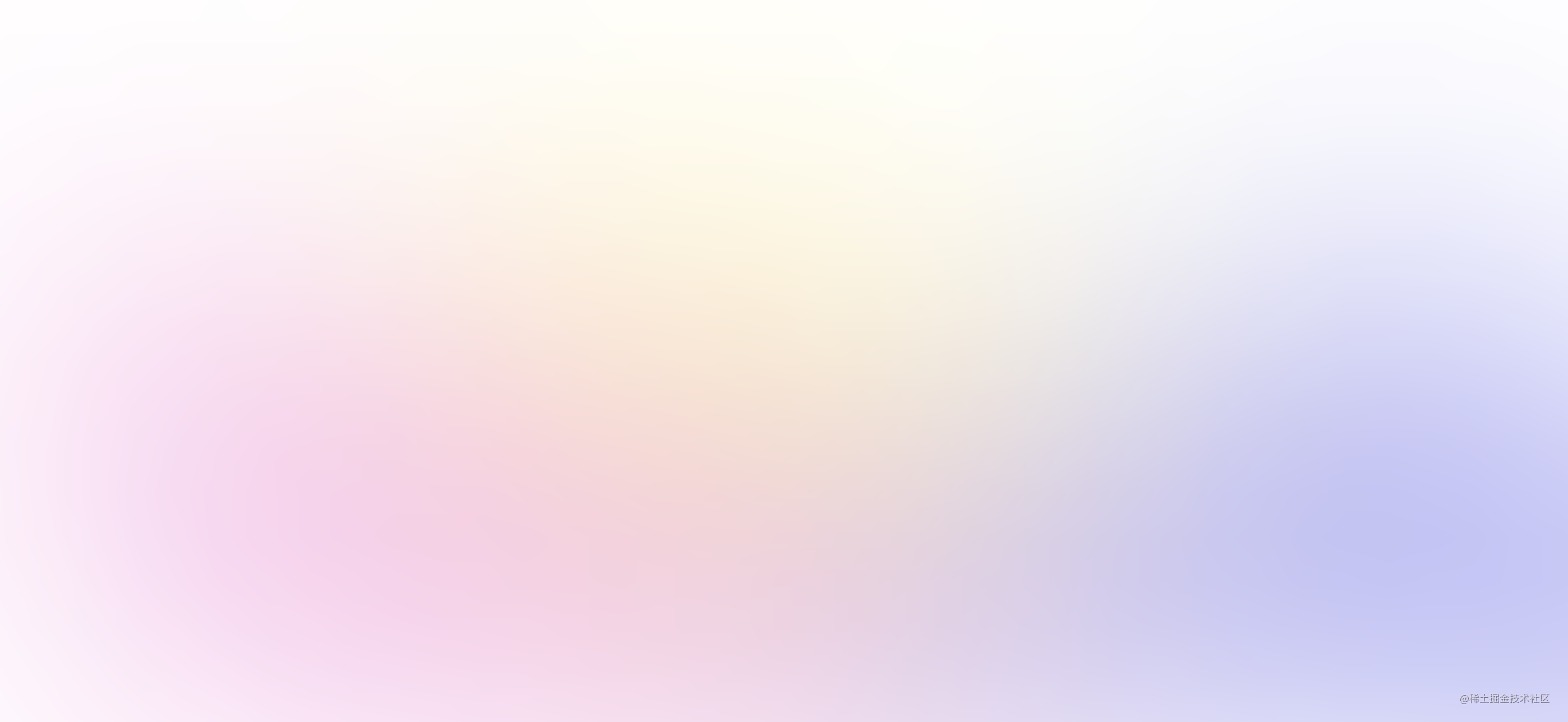
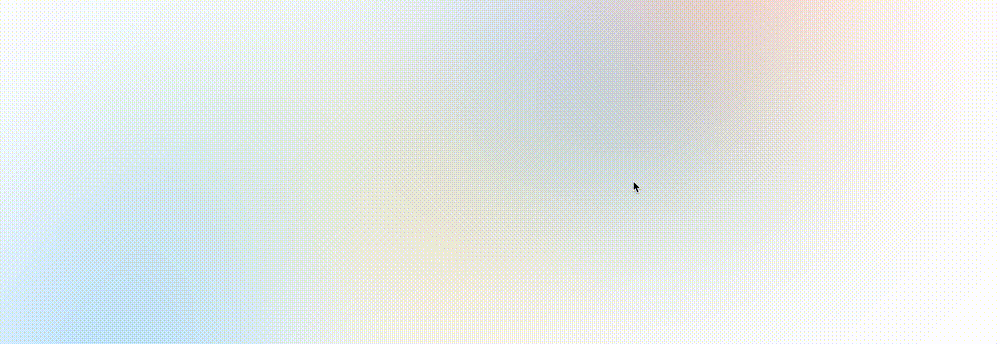
Recently, a low code platform in our company was completed and launched, and its home page is like this (data desensitization):

Peel off the content elements of the page and leave only the background, which is roughly as follows:
At first, it was intended to cut the picture, but when you think about it carefully, this effect can also be made very easily using CSS. This paper discusses:
- How to use CSS to make the gradient background of frosted (ground glass) texture effect as shown above
- How to use CSS doodle tool to batch produce the effect picture with animation effect
Implement gradient graph
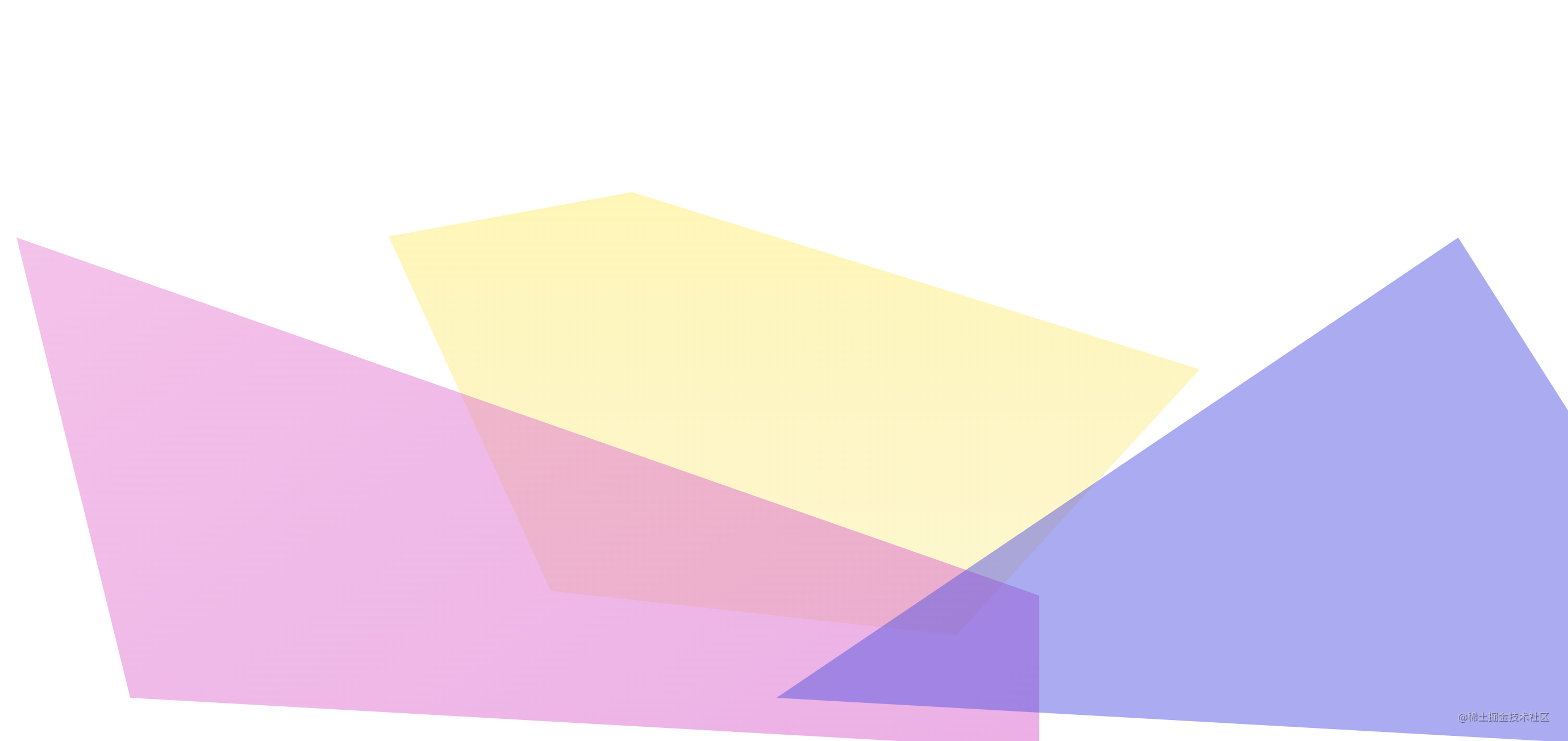
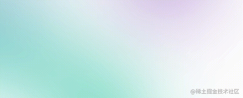
The above background effect seems complex, but it is actually very simple. It is:
Multi block irregular gradient background + Gaussian blur mask
In CSS, it can be realized with the help of background + backdrop filter: blur().
Remove the Gaussian blur mask superimposed on the top, and the elements behind it are actually very simple and clear. Maybe it's just this:
Here is a simple list of codes. We use three div s to realize three gradient graphs. Each graph is randomly cut into irregular polygons using clip path:
<div class="g-bg">
    <div class="g-polygon g-polygon-1"></div>
    <div class="g-polygon g-polygon-2"></div>
    <div class="g-polygon g-polygon-3"></div>
</div>
.g-polygon {
position: absolute;
opacity: .5;
}
.g-polygon-1 {
// Positioning code, the height and width of the container are optional
background: #ffee55;
clip-path: polygon(0 10%, 30% 0, 100% 40%, 70% 100%, 20% 90%);
}
.g-polygon-2 {
// Positioning code, the height and width of the container are optional
background: #E950D1;
clip-path: polygon(10% 0, 100% 70%, 100% 100%, 20% 90%);
}
.g-polygon-3 {
// Positioning code, the height and width of the container are optional
background: rgba(87, 80, 233);
clip-path: polygon(80% 0, 100% 70%, 100% 100%, 20% 90%);
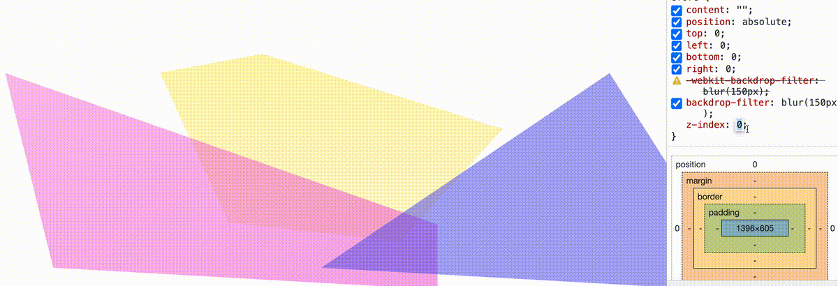
}Realization of Gaussian blur mask using backdrop filter
Next, the key to this step is to use the backdrop filter to realize Gaussian blur mask. The key line is backdrop filter: blur (150px)
.g-bg::before {
        content: "";
        position: fixed;
        top: 0; left: 0; bottom: 0; right: 0;
        backdrop-filter: blur(150px);
        z-index: 1;
    }
}
In this way, we realize the gradient background image of ground glass texture effect as shown in the above figure:
The recorded Gif image looks a little mushy. You can poke here and click DEMO to view it-- CodePen Demo -- Frosted glass background effect
Note that the backdrop filter: blur() is used here instead of filter: blur(). If you have any doubts about the choice of these two filters, you can see my explanation in this article-- Further discuss the similarities and differences between filter and backdrop filter
With the help of CSS doodle tool, this effect can be produced in batches
After a brief understanding of the principle, we can try to generate this effect in batch with the help of CSS doodle.
CSS doodle is a library based on Web component. It allows us to quickly create pages based on CSS Grid layout, and provides various convenient instructions and functions (random, loop, etc.), so that we can get different CSS effects through a set of rules. Those interested can hit the official website to understand-- CSS-doodle
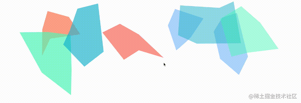
The code is very simple and easy to understand, that is, several graphics of different sizes, positions, colors and forms of random scenes:
<css-doodle>
    :doodle {
        @grid: 1x8 / 100vmin;
    }
    @place-cell: center;
    width: @rand(40vmin, 80vmin);
    height: @rand(40vmin, 80vmin);
    transform: translate(@rand(-200%, 200%), @rand(-60%, 60%)) scale(@rand(.8, 1.8)) skew(@rand(45deg));
    clip-path: polygon(
      @r(0, 30%) @r(0, 50%),
      @r(30%, 60%) @r(0%, 30%),
      @r(60%, 100%) @r(0%, 50%),
      @r(60%, 100%) @r(50%, 100%),
      @r(30%, 60%) @r(60%, 100%),
      @r(0, 30%) @r(60%, 100%)
    );
    background: @pick(#f44336, #e91e63, #9c27b0, #673ab7, #3f51b5, #60569e, #e6437d, #ebbf4d, #00bcd4, #03a9f4, #2196f3, #009688, #5ee463, #f8e645, #ffc107, #ff5722, #43f8bf);
    opacity: @rand(.3, .8);
</css-doodle>
The above code will randomly generate such a pattern (GIF can't see the click effect of the mouse, and each switch is a manual switch by clicking on the page):
OK, with the mask and the effect, we can generate the above background effect in batch:
If required, combined with hue rotate and simple displacement, we can even make the gradient background animation more vivid:
<css-doodle>
    // ditto...
    position: relative;
    top: @rand(-80%, 80%);
    left: @rand(-80%, 80%);
    animation: colorChange @rand(6.1s, 16.1s) infinite @rand(-.5s, -2.5s) linear alternate;

  @keyframes colorChange {
    100% {
      left: 0;
      top: 0;
      filter: hue-rotate(360deg);
    }
  }
</css-doodle>
In this way, we get the frosted glass gradient background with animation:
GIF screenshot effect is poor. You can click here for complete code and effect experience-- CodePen Demo -- CSS-doodle Pure CSS Background Effect
last
Well, that's the end of this article. I hope this article will help you 😃
More wonderful CSS technical articles are summarized in my Github -- iCSS , continuously updated, welcome to a star collection.
If you have any questions or suggestions, you can communicate more. The original articles are limited in writing and lack of talent and learning. If there is anything wrong in the article, please let me know.