
Since the release of Material Design in Google I/O 2014, the design language has been perfected. Material Design is one of my favorite designs. In the project, I will use the control of Material Design as much as possible.
Here's a brief introduction to Material Design control in "Encyclopedia of Ice and Fire".
Sideslip menu
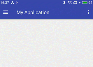
APP needs a place to switch content and settings. Side-slip menu is the best choice. In the past, we used third-party controls like Sliding Menu to implement side-sliding menus. With the release of Design Library, we have official side-sliding menus.
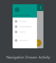
When you create a new project in Android Studio, you can directly select a template with a sideslip menu:
If no template is selected, remember to add the dependencies of the design library to build.gradle:
compile "com.android.support:design:${SUPPORT_LIB_VERSION}"DrawerLayout
Let's look at the layout of the home page.
<?xml version="1.0" encoding="utf-8"?>
<android.support.v4.widget.DrawerLayout
    xmlns:android="http://schemas.android.com/apk/res/android"
    xmlns:app="http://schemas.android.com/apk/res-auto"
    xmlns:tools="http://schemas.android.com/tools"
    android:id="@+id/drawer_layout"
    android:layout_width="match_parent"
    android:layout_height="match_parent"
    android:fitsSystemWindows="true"
    tools:openDrawer="start">

    <include
        layout="@layout/app_bar_main"
        android:layout_width="match_parent"
        android:layout_height="match_parent" />

    <android.support.design.widget.NavigationView
        android:id="@+id/nav_view"
        android:layout_width="wrap_content"
        android:layout_height="match_parent"
        android:layout_gravity="start"
        android:fitsSystemWindows="true"
        app:headerLayout="@layout/nav_header_main"
        app:menu="@menu/activity_main_drawer" />

</android.support.v4.widget.DrawerLayout>
Drawer Layout contains the main view and the sideslip menu, responsible for controlling the effect of the sideslip. Navigation View is our sideslip menu.
If you use ToolBar, and you want to achieve the status of the sideslip menu and the buttons on the ToolBar, like this:
The following code can be added to initialization:
ActionBarDrawerToggle toggle = new ActionBarDrawerToggle(
        this,
        drawerLayout,
        toolbar,
        R.string.navigation_drawer_open,
        R.string.navigation_drawer_close);
drawerLayout.addDrawerListener(toggle);
toggle.syncState();
NavigationView
From the layout attributes of Navigation View, it consists of header Layout and menu list menu.
Header Layout is a common layout. It usually uses gradient colors or pictures as background to display program name or user information.
The menu list below requires the introduction of a menu configuration file, which I wrote as follows:
<?xml version="1.0" encoding="utf-8"?>
<menu xmlns:android="http://schemas.android.com/apk/res/android"
    xmlns:app="http://schemas.android.com/apk/res-auto">

    <group android:checkableBehavior="single">
        <item
            android:id="@+id/nav_person"
            android:checked="true"
            android:icon="@drawable/menu_person"
            android:title="character" />
        <item
            android:id="@+id/nav_house"
            android:icon="@drawable/menu_house"
            android:title="family" />
        <item
            android:id="@+id/nav_history"
            android:icon="@drawable/menu_history"
            android:title="History" />
        <item
            android:id="@+id/nav_castles"
            android:icon="@drawable/menu_castle"
            android:title="Castle" />
        <item
            android:id="@+id/nav_night"
            android:checkable="false"
            android:icon="@drawable/menu_bulb"
            android:title="Night mode"
            app:actionLayout="@layout/menu_switch" />
    </group>

</menu>
The first four items are radio buttons for switching between different types of display.
The last item is the night mode switch button. It is non-clickable and introduces another layout through action Layout, which is a switch control, SwitchCompat.
Listener
Setting up a listener for Navigation View enables click-and-listen on the sidebar menu:
navigationView.setNavigationItemSelectedListener(new NavigationView.OnNavigationItemSelectedListener() {
    @Override
    public boolean onNavigationItemSelected(@NonNull MenuItem item) {
        switch (item.getItemId()) {
            case R.id.nav_person:
                //...
                break;
            case R.id.nav_night:
                boolean isChecked = switchCompat.isChecked();
                switchCompat.setChecked(!isChecked);
                break;
        }
    return true;
    }
});
By the way, the acquisition of switchCompat here is:
Menu menu = navigationView.getMenu();
MenuItem nightItem = menu.findItem(R.id.nav_night);
View nightView = MenuItemCompat.getActionView(nightItem);
SwitchCompat switchCompat = (SwitchCompat) nightView.findViewById(R.id.switch_compat);
That's all for the sideslip menu code. Let's see how it works.

Tag Tab
In the past, only third-party libraries were needed to achieve the top tab bar. Now with TabLayout, this effect can be easily achieved.
The layout is as follows:
<android.support.design.widget.TabLayout
    android:id="@+id/tab_layout"
    android:layout_width="match_parent"
    android:layout_height="wrap_content"
    app:tabMode="scrollable"
    app:theme="@style/ThemeOverlay.AppCompat.Dark" />
Set tabMode to scrollable so that when the width of the label bar exceeds the occupied width, it can scroll, otherwise all the labels will be compressed in the occupied width.
We know that tabs are to be used with ViewPager, so just add a word to initialize them together:
tabLayout.setupWithViewPager(viewPager)
It's so simple that it implements another function:

Drop-down refresh
I believe many people have been exposed to third-party drop-down refresh controls like PullToRefresh. Now let's take a look at Material Design's drop-down refresh SwipeRefresh Layout.
In the layout, the SwipeRefreshLayout package is used to implement the drop-down refresh area. When you drop-down at the top, a load box will appear and the onRefresh method of the listener will be triggered. Let's listen to the drop-down refresh in this way:
swipeRefreshLayout.setOnRefreshListener(new SwipeRefreshLayout.OnRefreshListener() {
    @Override
    public void onRefresh() {
        load();
    }
};
You can actively start or stop refreshing through the setRefreshing method.
The results are as follows:

Collapsible title bar
In APP, there is often a title bar for displaying page titles, placing search or setting buttons. Its role is self-evident, but it has always occupied a fixed area in an inch of screen. Now, we can fold up the title bar at the right time. Here are a few of the controls involved.
Toolbar
After the development of TitleBar and ActionBar, now we use Toolbar to realize the title bar:
<android.support.v7.widget.Toolbar
    android:id="@+id/toolbar"
    android:layout_width="match_parent"
    android:layout_height="?attr/actionBarSize"/>
Initialize in code:
setSupportActionBar(toolbar);
ActionBar actionBar = getSupportActionBar();
if (actionBar != null) {
    // Set the left button to click
    actionBar.setDisplayHomeAsUpEnabled(true);
}
AppBarLayout
AppBarLayout inherits from LinerLayout and supports sliding. To make the Toolbar respond to the folding effect, you need to use AppBarLayout as the parent layout of the Toolbar.
Controls wrapped in AppBarLayout can set a layout_scrollFlags property, which is the type of sliding fold. I set up Toolbar
app:layout_scrollFlags="scroll|enterAlways"When a page is scrolled up and down, the Toolbar scrolls up and down together until it is completely hidden or fully displayed.
CoordinatorLayout
AppBarLayout alone is not good, but also with Coordinator Layout to achieve folding effect. Coordinator Layout acts as a top-level layout to coordinate the interaction between its sub-layouts.
Combining the above controls, the final layout is as follows:
<?xml version="1.0" encoding="utf-8"?>
<android.support.design.widget.CoordinatorLayout
    xmlns:android="http://schemas.android.com/apk/res/android"
    xmlns:app="http://schemas.android.com/apk/res-auto"
    android:layout_width="match_parent"
    android:layout_height="match_parent">

    <android.support.design.widget.AppBarLayout
        android:id="@+id/appbar_layout"
        android:layout_width="match_parent"
        android:layout_height="wrap_content">

        <android.support.v7.widget.Toolbar
            android:id="@+id/toolbar"
            android:layout_width="match_parent"
            android:layout_height="?attr/actionBarSize"
            app:layout_scrollFlags="scroll|enterAlways" />

        <android.support.design.widget.TabLayout
            android:id="@+id/tab_layout"
            android:layout_width="match_parent"
            android:layout_height="wrap_content"
            app:tabMode="scrollable"
            app:theme="@style/ThemeOverlay.AppCompat.Dark" />

    </android.support.design.widget.AppBarLayout>

    <android.support.v4.widget.SwipeRefreshLayout
        android:id="@+id/swipe_refresh_layout"
        android:layout_width="match_parent"
        android:layout_height="wrap_content"
        app:layout_behavior="@string/appbar_scrolling_view_behavior">

        <android.support.v4.view.ViewPager
            android:id="@+id/view_pager"
            android:layout_width="match_parent"
            android:layout_height="match_parent"/>

    </android.support.v4.widget.SwipeRefreshLayout>

</android.support.design.widget.CoordinatorLayout>
To implement a control that interacts with Toolbar, you need to implement the NestedScrollingChild interface and configure "app:layout_behavior="@string/appbar_scrolling_view_behavior". Commonly used controls here are SwipeRefreshLayout, NestedScrollView, RecyclerView.
Basically all of them are layout codes, which can achieve this effect:

CollapsingToolbarLayout
In addition to simply retrieving the Toolbar, you can also achieve the cool effect of converting image shrinkage into Toolbar. To achieve this effect, you need to use Collapsing Toolbar Layout to wrap ImageView and Toolbar:
<?xml version="1.0" encoding="utf-8"?>
<android.support.design.widget.CoordinatorLayout
    xmlns:android="http://schemas.android.com/apk/res/android"
    xmlns:app="http://schemas.android.com/apk/res-auto"
    android:layout_width="match_parent"
    android:layout_height="match_parent">

    <android.support.design.widget.AppBarLayout
        android:layout_width="match_parent"
        android:layout_height="200dp">

        <android.support.design.widget.CollapsingToolbarLayout
            android:id="@+id/collapsing_toolbar"
            android:layout_width="match_parent"
            android:layout_height="match_parent"
            app:layout_scrollFlags="scroll|exitUntilCollapsed">

            <ImageView
                android:id="@+id/image_view"
                android:layout_width="match_parent"
                android:layout_height="match_parent"
                android:scaleType="centerCrop"
                app:layout_collapseMode="parallax" />

            <android.support.v7.widget.Toolbar
                android:id="@+id/toolbar"
                android:layout_width="match_parent"
                android:layout_height="?attr/actionBarSize"
                app:layout_collapseMode="pin" />

        </android.support.design.widget.CollapsingToolbarLayout>

    </android.support.design.widget.AppBarLayout>

    <android.support.v4.widget.NestedScrollView
        android:id="@+id/scroll"
        android:layout_width="match_parent"
        android:layout_height="match_parent"
        app:layout_behavior="@string/appbar_scrolling_view_behavior">

        <WebView
            android:id="@+id/web_view"
            android:layout_width="match_parent"
            android:layout_height="match_parent" />

    </android.support.v4.widget.NestedScrollView>

</android.support.design.widget.CoordinatorLayout>
Controls in CollapsingToolbarLayout need to set the layout_collapseMode property with optional values:
- Parallax Parallax mode, parallax folding effect as page scrolls
- pin Fixed Mode, Fully Folded and Fixed Display
The results are as follows:

Card view
In Material Design, there is a concept called "card", and CardView is the direct embodiment of this concept.
CardView is actually a MD-style FrameLayout, which has ripple clicks, rounded corners and z-axis height (shadows).
When using it, remember to add dependencies:
compile "com.android.support:cardview-v7:${SUPPORT_LIB_VERSION}"The usage is the same as FrameLayout. The following example sets the click effect of water ripple and the height of rounded corners and z axis:
<android.support.v7.widget.CardView
    android:layout_width="match_parent"
    android:layout_height="wrap_content"
    android:layout_margin="10dp"
    android:foreground="?attr/selectableItemBackground"
    app:cardCornerRadius="5dp"
    app:cardElevation="5dp">

    <!--...-->

</android.support.v7.widget.CardView>
Shared Element Animation
In Material Design, it is hoped that the jump of the page will have some coherence.
If Page A and Page B have the same element, after Android 5.0, we can implement an over-the-counter animation called shared element, which will change from the position of Page A to the position of Page B.
In Encyclopedia of Ice and Fire, you can do this by showing a picture of a person on both the home list and the details page.
The ImageView on the details page configures a transitionName, which is an identifier for element transformation:
<ImageView
    android:id="@+id/image_view"
    android:layout_width="match_parent"
    android:layout_height="match_parent"
    android:scaleType="centerCrop"
    android:transitionName="tran_01"/>
The code that jumps on the home page is modified to read as follows:
Pair[] pairs = new Pair[]{new Pair(binding.ivImg, "tran_01")};
ActivityOptionsCompat options = ActivityOptionsCompat.makeSceneTransitionAnimation(mainActivity, pairs);
ActivityCompat.startActivity(context, intent, options.toBundle());
This is the effect of shared elements:

Summary
By writing "Encyclopedia of Ice and Fire", some common controls of Material Design are summarized. But here we only talk about the basic usage of each control. For a deeper understanding, you need to read the relevant articles.
I don't know much about design, but with these controls, Ice and Fire Encyclopedia looks good.~