As Vue, which has topped the list of popular frameworks in recent five years, you will learn part of the use of components. The modularization of front-end development can make the code logic simpler and clearer, and greatly enhance the scalability of the project. For Vue, the embodiment of modularity focuses on components, and modularization is realized by components.
Usually, we use components through Vue. Before instantiating Vue objects Component method to register global components.
// Tell Vue that the todo item component is now required. The configuration is as follows, including props and template
Vue.component('todo-item', {
  props: ['todo'],
  template: '<li>{{ todo.text }}</li>'
})
// Instantiate a Vue object, mount it under the #app-7 element, and determine its attribute, array groceryList
var app7 = new Vue({
  el: '#app-7',
  data: {
    groceryList: [
      { text: 'Vegetables' },
      { text: 'Cheese' },
      { text: 'Whatever else humans are supposed to eat' }
    ]
  }
})
Among many components, as a necessary electronic form for office, it also occupies an important position in the front-end components. In addition to displaying data in the form of tables, spreadsheet also has a very important function, that is, it supports user-defined function expansion and various customized data display effects, such as checkbox, Radio button, etc; You also need to achieve the effect of using the drop-down menu (or other input controls) when the cell enters the editing state. We call it "custom cell", a component embedded in a component. SpreadJS currently has 8 drop-down lists. Before opening the list, we only need to set the option data in the cell style. You can refer to the following code usage list:
  // The way of click the dropdown icon to open list.
   var style = new GC.Spread.Sheets.Style();
   style.cellButtons = [
       {
           imageType: GC.Spread.Sheets.ButtonImageType.dropdown,
           command: "openList",
           useButtonStyle: true,
       }
   ];
   style.dropDowns = [
       {
           type: GC.Spread.Sheets.DropDownType.list,
           option: {
               items: [
                   {
                       text: 'item1',
                       value: 'item1'
                   },
                   {
                       text: 'item2',
                       value: 'item2'
                   },
                   {
                       text: 'item3',
                       value: 'item3'
                   },
                   {
                       text: 'item4',
                       value: 'item4'
                   }
               ],
           }
       }
   ];
   sheet.setText(2, 1, "Vertical text list");
   sheet.setStyle(3, 1, style);

   // The way open list with command rather then clicking the dropdown button.
   spread.commandManager().execute({cmd:"openList",row:3,col:1,sheetName:"Sheet1"});

Front end spreadsheet Although it is easy to use, due to the problems of framework life cycle and custom cell rendering logic, the current technical means can not directly use the components under the framework through template under the framework page. In the previous content, we mentioned that Svelte can be used to encapsulate components that can be used by other components using web components.
In addition to the methods mentioned above, if we want to use custom cells in Vue environment, we can consider using dynamic rendering to create and mount components, so as to inject components into custom cells.
The following is a demonstration of how to create a user-defined cell using VUE components in a VUE project.
practice
First, turn on runtime loading in the project, in Vue config. JS to add runtimeCompiler: true.
    module.exports = {
        devServer: {
            port: 3000
        },
        <font color="#ff0000">runtimeCompiler: true</font>
      }
When referring to ElementUI, it should be noted that the css reference of element should be placed before APP import, so that the style can be modified to overwrite the original project content.
import Vue from 'vue'
import ElementUI from 'element-ui';
import 'element-ui/lib/theme-chalk/index.css';
import App from './App.vue'
import router from './router'

Vue.use(ElementUI);

new Vue({
  el: '#app',
  router,
  render: h => h(App)
})

Vue.config.productionTip = false
To create autocompletecelltype, the specific code is as follows. There are several points to pay attention to.
1. For customized elements, gcUIElement attribute needs to be added. If the element or its parent element does not have this attribute, click the created component to exit the editing state directly and cannot be edited.
For the autocomplete of ElementUI, the content of the default drop-down option is injected into the body. You need to set Popper append to body = "false" in the component template to make the pop-up drop-down option render in the Div of gcUIElement.
If other components do not have similar options, you can also follow up the actual situation and add the gcUIElement attribute when popping up.
2. This. Using dynamically mounted components VM sets and gets the value of the cell.
3. Destroy the component in the deactivate editor.
import Vue from 'vue'
import * as GC from "@grapecity/spread-sheets"
import DataService from './dataService'

function AutoComplateCellType() {
}
AutoComplateCellType.prototype = new GC.Spread.Sheets.CellTypes.Base();
AutoComplateCellType.prototype.createEditorElement = function (context, cellWrapperElement) {
  cellWrapperElement.style.overflow = 'visible'
  let editorContext = document.createElement("div")
  editorContext.setAttribute("gcUIElement", "gcEditingInput");
  let editor = document.createElement("div");
  // The editorContext in the user-defined cell is used as a container. You need to create a child for mounting. It cannot be directly mounted to the editorContext
  editorContext.appendChild(editor);
  return editorContext;
}
AutoComplateCellType.prototype.activateEditor = function (editorContext, cellStyle, cellRect, context) {
    let width = cellRect.width > 180 ? cellRect.width : 180;
    if (editorContext) {

        // Dynamically create VUE components and mount them to the editor
        const AutoCompleteComponent = {
            props: ['text','cellStyle'],
            template: `<div>
                        <el-autocomplete
                        :style="cellStyle"
                        popper-class="my-autocomplete"
                        v-model="text"
                        :fetch-suggestions="querySearch"
                        placeholder="Please enter the content"
                        :popper-append-to-body="false"
                        value-key="name"
                        @select="handleSelect">
                        <i class="el-icon-edit el-input__icon"
                            slot="suffix"
                            @click="handleIconClick">
                        </i>
                        <template slot-scope="{ item }">
                            <div class="name">{{ item.name }}</div>
                            <span class="addr">{{ item.phone }}</span>
                        </template>
                        </el-autocomplete>
                    </div>`,
            mounted() {
                this.items = DataService.getEmployeesData();
            },
            methods: {
                querySearch(queryString, cb) {
                    var items = this.items;
                    var results = queryString ? items.filter(this.createFilter(queryString)) : items;
                    // Unable to set the location of dynamic content. gcUIElement can be added dynamically
                    // setTimeout(() => {
                    //   let popDiv = document.getElementsByClassName("my-autocomplete")[0];
                    //   if(popDiv){
                    //     popDiv.setAttribute("gcUIElement", "gcEditingInput");
                    //   }
                    // }, 500);
                    // Call callback to return the data of the suggestion list
                    cb(results);
                },
                createFilter(queryString) {
                    return (restaurant) => {
                    return (restaurant.name.toLowerCase().indexOf(queryString.toLowerCase()) === 0);
                    };
                },
                handleSelect(item) {
                    console.log(item);
                },
                handleIconClick(ev) {
                    console.log(ev);
                }
            }
        };

      // create component constructor
      const AutoCompleteCtor = Vue.extend(AutoCompleteComponent);
      this.vm = new AutoCompleteCtor({
        propsData: {
          cellStyle: {width: width+"px"}
        }
      }).$mount(editorContext.firstChild);
    }
    return editorContext;
};
AutoComplateCellType.prototype.updateEditor = function(editorContext, cellStyle, cellRect) {
    // Given a minimum edit area size
    let width = cellRect.width > 180 ? cellRect.width : 180;
    let height = cellRect.height > 40 ? cellRect.height : 40;
    return {width: width, height: height};
};
AutoComplateCellType.prototype.getEditorValue = function (editorContext) {
    // Set component defaults
    if (this.vm) {
        return this.vm.text;
    }
};
AutoComplateCellType.prototype.setEditorValue = function (editorContext, value) {
    // Gets the edited value of the component
    if (editorContext) {
      this.vm.text = value;
    }
};
AutoComplateCellType.prototype.deactivateEditor = function (editorContext, context) {
    // Destroy components
    this.vm.$destroy();
    this.vm = undefined;
};

export {AutoComplateCellType};
The effect is shown in the figure:
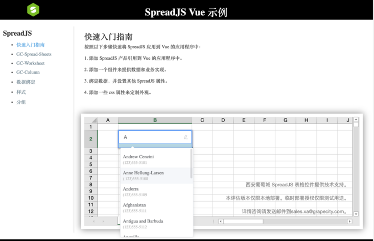
A perfect cell is freshly baked~

The method introduced here is only one of many implementation schemes. If you have other better ideas and methods, welcome to discuss them together~
If you are interested in more interesting features in front-end spreadsheets, you can check it out More examples of SpreadJS.
We will continue to bring you more serious and interesting content in the future~