CSS advanced (I) background and border
1, Browser prefix
- Firefox: -moz-
- IE: -ms-
- Opera: -o-
- Safari,Chrome: -webkit-
2, CSS coding skills
1. Minimize code duplication (reusability)
(1) When some values depend on each other, their relationship should be expressed in code
Example: the effect of a button
//not changed
padding:6px 16px;
background:#58a linear-gradient(#77a0bb,#58a);
color:white;
text-shadow:0 -1px 1px #335166;
font-size: 20px;
line-height:30px;
The maintainability of this code is poor, because if we want to change the font size, we have to adjust the line height at the same time, and other effects have to change the size accordingly. If it is modified to the following form, all styles of buttons can be controlled in one place
//After modification
padding: .3em .8em;
background:#58a linear-gradient(#77a0bb,#58a);
color:white;
text-shadow:0 -.05px .05px #335166;
font-size: 125%;
line-height:1.5;
Supplement: knowledge of em and rem
- em: the font size is associated with other sizes and the font size of the parent
- rem: font size and other sizes are associated with root < HTML > font size
(2) Sometimes, you can't have both easy code maintenance and less code
Example: add a 10px wide border to an element when there is no border on the left
//Less code
border-width: 10px 10px 10px 0px;
//The code is easy to maintain and better readable
border-width: 10px;
border-left-width:0;
(3)currentColor
Is a variable. currentColor itself is the initial value of many CSS colors. Such as: border color, outline color, text shadow, box shadow
Example: make all horizontal split lines < HR > automatically consistent with the text color
hr {
	height: .5em;
	background: currentColor;
}
(4) Inherit
Inherits from the parent element. For a pseudo element, the host element of the pseudo element is generated
2. Trust your eyes, not numbers
3. Responsive Web Design
A. Media query
Media queries cannot fix problems in a continuous manner, Its working principle is based on several specific substitutions ("breakpoints"), and the breakpoints of media query should not be determined by specific devices, but by the design itself. If most style codes are not written in an elastic way, what media query can do is to fix specific problems at a specific resolution.
tips to avoid unnecessary media queries:
Overall: try your best to achieve elastic and scalable layout, and specify the corresponding size in each breakpoint interval of media query.
- Replace fixed length with percentage length. If you can't, you should also try to use viewport related units (vw, vh, vmin, vmax)
- When you need to get a fixed width at a larger resolution, use max width instead of width, because it can adapt to a smaller resolution without using media query.
- Don't forget to set a max width value of 100% for replacement elements (such as img, object, video, iframe, etc.).
- If the background image needs to be completely covered with a container, the background size: cover attribute can be used no matter how the size of the container changes. But we also need to remember that the bandwidth is not unlimited, so it is unwise to shrink a large picture through CSS in mobile web pages.
- When pictures (or other elements) are arranged in a determinant, let the width of the viewport determine the number of columns. This can be achieved by * * elastic box layout or display: inline block * * plus conventional text folding behavior.
- When using multi column text, specify column width instead of column count so that it can be automatically displayed as a single column layout on a smaller screen
3, Border
Relevant official specifications: http://w3.org/TR/css3-background
css basic UI features: http://w3.org/TR/css3-ui
1. HSLA color
H (Hue): for Hue, S (Saturation): for Saturation, L (Lightness): for brightness, A (Alpha): for opacity
-
H is chromaticity, and the value is between 0 degrees and 360 degrees. 0 degrees is red, 120 degrees is green and 240 degrees is blue. 360 degrees is also red.
-
S is the saturation, the purity of the color, and is a percentage value. The value is 0% ~ 100%. 0% saturation is the lowest and 100% saturation is the highest
-
L is the brightness and a percentage value. The value is 0% ~ 100%, 0% is the darkest and 100% is the brightest.
-
A is opacity, the value is 0.0 ~ 1.0, 0.0 is completely transparent and 1.0 is completely opaque.
2. Translucent border
In css2, by default, the background extends to the lower layer of the area where the border is located. In css3, in order to solve this problem, the background clip attribute is introduced to adjust. The initial value of the attribute is border box: the background is cut off by border box. If you don't want the background to invade the range of the border, the attribute value is set to padding box, so that the browser will cut off the background with the outer edge of the inner margin
example:
border: 10px solid hsla(0,0%,100%,.5);
background:white;
background-clip: padding-box;
3. Multiple borders
(1) Box shadow scheme
box-shadow: h-shadow v-shadow blur spread color inset;
- h-shadow: position of horizontal shadow
- v-shadow: position of vertical shadow
- Blur: blur value
- spread: expand the radius (make the shadow area larger or smaller)
- inset: change external shadow to internal shadow
Solution: box shadow supports comma splitting syntax and realizes multiple borders by creating any number of projections.
background: yellowgreen;
box-shadow: 0 0 0 10px #655,
			0 0 0 15px deeppink,
			0 2px 5px 15px rgba(0,0,0,.6);//Add shadows outside the border
be careful:
-
Box shadow is stacked layer by layer, and the first layer projection is located at the top layer, and so on.
-
The behavior of projection is not completely consistent with the root border, because it does not affect the layout and is not affected by box sizing. However, the space required by the border can be simulated through the inner and outer margins.
-
Disadvantages: if you want to produce a dotted border effect, box shadow doesn't work
(2) outline scheme
Two layers of border = one layer of regular border + outline attribute to generate the outer border
background: yellowgreen;
border:10px solid %655;
outline:5px solid deeppink; //Outermost layer
advantage:
- You can control the distance between it and the edge of the element through the outline offset attribute, and you can even receive negative values. It is very useful for effects such as sewing edges
be careful:
- Outline * * is only applicable to scenes with double-layer "borders" * * because outline cannot accept multiple values separated by commas. If we need more layers, we can only use the box shadow scheme
- The border does not necessarily fit the rounded corner generated by the border radius attribute. Therefore, if the element is rounded, the stroke may still be right angle. This is a bug and cannot be handled at present
4, Flexible background positioning
css value and unit: http://w3.org/TR/css-values
Problem background: css2 can only specify the offset from the upper left corner. You want a certain gap between the picture and the corner of the container, or it is difficult to offset the background picture for a corner (lower right corner)
1. Extended syntax scheme of background position
css3 allows you to specify the offset of the background picture from any angle, just specify the keyword in front of the offset
background-position: right 20px bottom 10px
// Maintain an offset of 20px from the right edge and 10px from the bottom edge
Plus fallback scheme:
background: url() no-repeat bottom right #58a;
background-position: right 20px bottom 10px;
2. Background origin scheme
By default, the background position is based on the padding box, so that the border will not cover the background picture. Background origin can change the default value of padding box. If it is changed to content box, using the corner keyword in the background position attribute will take the edge of the content box as the benchmark (that is, the offset of the background picture from the corner is consistent with the inner margin):
padding:  10px;
background: url() no-repeat #58a bottom right / * or 100% * /;
background-origin: content-box;
3. calc() scheme
background: url() no-repeat bottom right #58a;
background-position: calc(100% - 20px) calc(100% - 10px);
//Upper left corner offset
5, Border fillet
Problem background: sometimes you need a container with rounded corners on the inside, while the four corners of the border or stroke still maintain a right angle on the outside. How can you achieve the effect with only one element?
Solution
background: tan;
border-radius: .8em;
padding:1em;
box-shadow:0 0 0 .6em #655;
outline: .6em solid #655;
The stroke will not follow the rounded corner of the element (thus showing a right angle), but the box shadow will follow the rounded corner. Therefore, if the two are superimposed together, the box shadow will just fill the gap between the stroke and the rounded corner of the container.
be careful:
- The extension radius needs to be smaller than the width of the stroke
- The projected extension radius can be half of the fillet radius for convenience
6, Stripe background
css image: http://w3.org/TR/css-images
Supplement: angle perspective knowledge
The color gradient makes the direction from the center of the circle to the outside.
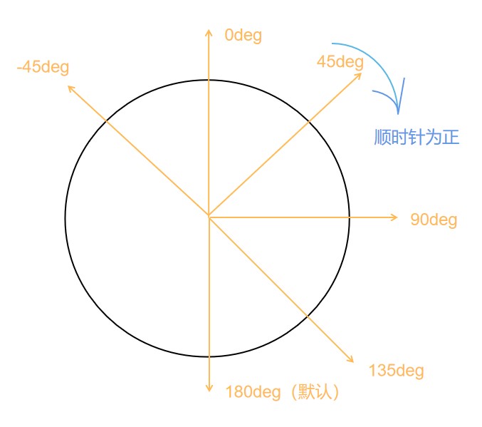
background:linear-gradient(#fb3 20%, #58a 80%)
It means that 20% of the area at the top of the container is filled with #fb3 solid color, and 20% at the bottom is filled with #58a solid color. The gradient appears in 60% of the area in the center of the container, that is, the gradient starts at 20% of the height and stops at 80% of the height
background:linear-gradient(#fb3 20%, #58a 80%)
There will be a sudden change of color without gradient
Because gradient is an image generated by code, we can treat it like any other background image. We can adjust the size. The background is tiled repeatedly by default.
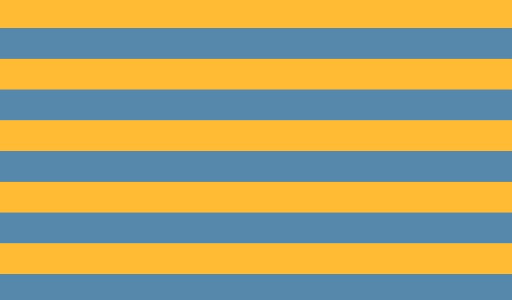
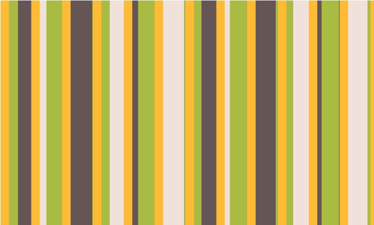
(1) Equal width stripe
background:linear-gradient(#fb3 20%, #58a 80%);
background-size:100% 30px;//15px per horizontal stripe
(2) Unequal stripe
The width ratio of two stripes of different colors is 3:7
//Method 1: modify two numbers at a time
background:linear-gradient(#fb3 30%, #58a 30%);
background-size:100% 30px;

//Method 2 (DRY)
background:linear-gradient(#fb3 30%, #58a 0);
background-size:100% 30px;
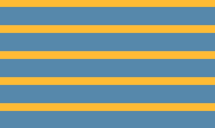
Important: if the position value of a color code is smaller than the position value of the color code before it in the whole list, the position value of the color code will be set to the maximum value of all the color code positions in front of it
(3) Multicolor stripes
background:linear-gradient(#fb3 33.3%, #58a 0,#58a 66.6%, yellowgreen 0);
background-size:100% 45px;
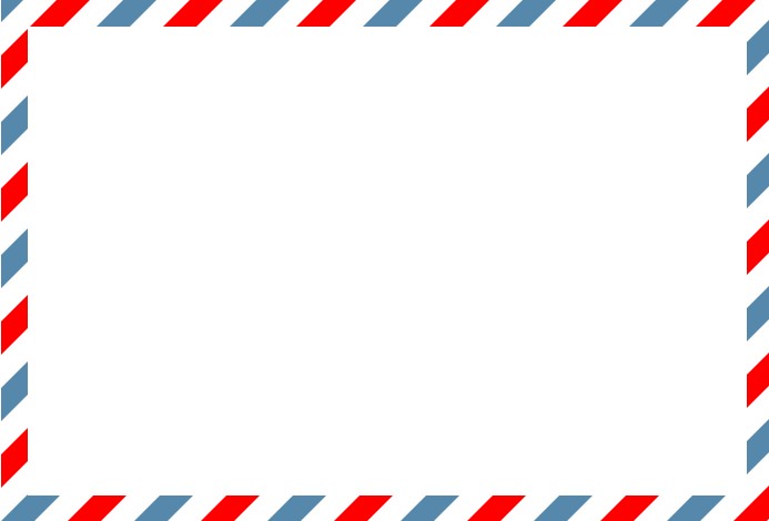
(4) Oblique stripe
Method 1: General

background:linear-gradient(45deg,#fb3 25%, #58a 0,#58a 50%,#fb3 0,#fb3 75%,#58a 0);
background-size:30px 30px;
be careful:
- At this time, the stripe width is not 15px as expected. To reach 15px, you need to
15 × 2 × √ 2 15×2×√2 15×2×√2
- If it is not 45deg, there will be a problem
Method 2: repeating linear gradient ()
The tilt angle can be changed
background: repeating-linear-gradient(45deg, #fb3 ,#fb3 15px,#58a 0 ,#58a 30px);

Equivalent to:
background:linear-gradient(45deg, #fb3 0, #fb3 25%, #58a 0, #58a 50%);
background-size:42.2px 42.2px;
background: repeating-linear-gradient(60deg, #fb3 ,#fb3 15px,#58a 0 ,#58a 30px);
(5) Homochromatic stripe

Instead of assigning a color to each stripe separately, the deepest color is assigned as the background color, and the translucent white stripe is superimposed on the background color to obtain a light stripe.
background: #58a;
background-image:repeating-linear-gradient(30deg,
                        hsla(0,0%,100%,.1),
						hsla(0,0%,100%,.1) 15px,
						transparent 0,transparent 30px);
7, Complex background pattern
CSS patterns can be regarded as a case worth using CSS preprocessor
1. Grid
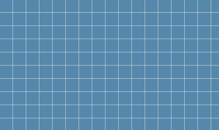
A. Standard grid
background: white;
background-image:linear-gradient(90deg,
					rgba(200,0,0,.5) 50%, transparent 0),
				 linear-gradient(
					rgba(200,0,0,.5) 50%, transparent 0);
background-size:30px 30px;
B. The grid size can be adjusted
Use length instead of percentage as the color scale
background: #58a;
background-image:linear-gradient(white 1px, transparent 0),
				 linear-gradient(90deg,
					white 1px, transparent 0);
background-size:30px 30px;
//A 30px grid pattern drawn with 1px white lines
C. Different lineweights + meshes of different colors
background: #58a;
background-image:linear-gradient(white 2px, transparent 0),
				 linear-gradient(90deg,
					white 2px, transparent 0),
				 linear-gradient(hsla(0,0%,100%,.3) 1px,
					transparent 0),
				 linear-gradient(90deg,hsla(0,0%,100%,.3) 						1px,transparent 0);
background-size:75px 75px,75px 75px,
				15px 15px,15px 15px;

2. Wave point
A. Ordinary
background:#655;
background-image:radial-gradient(tan 30%, transparent 0);
background-size:30px 30px;

B. Two layer wave point
background:#655;
background-image:radial-gradient(tan 20%, transparent 0),
				 radial-gradient(tan 20%, transparent 0);
background-size:30px 30px;
background-position:0 0,15px 15px;// 15=30/2
Note: in order to achieve the effect, the offset positioning value of the second layer background must be half of the patch width and height.

Preprocessing with scss:
@mixin polka($size,$dot,$base,$accent) {
    background:$base;
    background-image:
        radial-gradient($accent $dot,transparent 0),
    	radial-gradient($accent $dot,transparent 0);
    background-size:$size $size;
    background-position:0 0, $size/2 $size/2;
}
Called when in use:
@include polka(30px,30%,#655,tan);
3. Chessboard
Scalable vector graphics: http://w3.org/TR/SVG
Mixed mode: http://w3.org/TR/compositing-1
Bennett Feely Pattern Library: http://bennettfeely.com/gradients

Method 1: four layer gradient
background:#eee;
background-image:
	linear-gradient(45deg,#bbb 25%,transparent 0),
	linear-gradient(45deg,transparent 75%,#bbb 0),
	linear-gradient(45deg,#bbb 25%,transparent 0),
	linear-gradient(45deg,transparent 75%,#bbb 0);
background-position:0 0, 15px 15px, 15px 15px,30px 30px;
background-size:30px 30px;
Method 2: two-layer gradient
background:#eee;
background-image:
	linear-gradient(45deg,
					rgba(0,0,0,.25) 25%,transparent 0,
					transparent 75%, rgba(0,0,0,.25) 0),
	linear-gradient(45deg,
					rgba(0,0,0,.25) 25%,transparent 0,
					transparent 75%, rgba(0,0,0,.25) 0);
background-position:0 0, 15px 15px; //Horizontal coordinate
background-size:30px 30px;
Method 3: use preprocessor
@mixin checkerboard($size,$base,$accent:rgba(0,0,0,.25)){
    background:$base;
    background-image:
        linear-gradient(45deg,
        				$accent 25%,transparent 0,
						transparent 75%, $accent 0),
		linear-gradient(45deg,
						$accent 25%,transparent 0,
						transparent 75%, $accent 0);
    background-position:0 0, $size $size;
	background-size:2*$size 2*$size;
}
//When called
@include checkerboard(15px,#eee,tan);
Method 4: use SVG (shorter)
<svg xmlns="http://www.w3.org/2000/svg"
     width="100" heigth="100" fill-opacity=".25" >
    <rect x="50" width="50" height="50"/>
    <rect x="50" width="50" height="50"/>
</svg>
background:#eee url('data:image/svg+xml,\
	<svg xmlns="http://www.w3.org/2000/svg" \
     width="100" heigth="100" fill-opacity=".25" >\
    <rect x="50" width="50" height="50"/>\
    <rect y="50" width="50" height="50"/>\
	</svg>');
background-size:30px 30px;
8, Pseudorandom background
Example: random stripes
background:hsl(20,40%,90%);
background-image:
	linear-gradient(90deg, #fb3 11px, transparent 0),
	linear-gradient(90deg, #ab4 23px, transparent 0),
	linear-gradient(90deg, #655 41px, transparent 0);
background-size: 41px 100%,61px 100%,83px 100%;
Tile size: 41 × sixty-one × 83 = 207583 pixels
be careful:
- The size of the patch is the least common multiple of all background sizes. In order to maximize the least common multiple, prime numbers should be selected as much as possible.
**Key points: * * the idea is "cicada principle": increasing random authenticity through prime numbers.
Applicable:
- Production background
- In the photo library, apply a subtle pseudo-random rotation effect to each picture, use multiple: nth child (a) selectors, and let a be a prime number.
- To generate an animation that doesn't seem to rotate according to obvious rules, we can apply multiple animations with prime length
Importance of cicada principle to Web Design: http://www.sitepoint.com/the-cicada-principle-and-why-it-matters-to-web-designers
Cicada gradient: http://meerweb.com/eric/thoughts/2012/06/22/cicadients
9, Continuous image border
Background: I want to use a pattern or picture as a frame instead of a background. The principle of border image is the nine palace lattice expansion method. I can't let the earth shoot your area change with the width and height of the element and the thickness of the frame.
padding:1em;
border:1em solid transparent;
background:linear-gradient(white,white),
			url(n4.jpg);
background-size:cover;
background-clip:padding-box,border-box; //Specifies the drawing area of the background
background-origin: border-box; // By default, if the padding box is not set to border box, the background picture is placed at the origin of the padding box. What you see is the effect that the background picture spreads to the border box area in a tiled manner
//Abbreviation
padding:1em;
border:1em solid transparent;
background:linear-gradient(white,white) padding-box,
		   url(n4.jpg) border-box 0 / cover;
Case 1: old envelope
padding: 1em;
border: 1em solid transparent;
background: linear-gradient(white, white) padding-box,
			repeating-linear-gradient(-45deg,red 0,red 12.5%,
				transparent 0, transparent 25%,
				#58a 0, #58a 37.5%,
				transparent 0, transparent 50%) 0 / 5em 5em;
}
Case 2: ant marching frame (marking selection area)
@keyframes ants{
    to {
        background-position: 100%
    }
}
div {
    width: 500px;
    height: 300px;
    padding: 1em;
    border: 2px solid transparent;
    background: linear-gradient(white,white) padding-box,
        repeating-linear-gradient(-45deg,black 0,black 25%,white 0 ,white 50%) 0 / 1em 1em;
    animation: ants 12s linear infinite;
}
Case 3: footnote border image
font-size: 20px;
border-top: .2em solid transparent;
border-image: 100% 0 0 linear-gradient(90deg,currentColor 					3em, transparent 0);
padding-top: .5em;
Because all attributes use em units, the effect will change according to font size, and because they are used for currentColor, the border color will also change according to the change of color attribute.