1. How to use CSS
<!--1.Reference External css-->
<link rel="stylesheet" type="text/css" href="mystyle.css">
<!--2.Internal use css-->
<style>
	body{background-color: linen;}
</style>
<!--3.Hanlin Academician css-->
<div style="color:red;">text</div>
2. Selector
Simple selector
| Name | Usage method | describe |
|---|---|---|
| universal selector | *{ } | Select all elements |
| tag chooser | Label {} | Select the element for the specified label |
| id selector | #id{ } | Select the element with the specified id |
| Class selector | .class() | Select the element that specifies the class name |
Combination selector
| Name | Usage method | describe |
|---|---|---|
| Union selector | element,element{ } | Select elements for multiple selectors |
| Intersection selector | elementelement | Select elements that meet multiple criteria |
| Descendant Selectors | element element | All descendant elements directly or indirectly contained, including descendants of child elements |
| Child selectors | element>element | Elements directly contained by parent elements |
| Adjacent Sibling Selectors | element+element | Sibling elements that have the same parent element and are adjacent |
| Universal Brother Selector | element~element | All sibling elements under the same parent element |
Pseudo Class Selector
| selector | describe |
|---|---|
| a:link | Unvisited hyperlinks |
| a:visited | Visited hyperlinks can only be colored |
| :hover | On Mouse Hover |
| :active | On mouse click |
| :focus | After getting focus |
| :first-child | Match the first element |
| :last-child | Match the last element |
| :not(num) | Match elements divided by num |
| :nth-child(num) | Match the num of this element n:All elements Even or 2n:even, odd or 2n+1:cardinality |
Pseudo elements (only for inline elements)
| selector | describe |
|---|---|
| ::after{content:' '} | Insert content after selector |
| ::before{content:' '} | Insert content before selector |
| ::first-letter | First Initial Letter |
| ::first-line | First line |
| ::selection | Mouse Selected Text Content |
attribute selectors
| selector | describe |
|---|---|
| Label [Property Name] | Select elements with specified attributes |
| Label [Property name = Property value] | Select elements with specified attribute values |
| Label [Property Name ^=Property Value] | Select the element that begins with and specifies the attribute value |
| Label [Property Name $=Property Value] | Select the element that contains the end of the specified attribute value |
| Label [Property Name*=Property Name] | Select the element whose attribute value contains the specified value |
3. Content
3.1 Background
background
Backgroundis short for color, image, repeat, attachment, position, note the order
| attribute | describe | Attribute Value |
|---|---|---|
| background-color | background color | 1. Valid color names: e.g.'red','green'. 2.Hexadecimal value: e.g. "#ff0000" 3.RGB value: e.g. rgb(255,0,0) 4.RGBA value: e.g. rgba(255,0,0,0.3) |
| background-image | Background picture | 1.url("): Set the background picture address 2.linear-gradient (angle, start of color, start of gradient color): gradient 3.repeating-linear-gradient (angle, start of color, start of gradient color): repeating gradient 4.radial-gradient (gradient size at gradient origin, start color, gradient color): radial gradient, e.g. (100px 100px at 20px 20px,red,green) |
| background-repeat | Background Repetition | 1.repeat:(default), x, y direction repeat 2.repeat-x:x axis direction 3.repeat-y:y direction repeat 4.no-repeat: no repeat |
| background-attachment | Whether the background picture moves with the element | 1.scroll:(default) Background moves with element 2.fixed: The background is fixed on the page and does not move with the element |
| background-position | Starting position of background image | 1.top/left/right/bottom/center: Use two pairs, one side only and the other default Center 2. Horizontal offset Vertical offset: e.g. background-position:30px 0px 3.color image repeat attachment position: can be omitted, but the order cannot be changed |
backgroud-size Background Picture Size
Width and height: as backgroud-size:20px 30px
cover: Equal Ratio Zoom-in to Short Edge Full Display
contain: Wide and High Stretch to Wide and High Full Display
background-origin Background Picture Starts Displaying Starting Point
padding-box: (Default value)Background is calculated from the inside margin
border-box: Background is calculated from the outside margin
content-box: Background is calculated from the content area
background-clip background picture drawing area
border-box: (Default value)The background appears inside the border
padding-box: Background does not appear in the border, only in the content area and in the margin area
content-box: Background only appears in content area
opacity transparency
0~1
filter fuzziness
blur(px) The larger the fuzzy, the unit px
3.2 Border
The values of each attribute can be mixed, (top right, bottom left) (top left, bottom left) (top left, bottom left and right) (top left and bottom)
border
Border is short for style, width, color, e.g. border:3rpx solid red
| attribute | describe | Attribute Value |
|---|---|---|
| border-style | Border Style | dotted:Point Line Border Dashed:dashed border Solid:solid border double:Double-sided box none: no border hidden:Border groove: 3D bevel border. The effect depends on border-color ridge: 3D ridge border. The effect depends on border-color Inst: 3D inset border. The effect depends on border-color outset: 3D outset border. The effect depends on border-color |
| border-width | Border Width | px,pt,cm,em Preset values: thin, medium, thick |
| border-color | Border color | Default Inherit Parent Element Color Color name: e.g.'red' RGB/HSL/HEX Transparent:transparent |
border-radius border rounded corners
pixel/Scale, etc.: as border-radius:5px
 Mixed use:(Upper Left Right Lower Right Upper Left Lower)(Upper Left Right Upper Left Lower Right Lower)(Upper Left Right Upper Right Lower Left Down)
Other Individual Settings Properties
Abbreviation Properties: border-top,border-left,border-right,border-bottom
border-top-color, border-top-style, border-top-width etc.
3.3 Contour
As with border, the difference is that the outline is drawn outside the element's border and may overlap with other content. The outline is not part of the element size, that is, the total width and height of the element are not affected by the outline width
outline-style border style
dotted: Point Line Border
dashed: dashed
solid: solid border
double: Double Border
none: no border
hidden: Frame
groove: 3D Slope border. The effect depends on outline-color
ridge: 3D Ridge border. The effect depends on outline-color
inset: 3D inset Frame. The effect depends on outline-color
outset: 3D outset Frame. The effect depends on outline-color
outline-width Border Thickness
with px,pt,cm,em meter
 Use preset values: thin,medium , thick
outline-color border color
Color Name: as"red"
RGB/HSL/HEX
invert: Color reversal(Make sure the outline is visible,No matter what color background)
outline attribute abbreviation
width style color: as outline:3rpx solid red
outline-radius border rounded corners
pixel/Scale, etc.: as border-radius:5px
 Mixed use:(Upper Left Right Lower Right Upper Left Lower)(Upper Left Right Upper Left Lower Right Lower)(Upper Left Right Upper Right Lower Left Down)
Other Individual Settings Properties
Abbreviation Properties: border-top,border-left,border-right,border-bottom
border-top-color, border-top-style, border-top-width etc.
outline-offset offset
pixel: Add transparent space between the outline and border of an element
3.4 Margins
Margin margin
pixel/Proportion:(Upper Right Lower Left)(Up and down, left and right)(Top left and bottom)
auto: automatic(Centered)
inherit: Inherit parent component
Other separate settings: margin-top, margin-right, margin-bottom, margin-left
padding margin
pixel/Proportion:(Upper Right Lower Left)(Up and down, left and right)(Top left and bottom)
inherit: Inherit parent component
padding-top,padding-right,padding-bottom,padding-left
3.5 Width and Height
Width, height width
auto: (default),Fill automatically according to width and height
 pixel/Percentage
initial: Set width and height to default
inherit: Inherit from parent component
min-width,min-height,max-width,max-height
auto: (default),Fill automatically according to width and height
 pixel/Percentage
initial: Set width and height to default
inherit: Inherit from parent component
3.6 Text Settings
color Text color
Color Name: as "red"
Hexadecimal Value: as "#ff0000"
RGB value: as "rgb(255,0,0)"
text-decoration Text Decoration
none: Not set,Commonly used to remove underlines from hyperlinks
underline: Underline
line-through: Strikeout
overline: Overline
 combination: as text-decoration:underline red solid
user-select text optional
none: Prevent text from being selectable
auto: Default. Text can be selected if the browser allows it.
text: Text can be selected by the user
all: Single machine selection of text,Instead of double-clicking
text-transform case conversion
capitalize: title case
uppercase: All Letters Uppercase
lowercase: All lowercase letters
text-indent first line indent
pixel
letter-spacing character spacing
word-spacing word spacing
text-shadow font shadows
Horizontal Offset Vertical Offset Blur Color
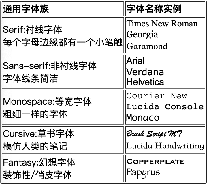
font-family font
In order to prevent the user's computer from not specifying a font, you need to provide several more fonts. You can also use @font-face to provide the server's font to the user
Space between Fonts is enclosed in quotation marks, such as font-family:'Times New Roman', Times, serif;
<!--Same common font-->
<table border>
        <tbody>
            <tr>
                <th style="text-align: left;">Universal Font Family</th>
                <th style="text-align: left;">Font name instance</th>
            </tr>
            <tr>
                <td>Serif:serif<br> There is a small stroke at the edge of each letter</td>
                <td><span style="font-family:'Times New Roman',serif">Times New Roman</span><br>
                    <span style="font-family:Georgia,serif">Georgia</span><br>
                    <span style="font-family:Garamond,serif">Garamond</span><br>
                </td>
            </tr>
            <tr>
                <td>Sans-serif:sans-serif<br>Simple font lines</td>
                <td><span style="font-family:Arial,sans-serif">Arial</span><br>
                    <span style="font-family:Verdana,sans-serif">Verdana</span><br>
                    <span style="font-family:Helvetica,sans-serif">Helvetica</span><br>
                </td>
            </tr>
            <tr>
                <td>Monospace:Equal width font<br>Fonts of the same thickness</td>
                <td><span style="font-family:'Courier New',monospace">Courier New</span><br>
                    <span style="font-family:'Lucida Console',monospace">Lucida Console</span><br>
                    <span style="font-family:Monaco,monospace">Monaco</span>
                </td>
            </tr>
            <tr>
                <td>Cursive:cursive script<br>Imitate human notes</td>
                <td><span style="font-family:'Brush Script MT',cursive">Brush Script MT</span><br>
                    <span style="font-family:'Lucida Handwriting',cursive">Lucida Handwriting</span><br>
                </td>
            </tr>
            <tr>
                <td>Fantasy:Fantasy Fonts<br>Decorative/Playful Fonts</td>
                <td><span style="font-family:Copperplate,fantasy">Copperplate</span><br>
                    <span style="font-family:Papyrus,fantasy">Papyrus</span>
                </td>
            </tr>
        </tbody>
    </table>
Show as follows:
font-style font style
normal: default
italic: Italics
oblique: tilt
font-weight font size
font-size font size
word-break Long Word Inner Line Break
normal: Browser Rule Wrap
break-all: Allow line breaks within words
keep-all: Can only break at half-space or hyphen
writing-mode text direction
horizontal-tb: From left to right, From top to bottom
vertical-rl: From top to bottom, From right to left
vertical-lr: From top to bottom, From left to right
3.7 Text Format
text-align text horizontal alignment
left/right/center: Left/in/Right alignment
justify: Align ends
vertical-align text vertical alignment
top/middle/bottom: upper/in/lower
 pixel
baseline: baseline(default),Lowest end may flow gaps,Change Alignment to top or bottom Solvable
line-height row height
Row height above height can achieve centering effect
Direction text direction
ltr: From left to right
rtl: From right to left
inherit: Inherit parent element
initial: default
word-wrap text wrap
break-word: Line Break
normal: Line Break
white-space handles html white space
normal: normal
nowrap: nowrap
pre: Keep blank
text-overflow text overflow
clip: Trim off
ellipsis: Use ellipsis instead of trimmed text
string: Use the specified string to represent the trimmed text
/* Single line text overflow */
.text1{
    overflow: hidden;
    text-overflow: ellipsis;
}
/* Multiline text overflow */
.text2{
    overflow: hidden;
    display: -webkit-box;
    -webkit-box-orient: vertical;
    -webkit-line-clamp: 2;
    word-break: break-all;
}
Column multi-column text
| attribute | Attribute Value | describe |
|---|---|---|
| column-gap | pixel | Gaps between columns |
| column-rule | width style color | Is an abbreviation of three attributes |
| column | column-width column-count | Abbreviation of Column Width and Number |
3.8 Table <table>
border-spacing
Set the distance between borders: border-spacing
border-collapse border merge
The newly created table table table table has a double border because the th/td of the table has separate borders, so collapse is used to collapse the table into single borders.
collapse: merge
border-spacing Border Spacing
Setting this property border-collapse will invalidate
pixel
caption-side table title position
top: Above Table
bottom: Below the table
inherit: Inherit parent element caption-side
empty-cells blank table processing
hide: hidden
show: (default)bound box
inherit: Inherit parent element empty-cells
table-layout table layout
automatic: (default)Column width is determined by cell content
fixed: Column width is determined by table width
inherit: Inherit parent element table-layout
3.9 list list list
list-style-type list tag type
none: Unmarked
disc: (default)disc
circle: Hollow circle
square: Square
decimal: number
decimal-leading-zero: 0 Number at the beginning(01,02,03 etc.)
lower-roman: Roman numerals in lower case(i, ii, iii, iv, v, etc.)
upper-roman:Uppercase Roman Numbers(I, II, III, IV, V, etc.)
lower-alpha: Lower case English letters The marker is lower-alpha (a, b, c, d, e, etc.)
upper-alpha: Capital English letters The marker is upper-alpha (A, B, C, D, E, etc.)
lower-latin: Latin lower case(a, b, c, d, e, etc.)
upper-latin: Uppercase Latin(A, B, C, D, E, etc.)
list-style-image
url: Specify image as tag
3.10 Media
object-fit container fit
When you set the width or height of a video or picture, there may be compression, which allows you to crop the picture without causing it to compress
fill: Picture Fill Element Content Box,Stretch if necessary/extrusion
contain: Maintain aspect ratio, Zoom the picture to fit the element content frame
cover: Maintain aspect ratio, Cut the screen to fill the element content box
none: Do not adjust picture
3.11 cursor Cursor Type
url: Custom Cursor URL.<br>To prevent URL Defined cursor is not available,Define a normal cursor at the end of this list
default: default,Normally an arrow
auto: Browser Settings Cursor
pointer: hand,click
move: move
text: text
wait: Be busy
not-allowed: Disable
crosshair: ten
help: ?
n-resize: ↑
s-resize: ↓
w-resize: ←
e-resize: →
nw-resize: ↖
ne-resize: ↗
se-resize: ↘
sw-resize: ↙
4. display ing layout
| Attribute Value | Name | describe |
|---|---|---|
| none | hide | Hiding an element differs from visibility:hidden in that it does not occupy a space |
| inline | Inline elements | Cannot set width and height, width and height are stretched by content |
| block | Block Element | Can set width and height |
| inline-block | Inline block element | Width and height can be set compared to inline Elements can be side-by-side compared to block s |
| flex | Box model | |
| grid | container |
4.1 Box Model
Overflow overflow
If the content of a child element exceeds the parent element, it overflows from the parent element, and overflow can be used to set how overflows are handled.
There are two additional attributes that can handle spills in the horizontal and vertical directions separately: overflow-x, overflow-y
visible: (Default value)So
hidden: hide
scroll: scroll bar
auto: Set scrollbars as needed
visibility Hidden Element
visible: So
hidden: hide, and display:none The difference is its placeholder
box-shadow Element Shadow
Horizontal Offset Vertical Offset Blur Color
resize interface user adjustable
Some elements, such as rich text interfaces, can be resized by the user, and resize prevents the user from resizing
none: User cannot resize element
both: User can adjust element width and height
horizontal: User can adjust element width
vertical: User can adjust element height
4.2 Elastic box: flex
You can declare an element as an elastic box or an elastic element, only the child elements of the elastic box can be an elastic element
Elastic Box Properties:
| attribute | describe | Attribute Value |
|---|---|---|
| justify-content | Horizontal alignment flex project | flex-start: (default) start alignment flex-end: end alignment center:Center Alignment space-around: elements flow out of the same blank space left and right space-evenly: average distribution space-between: Same white space between elements except for the two sides |
| align-items | Align flex projects vertically | Stretch: (default) stretch to fill container flex-start: Display on top of container flex-end: displayed at the bottom of the container center:Show in the middle of the container Baseline: baseline alignment |
| align-content | Vertically aligned elastic lines Line break to see effect | Stretch: (default) stretch to fill container flex-start: top alignment flex-end: bottom alignment center:Center Alignment |
| flex-direction | Arrangement Direction | row: (default) left to right column: Arrange from top to bottom row-reverse: Arrange from right to left colum-reverse: from bottom to top |
| flex-wrap | Line Break | nowrap: no line break wrap:line break Wrap-right to left wrap |
| flex-flow | Short form of direction wrap |
Elastic Element Properties:
| attribute | describe | Attribute Value |
|---|---|---|
| order | Set the order of elements | num: Number, default 0, top row |
| flex-grow | Scale the element so that it stretches proportionally when empty space is left in the elastic box | num: Number, default 0, no stretch |
| flex-shrink | Scale an element, which shrinks proportionally when it is compressed | num: Number, default 0, no shrinking |
| flex-basis | Set element initial length with priority over width | pixel |
| flex | Is short for grow shrink basis | |
| align-self | The position of the element itself in the flex box | stretch: (default) Element height is container height Center: center alignment flex-start: top alignment flex-end: bottom alignment Baseline: baseline alignment |
4.3 Container: grid
5. position positioning
| Attribute Value | Name | describe | Characteristic |
|---|---|---|---|
| static | (Default) Still | Do not turn on positioning | Not affected by top/bottom/left/right |
| relative | Relative positioning | Offset from its position | 1. Raise Element Level 2. Document stream will not be detached 3. Do not change the form of elements in-line/block |
| absolute | Absolute positioning | Offset from the most recently opened location's ancestor element, if no ancestor element opens location this is offset from html | 1. Raise Element Level 2. Elements detached from document stream 3. Change the form of the element to block inline with a high default content size |
| fixed | Viewport positioning | Offset from display window position, does not change position on window with scrollbar | |
| sticky | Sticky Location | Start relative and switch to fixed when offset is encountered |
top / bottom / left / right positioning property (effective after positioning is turned on)
pixel/Percentage
z-index hierarchy
num: The larger the value, the higher the hierarchy,Show Above. Be careful:No higher ancestor element can cover descendant elements
6. Animation
Transformation transform ation
The 3d transformation sets the viewing distance perspective, such as perspective: 500
| Attribute Value | Example | describe |
|---|---|---|
| translate(X,Y,Z) | transform: translate(50px,100px) | Move 50 PX to the right along the x-axis and 100 PX down the y-axis |
| rotate(deg) | transform: rotate(90deg) | Rotate 90 degrees around center |
| scale(width,height) | transform: scale(2, 3) | Zoom in two times around the central x-axis and three times around the y-axis |
| skew(deg,deg,deg) | transform: skew(20deg, 10deg) | Tilt 20 degrees along the x-axis and 10 degrees on the y-axis |
transition excess
Transition is short for property, duration, timing-function, delay, for example: transition: width 1s ease 0s;
| attribute | describe | Attribute Value |
|---|---|---|
| transition-delay | delay | secound: time, units s, how many seconds of delay before the animation is executed |
| transition-duration | Duration | secound: time, units s, animation execution time |
| transition-property | Overattributes | none:Not set all: all attributes will overeffect property: Only specified properties can be overridden |
| transition-timing-function | Animation effects | linear:Linear ease:Slow-in Slow-out ease-in:Slow-in ease-out:Slow out ease-in-out: Slow-in and slow-out cubic-bezier(n,n,n,n,): Bezier curve |
Animation animation
animation is short for name, duration, timing-function, delay, iteration-count, direction
Note: Always specify the animation-duration property, otherwise 0 duration will not execute
Keyframe: @keyframes is the intermediate state of an animation. You can use the keywords "from" and "to", which are equivalent to 0% and 100%, or you can use percentages to represent the state of each phase and use animation-name to reference the animation, for example:
<head>
    <style>
        div {
            height: 50px;
            background-color: red;
            animation-name: test;
            animation-duration: 1s;
            animation-direction: alternate;
            animation-iteration-count: infinite;
            animation-timing-function: ease;
        }
        @keyframes test {
            from {width: 50px;}
            to {width: 200px;}
        }
    </style>
</head>
<body>
    <div></div>
</body>
Effect:
| attribute | describe | Attribute Value |
|---|---|---|
| animation-name | Specify @keyframes | Keyframe Name |
| animation-duration | Animation Duration | Time, Units s s |
| animation-delay | Delay animation | Time, Units s s |
| animation-iteration-count | Number of animations played | number Infinite:infinite loop |
| transition-timing-function | Animation effects | linear:Linear ease:Slow-in Slow-out ease-in:Slow-in ease-out:Slow out ease-in-out: Slow-in and slow-out cubic-bezier(n,n,n,n,): Bezier curve |
| animation-play-state | Animation Execution Status | Paused:paused running:play |
| animation-direction | Animation Direction | normal:(default) from from to to execute reverse: from to from alternate: from from to to execute back and forth from to to alternate-reverse: execute from to front to back and forth |
| animation-fill-mode | Animation Fill Mode | none: Do not change default behavior forwards: Start with style settings and end with final state backwards: Start from front and end to style setting both: start from front and end at last |
7. Variables
Global and local variables for CSS:
/*Global variable: Defined in the':root'selector for use by the entire css document*/
:root{
    /*Global variable names begin with--*/
    --blue: #1e90ff;
    --white: #ffffff;
}
/* Local variables: defined for use within selectors */
div{
    /*Use var(name,value) to refer to a global variable. Value is used when no variable is found. Omit*/
    color:var(--blue);
    background-color: var(--white,white);
}
8. @media Media Query
To be updated