CSS common styles
List style
In the past, we had ul/ol list tags in HTML pages, but now we have unified them in CSS
1. List style type is used to set the style symbol in front of the list
- none remove the preceding symbol
- disc solid circle
- Circle hollow circle
- square solid rectangle
- Numerical representation of decimal decimal decimal progression
- Decimal leading zero is expressed in decimal system starting from 0, such as 00, 01, etc
- Lower alpha small English word line
- Upper alpha capital English word line
- Lower Roman small Roman
- Upper Roman capital Roman
- CJK earth branch uses twelve Branches to count
The twelve local branches said: Zi, Chou, Yin, Mao, Chen, Si, noon, Wei, Shen, you, Xu and Hai. - CJK heavy stem uses ten day stems to count
Ten day stem: A, B, C, D, e, himself, Geng, Xin, Ren and GUI
2. List style position sets the positioning of symbols
- The default value of outside is that the symbol is outside the content
- The inside symbol is inside the content
If list style type: none is set, the above attribute will not see the effect
3. List style image uses the specified picture as the symbol of the list item
list-style-image: url(./img/01.png)
4. List style is the comprehensive attribute of the above three attributes
list-style: cjk-heavenly-stem inside;
list-style: url(./img/01.png) inside;
Table style
In the previous HTML, the style attributes of our table should be the most
- border 2. cellspacing 3. cellpadding 4. align 5. valign 6. bgcolor
The above are the style attributes in the table. Since they are styles, they must be replaced by CSS

Add border to table
.table1,.table1 tr>*{
border:1px solid black;
}
Processing of cell spacing
- Border collapse represents the processing relationship between table cells. It has two attribute values
separate. This property causes the cells of the table to handle the separation state
Collapses are combined. At this time, there is no gap between tables - Border spacing when the cells are in the separate state, we can use this attribute to set the spacing between cells
border-spacing:10px
Counter
The counter does not count as a style, but as a function. The counter has only 3 properties in total
1. Counter reset resets a counter
counter-reset:Initial value of counter name;
counter-reset:aaa 0;
If the initial value is not set, the default value is 0
2. Counter increment sets the self increment of the counter
counter-increment:Counter name increment;
counter-increment:aaa 1;
3.counter takes this value from the counter
This attribute can only be used in:: before/::after in combination with the content attribute
::before{ content:counter(aaa); }
The use steps of the counter are as follows
- If you want to count who, counter reset is set on the outer layer of this element
- Who do you want to count? Counter increment is set on this element
- Where you want to display the content, you use:: before or:: after to append a counter on this element
Case 1
<div class="box">
<p>
<a href="#"> first connection < / a > < br >
<a href="#"> second connection</a>
</p>
<p>
<a href="#"> first connection < / a > < br >
<a href="#"> second connection</a>
</p>
<p>
<a href="#"> first connection < / a > < br >
<a href="#"> second connection</a>
</p>
</div>
design sketch:

.box{
font-size: 36px;
counter-reset: aaa 0;
}
.box>p{
counter-increment: aaa 1;
}
/* Where does the real count show */
.box>p>a:first-child::before{
content: counter(aaa);
}
Case 2
<div class="box">
<p>
<a href="#"> first connection < / a > < br >
<a href="#"> second connection</a>
</p>
<fieldset>
<a href="#"> first connection < / a > < br >
<a href="#"> second connection</a>
</fieldset>
<h2>
<a href="#"> first connection < / a > < br >
<a href="#"> second connection</a>
</h2>
</div>
I still want to achieve the effect shown in the figure above
.box{
font-size: 36px;
counter-reset: aaa 0;
}
.box>*{
counter-increment: aaa 1;
}
.box>*>a:first-child::before{
content: counter(aaa);
}
When we changed the middle tag name, our selector also changed accordingly, using * instead of the specific selector
Case 3: it still achieves the same effect as case 1, but can we change our thinking
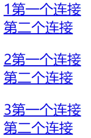
The implementation process is as follows
<style type="text/css">
.box{
font-size: 32px; counter-reset: aaa 0;
}
.box>p>a:first-child{
counter-increment: aaa 1;
}
.box>p>a:first-child::before{
content: counter(aaa);
}
</style>
<div class="box">
<p>
<a href="#"> first connection < / a > < br >
<a href="#"> second connection</a>
</p>
<p>
<a href="#"> first connection < / a > < br >
<a href="#"> second connection</a>
</p>
<p>
<a href="#"> first connection < / a > < br >
<a href="#"> second connection</a>
</p>
</div>
Element transparency
Speaking of transparency, students should know that we have learned a transparent color rgba and transparent before, but please note that these two things are called transparent colors
difference
<style type="text/css">
.a, .b {
width: 200px;
height: 200px;
border: 1px solid black;
font-size: 36px;
}
.a{
/* Set transparent color */
background-color: rgba(255,0,0,0.3);
}
.b{
background-color: rgb(255,0,0);
/* The entire element is set to transparent */
opacity: 0.3;
}
</style>
<div class="a"> I want to set transparency </div>
<div class="b"> I want to set the transparency of the element </div>
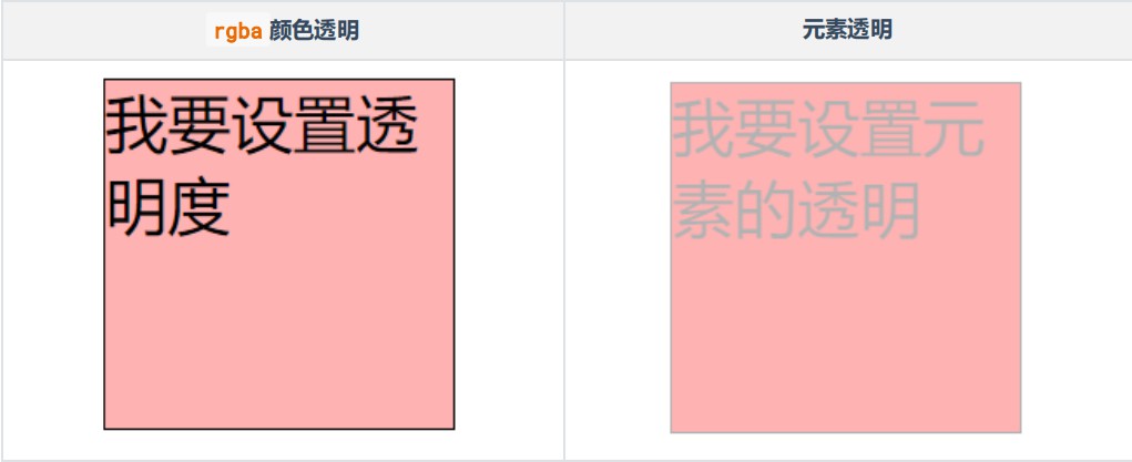
In the above code, we use opacity to set the transparency of elements, but this attribute is compatible. It is not supported in the lower version of IE, so if we want to be compatible with the lower version of IE, we need to add another attribute
.img1{opacity:0.5; /*W3C standard*/
filter: alpha(opacity=50); /*Low version IE compatible*/ }
- Opacity is a W3C standard. Its value range is 0 ~ 1. 1 represents complete opacity and 0 represents complete transparency
- filter:alpha(opacity=50) is the writing method of IE compatibility. Its value is 0 ~ 100. 0 represents complete transparency and 100 represents complete compatibility
Opaque
Hiding and displaying elements
There are many ways to hide and display elements in web pages, but the following two methods are most used
Using the visibility property
This attribute is used to set the visibility of elements. It has two attribute values, as follows:
- Visible visible
- Hidden hidden
Using the display attribute
- block allows elements to be displayed in the form of blocks
- none makes the element invisible
The difference between the two
In the above two attributes, we can hide and display elements, and they are essentially different
- After the visibility element is invisible, it will still occupy the position of the element (equivalent to changing the transparency of the element), and
Display: after none, the element is invisible and does not occupy this position - Visibility is not connected. After the parent element is hidden through visibility:hidden, the descendant element can still pass through again
visibility:visible to display;
display:none is connected. After the parent element is hidden, the child cannot be displayed anyway
Mouse cursor
The CSS attribute of the cursor uses cursor, and its attribute values are as follows
- pointer, the mouse will turn into the shape of a hand
- wait state
- help status
- Row resize resizes the cursor state above the vertical direction
- Col resize resizes the cursor state above the horizontal direction
- EW resize resize left and right
- NS resize up and down method to resize
- TextThe cursor changes to text status
The mouse cursor has many built-in States, but you can also set custom cursor icons
cursor: url(./img/02.png),default;
Box shadow
Box shadow we use the box shadow attribute, which uses six attribute values
box-shadow:x Axis offset y Axis offset ambiguity [Diffusivity] colour [Inside and outside shadow];
Brackets [] represent optional
<style type="text/css">
body{background-color: #000000; }
.circle{
margin: 100px;
width: 200px;
height: 200px;
border-radius: 50% ;
box-shadow: 0px 0px 30px 10px deeppink inset;
}
</style>
<div class="circle"> </div>

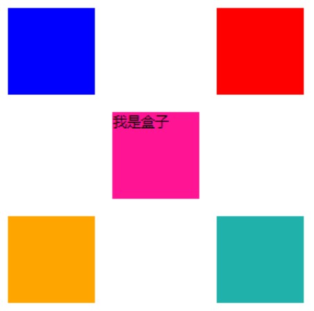
Compared with text shadow, box shadow has two more attributes: Shadow diffusion and internal and external shadow settings. Another big difference is that box shadow can set multiple shadows
<style type="text/css">
.box{
margin: 150px;
background-color: deeppink;
width: 100px;
height: 100px;
box-shadow: -120px -120px 0px 0px blue,
120px -120px 0px 0px red,
-120px 120px 0px 0px orange,
120px 120px 0px 0px lightseagreen;
}
</style>
<div class="box">I'm a box</div>
summary
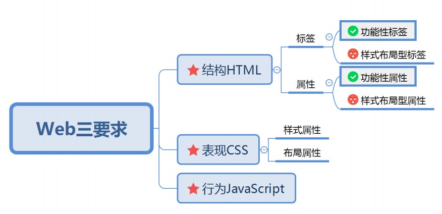
- Three elements of Web
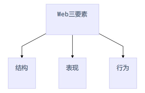
- HTML is the structure. What should be displayed on the page refer to the structure
- CSS refers to the presentation style. The style and position of the elements on the page are determined by the presentation style
- JavaScript refers to behavior
2. When talking about html, we said that HTML is composed of tag name, attribute and attribute value
<Label attribute name="Attribute value"></label>
Each tag may have some different attributes, but if these attributes are classified, they should be divided into the following two categories
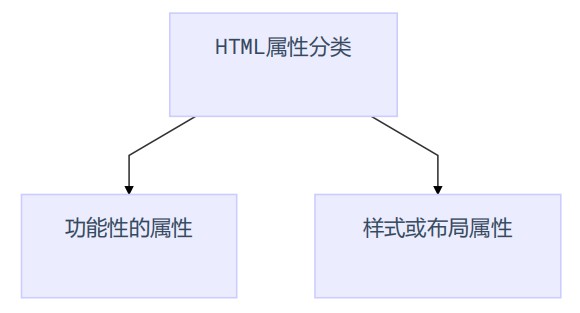
So far, students, we have to abandon HTML style and layout attributes, so everything related to style should be handed over to CSS
3. We talked a lot about HTML tags before. These tags are also divided into functional tags and style tags
Common functional tags are img/a/h1/p/iframe
Common style and layout labels b/i/u/font/del
All tags related to style and layout should be used less, and special CSS should be used instead
The purpose of the above three points is to let students separate the structure and style in HTML
4. The basic features of CSS must be clear
- Convenience refers to selectors in CSS
- Unifying the property name and value of CSS
- Separation means that the structure and style of CSS can be separated
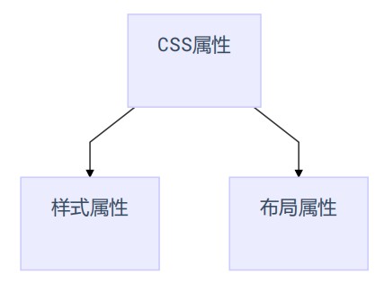
5.CSS has many attributes, but these attributes can be divided into two categories if they are classified and
