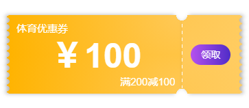
Recently, I was working on a small program project like a mall. Cards and vouchers are indispensable for the mall. At first, I planned to cut the UI, but I found it not so convenient, so I made a fuss by referring to various materials. Without much nonsense, I went to the renderings first:
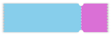
It can be seen from the effect drawing that the coupon is sawtooth on the left and right sides, and there is a dotted line in the middle. These three effects can be made with pseudo classes respectively. In order to facilitate the use of the encapsulated slot, the coupon is divided into two parts based on the dotted line. The following is the layout, which is relatively simple
<view class="tickets">
  <view class="l-tickets"></view>
  <view class="r-tickets"></view>
</view>
.tickets {
	display: flex;
	padding: 20rpx;
	width: 100%;
	height: 230rpx;
	box-sizing: border-box;
}
.l-tickets {
  width: 75%;
  background: skyblue;
}
.r-tickets {
	flex: 1;
	background: orchid;
}
The effect is as follows:

Next, let's make the left and right sawtooth. The CSS used in the coupon sawtooth is mainly the radial gradient () function (for detailed parameters, please refer to Rookie tutorial ), you can draw with pseudo classes:
.l-tickets {
  width: 75%;
  height: 100%;
  position: relative;
}
.l-tickets::after {
  content: '';
  position: absolute;
  height: 100%;
  width: 8rpx;
  top: 0;
  left: -8rpx;
  /*
  	Syntax:
  	background:bg-color bg-image position/bg-size bg-repeat bg-origin bg-clip bg-attachment initial|inherit;
  	radial-gradient(shape size at position, start-color, ..., last-color);
  */
  background: radial-gradient(circle at left center, transparent 8rpx, skyblue 0) left center / 8rpx 20rpx;
}
.r-tickets {
  flex: 1;
  position: relative;
}
.r-tickets::after {
  content: '';
  position: absolute;
  height: 100%;
  width: 8rpx;
  top: 0;
  right: -8rpx;
  background: radial-gradient(circle at right center, transparent 8rpx, orchid 0) right center / 8rpx 20rpx;
}
The effect is as follows:

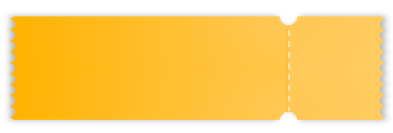
Then there are the upper and lower semicircles, which are also realized by radial gradient (). Draw the upper and lower radial gradients in the box and move to the corresponding position:
.l-tickets {
  width: 75%;
  height: 100%;
  position: relative;
  background: radial-gradient(circle at right top, transparent 16rpx,skyblue 0) right top / 100% 50% no-repeat,
              radial-gradient(circle at right bottom, transparent 16rpx, skyblue 0) right bottom / 100% 50% no-repeat;
}
.r-tickets {
  position: relative;
  background: radial-gradient(circle at left top, transparent 16rpx,  orchid 0) right top / 100% 50% no-repeat,
              radial-gradient(circle at left bottom, transparent 16rpx,  orchid 0) right bottom / 100% 50% no-repeat;
}
design sketch:

In fact, this step is almost completed. Next, take a look at the dotted line in the middle. If you want to be convenient and fast, you can directly use border, but the dotted line made by border cannot adjust the spacing between dotted lines, so it is not beautiful. Therefore, in order to pursue perfection, we use the linear gradient() function, that is, linear gradient to draw the dotted line:
.r-tickets::before {
  content: '';
  width: 1rpx;
  background: linear-gradient(to top, #fff 0%, #fff 50%, transparent 50%) top left / 1rpx 20rpx repeat-y;
  position: absolute;
  left: 0;
  top: 16rpx;
  bottom: 16rpx;
}
The effects are as follows:

Finally, we add a shadow to the card. The filter: drop shadow is used here. You can refer to the difference between filter: drop shadow and box shadow here , code directly:
.l-tickets {
  width: 75%;
  height: 100%;
  position: relative;
  background: radial-gradient(circle at right top, transparent 16rpx,skyblue 0) right top / 100% 50% no-repeat,
              radial-gradient(circle at right bottom, transparent 16rpx, skyblue 0) right bottom / 100% 50% no-repeat;
  filter: drop-shadow(-3px 0 3px rgba(0,0,0,.3));
}
.r-tickets {
  position: relative;
  background: radial-gradient(circle at left top, transparent 16rpx,  orchid 0) right top / 100% 50% no-repeat,
              radial-gradient(circle at left bottom, transparent 16rpx,  orchid 0) right bottom / 100% 50% no-repeat;
  filter: drop-shadow(3px 0 3px rgba(0,0,0,.3));
}
effect:
Here, the card is done! Just insert the content inside ~ ~ finally, there is a small expansion. The gradient adjustment inside the card coupon can be studied by interested friends:
.l-tickets {
  width: 75%;
  position: relative;
  background: radial-gradient(circle at right top, transparent 16rpx,#ffc854 0, #FFB300 100%) right top / 100% 50% no-repeat,
              radial-gradient(circle at right bottom, transparent 16rpx, #ffc854 0, #FFB300 100%) right bottom / 100% 50% no-repeat;
  filter: drop-shadow(-3px 0 3px rgba(0,0,0,.3));
}
.l-tickets::after {
  content: '';
  position: absolute;
  height: 100%;
  width: 8rpx;
  top: 0;
  left: -8rpx;
  background: radial-gradient(circle at left center, transparent 8rpx, #FFB300 0) left center / 8rpx 20rpx;
}
.r-tickets {
	flex: 1;
  position: relative;
  background: radial-gradient(circle at left top, transparent 16rpx,  #ffc854 0,#ffcc61 100%) right top / 100% 50% no-repeat,
              radial-gradient(circle at left bottom, transparent 16rpx,  #ffc854 0,#ffcc61 100%) right bottom / 100% 50% no-repeat;
  filter: drop-shadow(3px 0 3px rgba(0,0,0,.3));
}
.r-tickets::before {
  content: '';
  width: 1rpx;
  background: linear-gradient(to top, #fff 0%, #fff 50%, transparent 50%) top left / 1rpx 20rpx repeat-y;
  position: absolute;
  left: 0;
  top: 16rpx;
  bottom: 16rpx;
}
.r-tickets::after {
  content: '';
  position: absolute;
  height: 100%;
  width: 8rpx;
  top: 0;
  right: -8rpx;
  background: radial-gradient(circle at right center, transparent 8rpx, #ffcc61 0) right center / 8rpx 20rpx;
}
The effects are as follows:
Summary:
In fact, at the beginning, it was simple and convenient to draw a circle directly to cover it. However, if the background color of the page where the card coupon is located is different, it is inconvenient to adjust it after packaging, and it is easy to reveal the stuffing by adding shadows. Therefore, in the end, I decided to use gradient drawing. Although it seems a little difficult, it has high applicability and is quite cost-effective ~ finally, If there is something wrong or a better drawing method, all immortals are welcome to make corrections. One for Xiaobai, and work hard to learn ing... Need complete code can be private ww
Reference articles
CSS3 radial gradient to realize the wave shape of coupon
CSS drawing card coupon and coupon styles
CSS background property
CSS radial gradient() function
CSS linear gradient() function
CSS3 filter: difference between drop shadow filter and box shadow