Learning website The following are excerpted from the website
CSS introduction
CSS refers to cascading style sheets, which define how HTML elements are displayed.
CSS syntax
CSS rules consist of two main parts: selectors and one or more declarations.
Selectors are usually HTML elements that you need to change the style of.
Each declaration consists of a property and a value.
CSS comments start with / * and end with * /.
/* Selector {property 1: value 1; property 2: value 2;...} */
p {color:red;text-align:center;}
CSS selector
id selector
The id selector can specify a specific style for HTML elements marked with a specific id.
The HTML element sets the id selector with the id attribute, and the id selector in CSS is defined with "#".
/*HTML < p id = "para1" > Hello world</ p> */
#para1
{
	text-align:center;
	color:red;
}
class selector
class selectors are used to describe the style of a group of elements. class selectors are different from id selectors. class can be used in multiple elements.
The class selector is represented by a class attribute in HTML and a dot "." in CSS Number display.
/*All HTML elements with the center class are centered*/
.center {text-align:center;}
You can also specify specific HTML elements to use class:
/*All p elements use class="center" to center the text of the element*/
p.center {text-align:center;}
[note] the id/class attribute should not start with a number. It cannot work in Mozilla or Firefox.
CSS grouping and nesting
Group selector
There are many elements with the same style in the style sheet.
h1 {
    color: green;
}
h2 {
    color: green;
}
p {
    color: green;
}
To minimize code, you can use group selectors.
Each selector is separated by a comma.
In the following example, we use the grouping selector for the above code:
h1,h2,p {
    color: green;
}
Nested selector
The style that may apply to selectors inside selectors.
In the following example, four styles are set:
- p {}: specify a style for all p elements.
- . marked {}: specify a style for all class="marked" elements.
- . marked p{}: specify a style for P elements within all class="marked" elements.
- p.marked {}: specify a style for all P elements of class="marked".
- p#marked{}: specify a style for the p element with id="marked".
<!DOCTYPE html>
<html>
<head>
<meta charset="utf-8">
<title>Rookie tutorial(runoob.com)</title>
<style>
p
{
	color:blue;
	text-align:center;
}
.marked
{
	background-color:red;
}
.marked p
{
	color:white;
}
p.marked{
    text-decoration:underline;
}
</style>
</head>

<body>
<p>This paragraph is blue text, centered.</p>
<div class="marked">
<p>This paragraph is not blue text.</p>
</div>
<p>All class="marked"In element p Element specifies a style, but has different text colors.</p>

<p class="marked">Underlined p Paragraph.</p>
</body>
</html>
CSS combination selector
CSS combination selectors include the combination of various simple selectors.
CSS3 contains four combinations:
- Descendant selector (separated by spaces): used to select all descendant elements of an element.
/* Select all < p > elements in the < div > element */
div p {background-color: yellow;}
- Child element selector (separated by > sign): only elements that are direct / first level child elements of an element can be selected.
/* All direct child elements < p > in the < div > element are selected */
div>p {background-color: yellow;}
- Adjacent sibling selector (separated by a plus sign +): select the element immediately after another element, and they have the same parent element.
/* The first < p > element after all < div > elements is selected: */
div+p {background-color: yellow;}
- Subsequent sibling selector (separated by tilde): select the adjacent sibling elements after all specified elements, and they have the same parent element.
/* All adjacent sibling elements after all < div > elements are selected < p > */
div~p{background-color: yellow;}
Selector CSS properties
Differences between CSS attribute selectors ~ =, | =, ^ =, $=, * =:
"value is a complete word" type comparison symbol: ~ =|=
Comparison symbols of "splicing string" type: * =, ^ =$=
1. The attribute attribute contains value:
[attribute~=value] the independent word contained in the attribute is value, for example:
[title~=flower] --> <img src="/i/eg_tulip.jpg" title="tulip flower" />
[attribute*=value] do string splitting in the attribute, as long as the word value can be separated, for example:
[title*=flower] --> <img src="/i/eg_tulip.jpg" title="ffffflowerrrrrr" />
2.attribute attribute starts with value:
[attribute|=value] the attribute must be a complete and unique word, or separated by -: for example:
[lang|=en] --> <p lang="en"> <p lang="en-us">
[attribute^=value] the first few letters of the attribute can be value, for example:
[lang^=en] --> <p lang="ennn">
3.attribute attribute ends with value:
[attribute$=value] The last few letters of the attribute are value You can, for example:
a[src$=".pdf"] --> <a href="example.pdf"></a>
form sheet
/*
<form name="input" action="demo-form.php" method="get">
Firstname:<input type="text" name="fname" value="Peter" size="20"/>
Lastname:<input type="text" name="lname" value="Griffin" size="20"/>
<input type="button" value="Example Button"/>
</form>
*/
input[type="text"] {
    width: 150px;
    display: block;
    margin-bottom: 10px;
    background-color: yellow;
}
input[type="button"] {
    width: 120px;
    margin-left: 35px;
    display: block;
}
CSS background
- Background color
body {background-color:#b0c4de;}
- Background image (by default, the background image is placed in the upper left corner of the element and tiles vertically and horizontally repeatedly)
body {background-image:url('paper.gif');}
- Background position sets the starting position of the background image
| value | describe |
|---|---|
| left top/left center/left bottom/right top/right center/right bottom/center top/center center/ center bottom | If only one keyword is specified, the other value will be "center" |
| x% y% | The first value is horizontal and the second value is vertical. The upper left corner is 0% 0%. The lower right corner is 100% 100%. If only one value is specified, the other value will be 50%. The default value is: 0% 0% |
| xpos ypos | The first value is horizontal and the second value is vertical. The upper left corner is 0. The units can be pixels (0px0px) or any other CSS units . If only one value is specified, the other value will be 50%. You can mix% and positions |
| inherit | Specifies that the background position property setting should be inherited from the parent element |
body {
	background-image: url('smiley.gif');
	background-repeat: no-repeat;
	background-attachment: fixed;
	background-position: center;
}
- Background repeat sets whether and how the background image is repeated (by default, the vertical and horizontal directions of the background image are repeated)
| value | explain |
|---|---|
| repeat | The background image repeats vertically and horizontally. This is the default |
| repeat-x | Only the horizontal position repeats the background image |
| repeat-y | Only the vertical position repeats the background image |
| no-repeat | Background image does not repeat |
| inherit | Specifies that the background repeat property setting should be inherited from the parent element |
- Whether the background attachment image is fixed or scrolls with the rest of the page
| value | describe |
|---|---|
| scroll | The background image scrolls as the page scrolls, which is the default. |
| fixed | The background image does not scroll as the page scrolls. |
| local | The background image will scroll as the content of the element scrolls. |
| initial | Set the default value of this property. Read about initial |
| inherit | Specifies that the setting of background attachment should be inherited from the parent element. Read about inherit |
- The background abbreviation property can set all background properties in one declaration. The values are separated by spaces, regardless of order. You can have only some of these values.
body {background: #00ff00 url('smiley.gif') no-repeat fixed center;}
CSS Text
- Color sets the text color
h1 {color: #00ff00;}
- Direction sets the text direction
div{
    direction: rtl;
    /*unicode-bidi Property is used with the direction property to set or return whether text should be rewritten to support multiple languages in the same document*/
    unicode-bidi: bidi-override;
}
| value | describe |
|---|---|
| ltr | Default. Text direction from left to right. |
| rtl | The text direction is from right to left. |
| inherit | Specifies that the value of the direction attribute should be inherited from the parent element. |
- Letter spacing sets the character spacing
h1 {letter-spacing: 2px}
h2 {letter-spacing: -3px}
| value | describe |
|---|---|
| normal | Default. There is no extra space between the specified characters. |
| length | Defines a fixed space between characters (negative values are allowed). |
| inherit | Specifies that the value of the letter spacing attribute should be inherited from the parent element. |
- Line height setting line height
p.small {line-height: 90%}
p.big {line-height: 200%}
| value | describe |
|---|---|
| normal | Default. Set reasonable row spacing. |
| number | Set a number that multiplies the current font size to set the line spacing. |
| length | Set fixed line spacing. |
| % | Percentage line spacing based on the current font size. |
| inherit | Specifies that the value of the line height attribute should be inherited from the parent element. |
- Text align aligns the text in the element
If the direction attribute is ltr, the default value is left; If the direction property is rtl, the default value is right.
h1 {text-align: center;}
| value | describe |
|---|---|
| left | Arrange the text to the left. Default: determined by the browser. |
| right | Arrange the text to the right. |
| center | Arrange the text in the middle. |
| justify | Align text at both ends. |
| inherit | Specifies that the value of the text align attribute should be inherited from the parent element. |
- Text decoration adding decoration to text
The text decoration attribute specifies the decoration to be added to the text, such as underline, overline, strikeout, etc.
The text decoration attribute is short for the following three attributes:
text-decoration: underline wavy red; /*Red wavy underline*/
From a design point of view, the text decoration attribute is mainly used to delete the underline of links. It is not recommended to emphasize the text that is not a link, because it often confuses users.
a {text-decoration: none;}
- Text indent indents the first line of text in the element
p {text-indent: 50px;}
| value | describe |
|---|---|
| length | Defines a fixed indentation. Default: 0. |
| % | Defines an indentation based on a percentage of the width of the parent element. |
| inherit | Specifies that the value of the text indent attribute should be inherited from the parent element. |
- Text shadow set text shadow
/*White text shadow*/
h1 {
	color: white;
	text-shadow: 2px 2px 4px #000000;
}
| value | describe |
|---|---|
| h-shadow | Required. The location of the horizontal shadow. Negative values are allowed. |
| v-shadow | Required. The position of the vertical shadow. Negative values are allowed. |
| blur | Optional. Fuzzy distance. |
| color | Optional. The color of the shadow. see CSS color value. |
- Text transform controls the letters in the element
h1 {text-transform: uppercase;}
h2 {text-transform: capitalize;}
p {text-transform: lowercase;}
| value | describe |
|---|---|
| none | Default. Defines standard text with lowercase and uppercase letters. |
| capitalize | Each word in the text begins with a capital letter. |
| uppercase | The definition has only uppercase letters. |
| lowercase | The definition has no uppercase letters, only lowercase letters. |
| inherit | Specifies that the value of the text transform attribute should be inherited from the parent element. |
- Vertical align sets the vertical alignment of elements
<!DOCTYPE html>
<html>
<head>
<meta charset="utf-8">
<title>Rookie tutorial(runoob.com)</title>
<style>
img.top {vertical-align:text-top;}
img.bottom {vertical-align:text-bottom;}
</style>
</head>

<body>
<p>One<img src="logo.png" alt="w3cschool" width="270" height="50" />Default aligned image.</p>
<p>One<img class="top" src="logo.png" alt="w3cschool" width="270" height="50" />  text-top Aligned image.</p>
<p>One<img class="bottom" src="logo.png" alt="w3cschool" width="270" height="50" /> text-bottom Aligned image.</p>
</body>
</html>
| value | describe |
|---|---|
| baseline | Default. The element is placed on the baseline of the parent element. |
| sub | Align subscripts of text vertically. |
| super | Align superscript of text vertically |
| top | Align the top of the element with the top of the highest element in the row |
| text-top | Align the top of the element with the top of the parent element font |
| middle | Place this element in the middle of the parent element. |
| bottom | Aligns the bottom of the element and its descendants with the bottom of the entire row. |
| text-bottom | Align the bottom of the element with the bottom of the parent element font. |
| length | Raises or lowers an element by a specified height, which can be a negative number. |
| % | Use the percentage value of the "line height" attribute to arrange this element. Negative values are allowed. |
| inherit | Specifies that the value of the vertical align attribute should be inherited from the parent element. |
- White space sets how white space is handled in elements
p {white-space: nowrap;}
| value | describe |
|---|---|
| normal | Default. Whitespace is ignored by the browser. |
| pre | Blank will be retained by the browser. It behaves like a < pre > tag in HTML. |
| nowrap | The text does not wrap, and the text continues on the same line until it is encountered Until the label. |
| pre-wrap | Keep the blank character sequence, but wrap the line normally. |
| pre-line | Merge whitespace sequences, but leave line breaks. |
| inherit | Specifies that the value of the white space attribute should be inherited from the parent element. |
- Word spacing setting word spacing
The interval adjustment of Chinese characters is realized by letter spacing. Because there are no spaces between words in Chinese paragraphs, word spacing usually does not adjust the spacing.
p {word-spacing: 30px;}
| value | describe |
|---|---|
| normal | Default. Define the standard space between words. |
| length | Define the fixed space between words. |
| inherit | Specifies that the value of the word spacing attribute should be inherited from the parent element. |
CSS Fonts
CSS font attributes define font, bold, size, and text style.
-
The font family property sets the font family of the text.
The font family attribute should set several font names as a "backup" mechanism. If the browser does not support the first font, it will try the next font.
p {font-family: "Times New Roman", Times, serif;}
More commonly used font combinations Web security font combination.
- Font style set font style
p {font-style: italic}
| value | describe |
|---|---|
| normal | Default value. The browser displays a standard font style. |
| italic | The browser displays an italic font style. |
| oblique | The browser displays an oblique font style. |
| inherit | Specifies that the font style should be inherited from the parent element. |
Not all fonts have done this. Some uncommon fonts may only have a normal font. If you use italic, it will have no effect. At this time, you need to use oblique. It can be understood that Italic is to use italic text, and oblique is to tilt text without Italic attribute!
- Font size sets the size and pixel of the text
p {font-size:14px;}
| value | describe |
|---|---|
| xx-small/ x-small/ small/ medium/ large/ x-large/ xx-large | Set the font size to different sizes, from XX small to XX Large. Default: medium. |
| smaller | Set font size to a smaller size than the parent element. |
| larger | Set font size to a larger size than the parent element. |
| length | Set font size to a fixed value. |
| % | Set font size to a percentage value based on the parent element. |
| inherit | Specifies that the font size should be inherited from the parent element. |
- The font weight property sets the thickness of the text
p {font-weight:lighter;}
| value | describe |
|---|---|
| normal | Default value. Defines the standard character. |
| bold | Define bold characters. |
| bolder | Define thicker characters. |
| lighter | Define finer characters. |
| 100/200/300/400/500/600/700/800/900 | Defines characters from thin to thick. 400 is equivalent to normal and 700 is equivalent to bold. |
| inherit | Specifies that the font weight should be inherited from the parent element. |
- The font variant attribute is mainly used to define small uppercase text
p {font-variant: small-caps;}
- Font abbreviation attribute sets all font attributes in one declaration
The attributes that can be set are (in order): "font style font variant font weight font size / line height font family"
The values of font size and font family are required. If other values are missing, the default value will be inserted, if any.
p {font: italic bold 12px/30px Georgia,serif;}
CSS links
Different links can have different styles:
a:link {color:#000000;}      /*  Link not visited*/
a:visited {color:#00FF00;}  /*  Link visited*/
a:hover {color:#FF00FF;}  /*  Move the mouse over the link*/
a:active {color:#0000FF;}  /*  When the mouse clicks*/
The style of the link can use any CSS attribute (such as color, font, text, background, etc.).
<!DOCTYPE html>
<html>
<head>
<meta charset="utf-8">
<title>Rookie tutorial(runoob.com)</title>
<style>
a.one:link {color:#ff0000;}
a.one:visited {color:#0000ff;}
a.one:hover {color:#ffcc00;}

a.two:link {color:#ff0000;}
a.two:visited {color:#0000ff;}
a.two:hover {font-size:150%;}

a.three:link {color:#ff0000;}
a.three:visited {color:#0000ff;}
a.three:hover {background:#66ff66;}

a.four:link {color:#ff0000;}
a.four:visited {color:#0000ff;}
a.four:hover {font-family:Georgia, serif;}

a.five:link {color:#ff0000;text-decoration:none;}
a.five:visited {color:#0000ff;text-decoration:none;}
a.five:hover {text-decoration:underline;}
</style>
</head>

<body>
<p>Move the mouse over the link to change the style.</p>

<p><b><a class="one" href="/css/" target="_blank">This link changes color</a></b></p>
<p><b><a class="two" href="/css/" target="_blank">This link changes the font size</a></b></p>
<p><b><a class="three" href="/css/" target="_blank">This link changes the background color</a></b></p>
<p><b><a class="four" href="/css/" target="_blank">This link changes the font type</a></b></p>
<p><b><a class="five" href="/css/" target="_blank">This link changes the text modifier</a></b></p>
</body>

</html>
Note: a:hover must be after a:link and a:visited, and the effect can be seen in strict order.
Note: a:active must be after a:hover.
CSS list
- List style type sets the type of list item flag
"disc" for <ul> and "decimal" for <ol>
ul.circle {list-style-type: circle}
ul.square {list-style-type: square}
ol.upper-roman {list-style-type: upper-roman}
ol.lower-alpha {list-style-type: lower-alpha}
| value | describe |
|---|---|
| none | No mark. |
| disc | Default. The marker is a solid circle. |
| circle | The marker is a hollow circle. |
| square | The marker is a solid square. |
| decimal | The mark is a number. |
| decimal-leading-zero | A numeric marker beginning with 0. (01, 02, 03, etc.) |
| lower-roman | Lowercase Roman numerals (i, ii, iii, iv, v, etc.) |
| upper-roman | Capital Roman numerals (I, II, III, IV, V, etc.) |
| lower-alpha | The marker is lower alpha (a, B, C, D, e, etc.) |
| upper-alpha | The marker is upper alpha (a, B, C, D, e, etc.) |
| lower-greek | Small Greek letters (alpha, beta, gamma, etc.) |
| lower-latin | Small Latin letters (a, b, c, d, e, etc.) |
| upper-latin | Capital Latin letters (A, B, C, D, E, etc.) |
| hebrew | Traditional Hebrew numbering |
| armenian | Traditional Armenian numbering |
| georgian | Traditional Georgia Numbering (an, ban, gan, etc.) |
| cjk-ideographic | Simple ideographic numbers |
| hiragana | The marks are: a, i, u, e, o, ka, ki, etc. (Japanese Hiragana character) |
| katakana | The marks are: A, I, U, E, O, KA, KI, etc. (Japanese katakana characters) |
| hiragana-iroha | The tags are: i, ro, ha, ni, ho, he, to, etc. (Japanese Hiragana serial number) |
| katakana-iroha | The marks are: I, RO, HA, NI, HO, HE, TO, etc. (Japanese katakana serial number) |
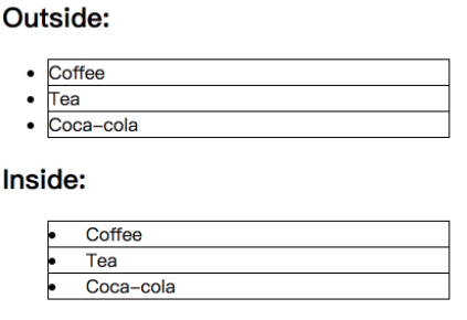
- List style position sets the position of the list item flag in the list
ul {list-style-position: inside;}
| value | describe |
|---|---|
| inside | The list item tag is placed within the text and aligned around the text according to the tag. |
| outside | Default value. Keep the tag to the left of the text. The list item tag is placed outside the text and the surrounding text is not aligned according to the tag. |
| inherit | Specifies that the value of the list style position attribute should be inherited from the parent element. |
- List style image sets the image as the list item flag
ul {list-style-image: url('sqpurple.gif');}
| value | describe |
|---|---|
| URL | The path of the image. |
| none | Default. No graphics are displayed. |
| inherit | Specifies that the value of the list style image attribute should be inherited from the parent element. |
-
List style shorthand property sets all list properties in one declaration.
Attributes that can be set (in order): list style type, list style position, list style image.
You can not set one of these values, such as "list style: circle inside;" It is also allowed. Unset properties use their default values.
-
Remove default settings
The list style type: none attribute can be used to remove small tags. By default, the list < UL > or < ol > also sets the inner margin and outer margin, which can be removed by using margin:0 and padding:0:
ul {
  list-style-type: none;
  margin: 0;
  padding: 0;
}
CSS table
- Table border
table, th, td {border: 1px solid black;}
The table in the above example has a double border. This is because the table and th/ td elements have separate boundaries.
To display a single border of a table, use the border collapse attribute.
table {border-collapse:collapse;}
table,th, td {border: 1px solid black;}
- The width and height attributes define the width and height of the table.
table {width:100%;}
th {height:50px;}
-
The text align property sets the horizontal alignment, left, right, or center;
Vertical align property sets vertical alignment, such as top, bottom or center;
td {
    height:50px;
    text-align: right;
    vertical-align: bottom;
}
- padding controls the spacing between borders and table contents
td {padding: 3px 7px 2px 7px;}
- Table color
The following example specifies the color of the border, and the text and background colors of the th element:
table, td, th {border:1px solid green;}
th {
    background-color: green;
    color: white;
}
- Caption side set title position
caption {caption-side:bottom;}
CSS box model
All HTML elements can be regarded as boxes. In CSS, the term "box model" is used for design and layout.
CSS box model is essentially a box that encapsulates the surrounding HTML elements, including margins, borders, padding, and actual content.
The box model allows us to place elements in the space between other elements and the surrounding element frame.
The following picture illustrates the box model:
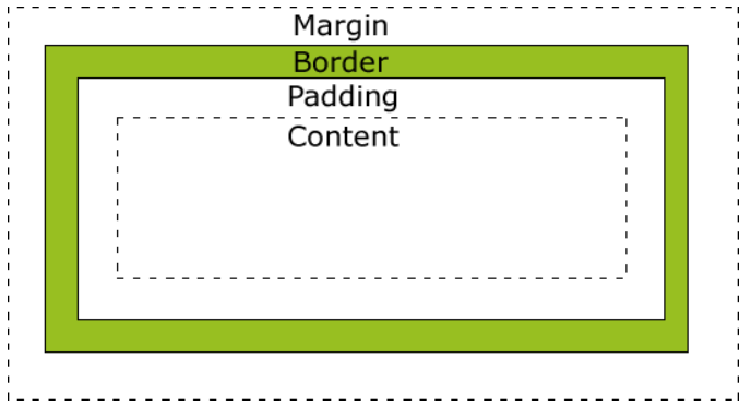
Description of different parts:
- Margin - clears the area outside the border, which is transparent.
- Border - a border around the inside margin and outside the content.
- Padding - clears the area around the content. The padding is transparent.
- Content - the content of the box, displaying text and images.
The formula for calculating the total width of the final element is as follows:
Total element width = width + left fill + right fill + left border + right border + left margin + right margin
The final calculation formula of the total height of the element is as follows:
Total element height = height + top fill + bottom fill + top border + bottom border + top margin + bottom margin
CSS border
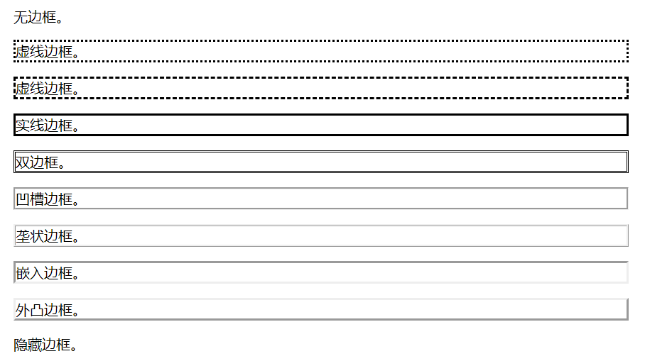
CSS border properties allow you to specify the style and color of an element's border.
- The border style property defines the style of the border
<!DOCTYPE html>
<html>
<head>
<meta charset="utf-8">
<title>Rookie tutorial(runoob.com)</title>
<style>
p.none {border-style:none;}
p.dotted {border-style:dotted;}
p.dashed {border-style:dashed;}
p.solid {border-style:solid;}
p.double {border-style:double;}
p.groove {border-style:groove;}
p.ridge {border-style:ridge;}
p.inset {border-style:inset;}
p.outset {border-style:outset;}
p.hidden {border-style:hidden;}
</style>
</head>

<body>
<p class="none">No borders.</p>
<p class="dotted">Dashed border.</p>
<p class="dashed">Dashed border.</p>
<p class="solid">Solid border.</p>
<p class="double">Double border.</p>
<p class="groove">Grooved border.</p>
<p class="ridge">Ridge border.</p>
<p class="inset">Embed border.</p>
<p class="outset">Convex border.</p>
<p class="hidden">Hide borders.</p>
</body>

</html>
- The border width property specifies the width for the border.
The "border width" attribute does not work if used alone. First use the "border style" attribute to set the border.
There are two ways to specify the width of the border: you can specify a length value, such as 2px or 0.1em (in px, pt, cm, em, etc.), or use one of three keywords, which are thick, medium (the default) and thin.
p.one {
    border-style:solid;
    border-width:5px;
}
p.two {
    border-style:solid;
    border-width:medium;
}
- The border color property sets the color of the border.
Border color alone does not work. You must first use border style to set the border style.
p {
    border-style:solid;
    border-color:red;
}
- In CSS, you can specify different sides and different borders:
p {
    border-top-style:dotted;
    border-right-style:solid;
    border-bottom-style:dotted;
    border-left-style:solid;
}
The above example can also set a single attribute border style, which can have 1-4 values:
- border-style:dotted solid double dashed;
- The top border is dotted
- The right border is solid
- The bottom border is double
- The left border is dashed
- border-style:dotted solid double;
- The top border is dotted
- The left and right borders are solid
- The bottom border is double
- border-style:dotted solid;
- The top and bottom borders are dotted
- The right and left borders are solid
- border-style:dotted;
- The four sides are dotted
The border color and border width can also be set separately for 4 edges as the border style. The same rules apply.
p {
	border-left-style: solid;
	border-left-width: 15px;
}
- The border shorthand property sets all border properties in a declaration. The attributes that can be set are (in order): border width, border style, and border color.
There are also four abbreviated attributes: border left, border right, border top and border bottom
CSS outline
An outline is a line drawn around an element, which is located on the periphery of the border edge and can highlight the element.
The outline is not part of the element size, so the width and height attributes of the element do not contain the width of the outline.
- Outline style sets the style of the outline
| value | describe |
|---|---|
| none | Default. Define no profile. |
| dotted | Defines a dotted outline. |
| dashed | Defines the dashed outline. |
| solid | Defines a solid outline. |
| double | Defines a double line profile. The width of the double line is equal to the value of outline width. |
| groove | Define the 3D groove profile. This effect depends on the outline color value. |
| ridge | Define the 3D convex groove profile. This effect depends on the outline color value. |
| inset | Define the 3D concave contour. This effect depends on the outline color value. |
| outset | Defines the 3D convex contour. This effect depends on the outline color value. |
| inherit | Specifies that the settings of the profile style should be inherited from the parent element. |
- Outline width specifies the width of the outline.
| value | describe |
|---|---|
| thin | Specify fine contour. |
| medium | Default. Specify a medium profile. |
| thick | Specify a rough outline. |
| length | Allows you to specify a value for contour thickness. |
| inherit | Specifies that the profile width setting should be inherited from the parent element. |
- The outline color property specifies the outline color.
| value | describe |
|---|---|
| color | Specifies the outline color. stay CSS color value Find a complete list of color values. |
| invert | Default. Perform color inversion (reverse color). You can make the outline visible in different background colors. |
| inherit | Specifies that the setting of the outline color should be inherited from the parent element. |
p {
	outline-style: dotted;
    outline-width: thick;
	outline-color: #00ff00;
}
- The outline shorthand property sets all the outline properties in one declaration. The attributes that can be set are (in order): outline color, outline style, and outline width
CSS margin (margin)
The CSS margin attribute defines the space around the element.
margin clears the surrounding (outer border) element area. margin has no background color and is completely transparent.
margin can change the up, down, left and right margins of elements alone, or change all attributes at once.
p {
	margin-top:100px;
	margin-bottom:100px;
	margin-right:50px;
	margin-left:50px;
}
The margin attribute can have one to four values.
- margin:25px 50px 75px 100px;
- The upper margin is 25px
- The right margin is 50px
- The bottom margin is 75px
- The left margin is 100px
- margin:25px 50px 75px;
- The upper margin is 25px
- The left and right margins are 50px
- The bottom margin is 75px
- margin:25px 50px;
- The upper and lower margins are 25px
- The left and right margins are 50px
- margin:25px;
- All four margins are 25px
| value | explain |
|---|---|
| auto | Set the browser margin. The result will depend on the browser |
| length | Define a fixed margin (using pixels, pt, em, etc.) |
| % | Define a margin that uses a percentage |
Margin can use negative values, overlapping content.
CSS padding
padding defines the space between the element border and the element content, that is, the inner margin up, down, left and right.
p {
	padding-top:25px;
	padding-bottom:25px;
	padding-right:50px;
	padding-left:50px;
}
The rule of padding attribute is the same as that of margin.
CSS dimension
The CSS dimension attribute allows you to control the height and width of elements. Again, it allows you to increase line spacing.
| attribute | describe |
|---|---|
| height | Sets the height of the element. |
| line-height | Set row height. |
| max-height | Sets the maximum height of the element. |
| max-width | Sets the maximum width of the element. |
| min-height | Sets the minimum height of the element. |
| min-width | Sets the minimum width of the element. |
| width | Sets the width of the element. |
CSS display and visibility
The display attribute sets how an element should be displayed, and the visibility attribute specifies whether an element should be visible or hidden.
Hidden element - display:none or visibility:hidden
You can hide an element by setting the display attribute to "none" or the visibility attribute to "hidden". Note, however, that these two methods produce different results.
visibility:hidden can hide an element, but the hidden element still needs to occupy the same space as before. In other words, although the element is hidden, it will still affect the layout.
display:none can hide an element, and the hidden element will not occupy any space. In other words, the element is not only hidden, but also the space originally occupied by the element will disappear from the page layout.
Inline element < -- > block element
There are three main CSS styles:
- display:block -- display as a block level element
- display:inline -- display as inline element
- Display: inline block -- display as inline block elements, which are displayed in the same row, and can modify the width, height, inner and outer margins and other attributes (ordinary inline elements cannot modify the width, height, inner and outer margins and so on)
We often add the display: inline block style to all < li > elements, so that the original vertical list can be displayed horizontally.
The following example displays a list item as an inline element:
li {display:inline;}
The following example takes the span element as a block element:
span {display:block;}
visibility: collapse
For the visibility attribute in CSS, its value is usually set to visible or hidden.
visibility: hidden is equivalent to display:none. It can hide elements, but the difference between the two is:
- 1. Display: the none element no longer takes up space.
- 2. visibility: hidden makes the element invisible on the web page, but still takes up space.
However, visibility may also take the value of collapse.
When the element visibility: collapse is set, the general performance of the element is the same as that of visibility: hidden, that is, it will occupy space. However, if the element is a table related element, such as table row, table column, table column group, etc., its performance is the same as display: none, that is, the occupied space will be released.
CSS position
The position attribute specifies the location type of the element.
Elements can be positioned using the top, bottom, left, and right attributes. However, these properties do not work unless the position property is set first. They also work in different ways, depending on the positioning method.
-
Five values of position attribute:
-
Static: the default value of HTML element, that is, it has no location and follows the normal document flow object. Statically positioned elements are not affected by top, bottom, left and right.
-
Fixed: the position of the element is fixed relative to the browser window. Fixed positioning makes the position of the element independent of the document flow, so it does not occupy space. The fixed positioned element overlaps with other elements.
-
Relative: the relative positioning of an element is relative to its normal position. Move the relative positioning element, but the space it originally occupies will not change. Relative positioning elements are often used as container blocks for absolute positioning elements.
-
Absolute: the position of the absolutely positioned element is relative to the nearest positioned parent element. If the element has no positioned parent element, its position is relative to < HTML >. Absolute positioning makes the position of the element independent of the document flow, so it does not occupy space. The element positioned by absolute overlaps with other elements.
-
Sticky: sticky positioning. The elements of sticky positioning depend on the user's scrolling and switch between position:relative and position:fixed positioning.
Element positioning is relative positioning before crossing a specific threshold, and then fixed positioning. This specific threshold refers to one of top, right, bottom or left. In other words, specify one of the four thresholds of top, right, bottom or left to make the viscous positioning effective. Otherwise, its behavior is the same as relative positioning.
-
<!DOCTYPE html>
<html>
<head>
<meta charset="utf-8">
<title>Rookie tutorial(runoob.com)</title>
<style>
div.sticky {
  position: -webkit-sticky;  /* Safari */
  position: sticky;
  top: 0;
  padding: 5px;
  background-color: #cae8ca;
  border: 2px solid #4CAF50;
}
</style>
</head>
<body>

<p>Try scrolling the page.</p>
<p>be careful: IE/Edge 15 And earlier IE Version not supported sticky Properties.</p>

<div class="sticky">I'm sticky positioning!</div>

<div style="padding-bottom:2000px">
  <p>Roll me</p>
  <p>Roll me back and forth</p>
  <p>Roll me</p>
  <p>Roll me back and forth</p>
  <p>Roll me</p>
  <p>Roll me back and forth</p>
</div>

</body>
</html>
- z-index sets the stacking order of elements: elements with higher stacking order always precede elements with lower stacking order.
<!DOCTYPE html>
<html>
<head>
<meta charset="utf-8">
<title>Rookie tutorial(runoob.com)</title>
<style>
div {
	background-color:red;
	width:100%;
	height:100px;
	position:absolute;
	left:0px;
	top:0px;
	z-index:-1;
}
</style>
</head>

<body>
<div></div>
<p>because div Element set z-index Attribute value is -1, So it will appear after the text.</p>
</body>
</html>
- clip clips an absolutely positioned element
| value | describe |
|---|---|
| shape | Sets the shape of the element. The only legal shape value is rect (top, right, bottom, left) |
| auto | Default value. No clipping is applied. |
| inherit | Specifies that the value of the clip attribute should be inherited from the parent element. |
img {
	position:absolute;
	clip:rect(0px,60px,200px,0px);
}
If there is "overflow: visible" first, the clip attribute does not work.
CSS overflow
The overflow attribute is used to control the display mode of the content overflow element box. It can control the addition of a scroll bar in the corresponding element interval when the content overflows the element box.
| value | describe |
|---|---|
| visible | Default value. The content will not be trimmed and will appear outside the element box. |
| hidden | The content is trimmed and the rest is invisible. |
| scroll | The content is trimmed, but the browser displays a scroll bar to see the rest of the content. |
| auto | If the content is trimmed, the browser displays a scroll bar to see the rest of the content. |
| inherit | Specifies that the value of the overflow attribute should be inherited from the parent element. |
div {
    width: 200px;
    height: 50px;
    border: 1px dotted black;
    overflow: auto;
}
Note: the overflow attribute only works on block elements of the specified height.
overflow-y Specifies how to handle the content area of the content overflow element at the top / bottom edge.
overflow-x Specifies how to handle the content area of the content overflow element at the right / left edge.
CSS float
float moves elements to the left or right, and the surrounding elements rearrange. It is often used for images, but it is also very useful in layout.
A floating element moves as far left or right as possible until its outer edge touches the border containing a box or another floating box.
The element after the floating element will surround it. Elements before floating elements will not be affected.
If you put several floating elements together, they will be adjacent to each other if there is space.
img {float:right;}
After the element floats, the surrounding elements will be rearranged. To avoid this, use the clear attribute. The clear attribute specifies that floating elements cannot appear on both sides of an element.
| value | describe |
|---|---|
| left | The element floats to the left. |
| right | The element floats to the right. |
| none | Default value. The element does not float and is displayed where it appears in the text. |
| inherit | Specifies that the value of the float attribute should be inherited from the parent element. |
.text_line {clear:both;}
| value | describe |
|---|---|
| left | Floating elements are not allowed on the left. |
| right | Floating elements are not allowed on the right. |
| both | Floating elements are not allowed on either side. |
| none | Default value. Allow floating elements to appear on both sides. |
| inherit | Specifies that the value of the clear attribute should be inherited from the parent element. |
Use float to create a page header, footer, left content and main content:
<!DOCTYPE html>
<html>
<head>
<meta charset="utf-8">
<title>Rookie tutorial(runoob.com)</title>
<style>
* {
    box-sizing: border-box;
}
body {
    margin: 0;
}
.header {
    background-color: #2196F3;
    color: white;
    text-align: center;
    padding: 15px;
}
.footer {
    background-color: #444;
    color: white;
    padding: 15px;
}
.topmenu {
    list-style-type: none;
    margin: 0;
    padding: 0;
    overflow: hidden;
    background-color: #777;
}
.topmenu li {
    float: left;
}
.topmenu li a {
    display: inline-block;
    color: white;
    text-align: center;
    padding: 16px;
    text-decoration: none;
}
.topmenu li a:hover {
    background-color: #222;
}
.topmenu li a.active {
    color: white;
    background-color: #4CAF50;
}
.column {
    float: left;
    padding: 15px;
}
.clearfix::after {
    content: "";
    clear: both;
    display: table;
}
.sidemenu {
    width: 25%;
}
.content {
    width: 75%;
}
.sidemenu ul {
    list-style-type: none;
    margin: 0;
    padding: 0;
}
.sidemenu li a {
    margin-bottom: 4px;
    display: block;
    padding: 8px;
    background-color: #eee;
    text-decoration: none;
    color: #666;
}
.sidemenu li a:hover {
    background-color: #555;
    color: white;
}
.sidemenu li a.active {
    background-color: #008CBA;
    color: white;
}
</style>
</head>
<body>

<ul class="topmenu">
  <li><a href="#Home "class =" active "> Home</a></li>
  <li><a href="#News "> News</a></li>
  <li><a href="#Contact "> contact us</a></li>
  <li><a href="#About "> about us</a></li>
</ul>

<div class="clearfix">
  <div class="column sidemenu">
    <ul>
      <li><a href="#flight">The Flight</a></li>
      <li><a href="#city" class="active">The City</a></li>
      <li><a href="#island">The Island</a></li>
      <li><a href="#food">The Food</a></li>
      <li><a href="#people">The People</a></li>
      <li><a href="#history">The History</a></li>
      <li><a href="#oceans">The Oceans</a></li>
    </ul>
  </div>

  <div class="column content">
    <div class="header">
      <h1>The City</h1>
    </div>
    <h1>Chania</h1>
    <p>Chania is the capital of the Chania region on the island of Crete. The city can be divided in two parts, the old town and the modern city.</p>
    <p>You will learn more about responsive web pages in a later chapter.</p>
  </div>
</div>

<div class="footer">
  <p>Bottom text</p>
</div>

</body>
</html>
CSS alignment
- Align element center
If the width property is not set (or 100%), the center alignment will not work.
.center {
    margin: auto;
    width: 50%;
}
- Center text
.center {
    text-align: center;
}
- Picture center alignment
img {
    display: block;
    margin: 0 auto;
}
-
Left / right alignment
-
position: absolute;
When using position to align elements, the < body > element usually sets margin and padding. This can avoid visible differences in different browsers.
body { margin: 0; padding: 0; } .right { position: absolute; right: 0px; width: 300px; background-color: #b0e0e6; }-
float
*If the height of the child element is greater than that of the parent element and the child element is set to float, the child element will overflow. You can add overflow: auto on the parent element; To solve the problem of child element overflow:
body { margin: 0; padding: 0; } .right { float: right; width: 300px; background-color: #b0e0e6; } -
-
Vertical center
- padding
.center { padding: 70px 0; border: 3px solid green; }- line-height=height
.center { height: 200px; line-height: 200px; border: 3px solid green; text-align: center; } /* If the text has more than one line, add the following code: */ .center p { line-height: 1.5; display: inline-block; vertical-align: middle; }- transform
.center {
    height: 200px;
    position: relative;
    border: 3px solid green;
}

.center p {
    margin: 0;
    position: absolute;
    top: 50%;
    left: 50%;
    transform: translate(-50%, -50%);
}
Setting up the same padding of the container to achieve vertical centering and using line height = height to achieve vertical centering are only valid for single line text. When the number of text lines exceeds single line:
- 1) padding: the text is still in the vertical center of the container, but the height of the container will increase with the increase of the number of text lines;
- 2) Line height = height: the height of the container remains unchanged. Line height is the line spacing of the text, and the text will overflow the container display;
Vertical align: middle can be used for multi line text; To realize the vertical centering of the element, but if the content volume of the child element is greater than that of the parent element, it will still overflow. Later, we need to use word overflow processing to solve it.
CSS pseudo class / pseudo class
CSS pseudo classes are used to add some special effects of selectors.
Syntax of pseudo class / pseudo element:
selector:pseudo-class/pseudo-element {property: value;}
CSS classes can also use pseudo classes / pseudo elements:
selector.class:pseudo-class/pseudo-element {property: value;}
Pseudo class selection element is based on the current state of the element, or the current characteristics of the element, rather than static flags such as id, class and attribute of the element. Because the state changes dynamically, when an element reaches a specific state, it may get the style of a pseudo class; When the state changes, it will lose this style again. It can be seen that its function is somewhat similar to that of class, but it is based on abstraction outside the document, so it is called pseudo class.
Different from the pseudo class for elements in a special state, the pseudo element operates on the specific content in the element. Its operation level is deeper than that of the pseudo class, so its dynamics is much lower than that of the pseudo class. In fact, the purpose of designing pseudo elements is to select the first word (parent) and first line of element content, and select the work that ordinary selectors can't complete before or after some content. The content it controls is actually the same as the element, but it is only an abstraction based on the element and does not exist in the document, so it is called pseudo element.
:link/:visted/:hover/:active
Different states of links can be displayed in different ways.
a:link {color:#FF0000;} /*  Set the page link style that has not been visited*/
a:visited {color:#00FF00;} /*  Set the style of page links visited*/
a:hover {color:#FF00FF;} /*  Link style when there is a mouse over it*/
a:active {color:#0000FF;} /*  Set the style when you click the link*/
Note: in the CSS definition, a:hover must be placed after a:link and a:visited to be valid.
Note: in the CSS definition, a:active must be placed after a:hover to be valid.
:before/:after
: before selector inserts content before the selected element.
: after selector inserts content after the last child element of the selected element.
p:before {content: "Read this: ";}
p:after {content: "- Remember this";}
The content attribute is used with: before and: after pseudo elements to insert content.
/* content: normal|none|counter|attr|string|open-quote|close-quote|no-open-quote|no-close-quote|url|initial|inherit; */
/*normal In the: before and: after pseudo class elements, it will be regarded as none, that is, it is also a null value.*/
p#testID:before {content:normal;}
p#testID:before {content:none;}
/*Set text content*/
p:before {content: "string Set text content";}
/*Set the counter in the format of counter(name) or counter(name,style). The generated content is the count of the minimum range of the specified name of the pseudo class element; Format is specified by style (default is' decimal '- decimal number)*/
p {counter-increment: myIndex;}
p:before {content:counter(myIndex);}
/*Returns the attribute attribute of an element as a string*/
a:after {content: " (" attr(href) ")";}
/*Set quotation marks*/
p::before {content: open-quote;}
p::after {content: close-quote;}
/*Remove the opening quotation marks of the content and close the quotation marks*/
p#testID:before {content: no-open-quote;}
p#testID:after {content: no-close-quote;}
/*Set the link address of certain media (image, sound, video, etc.)*/
p:before {content: url(smiley.gif);}
[counter] (# CSS counter) content.
:first-child/:last-child/:nth-child/:root/:target/:not/:empty
- : the first child pseudo class selects the first child element of the parent element. Equivalent to: nth child (1)
/* The first < p > element that matches the parent element of < p > */
p:first-child {background-color:yellow;}
/* Select and style each < I > element in each < p >, where the < p > element is the first child of its parent element */
p:first-child i {background:yellow;}
/* The style selected for the first < li > element in each list */
li:first-child {background:yellow;}
/* The style selected for the first child element of each < UL > element */
ul>:first-child {background:yellow;}
- : the first of type selector matches an element whose parent is the first child element of a particular type. Equivalent to: nth of type (1).
/* The selected p element is the first p element of its parent element */
p:first-of-type {background:#ff0000;}
- The: last child selector is used to match the last child element in the parent element. Equivalent to: nth last child (1).
/* <p> Is the last element of its parent element */
p:last-child {background: #ff0000;}
- : the last of type selector matches an element whose parent is the last child element of a particular type. Equivalent to: nth last of type (1).
/* Specifies the last p element of its parent */
p:last-of-type {background:#ff0000;}
-
The: nth child (n) selector matches the nth child element in the parent element, and the element type is unlimited.
n can be a number, a keyword (odd/even), or a formula (an+ b).
/* Specifies the background color of the second child element in the parent element that each p element matches */
p:nth-child(2) {background: #ff0000;}
/*Specify two different background colors for odd and even p elements (the first child of the index is 1)*/
p:nth-child(odd) {background: #ff0000;}
p:nth-child(even) {background: #0000ff;}
/*Specifies the background color (n counts from 0) for all p elements whose index is a multiple of 3*/
p:nth-child(3n+0) {background: #ff0000;}
-
The: nth last child (N) selector matches each element belonging to the nth child of its element, counting from the last child, regardless of the element type.
n can be a number, a keyword, or a formula.
-
The: nth of type (n) selector matches the nth sibling element of the same type.
-
The: nth last of type (n) selector matches the penultimate sibling element of the same type.
-
The: only child selector matches elements that belong to the only child element in the parent element.
/* Matches the p element that belongs to the only child element in the parent element */
/* <div><p>Unique child</p></div>
p:only-child {background: #ff0000;}
- : only of type represents any element, which has no other sibling elements of the same type.
- The: not(selector) selector matches whether each element is the specified element / selector.
/*Set the background color for each element that is not a < p > element*/
:not(p) {background: #ff0000;}
- The: empty selector selects each element without any children (including text nodes)
/* <p></p> */
p:empty {
	width:100px;
	height:20px;
	background:#ff0000;
}
- : the root selector matches the root element of the document. In HTML, the root element is always an HTML element.
/*Set the background color of HTML document*/
:root {background: #ff0000;}
-
The: target selector is available for the style of the currently active target element.
The name of the anchor is the URL linked to an element in a file. The element is linked to the target element.
/*
<p><a href="#news1">Jump to New content 1</a></p>
<p><a href="#news2">Jump to New content 2</a></p>
<p id="news1"><b>New content 1...</b></p>
<p id="news2"><b>New content 2...</b></p>
*/
#news1:target
{
	border: 2px solid #D4D4D4;
	background-color: #e5eecc;
}
:first-line/:first-letter
-
The: first letter selector is used to specify the style of the first letter of the element.
: the first line selector is used to specify the style of the first line of the selector.
/*The style selected in the first row of each < p > element*/
p:first-line {background-color: yellow;}
/*The style selected for the first letter of each < p > element*/
p:first-letter {
	font-size: 200%;
	color: #8A2BE2;
}
Tip: the: first letter and: first line selectors are only applicable in block level elements. The following attributes can be used:
- font properties
- color properties
- background properties
- margin properties
- padding properties
- border properties
- text-decoration
- vertical-align (only if float is 'none')
- text-transform
- line-height
- float
- clear
Pseudo classes involving form elements
-
: optional selector sets the specified style when the form element is optional. If the required attribute is not specially set in the form element, it is an optional attribute.
: required selector sets the specified style when the form element is required. Form elements can use the required attribute to set required items.
Note: the:: optional and: required selectors only apply to form elements: input, select, and textarea.
input:optional {background-color: yellow;}
input:required {background-color: red;}
-
The: focus selector is used to select the element with focus.
Tip: the focus selector accepts keyboard events or other elements entered by the user.
input:focus {background-color: yellow;}
- : checked selector matches each selected input element (radio button or check box only).
input:checked {
    height: 50px;
    width: 50px;
}
-
: Disabled selector matches each disabled element (mainly for form elements).
The: enabled selector matches each enabled element (mainly for form elements).
be careful:/* Sets the background color of all enabled input elements of type="text" */
input[type="text"]:enabled {background:#ffff00;}
/* Sets the background color of all disabled input elements of type="text" */
input[type="text"]:disabled {background: #dddddd;}
-
The: in range selector is used to specify the style in which the value of the label is displayed when the interval value is specified.
The: out of range selector is used for the style displayed when the value of the label is outside the specified range.
Note: the:: in range and: out of range selectors only work on elements that can specify values outside the range, such as the min and max attributes in the input element.
/* <input type="number" min="5" max="10"/> */
input:out-of-range {border:2px solid red;}
input:in-range {border:2px solid yellow;}
-
: invalid selector is used to set the specified style when the value in the form element is illegal.
: valid selector sets the specified style when the value of the form element needs to be verified according to the specified conditions.
Note: the: invalid and: valid selectors only work on elements that can specify interval values, such as min and max attributes in the input element, correct email fields, legal numeric fields, etc.
**be careful:**/* <input type="email"/> */
input:invalid {border:2px solid red;}
input:valid {background-color: yellow;}
-
The: read write selector is used to match readable and writable elements.
The: read only selector is used to select the element with the "readonly" attribute set. Form elements can be defined as read-only by setting the "readonly" attribute.
Note: the read-write selector is only used when the input and textarea elements are set The read only selector applies to input and textarea elements, but it also applies to elements with the "read only" attribute set.
/*
<p>Ordinary input elements: < br > < input value = "hello" ></p>
<p>Read only input element: < br > < input readonly value = "hello" ></p>
*/
input:read-only {background-color: yellow;}
input:read-write {background-color: yellow;}
:lang
- : lang pseudo classes give you the ability to define special rules for different languages.
q:lang(no) {quotes: "~" "~";}

/* html code */
<p>Some text <q lang="no">A quote in a paragraph</q> Some text.</p>
CSS transparency
The opacity property sets the transparency level of an element.
Specifies the opacity. From 0.0 (fully transparent) to 1.0 (fully opaque). The default is 1.0.
div {opacity:0.5;}
CSS counter
The CSS counter is set by a variable, which is incremented according to the rules.
CSS counters use the following properties:
- Counter reset - create or reset counters
- Counter increment - increment variable
- Content - insert generated content
- counter() or counters() function - adds the value of the counter to the element
body {counter-reset:section;}
h1 {counter-reset:subsection;}
h1:before {
  content:"Section " counter(section) ". ";
  counter-increment:section;
}
h2:before {
  counter-increment:subsection;
  content:counter(section) "." counter(subsection) " ";
}

ol {
  counter-reset: sect;
  list-style-type: none;
}
li::before {
  counter-increment: sect;
  content: counters(sect,".") " ";
}
Note: the counter increment property sets the counter increment for each occurrence of a picker. The default increment is 1. The counter reset property sets the value of the counter for the number of occurrences of a selector. The default is 0.
CSS cursor type
<!DOCTYPE html>
<html>
<head>
<meta charset="utf-8">
<title>Rookie tutorial(runoob.com)</title>
</head>
<body>
<p>Please move the mouse over the word, and you can see that the mouse pointer changes:</p>
<span style="cursor:auto">auto</span><br>
<span style="cursor:crosshair">crosshair</span><br>
<span style="cursor:default">default</span><br>
<span style="cursor:e-resize">e-resize</span><br>
<span style="cursor:help">help</span><br>
<span style="cursor:move">move</span><br>
<span style="cursor:n-resize">n-resize</span><br>
<span style="cursor:ne-resize">ne-resize</span><br>
<span style="cursor:nw-resize">nw-resize</span><br>
<span style="cursor:pointer">pointer</span><br>
<span style="cursor:progress">progress</span><br>
<span style="cursor:s-resize">s-resize</span><br>
<span style="cursor:se-resize">se-resize</span><br>
<span style="cursor:sw-resize">sw-resize</span><br>
<span style="cursor:text">text</span><br>
<span style="cursor:w-resize">w-resize</span><br>
<span style="cursor:wait">wait</span><br>
<span style="cursor:not-allowed">not-allowed</span><br>
</body>
</html>
CSS media type
Media types allow you to specify how files will be rendered on different media. The file can be displayed on the screen, on paper, or in an auditory browser in different ways.
@Media rules allow you to set different styles for different media in the same style sheet.
/*A 14 pixel Verdana font style is displayed on the browser screen. However, if the page is printed, it will be a 10 pixel Times font. Note that font weight is set to bold on screen and on paper*/
@media screen {
    p.test {font-family:verdana,sans-serif;font-size:14px;}
}
@media print {
    p.test {font-family:times,serif;font-size:10px;}
}
@media screen,print {
    p.test {font-weight:bold;}
}
| media type | describe |
|---|---|
| all | For all media devices. |
| aural | For voice and audio synthesizers. |
| braille | Tactile feedback device for blind people using Braille method. |
| embossed | A Braille Printer for paging. |
| handheld | For small handheld devices. |
| For printers. | |
| projection | Used for scheme presentation, such as slides. |
| screen | For computer monitors. |
| tty | Used for media using fixed density letter grids, such as teletypewriters and terminals. |
| tv | Used for TV type equipment. |
CSS !important rule
In CSS! The important rule is used to increase the weight of the style.
! Important has nothing to do with priority, but it is directly related to the final result. Use one! This declaration overrides any other declarations when the important rule is.
When two conflicting with each other! When the declaration of the important rule is applied to the same element, the declaration with higher priority will be adopted.
/*Although the ID selector and class selector have higher priority, the background color of the three paragraphs is displayed in red because! The important rule overrides the background color attribute.*/
p#myid {background-color: blue;}
p.myclass {background-color: gray;}
p {background-color: red !important;}
Note: use! important is a bad habit and should be avoided as much as possible, because it breaks the inherent cascading rules in the style sheet and makes debugging and finding bugs more difficult.
Suggestions for use:
- Be sure to give priority to using the priority of style rules to solve problems instead of! important
- It can only be used in specific pages that need to cover the whole site or external CSS! important
- Never use it in your plugin! important
- Never use in site wide CSS code! important
If you want to set a whole site style CSS style on your website, you can use it! important. For example, we need to make the style of all buttons on the website the same.
CSS3 border
border-radius
border-radius: 1-4 length | % / 1-4 length | %;
/*
Four values: the first value is the upper left corner, the second value is the upper right corner, the third value is the lower right corner, and the fourth value is the lower left corner.
Three values: the first value is the upper left corner, the second value is the upper right corner and lower left corner, and the third value is the lower right corner
 Two values: the first value is the upper left corner and lower right corner, and the second value is the upper right corner and lower left corner
 One value: the four fillet values are the same
*/
/*Top left corner 25px, top right corner 20px, bottom right corner 15px, bottom left corner 10px*/
border-radius:25px 20px 15px 10px;
/*Upper left corner 25px, upper right corner 20px, lower right corner 15px, lower left corner 20px*/
border-radius:25px 20px 15px;
/*Upper left corner 25px, upper right corner 20px, lower right corner 25px, lower left corner 20px*/
border-radius:25px 20px;
/*Upper left corner 25px, upper right corner 25px, lower right corner 25px, lower left corner 25px*/
border-radius:25px;
/*
The horizontal radius is before the slash, and the vertical radius is after the slash
 Upper left corner 2em 0.5em, upper right corner 1em 3em, lower right corner 4em 0.5em, lower left corner 1em 3em
*/
border-radius: 2em 1em 4em / 0.5em 3em;
/*Add rounded borders to div elements*/
div {
    border:2px solid;
    border-radius:25px;
}
box-shadow
The box shadow property can set the box of one or more drop-down shadows.
box-shadow: h-shadow v-shadow blur spread color inset;

/*Multiple shadows, which is a comma separated list of shadows*/
box-shadow: h-shadow v-shadow blur spread color inset,h-shadow v-shadow blur spread color inset,......;

box-shadow: 10px 10px 5px 5px #888888 inset;
| value | explain |
|---|---|
| h-shadow | Required. The location of the horizontal shadow. Allow negative values |
| v-shadow | Required. The position of the vertical shadow. Allow negative values |
| blur | Optional. Fuzzy distance |
| spread | Optional. Shadow size |
| color | Optional. The color of the shadow. stay CSS color value Find a complete list of color values |
| inset | Optional. Change the outer shadow to the inner shadow |
You can also add shadow effects to the two pseudo elements:: before and:: after
<!DOCTYPE html>
<html>
<head>
<meta charset="utf-8">
<title>Rookie tutorial(runoob.com)</title>
<style>
#boxshadow {
    position: relative;
    -moz-box-shadow: 1px 2px 4px rgba(0, 0, 0,0.5);
    -webkit-box-shadow: 1px 2px 4px rgba(0, 0, 0, .5);
    box-shadow: 1px 2px 4px rgba(0, 0, 0, .5);
    padding: 10px;
    background: white;
}

/* Make the image fit the box */
#boxshadow img {
    width: 100%;
    border: 1px solid #8a4419;
    border-style: inset;
}

#boxshadow::after {
    content: '';
    position: absolute;
    z-index: -1; /* hide shadow behind image */
    -webkit-box-shadow: 0 15px 20px rgba(0, 0, 0, 0.3);
    -moz-box-shadow: 0 15px 20px rgba(0, 0, 0, 0.3);
    box-shadow: 0 15px 20px rgba(0, 0, 0, 0.3);
    width: 70%;
    left: 15%; /* one half of the remaining 30% */
    height: 100px;
    bottom: 0;
}
</style>
</head>
<body>

<div id="boxshadow">
  <img src="rock600x400.jpg" alt="Norway" width="600" height="400">
</div>

</body>
border-image
Set border picture
The border image property is a shorthand property used to set border-image-source, border-image-slice, border-image-width, border-image-outset and border-image-repeat Value of.
border-image: source slice /width /outset repeat;
| value | describe |
|---|---|
| border-image-source | Specifies the location of the image to use to draw the border |
| border-image-slice | Image boundary offset inward |
| border-image-width | Width of image boundary |
| border-image-outset | Specifies the amount of border image area drawn outside the border |
| border-image-repeat | Used to set whether the image boundary should repeat, stretch, round or space |
div#borderimg {
    -webkit-border-image: url(border.png) 30 round; /* Safari 3.1-5 */
    -o-border-image: url(border.png) 30 round; /* Opera 11-12.1 */
    border-image: url(border.png) 30 round;
}
For more information about border image, please refer to the information from bump lab Correct usage of border image.
CSS3 background
background-image
CSS3 allows you to add multiple background images to elements. Different background images and images are separated by commas, and the one at the top of all images is the first one.
background-image: url1,url2,url3,......
body
{
   	background-image: url(img_flwr.gif), url(paper.gif);
    background-position: right bottom, left top;
    background-repeat: no-repeat, repeat;
    /*
    or
    background: url(img_flwr.gif) right bottom no-repeat, url(paper.gif) left top repeat;
    */
}
background-size
The background size property specifies the size of the background picture.
| value | describe |
|---|---|
| length | Set the height and width of the background picture. The first value sets the width and the second value sets the height of the. If only one value is given, the second is set to auto |
| percentage | The percentage of the positioning area relative to the background is calculated. The first value sets the width and the second value sets the height of the. If only one value is given, the second is set to "auto" |
| cover | The aspect ratio of the image is maintained and the image is scaled to the minimum size that will completely cover the background positioning area. |
| contain | The aspect ratio of the image is maintained and the image is scaled to the maximum size that will fit the positioning area of the background. |
body
{
	background:url(/try/demo_source/img_flwr.gif);
	background-size:80px 60px;
	background-repeat:no-repeat;
}
background-origin
The background origin attribute specifies that the background position attribute should be a relative position.
Note: if the background attachment of the background image is "fixed", this attribute has no effect.
| value | describe |
|---|---|
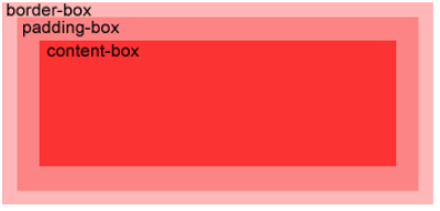
| padding-box | The relative position of the background image filling box, the default value |
| border-box | The relative position of the bounding box of the background image |
| content-box | The content box of the relative position of the background image |
background-clip
The background clip property specifies the background drawing area.
| value | explain |
|---|---|
| border-box | Default value. The background is drawn inside the border box (cut into a border box). |
| padding-box | The background is drawn inside the filled box (cut into a filled box). |
| content-box | The background is drawn in the content box (cut into the content box). |
CSS3 gradient
CSS3 gradients allow you to show a smooth transition between two or more specified colors.
CSS3 defines two types of gradients:
- Linear Gradients - down / up / left / right / diagonal
- Radial Gradients - defined by their centers
CSS3 linear gradient
background-image: linear-gradient(direction|angle, color-stop1, color-stop2, ...);
The linear gradient() function is used to create a picture that represents a linear gradient of two or more colors.
To create a linear gradient, you need to specify at least two colors, and you can also realize the gradient effect in different directions (specified as an angle). If you do not specify the direction, the gradient will be from top to bottom by default.
Usage direction: to bottom, to top, to right, to left, to bottom right, to bottom left, to top left, to top right.
Use angle:
/* From top to bottom, blue fades to red */
linear-gradient(blue, red);

/* The gradient axis is 45 degrees, from blue to red */
linear-gradient(45deg, blue, red);

/* From bottom right to top left, from blue to red */
linear-gradient(to left top, blue, red);

/* From bottom to top, the gradient starts with blue, starts with green at 40% of the height, and ends with red */
linear-gradient(0deg, blue, green 40%, red);
css uneven gradient percentage learning. The percentage represents the standard centerline position of the specified color. The transition color is between the percentages. If there is overlap between the percentages, the gradient transition color will be lost.
/*
10% Indicates that the color center line of red is 10% of the linear gradient direction.
85% Indicates that the color center line of green is 85% of the linear gradient direction.
90% Indicates that the color center line of blue is at 90% of the linear gradient direction.
10% To 85% are red green transition colors, and 85% - 90% are green blue transition colors.
*/
background: linear-gradient(red 10%, green 85%, blue 90%)
CSS3 radial gradient
The radial gradient is defined by its center.
To create a radial gradient, you must also define at least two color nodes. The color node is the color you want to render a smooth transition. At the same time, you can also specify the center, shape (circular or oval) and size of the gradient. By default, the center of the gradient is center (representing the center point), the shape of the gradient is ellipse (representing the ellipse), and the size of the gradient is farthest corner (representing the farthest corner).
background-image: radial-gradient(shape size at position, start-color, ..., last-color);
| value | describe |
|---|---|
| shape | Determines the type of circle: ellipse (default): Specifies the radial gradient of the ellipse. Circle: Specifies the radial gradient of the circle |
| size | Defines the size of the gradient. Possible values: farthest corner (default): Specifies that the radius length of the radial gradient is from the center of the circle to the angle farthest from the center of the circle; Closest side: Specifies that the radius length of the radial gradient is from the center of the circle to the edge closest to the center of the circle; Closest corner: Specifies that the radius length of the radial gradient is from the center of the circle to the nearest angle from the center of the circle farthest side: Specifies that the radius length of the radial gradient is from the center of the circle to the edge farthest from the center of the circle |
| position | Defines the position of the gradient. Possible values: Center (default): set the ordinate value of the center of the radial gradient in the middle. Top: set the top as the ordinate value of the radial gradient center. Bottom: set the bottom as the ordinate value of the radial gradient center. |
| start-color, ..., last-color | Specifies the start and end color of the gradient. |
background-image: radial-gradient(circle farthest-side at 60% 55%, blue, green, yellow, black);
Transparency gradient
CSS3 gradients also support transparency, which can be used to create a fading effect.
To add transparency, we use the rgba() function to define the color node. The last argument in the rgba() function can be a value from 0 to 1, which defines the transparency of the color: 0 means fully transparent and 1 means fully opaque.
background-image: linear-gradient(to right, rgba(255,0,0,0), rgba(255,0,0,1));
rgba is an attribute in CSS3. The first three numbers in rgba brackets represent the rgb values (0-255) of the three colors of red green blue. The last one is to set the transparency of the color, that is, the alpha value. The range is from 0 to 1. The closer to 1, the lower the transparency.
Repeated linear gradient
The repeating linear gradient() function is used to repeat a linear gradient:
background-image: repeating-linear-gradient(red, yellow 10%, green 20%);
Repeated radial gradient
The repeating radial gradient() function is used to repeat the radial gradient:
background-image: repeating-radial-gradient(red, yellow 10%, green 15%);
CSS3 text effect
text-shadow
The text shadow property applies to shaded text.
text-shadow: h-shadow v-shadow blur color;
| value | describe |
|---|---|
| h-shadow | Required. The location of the horizontal shadow. Negative values are allowed. |
| v-shadow | Required. The position of the vertical shadow. Negative values are allowed. |
| blur | Optional. Fuzzy distance. |
| color | Optional. The color of the shadow. see CSS color value. |
text-shadow:0 0 3px #FF0000;
text-overflow
The text overflow attribute specifies how text should be displayed when it overflows the element containing it. You can set that after overflow, the text is cut and ellipsis (...) is displayed Or display a custom string (valid only in Firefox browser)).
| value | describe |
|---|---|
| clip | Cut text. |
| ellipsis | Show ellipsis To represent the trimmed text. |
| string | Use the given string to represent the trimmed text. |
| initial | Set as the default value of the property. Read about initial |
| inherit | Inherit the attribute value from the parent element. Read about inherit |
Text overflow needs to be used with the following two attributes:
- white-space: nowrap;
- overflow: hidden;
text-overflow: clip|ellipsis|string|initial|inherit;
word-wrap
The word wrap attribute allows long, indivisible words to be split and wrapped to the next line.
| value | describe |
|---|---|
| normal | Wrap only at the allowed hyphenation point (the browser keeps the default processing). |
| break-word | Wrap inside a long word or URL address. |
/*
<p class="test"> This paragraph contains a very long word: thisisaveryveryveryveryveryverylongword. The long word will break and wrap to the next line.</p>
*/
p.test {
	width:11em;
	border:1px solid #000000;
	word-wrap:break-word;
}
word-break
The word break property specifies the line breaking rule for non CJK scripts.
Tip: CJK script is the script of China, Japan and South Korea ("China, Japan and South Korea").
| value | describe |
|---|---|
| normal | Use the browser's default line break rule. |
| break-all | Allow line breaks within words. |
| keep-all | You can only wrap at half width spaces or hyphens. |
word-break: normal|break-all|keep-all;

p.test {word-break:break-all;}
CSS3 font
With previous versions of CSS, web designers had to use fonts already installed on the user's computer.
With CSS3, a web designer can use any font he / she likes.
When you find the font file you want to use, simply include the font file in the website, and it will be automatically downloaded to the users who need it.
Your own font is defined in the CSS3 @ font face rule. The following table lists all font descriptions and @ font face rule definitions:
| descriptor | value | describe |
|---|---|---|
| font-family | name | Required. Specifies the name of the font. |
| src | URL | Required. Defines the URL of the font file. |
| font-stretch | normal/condensed/ultra-condensed/extra-condensed/semi-condensed/expanded/semi-expanded/extra-expanded/ultra-expanded | Optional. Defines how fonts are stretched. The default is "normal". |
| font-style | normal/italic/oblique | Optional. Defines the style of the font. The default is "normal". |
| font-weight | normal/bold/100/200/300/400/500/600/700/800/900 | Optional. Defines the thickness of the font. The default is "normal". |
| unicode-range | unicode-range | Optional. Defines the UNICODE character range supported by the font. The default is "U+0-10FFFF". |
@font-face
{
    font-family: myFirstFont;
    src: url(sansation_light.woff);
}

div
{
    font-family:myFirstFont;
}
CSS3 2D conversion
Conversion properties
The transform attribute is applied to the 2D or 3D transformation of the element. This property allows you to rotate, scale, move, tilt, and so on.
transform: none|transform-functions;
The transform origin attribute allows you to change the location of the transform element. 2D conversion elements can change the X and Y axes of elements. You can also change the Z axis of an element when converting elements in 3D.
transform-origin: x-axis y-axis z-axis;
Note: the transform attribute must be used before using this attribute.
| value | describe |
|---|---|
| x-axis | Defines where the view is placed on the X axis. Possible values: left/center/right/length /% |
| y-axis | Defines where the view is placed on the Y axis. Possible values: top/center/bottom/length /% |
| z-axis | Defines where the view is placed on the Z axis. Possible values: length |
2D conversion method
| function | describe |
|---|---|
| matrix(n,n,n,n,n,n) | Define a 2D transformation using a matrix of six values. |
| translate(x,y) | Defines a 2D transformation that moves elements along the X and Y axes. |
| translateX(n) | Defines a 2D transformation that moves elements along the X axis. |
| translateY(n) | Define the 2D transformation and move the element along the Y axis. |
| scale(x,y) | Define the 2D scaling transformation and change the width and height of the element. |
| scaleX(n) | Define the 2D scaling transformation and change the width of the element. |
| scaleY(n) | Define the 2D scaling transformation and change the height of the element. |
| rotate(angle) | Define 2D rotation and specify the angle in the parameter. |
| skew(x-angle,y-angle) | Defines the 2D tilt conversion, along the X and Y axes. |
| skewX(angle) | Defines the 2D tilt conversion, along the X axis. |
| skewY(angle) | Defines the 2D tilt conversion, along the Y axis. |
/*Move 50 pixels from the left element and 100 pixels from the top*/
div {
	-ms-transform: translate(50px,100px); /* IE 9 */
	-webkit-transform: translate(50px,100px); /* Safari and Chrome */
    transform: translate(50px,100px);
}

/*Rotate 30 degrees clockwise*/
div {
	-ms-transform: rotate(30deg); /* IE 9 */
	-webkit-transform: rotate(30deg); /* Safari and Chrome */
    transform: rotate(30deg);
}

/*The width is twice the original size and the height is three times its original size*/
div {
    -ms-transform:scale(2,3); /* IE 9 */
	-webkit-transform: scale(2,3); /* Safari */
	transform: scale(2,3); /* Standard grammar */
}

/*Tilt 30 degrees on the X-axis and 20 degrees on the Y-axis*/
div
{
	-ms-transform: skew(30deg,20deg); /* IE 9 */
	-webkit-transform: skew(30deg,20deg); /* Safari and Chrome */
    transform: skew(30deg,20deg);
}

/*Rotate div element 30 degrees*/
div
{
	-ms-transform:matrix(0.866,0.5,-0.5,0.866,0,0); /* IE 9 */
	-webkit-transform:matrix(0.866,0.5,-0.5,0.866,0,0); /* Safari and Chrome */
    transform:matrix(0.866,0.5,-0.5,0.866,0,0);
}
CSS3 3D conversion
Conversion properties
- tansform,tansform-orgin
- The transform style attribute specifies how nested elements are rendered in 3D space.
| value | describe |
|---|---|
| flat | Indicates that all child elements are rendered in a 2D plane. Default value |
| preserve-3d | Indicates that all child elements are rendered in 3D space. |
/*Let the converted child elements retain the 3D conversion*/
div {
    -webkit-transform: rotateY(60deg); /* Safari and Chrome */
    -webkit-transform-style: preserve-3d; /* Safari and Chrome */
    transform: rotateY(60deg);
    transform-style: preserve-3d;
}
- Perspective specifies the perspective effect of 3D elements.
perspective: number|none;

/*Sets the angle from which to view an element*/
div
{
    -webkit-perspective: 500px; /* Safari and Chrome */
     perspective: 500px;
}
- Specify the position of the bottom of the 3D perspective period element.
perspective-origin: x-axis y-axis;

div {
    -webkit-perspective:150; /* Safari and Chrome */
    -webkit-perspective-origin: 10% 10%; /* Safari and Chrome */
    perspective:150;
    perspective-origin: 10% 10%;
}
- Backface visibility defines whether an element is visible when it is not facing the screen.
| value | describe |
|---|---|
| visible | The back is visible. |
| hidden | The back is invisible. |
div
{
    -webkit-backface-visibility:hidden; /* Chrome ,Safari */
    -moz-backface-visibility:hidden; /* Firefox */
    -ms-backface-visibility:hidden; /* Internet Explorer */
    backface-visibility:hidden;
}
3D conversion method
| function | describe |
|---|---|
| matrix3d(n,n,n,n,n,n, n,n,n,n,n,n,n,n,n,n) | Define 3D conversion, using a 4x4 matrix of 16 values. |
| translate3d(x,y,z) | Define 3D conversion. |
| translateX(x) | Define the 3D conversion, using only the values for the X axis. |
| translateY(y) | Define the 3D conversion, using only the values for the Y axis. |
| translateZ(z) | Define the 3D conversion, using only the values for the Z axis. |
| scale3d(x,y,z) | Defines the 3D scale conversion. |
| scaleX(x) | Define 3D scaling conversion by giving a value of X axis. |
| scaleY(y) | Define 3D scaling conversion by giving a value of Y axis. |
| scaleZ(z) | Define 3D scaling conversion by giving a value of Z axis. |
| rotate3d(x,y,z,angle) | Define 3D rotation. |
| rotateX(angle) | Defines the 3D rotation along the X axis. |
| rotateY(angle) | Defines the 3D rotation along the Y axis. |
| rotateZ(angle) | Defines the 3D rotation along the Z axis. |
| perspective(n) | Defines the perspective view of the 3D transformation element. |
CSS3 transition
CSS3 transition is the effect of elements gradually changing from one style to another.
transition
The transition attribute sets the transition effect of the element style. It is short for the following four attributes:
- Transition property specifies the name of the CSS property to which the transition is applied.
- Transition duration defines the time taken for the transition effect. The default is 0.
- **Transition timing function * * specifies the time curve of the transition effect. The default is "ease".
- Transition delay specifies when the transition effect begins. The default is 0
transition: property duration timing-function delay; /* Default: all 0 ease 0 */
Note: always specify the transition duration attribute, otherwise if the duration is 0, the transition will not have any effect.
transition-property
transition-property: none|all| property;
| value | describe |
|---|---|
| none | No attributes get a transition effect. |
| all | All attributes will get a transition effect. |
| property | Defines a comma separated list of CSS attribute names that apply transition effects. |
transition-duration
The transition duration property specifies the time (in seconds or milliseconds) it takes to complete the transition effect.
transition-duration: time;
| value | describe |
|---|---|
| time | Specifies the time (in seconds or milliseconds) it takes to complete the transition effect. The default value is 0, which means there will be no effect. |
transition-timing-function
The transition timing function property specifies the speed of the switching effect. This attribute allows a transition effect to change the speed of its duration.
transition-timing-function: linear|ease|ease-in|ease-out|ease-in-out|cubic-bezier(n,n,n,n);
| value | describe |
|---|---|
| linear | Specifies the transition effect from beginning to end at the same speed (equal to cubic Bezier (0,0,1,1)). |
| ease | Specify the transition effect of starting slowly, then getting faster, and then ending slowly (cubic Bezier (0.25,0.1,0.25,1)). |
| ease-in | Specifies the transition effect starting at a slow speed (equal to cubic Bezier (0.42,0,1,1)). |
| ease-out | Specifies the transition effect ending at a slow speed (equal to cubic Bezier (0,0,0.58,1)). |
| ease-in-out | Specifies the transition effect starting and ending at a slow speed (equal to cubic Bezier (0.42,0,0.58,1)). |
| cubic-bezier(n,n,n,n) | Define your own value in the cubic Bezier curve function. Possible values are values between 0 and 1. |
transition-delay
The transition delay property specifies when the transition effect will begin.
The transition delay value is in seconds (S) or milliseconds (ms). The default value is 0.
transition-delay: time;
<!DOCTYPE html>
<html>
<head>
<meta charset="utf-8">
<title>Rookie tutorial(runoob.com)</title>
<style>
div
{
	width: 100px;
	height: 100px;
	background: red;
	-webkit-transition: width 2s ease 2s, height 3s ease 2s; /* Safari */
	transition: width 2s ease, height 3s ease 2s;
}

div:hover
{
	width: 300px;
	height: 300px;
}
</style>
</head>
<body>
<p><b>be careful:</b>The instance cannot be in Internet Explorer 9 And earlier IE Work on version.</p>

<div></div>

<p>Move the mouse to div On the element, view the transition effect.</p>

</body>
</html>
CSS3 animation
CSS3 can create animation, which can replace many web page animation images, Flash animation and JavaScript effects.
@The keyframes rule is to create animations by gradually changing the style settings from one CSS to another.
You can change CSS style settings multiple times during animation.
When the specified change occurs, use%, or the keywords "from" and "to", which are the same as 0% to 100%. 0% is the beginning of the animation, and 100% is when the animation is completed.
For best browser support, you should always define selectors as 0% and 100%.
@keyframes animationname {keyframes-selector {css-styles;}}
| value | explain |
|---|---|
| animationname | Required. Defines the name of the animation. |
| keyframes-selector | Required. Percentage of animation duration. Legal values: 0-100%, from (same as 0%), to (same as 100%). Note: you can use an animated keyframes selectors. |
| css-styles | Required. One or more legitimate CSS style attributes |
animation
Animation shorthand for all animation attributes.
animation: name duration timing-function delay iteration-count direction fill-mode play-state;
<!DOCTYPE html>
<html>
<head>
<meta charset="utf-8">
<title>Rookie tutorial(runoob.com)</title>
<style>
div
{
	width:100px;
	height:100px;
	background:red;
	position:relative;
    -webkit-animation: mymove 5s linear 2s infinite alternate;/* Safari And Chrome: */
    animation: mymove 5s linear 2s infinite alternate;
}

@keyframes mymove
{
	0%   {top:0px; left:0px; background:red;}
	25%  {top:0px; left:100px; background:blue;}
	50%  {top:100px; left:100px; background:yellow;}
	75%  {top:100px; left:0px; background:green;}
	100% {top:0px; left:0px; background:red;}
}

@-webkit-keyframes mymove /* Safari and Chrome */
{
	0%   {top:0px; left:0px; background:red;}
	25%  {top:0px; left:100px; background:blue;}
	50%  {top:100px; left:100px; background:yellow;}
	75%  {top:100px; left:0px; background:green;}
	100% {top:0px; left:0px; background:red;}
}
</style>
</head>
<body>

<p><strong>be careful:</strong>@keyframes incompatible IE 9 and And earlier browsers.</p>

<div></div>

</body>
</html>
animation-name
The animation name property specifies a name for the @ keyframes animation.
animation-name: keyframename|none;
| value | explain |
|---|---|
| keyframename | Specifies the name of the key to bind to the selector |
| none | Specifies whether there is animation (which can be used to override animation from cascading) |
animation-duration
The animation duration property defines how many seconds or milliseconds it takes an animation to complete a cycle.
animation-duration: time;
animation-timing-function
Animation timing function specifies how the animation will complete a cycle.
The speed curve defines the time it takes for the animation to change from one set of CSS styles to another. The speed curve is used to make the change smoother.
animation-timing-function: linear|ease|ease-in|ease-out|ease-in-out|
							cubic-bezier(n,n,n,n)|steps(int,start|end);
animation-delay
The animation delay property defines when the animation starts.
The unit of the animation delay value can be seconds (s) or milliseconds (ms).
Tip: allow negative values, - 2s to start the animation immediately, but skip 2 seconds to enter the animation.
animation-iteration-count
The animation iteration count property defines how many times the animation should be played.
| value | describe |
|---|---|
| n | A number that defines how many times the animation should be played. Default 1 |
| infinite | Specifies that the animation should play indefinitely (forever) |
animation-direction
The animation direction property defines whether the animation is played back alternately in cycles.
Note: this property has no effect if the animation is set to play only once.
| value | describe |
|---|---|
| normal | Default value. The animation plays normally. |
| reverse | The animation plays backwards. |
| alternate | The animation is performed an odd number of times (1, 3, 5...) Forward play, even number of times (2, 4, 6...) Play backwards. |
| alternate-reverse | The animation is performed an odd number of times (1, 3, 5...) Reverse play, even number of times (2, 4, 6...) Forward play. |
animation-fill-mode
The animation fill mode attribute specifies the style to be applied to the element when the animation does not play (when the animation is complete, or when the animation does not start playing with a delay).
By default, CSS animation does not affect elements until the first key frame is played, and stops affecting elements after the last key frame is played. The animation fill mode property overrides this behavior.
| value | describe |
|---|---|
| none | Default value. The animation does not apply any styles to the target element before and after the animation is executed. |
| forwards | At the end of the animation (as determined by the animation iteration count), the animation applies the attribute value. |
| backwards | The animation applies the attribute values defined in the keyframes that start the first iteration of the animation during the animation delay definition. These are values in the from keyframe (when the animation direction is normal or alternate) or the to keyframe (when the animation direction is reverse or alternate reverse). |
| both | Animation follows the rules of forwards and backwards. That is, animation expands animation attributes in two directions. |
/*Animate an object from one place to another and let it stay there*/
-webkit-animation-fill-mode:forwards; /* Safari And Chrome */
animation-fill-mode:forwards;
animation-play-state
The animation -- play state property specifies whether the animation is running or paused.
Note: use this property in JavaScript to pause animation during a cycle.
animation-play-state: paused|running;
CSS3 multi column
column-count
The column count property specifies the number of columns to split.
| value | explain |
|---|---|
| number | The optimal number of columns will prevent the contents of the elements from flowing out |
| auto | The number of columns will depend on other attributes, such as: "column width" |
column-gap
The column gap property specifies the gap between columns.
column-gap: length|normal;
column-rule-style
The column rule style property specifies the border style between columns.
column-rule-style: none|hidden|dotted|dashed|solid|double|groove|ridge|inset|outset;
column-rule-width
The column rule width property specifies the border thickness of the two columns.
| value | explain |
|---|---|
| thin | Rules for specifying a thin border |
| medium | Define a medium border rule |
| thick | Rules for specifying a thick border |
| length | Rules for specifying width |
column-rule-color
The column rule color property specifies the border color of the two columns.
column-rule
Column rule attribute is the abbreviation of all attributes of column rule - *. The column rule property sets the width, style, and color between columns.
/* column-rule: column-rule-width column-rule-style column-rule-color; */

div.newspaper {
	-moz-column-count:3; /* Firefox */
	-webkit-column-count:3; /* Safari and Chrome */
	column-count:3;

	-moz-column-gap:40px; /* Firefox */
	-webkit-column-gap:40px; /* Safari and Chrome */
	column-gap:40px;

	-webkit-column-rule: 1px solid lightblue; /* Chrome, Safari, Opera */
    -moz-column-rule: 1px solid lightblue; /* Firefox */
    column-rule: 1px solid lightblue;
}
column-width
The column width property specifies the width of the column.
| value | describe |
|---|---|
| auto | The browser determines the width of the column |
| length | Specifies the length of the column width |
div {
	-moz-column-width:100px; /* Firefox */
	-webkit-column-width:100px; /* Safari and Chrome */
    column-width:100px;
}
column-span
The column span attribute specifies how many columns an element should span.
| value | describe |
|---|---|
| 1 | Element should span a column |
| all | This element should span all columns |
h2 {
	-webkit-column-span:all; /* Safari and Chrome */
    column-span:all;
}
columns
columns is a shorthand for column width and column count.
/*columns: column-width column-count;
Default: auto auto*/
div {
    -webkit-columns:100px 3; /* Safari and Chrome */
    -moz-columns:100px 3; /* Firefox */
    /*
   	When the width of each column is greater than 100px, it will be displayed in three columns; When the browser width is reduced, which makes it impossible to meet the requirement that each column is greater than 100px in the case of three columns, it starts to turn to 2 	 Column; When the browser zooms out again and each column in the 2 columns can no longer maintain 100px each column, it will be converted to 1 column again

	By analogy, "100px" is the width value that can not be lower than each column, "3" indicates the column to be displayed. Relative to setting column width or column count separately, 		 columns should be more flexible.
    */
    columns:100px 3;
}
CSS3 user interface
resize
The resize attribute specifies whether an element is resized by the user. The effect is similar to < textarea > < / textarea > text field label.
resize: none|both|horizontal|vertical:
| value | describe |
|---|---|
| none | You cannot resize an element. |
| both | You can adjust the height and width of the element. |
| horizontal | You can adjust the width of the element. |
| vertical | You can adjust the height of the element. |
outline-offset
The outline offset property sets the offset of the outline frame outside the border edge.
outline-offset: length|inherit:
box-sizing
The box sizing attribute specifies the calculation method of the final size of the container element, mainly setting whether to add padding and border, etc.
| value | explain |
|---|---|
| content-box | Default value. If you set the width of an element to 100px, the content area of the element will be 100px wide, and the width of any border and inner margin will be increased to the width of the last drawn element. |
| border-box | Tell the browser: the values of the border and inner margin you want to set are included in width. In other words, if you set the width of an element to 100px, the 100px will include its border and padding. The actual width of the content area is the value of width minus (border + padding). In most cases, this makes it easier to set the width and height of an element. Note: border box does not include margin. |
| inherit | Specifies the value of the box sizing attribute, which should be inherited from the parent element |
/* Set general box sizing */
* {
  box-sizing: border-box;
}
Box sizing is used to tell the browser which box model to use to render the document.
Content box is the default box model, that is, W3C standard box model. Now all mainstream browsers support and use this model to render layout, including IE. But the trouble is a pile, because in this model, the setting of border and padding will destroy the size of elements, resulting in the final layout effect does not meet the ideal effect. If you want to achieve the ideal effect, you need to calculate the width and height, which is very troublesome.
The border box refers to the IE box model, also known as the "weird box model". Under this model, the border and filling will not affect the width and height of the element, which is equivalent to occupying the space of the element into its own space. The overall size of the element remains the same, the content space becomes smaller, and the border and filling occupy the place originally belonging to the content space. This is very comfortable when designing the layout at ordinary times, because after specifying the element size and setting the attribute value, the element size will not be damaged and recalculated.
CSS3 picture
Filter (filter)
The filter attribute defines the visual effects (such as blur and saturation) of the element (usually).
filter: none | blur() | brightness() | contrast() | drop-shadow() | grayscale() | hue-rotate() | invert() | opacity() | saturate() | sepia() | url();
be careful:
- The filter usually uses a percentage (e.g. 75%), of course, it can also be expressed as a decimal (e.g. 0.75).
- Multiple filters can be used, each separated by a space.
| Filter | describe |
|---|---|
| none | Default, no effect. |
| blur(px) | Set Gaussian blur to the image. The value of "radius" sets the standard deviation of Gaussian function or the number of pixels on the screen, so the larger the value, the more blurred it will be; If there is no set value, the default value is 0; This parameter sets the css length value, but does not accept the percentage value. |
| brightness(%) | Apply a linear multiplication to the picture to make it look brighter or darker. If the value is 0%, the image will be completely black. If the value is 100%, the image does not change. Other values correspond to the linear multiplier effect. If the value exceeds 100%, the image will be brighter than the original. If there is no set value, the default value is 1. |
| contrast(%) | Adjust the contrast of the image. If the image is all black, it will be 0%. The value is 100% and the image remains unchanged. The value can exceed 100%, which means that a lower contrast will be used. If no value is set, the default value is 1. |
| drop-shadow(h-shadow v-shadow blur spread color) | Set a shadow effect on the image. |
| grayscale(%) | Converts an image to a grayscale image. Value defines the scale of the conversion. If the value is 100%, it will be completely converted to gray image, and if the value is 0%, the image will not change. A value between 0% and 100% is the linear multiplier of the effect. If not set, the default value is 0; |
| hue-rotate(deg) | Apply hue rotation to the image. The "angle" value sets the color ring angle value that the image will be adjusted. If the value is 0deg, the image does not change. If the value is not set, the default value is 0deg. Although there is no maximum value, a value exceeding 360deg is equivalent to another circle. |
| invert(%) | Inverts the input image. Value defines the scale of the conversion. 100% of the value is completely reversed. If the value is 0%, the image does not change. Values between 0% and 100% are linear multipliers of the effect. If the value is not set, the default value is 0. |
| opacity(%) | The transparency of the converted image. Value defines the scale of the conversion. A value of 0% is completely transparent, and a value of 100% has no change in the image. If the value is between 0% and 100%, it is the linear multiplier of the effect, which is also equivalent to multiplying the number of image samples. If the value is not set, the default value is 1. This function is very similar to the existing opacity attribute. The difference is that through filter, some browsers will provide hardware acceleration in order to improve performance. |
| saturate(%) | Convert image saturation. Value defines the scale of the conversion. A value of 0% is completely unsaturated, and a value of 100% has no change in the image. Other values are linear multipliers of the effect. More than 100% is allowed, there is a higher saturation. If the value is not set, the default value is 1. |
| sepia(%) | Converts the image to dark brown. Value defines the scale of the conversion. A value of 100% is completely dark brown, and a value of 0% has no change in the image. A value between 0% and 100% is the linear multiplier of the effect. If not set, the default value is 0; |
| url() | The URL function accepts an XML file that sets an SVG filter and can contain an anchor to specify a specific filter element. For example: filter: URL (SVG url#element ID) |
| initial | Set the attribute to the default value. See: CSS initial keyword |
| inherit | Inherit this attribute from the parent element. See: CSS inherit keyword |
img {
    -webkit-filter: contrast(200%) brightness(150%);  /* Chrome, Safari, Opera */
    filter: contrast(200%) brightness(150%);
}
CSS3 flex box
Elastic box is a new layout mode of CSS3.
CSS3 elastic box (Flexible Box or flexbox) is a layout method to ensure that elements have appropriate behavior when the page needs to adapt to different screen sizes and device types.
The purpose of introducing elastic box layout model is to provide a more effective way to arrange, align and allocate blank space for sub elements in a container.
Flex container && Flex item
The elastic box consists of a flex container and a flex item.
Elastic containers are defined as elastic containers by setting the value of the display property to flex or inline flex.
The elastic container contains one or more elastic child elements.
Note: the outside of the elastic container and the inside of the elastic sub element are rendered normally. The elastic box only defines how the elastic sub elements are laid out in the elastic container.
Elastic sub elements are usually displayed in a row within the elastic box. By default, there is only one row per container.
<!DOCTYPE html>
<html>
<head>
<style>
.flex-container {
    display: -webkit-flex;
    display: flex;
    width: 400px;
    height: 250px;
    background-color: lightgrey;
}

.flex-item {
    background-color: cornflowerblue;
    width: 100px;
    height: 100px;
    margin: 10px;
}
</style>
</head>
<body>

<div class="flex-container">
  <div class="flex-item">flex item 1</div>
  <div class="flex-item">flex item 2</div>
  <div class="flex-item">flex item 3</div>
</div>

</body>
</html>
justify-content
Justify content is used to set or retrieve the alignment of elastic box elements in the main axis (horizontal axis) direction.
justify-content: flex-start | flex-end | center | space-between | space-evenly | space-around;
| value | describe |
|---|---|
| flex-start | Default value. Arrange from the beginning of the line |
| flex-end | Arrange from the end of the line |
| center | Center (if the remaining free space is negative, the elastic items will overflow in both directions at the same time) |
| space-between | Arrange each element evenly, with the first element at the starting point and the last element at the end point (if the remaining space is negative or there is only one elastic item, this value is equivalent to flex start) |
| space-evenly | Arrange each element evenly with equal spacing between each element |
| space-around | Arrange each element evenly and allocate the same space around each element (if the remaining space is negative or there is only one elastic item, the value is equivalent to center) |
.flex-container {
    display: -webkit-flex;
    display: flex;
    -webkit-justify-content: flex-end;
    justify-content: flex-end;
    width: 400px;
    height: 250px;
    background-color: lightgrey;
}
align-items
Align items sets or retrieves the alignment of elastic box elements in the direction of the side axis (longitudinal axis).
Tip: use the align self attribute of each elastic object element to override the align items attribute.
align-items: flex-start | flex-end | center | baseline | stretch
| value | describe |
|---|---|
| stretch | Default value. Elements are stretched to fit the container. If the attribute value of the specified side axis size is' auto ', its value will make the size of the item's margin box as close as possible to the size of the row, but will comply with the limit of the' min / max width / height 'attribute. |
| flex-start | The element is at the beginning of the container. |
| flex-end | The element is at the end of the container. |
| center | The element is located in the center of the container. If the size of the row is smaller than the size of the elastic box element, the same length will overflow in both directions. |
| baseline | The element is located on the baseline of the container. If the inner axis of the elastic box element is the same as the side axis, this value is equivalent to 'flex start'. In other cases, this value will participate in baseline alignment. |
.flex-container {
    display: -webkit-flex;
    display: flex;
    -webkit-align-items: center;
    align-items: center;
    width: 400px;
    height: 250px;
    background-color: lightgrey;
}
flex-flow
The flex flow attribute is a composite of the flex direction and flex wrap attributes.
Note: if the element is not the element of the elastic box object, the flex flow attribute has no effect.
flex-flow: flex-direction flex-wrap|initial|inherit;

/* Default: Flex flow: row nowrap */
flex-direction
The flex direction attribute specifies the position of the elastic child element in the parent container.
flex-direction: row | row-reverse | column | column-reverse;
| value | describe |
|---|---|
| row | Arrange horizontally from left to right (align left), the default arrangement |
| row-reverse | Reverse horizontal arrangement (right aligned, from back to front, with the last item at the front) |
| column | Longitudinal arrangement |
| column-reverse | Reverse the vertical arrangement, from the back to the front, and the last item is at the top |
.flex-container {
    display: -webkit-flex;
    display: flex;
    -webkit-flex-direction: row-reverse;
    flex-direction: row-reverse;
    width: 400px;
    height: 250px;
    background-color: lightgrey;
}
flex-wrap
The flex wrap attribute is used to specify how the child elements of the elastic box wrap.
flex-wrap: nowrap|wrap|wrap-reverse|initial|inherit;
| value | describe |
|---|---|
| nowrap | Default value. Specify flexible items without splitting rows or columns. |
| wrap | Specify flexible items and split them into rows or columns when necessary. |
| wrap-reverse | Provide for flexible items to be broken down in rows or columns when necessary, but in reverse order. |
.flex-container {
    display: -webkit-flex;
    display: flex;
    -webkit-flex-wrap: wrap;
    flex-wrap: wrap;
    width: 300px;
    height: 250px;
    background-color: lightgrey;
}
align-content
The align content attribute is used to modify the behavior of the flex wrap attribute. It is similar to align items, but instead of setting the alignment of elastic child elements, it sets the alignment of each row.
Note: there must be multiple lines of items in the container for this attribute to render.
align-content: flex-start | flex-end | center | space-between | space-around | stretch;
| value | describe |
|---|---|
| stretch | Default. The rows will stretch to take up the remaining space. |
| center | The rows are stacked in the middle of the elastic box container. |
| flex-start | Each row is stacked to the starting position of the elastic box container. |
| flex-end | Each row is stacked to the end of the elastic box container. |
| space-between | The rows are evenly distributed in the elastic box container. |
| space-around | Each row is evenly distributed in the elastic box container, and half of the spacing between child elements is reserved at both ends. |
.flex-container {
    display: -webkit-flex;
    display: flex;
    -webkit-flex-wrap: wrap;
    flex-wrap: wrap;
    -webkit-align-content: center;
    align-content: center;
    width: 300px;
    height: 300px;
    background-color: lightgrey;
}
order
The order property sets or retrieves the order in which the child elements of the elastic box model object appear.
Note: if the element is not an element of the elastic box object, the order attribute has no effect.
order: number;
Use integer values to define the arrangement order, and the ones with small values are in the front. Can be negative.
/*
<div class="flex-item first">flex item 2</div>
*/
.flex-item {
    background-color: cornflowerblue;
    width: 100px;
    height: 100px;
    margin: 10px;
}

.first {
    -webkit-order: -1;
    order: -1;
}
Align margin
Set the "margin" value to the "auto" value to automatically obtain the remaining space in the elastic container.
Therefore, setting the vertical margin value to "auto" can make the elastic sub element completely centered on the two upper axes of the elastic container.
<!DOCTYPE html>
<html>
<head>
<meta charset="utf-8">
<title>Rookie tutorial(runoob.com)</title>
<style>
.flex-container {
    display: -webkit-flex;
    display: flex;
    width: 400px;
    height: 250px;
    background-color: lightgrey;
}

.flex-item {
    background-color: cornflowerblue;
    width: 75px;
    height: 75px;
    margin: auto;
}
</style>
</head>
<body>

<div class="flex-container">
  <div class="flex-item">Perfect centering!</div>
</div>

</body>
</html>
The problem of vertical centering of block elements is solved by flex.
The problem of vertical centering of inline elements is solved as follows:
1) Single line
The value of the css attribute line height of the element is consistent with the css attribute height of the parent element of the element.
2) Multiline
Set the css attribute of the element: display: table cell; vertical-align: middle;, You also need to set the css attribute of the parent element of this element: display: table;.
align-self
The align self attribute is used to set the alignment of the elastic element itself in the direction of the side axis (longitudinal axis). The align self property overrides the align items property of the flexible container.
align-self: auto | flex-start | flex-end | center | baseline | stretch
| value | describe |
|---|---|
| auto | Default value. Element inherits the align items attribute of its parent container. stretch if there is no parent container. |
| flex-start | The boundary of the starting position of the side axis (longitudinal axis) of the elastic box element is close to the starting boundary of the side axis of the row. |
| flex-end | The boundary of the starting position of the side axis (longitudinal axis) of the elastic box element is close to the end boundary of the side axis of the row. |
| center | The elastic box element is centered on the side axis (longitudinal axis) of the row. |
| baseline | If the inner axis and side axis of the elastic box element are the same, this value is equivalent to 'flex start'. In other cases, this value will participate in baseline alignment. |
| stretch | Elements are stretched to fit the container. |
<!DOCTYPE html>
<html>
<head>
<meta charset="utf-8">
<title>Rookie tutorial(runoob.com)</title>
<style>
.flex-container {
    display: -webkit-flex;
    display: flex;
    width: 400px;
    height: 250px;
    background-color: lightgrey;
}

.flex-item {
    background-color: cornflowerblue;
    width: 60px;
    min-height: 100px;
    margin: 10px;
}

.item1 {
    -webkit-align-self: flex-start;
    align-self: flex-start;
}
.item2 {
    -webkit-align-self: flex-end;
    align-self: flex-end;
}

.item3 {
    -webkit-align-self: center;
    align-self: center;
}

.item4 {
    -webkit-align-self: baseline;
    align-self: baseline;
}

.item5 {
    -webkit-align-self: stretch;
    align-self: stretch;
}
</style>
</head>
<body>

<div class="flex-container">
  <div class="flex-item item1">flex-start</div>
  <div class="flex-item item2">flex-end</div>
  <div class="flex-item item3">center</div>
  <div class="flex-item item4">baseline</div>
  <div class="flex-item item5">stretch</div>
</div>

</body>
</html>
flex
The flex property is used to set or retrieve how the child elements of the elastic box model object allocate space.
The flex attribute is a shorthand for the flex grow, flex shrink, and flex basis attributes.
Note: if the element is not a child element of the elastic box model object, the flex attribute has no effect.
flex: auto | initial | none | inherit | [ flex-grow ] || [ flex-shrink ] || [ flex-basis ]
| value | describe |
|---|---|
| flex-grow | A number that specifies how much the project will expand relative to other flexible projects. The default value is 0. |
| flex-shrink | A number that specifies the amount by which an item will shrink relative to other flexible items. The default value is 1. |
| flex-basis | The length of the item. Legal value: "auto", "inherit" or a number followed by "%", "px", "em" or any other length unit. |
| auto | Same as 1 auto. |
| none | Same as 0 auto. |
| initial | Set the property to its default value, which is 0 1 auto. see also initial. |
| inherit | Inherit this attribute from the parent element. see also inherit. |
flex-grow
The flex growth property is used to set or retrieve the expansion ratio of the elastic box.
Note: if the element is not the element of the elastic box object, the flex growth attribute has no effect.
div {display: flex;}
div:nth-of-type(1) {flex-grow: 1;}
div:nth-of-type(2) {flex-grow: 3;}
div:nth-of-type(3) {flex-grow: 1;}
flex-shrink
The flex shrink attribute specifies the shrink rule for flex elements. Flex elements shrink only when the sum of the default widths is greater than the container, and the size of the shrinkage is based on the value of flex shrink.
Flex shrink allocates the difference between the sum of the child element widths and the parent element widths to each child element according to the value of the child element flex shrink. The original width of each child element subtracts the proportionally allocated value, and the remaining value is the actual width.
Note: if the element is not the element of the elastic box object, the flex shrink attribute has no effect.
<!DOCTYPE html>
<html>
<head>
<meta charset="utf-8">
<title>Rookie tutorial(runoob.com)</title>
<style>
#content {
  display: flex;
  width: 500px;
}

#content div {
  flex-basis: 120px;
  border: 3px solid rgba(0,0,0,.2);
}

.box {
  flex-shrink: 1;
}

.box1 {
  flex-shrink: 2;
}
</style>
</head>
<body>

<p>div Total width 500 px, flex-basic 120 px. </p>
<p>A, B, C set up flex-shrink:1.  D , E Set to flex-shrink:2</p>
<p>D , E Width and A, B, C Different</p>
<div id="content">
  <div class="box" style="background-color:red;">A</div>
  <div class="box" style="background-color:lightblue;">B</div>
  <div class="box" style="background-color:yellow;">C</div>
  <div class="box1" style="background-color:brown;">D</div>
  <div class="box1" style="background-color:lightgreen;">E</div>
</div>
</body>
</html>
Example analysis: the default value of flex shrink is 1. If this attribute is not displayed and defined, the ratio will be calculated automatically after all factors are added according to the default value of 1 to shrink the space.
In this example, A, B and C explicitly define flex shrink as 1 and D and E define flex shrink as 2. Therefore, the remaining space is divided into 7 parts, in which A, B and C account for 1 part and D and E account for 2 parts, i.E. 1:1:2:2
We can see that the parent container is defined as 500px, and the children are defined as 120px. After the children are added, it will be 600 px, exceeding the parent container by 100px. Then the excess 100px needs to be digested by A, B, C, D and E according to the contraction factor.
So we can calculate how much overflow A, B, C, D and E will be removed:
A removed overflow: 100 * (1 / 7), i.e. about 14px
B spillage removed: 100 * (1 / 7), i.e. about 14px
C spillage removed: 100 * (1 / 7), i.e. about 14px
D spillage removed: 100 * (2 / 7), i.e. about 28px
E spillage removed: 100 * (2 / 7), i.e. about 28px
Finally, the actual widths of A, B, C, D and E are: 120-14=106px, 120-14=106px, 120-14=106px, 120-28=92px,120-28=92px. In addition, this width includes the border.
flex-basis
The flex base property is used to set or retrieve the flex base value.
flex-basis: number|auto|initial|inherit;
| value | describe |
|---|---|
| number | A unit of length or a percentage that specifies the initial length of a flexible item. |
| auto | Default value. The length is equal to the length of the flexible item. If the item does not specify a length, the length will be determined according to the content. |
| initial | Set this property to its default value. see also initial. |
| inherit | Inherit this attribute from the parent element. see also inherit. |
CSS3 multimedia query
Using @ media query, you can define different styles for different media types.
@Media can set different styles for different screen sizes, especially if you need to set up responsive pages, @ media is very useful.
The width and height of the page will also be reset according to your browser during rendering.
Syntax:
@media not|only mediatype and (media feature) {
    CSS-Code;
}
not: not is used to exclude some specific devices, such as @ media not print (non printing device). only: used to specify a particular media type.
Multimedia query is composed of multiple media and can contain one or more expressions. The expression returns true or false according to whether the condition is true or not. If true is returned, the document will display the specified style effect on the matching device.
/* When the width of the browser is 520 to 699px or greater than 1151px, change the background color to red */
@media screen and (max-width: 699px) and (min-width: 520px), (min-width: 1151px) {
    div.example {background: red;}
}
You can use different stylesheets for different media:
<link rel="stylesheet" media="not|only mediatype and (media feature)" href="mystylesheet.css">
Media type
| value | describe |
|---|---|
| all | For all equipment |
| For printer and print preview | |
| screen | Used for computer screen, tablet, smartphone, etc. |
| speech | Used in screen readers and other sound generating devices |
media feature
| value | describe |
|---|---|
| width | Defines the width of the visible area of the page in the output device. |
| min-width | Defines the minimum visible area width of the page in the output device. |
| max-width | Defines the maximum visible area width of the page in the output device. |
| height | Defines the height of the visible area of the page in the output device. |
| min-height | Defines the minimum visible area height of the page in the output device. |
| max-height | Defines the height of the maximum visible area of the page in the output device. |
| device-width | Defines the screen visible width of the output device. |
| height | Defines the height of the visible area of the page in the output device. |
| max-device-width | Defines the maximum visible width of the screen of the output device. |
| min-device-width | Defines the minimum visible width of the screen of the output device. |
| device-height | Defines the screen visibility height of the output device. |
| min-device-height | Defines the minimum visible height of the screen of the output device. |
| max-device-height | Defines the maximum height visible on the screen of the output device. |
| orientation | Defines whether the height of the visible area of the page in the output device is greater than or equal to the width. |
| device-aspect-ratio | Defines the ratio of the screen visible width to the height of the output device. |
| min-device-aspect-ratio | Defines the minimum ratio of the screen visible width to the height of the output device. |
| max-device-aspect-ratio | Defines the maximum ratio of the screen visible width to the height of the output device. |
| aspect-ratio | Defines the ratio of width to height of the visible area of the page in the output device |
| min-aspect-ratio | Defines the minimum ratio of width to height of the visible area of the page in the output device. |
| max-aspect-ratio | Defines the maximum ratio of width to height of the visible area of a page in an output device. |
| color | Define the number of each group of color originals of the output device. If it is not a color device, the value is equal to 0 |
| min-color | Define the minimum number of each group of color originals of the output device. |
| max-color | Define the maximum number of each set of color originals of the output device. |
| color-index | Defines the number of entries in the color query table of the output device. If the color query table is not used, the value is equal to 0 |
| min-color-index | Defines the minimum number of entries in the color query table of the output device. |
| max-color-index | Defines the maximum number of entries in the color query table of the output device. |
| resolution | Defines the resolution of the device. For example: 96dpi, 300dpi, 118dpcm |
| min-resolution | Defines the minimum resolution of the device. |
| max-resolution | Defines the maximum resolution of the device. |
| monochrome | Defines the number of monochrome elements per pixel in a monochrome frame buffer. If it is not a monochrome device, the value is equal to 0 |
| min-monochrome | Defines the minimum number of monochrome elements per pixel in a monochrome frame buffer. |
| max-monochrome | Defines the maximum number of monochrome elements per pixel in a monochrome frame buffer. |
| scan | Define the scanning process of TV equipment. |
/*
<h2>Responsive judgment</h2>
<p class="example">Operate the browser window to view the effect</ p>
*/
.example {
    padding: 20px;
    color: white;
}
/* Extra small devices (phones, 600px and down) */
@media only screen and (max-width: 600px) {
    .example {background: red;}
}

/* Small devices (portrait tablets and large phones, 600px and up) */
@media only screen and (min-width: 600px) {
    .example {background: green;}
}

/* Medium devices (landscape tablets, 768px and up) */
@media only screen and (min-width: 768px) {
    .example {background: blue;}
}

/* Large devices (laptops/desktops, 992px and up) */
@media only screen and (min-width: 992px) {
    .example {background: orange;}
}

/* Extra large devices (large laptops and desktops, 1200px and up) */
@media only screen and (min-width: 1200px) {
    .example {background: pink;}
}
Note: set the attribute of css style for the element, if it is the same as the media style set in media query. It should be noted that the css style of the element should be written on the media query, otherwise the css style will overwrite the media style and invalidate it.
CSS grid layout
CSS provides a grid based layout system with rows and columns, which makes it easier for us to design web pages without using floating and positioning.
CSS grid container
To turn an HTML element into a grid container, set the display attribute to grid or inline grid. All immediate child elements of this element will become grid elements.
- Use display: grid; To set the block level elements of the grid container.
- Use display: inline grid; To set the inline grid container.
grid-template-columns
The grid template columns property is used to set the number and width of columns in the grid layout. Property values are a space separated list, where each value defines the width of the corresponding column.
grid-template-columns: none|auto|max-content|min-content|length|initial|inherit;
| value | describe |
|---|---|
| none | By default, the size of the column is not specified. |
| auto | The size of the column is determined by the size of the container and the content of the grid elements in the column. |
| max-content | The size of each column is set to the size of the largest grid element in that column. |
| min-content | The size of each column is set to the size of the smallest grid element in that column. |
| length | Length value, which can be a value in px or a percentage%. 0 is the default. Learn more Length unit. |
| initial | Set this property to the default value. Read about initial |
| inherit | Inherit this attribute from the parent element. Read about inherit |
If you want the grid layout to contain 4 columns, you need to set the width of 4 columns. If the width of all columns is the same, you can set it to auto.
.grid-container {
  display: grid;
  grid-template-columns: auto auto auto auto;
}
Note: if you have more than 4 grid elements in a 4-column grid, the grid layout will generate a new row to place the element.
.grid-container {
  display: grid;
  grid-template-columns: 80px 200px auto 40px; /* Declare 4 columns and specify the width of the column */
}
The grid introduces fr units to help us create flexible grid tracks (a grid track is the space between any two lines in the grid). One fr unit represents an equal share of the available space in the grid container.
.grid-container {
  display: grid;
  /*Defining a mesh definition creates three tracks of equal width that grow and contract with the available space*/
  grid-template-columns: 1fr 1fr 1fr;
}
grid-template-rows
The grid template rows property is used to set the number and height of rows in the grid layout. These values are a space separated list, where each value specifies the height of the corresponding row.
grid-template-rows: none|auto|max-content|min-content|length|initial|inherit;
grid-template-areas
The grid template areas property is used to set the grid layout.
grid-area Attribute can name grid elements.
Named grid elements can be referenced through the grid template areas attribute of the container.
Each line is defined by '' within single quotation marks, separated by spaces.
. indicates a grid item without a name.
.item1 { grid-area: header; }
.item2 { grid-area: menu; }
.item3 { grid-area: main; }
.item4 { grid-area: right; }
.item5 { grid-area: footer; }

.grid-container {
    display: grid;
  	grid-template-areas:
    	'header header header header header header'
    	'menu main main main right right'
    	'menu footer footer footer footer footer';
}
justify-content
The justify content attribute is used to align the grid in the container and set how to allocate the space between and around the elements along the elastic container axis (or grid row axis).
Note: the total width of the grid must be less than the width of the container for the justify content attribute to take effect.
justify-content: start|end|center|space-between|spance-evenly|space-around|initial|inherit;
.grid-container {
  display: grid;
  justify-content: space-around;
  grid-template-columns: 50px 50px 50px; /* Set the grid width to be less than the container width */
}
align-content
The align content attribute is used to set the alignment of grid elements in the vertical direction in the container.
Note: the total height of the grid element must be less than the height of the container for the align content attribute to take effect.
align-content: start|end|center|space-between|space-evenly|space-around;
.grid-container {
  display: grid;
  height: 400px;
  align-content: center;
}
gap
Gap attribute is used to set the gap between grid rows and columns. This attribute is short for row gap and column gap.
gap: row-gap column-gap;
/*Set the row spacing to 50px and the column spacing to 50px*/
.grid-container {
  gap: 50px;
}
/*Set the row spacing to 20px and the column spacing to 50px*/
.grid-container {
  gap: 20px 50px;
}
row-gap
The size of the gap between rows specified by the row gap attribute.
row-gap: length|normal|initial|inherit;
| value | describe |
|---|---|
| length | A specified length will set the gap between rows |
| normal | Default value. Specifies the normal gap between rows |
| initial | Set this property to its default value. Read about initial |
| inherit | Inherit this attribute from its parent element. Read about inherit |
column-gap
The gap between columns specified by the column gap attribute.
column-gap: length|normal;
grid-auto-flow
The grid auto flow attribute specifies how the automatic layout algorithm works and exactly how the elements automatically arranged in the grid are arranged.
grid-auto-flow: row|column|dense|row dense|column dense;
| value | describe |
|---|---|
| row | Default value. Place grid elements by populating each row, adding new columns if necessary. |
| column | Place grid elements by populating each column, adding new columns if necessary. |
| dense | This keyword specifies that the automatic layout algorithm uses a "dense" stacking algorithm. If a smaller element appears later, it will try to fill the blank left in the front of the grid. This will fill in the blanks left by slightly larger elements, but it may also cause the original order to be disturbed. |
| row dense | Fill the front blank in the grid by row |
| column dense | Fill the front blank in the grid by column |
<!DOCTYPE html>
<html>
<head>
<meta charset="utf-8">
<title>Rookie tutorial(runoob.com)</title>
<style>
.item3 { grid-column: auto / span 2; }

.grid-container {
  display: grid;
  grid-template-columns: auto auto auto;
  grid-template-rows: auto auto;
  grid-gap: 10px;
  background-color: #2196F3;
  padding: 10px;
}

.grid-container > div {
  background-color: rgba(255, 255, 255, 0.8);
  text-align: center;
  padding: 20px 0;
  font-size: 30px;
}
</style>
</head>
<body>

<p>"item3" Span two columns, Which element fills the preceding blank?</p>
<h2>grid-auto-flow: column dense</h2>
<div class="grid-container" style="grid-auto-flow:column dense;">
  <div class="item1">1</div>
  <div class="item2">2</div>
  <div class="item3">3</div>
  <div class="item4">4</div>
</div>
<h2>grid-auto-flow: row dense</h2>
<div class="grid-container" style="grid-auto-flow: row dense;">
  <div class="item1">1</div>
  <div class="item2">2</div>
  <div class="item3">3</div>
  <div class="item4">4</div>
</div>

</body>
</html>
grid-auto-rows
The grid auto rows property is used to set the default size of rows in the grid container.
This property only affects rows that are not sized.
grid-auto-rows: auto|max-content|min-content|length;
| describe | |
|---|---|
| auto | Default value. The size of the column is determined by the size of the container |
| max-content | Sets the size of each column based on the largest grid element in the column |
| min-content | Sets the size of each column based on the smallest grid element in the column |
| length | Sets the size of the column using a custom length value. Read about length units |
grid-auto-columns
The grid auto columns property sets the default size of the columns in the grid container.
This property only affects columns that are not sized.
grid-auto-columns: auto|max-content|min-content|length;
| value | describe |
|---|---|
| auto | Default value. The size of the column is determined by the size of the container |
| fit-content() | It is equivalent to the formula min (max content, max (auto, argument)), which is similar to the calculation of auto (i.e. minmax (auto, Max content)) |
| max-content | Sets the size of each column based on the largest grid element in the column |
| min-content | Sets the size of each column based on the smallest grid element in the column |
| minmax(min.max) | Set min or more and max or less |
| length | Sets the size of the column using a custom length value. Read about length units |
| % | Use the percentage value to set the size of the column |
grid-template
The grid template attribute is used for grid layout and sets the rows, columns and partitions in the grid.
Grid template is a short form of the following attributes:
grid-template: none|grid-template-rows / grid-template-columns|grid-template-areas|initial|inherit;
/*Make a three column grid layout with the first row 150 pixels high*/
.grid-container {
  display: grid;
  grid-template: 150px / auto auto auto;
}
grid
Grid is a shorthand property of all grid containers in CSS, which can be used to set the following properties:
- Explicit grid attributes: grid template rows, grid template columns, and grid template areas.
- Implicit grid attributes: grid auto rows, grid auto columns, and grid auto flow.
- Spacing attribute: grid column gap and grid row gap.
CSS grid elements
The grid container contains one or more grid elements. By default, each column and row of the grid container has a grid element. We can also set the grid element to span multiple columns or rows, and the rows and columns are row numbers.
Grid line
The intersection between columns and rows is the grid line. Grid will create numbered grid lines for us to locate each grid element.
grid-column
Grid column is a shorthand for grid column start and grid column end attributes.
The grid column attribute defines the start and end positions of the grid element columns.
grid-column: grid-column-start / grid-column-end;
/* Set "item1" to start at column 1 and end before column 5 */
.item1 {
  grid-column: 1 / 5;
}
/* Set "item1" to start at column 1 and span 3 columns*/
.item1 {
  grid-column: 1 / span 3;
}
grid-column-start
The grid column start attribute defines which column the grid element starts from.
grid-column-start: auto|span n|column-line;
| value | describe |
|---|---|
| auto | By default, grid elements are set by flow. |
| span n | Specifies the number of columns that the grid element will span. |
| column-line | Specifies which column to start displaying grid elements on. |
grid-column-end
The grid column end attribute defines how many columns the grid element spans or at which column it ends.
grid-column-end: auto|span n|column-line;
grid-row
The grid row attribute defines the start and end positions of grid element rows.
Grid row is a shorthand for grid row start and grid row end attributes.
grid-row: grid-row-start / grid-row-end;
grid-row-start
The grid row start property specifies which row starts displaying grid elements.
grid-row-start: auto|row-line|span n;
grid-row-end
The grid row end property specifies which row to stop displaying grid elements, or sets how many rows to span.
grid-row-end: auto|row-line|span n;
grid-area
Grid area attribute is the abbreviation of grid row start, grid column start, grid row end and grid column end attributes.
grid-area: grid-row-start / grid-column-start / grid-row-end / grid-column-end;
/*Set "item8" to start from line 1 and column 2, and end from line 5 and column 6*/
.item8 {
  grid-area: 1 / 2 / 5 / 6;
}
The grid area attribute can also name grid elements. Named grid elements can be created through the grid-template-areas Property.
/*item1 Name it "myArea" and span 2 columns*/
.item1 {
  grid-area: myArea;
}
.grid-container {
  grid-template-areas: 'myArea myArea . . .';
}
Responsive grid layout
Use media query to rearrange the order under the specified screen size
<!DOCTYPE html>
<html>
<head>
<meta charset="utf-8">
<title>Rookie tutorial(runoob.com)</title>
<style>
.grid-container {
  display: grid;
  grid-template-columns: auto auto auto;
  grid-gap: 10px;
  background-color: #2196F3;
  padding: 10px;
}

.grid-container > div {
  background-color: rgba(255, 255, 255, 0.8);
  text-align: center;
  padding: 20px 0;
  font-size: 30px;
}

@media only screen and (max-width: 500px) {
  .item1 { grid-area: 1 / span 3 / 2 / 4; }
  .item2 { grid-area: 3 / 3 / 4 / 4; }
  .item3 { grid-area: 2 / 1 / 3 / 2; }
  .item4 { grid-area: 2 / 2 / span 2 / 3; }
  .item5 { grid-area: 3 / 1 / 4 / 2; }
  .item6 { grid-area: 2 / 3 / 3 / 4; }
}
</style>
</head>
<body>

<h1>Different layouts on different devices</h1>

<p>Reset the browser size to see the effect.</p>

<div class="grid-container">
  <div class="item1">1</div>
  <div class="item2">2</div>
  <div class="item3">3</div>
  <div class="item4">4</div>
  <div class="item5">5</div>
  <div class="item6">6</div>
</div>

</body>
</html>