We can draw all kinds of shapes and figures with css attributes, such as true circle, heart, eight trigrams, triangle, four leaf grass, infinite symbols, dialog box, three-dimensional ball, etc. the attributes used include border radius, position positioning, pseudo elements after and before, border border frame, gradient, etc
disc
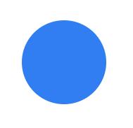
.circle {
    width: 120px;
    height: 120px;
    background: #317ef3;
    border-radius: 100%;
}
ring
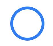
.ring {
    width: 120px;
    height: 120px;
    border: 10px solid #317ef3;
    border-radius: 100%;
    box-sizing: border-box;
}
Semicircle (four different directions)
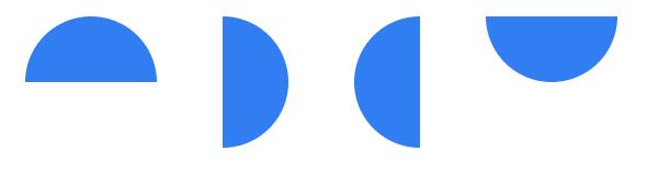
.top-semicircle {
    width: 120px;
    height: 60px;
    background: #317ef3;
    border-radius: 60px 60px 0 0;
}

.lf-semicircle {
    width: 60px;
    height: 120px;
    background: #317ef3;
    border-radius: 0 60px 60px 0;
}

.rt-semicircle {
    width: 60px;
    height: 120px;
    background: #317ef3;
    border-radius: 60px 0 0 60px;
}

.bot-semicircle {
    width: 120px;
    height: 60px;
    background: #317ef3;
    border-radius: 0 0 60px 60px;
}
Quarter circle (sector)


.toplf-sector,
.toprt-sector,
.botlf-sector,
.botrt-sector {
    width: 60px;
    height: 60px;
    background: #317ef3;
}

.toprt-sector {
    border-radius: 60px 0 0 0;
}

.toplf-sector {
    border-radius: 0 60px 0 0;
}

.botlf-sector {
    border-radius: 0 0 60px 0;
}

.botrt-sector {
    border-radius: 0 0 0 60px;
}
heart-shaped

.love {
    width: 100px;
    height: 100px;
    background: #317ef3;
    position: relative;
    transform: rotate(45deg);
    -webkit-transform: rotate(45deg);
    -moz-transform: rotate(45deg);
    -o-transform: rotate(45deg);
}

.love:after {
    content: "";
    width: 50px;
    height: 100px;
    background: #317ef3;
    border-radius: 50px 0 0 50px;
    position: absolute;
    right: 99px;
    top: 0;
}

.love::before {
    content: "";
    width: 100px;
    height: 50px;
    background: #317ef3;
    border-radius: 50px 50px 0 0;
    position: absolute;
    bottom: 99px;
    left: 0;
}
Pac Man

.eat {
    width: 0;
    height: 0;
    border: 60px solid #317ef3;
    border-radius: 100%;
    border-right-color: transparent;
}
Egg
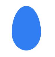
.egg {
    width: 100px;
    height: 150px;
    background: #317ef3;
    border-radius: 50px 50px 50px 50px/90px 90px 60px 60px;
}
Ellipse (horizontal)
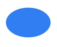
.ellipse1 {
    width: 180px;
    height: 120px;
    background: #317ef3;
    border-radius: 100%;
}
Ellipse (vertical)
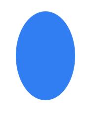
.ellipse2 {
    width: 120px;
    height: 180px;
    background: #317ef3;
    border-radius: 100%;
}
Capsule (horizontal)

.capsule1 {
    width: 200px;
    height: 100px;
    background: #317ef3;
    border-radius: 50px;
}
Capsule (vertical)
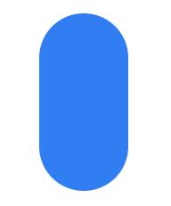
.capsule2 {
    width: 100px;
    height: 200px;
    background: #317ef3;
    border-radius: 50px;
}
Taiji eight trigrams array
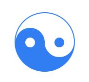
.taiji {
    width: 120px;
    height: 60px;
    background: #fff;
    border: 2px solid #317ef3;
    border-bottom: 60px solid #317ef3;
    border-radius: 100%;
    position: relative;
}

.taiji::before {
    content: "";
    position: absolute;
    left: 0;
    top: 50%;
    width: 20px;
    height: 20px;
    background: #fff;
    border: 20px solid #317ef3;
    border-radius: 100%;
}

.taiji::after {
    content: "";
    position: absolute;
    right: 0;
    top: 50%;
    width: 20px;
    height: 20px;
    background: #317ef3;
    border: 20px solid #fff;
    border-radius: 100%;
}
Clover

.four-leaf {
    width: 210px;
    height: 210px;
    position: relative;
}

.four-leaf span {
    display: block;
    width: 100px;
    height: 100px;
    background: #317ef3;
    position: absolute;
}

.four-leaf span.leaf1 {
    left: 0;
    top: 0;
    border-radius: 50px 50px 0 50px;
}

.four-leaf span.leaf2 {
    right: 0;
    top: 0;
    border-radius: 50px 50px 50px 0;
}

.four-leaf span.leaf3 {
    left: 0;
    bottom: 0;
    border-radius: 50px 0 50px 50px;
}

.four-leaf span.leaf4 {
    right: 0;
    bottom: 0;
    border-radius: 0 50px 50px 50px;
}
Petals (leaves)
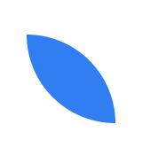
.leaf5 {
    width: 100px;
    height: 100px;
    background: #317ef3;
    border-radius: 0 100px;
}
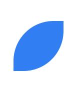
.leaf6 {
    width: 100px;
    height: 100px;
    background: #317ef3;
    border-radius: 80px 0px;
}
Five leaf flowers

.five-petal {
    width: 160px;
    height: 160px;
}

.five-petal span {
    display: block;
    width: 80px;
    height: 80px;
    background: #317ef3;
    border-radius: 0 100px;
    transform-origin: 100% 100%;
    position: absolute;
}

.five-petal .petal2 {
    transform: rotate(72deg);
}

.five-petal .petal3 {
    transform: rotate(144deg);
}

.five-petal .petal4 {
    transform: rotate(216deg);
}

.five-petal .petal5 {
    transform: rotate(288deg);
}
Infinite sign
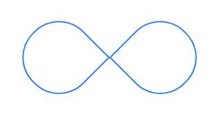
.infinite {
    width: 250px;
    position: relative;
}

.infinite span {
    width: 100px;
    height: 100px;
    background: #fff;
    border: 2px solid #317ef3;
    position: absolute;
}

.infinite .lf {
    border-radius: 50px 50px 0 50px;
    transform: rotate(-45deg);
    left: 0;
}

.infinite .rt {
    border-radius: 50px 50px 50px 0;
    transform: rotate(45deg);
    right: 0;
}
tails

.xwb1 {
    width: 100px;
    height: 60px;
    border-top: 20px solid #317ef3;
    border-radius: 0 60px 0 0;
}

.xwb2 {
    width: 100px;
    height: 60px;
    border-left: 20px solid #317ef3;
    border-radius: 60px 0 0 0;
}
Moon

.moon {
    width: 100px;
    height: 100px;
    border-left: 30px solid #317ef3;
    border-radius: 50px 0 0 50px;
}
Draw triangle schematic
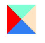
.triangle-shiyi {
    width: 0;
    height: 0;
    border: 50px solid #317ef3;
    border-left-color: red;
    border-top-color: aquamarine;
    border-right-color: bisque;
}
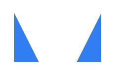
isosceles right triangle
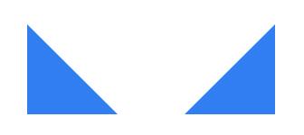
.dbzj-sanjiao1 {
    width: 0;
    height: 0;
    border-bottom: 100px solid #317ef3;
    border-right: 100px solid transparent;
}

.dbzj-sanjiao2 {
    width: 0;
    height: 0;
    border-bottom: 100px solid #317ef3;
    border-left: 100px solid transparent;
}

.dbzj-sanjiao3 {
    width: 0;
    height: 0;
    border-top: 100px solid #317ef3;
    border-right: 100px solid transparent;
}

.dbzj-sanjiao4 {
    width: 0;
    height: 0;
    border-top: 100px solid #317ef3;
    border-left: 100px solid transparent;
}
right triangle
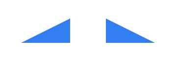
.dbzj-sanjiao5 {
    width: 0;
    height: 0;
    border-bottom: 50px solid #317ef3;
    border-left: 100px solid transparent;
    /* border-left,border-right Decision width */
    /* border-top,border-bottom Decision height */
}

.dbzj-sanjiao6 {
    width: 0;
    height: 0;
    border-bottom: 50px solid #317ef3;
    border-right: 100px solid transparent;
}
.dbzj-sanjiao7 {
    width: 0;
    height: 0;
    border-bottom: 100px solid #317ef3;
    border-right: 50px solid transparent;
}

.dbzj-sanjiao8 {
    width: 0;
    height: 0;
    border-bottom: 100px solid #317ef3;
    border-left: 50px solid transparent;
}

.dbzj-sanjiao9 {
    width: 0;
    height: 0;
    border-top: 50px solid #317ef3;
    border-right: 100px solid transparent;
}

.dbzj-sanjiao10 {
    width: 0;
    height: 0;
    border-top: 50px solid #317ef3;
    border-left: 100px solid transparent;
}
Acute triangle
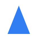
.dbzj-sanjiao11 {
    width: 0;
    height: 0;
    border-left: 40px solid transparent;
    border-right: 40px solid transparent;
    border-bottom: 100px solid #317ef3;
}
Obtuse triangle

.dbzj-sanjiao12 {
    width: 0;
    height: 0;
    border-bottom: 50px solid #317ef3;
    border-right: 100px solid transparent;
    position: relative;
}

.dbzj-sanjiao12::before {
    content: "";
    position: absolute;
    left: 0;
    top: 0;
    border-bottom: 50px solid #fff;
    border-right: 20px solid transparent;
}
parallelogram
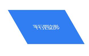
.pxsbx1 {
    width: 200px;
    height: 120px;
    background: #317ef3;
    color: #fff;
    text-align: center;
    line-height: 120px;
    font-size: 18px;
    transform: skewX(30deg);
}
Sometimes the effect we need is that the text in the parallelogram is not inclined. The implementation method can be to use the combination of pseudo elements and positioning methods to add pseudo elements after the text
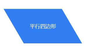
.pxsbx2 {
    width: 200px;
    height: 120px;
    text-align: center;
    line-height: 120px;
    position: relative;
    font-size: 18px;
    color: #fff;
}

.pxsbx2::after {
    content: "";
    position: absolute;
    left: 0;
    top: 0;
    z-index: -1;
    width: 200px;
    height: 120px;
    background: #317ef3;
    transform: skewX(30deg);
}
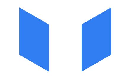
.pxsbx3 {
    width: 100px;
    height: 160px;
    background: #317ef3;
    transform: skewY(30deg);
}

.pxsbx4 {
    width: 100px;
    height: 160px;
    background: #317ef3;
    transform: skewY(-30deg);
}
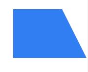
Isosceles trapezoid
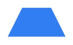
.tixing1 {
    width: 100px;
    height: 0;
    border-bottom: 100px solid #317ef3;
    border-left: 50px solid transparent;
    border-right: 50px solid transparent;
}
Right angle trapezium
.tixing2 {
    width: 100px;
    height: 100px;
    background: #317ef3;
    position: relative;
}

.tixing2::before {
    content: "";
    width: 0;
    height: 0;
    border-bottom: 100px solid #317ef3;
    border-right: 50px solid transparent;
    position: absolute;
    left: 100%;
    top: 0;
}
Border dialog box
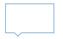
.duihuakuang1 {
    width: 200px;
    height: 120px;
    border: 2px solid #317ef3;
    position: relative;
}

.duihuakuang1::before {
    content: "";
    position: absolute;
    left: 40px;
    top: 92%;
    width: 20px;
    height: 20px;
    border-right: 2px solid #317ef3;
    border-bottom: 2px solid #317ef3;
    transform: rotate(45deg);
    background: #fff;
}
Stereoscopic ball type
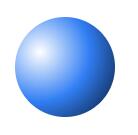
.litiqiuxing1 {
    width: 100px;
    height: 100px;
    border-radius: 100%;
    background: #317ef3;
    background: radial-gradient(circle at 25% 35%, #fff, #317ef3, #071529);
}

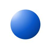
.litiqiuxing2 {
    width: 100px;
    height: 100px;
    border-radius: 100%;
    background: #317ef3;
    background: radial-gradient(circle at top, #fff, #317ef3, #071529)
}
.litiqiuxing3 {
    width: 100px;
    height: 100px;
    border-radius: 100%;
    background: #317ef3;
    background: radial-gradient(circle at left top, #fff 10%, #78a8f2 30%, #0b59ca 60%, #04409a 80%, #202b3a 100%)
}