After installing the latest Windows 10 update, I noticed a great detail effect in the system UI. In the magnetic paste of the start menu or the UWP-style settings interface, the highlighted border of the element can sense the mouse, and the highlighted part of the border can move with the mouse. Suddenly inspired, can this effect be achieved with CSS?
Analysis
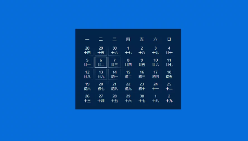
Take the effect of desktop calendar as an example. When the mouse moves, the border around it becomes visible gradually. This effect is not a searchlight effect! This can be achieved by mask ing in CSS with a radial gradient.

But the problem is that masks act on the whole element, and there's no way to act on borders without affecting content. Well, that only separates the border from the actual content in different layers. Well, it shouldn't be a problem to update the mask position when the mouse moves.
Realization
Dead work
Firstly, two layers of calendar grid, one layer showing date information, and the other layer showing the effect of searchlight. It's not important to use flex layout, grid, even inline-block. What's important is that the upper and lower layers of the grid must be aligned. Then we use relative containers to circle and fix the two absolute layers.
<div class="calendar">
    <div class="calendar-header">
        <div class="week-day">One</div>
        <div class="week-day">Two</div>
        <div class="week-day">Three</div>
        <div class="week-day">Four</div>
        <div class="week-day">Five</div>
        <div class="week-day">Six</div>
        <div class="week-day">day</div>
    </div>
    <div class="calendar-body">
        <div class="grid-container border-layer">
            <div class="grid-item"></div>
            ...
            <div class="grid-item"></div>
        </div>
            <div class="grid-container number-layer">
            <div class="grid-item"><span>28</span><span>Fourteen</span></div>
            <div class="grid-item"><span>29</span><span>Fifteen</span></div>
            ...
            <div class="grid-item"><span>2</span><span>Nineteen</span></div>
        </div>
    </div>
  </div>
web Front-end development learning Q-q-u-n:  767273102 ,Share learning methods and small details that need attention, and keep updating the latest teaching and learning methods (detailed front-end project teaching video)
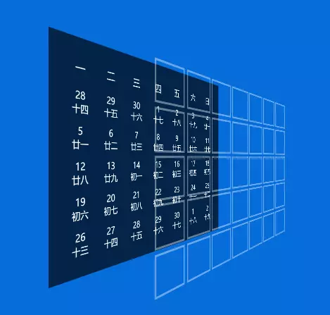
Layer diagram:
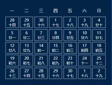
The effect is as follows:
When the mouse is not put on, hide the border layer first.
.border-layer {
 ...
  visibility: hidden;
}

.calendar:hover .border-layer {
  visibility: visible;
}
CSS Mask
CSS Mask is similar to the layer mask in Photoshop. It can be used as a mask on the target element. The alpha channel (i.e. transparency information) of the image determines which part of the target element is visible (or brightness information can be selected).
For example, if the mask image is a translucent image, the effect is the same as setting opacity: 0.5; if the mask image is a hollow Pentagon in the middle, the effect is that the element is cut into a Pentagon shape.
Mask's grammar is almost identical to background s'grammar. Here we use radial gradient to create a gradient circle with a radius of 80px from center white to edge transparent, and use mask-repeat and mask-size to prevent repeat and distortion.
  -webkit-mask-image: radial-gradient(circle at center, white 0%, transparent 80px);
  -webkit-mask-repeat: no-repeat;
  -webkit-mask-size: 160px 160px; /* The radius is 80px, so size needs to be 160px. */
Next, let's update mask-position. There are two points to note here. One is to get the relative coordinates of the mouse to the target element, and the other is position offset.
MouseEvent has a bunch of X/Y. We can get the coordinates we need by subtracting the coordinates of the target element relative to the document from the pageX/pageY coordinates of the relative document. Vector formula: AB = AC - BC:
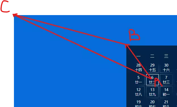
However, the coordinates of mask-position need to be dealt with here. We define a mask as a 160x160 circular gradient, and mask-position, like background-position, defines the location of the upper left corner of the mask (0, 0) that actually needs to be aligned with which coordinate of the container. So we need to subtract the calculated coordinates (80, 80) to keep the gradient center in line with the coordinates of the mouse.
var borderLayer = document.querySelector(".border-layer");

document.querySelector(".calendar").addEventListener("mousemove", function(ev){
  var x = ev.pageX;
  var y = ev.pageY;
  var bounding = borderLayer.getBoundingClientRect();

  borderLayer.style.webkitMaskPosition = `${x - bounding.x - 80}px ${y -bounding.y - 80}px`;
});
web Front-end development learning Q-q-u-n:  767273102 ,Share learning methods and small details that need attention, and keep updating the latest teaching and learning methods (detailed front-end project teaching video)
The ultimate effect: codepen.io/liuxiaole-t...
Epilogue
The scheme of layering border and then applying mask can only be effective in specific situations. Separating another layer increases a lot of maintenance costs. When consulting the MDN data, I came across a mask-border, which seems to act on the mask of the border. At present, there is no browser to implement it.