Learn step by step, and then make a comprehensive page
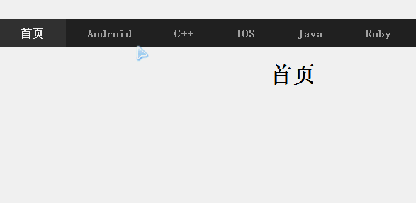
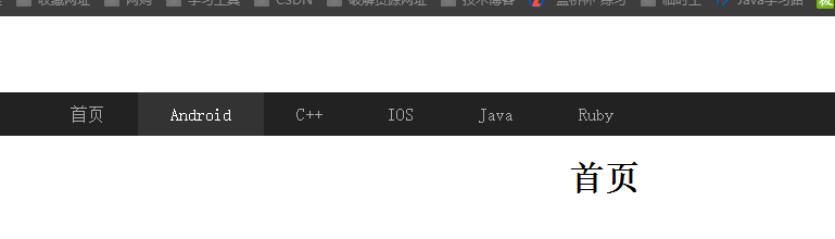
1. Navigation bar highlighted on the current page
The first is HTML code, which is very simple. ul+li implements the menu
<!DOCTYPE html>
<html lang="en">
<head>
    <meta charset="UTF-8">
    <title>Navigation bar I</title>
</head>
<body>
    <header class="header">
        <div class="nva">
            <ul class="list">
                <li><a href="Android.html">Android</a></li>
                <li><a href="C++.html">C++</a></li>
                <li><a href="IOS.html">IOS</a></li>
                <li><a href="Java.html">Java</a></li>
                <li><a href="Ruby.html">Ruby</a></li>
            </ul>
        </div>
    </header>
<h1>home page</h1>
</body>
</html>
Basic effect:

Next, set the CSS attribute. Note that label a is a row level element, so you need to use display to convert it into a block level element. This is very common. There is also the common usage of line height
*{ margin:0; padding: 0; }
a{ text-decoration: none; }
.nva{ width: 100%; height: 40px; margin-top: 70px; background-color: #222; }
.list{ width: 80%; height: 40px; margin: 0 auto; list-style-type: none; }
.list li{ float: left; }
.list li a{ padding: 0 30px; color: #aaa; line-height: 40px; display: block; }
.list li a:hover{ background:#333; color:#fff; }
.list li a.on{ background:#333; color:#fff; }
h1{ margin: 20px auto; text-align: center; }
Achieved results:
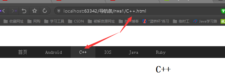
Finally, JS dynamically adds positioning effect js, there will be links in the page Jump. The attributes will be matched according to the suffix of the link, and the matching will change the style to achieve the desired effect You should pay attention to how to get the URL and how to find the href information from the URL
$(function(){
    //The current link is indexed by the last element after / split
    var index = window.location.href.split("/").length-1;
    //The first four letters of the last element prevent parameters from being followed
    var href = window.location.href.split("/")[index].substr(0,4);

    if(href.length>0){
        //If the match is successful, change the style
        $(".list li a[href^='"+href+"']").addClass("on");
        //[attribute^=value]: matching a given attribute is an element starting with some value.
    }else {
        //Default home page highlight
        $(".list li a[href^='index']").addClass("on");
    }
});
design sketch
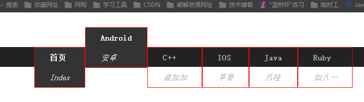
2. Enter the navigation bar for automatic switching
On the basis of 1, modify the content of HTMLa tag, and then set the animation effect through CSS
<ul class="list">
                <li><a href="index01.html">
                <b>home page</b>
                <i>Index</i>
                </a></li>
                <li><a href="Android.html">
                    <b>Android</b>
                    <i>Android</i>
                </a></li>
                <li><a href="C++.html">
                    <b>C++</b>
                    <i>Who's Gaga</i>
                </a></li>
                <li><a href="IOS.html">
                    <b>IOS</b>
                    <i>Apple</i>
                </a></li>
                <li><a href="Java.html">
                    <b>Java</b>
                    <i>Java</i>
                </a></li>
                <li><a href="Ruby.html">
                    <b>Ruby</b>
                    <i>Such as August 1</i>
                </a></li>
            </ul>
CSS realizes the animation effect. First, set the b and i tags as block level elements, so that they can be vertically distributed, and then set a transition for a. the so-called animation is to change and move a up after delimitation, and then add a border to a for observation. See the figure below
Finally, if you want to achieve the effect, you can set an overflow hidden attribute for the div of the package menu
*{ margin:0; padding: 0; }
a{ text-decoration: none; }
.nva{ width: 100%; height: 40px; margin-top: 70px; background-color: #222; overflow: hidden; }
.list{ width: 80%; height: 40px; margin: 0 auto; list-style-type: none; }
.list li{ float: left; }
.list li a{ padding: 0 30px; color: #aaa; line-height: 40px; display: block; transition: 0.3s; }
                            .list b,.list i{ display: block; }
.list li a:hover{ margin-top: -40px; background:#333; color:#fff; }
.list li a.on{ background:#333; color:#fff; }
h1{ margin: 20px auto; text-align: center; }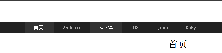
JQ can also be used to implement it. The code is as follows
$(function () {
    $(".list a").hover(function () {
        //Stop is to stop the current animation while executing other animations
        $(this).stop().animate({
            "margin-top": -40
        }, 300);
    }, function () {
        $(this).stop().animate({
            "margin-top": 0
        }, 300);
    });
});
3. Implementation of elastic submenu
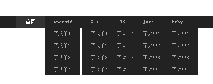
First, the submenu uses div package, which is full of a tags, as shown below
                <li><a href="Android.html">
                    <b>Android</b>
                </a>
                    <div class="down">
                        <a href="#"> submenu 1</a>
                        <a href="#"> submenu 2</a>
                        <a href="#"> submenu 3</a>
                        <a href="#"> submenu 4</a>
                    </div>
                </li>
Next, set the style. Since it is a submenu, it will be separated from the document page, so use the absolute attribute. If you use this attribute, the parent container will be relative
*{ margin:0; padding: 0; }
a{ text-decoration: none; }
.nva{ width: 100%; height: 40px; margin-top: 70px; background-color: #222; position: relative; }
.list{ width: 80%; height: 40px; margin: 0 auto; list-style-type: none; }
.list li{ float: left; }
.list li a{ padding: 0 30px; color: #aaa; line-height: 40px; display: block; transition: 0.3s; }
.list b{ display: block; }
.list li a:hover{ background:#333; color:#fff; }
.list li a.on{ background:#333; color:#fff; }
.list .down{ position: absolute; top: 40px; background-color: #222; /*display: none;*/ }
.list .down a{ color: #aaa; padding-left: 30px; display: block; }
h1{ margin: 20px auto; text-align: center; }
The following effects:
Next, use the JQ and easing plug-ins to control the animation The find method is generally used to find the descendants of the operation element
$(function () {
    $(".list li").hover(function () {
        //The easing plug-in is used here
        $(this).find(".down").stop().slideDown({duration:1000,easing:"easeOutBounce"});
    }, function () {
        $(this).find(".down").stop().slideUp({duration:1000,easing:"easeOutBounce"});
    });
});
The effect and picture recording are not very good. In fact, they are flexible animation