1. Wizard diagram
1.1 why do I need sprite diagram
Many small background images are often used as decoration in a web page. When there are too many images in the web page, the server will frequently receive and send request images, resulting in excessive request pressure on the server, which will greatly reduce the loading speed of the page. So,
In order to effectively reduce the number of requests received and sent by the server and improve the page loading speed,
There it is
CSS sprite Technology
(also known as CSS Sprites, CSS Sprite).
Core principle: integrate some small background images in the web page into a large picture, so that the server only needs one request.
Purpose of wizard Technology:
In order to effectively reduce the number of requests received and sent by the server and improve the loading speed of the page
.
1.2 use of sprites
Use sprite core:
1. Sprite technology is mainly used for background pictures, which is to integrate multiple small background pictures into a large picture.
Sprite image is mainly used for small background images.
2. This big picture is also called sprites sprite or sprite
3. Move the position of the background picture, which can be used at this time
background-position .
4. The moving distance is the distance of the target image
x
and
y
Coordinates. Note that the coordinates in the web page are different.
You can use the firewall tool
5. Generally, it moves upward and left, so the value is negative. (be sure to pay attention to the coordinates in the web page: the right side of the x axis is positive, the left side is negative, and the y axis is the same.)
6. When using sprite images, it is necessary to accurately measure the size and position of each small background image.
2. Font Icon
2.1 generation of font icons
Sprite diagram has many advantages, but its disadvantages are obvious:
1. The picture file is still relatively large.
2. The picture itself will be distorted when zoomed in and out.
3. Once the picture is made, it is very complicated to replace it.
At this time, the emergence of a technology solves the above problems well, that is
Font Icon iconfont
. Font Icon usage scenario: mainly used to display some common and commonly used small icons in web pages.
Font Icon
It can provide a convenient and efficient way for front-end engineers to use icons,
It shows icons, which are essentially fonts.
2.2 advantages of font icons
- Lightweight: an icon font is smaller than a series of images. Once the font is loaded, the icon will be rendered immediately, reducing server requests.
- Flexibility: the essence is text, which can change color, produce shadow, transparent effect, rotation, etc. at will.
- Compatibility: almost all browsers are supported and can be used safely.
be careful:
Font icons can not replace sprite technology, but only improve and optimize the icon technology in work.
Summary:
1. If you encounter some small icons with simple structure and style, use font icons.
2. If you encounter some small pictures with more complex structure and style, use the wizard diagram.
2.3 font icon download
Recommended download sites:
- icomoon font http://icomoon.io
IcoMoon was founded in 2011 and launched the first custom icon font generator, which allows users to select the required icons and make them into a font. The content of the font is diverse and very comprehensive. The only regret is that the foreign servers have a slow network speed.
- Ali iconfont font library http://www.iconfont.cn/
This is an iconfont font icon font library of Alibaba M2UX, including Taobao Icon Library and Alibaba mother icon library. You can use AI to create icons and upload them. The point is, free!
2.4 introduction of font icons
After downloading, pay attention not to delete the original file, which will be used later
.
1. Put the in the download package
fonts
Put the folder in the root directory of the page.

2. Global declaration of fonts in css Style: simply understand how to introduce these font files into our page through css. Be sure to pay attention to the path of font files.
<style>
    /* Font declaration */
     @font-face {
  font-family: 'icomoon';
  src:  url('fonts/icomoon.eot?p4ssmb');
  src:  url('fonts/icomoon.eot?p4ssmb#iefix') format('embedded-opentype'),
    url('fonts/icomoon.ttf?p4ssmb') format('truetype'),
    url('fonts/icomoon.woff?p4ssmb') format('woff'),
    url('fonts/icomoon.svg?p4ssmb#icomoon') format('svg');
  font-weight: normal;
  font-style: normal;
  font-display: block;
}
</style>
3. Add a small icon in the HTML tag.
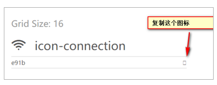
<span></span>
4. Define the font for the label.
span {
    font-family: 'icomoon';
    font-size: 100px;
    color:pink;
  }
Make sure that this font is consistent with the font in @ font face above.

2.4. 1 font file format
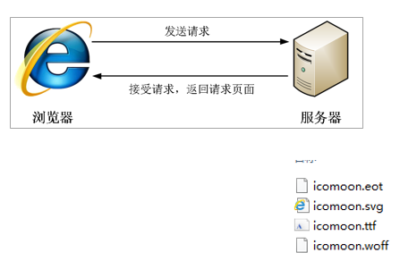
Why are there four files in the fonts folder?
Font formats supported by different browsers are different. Font icons are compatible because they contain font files supported by mainstream browsers.
- TureType(.ttf) format ttf font is the most common font on Windows and Mac. Browsers that support this font include IE9 +, Firefox 3.0 5+, Chrome4+,Safari3+,Opera10+,iOS Mobile,Safari4.2+;
- Web Open Font Format(.woff) format woff font. Browsers supporting this font include IE9 + and Firefox 3 5+,Chrome6+, Safari3.6+,Opera11.1+;
- Embedded Open Type(.eot) format eot font is a special font for ie. browsers supporting this font have IE4 +;
- SVG(.svg) format SVG font is a format based on SVG font rendering. Browsers supporting this font include chrome 4 + and safari 3 1+, Opera10.0+,iOS Mobile Safari3.2+;
2.5 addition of font icons
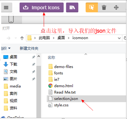
If the original font icon is not enough at work, you need to add a new font icon to the original font file.
Put the in the compressed package
selection.json re upload
, and then select the icon you want new, download the compressed package again, and replace the original file.
Principle of Font Icon loading:
3. CSS triangle
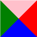
Some triangles are common in web pages. You can draw them directly using CSS without making pictures or font icons. The method is as follows:
.box1 {
    width: 0;
    height: 0;
    border-top: 10px solid pink;
    border-right: 10px solid red;
    border-bottom: 10px solid blue;
    border-left: 10px solid green;
}
.box2 {
width: 0;
height: 0;
line-height: 0; /*Take care of compatibility and can be removed*/
font-size: 0; /*Take care of compatibility and can be removed*/
border: 50px solid transparent;
border-left-color: pink;
}

4. CSS user interface style
So called
Interface style
, is to change some user operation styles to improve the user experience.
- Change the user's mouse style
- Form outline
- Prevent form field dragging
4.1 mouse style cursor
li {cursor: pointer; }
Sets or retrieves which system predefined cursor shape the mouse pointer moves over the object.
| Attribute value | describe |
| dedault | Small white arrow (default) |
| pointer | Little hand |
| move | move |
| text | text |
| not-allowed | prohibit |
4.2 outline
Add outline to form: 0; Or outline: none; After the style, you can remove the default blue border.
input {outline: none; }
4.3 prevent dragging text field resize
In actual development, we can't drag the lower right corner of the text field. After adding the following styles, we can remove the default drag in the lower right corner.
textarea{ resize: none;}
5. Vertical align attribute application
CSS
vertical-align
Attribute usage scenario: it is often used to set the vertical alignment of pictures or forms (inline block elements) and text.
Official explanation: used to set an element
Vertical alignment
, but it is only valid for inline elements or inline block elements.
Syntax:
vertical-align :
baseline
| top | middle | bottom
| value | describe |
| baseline | Default. The element is placed on the baseline of the parent element. |
| top | Align the top of the element with the top of the highest element in the row. |
| middle | Place this element in the middle of the parent element. |
| bottom | Align the top of the element with the bottom of the lowest element in the row. |

5.1 picture, form and text alignment
Pictures and forms belong to inline block elements. The default vertical align is baseline alignment.
At this time, you can give the block elements in the lines such as pictures and forms
vertical-align
Property is set to
middle allows text and pictures
Vertically centered.
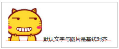
5.2 solve the problem of default blank gap at the bottom of the picture
bug: there will be a blank gap at the bottom of the picture because the block elements in the line will align with the baseline of the text.
There are two main solutions:
1. Add to the picture
vertical-align:middle | top| bottom
Wait.
Promote the use of
2. Convert the picture to block level elements
display: block;

6. Overflow text ellipsis display
6.1 single line text overflow display ellipsis

/* Three conditions must be met */
/*1. Force text to appear on one line first*/
 white-space: nowrap; ( default normal Auto wrap)
 /*2. Excess hidden*/
 overflow: hidden;
 /*3. Text replaces the excess with an ellipsis*/
 text-overflow: ellipsis;
6.2} multiple line text overflow display ellipsis

Multi line text overflow displays ellipsis, which has large compatibility problems. It is suitable for WebKit browser or mobile terminal (most of the mobile terminal is WebKit kernel).
It is more recommended to let the background personnel do this effect, because the background personnel can set how many words to display, which makes the operation easier.
overflow: hidden;
text-overflow: ellipsis;
/* Elastic box model display */
display: -webkit-box;
/* Limit the number of lines of text displayed in a block element */
-webkit-line-clamp: 2;
/* Sets or retrieves the arrangement of the child elements of the expansion box object */
-webkit-box-orient: vertical;
7. Common layout skills
Clever use of a technology for faster and better layout:
1.margin
Application of negative values
2.
Text around floating elements
3.
Ingenious use of inline blocks
4.CSS
Triangular reinforcement
7.1 application of negative margin
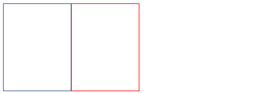
1.
Let each box
margin
Move to the left
-1px
Just press the border of the adjacent box.
2.
When the mouse passes a box, you can raise the level of the current box (if there is no positioning, add relative positioning (keep the position), and if there is positioning, add z-index
).
 /* ul li:hover {
1. If the box is not positioned, the mouse can add relative positioning
    position: relative;
    border: 1px solid blue;
    } */

ul li:hover {
/* 2.If li has positioning, use z-index to improve the level */
    z-index: 1;
    border: 1px solid blue;
}
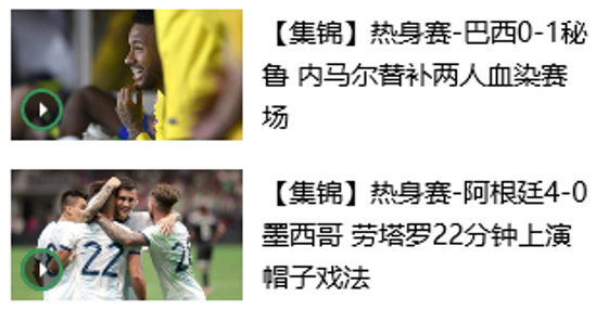
7.2} text around floating elements
Clever use of floating elements will not suppress the character.
7.3} ingenious use of in-line blocks


The page number is displayed in the middle of the page:
1. Convert these link boxes into inline blocks
2. There is a gap between the block elements in the row, and
Parent
Add text align: Center;
Inline block elements are centered horizontally
7.4 CSS triangle reinforcement

Principle:

Code:
.box1 {
    width: 0;
    height: 0;
    /* Increase the width of the top border */
    /* border-top: 100px solid transparent;
    border-right: 50px solid skyblue; */
    /* The left and bottom border widths are set to 0 */
    /* border-bottom: 0 solid blue;
    border-left: 0 solid green; */
    /*Here is another way to write*/
    /* 1.Only the right border has color */
    border-color: transparent red transparent transparent;
    /* 2. All styles are solid */
    border-style: solid;
    /* 3. The width of the top border should be larger, the width of the right border should be smaller, and the other borders should be 0 */
    border-width: 100px 50px 0 0 ;

}
8. CSS initialization
Different browsers have different default values for some tags. In order to eliminate the differences in HTML text rendering between different browsers and take care of browser compatibility, CSS needs to be initialized.
Simple understanding:
CSS initialization refers to resetting the style of the browser, also known as CSS reset. Every web page must first be initialized with CSS.
Here with Jingdong CSS
Take initialization code as an example.
Unicode encoded font:
Replace the Chinese font name with the corresponding Unicode code, which can effectively avoid the problem of garbled code when the browser interprets the CSS code. For example:
Bold \ 9ED1F53
Arial \ 5B8BF53
Microsoft YaHei \ 5FAEF6FC5ED1
/* Clear the inside and outside margins of all our labels */
* {
    margin: 0;
    padding: 0
}
/* em And i italicized text is not tilted */
em,
i {
    font-style: normal
}
/* Remove the dot of li */
li {
    list-style: none
}

img {
    /* border 0 Take care of lower version browsers. If the picture contains links, there will be border problems */
    border: 0;
    /* Cancel the problem of blank gap at the bottom of the picture */
    vertical-align: middle
}

button {
    /* When the mouse passes the button button, the mouse becomes a small hand */
    cursor: pointer
}

a {
    color: #666;
    text-decoration: none
}

a:hover {
    color: #c81623
}

button,
input {
    /* "\5B8B\4F53" This means that the browser has better compatibility */
    font-family: Microsoft YaHei, Heiti SC, tahoma, arial, Hiragino Sans GB, "\5B8B\4F53", sans-serif
}

body {
    /* CSS3 Anti aliasing makes the text clearer */
    -webkit-font-smoothing: antialiased;
    background-color: #fff;
    font: 12px/1.5 Microsoft YaHei, Heiti SC, tahoma, arial, Hiragino Sans GB, "\5B8B\4F53", sans-serif;
    color: #666
}

.hide,
.none {
    display: none
}
/* Clear float */
.clearfix:after {
    visibility: hidden;
    clear: both;
    display: block;
    content: ".";
    height: 0
}

.clearfix {
    *zoom: 1
}