CSS layout -- position attribute
The position attribute specifies the type of positioning method (static, relative, fixed, absolute, or sticky) applied to the element.
------------------------------------------------------------------------------------------
position attribute
The position attribute specifies the type of positioning method applied to the element.
There are five different location values:
- static
- relative
- fixed
- absolute
- sticky
Elements are actually located using the top, bottom, left, and right attributes. However, these properties will not work unless the position property is set first. They work differently depending on the position value.
-------------------------------------------------------------------------------------------
position: static;
By default, the positioning mode of HTML elements is static.
Statically positioned elements are not affected by the top, bottom, left, and right attributes.
position: static; Elements of are not located in any special way; It is always positioned according to the normal flow of the page:
example:
Full code:
<!DOCTYPE html>
<html lang="en">
<head>
    <meta charset="UTF-8">
    <meta http-equiv="X-UA-Compatible" content="IE=edge">
    <meta name="viewport" content="width=device-width, initial-scale=1.0">
    <title>Document</title>
    <style>
        .box1{
            width: 100px;
            height: 100px;
            background-color: aqua;
            position: static;
            left:500px;
        }
    </style>
</head>
<body>
    <div class="box1"></div>
</body>
</html>
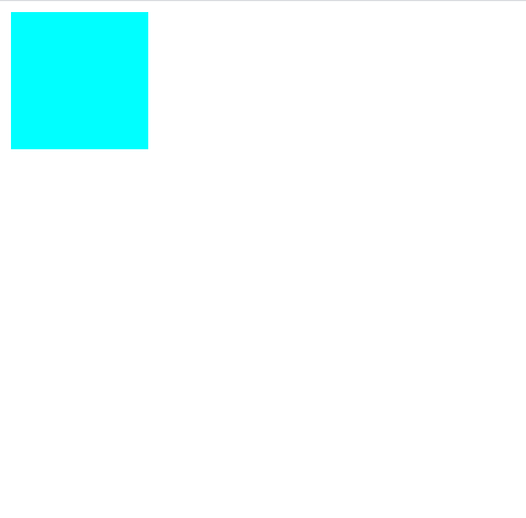
Operation effect:
It can be seen that the left attribute set does not work
------------------------------------------------------------------------------------------
position: relative;
position: relative; The element of is positioned relative to its normal position.
Setting the top, right, bottom, and left attributes of a relatively positioned element will cause it to deviate from its normal position for adjustment. The rest of the content will not be adjusted to accommodate any space left by the element.
Instance before opening:
Full code:
<!DOCTYPE html>
<html lang="en">
<head>
    <meta charset="UTF-8">
    <meta http-equiv="X-UA-Compatible" content="IE=edge">
    <meta name="viewport" content="width=device-width, initial-scale=1.0">
    <title>Document</title>
    <style>
         .box1{
            width: 100px;
            height: 100px;
            background-color:lawngreen;
        }
        .box2{
            width: 100px;
            height: 100px;
            background-color: aqua;
            position:relative;
            left: 100px; /*Set the left property and move 100px to the right*/
            top: -100px;/*Set the top attribute and move up 100px*/
        }
        .box3{
            width: 100px;
            height: 100px;
            background-color:lightcoral;
            position:relative;
        }
    </style>
</head>
<body>
    <div class="box1"></div>
    <div class="box2"></div>
    <div class="box3"></div>
</body>
</html>
Operation effect
By setting the left and top attributes, move box2 to the right of box1 to avoid the layout confusion caused by margin. Take the position before moving as the reference for the next move, and the position before moving will not be occupied by other elements.
box1: Green
box2 blue
box3: reddish brown

------------------------------------------------------------------------------------------
position: fixed;
position: fixed; The element of is positioned relative to the viewport, which means that it is always in the same position even if you scroll the page. The right, bottom, and left attributes are used to locate this element.
Fixed positioned elements do not leave gaps where they should normally be placed on the page.
------------------------------------------------------------------------------------------
position: absolute;
position: absolute; The element is positioned relative to the nearest ancestor element (not relative to the viewport, such as fixed).
However, if the absolutely positioned element has no ancestor, it uses the document body and moves with the page scrolling.
Note: the "positioned" element is any element whose position is not static.
This is a simple example:
example:
Full code:
<!DOCTYPE html>
<html lang="en">
<head>
    <meta charset="UTF-8">
    <meta http-equiv="X-UA-Compatible" content="IE=edge">
    <meta name="viewport" content="width=device-width, initial-scale=1.0">
    <title>Document</title>
    <style>
         .box1{
             width: 400px;
             height: 400px;
             background-color: lightgreen;
             position: relative;
         }
         div > .box2{
             width: 200px;
             height: 200px;
             background-color: mediumvioletred;
             position: absolute;
             top: 200px;
         }
    </style>
</head>
<body>
    <div class="box1">
        <div class="box2"></div>
    </div>

</body>
</html>
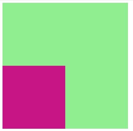
Operation effect:
Turn box2 on absolute positioning and box1 on relative positioning; At this time, box2 is positioned relative to box1, and the effect diagram is as follows:
Before opening positioning:

After opening positioning:
------------------------------------------------------------------------------------------
position: sticky;
position: sticky; The element of is located according to the user's scrolling position.
Sticky elements switch between relative and fixed according to the scroll position. At first it will be relatively positioned until a given offset position is encountered in the viewport - and then it will be "pasted" in the appropriate position (such as position:fixed).
Note: sticky positioning is not supported in Internet Explorer, Edge 15, and earlier versions. Safari requires a webkit prefix (see the example below). You must also specify at least one of top, right, bottom, or left for sticky positioning to work.
In this example, when it reaches its scrolling position, the sticky element will stay at the top of the page (top: 0).
example:
Full code:
I won't give you the renderings here. If you are interested, try it manually, and you will find different and commonly used layouts
<!DOCTYPE html>
<html lang="en">
<head>
    <meta charset="UTF-8">
    <meta http-equiv="X-UA-Compatible" content="IE=edge">
    <meta name="viewport" content="width=device-width, initial-scale=1.0">
    <title>Document</title>
    <style>
          body{
                background-color: midnightblue;
                height: 1200px;
             }
         .box1{
             width: 1500px;
             height: 5px;
             position: -webkit-sticky; /* Safari */
             position: sticky;
             top: 0;
             background-color: lightgreen;
         }
    </style>
</head>
<body>
    <div class="box1">
    </div>

</body>
</html>
------------------------------------------------------------------------------------------
Overlapping elements
When positioning elements, they can overlap with other elements.
The z-index attribute specifies the stack order of elements (which element should be placed before or after other elements).
Elements can be set to a positive or negative stacking order:
This is a title. Since the z-index of the image is - 1, it is behind the text.
example
img {
position: absolute;
left: 0px;
top: 0px;
z-index: -1;
}
You can try it yourself
Elements with a higher stacking order always precede elements with a lower stacking order.
Note: if two positioned elements overlap without specifying z-index, the last element in the HTML code will be displayed at the top
The detailed explanation of z-index will be updated in the follow-up blog.
Thanks for your support. It's not easy to create. I'm busy. You can give me a little praise, huh!